Born in 1885, Gunnar Asplund is thought to be one of the most important architects in Scandinavia during the 20th century with influence rippling even in today's architecture.His designs merge the classicist style with modern influences, resulting in a clear, strict line but yet one that exudes warmth and that relates to the human. During 1918 and 1928 he created a series of projects with significant importance even to today's Scandinavian architecture like the Snellman Villa (Villa Snellman), the Lister county courthouse (Listers härads tingshus), and the small chapel at the woodland cemetery (skogskapellet),the Scandia-theater in Stockholm, as well as the Stockholm city-library. During the 20th century the Swedish architecture line was being influenced by the Neoclassical style and thus Asplund's main projects reflect an approach based on this current.
The appearance of functionalism in Sweden is also linked to the name of Erik Gunnar Asplund, him being considered to be the introducer of functionalist architecture here. As you can see from his main project gallery above, the Swedish architect's style varied through time and adapted along with the international directions, but all of the designs mentain personal interpretations of the modern ideas of form.
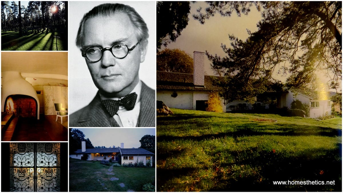
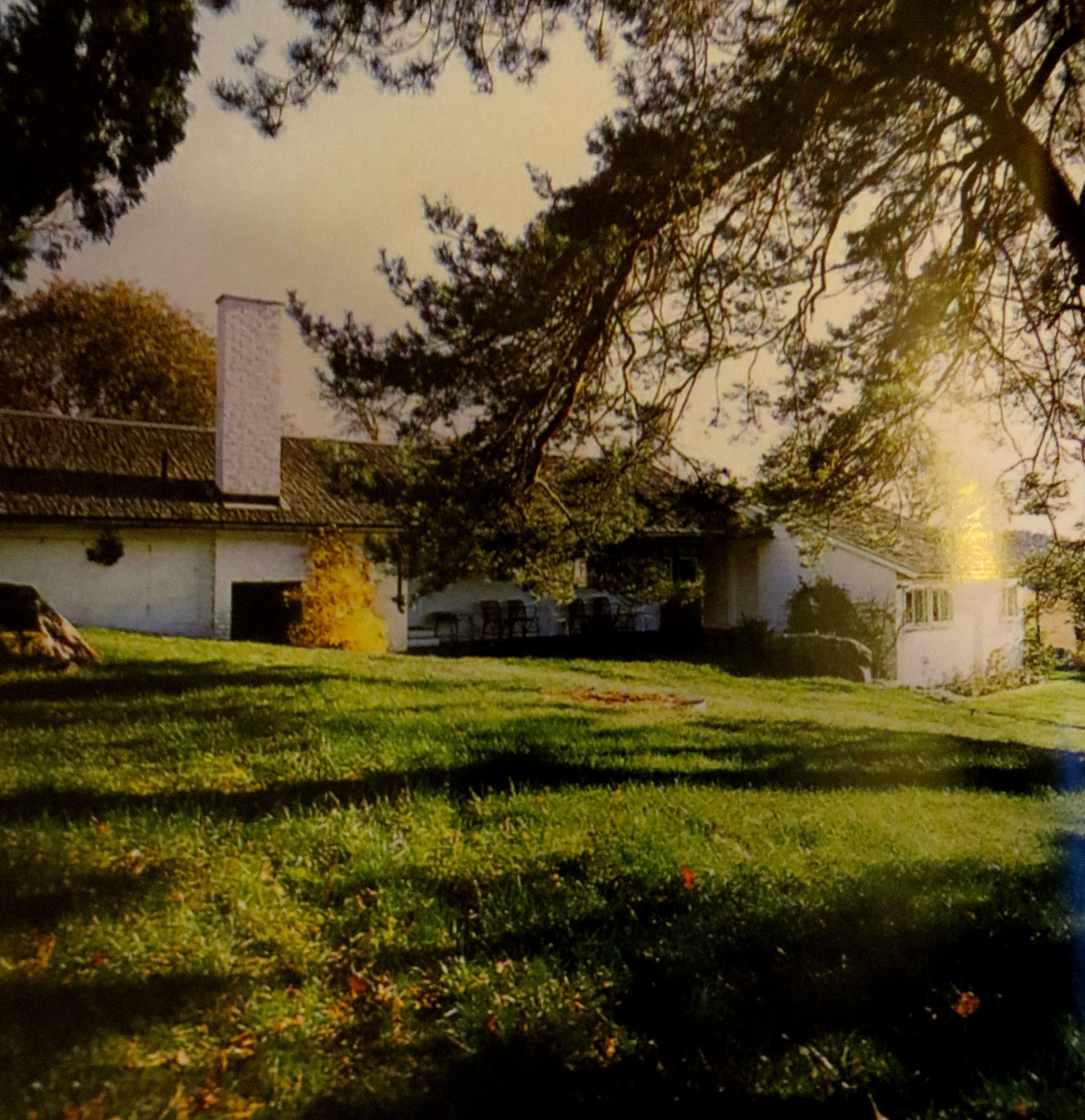
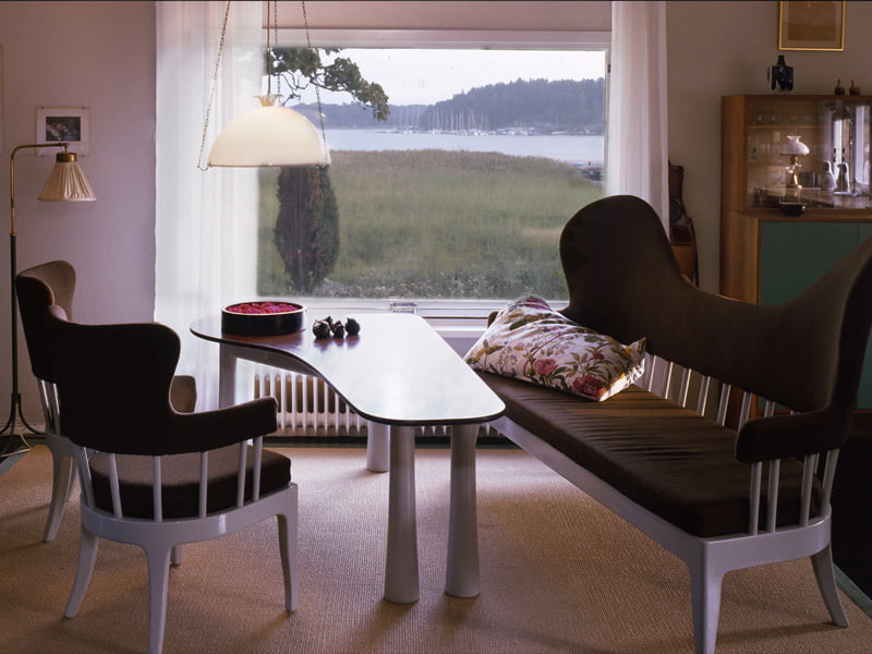
Asplund's private summer house at Stennas,Hastnasviken, Lison, 50 kilometers south of Stockholm reflects a certain coziness and simplicity you might not figure to find in an architects home.The design expresses a friendly, open and inviting atmosphere with its back resting on a cliff and front overlooking the beautiful sights of the bay.The beautiful green of the lawn and the stark white of the wooden board facade meet in an elegant synergy contraposed by a rough tile flat angled roof.The Scandinavian influences are very present in the overall design, but you have to admit that a certain sense of elegance and sophistication exudes from this architectural piece, even you can not quite seem to find at a first glance the source of it.
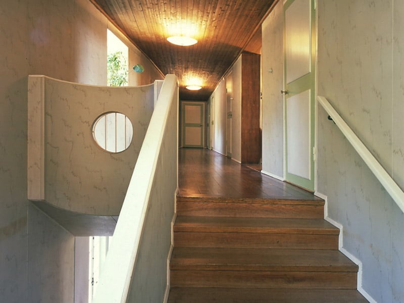
Following the main entrance from the wooden intimate deck you find the social spaces connecting the exterior and interior. " In plan the large room facing south is drawn towards the west and turned in order to make a wide angle by the entrance terrace." Such fine details that are bearably noticeable give this piece that air of elevation.The interior spaces have been skilfully divided into smaller ones that generate intimacy and coziness, whilst capturing incredible views of the Swedish forest and bay.
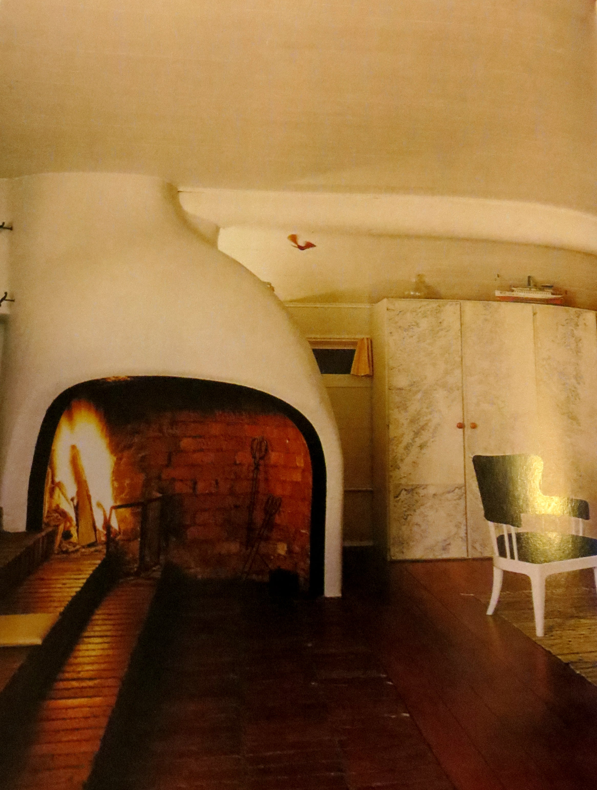
One of the most beautiful parts of Erik Gunnar Asplund's summer home is the wide tiled red staircase in connection with the vernacular fireplace.Set in the biggest room of the house, the drawing room, it separates this end of the home from the core of the house which contains the dinning room, followed by the kids' rooms and ending at the opposite end with the kitchen and maid's room, keeping, in a functionalist style, the work and leisure totally separate. The stone paved paths, the views of the bay and touch of the forest, the huge contrast between the insertion itself and the natural ambiance tells a story of an open friendly family and of beautiful evenings enjoying the beauty of nature and of warm cozy nights by the fire.
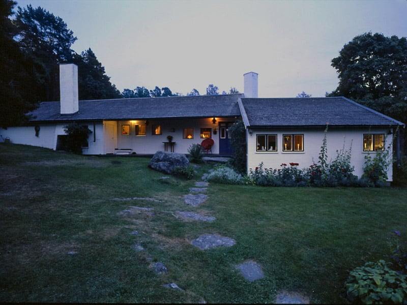
The house seems to be orientated strangely towards the evening light and his exterior facades have been treated with a more elegant care for details in contrast tot the uneven rough ceiling of the interior spaces, thus reflecting an important exteriorization and prioritization of nature's impact on the daily life.
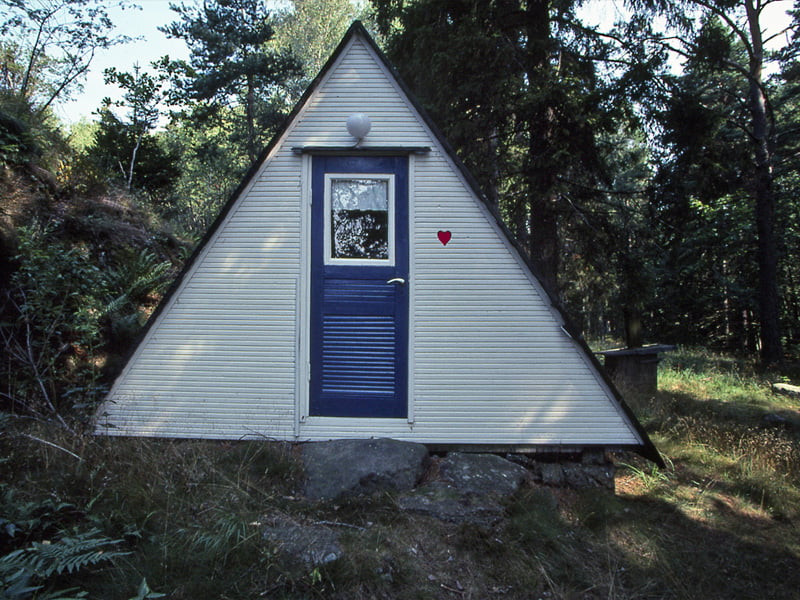
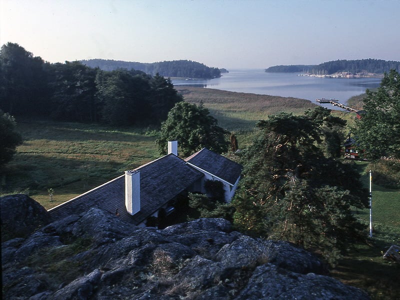
In the end, this simple cottage-like home is perfectly inserted into the surrounding site, being a reflection of an era where styles merged and emerged daily. The design result, even though Asplund did not put accent on beauty but on personal comfort and coziness, is one of pure elegance and warmth. Looking from the cliff over the house and bay you can admire the perfect integration of the home into the landscape, its elongation towards the shimmering light and exposure to the near forest. Overall, a Scandinavian design with a modern twist and respect for nature.
Following we will present you a collection of Erik Gunnar Asplund's main projects that have influenced the Swedish architecture world and have a certain importance even today, especially due to the time frame they have been designed in and of the changes they have survived during the 20th century.
Erik Gunnar Asplund’s Main Architectural Projects
Villa Snellman 1917-1921
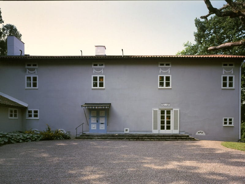
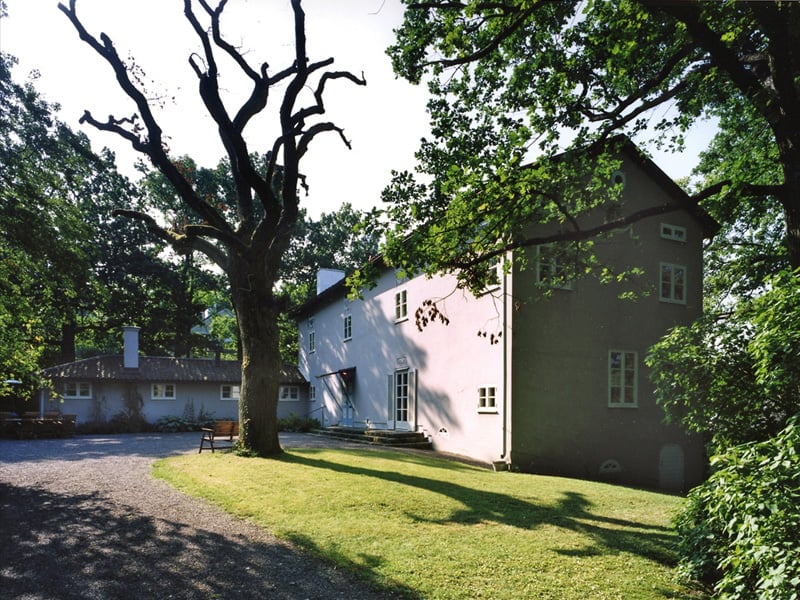
"During the years 1917-18 Asplund designed a villa at Djursholm for bank director Snellman. It was a simple yet subtly complicated structure comprised by a two levelled main wing and a kitchen wing in angle to it. The building is like as if it was cut out of a block and has an unusual small house-depth. This circumstance meant that all rooms faced the garden. In order to still create a connection between the garden and the entrance side, the hall is consistent along the house breadth. This room received a glass door with glass sections aside the main entrance door. With this solution a summer entrance and all season standard entrance was established. The two doors are very different, and are yet kept together by a common stair-section.On the top floor there is an oval room from which a straight corridor is based. Its walls are not parallell. One wall is skewed to the other. The facing is smooth and simple with rows of barred windows, of which one has twice the bars as the others. Note also that lower window row successively displace itself to the one above.
The house is built in processed wood. The facings are light grey with window and door sections in white. Irregularities in the facing, to some slightly provocative, is in their refinement largely practically motivated and expresses the connections between rooms in the building."
[via Erik Gunnar Asplund's Architecture Foundation Site]
Woodland Cementary 1915 - 1940
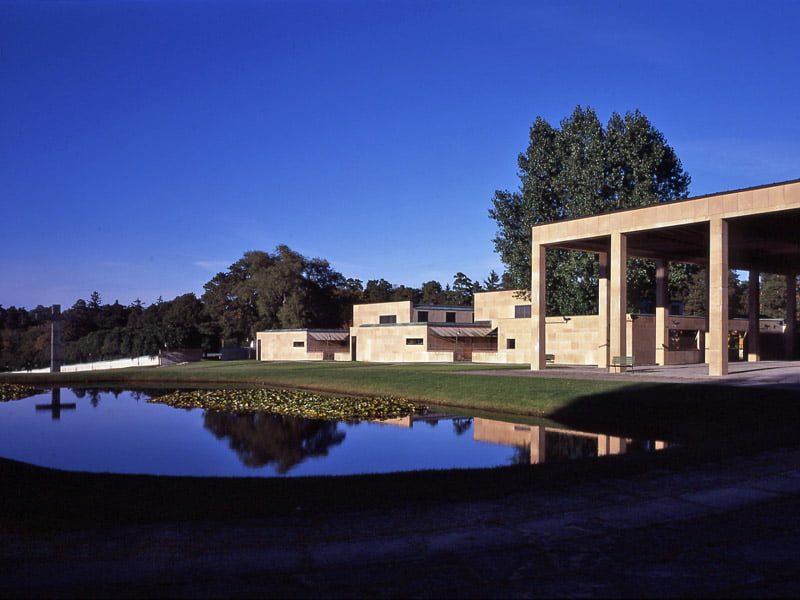
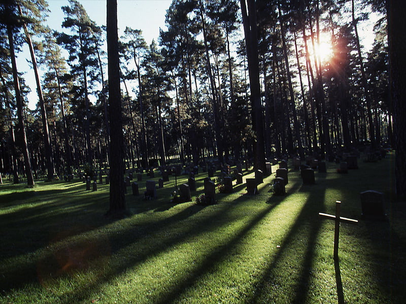
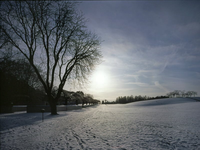
"In Stockholm an international contest of ideas was launched regarding the enlargement of south Stockholm cemetery in Enskede. Asplund participated along with his old schoolmate Sigurd Lewerentz whose designs for the Helsingborg chapel crematorium had received much attention at the Baltic exhibition in Malmö.Together they developed the contribution “Tallum”, in which the woodland and its strong Nordic romantic feel was strongly emphasised. In their plan there also were antique visions with classicist gravelanes. Their contribution was awarded first prize “due to its respectful and excellent character”. The jury also praised the way it utilized the existing landscape as well as the connection to the local train station (these days the subway station “Skogskyrkogården”)..
The contribution was set as base for further development that eventually turned out to be lengthy. Up to 1934 both worked together with the design of the landscape, while they separately had worked with the woodland chapel (Asplund) and the resurrection chapel (Lewerentz). From this point on Asplund continued to work alone with the main chapel; the chapel of the holy cross and crematorium. The project was only finalized 1940 shortly before Asplund died.Lewerentz on the other hand had concentrated on the further development of the landscape and related details, such as entrance section, the surrounding walls, roads, burial grounds etc. and had as early as 1916 handed over a first version of their entry - “A long, hard and not very gratifying or spectacular work but perhaps the most remarkable and it will surely provide the character of the cemetery”, Asplund once stated in 1921. " [via Erik Gunnar Asplund's Architecture Foundation Site]
Lister County Courthouse 1919 - 1921
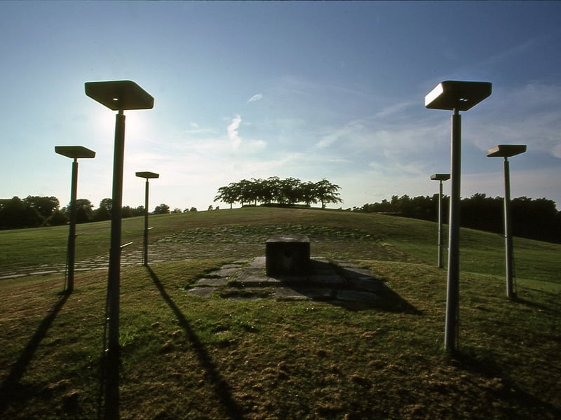
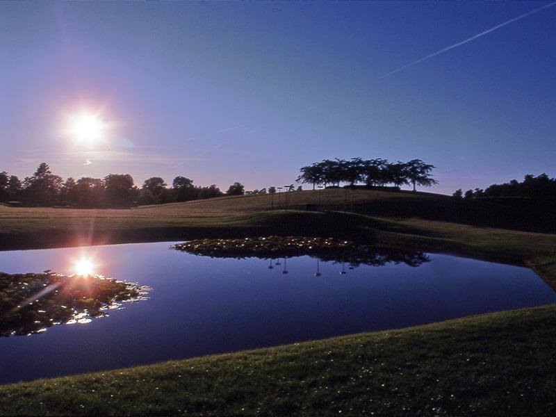
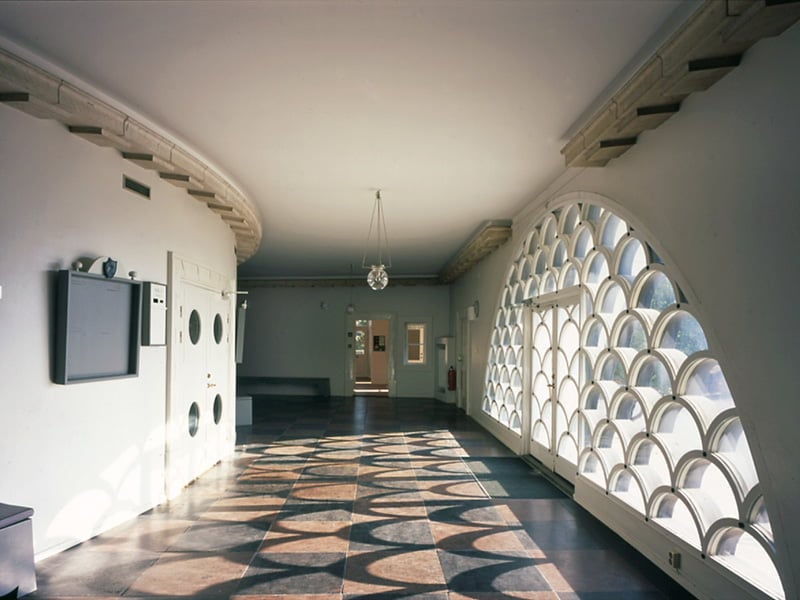
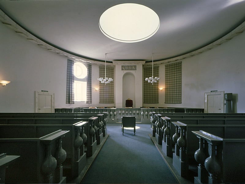
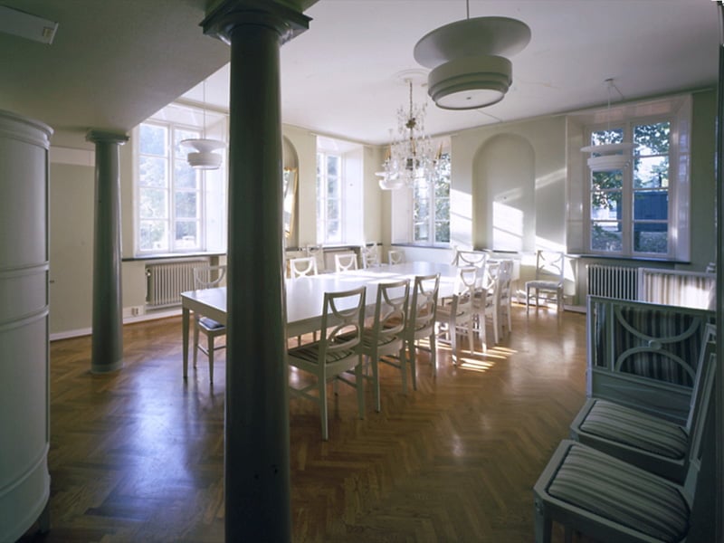
"The courthouse was designed 1919. The relatively small building has essentially only one significant facing, the broad gable facing with its segment shaped glass section that frames in the entrance door, has a connection to the older station structure, which is placed at the end of the extended alley. The purpose of this particular placement was to create a monumental and dignified environment.
The court hall has circular plan solution. The daylight shines thru the circular roof window along with a round and a squared window at the side which combined focuses the light on the supposed negotiators and members of the court, close to the bench. The colouring here is heavy and powerful. Asplund originally made the walls golden brown, while public section and the bench is painted black on top of grey.The inner traffic of the house was elegantly solved by stairs which leaps between the double walls that surrounds the main court hall. With this Asplund could create a direct connection between the garden and the judge’s quarters on second floor – without disrupting the connection with the offices on ground level. Similarly as the woodland chapel that also was on the drawingbord of the time, Asplund worked with shaping the architecture in a way that it expressed a process, approachment, expectance, preparation and finally, as in this case, the court halls own strong effect. In Sölvesborg, one could say that the path of procession begins already at the trainstation. Motion as a theme is ever present in Asplunds work and can be traced in several of his other works. A kind of distinctive element in Asplunds architecture. Today the court is not in use." [via Erik Gunnar Asplund's Architecture Foundation Site]

Woodland Chapel 1917 - 1920
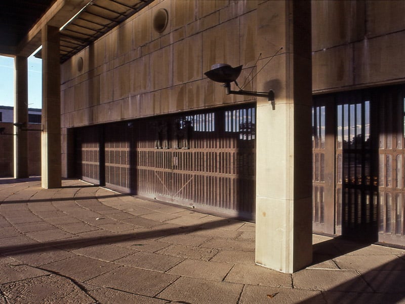
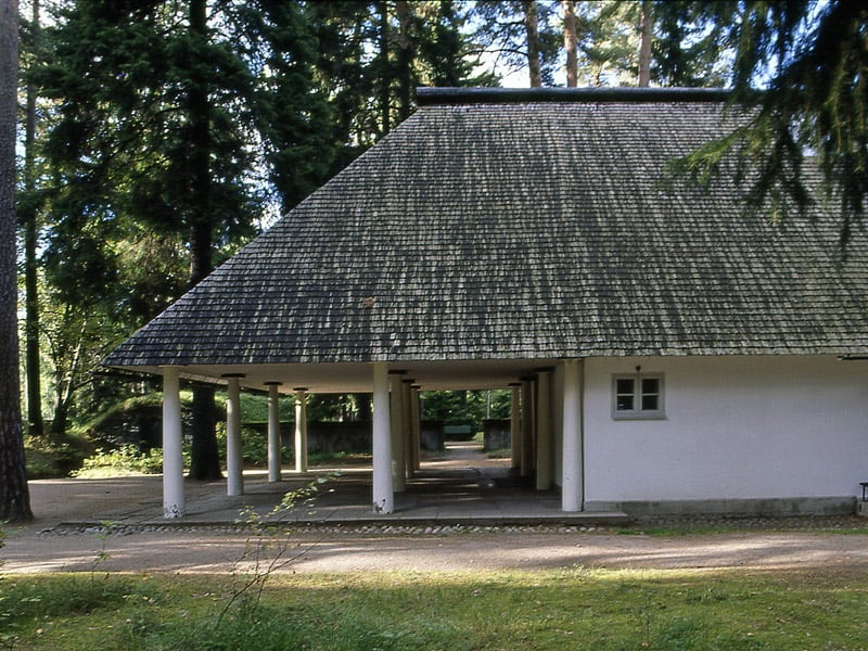
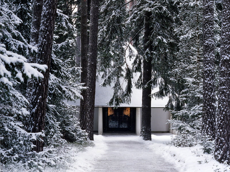
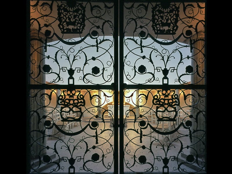
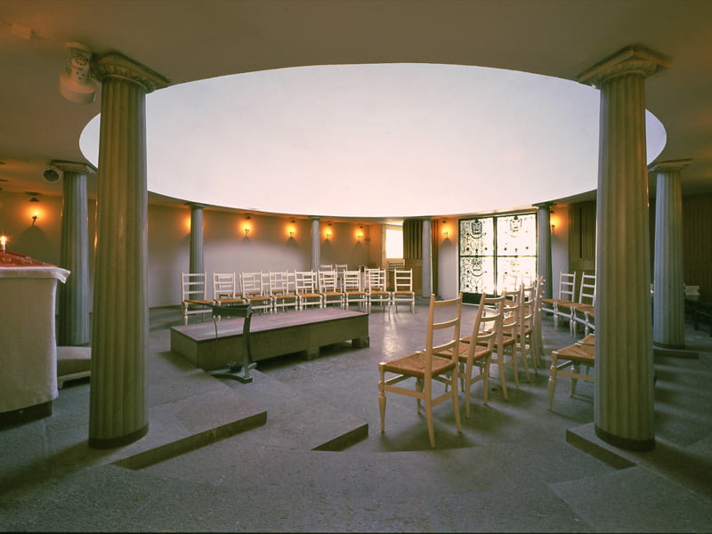
"While one waited for the big crematorium chapel, there was a need for a smaller chapel at the woodland cemetery. In 1918 Asplund presented drafts to the “little chapel”, which in appearance connected to the main chapel (of the original suggestion).The building committee however wanted a smaller chapel in wood and shortly thereafter Asplund could forward new drafts as an answer to that demand. It was a small chapel with an almost squared room with pillars carrying a dome with a light entrance at the top. The exterior was dominated by the shake covered roof stretching out over a porch with slender supporting pillars.The small chapel is almost hidden away amongst pines and spruces which towers high above the roof to the building. It is surrounded by low processed concrete wall with a gate centred ahead of the chapel that is reached by a lengthy path in the forest. Against the shakes of the roof Carl Milles golden angel of death (made in copper) delineates. When the ironclad gates are opened, appears the light hall of the chapel thru the grid gate.The woodland cemetery was given its shape as a grand landscape by Asplund and Lewerentz together. During the 1920’s they designed a chapel each, but when the main chapel and crematorium was to be built 1934, it was based on partly new designs, which included two smaller and additional chapels, the intentions were that the two would cooperate on this. For various reason it turned out to be Asplund alone who made these designs." [via Erik Gunnar Asplund's Architecture Foundation Site]
Movie Theater Skandia 1922 - 1921
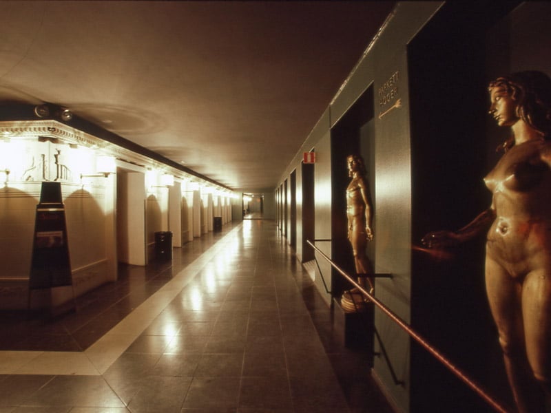
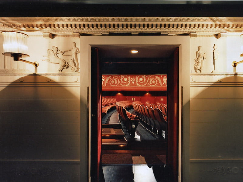
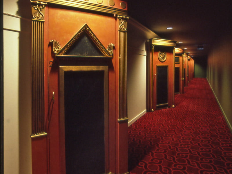
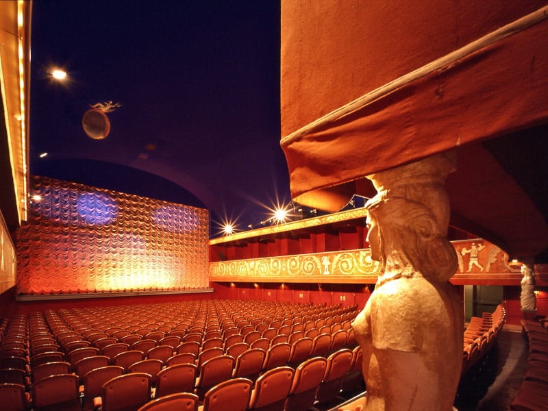
"In the Warodellian facility in Stockholm, built in the 1850’s, a cinema was fitted in during 1922-23. The yard was overbuilt while the entry facing towards Drottninggatan was treated with great care. The drawings to the yard overstructure were made by Ragnar Hjort while Asplund carried out the detailed plan for the cinema interior. As a starting point, he had the contractor’s conviction that the audience wanted to meet a festive, surreal and spectacular environment as a frame for the fictitious world of film.
A gate with coffer-ceiling conveys the transition from the street, with its dark asphalt suggesting that the dark floor inside is a continuation of the street outside. The vestibule is made in a grey colours-scheme with limestone, black metal and black leather. The clock was also black with white enamel digits. Two lesser vault decorated rooms in connection to the vestibule had stucco in a deep green nuance.In the promenade a few stair steps lower then the vestibule; the walls radiated shimmering white with warm red doorsections in contrast to the ceilings and outer walls deep and murky green. The actual auditorium was entirely in red. The side balcony’s and the rear gallery was clad in velvet, in the same nuance as the seats. This festive splendour was in contrast to the ceilings night blue sky. The ballshaped, velvet clad lamps soar under the dark night sky. The custom embroidered velvet on the balcony fronts, tailored with wool-, silver- and silk thread and relief applications is textile treasure with no equal for its time. The motif’s was designed jointly by Asplund and Axel Munthe. Skandias fantastic interior include both sculpture and painting. Among the artists that Asplund selected for this project was both established and untested ones. Behind the paintings stood Einar Forseth, Leander Engström and Hilding Linnqvist while Stig Blomberg, Nils Engberg, Gunnar Torhamn och Ivar Johansson was responsible for the relief’s and sculptures. As in many future projects Asplund develops a close relation to the leading Swedish artists of the time." [via Erik Gunnar Asplund's Architecture Foundation Site]
The City Library of Stockholm 1920 - 1928
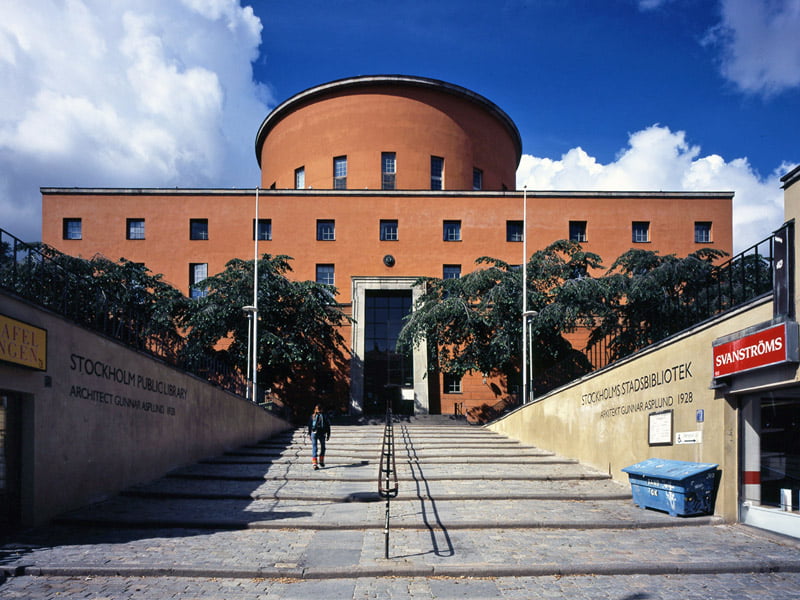
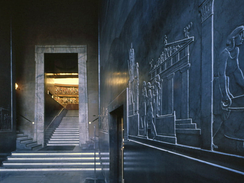
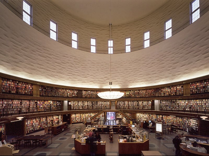
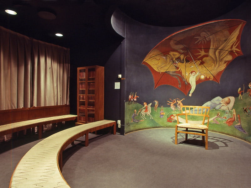
"Due to a donation it became possible for the Stockholm administration to offer the inhabitancy a community-library, something that up to that point had not existed in Sweden. As the project was planned it was initially intended to launch a general architect-contest regarding it. However it did not turn out that way, since the man who had planned the contest, namely E.G. Asplund, received the commission to offer suggestions for it. To that end he travelled to the USA to study the subject.In Asplund designs the library was crafted as an introspective temple of knowledge. With a long way up to, and then into, the building for the supposed visitor. In this way he created preparation, expectation, and a possibility to shake of the street-clamour before we enter tranquilly within the great main hall. A well directed procession for visitors was thus achieved.
The circular main hall with its (book) terraces became the main theme in the architecture. The entire project was comprised of an inner room, an interior which the facings subdued themselves to. That which signifies the main facing was the path that leads to the main entrance since all facings are remarkably alike in their designs.
The central hall signified itself originally with a dome, visible over the lower wings. The dome however was changed to a cylinder with vertical windows. All this to secure better light inside the raw glass of the dome could offer.In order to create monumentality with the relatively small structure, Asplund displaced the scaling in friezes and the entry portal to successively narrow out on top, and hence achieved a simulated perspective that made the building appear as bigger then it actually was. The city library is amongst Asplunds most lengthy works, and it slowly grew on the drawing board. In almost 10 years the work slowly progressed. Almost immediately he returned to the project due to the expansion that was to be made, namely the bazaar lanes below the entry facing. As well as the storage-wings that was already included in the original plans. The building hence received a full squared plan solution. The bazaar structure is a first sign of Asplunds path to modern international style." [via Erik Gunnar Asplund's Architecture Foundation Site]
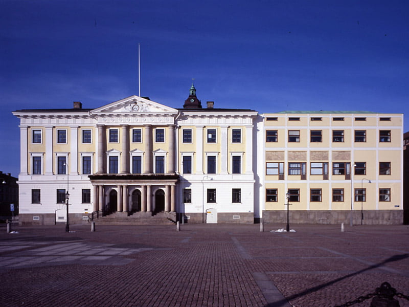
Extension to Gothenburg Townhall 1913 - 1937
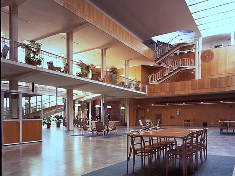
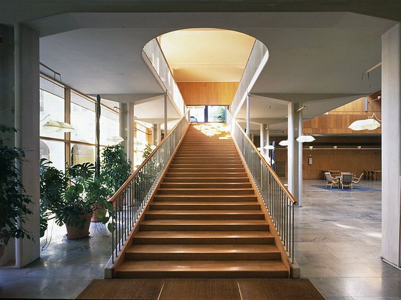
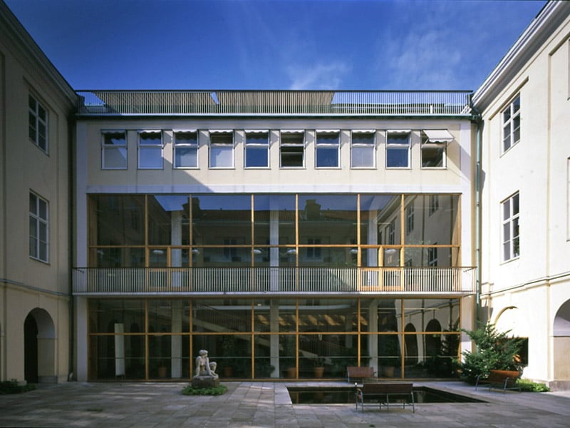
"The enlargement of the Gothenburg Townhall had begun as a competition in 1913. The long and slow process of completing the project also meant there were to be plenty of changes over time. The work eventually became intertwined with designs regarding Gustav Adolfs square which was adjacent to the townhall. After another contest in 1918 Asplund was commissioned to do designs for this as well. His suggestion, which was radical for its time, turned toward the canal at first, and not as one might expect, towards the square.The continued work with the actual square however provided reason to turn the townhall entrance towards it. The expansion was now designed as an individual building with its own entrance. After some 20 years of investigations Asplund presented schematics in which he, by request, utilizes the existing facing of the original townhall and extends it over to the expansion. Behind the coulisse hid a modernist building that was to create confusion and uncertainty amongst members of the building committee. The project was postponed in wait for new facing designs which gradually was developed and eventually finalized to the results we have today. However, Asplund came to change the facings even as building had started. Once the scaffolds were removed the finished result was greeted with a public outcry. " [via Erik Gunnar Asplund's Architecture Foundation Site]
The Chapel Crematorium 1935 - 1940
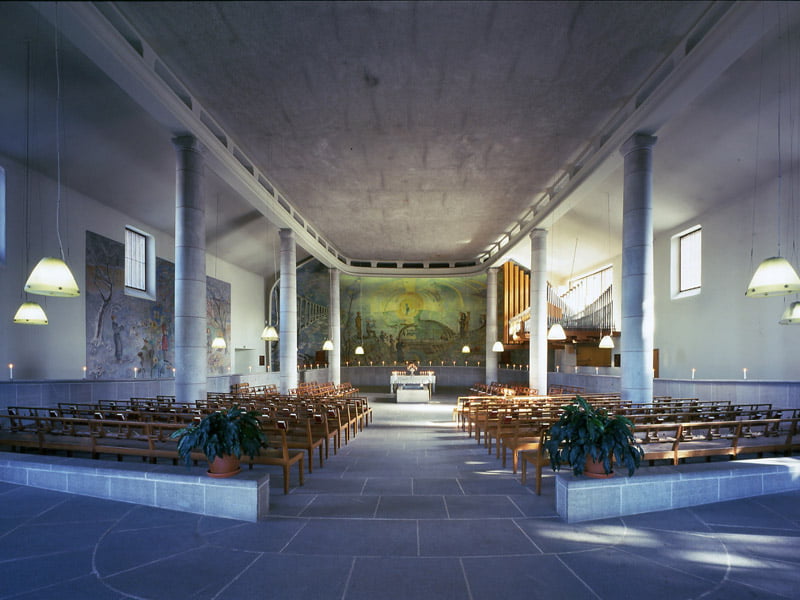
"In the joint work with designing the landscape included the placing of John Landqvists resurrection-monument, which was bought in the Stockholm exhibition 1930. It wandered through the various suggestions from Lewerentz classicist half round entrance place connected to the main gate out to the landscape, placed upon an obelisk, thereafter to the ceremonial grounds and finally to the porch of the main chapel. Each step meant an increasing understanding of the importance of the grand and designed landscape. The main chapel came to be, as the years went by, displaced from the top of the ridge and eastwards to benefit the dominance of the landscape panorama. Asplund long considered the have the building in brick, as the porch’s quadratic pillars. The bricks soft material character would that way emphasize the kinship with the surrounding nature. When Asplund instead came to choose marble plates to cover the facings, these came to stand as a contrast with the landscape and heighten the effect. The modernist shapes and tradition thereby lent support to his vision. Asplunds care about function was expressed in many details in the chapel. For instance is all corners rounded, ahead of the closest bench intended for the immediate mourning family, lay a stone mosaic with cut ornaments to rest your eyes upon, a bench intended for three persons is angled to ensure that also the third person is able to participate fully. The actual crematorium section is anachronistic which has led to new contest with international participants has been conducted for guidance on the placing and creation of a new crematorium. " [via Erik Gunnar Asplund's Architecture Foundation Site]
