
Updated on
Red accent walls occupy the most psychologically powerful position in any interior design decision — a color clinically shown to elevate heart rate, increase metabolism, and heighten emotional response, which is precisely why most homeowners avoid it and why the ones who use it correctly create rooms that are impossible to forget. If you've been considering a red wall but aren't sure which room can absorb it, how to balance its intensity, or which shade works without overwhelming the space, this collection spans kitchen and dining applications, hallway installations, bedroom feature walls, and living room accent configurations across dozens of real interiors. Adjacent territory includes red-and-white contrast builds, earthy tone balancing strategies, gallery walls on red backgrounds, natural greenery pairings, pattern-and-texture combinations, and light management techniques for rooms where red risks reading as dark. The detail most red wall guides skip: saturation level matters more than hue — a deeply saturated primary red demands significantly more natural light and white balance than a muted brick or crimson tone, and choosing the wrong saturation for your room's light conditions is the single most common reason red walls fail in practice. Whether you're working with a sun-flooded kitchen, a narrow hallway, or a bedroom that needs energy without anxiety, beginner-friendly red accent wall ideas for every room type are represented throughout this collection.

Before You Start
Red paint looks entirely different on a wall than it does on a chip, and that gap is wider with red than with any other color family. Saturation is the variable most people get wrong — a deeply saturated primary red in a room with limited natural light reads as dark and enclosed rather than bold and warm, while the same red in a sun-flooded room reads entirely differently by mid-afternoon. Test the actual paint on the wall in a 60 by 60 centimeter (24 by 24 inch) patch and observe it at morning light, midday, and under artificial evening light before committing. The color you see on the chip under store lighting bears almost no relationship to what you will live with. Undertone is the second decision worth getting right before purchasing: red paint pulls either orange-warm or blue-cool depending on its pigment base, and the wrong undertone against your existing flooring or furnishings creates a visual tension that no amount of accessory styling resolves. Hold the chip directly against your largest fixed surface — the floor, the sofa, the cabinetry — not against a white wall. Primer matters more with red than with any other color because red pigment has low opacity; skipping a tinted primer means three or four coats to achieve even coverage, which adds cost and time the chip never warned you about.
Red paint looks entirely different on a wall than it does on a chip, and that gap is wider with red than with any other color family. Saturation is the variable most people get wrong — a deeply saturated primary red in a room with limited natural light reads as dark and enclosed rather than bold and warm, while the same red in a sun-flooded room reads entirely differently by mid-afternoon. Test the actual paint on the wall in a 60 by 60 centimeter (24 by 24 inch) patch and observe it at morning light, midday, and under artificial evening light before committing. The color you see on the chip under store lighting bears almost no relationship to what you will live with. Undertone is the second decision worth getting right before purchasing: red paint pulls either orange-warm or blue-cool depending on its pigment base, and the wrong undertone against your existing flooring or furnishings creates a visual tension that no amount of accessory styling resolves. Hold the chip directly against your largest fixed surface — the floor, the sofa, the cabinetry — not against a white wall. Primer matters more with red than with any other color because red pigment has low opacity; skipping a tinted primer means three or four coats to achieve even coverage, which adds cost and time the chip never warned you about.
Red Accent Wall Ideas
Red Kitchen and Dining Wall Accents
Red in the kitchen and dining room has a functional logic beyond aesthetics — the color is associated with appetite stimulation and social energy, making it one of the few paint choices that actively supports what the room is designed for. Balanced with white surfaces, sufficient natural light, and warm wood tones, a red kitchen wall moves from overwhelming to genuinely invigorating. The designs below demonstrate the full range of what that balance can look like.
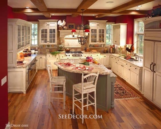
Red confined to a single wall and balanced by white cabinetry, sufficient light, and clean lines stays energizing rather than aggressive. The proportion of red to white here is the key decision — the wall provides the emotional charge while the surrounding surfaces absorb it.
via seedecor.net
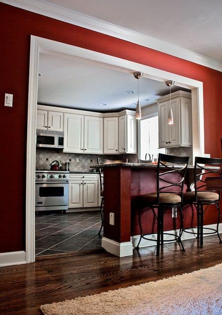
The bar wall receives the full red treatment, framed cleanly in white trim — while the kitchen beyond retreats into white and gray. This zoning approach lets you use the color at full intensity in a social area while keeping the functional workspace visually calm.
via flickr.com
A Scandinavian setting that uses red alongside polka dot detailing demonstrates how pattern can distribute a strong color across a surface, reducing its visual weight while maintaining its energy. The minimal furniture keeps the composition readable.
via ourcosyhome.ru
A chalkboard in a red frame mounted on a white wall creates a contained, high-contrast focal point that references the red accent wall concept without committing to it fully — an effective approach for kitchens where full wall coverage feels like too strong a commitment.
via coastalliving.com
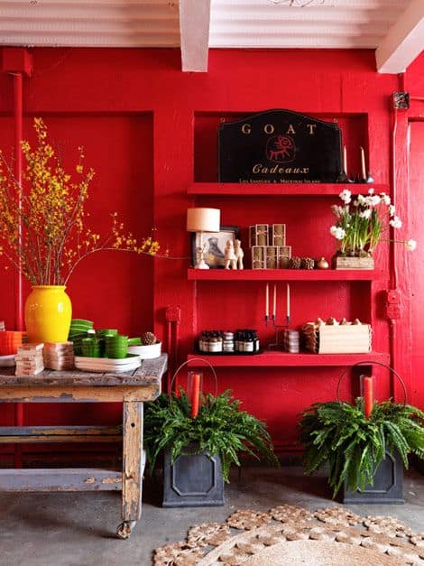
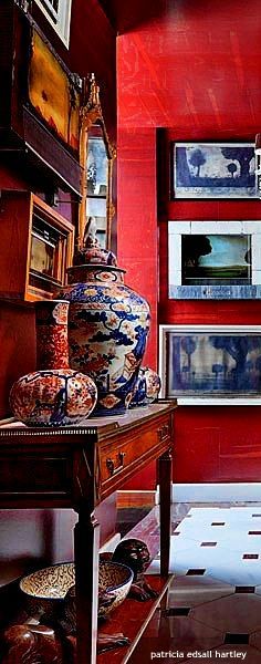
A deep, saturated red wall functions as a stage backdrop — it pushes everything placed in front of it forward, creating the depth of field effect that makes sculptural objects, ceramics, and kitchen collectibles read as curated rather than simply stored.
via journal.homepolish.com
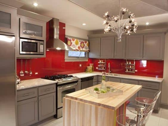
The taupe and gray palette here works in concert with a restrained red accent to pull the wooden island forward as the room's primary focal point. The red doesn't dominate — it directs attention, which is arguably the more sophisticated application of the color.
via HGTV
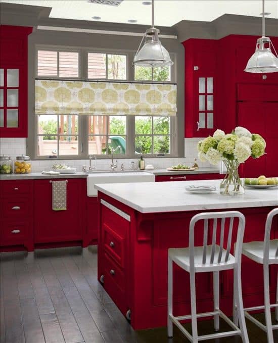
Red furnishings rather than red walls represent a more permanent and considered approach — harder to change than paint, which means the decision requires greater confidence in the color. Sufficient natural light is non-negotiable here; without it, red furnishings read as dark and oppressive rather than warm and energizing.
via bhg.com
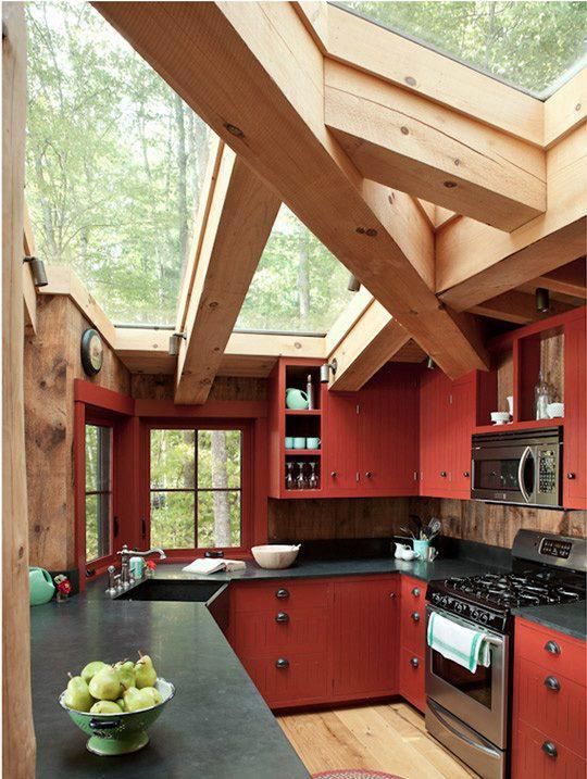
Full red furnishings, a black countertop, and exposed wooden beams is a composition that demands exceptional light management to avoid feeling heavy. The extraordinary volume of natural light flooding this room is what makes the combination work — the light literally bleaches the red's intensity and allows the wooden structure to dominate visually.
via thekitchn.com
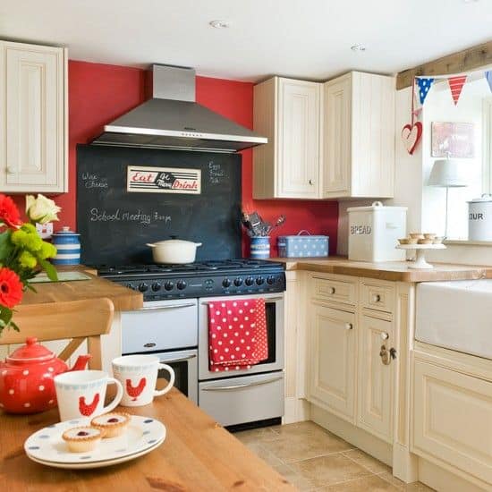
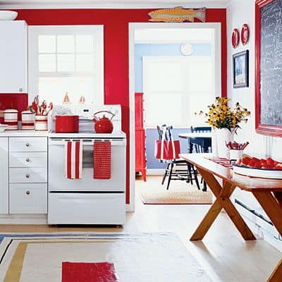
One red wall against a black chalkboard and white surrounding furnishings demonstrates the classical red-black-white triad — a combination with enough contrast energy to make a small kitchen feel considerably larger and more dynamic than its dimensions suggest.
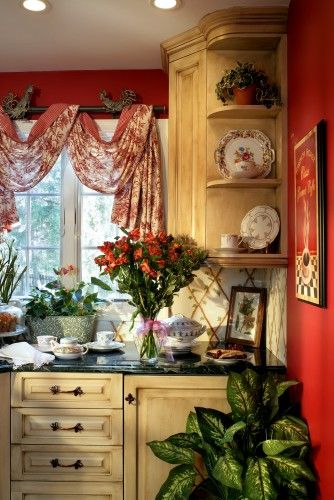
A French cottage kitchen relies on the natural complementary relationship between red and green — the aged red wall and the fresh greenery resolve each other's intensity, producing a warmth that neither could achieve alone. This is one of the most reliable color pairings available to anyone working with a red wall in a kitchen setting.
via houzz.com

Red used as a paint color behind cabinetry highlights the silhouette of every piece in front of it — the contours of shelves, handles, and open frames all read more crisply against a warm saturated background than they ever would against white or gray.
via hgtv.com
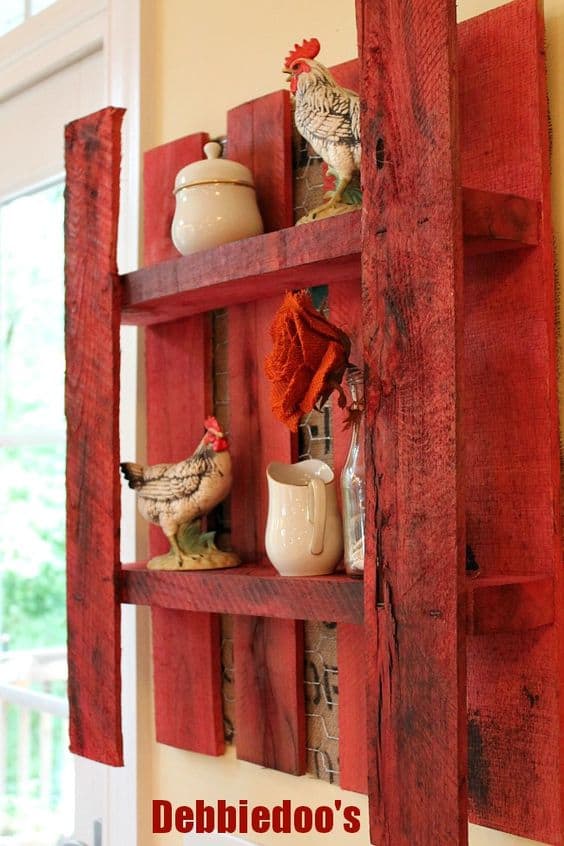
A red-painted pallet shelf brings the rustic energy of a rural outbuilding indoors without requiring any structural changes to the kitchen. The color here is applied to the object rather than the wall, which makes it a reversible and low-commitment way to test red's effect in a space before committing to full wall coverage.
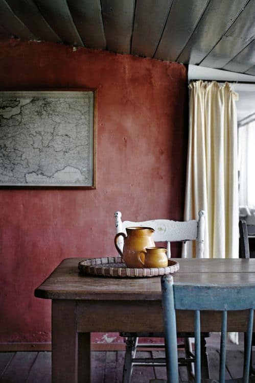
An aged, time-worn red surface demonstrates that the color's intensity can be dialed back significantly through finish choice — a distressed or matte application reads as warmer, softer, and more historically grounded than a fresh high-sheen coat of the same hue.
via homelife.com.au
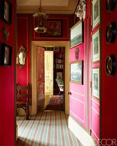
Red Hallway Accent Walls
The hallway is arguably the highest-impact room for a red accent wall — it is the first space a guest experiences, it is typically narrow enough that a single wall dominates the entire field of view, and it is also the room where the energy of red is most appropriate since it is a transitional space rather than a place of rest. The designs below show the full range of what a red hallway can achieve.
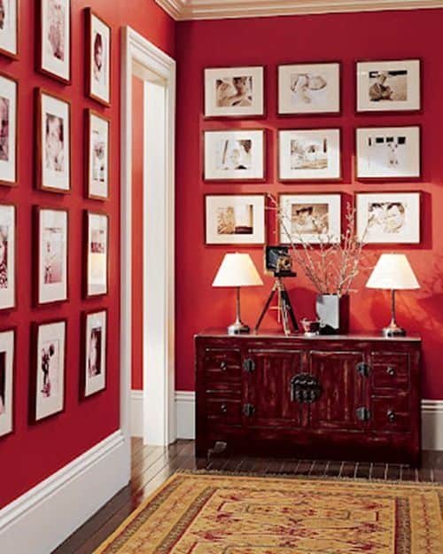
A red hallway wall energizes guests from the moment they enter and provides an immediately powerful backdrop for a gallery display. The color amplifies the impact of framed art in a way that white walls simply cannot — every frame reads as more intentional, more considered, more worth stopping to look at.
via centsationalgirl.com
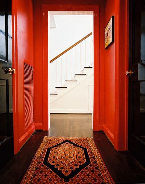
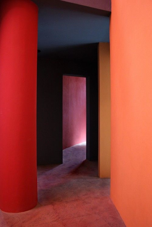
Intense red framing a white opening beyond, flanked by two black doors — this is a composition that requires precise execution but produces extraordinary results. The contrast between the red enclosure and the white space beyond creates a visual tension that makes the hallway feel longer and the destination feel more significant.
via lonny.com
Subtle hue variations across adjacent red surfaces create a depth that the eye registers before the mind processes — the space feels dimensionally richer than a flat single-color application without any additional decorative elements required.
via ruthburts.com
via elledecor.com
A gradient gallery hallway that opens red at the entrance and deepens toward a lit opening at the far end uses the color to create a deliberate journey — the visitor moves from warmth and energy into light, which is a narrative effect most paint choices are entirely unable to produce.
via saffronandsilk.blogspot.com
A personal memory display on a red wall reads as a statement of identity rather than decoration — the color behind the photographs and mementos amplifies their significance, making this one of the most emotionally resonant applications of the red accent wall in any room type.
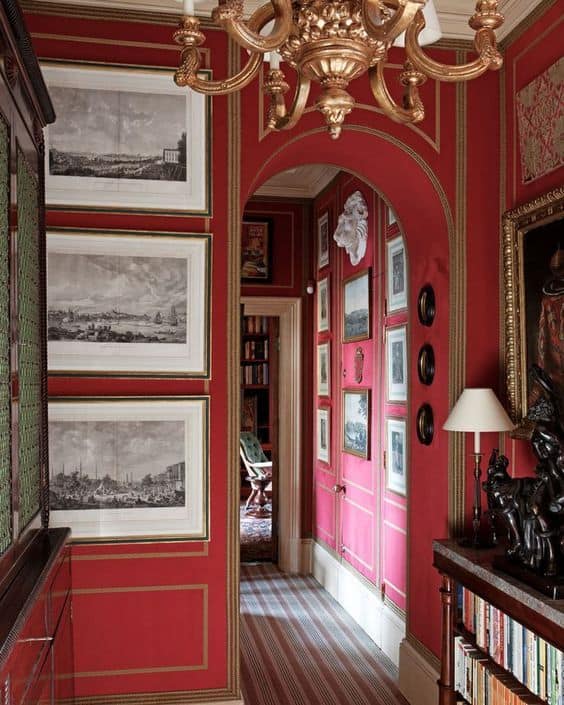
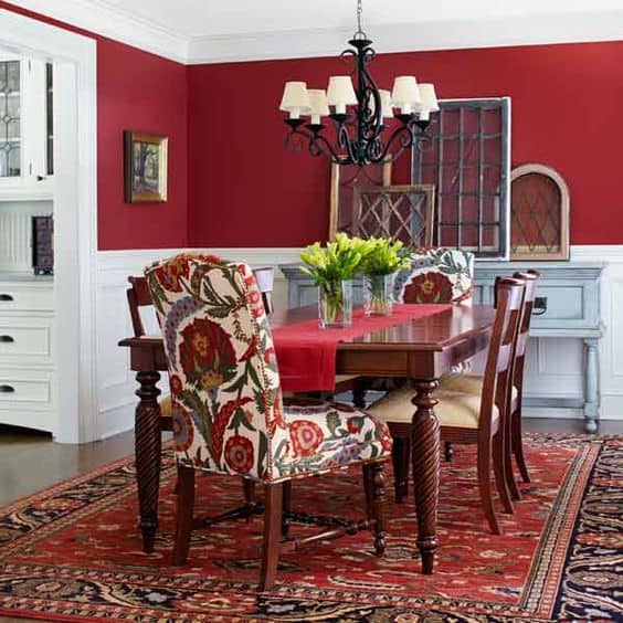
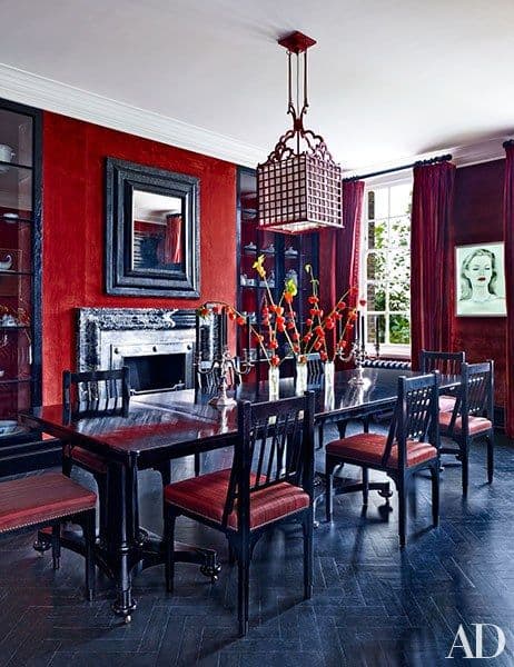
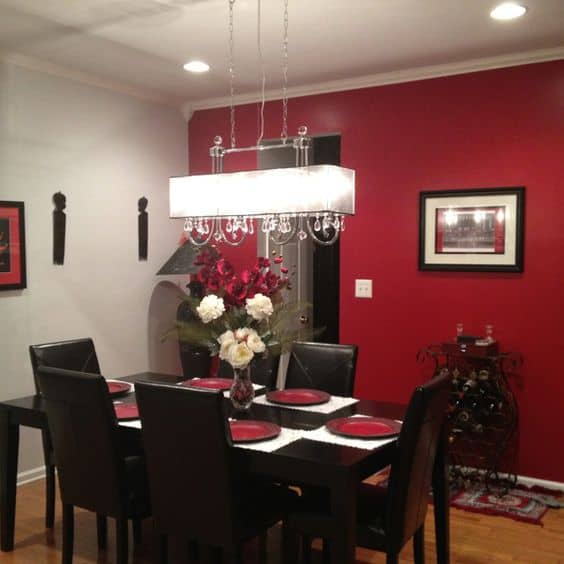
Dining Room Red Accent Wall
In the dining room, red functions as both a social and appetitive stimulant — two qualities that are entirely appropriate for a space centered on shared meals. The key design challenge is managing the color's intensity so it enhances the atmosphere of a meal without competing with the food, the table setting, or the conversation happening around it.
White wood paneling in a room using multiple red hues does essential work — it breaks the red into zones, prevents it from becoming visually monotonous, and reinforces the sense of spatial depth. The result reads as considered and formal rather than simply painted.
via thisoldhouse.com
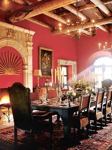
The contrast between natural wood grain and a textured red wall in a light-flooded dining room creates a warmth that neither material achieves alone. The texture of the wall surface adds further visual interest by varying the way the red absorbs and reflects light across the day.
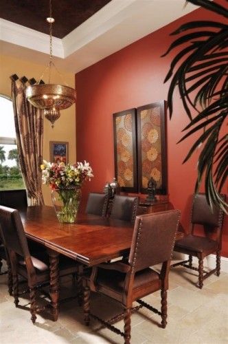
In a densely furnished dining room with competing patterns, textures, and materials, red on the wall functions as the unifying element — it provides a consistent warm background tone that ties disparate objects together without requiring any of them to match each other directly.
via Jeremy Samuelson; designed by Rachel Horn
via houzz.com
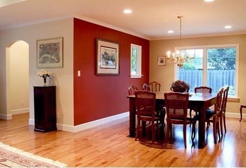
A single red wall in an open or ambiguous space requires careful consideration — without strong architectural framing or sufficient surrounding contrast, one accent wall in an ill-defined room can feel arbitrary rather than intentional. The lesson here is that the wall's context matters as much as the color itself.
Source Unknown
Source Unknown
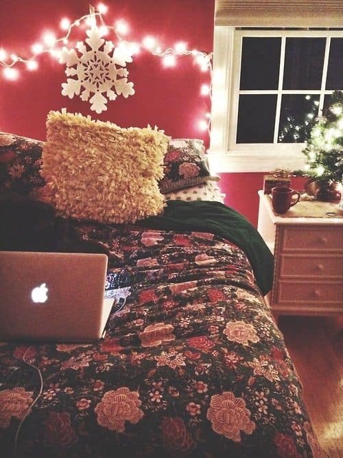
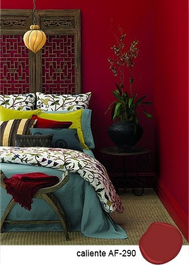
Red Accent Wall in the Bedroom
Red in the bedroom is the most contested application of the color in residential design — its energizing properties are exactly what makes it both compelling and problematic in a space meant for rest. Used on a single feature wall behind the bed, at a muted or aged saturation level, and balanced with soft neutrals in the bedding and flooring, red can create a bedroom that feels sensual and grounded rather than agitated. The examples below demonstrate both the possibilities and the boundaries.
Bedroom Red Accent Walls
via weheartit.com
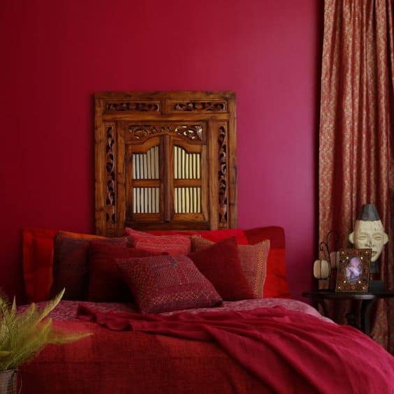
Multiple red hues used within the same bedroom create a chromatic space that feels layered and considered rather than flat — the variation between tones prevents the color from becoming monotonous while the consistent warm family keeps the room visually cohesive.
via debbietravis.com
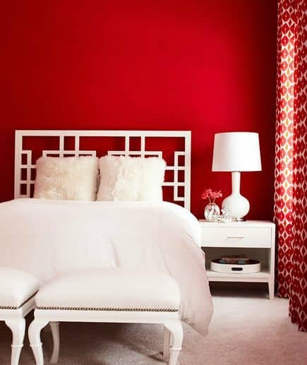
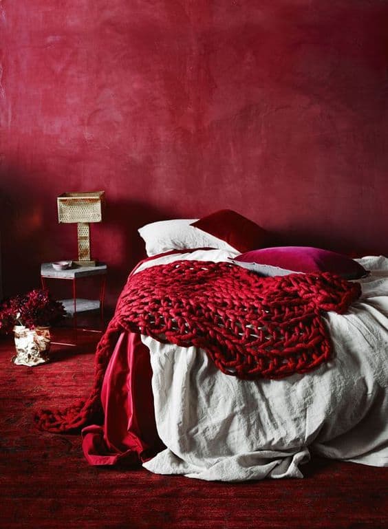
Stark white bedding and furnishings against a pure red wall create the maximum possible contrast within a warm palette — the white acts as visual relief, allowing the eye to rest between encounters with the intense wall color. Without it, the same red would read as considerably more oppressive.
via realsimple.com
There are reds that simply announce themselves — not aggressively, but with complete confidence. When you encounter the right shade for your room's light conditions and furnishings, the decision will feel obvious rather than considered. This is one of those shades.
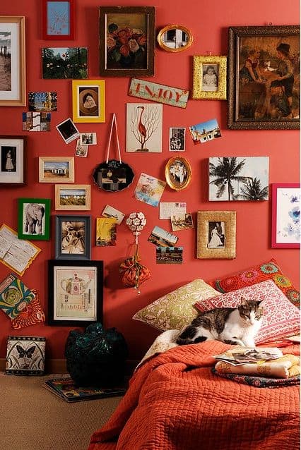
A red backdrop makes a personal gallery wall — photographs, prints, and collected objects — feel curated and deliberate. The same collection on a white wall reads as casual; on a red wall it reads as a considered statement, which changes the entire emotional register of the room.
via pinterest.com
A red bedroom can achieve serenity — not despite the color but because of how it is applied. Deep, muted red with soft furnishings and controlled lighting produces an atmosphere closer to a private sanctuary than the energized, active space that brighter reds create.
Depth created through layered red hues and balance achieved through considered lighting — this bedroom demonstrates that the management of light within a red room is as important as the paint choice itself. The same red in poor light would read entirely differently.
via eudecoro.com.br
via cowboyreflections.com
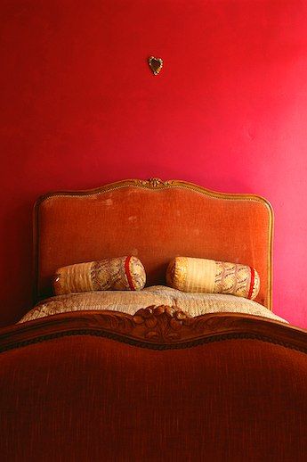
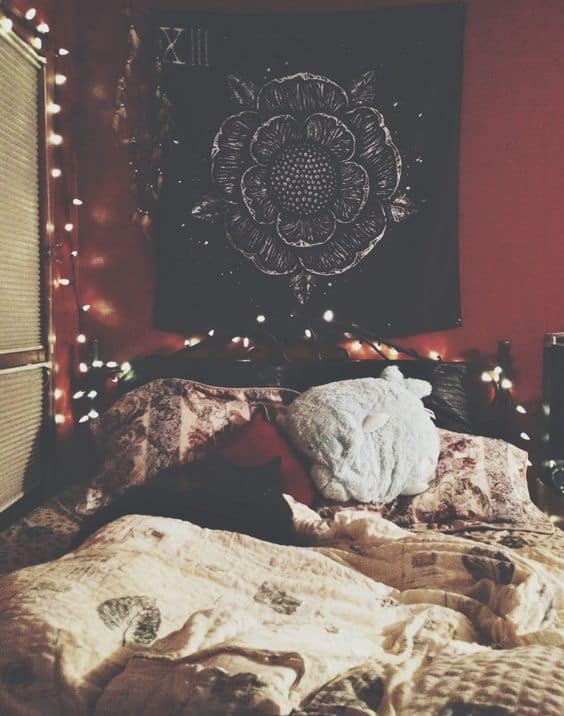
The small heart detail above the bed does something technically important here — it introduces a softening element into a high-contrast palette, breaking the tension between red and white just enough to shift the room's emotional register from bold to genuinely warm. It is the kind of finishing detail that determines whether a decorated space feels complete.
Source Unknown
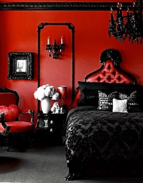
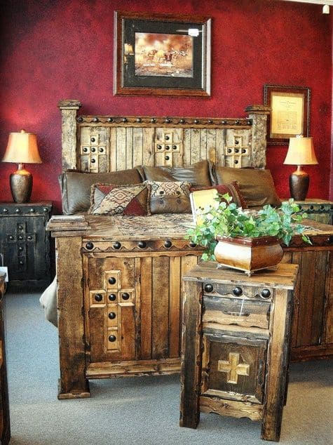
Black and red is not a combination most designers recommend for bedrooms, but when executed with confidence it produces a boldness and contrast that no other pairing achieves. It suits a very specific aesthetic sensibility — and for those who share it, no alternative will ever feel as right.
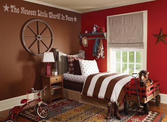
The red-and-brown combination in a child's room reads as rustic and dated rather than vibrant — the two warm tones absorb each other's energy instead of creating contrast. What redeems this particular space is the red wall paired with the playful toy cart, which introduces enough visual separation to make the color work independently of its problematic pairing.
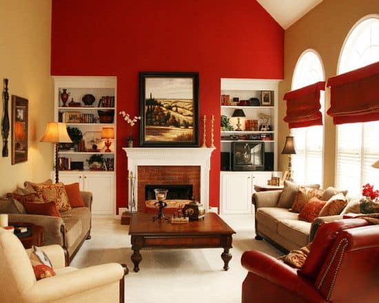
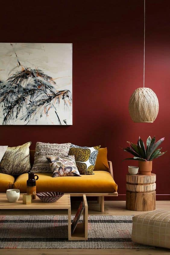
Red Accent Wall in the Living Room
Find Balance Through Simple Elements
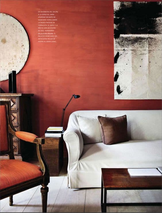
Simple, well-chosen furnishings in a red living room demonstrate that the color doesn't require elaborate styling support — it provides its own visual energy and asks only that the objects placed in front of it be allowed to stand on their own rather than compete with each other.
via plascontrends.co.za
via lonny.com
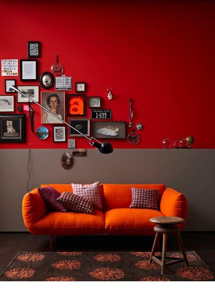
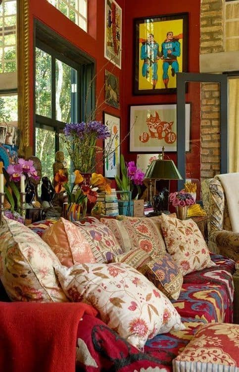
Use Intricate Pattern Detailing
Red is one of the few background colors that can absorb a complex pattern or a densely framed gallery without the composition collapsing into visual noise — the color's warmth holds disparate elements together rather than fragmenting them.
via christinefife.com
Used as a support element, a red accent wall earns its place by amplifying what is placed in front of it — the color recedes into a supporting role while the intricate furnishings, textiles, and objects it frames become the primary focal points.
via ladolcevitablog.com
Use Simple Shelving to Display Memories
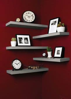
Source Unknown
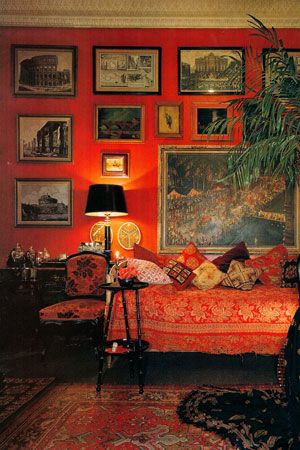
Bring Forward a Gallery
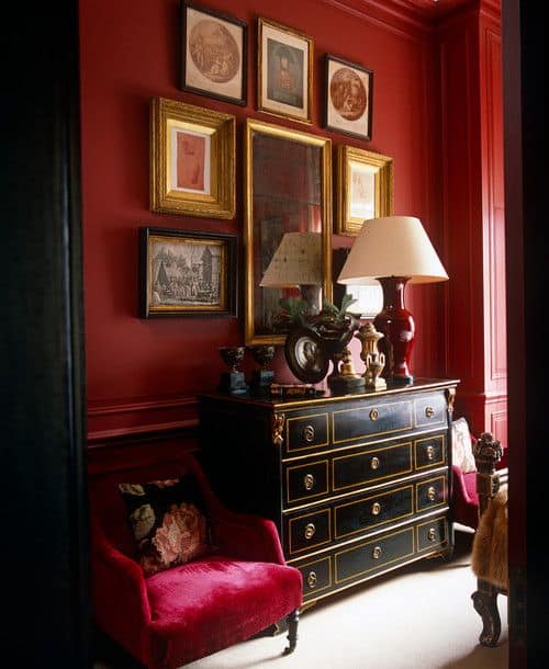
Gold frames on a red wall is one of the most classically considered combinations in residential interior design — the warmth of both materials reinforces each other, and the contrast between the frame's reflective metallic surface and the matte wall creates exactly the visual separation needed to make each piece legible as an individual artwork.
via vonderhude.de
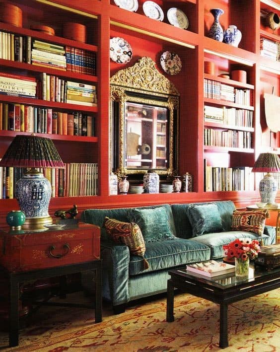
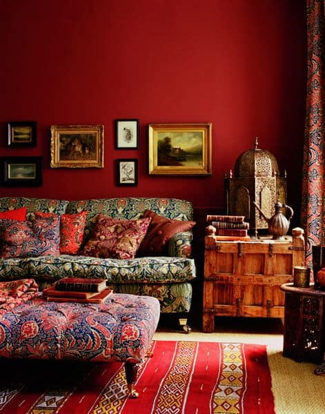
Chromatic Balance With Earthy Tones
Earthy tones — terracotta, tan, warm beige, natural wood — reduce red's intensity more effectively than cool neutrals because they share the same warm undertone. This chromatic relationship means the room feels cohesive rather than in conflict, and the red reads as the most saturated member of a family rather than an intruder from a different palette.
via cotemaison.fr
Modern interiors with sculptural, low-profile furnishings handle red remarkably well — the clean geometry of modernist pieces creates enough visual breathing room around the color that it reads as a bold design choice rather than an overwhelming one.
Source Unknown
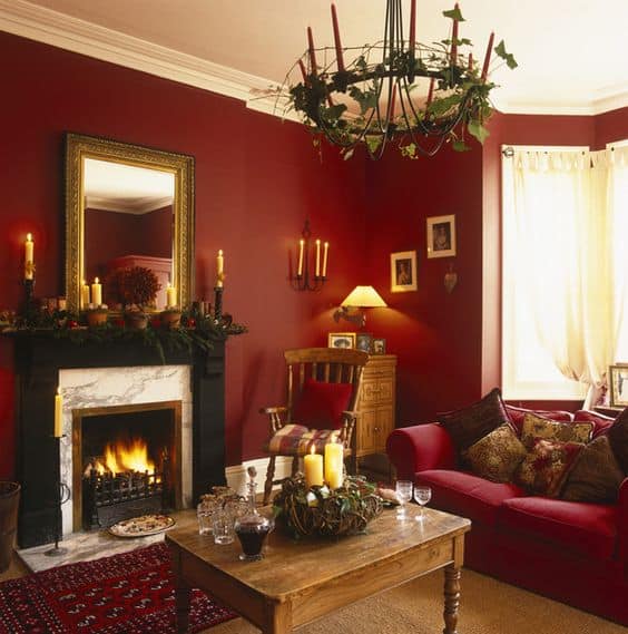
Break the Impact With Light
Natural light entering through a large window changes the character of a red interior more dramatically than any other single variable — the same wall that reads as dark and enclosed in artificial light becomes vibrant, warm, and alive when flooded with daylight. If you are considering red for a room, assess it at multiple times of day before committing.
via bhg.com
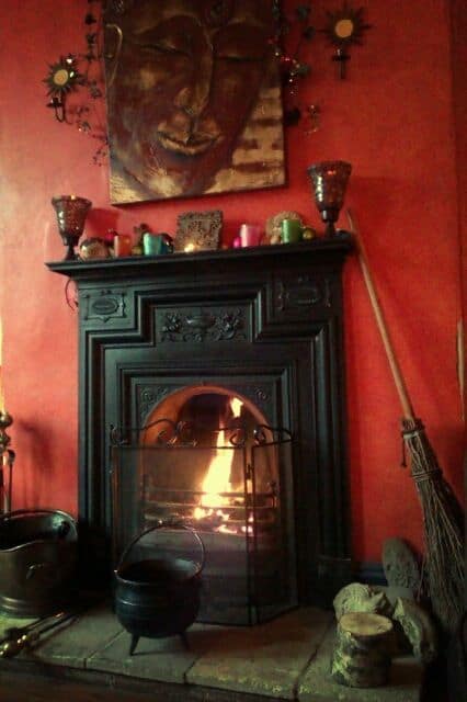
A wood-burning stove or fireplace in a red room creates a layered warmth that goes well beyond the visual — the association between red walls, flickering fire, and the smell of burning wood produces one of the most atmospherically complete interior environments possible. This is red at its most elemental and most justified.
via loveatpsychedelicvelocity.tumblr.com
Create a Red Focal Point on the Wall
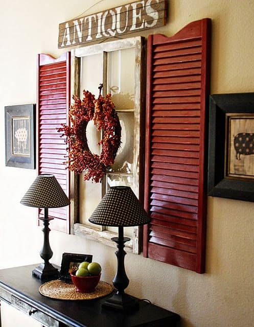
Introducing an unexpected object — a repurposed window frame, an oversized clock, an architectural salvage piece — onto a red wall breaks the color's dominance at a specific point and creates a focal element that the eye navigates toward naturally. The red becomes the context rather than the subject.
via dishfunctionaldesigns.blogspot.com
Natural Green Complementing a Red Accent Wall
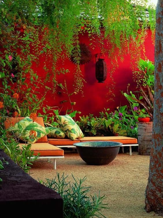
Green and red are complementary colors on the color wheel — the chromatic relationship that produces the most natural-looking contrast available. Plants and foliage against a red wall resolve the color's intensity without competing with it, and the organic naturalness of living greenery softens what might otherwise feel like a formally composed interior.
via books.google.com
Complementing Texture and Patterns
The right background color allows every texture and pattern placed against it to perform at full strength. Red, used as that background, gives textiles, wallpapers, and layered furnishings the visual support they need to read as intentional rather than busy.
via picsdecor.com
Red accent walls are most powerfully used as support elements — a background that amplifies the things placed in front of it rather than competing with them. The homeowners who use red most successfully understand this distinction: they choose the color to serve their furnishings, their collections, and their light, rather than expecting the color alone to do all the work. Which room in your home could benefit from that kind of bold, considered background? Share your thoughts in the comments below.