Expertises: Art, Do it yourself, Home improvement, Design, Craft
Updated on

Inspiring Ideas for Modern Home
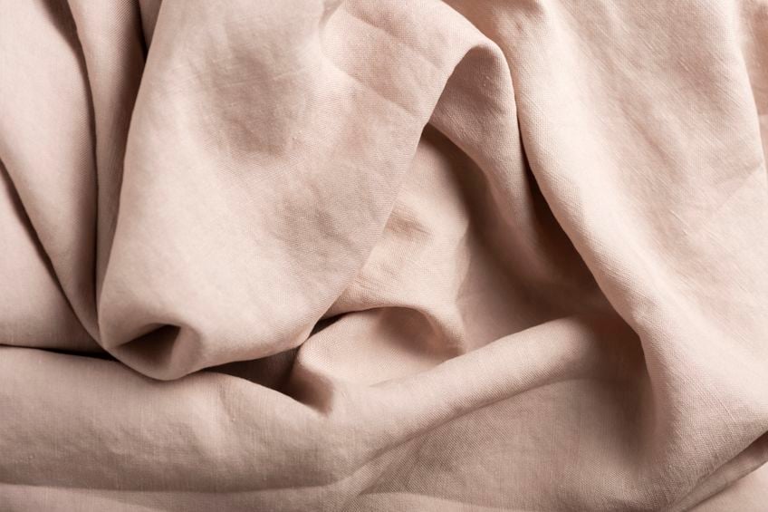
Taupe is a sophisticated neutral color created by blending brown and gray, often enriched with undertones of mauve, green, or beige, making it one of the most adaptable hues in interior design. Defined within the Natural Color System (NCS) as a low-chroma tone between warm and cool, taupe’s nuanced spectrum includes variants such as rose taupe, greige, mushroom, and mauve taupe. It is favored by major paint brands—Benjamin Moore's "Stone Hearth" (984) and Sherwin-Williams' "Anew Gray" (SW 7030)—for its unparalleled ability to balance contrast and cohesion in both modern and traditional interiors. According to the American Society of Interior Designers, over 60% of professional designers use taupe to establish visual continuity across open-concept spaces, leveraging its chromatic neutrality to anchor bold accents or soften architectural transitions. Color expert Maria Killam emphasizes taupe’s value in home environments, noting that “its quiet complexity creates depth without visual noise.” This chromatic subtlety, combined with taupe’s ability to react dynamically to natural and artificial lighting, makes it essential for creating emotionally resonant, well-composed interiors.

Taupe is a low-saturation, chromatically neutral color situated between gray and brown, characterized by its complex undertones and exceptional versatility. Derived from the French word taupe, meaning "mole," the name references the soft, earthy tones of the European mole’s fur. In color science, taupe resides in the gray‑brown space of frameworks like the Munsell and NCS systems, and may display undertones of mauve, green-beige, or mushroom depending on formulation and lighting—making it a metameric hue that shifts in appearance under different conditions. Leading paint brands such as Benjamin Moore and Pantone recognize taupe within their neutral and textile palettes, respectively. Its most significant design strength lies in its ability to bridge warm and cool schemes, offering chromatic stability and spatial nuance in both minimalist and richly layered environments. As Jean‑Louis Deniot, a renowned interior designer, succinctly puts it: “I aim for my interiors to be eclectic chic as well as serene.”
Some common hex codes for different shades of taupe include:
A popular taupe interior paint shade from Benjamin Moore is "Revere Pewter" (HC-172), which is a blend of gray and beige, often chosen for its ability to create a warm and inviting atmosphere. Its hex code is #A59B94.
The widespread popularity of taupe in interior design and fashion can be attributed to its versatility and compatibility with a broad range of colors. Taupe's ability to serve as a neutral backdrop or a sophisticated accent in any space makes it a highly sought-after choice.
Taupe is an elegant and versatile color that goes well with pretty much everything. However, there are various shades that you can choose from.
As such, below are a few quick tips for choosing the right taupe shade for your room:
First, you should really understand: what color is taupe exactly?
The RGB taupe color code is #483C32. The RGB taupe color code for the most saturated tone is #773803, while the least saturated tone is #3f3d3b.
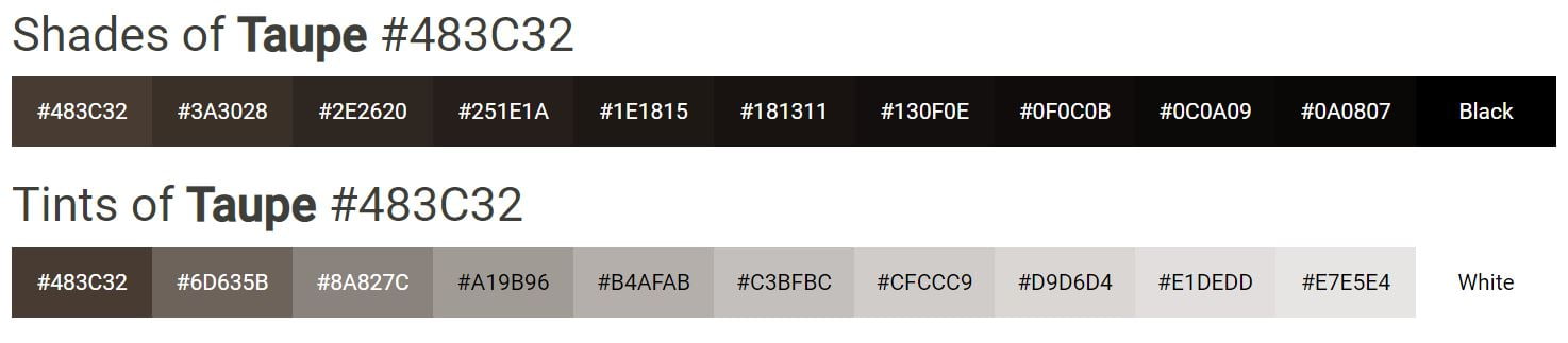
Below are other more specific codes for taupe:
You can get the right taupe shade by considering the following factors:
If your room is small and dark, light taupe will make it feel brighter and larger. Meanwhile, you should opt for dark taupe if you want a big room to feel smaller and cozier.
A north-facing room doesn't get a lot of natural sunlight. As such, taupe with warmer tones can give the room a warm glow.
But with south-facing rooms, any shade of taupe can work. However, one with cool undertones can balance out the sun's warmth.
Having east- and west-facing rooms is trickier since you'll have to study the lighting yourself. This is to check how much light it gets when you use the space the most.
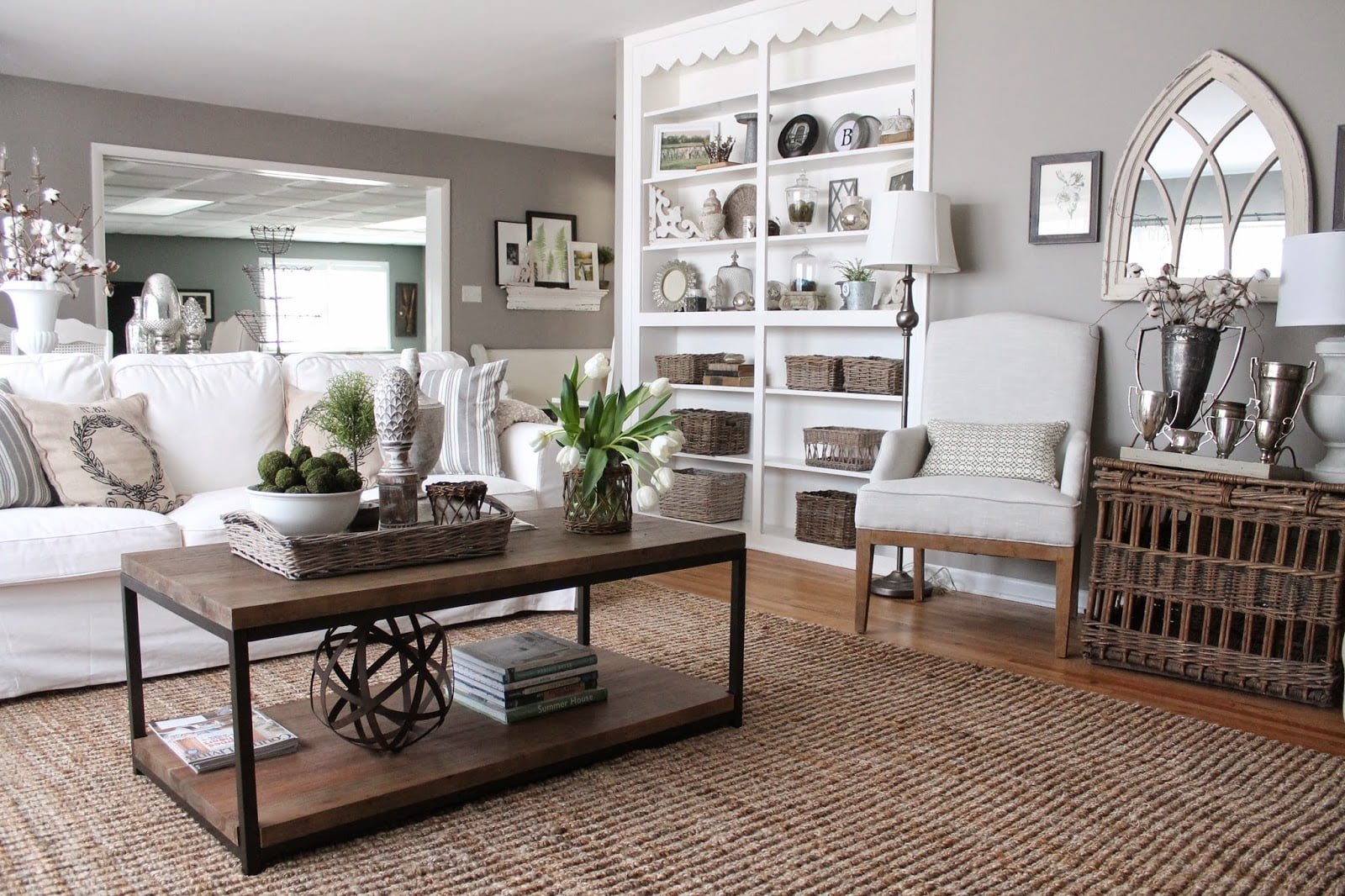
Do you want a rustic living room, a homely kitchen, or a cozy bedroom? Combine the color taupe with others to create the atmosphere you want for a room.
For a rustic living room, have taupe trims and walls in a light neutral shade or off-white.
Alternatively, you can have taupe walls as a base too. This is more calming than white (which can be too bright or stark) since it has a brown or gray base.
Meanwhile, for a homely kitchen, a mid-tone neutral taupe for the cabinets can add depth and richness without being too dark.
Bring the color out with a stone countertop and white subway tiles for the walls.
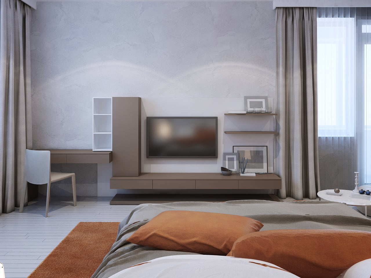
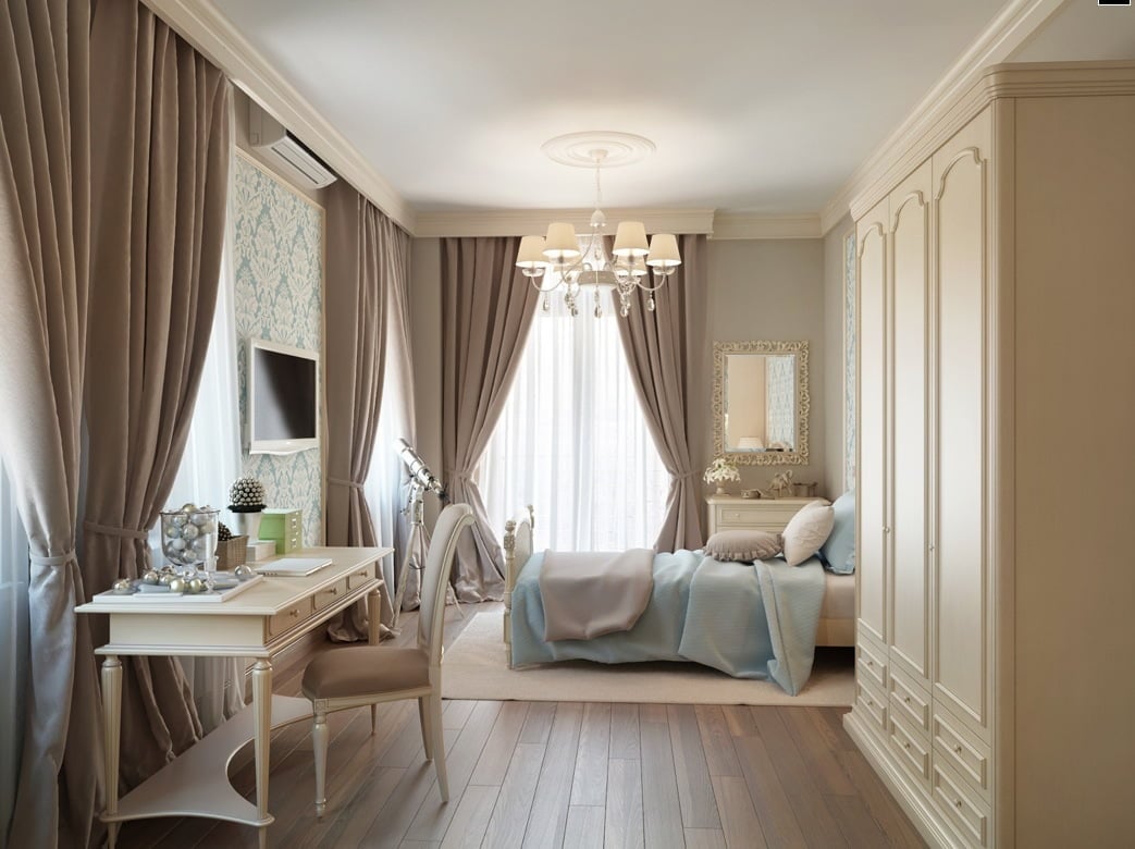
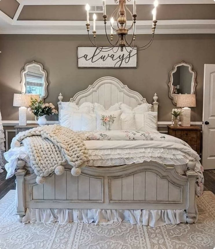
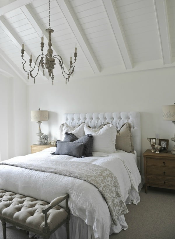
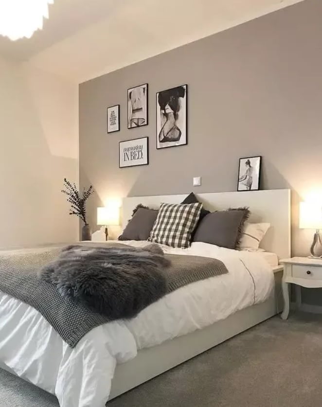
To make a cozy bedroom, dark taupe walls create an enveloping effect. Alternatively, you can use that dark shade on the curtains or furniture.
Instead of choosing just one shade of taupe, why not use multiple shades?
Utilizing a monochrome scheme is an easy way to instantly create an elegant, timeless, and tranquil room — especially if you incorporate a warm taupe in the palette.
Combine various shades and see how you can balance them in the room. Another is to layer different textures to add depth.
So, you can have matte taupe walls but have satin taupe on trims and cabinets.
Taupe is a neutral hue, but it's not boring. In fact, this is a great option if you want to make bold interior design choices!
You can pair taupe colors with more vibrant colors — like emerald green and fuschia. Any shade of blue is a sophisticated match for taupe too.
Taupe is certainly great as a foundation. But it's also an excellent option for an accent color — especially dark taupe.
Add warmth to and ground a cool color palette by adding an earthy taupe shade. Cerulean blue, for instance, has a beautiful green undertone that can be complemented by taupe.
A dark taupe accent can also stop white interiors from feeling too clinical.
There are many ways to incorporate this dark gray-brown shade, such as:
Benjamin Moore & Co., a manufacturer of paints, stains, and other architectural coatings, released their top six shades of taupe.
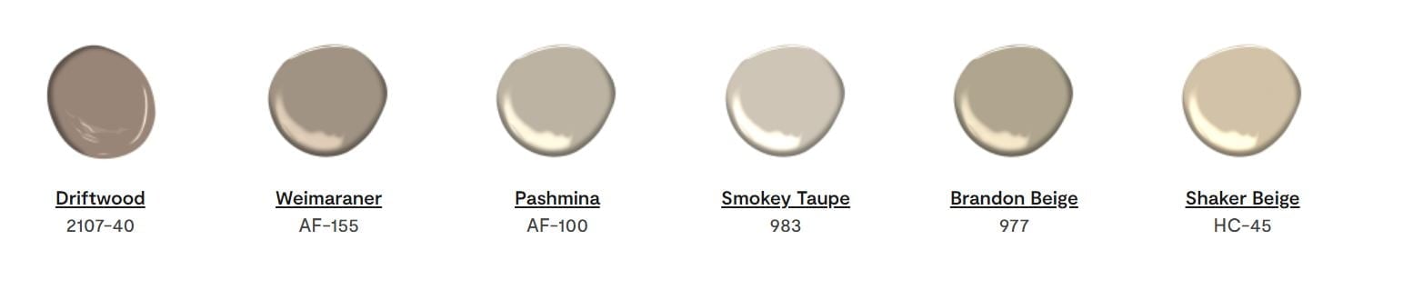
But there are more beautiful shades that we'd like you to know about.
So, below, we've listed a few shades of taupe, alongside their RGB and CMYK codes to help you find them if you wish to use them:
This warm taupe is sometimes considered a shade of pink because of its pink undertones. It has a darker reddish-gray appearance.
Mauve taupe is a good contrast to lime green.
This is the shade that A Dictionary of Color describes. You can call it the "standard shade of taupe" — though it's darker than other taupe shades.
Light taupe looks like a dark tan and is used for Crayola's taupe pencils. As a light color, it makes a room more inviting than a very dark shade.
Lighter shades of taupe work well with pastel colors — like pastel pink.
Contrary to what you might think, olive green is one of the warmer shades of green due to the yellow undertone. So, light taupe complements it.
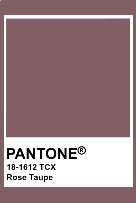
Rose taupe is also considered a shade of red since it can be described as a desaturated dark red.
It works well with any muted shade of brown and red. It contrasts nicely with a dark desaturated cyan too.
Purple taupe is a deeper and darker grayish-magenta that makes a good contrast for dark grayish-green colors.
Gray taupe is a darker shade of taupe that's gray-brown. This pairs well with other gray shades and warm colors.
Gray taupe also looks good with sky blue.
Taupe colors are certainly very easy to work with — especially if you have a good grasp of the color wheel. Below, we’ve answered some questions to help you understand this grayish-brown color more: The color taupe is a combination of black or red with yellow and green undertones. To change the shade or saturation, adjust those mixed colors. If you’re using paint colors, it’s better to use a palette knife than a paintbrush to mix them together. Taupe is a pale brownish-gray. Interior designers say that perfect taupe walls become great backdrops for brighter shades, warm woods, and brass or gold accents. Taupe is somewhere in between. You can control the shade depending on what colors you’ll be adding to it. If you put in more gray, then your taupe can appear as a very warm gray. Beige and taupe are both universal colors, so they go well with anything — including each other. Beige and taupe are a great combination if you want a monochromatic modern farmhouse vibe. Taupe best fits its complementary colors on the color wheel, which are blue and purple — but you can pair it with pretty much anything. However, you’ll have to consider shades. For instance, darker shades of taupe go beautifully with darker shades of blue, like navy blue. Meanwhile, a light taupe color goes well with lighter shades of yellow, such as buttery and creamy yellows. These balance warm and cool tones to make a room more cohesive. Flesh tones are also good to combine with taupe. This versatile color can represent many things in color psychology. Some of them include the following: No, taupe and khaki are not the same color. Khaki, coming from the Urdu word meaning “dusty,” is a light brownish green that’s normally connected to military uniforms. Khaki is also called khaki green. Meanwhile, the word taupe comes from the French word taupe and the Latin word Talpa, which was used to describe moleskin. It’s a gray-brown color, also described as pale brownish gray. From the name itself, greige is a gray-beige that’s grayer — so it’s a cooler color. Meanwhile, taupe is a warmer color. However, some people say that greige is actually a shade of taupe, while others say they’re different.Various Taupe Color FAQs
How Do You Create Taupe?What Is Perfect Taupe?Is Taupe Gray or Brown?Do Beige and Taupe Go Well Together?What Color Best Fits With Taupe?What Does the Color Taupe Represent?
Are Taupe and Khaki the Same Color?Why Are Taupe and Greige Being Interchanged?

Taupe colors are some of the easiest to incorporate into any color palette — whether for acrylic paint projects or interior design.
Below are 20 easy ways to use this versatile color in any room:
Taupe curtains — especially full and plush — can highlight any room beautifully. That's because curtains are a feminine and classy way to display any shade of taupe.
This makes taupe curtains an easy but stylish addition to any room.
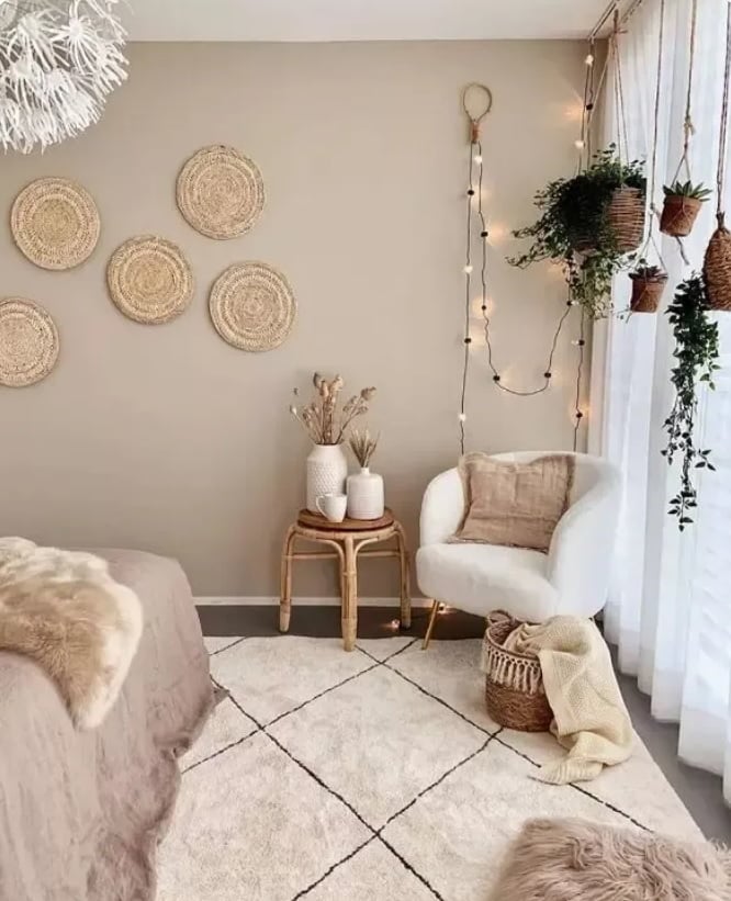
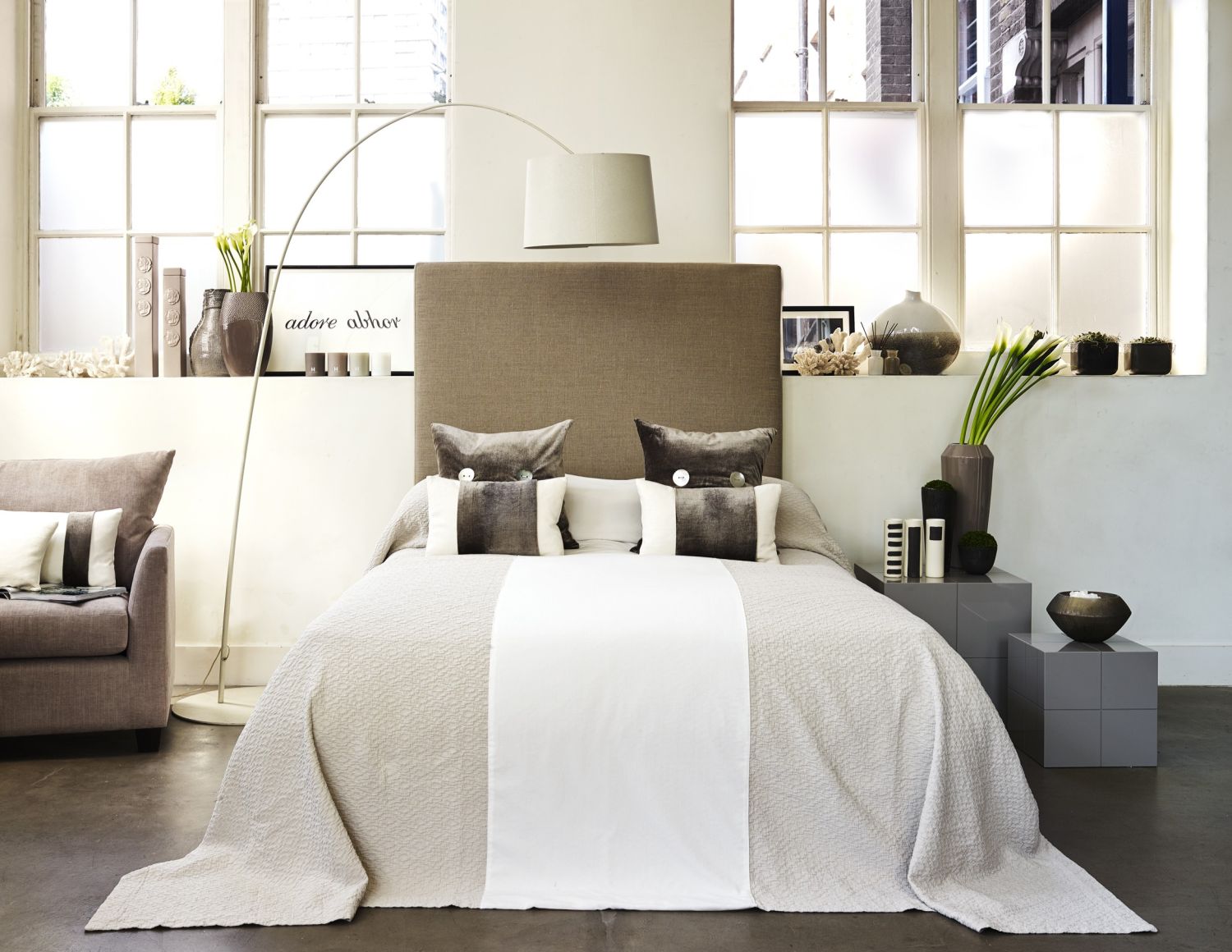
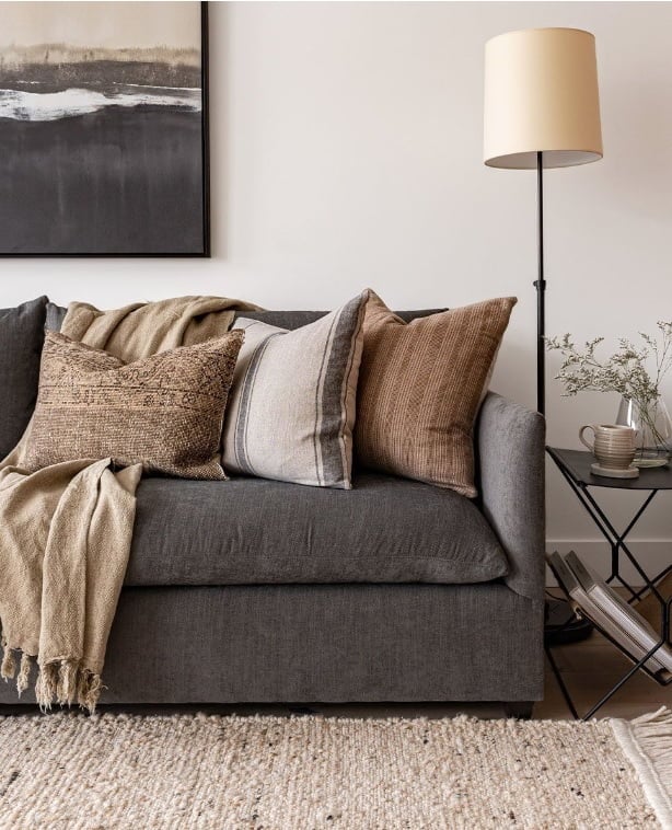
Taupe won't overwhelm a room. Instead, it can even add some airiness and lightness to the space. You can also add accents of the same shade to your furniture.
There are many shades of taupe. As such, it's a matter of what atmosphere you want your room to have.
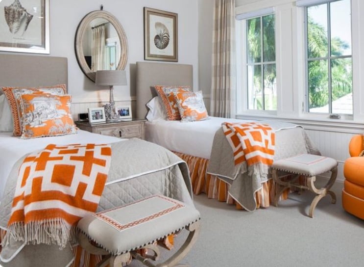
For something more relaxing, you can have a mid-tone shade complemented with lighter curtains and furniture. A good combination is dark taupe walls and white and rose gold neutrals.

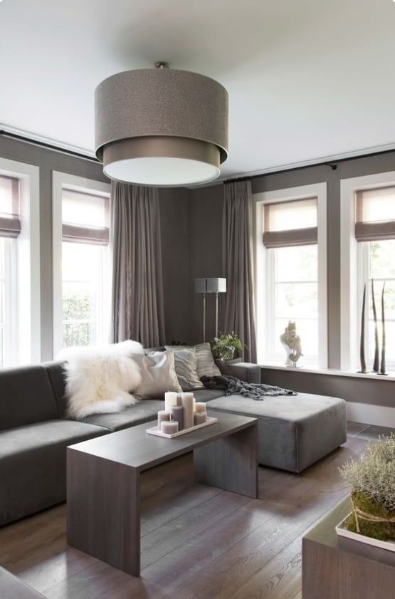
Taupe is great for large rooms.
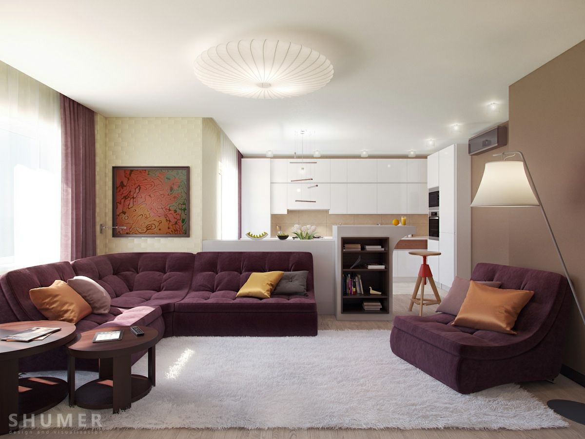
It's especially perfect for soft furniture, giving it a warm and cozy look that will invite anyone to sit down.
You can have taupe sofas and throw pillows on accent chairs. Pair taupe with lighter and brighter cream tones to further create that romantic element.
Rather than worrying about how to blend taupe into your room, you can work with contrasting finishes.
For instance, you can have an ivory room and add some taupe here and there — such as a corner chair, throw pillows, and accent outlines of a 3D wall.
Check the color wheel to see which paint colors can contrast with taupe.
Taupe with a purple undertone can be paired with plum to create a sultry or expensive-looking space.
If you want a Victorian theme (even in terms of just color), layer shades of taupe, gray, and white tones.
Why not decorate a room with all shades of taupe? Taupe isn't overwhelming and comes in varying shades, so it's a good color for creating a modern-looking room.
The different shades look like different colors too, easily adding texture to the room.
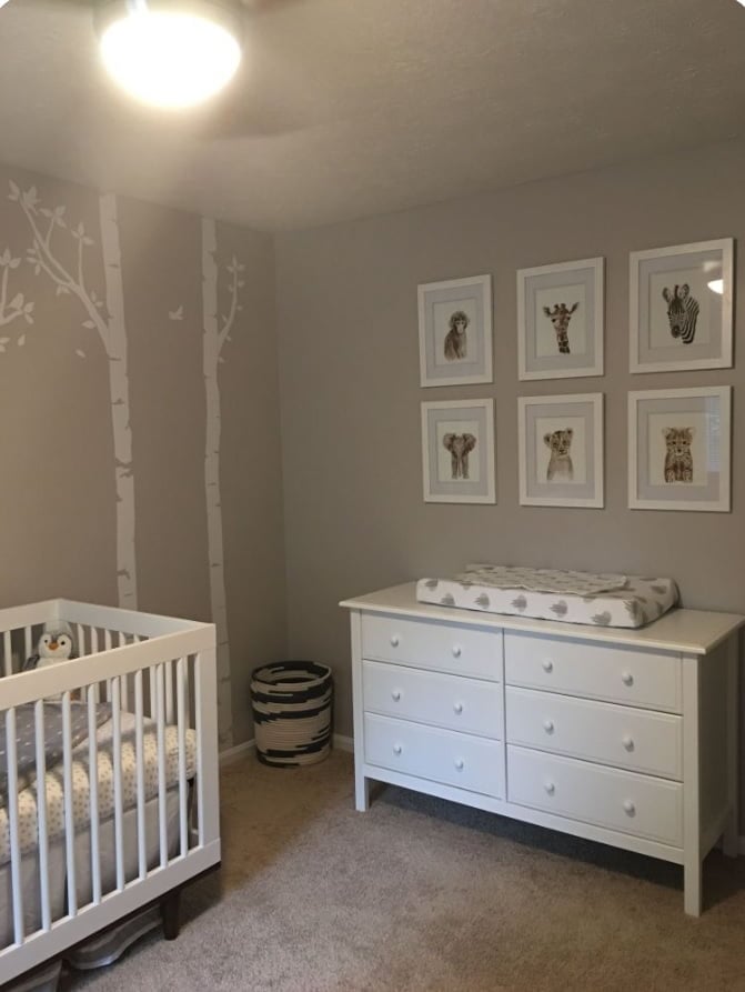
If you use the taupe color right, you can make a stylish and modern nursery.
The neutral tone lets you adjust the style as your child grows.
For instance, you can add colorful decorations for the baby, then switch out the crib for furniture in the future, and change the decorations and accent colors.
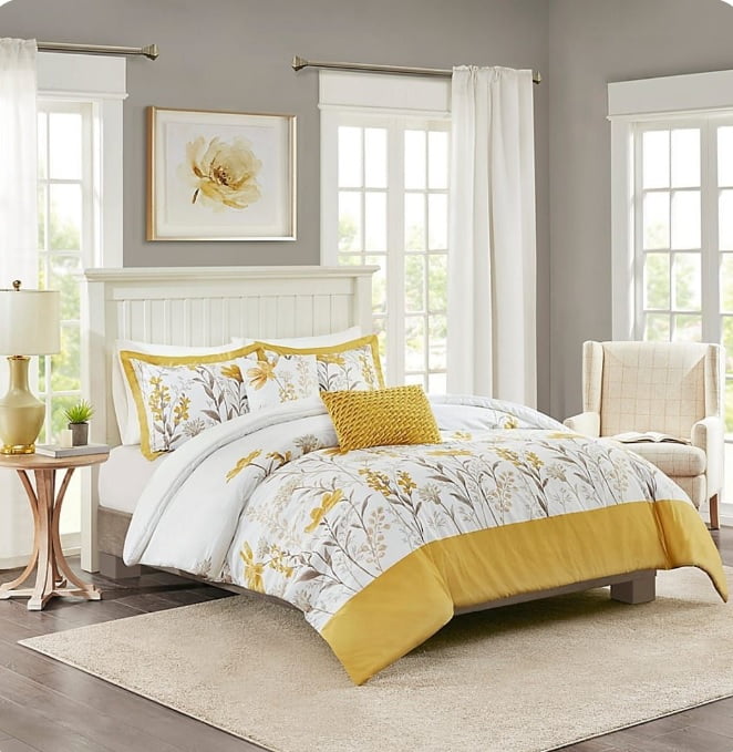
As a soft and subtle color, taupe also works well with bold colors and prints.
But if a strong orange isn't to your liking, you can choose a more muted orange — or a different color altogether, like cool lavender or light green.
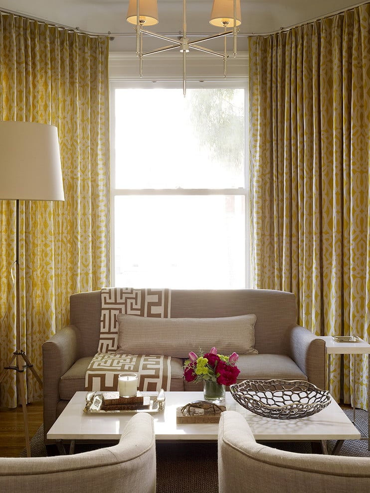
A slight taupe on the furniture blends well in a room with a gold and mustard theme. Taupe makes the room brighter and can also act as a point of reference.
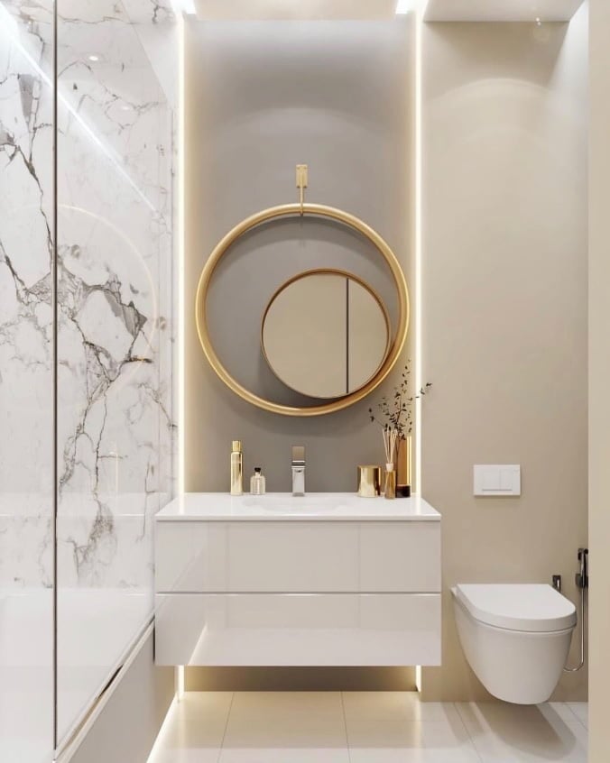
Taupe is the perfect base for a calming and sophisticated bathroom. It makes the space seem cleaner, too.
Taupe color is especially great to pair with white bathroom fixtures and towels.
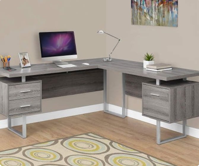
Use taupe as a base to make a space that inspires you to be creative and focus on tasks that need to be done. This will also be a space where you'll enjoy spending time.
Add some pops of color or other accents to give some more character to the space.
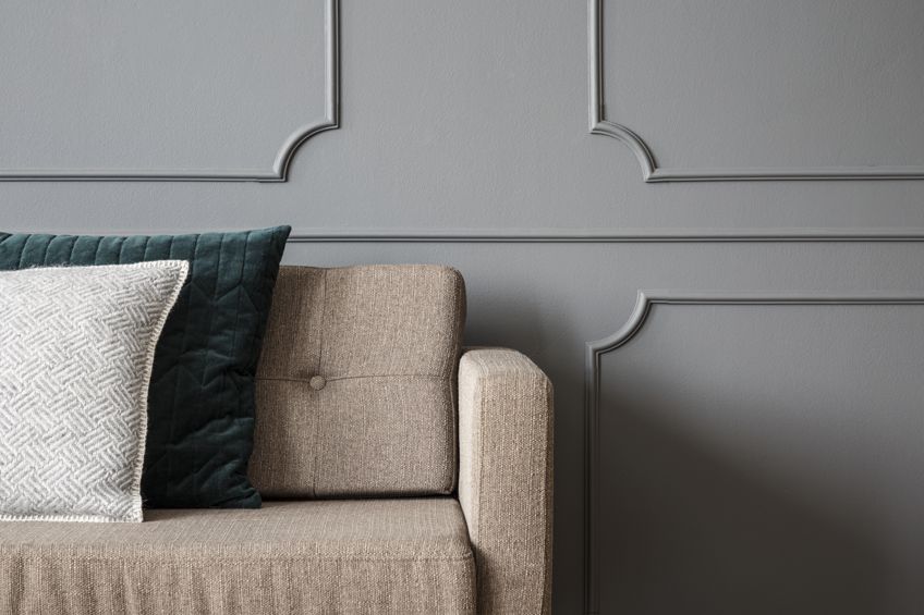
Rather than use taupe with undertones, why not try a color with taupe undertones? For instance, gray with strong taupe undertones give a muted but sophisticated atmosphere.
Pair the taupe color with another neutral shade, like gray or white. Then, sprinkle some color (like yellow or green) into the room to create points of reference.
You can add taupe to an already-existing rustic theme. Place some taupe accents on throw pillows, stools, or other decor.
While taupe looks good in a modern room, it also looks beautiful in more traditional settings. It helps create a cozier and homelier atmosphere.
Use darker taupe curtains in a room with a lot of natural light. This will frame the light nicely, giving the room more contrast and warmth.
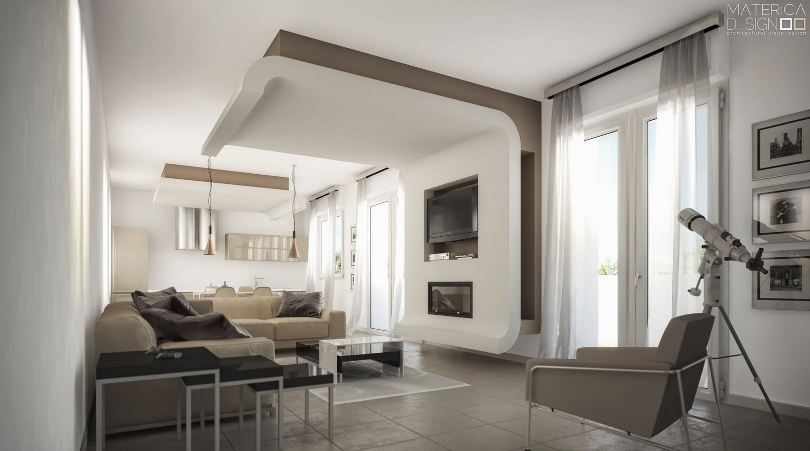
For a very contemporary look, keep your color scheme (and even decor and furniture, if you can) minimalist.
For instance, use taupe for your accent wall and furniture, then pair that with white for everything else.
Sometimes, you just need a color that can tie the whole room together. Taupe can do that for you.
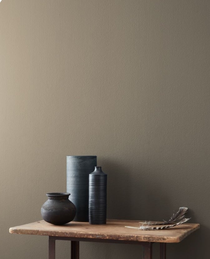
Have taupe walls or a taupe floor for a warm, subtle foundation that will support your color scheme.
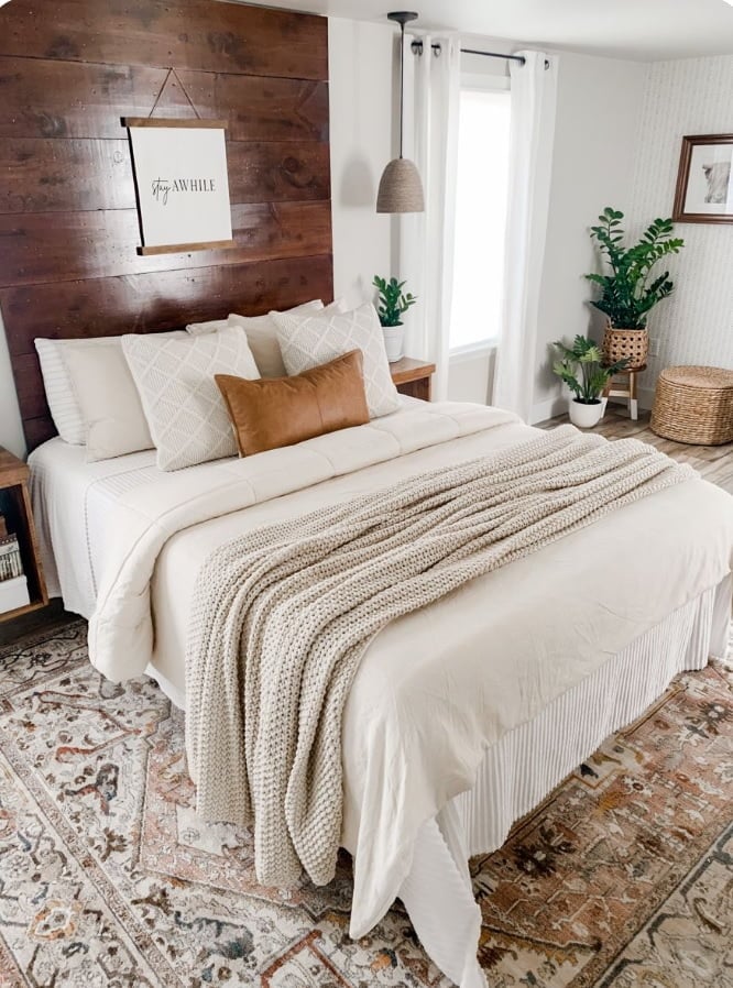
If your rustic room has planked walls or warm wooden flooring, taupe textiles will be perfect for it. It adds to the rustic feel, making the room homelier and more inviting.
Conclusion
Taupe is a refined neutral that straddles the line between gray and brown, with a range of undertones such as mauve, beige, and green-gray that allow it to shift in character depending on lighting and context. Its nuanced versatility makes it an ideal bridge between warm and cool palettes, allowing designers to create depth and cohesion across a wide variety of styles—from minimalist to traditional. As a tone derived from the natural coloring of the mole, taupe brings an earthy, grounded elegance to interiors, functioning as a subtle yet powerful backdrop that enhances surrounding elements without overwhelming them.
Whether used as a primary wall color, an upholstery base, or a contrasting trim, taupe offers both spatial calm and visual sophistication. It pairs effortlessly with muted pastels, rich jewel tones, metallics, and organic materials, adapting to modern, rustic, and classic environments alike. For a deeper understanding of how taupe behaves in applied design, including its various shades and ideal combinations, this comprehensive guide to taupe color offers valuable insight into its full design potential.