Expertises: Art, Pastel, Brush, Drawing, Pencil
Updated on

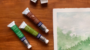
Inspiring Ideas for Modern Home
To ensure success in acrylic art, pay attention to the pigment information, lightfastness rating, and transparency/opacity level when reading a paint tube. Pigment info tells you the color name and composition, lightfastness rates, and the paint's resistance to fading.

Understanding the labeling on paint tubes can greatly benefit artists seeking to create intricate works of art. The symbols and text on paint labels provide valuable information regarding a paint's transparency and lightfastness, aiding in the planning and execution of artistic projects.
While initially overwhelming, it offers valuable insight about the composition and properties of the paint. This guide looks at the reason labeling conventions allow informed decision-making when selecting paints for acrylic or watercolor painting.
Labeling art materials helps artists visualize the final color that will appear once the paint dries on their canvas. The primary element you will find on a paint tube label is the name of the color. Occasionally, the name reflects the pigment utilized to produce the color, while at other times, it may be a marketing name, like "Sky Blue" or "Grass Green."
Using marketing names by a paint brand can substantially affect an artist's color selection process. For example, the disparity between "Prussian Blue" and "Midnight Blue" influences an artist's color preference depending on the outcome they desire to achieve.
Therefore, understanding the names of paints is an essential component of comprehending paint tube labels.
Understanding the intricacies of color is crucial for creating beautiful paintings and pigments are the fundamental components of color in paints, as they come in various forms. Each pigment possesses unique properties, including lightfastness, opacity, and hue, that impact the final appearance of a painting.
When looking at a paint tube, it is common to see a series of characters such as "PR122" or "PW6." The letter before the number represents the type of pigment used to create the color, with "P" standing for pigment and the character combinations called color indexes.
Knowing a paint's color index can help decipher the color recipe, allowing the ability to blend comparable shades with different pigments. The number at the end of the color index indicates the chemical compound that constitutes the pigment. For example, Quinacridone Magenta is identified by the color index PR122, while PW6 identifies Titanium White.
Roman numerals may also indicate the lightfastness of paint, with I being the most lightfast and V being the least. Finally, the American non-profit association ASTM International developed a grading system to identify the quality of paint, with student grades being the lowest quality and artist grades being the highest.
Oil paint is a popular medium amongst artists due to its vivid colors and ability to manage the canvas well. It is created by mixing pigments with drying oils such as linseed or safflower to form a thick, creamy paint. However, not all oil paints are created equal, and there are several factors to consider when choosing the right paint for a particular project.
One big difference between oil paints is the quality. Student-grade oil paints tend to be cheaper but contain less pigment, resulting in colors that may be less vibrant and can fade quickly over time. On the other hand, professional-grade oil paints contain higher levels of pigment and have a higher permanence rating, meaning they will resist fading for longer.
It is crucial to read the labels and research the brand before purchasing. It is also essential to know the different oil paint manufacturers and brands, as they may have different characteristics and formulations. Some brands may use fugitive colors, which can fade quickly, while others may contain toxic pigments that can lead to chronic health problems.
When discussing colors, artists often use the term 'hue' to refer to pure color without any added black, white or gray. For instance, a color may be blue, but it could also be light blue, dark blue or somewhere in between. Understanding hue is essential for creating harmonious color schemes and ensuring that the colors used in a painting complement each other.
Color index codes are a valuable tool to help artists understand the properties of different pigments and create their desired colors. For example, Golden's Heavy Body Prussian Blue Hue has a color index of PBk 9/PB15:0/PV23, which indicates that it is a mixture of Bone or Ivory Black (PBk9), Phthalo Blue (PB15) and Dioxazine Violet/Purple (PV23). Knowing this information can help artists mix a similar color using different pigments if the specific paint they need is unavailable.
In addition to hue, other factors such as lightfastness, opacity and transparency impact the appearance of a painting. Professional-grade paints, such as cadmium paints, often have better lightfastness and opacity than student-grade paints but they are more expensive.
When reading a paint label, it is essential to note the paint used. Acrylic polymer paints are water-soluble and dry quickly, while oil paints are not water-soluble and take longer to dry. Some paints, such as cadmium red and cadmium hue, can be toxic and should be used cautiously. Titanium white is a standard pigment used to create white paint.
You are not alone if you have ever wondered about the letter and number combinations on your paint tube. Understanding paint color codes can be vital, especially when working with acrylic paints. These codes are called Color Indexes and reveal the pigment used to create the paint color.
The number at the end of the code represents the specific chemical compound used in the paint. For example, "PB29" refers to Ultramarine Blue, and "PB28" refers to Cobalt Blue Hue. The "P" stands for "Pigment," while the letter following it indicates the color family (e.g., "B" for blue).
By analyzing these codes, you can comprehend the basic recipe of color and use it to recreate or modify color when needed. For example, Golden's Cobalt Blue Hue is identified with the pigment code PB28/PB15:3. The code indicates that this hue is created by mixing two different pigments: Cobalt Blue (PB28) and a greenish-yellow pigment (PB15:3).
Knowing the pigment codes can help you estimate the tinting strength and opacity of the paint color. Some pigments, like Ultramarine Blue, are transparent, while others, like Cobalt Blue Hue, are more opaque. This information is beneficial when working with student-grade paints, which tend to have lower pigment concentration.
The paint label or manufacturer usually lists the pigment codes on the paint tube or container. Therefore, reading a paint tube label before purchasing or using acrylic paints is crucial to get the desired color or effect.
When examining the label on a tube of paint, if the term "hue" is present, it indicates that a newer pigment has been used to produce the color. This substitution may be due to various reasons, such as toxicity concerns, cost reduction, or unavailability of the original pigment. However, it does not necessarily imply that the resulting color is of lower quality than the original.
Instead, the term "hue" is used to assure consumers that the color is similar but not an exact match for the original. Therefore, it is essential to understand the meaning of "hue" on paint tubes to make an informed decision when selecting paint colors, regardless of the brand.
Additionally, it is vital to be aware of the potential for poor lightfastness, which can cause colors to fade quickly over time, particularly with pigments like flake white. To ensure you choose high-quality paints, look for certifications from reputable organizations such as the Creative Materials Institute.
The durability rating of a pigment is an assessment of its ability to withstand various environmental factors, including but not limited to heat, humidity, and cold temperatures in natural settings. In simpler terms, the rating indicates how well a pigment can maintain its color and resist fading or alteration caused by exposure to environmental elements.
This is essential for artists, manufacturers, and consumers who desire art materials, products, or surfaces with long-lasting color quality.
Lightfastness is essential for artists who want their artwork to stand the test of time. It refers to a pigment's ability to withstand exposure to light without fading over time and so it’s one of the various factors that impact permanency of a painting.
The American Standard Test Measure (ASTM) scale is commonly used to rate a pigment's lightfastness. This scale ranges from I to V, with I being the most lightfast and V being the least. In other words, pigments with a lower number on the scale are considered more resistant to fading caused by exposure to sunlight.
The ASTM rating system can help artists determine the expected lifespan of their artwork. A V rating (Very Poor) indicates a pigment's lifespan is fewer than two years under normal conditions.
A rating of IV (Poor) means the pigment can last between 2 and 15 years, while a III rating (Fair) suggests a lifespan of 15 to 50 years. Pigments with a rating of II (Very Good) can last between 50 and 100 years, while those with an I (Excellent) can last over 100 years.
It is important to note that there is currently no standard label practice for indicating lightfastness, and not all manufacturers use the same symbols. Therefore, it is vital to familiarize oneself with the symbols used by individual manufacturers to make informed decisions about paint choices.
When browsing for paint, you may notice a series number and opacity rating on the label. These are essential indicators of the quality and characteristics of the paint.
The series number refers to the paint cost, with 1 being the least expensive and 5 being the most expensive. This cost is primarily determined by the pigment used, with some pigments being more accessible and easier to process than others. For beginners, starting with a series one 1, such as Titanium White, is recommended, which has good coverage and is affordable.
Symbols indicate opacity rating on the label, including -
Some paint labels may also include a paint swatch to give an idea of opacity/ transparency. However, paint manufacturers, such as Golden Artist Colors, Inc., use a sliding scale labeled as Tinting Strength instead of the standard opacity symbols. It is essential to check the label carefully to understand the opacity rating of the paint.
The "Conforms to ASTM D 4236" label on acrylic paint means that any potential health hazards from exposure are appropriately labeled. This is especially important for toxic ingredients such as cadmium pigments, which have been scientifically proven toxic in large amounts. Hence, some paint brands offer cadmium-free alternatives.
You will also see that the ACMI stamp on acrylic paint labels indicates that a certified toxicologist has evaluated the paint. The "AP" symbol on the stamp means the product is safe for adults and children, while the "CL" symbol means cautionary labeling is required.
Occupational safety and health regulations in the United States require proper labeling of chemical substances in art and manufacturing. Overall, viscosity, lightfastness, and price are essential factors when choosing paint.
Tip
One tip for reading a paint tube is to pay attention to the color index name and number listed on the label. The color index name and number indicate the specific pigment used in the paint, which can give you a better understanding of the color's properties and potential mixtures. Additionally, knowing the pigment can help you determine the lightfastness and toxicity of the paint, which can be important factors to consider when selecting paints for your artwork.
A paint tube typically contains information such as the brand name, color name, pigment type, and lightfastness rating. To read this information, look for the labels or codes on the packaging. The pigment type can tell you a lot about the characteristics of the paint, such as its transparency, color intensity, and handling properties. Additionally, the lightfastness rating can help you determine how long the color will last without fading or deteriorating. Yes, you can mix different brands and colors of paint, but it’s important to pay attention to the pigment type and chemical composition. Some paints may not mix well or create unwanted effects, such as muddy colors or uneven textures. To ensure compatibility, check the manufacturer’s guidelines or do a small test before mixing large amounts of paint. One common mistake is assuming that all paint colors are created equal. Different brands and pigments may have varying levels of opacity, saturation, and color shift, so it’s important to compare them before painting.Read A Paint Tube FAQs
What information can be found on a paint tube, and how do I read it?Why is it important to know a paint's pigment type and lightfastness rating?Can I mix different brands or colors of paint, and how do I know which ones are compatible?What are some common mistakes to avoid when reading paint tubes?

As an artist, understanding the labeling of paint tubes can significantly enhance your creative process. So, pay close attention to the pigment information, lightfastness rating, transparency, and opacity level.
The color indexation and pigment codes on paint labels provide valuable information about a paint's composition and properties, while the "hue" label indicates the color's similarity to the original pigment. You can make informed decisions and create beautiful artwork by thoroughly comprehending these labeling conventions.
So the next time you pick a paint tube, read this guide and take a minute to understand its labeling.