
Updated on
The color scheme is one of the most important things to take into consideration when you are decorating your house.

On entering a house, the color palette immediately sets the mood and tells a story. A place that has blue-green as the dominant color is likely going to look a little somber. In contrast, a house with a dominant chartreuse color is likely to feel more vibrant. So, you can understand how important it is to get the color scheme right for your home.
When in doubt, simply turn to the color wheel, and you will have your answers. The newest and the most trendy thing to try, however, is the analogous color scheme. If you are excited to know more about what it is, you are at the right place.
In this guide, we take a deep dive into analogous color schemes and tell you everything that you need to know about it. So, without any more delay, let’s check it out!
Analogous Color Schemes 101

What Are Analogous Color Schemes?
Contrary to how scary the phrase may sound, analogous color schemes are actually pretty easy to understand.
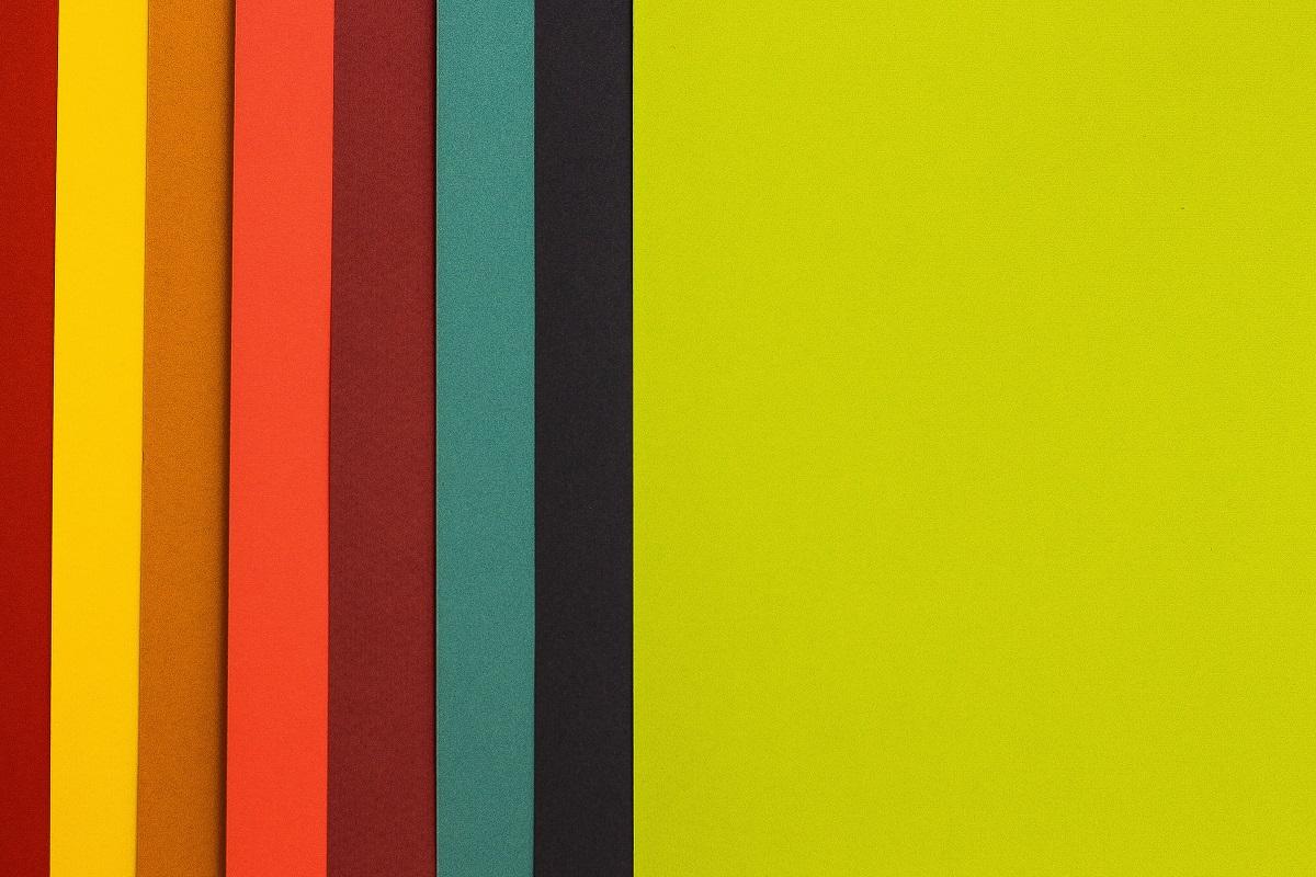
Grouping of any three shades from the color palette is all it means but remember, it has to be in the same order as on the color wheel. For example, if you look at the color wheel, green, blue-green, and blue can be considered analogous colors.
An analogous palette can begin from any end of the spectrum, and that means that you can either go clockwise or anticlockwise when choosing the colors. You can also opt for warmer shades such as red, red-violet, and red-orange, as these complimentary colors work great together.
When choosing the colors, keep in mind that two of the colors need to be primary colors, and the other one can be of a neutral shade.
How To Decorate Your House With Analogous Colors?
There’s no way someone can tell you whether a blue-green is going to look better than a red-violet on your living room wall.
Some people like bold colors, whereas others would prefer more mellow hues. In short, there is no right or wrong, and you are free to experiment with different colors.
Before you decide on which option you would want as the base color, it is best to select the dominant shade. After you have decided on a few colors, it is time to find some supporting hues to make the color scheme complete.
To make things easier, you can make a mood board to choose from the color wheel. This makes it convenient to pick a color scheme as you have a color wheel right in front. Over time, people end up developing a taste for a particular color palette and select the color scheme from the same palette.
Once you have decided on a color, pick the two other colors surrounding it to make your color scheme complete. In case you have liked two colors, select the one present in between to bridge the gap. This way, you will have an analogous color palette ready for your house.
How To Create Contrast When Playing With Analogous Colors?
Because the colors in an analogous color scheme are so similar, creating contrast with them might feel a little challenging. But achieving contrast with analogous colors is actually easy if you know the right tricks.
To begin with, pay special attention to the subtleties of the colors that you are working with. By understanding their nature, you will learn that the colors behave differently when they are light or dark.
Even if you modify the saturation, the colors will look significantly different. That’s why when you play with undertones, you can introduce an excellent contrast to the home décor.
The more simple thing, however, is to just play with the tone of the color that you like on your color palette. Not all the three colors that you choose have to exude the same kind of vibrancy and can be used to create contrast. You can even infuse accent colors into the mix to create a great contrast in your home.
What’s more, when you are thinking of home décor, you can even add textures and prints to the mix. But make sure that the pattern matches the color palette and add some complimentary shades to ensure excellent cohesion.
How To Maintain Balance When Choosing Colors From The Color Wheel?
Maintaining a good balance in an analogous color scheme is not too difficult because all the colors are harmonious as they are in order.
In order to maintain a good balance, always ensure that you are not using the dominant color too much. Doing that would make your space look a bit off-balanced. Instead, you should strive to find the right balance and stick to the 60:30:10 as the thumb rule. Don’t know what that is? Let us break it down for you.
A perfectly well-balanced color scheme in a room is nothing short of an art. For that, you need to use a dominant color on 60% of the space. The next 30% of the space needs to be filled with one supporting color of your liking, while for the rest, 10%, select another supporting color of your choice.
Irrespective of the analogous color scheme, following this rule is always a good idea. We have seen many people use the same color too much in one space, so try to avoid this mistake as it will only make your home look clustered.
How To Introduce Neutrals In An Analogous Color Scheme?
Only adding bold color may make your space look overwhelming. In order to make the space look a little calm, you can consider adding a few neutrals to the triadic color scheme. This is simple, and all you have to do is add white, black, or gray to the colors to bring about a change in them.
When you add white, it is called a ‘tint,’ and the color gets lightened. On adding gray, the ‘tone’ of the color changes. And when you add black, the color gets a different ‘shade.’
We have a red-violet color on one of our walls. If we have to introduce a neutral tone, we won’t definitely go for a blue-violet, right? In this scenario, what we did was add a little white to the red-violet and put it on the other walls to create a good balance.
When you use the neutral shades right, the dominant color in your room gets a chance to stand out among the other colors. The same is true when you are using an accent color.
How To Put An Analogous Color Scheme To Use?
In this section, we take a look at some of the best ways that you can use an analogous color scheme to amp up the décor in your house.
When you ace the game of selecting the suitable color scheme for the rooms, the décor in your home will be simply jaw-dropping. So, let’s take a look at how you can use the color wheel to your benefit!
1. Using Wood As The Neutral Shade
When you are playing with colors such as blue-green, blue-violet, or blue-purple, finding furniture of that color is going to be pretty tedious. There’s hardly any store that makes furniture in these colors.
But there’s nothing to worry about as there is no way you would go wrong with adding a few wooden pieces of furniture to the mix.
2. Use Analogous Colors To Set The Mood
You can use analogous colors to your benefit and make the rooms stand out. Depending on the kind of color that you prefer, you can select the analogous color scheme accordingly.
If you are feeling experimental, select somber colors like blue-green or blue to make one of your rooms stand out. Playing with darker color shades might feel a little challenging sometimes. But when done right, the results can be amazing.
3. Orange, Yellow-Orange, And Yellow
This is one of the best bold color palettes that you can choose from the color wheel if you want to give the room a vibrant touch. People who like to give their house a retro look often go for this color scheme.
It is one of the best combinations of primary color, secondary colors, and tertiary color and has the capacity to make your space look revitalized. These colors are bright and will surely add a youthful touch to your space. Not all types of décor go well with yellow, so you might have to research a little on that! If you are feeling experimental, you can even give Mikado a try.
4. Using Violet, Blue-Violet, And Blue
If you like to add a feminine touch to your home décor, try to incorporate analogous colors that are feminine in spirit. And this color scheme scores a perfect ten on that count.
Using this combination of three colors is surely going to make your interiors look more trendy and chic. When using this palette, do not forget to throw in some wooden furniture to the décor to make the space look even better.
In case you decide on working with four colors, make sure that the fourth color is a complementary undertone that would bring forth a cohesive output. You can even add teal to the mix to complement the other colors.
5. Pastels To Your Rescue
There’s no need to always stick to the base color on the color wheel, and you can easily experiment with different shades of the colors that you like. If you like yellow and orange, you do not need to simply stick to the base colors.
You can mix black to orange to get a darker shade or add white to yellow to get a lighter shade. This would help you achieve the pastel shades of the colors that you like. And it will leave you with immense scope of playing with colors.
Analogous color schemes are more versatile than you think! When you select the color scheme wisely, you are left with an extensive color palette that would make the room stand out like no other.
Final Words
That’s all we have on analogous colors!
As we promised, we tried to make analogous colors simple for you to understand. When you think of incorporating an analogous color scheme, you do not necessarily have to stick to just the walls. You can use an analogous color scheme in all the decorative items that you use.
Plus, make sure that your curtains and rugs also fall into the scheme. If the furniture in your house is predominantly of wooden color, it is best that you search for colors that go well with brown.
Analogous colors mostly look cohesive, but with some extra effort, you can mix and match to make your interiors stand out. If you have any other suggestions that you would like to share with us, feel free to write in the comments section below. And for more exciting reads on interior decorations, keep a watch on this space.
Until next time, fare thee well!
Related Articles
Colors That Go With Orange-Orange Color Combinations