Expertises: Art, Painting, Drawing, Home improvement, Gardening
Updated on
Inspiring Ideas for Modern Home
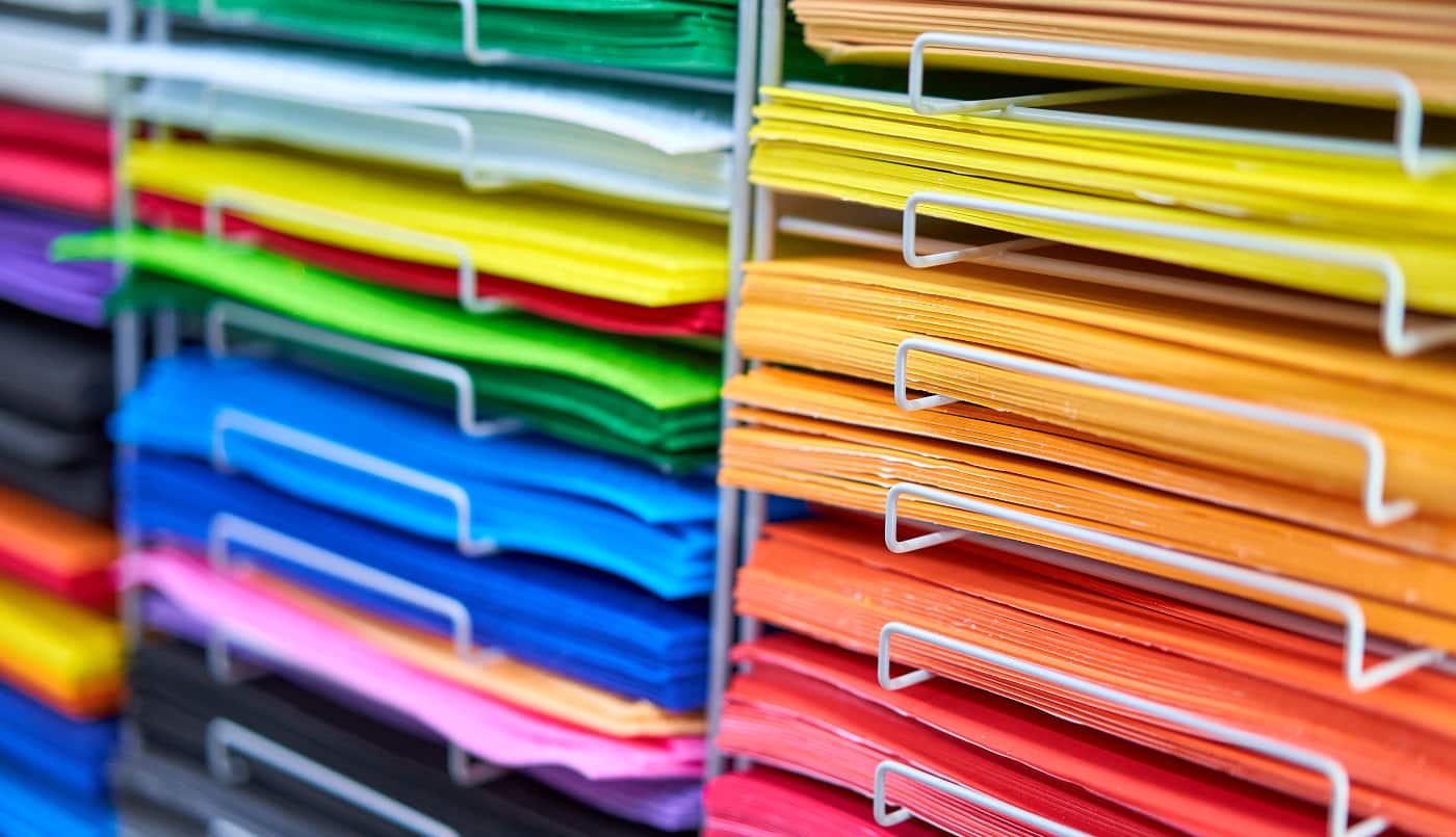
Well, who does not like vibrant-colored merchandise? No one that we know of! Today we will discuss how to separate colors for screen printers in the most effective manner.

Color printing is easy but to create the best of effects, you need to know how to separate colors. If you learn the skill, you can make the coolest of merchandise at the most affordable cost. But before you start with the process, there are a number of things that you need to know.
Today, we are discussing the techniques that you can implement to separate colors for screen printers. We are also going to share some very interesting and essential tips that will save you time, money, and potential hazards.
So, without any further ado, let’s begin!
Before we delve into how to separate colors, we will give you a brief idea about the various techniques that screen printers use to separate colors. Understanding the process in-depth would help you execute the separation more effectively.
Let’s take a look at the standard color separation techniques that are used.
This is one of the most common kinds of color separation techniques that are in vogue. It has been quite popular for decades now, especially when vector images are concerned.
The reasons behind its popularity are the ease of the technique and the excellent results that it delivers. Most design software allows you to spot or pick the color. However, with software like CorelDRAW and Adobe Illustrator, you should always ensure that the color is right before you decide on printing.
Keep in mind that this technique of color separation works best on solid tones. But if you are looking to create more shaded colors, you should opt for halftone dots in the process. If you do this, the design will get printed in the exact form as you envision it.
This technique has gained popularity in recent years and has also contributed towards the popularity that photoshop enjoys today.
If you are an artist who’s looking to create photorealistic images on a t-shirt, you can use this technique to implement halftone dots in cyan, magenta, yellow, and black. It is one of the most commonly used techniques in re-creating photorealistic images as per the industry standards.
However, it is better to be safe than sorry. So, ensure that you always double-check before it goes for printing. This way, you can make sure that the colors come out perfectly.
If you are careful, you can prevent costly mistakes from happening. After a print is done, if the colors do not come out right, it is rather costly to correct it and send it for re-printing.
If you are new to color separation, you need to give this a try because it is the easiest of all the processes. But before you choose to go with this process, remember that the designs that you can make with it are a tad limited.
Why? Because the square pixels it uses are all of the same dimension. It does not use halftone dots that are instrumental in creating shading effects. So, with this method, the colors are a little flat.
You should opt for this process if you are looking to create simple images in high-quality prints. To be honest, it is not very suitable for realistic pictures.
Mostly, it is compatible with Photoshop, but if you want to work on it a bit more before printing, you can always transfer it to CorelDRAW or Illustrator.
Well, at first, this method might seem quite similar to the four-color process, but on a closer inspection, you will notice that there are significant differences.
The first difference is that this process uses halftone dots instead of solid dots that are more commonly used in the four-color process. However, the major difference becomes visible in the kind of ink colors that are used in this simulated-process color technique. And this selection has a major influence on the design once it is printed.
Once the prints are prepared, you will find that the colors are a lot more vivid as compared to the other techniques.
Also, you can use this to your advantage and make use of this process when printing on materials of darker shades. However, that in no way means that the color vividness is absent when it comes to lighter colors.
Honestly, you can create perfect color separations quite simply if you follow a proper process. If that is done, you can very easily ensure that you create a good quality color separation that is quite accurate. It is true that different screen printers have different modes of working, and you have to find a good balance and understand your preference when choosing one.
In this section, we will take a look at how to smartly separate colors. Let’s check them out.
When it comes to color separation, the quality of the artwork that you are using is very crucial. It has to be high-quality because if it is of lower resolution, the final print will not come out as nice.
So, if your clients send images of poor quality, ask for better images before you commence with the work. This will help you save both time and money that you would otherwise have to spend on corrections.
Before you start with the work, it is always advisable that you check what kind of colors will be involved in the process. Make sure that you understand whether you will need to extract flat tones or shaded ones.
Once you are clear on this, color separation becomes a lot simpler. Depending on the output you desire, you can choose the color separation process more wisely. You would have to choose certain methods for unusual hues and gradations, and for flat colors, you would have to choose other options.
Well, like any other work, this one also comes with its own set of problems. However, if you make note of the possible problems before beginning work, chances are that you will be able to tackle them better.
Depending on the color separation process that you are using, you will find different drawbacks. Conduct some research and keep the solutions handy in case you have to face similar problems. For example, if you decide to go for a four-color technique, you might have to face the trouble of color pollution when deciding to separate the colors.
So, depending on the foreseeable nature of the trouble, think about all possible solutions.
And with that, we have reached the end of our guide!
We hope that everything we have shared about effectively separating colors for screen printing has been of help to you.
To sum it up, we have to say that it is not a difficult process once you understand its intricacies. With a little research and skill, you will be able to weave wonders with all the processes that we have mentioned.
Our one last suggestion is that you understand that it is a costly process, and you try to reduce the errors to a minimum. If you have any further questions, please feel free to reach out to us in the comments section below.
We hope you find the color separation technique that works best for you. Until next time!
Related Articles
Learn How To Print On Plastic Bags
13 Best Printer For Screen Printing Transparencies [Buyer’s Guide]