Maintaining an art portfolio is often a very personal hobby than a professional formatting for many. It so happens that even for the most gifted artists, it sometimes becomes an immense challenge to create an art portfolio that they could present easily and quickly when required.
This is mainly because most of us aren’t really aware of all the brilliant ways technology could help us create a marvelous format for all our artwork in order to showcase them.
On these lines, we could also say that it becomes increasingly difficult to create a definite portfolio, especially if we’re dealing with concept art. This is because it can take you quite a while to sequence your concept art when it comes to categorizing them.
A portfolio is something that is so much more than just a physical or digital folder of your artwork. It is a reflection of your dedication to your work, your potential, and a true indicator of your professionalism.
And this is why we’re going to give you some pretty useful tips and tricks that will transform the entire facade of your portfolio! So, sit back and go through what we have to say about it!
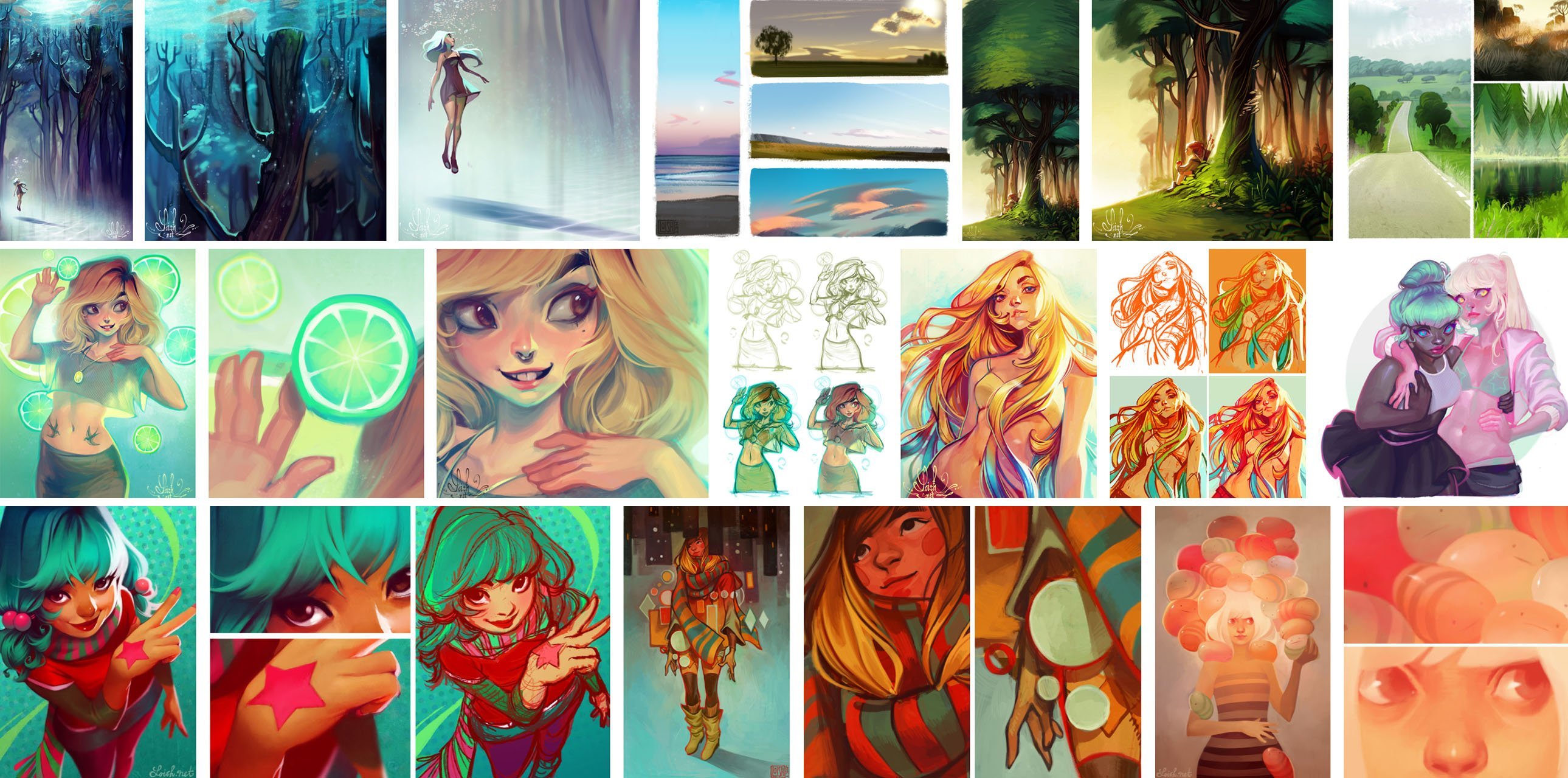
Featured Artwork Courtesy of Lois van Baarle
Tips & Tricks for Concept Art Portfolios
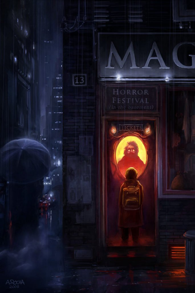
Artwork Courtesy of Andreas Rocha
-
Focus on your best work
One of the most foolproof ways to manage a portfolio is to focus on that area which you know best and are completely adept at. In other words, what we mean is, the first and primary section that you display should be your strongest point.
This is quite a significant factor that we often miss out on. This is because we often think of impressing the viewer first with what we think they’ll like the most, instead of proudly showing off our best works.
So, what you could do is start emphasizing a very personal and individual statement right from the beginning. So even while selecting a theme or designing your own, emphasize your work on the homepage. This way, visitors could browse through your folio quickly and understand what you are best at.
Make a small gallery of your best works on the homepage for all to look through. This saves everyone’s time, which is obviously what your recruiter would expect you to follow.
-
Use a clean, straightforward pattern
A pattern or design that is uncomplicated to study and analyze holds a definite charm to itself. Also, when you’re an artist, you should ditch out on too many words and let your art do all the talking for themselves.
Try keeping a very clean, uncluttered, and simple approach to your portfolio. Concentrate on making your artworks the focal point in your folio (as they obviously should be), and cut back on all the extra bit that may hamper navigation.
If you think about it, you’ll see that there are only 3 main things that would serve the entire purpose of introducing your artwork to the world:
- Your contact page
- About the artist
- The entire portfolio gallery
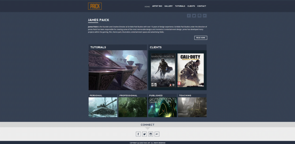
For example, James Paick’s portfolio is created in such a way that you’d be able to find every page in the top navigation with high contrast links. The content could be skimmed through quickly, and it’s pretty easy to locate all the important works and details on the layout. Some of the links even come with dropdown menus for other sub-pages, and the gallery page is divided into categories of different works.
However, by this, we don’t mean that you should have a bland and boring folio design, as that could be a different kind of problem altogether and people might think you’re not serious about your portfolio at all. A balance between functionality and aesthetic appeal is what you should aim for.
-
A simple navigation is a winning point
A basic portfolio site might consist of 2-5 pages. You could place these links near the top and leave them there without any hassle.
However, some portfolios might require dropdown menus for sub-pages, categories, and links so that one could navigate further and get to know the artist and his ways better.
Many artists also run their own blogs, which may consist of links for tags and categories. It is absolutely okay to add a lot of pages or links to your site, as long as you keep top navigation uncluttered and simple to move around.
Also, if you have many pages, for example, 10-12 pages, it probably won’t be possible for you to link each one of those right from the top. In such cases, creating dropdown menus could work really well.
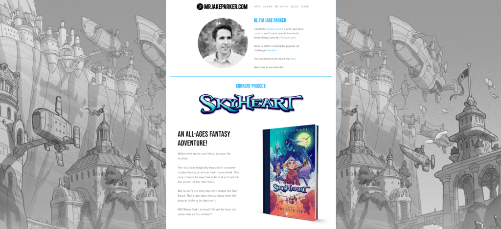
Again, to give you an example: Jake Parker’s website is amazingly done with a brilliant layout for web copy, basic links, and clean dropdown menus. You get an idea of how beautifully simple it is made to be even if you just skim through the layout real quick.
And this is exactly what you should aim for while creating the pathways around your website. Always remember that it’s meant for the convenience of all the viewers of your profile. If you aren’t designing all that much, then take your time deciding on what kind of theme would be ideal for your website.
-
Adding a personal touch
The key to making a good impression through your portfolio is to put a good bit of yourself out there with ease and confidence. This establishes a personal and friendly connection between you and all of your viewers, providing them with a place where they could confidently and freely communicate with the artist and get to know them better.
Be willing to add a bit about yourself, your inspiration(s) behind your art, your story or education, or whatever it is that you’re comfortable sharing with your viewers. This will also give them a scope to understand that you’re an authentic and honest artist.
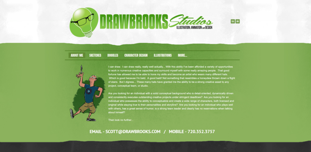
The portfolio site of Scott Brooks stands to be a good example of how one should put in a personal touch to their website. You could see that the tone, color, and layout are coordinated and balanced perfectly with the adorable nature of the content. This provides a single unified, coherent structure that’s charming and attractive for all who want to look around a bit.
Treat your portfolio site as your sweet little online residence where on feels invited and gets to know a little more about you, your tastes, what you’re good at, and all of your best works. This way, they could potentially find ways to approach you for job inquiries.
-
Launching a custom domain
This is a significant point to keep in mind while creating an online portfolio site. Owning a domain name could transform the entire appeal of your website. The website domain could be whatever you choose, the .com or other TLD.
When you buy a domain, then that requires to be hosted by a web server hosting company such as HostGator or Bluehost. The total expense that you incur for the domain plus for the hosting site could amount up to around $150 per year for a simple and basic portfolio.
One thing that you should avoid doing is building your portfolio on free services such as Tumblr or Blogger. These are way more difficult to customize and, in all honesty, their URLs don’t really look all that professional.
Launching your site under your own domain could be a pretty challenging feat to achieve, no matter how easy it looks initially. You can get numerous free WordPress setup guides that teach you how to install the platform on any server environment correctly. And, once you purchase the domain and hosting you’ll come across several how-to guides on the FAQ page of the web host.
Also, many theme markets such as ThemeForest offer a ton of portfolio themes which you could buy for around $20-$50. These can be installed easily and without much hassle.
You could set up a portfolio website in a day if you follow some basic tutorials that are easily available online. And once you get it done right then, you could just let it be there to do all the further work for you. You could remove or add any old piece or change any text from it easily by using WordPress.
The benefits of owning and using a domain are immense. And fortunately enough as WordPress is free, it helps you to edit easily and with a cleaner layout than what is offered by most other free services.
-
Spell-checking, formatting, and briefing
This is one of the fundamental things that you’re required to keep in mind at all times. No matter what design, pattern, layout, approach or text you go for, you will have to make sure it is laid out in the correct format and is absolutely free of spelling or grammatical errors.
We know that this might sound like the most obvious thing ever. But, you’d be amazed to know how many people royally mess this part up unknowingly and then face scathing criticism at interviews.
A correct format and error-free layout that contains all your works, info, contact number and every other vital thing not only makes it easier for others to reach you, but it also reflects a sincere, clean and professional approach towards your work that is admirable for anyone.
It is always advisable for you to do a thorough proofread and check for spelling and/or grammatical errors before you get your portfolio out there for the world to see.
Beyond that, even after all the checks have been made, the clarity and conceptual values of the words chosen must be check, re-checked and checked once more, imagine you have to use just three words to describe somehow the work of an art project that took three months, or even better three years, we cannot use words randomly right?
The legendary work of Lois Van Baarle is presented in just a couple of words, more often than not, in one word, on her portfolio website. Cast a glance over this legendary talent, what do you think?

Although, it is not really difficult to rectify a mistake even if you have already set your website up, but it is always commendable to make a sincere effort of rectifying your mistakes before someone else has to point it out to you. This makes for a good impression and image.
You could use many proofreader websites to get the job done, or you could simply ask someone else to do it for you, an extra site of eyes is priceless, especially if they have the same background as you do!
Finally, make your approach a short and sweet one while communicating about your work to others through your online portfolio. It should not take much time to go through your work. Make it crisp, short, and to the point. A witty or humorous take could work wonders. But DO NOT go overboard with it. Also, avoid using vulgar or profane language at all costs even if you mean it in a light-hearted tone.
-
Your portfolio should fit the kind of work you’re looking for
When you’re applying for a certain opening, do make sure that your work is relevant to it to and fits the criteria. For instance, if you want to work on a specific team, say: a story team, you’d be required to present your storyboards in your portfolio. Portfolios should, in fact, consist majorly of storyboards as these prove your authenticity, prowess, and caliber in the field.
Your portfolio should, by all means, contain those works you’re most confident of and not anything that is irrelevant to the subject. So if you are looking to apply as a character designer, do not clutter your portfolio with tons of logo designs or doodles. You should have sufficient specimens of character art that you have created in your portfolio.
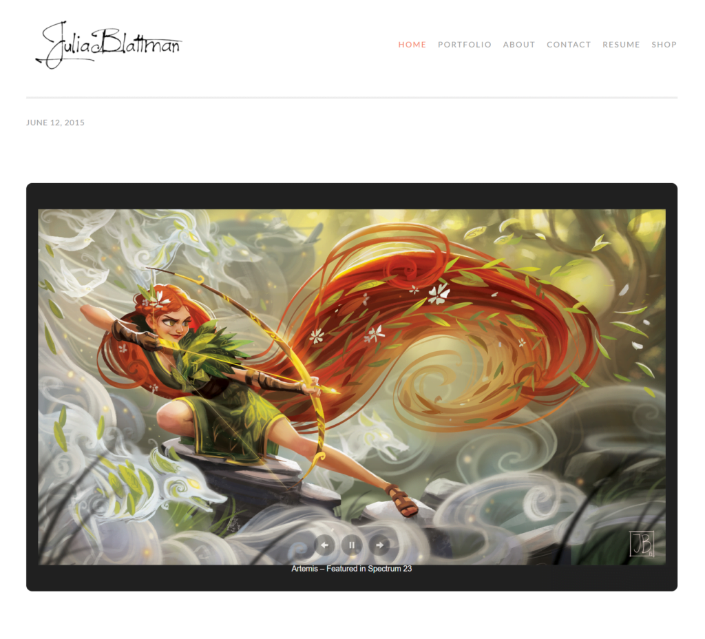
Cast a glance over Julia's portfolio here and you will notice from in a glance, just from the slideshow what sort of illustrations fuel her, her art is out of this world, insanely beautiful whilst maintaining the artistic signature of the extraordinary mind behind it.
Never submit work that does not pertain to the subject, in the hope of getting lucky with an opportunity. This sort of mindset is not only insincere but also deceitful to an extent.
Be patient with creating a good portfolio, customize it well, and go for that opening with confidence. This will save everyone’s time as well as make a good first impression for you, always.
-
Editing | Cutting out on all the extras
As we have already mentioned, a simple, organized, and uncomplicated layout will fetch you greater points than a messy one. Knowing what to chop out is an important factor when it comes to making a concept art portfolio. It can be really tough to decide and select amongst your best and favorite works, but that’s a tough call you’d eventually have to make anyway.
A minimal layout that consists of only the very best of your works would stand out in a crowd that is trying too hard to impress and get noticed.
Editing and customizing your website will take time and sound knowledge of how to develop a professional approach if you’re applying for a job.
Avoid crowding and cramming the pages with art and images. And, do not use too much page, to begin with. If you think you do not have enough work to showcase, then go for a smaller portfolio.
The point over here is to project more, describe elaborately, and make a strong impression with less. More often than not, it makes for a very confident approach that speaks of your knowledge and grasp over your field of work.
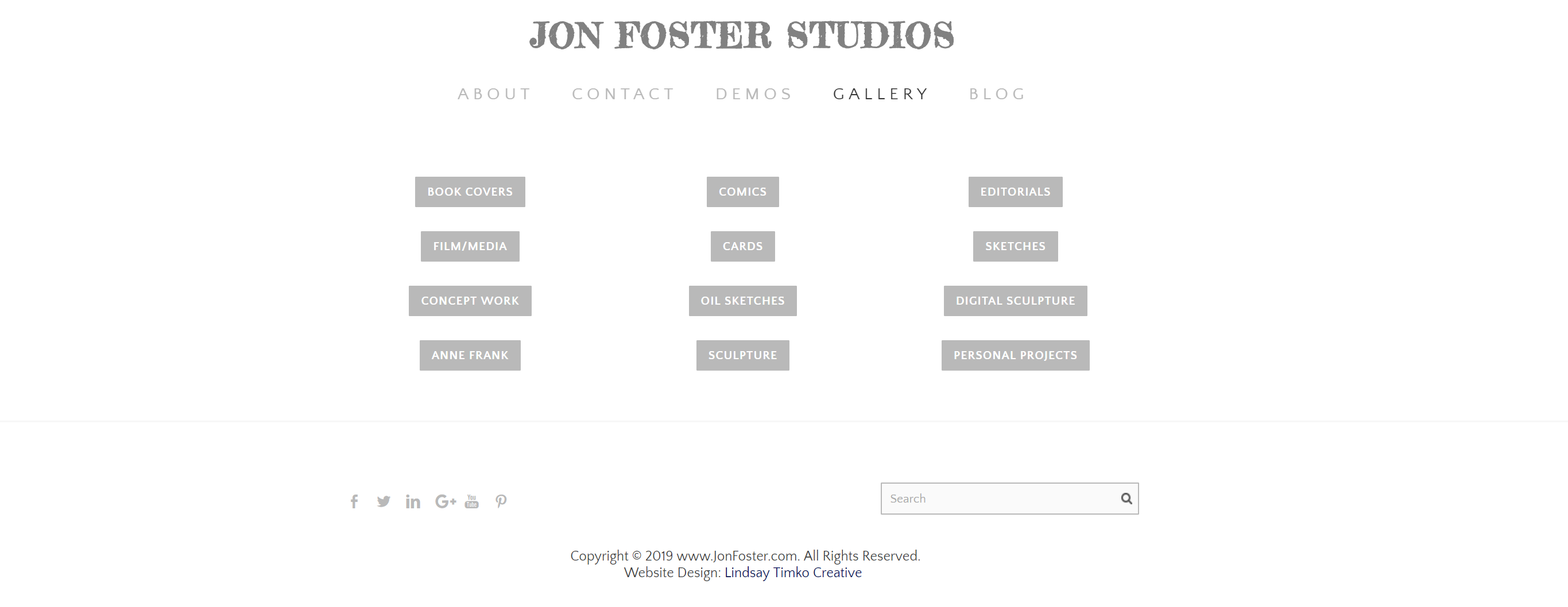
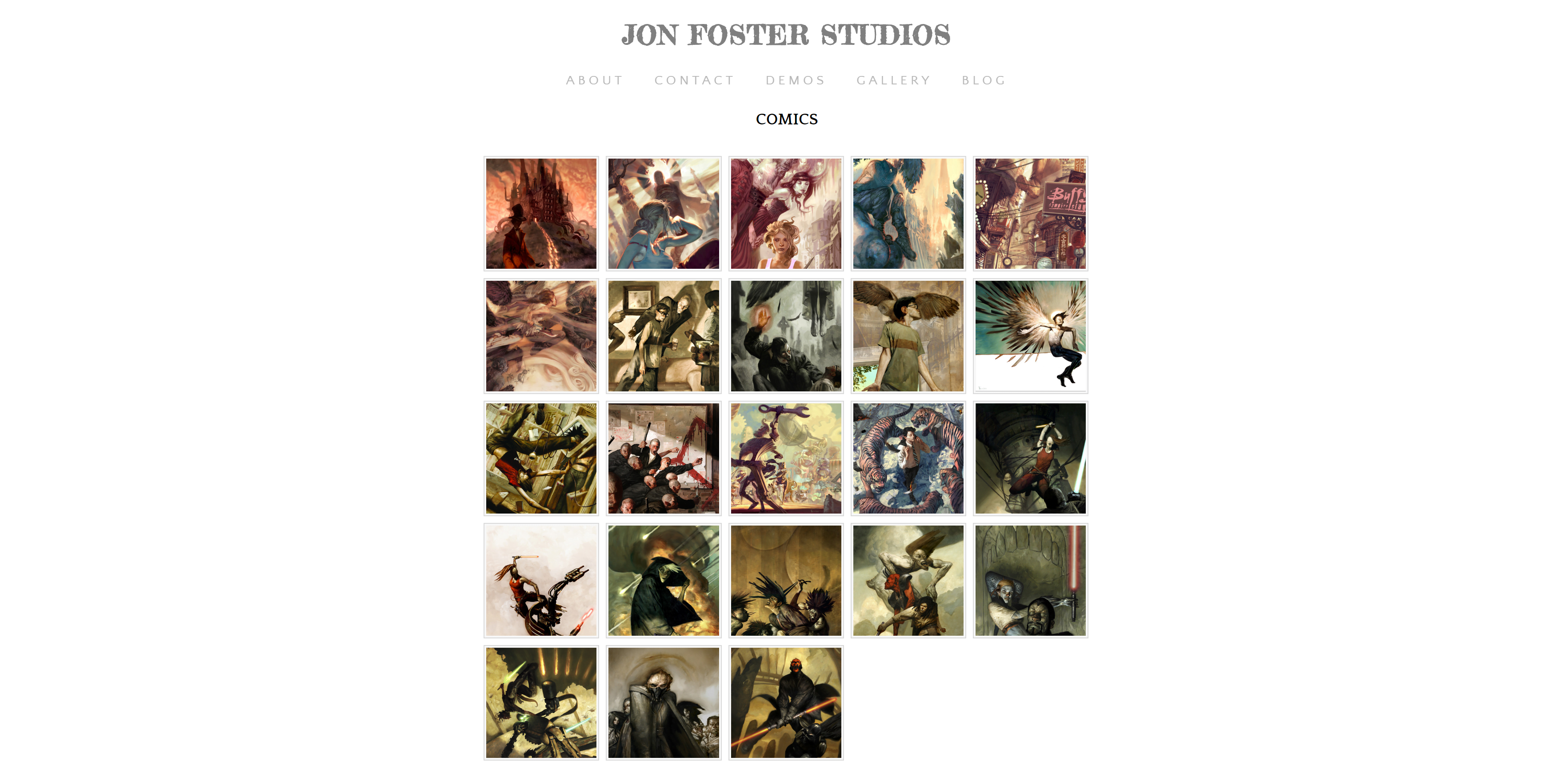
Jon Foster's portfolio showcases this brilliantly, no clutter, no hesitation, in the homepage you have absolutely everything that one might need in an extraordinarily neat format, naturally populated with jaw-dropping artwork!
-
Always remain very professional in your approach
Well, it might sound that we’re messing with your natural flow of creating or customizing your own profile and portfolio, but maintaining a formal, crisp approach to a certain degree might just help you get through to a desirable job prospect easily.
A professional approach and layout will help you get easily noticed by recruiters who might wanna stop by your website and have a look around if any of your works catches their eye.
And if you’re gearing up for a job interview which will require for you to showcase your work, then it will save you a lot of time if you already have a formal portfolio ready at hand.
Also, if you want to create something that could be used for both formal and informal purposes alike, then you could make separate categories and divisions within the same layout which you could display according to the requirement. This could work quite well for those who want to keep all of their favorite works on a single portfolio , again, do not crowd all your artworks in one.
Maintaining a formal attitude and approach in your portfolio, especially if you want to land a professional project, could get you a step closer in that very direction.
However, if you’re not keen on settling for anything professional as such, then you can go right ahead and create your portfolio however you like and stun the world with your talent!
-
Be very straightforward with your intent
At times, it so happens that some may lose sight of what they’re actually looking for, out of sheer desperation or urgent need of anything to hold on to. Wow! That was way too intense for life in general. Wasn’t it? But the same applies for even your portfolios as well.
At times you might feel like adding or writing too much information about yourself for grabbing attention or impressing the recruiter. However, this might do just the opposite of what you expect.
Always have a very sharp, straightforward, and honest approach in communicating your requirements and intent. Confidence is key in this regard.
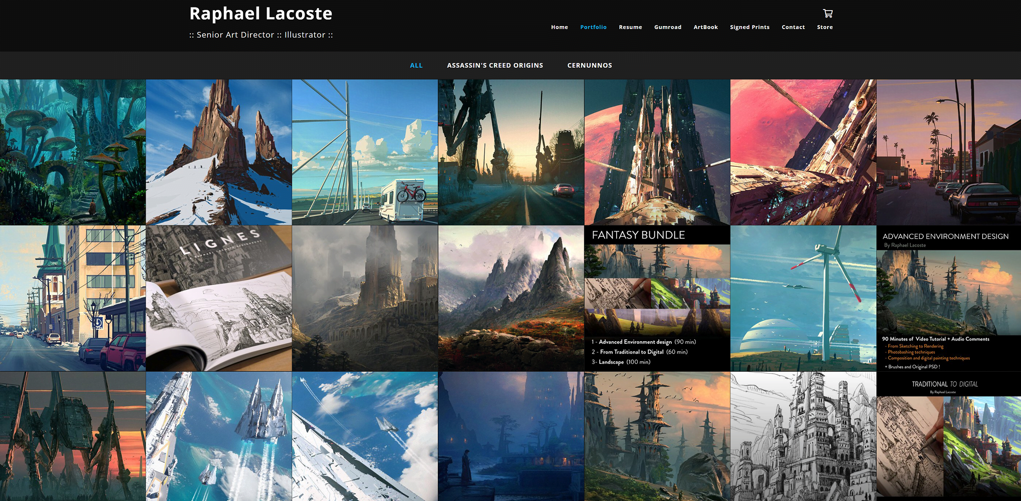
Always remember that an lack of confidence or a desperate attitude is easily discernible by interviewers and recruiters, and that is far from being attractive or impressive or even trustworthy.
Keep your portfolios easy and simple. Explain well and confidently and leave the rest up to the artwork in your portfolio, just like Raphael Lacoste's portfolio above, the artwork and the two simple titles he proudly displays white on black are sufficient. Who can contest the phenomenal conceptual art of this Senior Art Director and Illustrator?
Conclusion
So this was it for all that you should know and remember about making concept art portfolios. It could be challenging initially to understand how to go about it, but with patience and a bit of online research on the topic, you’d end up with fantastic results!
We hope you liked our effort as much as we loved making it for you!
Thanks for giving it a read!
Related Articles
53 Best Medibang & FireAlpaca Brushes & Textures For Digital Artists
25 Best Free GIMP Brushes for Drawing & Painting Digitally
20 Free FireAlpaca Brushes for Digital Painting & Drawing
21 Best Manga Studio & Clip Studio Paint Brushes [Free Download]
Best Free Aseprite Tutorials For Pixel Artists & Game Designers
21 Best Paint Tool SAI Brushes and Textures
Speed Paintings 101 |What It Is, Tips, Tricks, Tools & Video Tutorials
54 Best Photoshop Brushes | Best Drawing & Painting Brush Packs
80 Best Procreate Brushes for the Realm [Free & Premium Brush Sets]
14 Amazing Free Krita Brushes and Brush Packs for Digital Art
11 Best Color Theory Books for Artists Everywhere
13 Websites With Copyright and Royalty Free Art to Consider
Types of Digital Art Right Now Explained
25 Best Concept Art Books for Artists Everywhere
8 Best Cartooning Books For Artists Today
5 Types of Concept Art to Consider Today
51 Enigmatic Forest Concept Art That Will Amaze You
67 Surreal Castle Concept Art Depictions to Surge Inspiration From
16 Best Pixel Art Programs and Software | All OS
77 Epic Knight Concept Art To Inspire You

