What is the most common way to know the areas in which technology is applicable? Well, you take advantage of that technology and look for areas in which such advantages are needed. And you will at least get one area where that technology is applicable. So, here in this article, we are going to be talking about 3D printing and some useful ideas from that technology. And how this technology is applicable to your home or anyone else’s because of the many benefits that associate with anybody’s home very easily.
Starting with the advantage that this technology has which is faster production. This a very relevant benefit, because most of the time when we want a product for our home, is when we are not willing to wait much for that product, we just want it urgently. Also, because most of the time some products are only needed while we are doing repair work on some older product that was bought at our place, like say a wall clock or a pen stand or a key stand. All of the above mentioned products can be 3D made.
The other advantage of this technology is that it is easily accessible. You can sit at your home, and look for designs that are good ones for the product that you are willing to buy. Take the design file of that product and upload it on websites to see pricing and compare them. You do not need to step out of your place to buy your favorite designed product.
What else would you need in times like these?
Think of any manufacturing traditional service, say, for example, the service with which you would have bought home a pen stand. Would you be able to have the same sort of accessibility with that technology as you do in 3D printing? So, you get it that 3D printing has overall very many inherent benefits if the products made out of the technology are used in this area of application. In this article, we will be showing you just a few of those ideas.
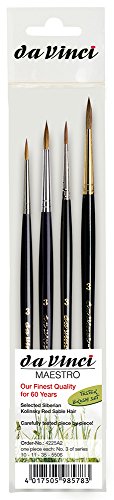
Featured Image Source: pinshape.com
Useful 3D Printed Ideas
Lamp
LoboCNC which is the website name of Jeff Kerr on the Thingiverse website has designed a lamp that he has named Crinkle Lamp because the surface of this Lamp contains some wrinkles, and it's not smooth. About himself, LoboCNC says he designs and builds 3D printers, way too many printers, he thinks he might have a problem. LoboCNC has 143 designs, 7 collections, and 2 makes registered on Thingiverse and a huge following of 10303 people. His location shows Bellingham, WA, and his display pic shows a Guitar.
Clock
Another designer that is known on the Thingiverse website by the name NEMOR has designed a clock which is called R4. With 17 designs to his or her name, we weren’t able to read NEMOR's description because we do not know how to read the Chinese language. NEMOR is a designer, maker, and professional with an advanced skill base. This clock is made on ATOM 2 3D printer, wherein according to the designer the rafts do not matter in this print. The resolution is 0.2mm and the infill percentage is 10 percent. The filament brand used by the designer is Spidermaker, the material is PLA and the filament color used is Gray or Red. The print time taken to print this design is 10 hours if you wish to get 0.2 mm resolution and you require good quality filament. He or She is based in Taiwan, Taipei.
Light Switch
Patrick Immel has made this extremely technical geared light switch cover which is his first print. The designer has one design to his name on the website Thingiverse. He claims to be a professor of Scenic and lighting design at Northwest Missouri State University. In the summary part, Mr. Immel claims this to be his first print made with his new Ender 3 Duet wifi combo. Ender 3 is the 3D printer by the brand Creality.
If you are a person who has a technical background or loves making things complicated rather than simple switching or say maybe Inception, you will like the care taken by the designer in minute regions for this switch. Because it's very unique in the ways it's geared, so essentially one thing is going to lead to the other, and in the end, after all those things lead to each other, there is going to be the triggering of the switch.
Paper Towel Holder
SpaceMonkey42 is a designer in the USA who has 45 designs registered on the Thingiverse website. The designer claims to enjoy designing, making, and printing 3D objects. There are hardly any people who do not know the Super Mario Brothers game and there are even lesser people who knew it but didn’t like to play it or even do. For all of you out there, you of course remember when a stage was completed in that game, you had to jump from a block of bricks arranged over each other to grab the flag’s top, and the faster, the flight you took, you were able to reach at the top like the rules of Classical Physics.
What makes me talk about Super Mario brothers and that specific point in the game is that the designer seems to be too fond of that phase. And he or she is so much fond of it that he or she has actually implemented that vision into reality as a paper towel holder and a napkin.
Plant Stand
If you love to have plants at your desk, this is probably the most innovative one you are going to know about. A plant stand that can water itself at regular intervals! It's available on the Thingiverse website, the design is made by a designer named Parallel Goods. Printed in material PLA, the design has a layer height of 0.3 mm and an infill of 10 percent. You can even print this design without support structures. If there is a single idea that we were to promote from our website, it would have to be this one. This two-part design is sophisticated and tactile, and it prevents neglect of your household plants. It’s a positive win-win scenario!
Pen or Pencil Holder
It’s unique in its shape. One of the advantages that we didn’t mention at the start of the introduction but 3D printing has is the customization thing. You can find this design on Cults, made by 3D designer Bee Very Creative. Check this out and you will love it.
Headphone Stand
As we were talking about customization is something that 3D printing offers. How about a headset stand like no other? What this essentially means is that you would no longer have to get irritated by the wires getting cluttered. This designer Makerbot at Thingiverse has got you the correct product. Do check it out.
Flower Wall Mount
During the 3D design of this 3D print, the designer recommends no rafts. But you will need support structures and a resolution of 0.2 mm with an infill of 10 percent. Uploaded by a designer named 3DPVDB on Thingiverse, these flower wall mounts will be a very suitable thing to hang over your wall, out in the open, or in your home. Just imagine, whatever the weather is outside your window, these wall-mounted flower pots will always brighten up your home! They will tend to your plants by pouring water through a cloud, which then diffuses the water into raindrops. These easy DIY room decor ideas should be filed away for a rainy day, perhaps?
Letter Board
Augustin Flowalistik has uploaded his design of the letter board on the Thingiverse website where you can compose messages at times when you are not speaking with each other. If you are a husband and wife, undergoing a fight, this can be a superb way of communication between you two. If you are a room partner of some other person, who has job timings different than yours, use this letter board to convey to him or her about the plans for the weekend or lack of vegetables in the home or a habit of his or her you don’t like.
This is a fully 3D-printed letter board, which can be used to fulfill many purposes. On one hand, you can compose messages using a set of 3D-printed letters and numbers. On the other you can also include it in this room decor idea is a set of 3 standard photo sizes, so you can make smaller letter boards using photo frames instead of 3D printing one from scratch.
Key Holder
Let’s just face the fact that you do not find your keys because you do not keep them in the same place always. Get this keyholder from the Cults website made by Maker_at_Heart designer. And we do not wish to inform you of the benefits of having a key holder.
It’s not just a simple key holder, but there is also a shelf included in it which can be the solution to avoid losing small objects after cleaning your pockets. According to the designer you can even use it to hang up clothes. The two-piece of these keyholder designs offers a stylish way of displaying your must-haves once leaving the house, as well. Please note the fact that it can be mounted by using the two M6 holes, or just by applying some mounting tape.
Photo Frame
Tosh is the name of the designer who posted this design on the Thingiverse website. The design is not just minimal, but also easy to mount on the wall. By using this photo frame you can make your photos and postcards spring to life. The photo frame has a minimal design, is simple to mount to the wall, and easily prints in an hour or less. You could make a whole bunch in an afternoon for a quick interior refresh.
Trophy
Unicorns are something that you wanted to see, or someone around you is a fan of? Gift him or her or yourself this Unicorn head-shaped Trophy that is posted on the Thingiverse website by Thomas Voillaume. Sooner or later, the possibility always existed of a low-poly design was going to rear its head on this list of DIY room decor ideas. So, what is better to have than a Unicorn trophy? If nothing at all, it is way cooler than a moth-eaten stuffed moose’s head, that’s for sure. Yeah?
Boxes
Look around you, home is always a mess, distributing and keeping things arranged into a box and making it more worth living. These boxes posted on Thingiverse by Andrew Askedall are very very appropriate. These boxes are not only a cool thing to 3D print, but they are also useful. They are great for keeping little knick-knacks. Something really smart about these boxes is the design of how the drawers are stackable in any number of configurations, amounting to a veritable Tetris of storage solutions.
You can use them for keeping organizing little sheets of paper, one of every genre into it. And that’s how you can land up every time exactly at the paper you wish to see, and not waste much of your time. Do check them out if you have in mind an idea to arrange your home and its stuff.
Conclusion
So, as you will see after reading this article, all the things that are written about are such that they are customized. And that is something that is the real benefit of 3D printing. You can customize it, however, you like it. And home is the place wherein you like to get in things that are more customized. Things that people would not get to see anywhere else. So they are perfect because there might not be any other like them anywhere around you. Their customization is their first benefit, their flexibility is the other. They are useful, they are attractive. Above all, they are technically advanced because they aren’t manufactured with any traditional manufacturing methods, but with 3D printing technology.
Digital painting is a medium that helps you create some amazing artwork, by painting directly onto your desktop or tablet. You do require the same set of techniques and skills just like our traditional painting.
When you are painting on the computer, it is less messy as you do not require oils or inks like a traditional painting. It gives the liberty to be creative and work on a small space while using different digital tools. Painting on the computer is a lot faster as you do not need to wait for the paint to dry.
This tutorial will help you learn about digital painting, there are many digital artists who have solely gained their skills by watching others and different tutorials on YouTube. Even if you are new to digital painting or you want to enhance your existing set of skills, then watching this tutorial will be beneficial.
The different tutorials presented below are free of cost, but you can also choose to go for the premium classes later which come with a price tag. It is important to have a working knowledge of the fundamentals of painting like lighting, perspective, and form, which will assist you to make the most out of this tutorial.
So without further ado, let’s get into our tutorials!
Everyone starts learning something new as a beginner. Do not worry if you lack knowledge about the use of different painting programs or if you don’t possess any of the equipment. The tutorial will help you get the basic knowledge of the painting software and the way different tools are used.
The fundamentals of both drawing and painting can be learned as you get your software, and hardware, along with a basic understanding of your tools.
1. Beginners guide to becoming a digital artist
The ability to produce some great work and become an artist requires a lot of hard work. Having the right workflow can make the process of learning digital art easier to a certain extent. This guide also provides you with tips to improve your artistic skills and suggests different features of the software and equipment that are required for a beginning digital artist.
2. Introduction to painting on Photoshop
This guide introduces the different Photoshop brushes and the way it is used. It helps you to understand how to get the same look on Photoshop, that you could get with an actual painting brush.
The videos are brief and simple enough to help a beginner understand the tips and tricks of digital painting.
3. A crash course on using color
This video helps you to understand the usage of color tools in Photoshop. If you are new to using Photoshop then this will help you understand the mixing of colors and teach you to work with colors in general.
4. 10 guidelines for beginner digital artists
The list of tips helps you to develop a sense of confidence, makes you comfortable, and helps you enjoy the process of learning digital painting. The guide helps you develop different ways to master the art of painting and to bring about an improvement in your workflow.
It has been created for beginners, but it can also be of benefit to experienced artists.
5. Digital tutorial and basic tricks
This tutorial helps to understand the fundamentals of Photoshop which helps you learn about color, smudging, and blending tricks. To get started on using these tips and tricks you will preferably need a tablet as you get started, while for complex painting you will require a display tablet. However, the regular display tablet will also help you do the work in an effective way.
6. Simple methods of digital painting for beginners
Want to quickly learn about painting?
This tutorial shows you a quick coloring method to make new forms before you even start shading by just using some flat colors and a big brush. Once the composition and the color have been figured out, it shows you how to start blending. It also shows you the different keyboard shortcuts that you can use for selecting the colors. Overall the tutorial gives a good lesson on painting for any new digital painter.
7. Basics of digital art
This video looks like a demo rather than a tutorial; you can see the artist giving an explanation across the video about how the work is being done and the tools being used. It is an interesting watch, as you get to see how the character is taking a form. The tutorial starts only after three minutes, while the maximum part of the video is centered around a discussion on digital art.
8. Methods for basic rendering
This video will help teach you some basic techniques of rendering in Photoshop, which is simple for you to learn. Watch this video to completely understand the outlining, and sketching and eventually, you will be learning to paint an entire design. It also highlights the different tools that can be used to render artwork and for drawing.
9. Portrait painting beginners' guide
There is no need for you to feel scared if you have not made a digital portrait. Watch this video to help you get through the entire process of making a digital portrait right from scratch. It focuses on helping you learn about creating a basic sketch for enhancing the final details.
This tutorial is not a complete guide to creating portraits, but it gives you a lesson on painting with exercises on making portraits. While you also need to understand that the process of making portraits involves tracing which is the practice of painting and not drawing.
10. Opacity vs Flow
It is important to know the difference between opacity and flow in the brush tool, as they are one of the most commonly used tools in Photoshop. This video shows you how these two variables (opacity and flow) can be played by using the same brush to create different effects. It also helps you to understand how to swap between these two variations while using a brush.
11. Illustration in Photoshop
Watch this tutorial by Aaron Blaise who is a veteran Disney artist. It will help you to understand navigation, the different tools, menu items, layers, and shading. If you are getting started in Photoshop or illustration then this video will be helpful in focusing on the basics, as it gives a thorough description.
12. Coloring Over Line Drawings
Learning to paint digitally will require a lot of time and practice. But if you have already made a line drawing then it will be helpful for you. You will be able to understand how not to lose your lines while painting over a sketch. This video will be exciting to watch if you have been trying to learn how to pick up different ideas for using color. It will also help you to learn about shading, color, and lighting.
13. Paintings Tricks and Tips- Narrated
Are you looking for a fast-track version of a complete digital painting?
This video has been covered with a full narration that will help you enhance your knowledge of digital painting. The artist has created different forms of painting. The video shows how to use a common technique that starts with using flat gray and then how you can continue to add shadows. To get the same results you need to follow the technique that is shown in the tutorial.
14. Tips for Landscape Painting
Concept and Digital art put a large focus on landscapes. It is an indispensable factor of game design while also being a popular choice in illustration, animation, and even in general fan art. By watching this video you’ll be able to learn from scratch on the fundamentals of painting beautiful landscapes.
The video focuses on teaching you to use bigger brushes; to help you cover a larger surface area. It also shows you how to blend the different areas together to make the landscape appear realistic. Overall the tutorial will help you to quickly create landscapes.
15. Painting Basic Foliage
Watch this tutorial to understand how you don’t need to draw every single leaf to create foliage and leaves on trees. It is quite common for people to make this mistake. The artist also demonstrates the functions of different colors and brushes while painting foliage.
This video will be of good learning if landscapes are what you’re working with or if you want to practice a few digital still-life paintings.
16. Basics for Blending
Blending is a type of art that will take anyone a good amount of time to master. Watch this video to learn how to get started with learning this art. You’ll be able to understand how to select different colors and ways to blend them smoothly based on the piece you are trying to create.
On watching this video you’ll be able to learn how to create some good effects on a drawing tablet with different types of pressure and brushes.
17. How To Blend Colors
This video provides you with a detailed outlook on the different types of Photoshop brushes, their functions, and how they can be adjusted.
In particular, you’ll be learning about the types of adjustments and brushes that go well in creating portraits. At the same time, you will understand how changing the textures can help to change the effects created by the brushes. The video also focuses on helping you learn to smoothly blend different colors by using brushes, or you can keep your work painterly and rough. Whichever is preferred by you!
18. How To Color Fast & Easy
From this video, you’ll be able to learn how to select the colors for the base, shadow, and highlights. It will help you to understand the simple tricks that will prevent you from coloring over the lines, without spoiling the original sketch.
The artist in the video will show you the following:
How larger areas can be filled quickly?
How transparency can be used to work faster?
How your layers can be kept organized?
How shading and highlighting of larger areas can be done quickly?
19. Clean Brushwork
Have you been wondering how to make clean brushwork?
Watch this video to understand how to avoid getting visible brushstrokes in your work, and to have a smooth coverage instead.
Having painterly and rough strokes is completely fine if that’s the look you’re going for!
Watching this video even once will help you get a hold of how the different tools in Photoshop work and their location. It is definitely a good watch, as the artist shows you how to paint a character’s face.
By watching this demonstration you will gain an understanding and practice of the art of shading and coloring in Photoshop. It also mentions a few fundamental topics on color theory for art, with a detailed description.
Intermediate Digital Painting Tutorials
Once you’re aware of the basics of digital painting, then you can climb up the ladder by watching these intermediate demonstrations and video tutorials. However, even beginners can watch these videos to learn a few tricks; along the way, it might get a little difficult to follow when you’re a novice to digital painting.
21. Rock Painting Tutorial
If you’re drawing landscapes as an artist, then rocks are something that you’ll have to paint quite often. It might appear simple but they are surprisingly difficult to complete. This tutorial will help you learn about the different ways to sketch, shade, and color rocks while you’re doing digital painting. You can watch this video several times to get a grip on these skills.
22. Stylized Portrait
This tutorial on making stylized portraits provides you with some great tips on creating the right skin tone.
Watch this tutorial to learn the following tricks:
Picking the right colors for different skin tones.
Creating a balance between warm and cool colors.
The use of different brushes and pressure to get the desired effects.
Use of minimal colors in portraits to create dramatic lighting.
23. Elephant Digital Painting
Watch this thorough intermediate-level video tutorial by Aaron Blaise a Disney Animator. Aaron uses images for reference which acts as an inspiration for creating the original drawing.
You’ll be able to understand the different techniques which can be used in Photoshop to improve your vision of art, while the same cannot be learned through physical tools. This video demonstrates how you can keep the sketches organized as you’re figuring out what you’re going to draw and the ways to get it done. It also helps you learn about the rendering and texturing details to get work done like a professional.
24. Painting Skin Tones
Want to learn different tricks for improving your ways to get the right texture and skin tone?
In this tutorial, the artist shows you the entire process by starting with a mid-tone background and even how to adjust for transparency. Even while you’re not using regular skin tones, it’s essential for you to select the right colors for any animal or human that you’re painting. You’ll also understand how to select the right color for highlight and shading purposes.
25. How I Make A Landscape
This video is of genuine value to different artists, even though it does not follow a step-by-step guide. It is a speed-paint video of an artist painting a landscape with captions explaining the entire process. While this is a demonstration and not a video but by paying close attention you will get to learn new shortcuts and tricks.
26. Painting Snow
The rendering details for creating snow can get unsurprisingly tricky as the texture varies depending on the basic of lighting, the surface underneath the snow, and several other factors.
Watch this video to get a clearer understanding of painting various types of snow with different colors and textures. The video is not too long, and it’s a must-watch if you’re trying to create winter scenery.
27. Paint Hair & Fur
The fur is far more difficult to paint than the skin, but once the tricks are learned you’ll not forget them easily. Watching this video will help you understand how light and shadow can be handled while you’re drawing hair and fur. You’ll also learn how to select your brushes and the ways to get the desired effects by using them.
28. Thumbnail Painting Process
Several artists like to first start by creating thumbnail drawings and then begin with their main piece. As it helps to get a clear picture of the composition and the color choices; to assist them in deciding on the final composition.
Watch this video to learn how creating thumbnails can help you understand what you prefer before you begin with your main painting. This process will be helpful for anyone who is getting into character design or concept art.
29. How to Paint Better Textures
This is a brilliant tutorial on painting textures that appear realistic on objects that are made of stone and wood. You’ll be able to learn how you can paint dents, cracks, divots on stone, and whatever you’re planning to paint with a lot of textures.
This tutorial will be helpful to learn how to work with several tools like the dropper tool, texture brushes and several other techniques for drawing simple textures on objects.
30. Value Sketching
The artist in this tutorial gives focus on quickly sketching a piece of landscape to show values. If you’re looking to bring about an improvement to your value studies then watch this fascinating tutorial.
It is important to get the darks and lights correctly in your drawings just as choosing the right colors. Value is an important skill for both traditional and digital artwork. So we advise you to watch this video!
31. Digital Sketching
This tutorial focuses more on demonstrating sketching rather than digital art. We recommend you watch this video as you will understand how an artist selects different tools and sets up their figures.
You’ll also be able to watch how a completed piece comes together for Photoshop users through various advanced workflows. This video is lengthy (two hours), but if watched closely then you can learn several little techniques or you can choose to follow along with another monitor.
32. Shading with Light & Form
This video will help you practice shading and understand its usage while designing different forms. The ability to create realistic forms that are highlighted on the screen is all about having the right lighting and shape.
33. Lost Edges
On your objects, you can have soft or hard edges, and this is the best part of digital painting. It is a lot simpler when this is done digitally, as CTRL +Z can help you re-try the brush strokes.
Watch this video to understand how you can avoid losing form while working with softer edges. It also teaches you different strategies that you can use for practice.
34. Rain Effect in Krita
This video demonstrates how you don’t need to draw every single droplet, and instead, you can quickly create rain effects on a completely new layer. The artist is using Krita in this tutorial. However, in Photoshop and other programs of digital painting, the techniques of Krita do translate well. If you like using Krita, and you’re getting into painting then it’s better to master this software.
35. Monster Cutie
Watch this tutorial if you’re an aspiring creature designer, and we also recommend this video if you’re a digital painter looking out for a few real-world exercises. It demonstrates how you can create a monster from scratch and the complete process to design the whole concept. It’s an hour-long video but you will be able to learn to create a full creature from start to finish.
Advanced Digital Painting Tutorials
It has been observed in many artists that as they gain confidence in their work, they sometimes feel that they’re lagging in their skill set. This shows that it’s about time for you to start pushing your limits and improving your skills.
As you watch these videos you’ll be able to understand how intricate tasks are performed by professional artists and you’ll get full-length tutorials that will help you learn design from scratch.
36. Design Creatures From Scratch
In this video, the artist demonstrates how various reference photos can be used to make new designs. This will show you the importance of inspiration for every artist which will help to create designs smartly.
With a creative spirit across each stroke and a few varieties of single-colored creatures, this tutorial will teach how your design phase can be planned and how creatures should be painted with a purpose.
37. Painting Lips
Do you want to learn about the techniques of drawing and painting lips?
Watch this tutorial to have a clear understanding of the same. The artist demonstrates the art of placement, coloring, shading, highlighting, and several more at various angles on different pairs of lips.
38. Knights of Baratheon
So this is a tutorial where the artist is creating everything freehand, there is no base sketch. Even though it is technically known as a tutorial, we advise you to watch it and enjoy the process first. Try to learn the most of it from the artist, and later you can follow along.
Try to observe the following:
How the colors are selected?
How the focus is being adjusted?
As this is an on-the-fly painting, how is the artist adjusting the focus directly on the view?
39. SAI Shading
Check out this tutorial, if you have heard about the Paint Tool SAI and you are not aware of how it works but have the desire to learn this tool. There is no narration, but you can follow it easily while working alongside the tutorial.
By watching this video, you will understand how you can shade your digital artwork just like a pro!
40. Painting The Eye
Eyes are an important feature in a portrait which can either make the design appear beautiful or it might destroy the look. There are tons of video tutorials on painting the eye on YouTube.
But watching this video will help you understand the details without wasting time. If you want to learn how a realistic eye with a spark of life can be painted quickly then do give this video a watch.
41. Painting Eyes
In this tutorial, you will learn how to draw eyes with great precision. It demonstrates how the importance of getting the placement right is similar to the rendering of the actual eyes. You’ll also be able to learn about proportion, composition, angles, coloring and every other detail that you should know about painting different types of eyes.
This video might seem like it’s covering a basic topic, but the advanced strategies learned here will help to take your digital work to greater heights.
42. Painting An Iris
You probably need to take a deeper dive into drawing ideas from life and paint it with realism. This is important to be followed even while practicing digital art.
This tutorial will help you learn about painting the eyes with more precision. You’ll not be painting an isolated iris quite often, but taking a close look at this tutorial will help you simplify the process.
43. WoW in Manga Studio 5
It is an end-to-end narrated demonstration of how a character from World of Warcraft has been digitally painted. You might be knowing that WoW concept artists are great professionals if you’re generally into game artbooks or concept art. This tutorial has followed the same style.
If you watch the video closely then you will learn a lot about how your initial concept can be sketched in Photoshop, then shading, coloring, and the details of rendering to create a masterpiece of concept art.
44. Stormy Sea Viking Ship
This is another end-to-end demonstration of a Viking Ship being painted on a rough and stormy sea. By watching this video you will see how this piece is being handled by the artist. You’ll learn more about perspective, texture, color, and creating wood and water textures.
In this tutorial, the artist has chosen to use a few extremely dramatic lightings, which eventually helps you learn a lot.
45. Line Art and Coloring
Watch this video if you have been wanting to learn to animation, but didn’t know where you can probably start. You’ll be able to see a concept being painted by a professional artist on YouTube.
It is a twelve-minute-long video, which is simple for anyone to follow. It starts with a messy sketch being created by the artist, which is then traced using solid dark lines, and then a few basic colors have been added. However, the result, in the end, has turned out to be perfect and cartoony for a new comic strip.
46. Live Illustration Demo
Watch this fun demonstration where the artist is in conversation with an interviewer, as the view is pulled back from the original screen. It’s exciting to watch how an artist works. It also helps you to learn several techniques and behaviors which can be implemented in your workflow.
This video is about 2 hours long, but the workflow is fun to watch and you’ll enjoy the narration.
47. Intro To Speed Painting
Anyone with an interest in painting digitally will be following speed painters on YouTube. Watching them work is definitely fun and the level of skill shown in these videos is crazy.
If you wish to pursue speed painting then we advise you to watch this video as it shows different strategies, tips, and shortcuts to quickly create a complete scene in about 30-60 minutes. It is obvious that speed painting is an advanced skill. But, this video will help you to get refined brushstrokes quickly and to come up with new concepts instantly.
48. Realistic Portrait-Bernie Sanders
Watch this video to see an artist painting a monochromatic portrait of Bernie Sanders with the use of lights and darks in a realistic way. The artist has put a lot of attention to blending and value for creating a realistic portrait, which was all digitally done in Corel Painter.
You can see the fine details of creating hair by using a liner brush, rendering of realistic skin, and the use of techniques of blurring to make the final result in this tutorial.
49. Clouds & Atmosphere Painting
The atmosphere is defined by the fog, smoke, clouds, and mist. All of them add to our landscapes with a strong sense of realism. Check out this video, if you want to create some life-like atmospheres.
The video is around 40 minutes long and shares plenty of practical techniques that can be used in your environmental work.
50. Advanced Photoshop Painting
There is always a lot to learn in Photoshop. This video teaches you how with a freehand you can add color details by using brushes. And it also shows you how layers can be used to color quickly. It has some good tips for lighting and helps you add an edge to your drawings.
51. Painting Water
There are different factors that need to be considered while painting water like translucency, reflections, color, and texture.
Painting water also depends on whether you’re trying to render a day scene or a night scene. There are also differences on the basis of location like a pond, beach, puddle, ocean, waterfall, smooth calm water, or rough choppy water, and the list can go on.
This video covers all these topics, so do give it a watch!
Conclusion
Watching these tutorials and different artists at work will improve your skills, give you a lot of ideas, and several tips that will be beneficial in helping you become a digital artist. It is not always important to follow along but by watching these videos you will definitely grow as an artist.
Understanding the importance of selecting the right retaining wall materials is key to constructing a durable and aesthetically pleasing structure or landscape. These materials not only offer essential lateral support to soil masses but also provide various additional benefits tailored to your specific needs.
As you embark on the journey to build a retaining wall, multiple factors such as purpose preferred aesthetic, and budget come into play when choosing the ideal material. To assist you in this process, our comprehensive guide features 11 distinct types of retaining wall materials worth considering, ensuring you make an informed choice that suits your requirements.
Before diving into the guide and exploring these diverse materials, let's briefly examine the functions of retaining walls, which will enhance your understanding of their significance in your outdoor space.
Functions Of A Retaining Wall
Preventing Erosion
The foremost and basic function of this wall is to offset the force of a slope through its design. This ensures that the soil on both sides of the wall is protected. In case of severe downhill erosion, the wall decreases the angle of the slope and holds back the soil.
Manage The Water Runoff
Having a retaining wall in your garden yard will ensure that the flow of rainwater slows down. Thus, it helps in maintaining optimum water flow which is essential for lawn care or gardening.
Provide Useful Land
Since ancient times, human beings have used the retaining wall technique to build terraces of useful land on sloppy regions. Such a wall can serve the same purpose, though on a smaller scale, helping you to create a small garden for your home.
Adds Style To Your Landscape
Last but not least, retaining walls can add a stylish element to the landscape, and thus, enhance its overall beauty. Different shapes, sizes, and colors of building materials are available for the purpose.
Enhance Acoustics
Retaining walls can also significantly contribute to your outdoor space's acoustic properties by serving as effective noise barriers. These walls create a more peaceful and comfortable living environment, reducing unwanted sounds from surrounding areas. To further improve your home's noise reduction capabilities, consider incorporating an array of soundproofing materials designed for maximum efficacy.
Types Of Retaining Wall Materials
Brick
Brick is among the most widely used materials for building all kinds of structures. The primary reasons behind its popularity are quite easy to spot. Firstly, it projects very inviting and warm vibes, which blend wonderfully with landscapes and traditional homes. Furthermore, along with looks, it possesses greater strength than many building materials.
Bricks can be used to make two different kinds of retaining walls, namely cavity walls and block core walls. A cavity wall is made entirely out of brick and consists of two standard walls inches apart and sharing the same foundation.
On the other hand, the block core wall is constructed out of CMU (concrete masonry unit) blocks. The blocks basically hold steel rods in the cells, which are filled with concrete. After this, brick is laid outside the structural blocks.
Benefits
Most importantly, bricks are not affected by the weather changes taking place from time to time. Be it an increase in moisture levels or the ravages caused due to flying debris, they remain more or less intact. Moreover, they require minimum maintenance and retain the wall color quite well, eliminating the hassle of painting it regularly.
Besides, they are made up of clay and shale, which are among the most eco-friendly and easily available materials out there. Bricks can also be reused in the construction of other similar structures such as walking paths.
Furthermore, they offer just the durability that people wish for, thanks to the installation methods which result in the building up of a solid structure.
Disadvantages
Although bricks are available in a range of colors, they offer limited variety in comparison with other materials. Also, being quite heavy, they require careful monitoring while making the wall a solid foundation. In terms of price, they are slightly costlier, and hence, fall in the upper price category.
Gabion
This is a centuries-old system of building walls, its name coming from the Italian word Gabbia which means cage. As the meaning suggests, gabion walls are indeed cages made of steel or wire rods and are filled with rubble or rocks.
These walls were built in several places during the times of the Civil War for protecting soldiers. And due to their ability to be combined with any recycled material, they have a loyal customer base amongst eco-conscious people across the globe. This has also been facilitated by the newer wire technologies and coatings, which have extended the life of gabion structures considerably.
Interestingly, gabion retaining walls can be a great choice for waterfront areas. These walls act to hold the soil layers and banks with a somewhat flexible mass of great weight.
Benefits
Believe it or not, gabion walls don't require prior knowledge of architecture or masonry. The time needed to build these walls is very small and the process of transportation is easy as well. Also, the baskets and the materials used within them are really flexible, making the gabion walls easily fit in any setup in the backyard.
Furthermore, any section of these walls can be upgraded or even replaced, making them highly dynamic in nature. Notably, it is possible to fill the gaps between pieces of concrete or rock with silt or vegetation. This will help in reinforcing its strength.
Besides, despite the heaviest of downpours, the walls remain firmly in position.
Disadvantages
Although gabion walls can be installed quite easily, they require regular care and maintenance. This is owing to the vulnerability of the baskets to rust. Also, the walls must be kept away from water, as the internal elements of the baskets might get corroded. Besides, gabion may not seem so visually appealing to many people compared to other building materials.
Stone Veneer
Used as decorative material for covering surfaces and vertical walls, stone veneer also offers protection to retaining walls. Thus, a solid core is necessary to function as the wall, and the veneer is applied above it as an aesthetic and guarding element.
Interestingly, this building material lends a stunning and luxurious look to any structure it is used in. Also, stone veneer is available in different colors and styles, hence it must be matched for use with existing architecture.
Benefits
The most amazing fact about this building material is that it can be used to create any kind of look, thanks to its beautiful texture and aesthetic value. Elegant patterns, unique shapes, and also the growth of lichen on the rocks are very difficult to be recreated.
Added to this, stone veneer lasts as long as several centuries and will hence offer great sturdiness to your retaining wall. No cracks will develop on the wall, nor will its color fade with time.
Furthermore, it is one of the lighter options for building materials available, making it much easier to build the wall. Also, the solid core required for the stone veneer can be built in any thickness or height, which signifies its great flexibility.
Disadvantages
Firstly, it is not as affordable an option as the manufactured materials. At times, it also might be difficult to match every piece with the existing architecture. Besides, the services of professional contractors are generally involved in the installation.
Poured Concrete
Also referred to as cast-in-place concrete, it is quite a popular option in architecture. This building material is produced by directly pouring concrete into the structures on any site. Due to its sleek and clean-cut appearance, poured concrete suits best any modern ambiance.
Notably, its ability to support soil load is dependent on weather conditions and other natural elements. Poured concrete walls are constructed on a huge scale along freeways.
These walls can be found in regions with mild climates such as southern California. The emergence of modern design techniques in these regions has made more and more people interested in this kind of retaining wall.
Benefits
This building material can be poured in any form you can imagine and as such, offers the scope of choosing between different design options. Also, the look it offers is consistent, so that you can know the result you'll get at the end.
Moreover, with poured concrete walls, incorporating other elements such as drainage systems becomes very convenient. Further, to ensure that the walls made of poured concrete can adjust to climatic issues in a better way, you can also use certain admixtures. Thus, poured concrete offers you the flexibility to make changes according to your needs.
Besides, owing to a much greater density of the material than concrete blocks, the walls are much stronger. As such, you don't have to worry about adding any support to the wall.
Disadvantages
Chemicals such as sulfates and chlorides must be kept away from the vicinity of poured concrete walls as these can cause damage. Besides, the walls can also be damaged by exposure to water.
Also, poured concrete walls generally require structural support to avoid the possibility of any cracks. Architects stress engaging skilled contractors for building these walls, as a wave or bulge might develop due to faulty construction.
Limestone
This sedimentary rock has fragments of skeletal remains of marine organisms, such as mollusks and corals. As it occurs naturally, it is found in abundance throughout the globe. The primary materials present in this rock are aragonite and calcite.
This might give you the impression that limestone is more fragile than traditional rocks. But do remember that many of the most magnificent ancient structures such as the Pyramids of Giza were built from this material. Hence, it is one of the oldest construction materials known to human beings, and its importance in the world of architecture must not be ignored.
Benefits
The process of clean-up walls often becomes exhausting, but with a limestone wall, you don't have to worry about that at all. Retaining walls made of limestone is extremely easy to clean. A gentle brush is all that you need. The material is also fireproof and resistant to bugs and wheatears, and as such doesn't lose its charm with time.
Interestingly, limestones infuse a very classy and timeless feel into the structures where they are used. For those of you who love the appearance of the dessert-bound architecture of past eras, this is the perfect material.
Another great quality of limestone is that it offers great consistency. You can most conveniently obtain consistent shapes while using this building material. This becomes very essential during the process of building retaining fences. Thus, if you value the consistency factor, you must go for a limestone retaining wall.
Furthermore, you will find a lot of varieties of limestone to select from. Some of these are rubbed silver, polished, variegated, and gray limestone.
Disadvantages
Although limestone is able to withstand almost all extreme climatic conditions, it is weathered to some extent by chemical solutions. It is most affected by rainwater containing high amounts of carbon dioxide. Also, due to its highly porous nature, it is very vulnerable to being stained or watermarked by liquids.
Concrete Block
Concrete is one of the most sophisticated building materials available and offers immense variety as well as flexibility. A concrete block has been considered a key component of retaining walls. Designed in such a way that they set comfortably on a base of gravel, these blocks stay strong even on applying pressure.
Besides, contrary to the general opinion that these blocks look very plain, they go really well with the Spanish style of architecture. Added to this, ground-faced concrete blocks are popularly used in the architecture of the midcentury.
Benefits
These blocks are free of toxic chemicals and also do not discharge any harmful allergens. Hence they are extremely eco-friendly options to go for. Moreover, the blocks require cleaning only once a year, a property that is hard to find in many building materials.
As for the variety of concrete blocks available, there are several different sizes and shapes. The split face variety offers a wide range of colors of differing costs and also requires a much-simplified wall construction. Also, these blocks can be used in creating curves in any structure.
Furthermore, installing concrete blocks is much easier than many other labor-intensive types. And, once installed, they can last an entire century.
Disadvantages
While choosing a building material for your retaining wall, remember that it can be used in constructing walls measuring up to four feet in length. Thus, if you wish to raise the flower beds in your garden to protect them from animals, you must go for any other material.
In case you want to change the way a retaining wall is placed, you have to go through much trouble for dismounting it.
Also, the walls made of such blocks need careful designing. Hence, you should ideally consult a professional for advice on incorporating the drainage system and other issues.
Boulders
Boulder walls undoubtedly fall among the most ancient and long-lasting kinds of man-made structures. In comparison to modular blocks or quarried stones which are available in limited numbers, boulders are found in abundance.
Also, they can be used in retaining walls without going through any refining procedures. In fact, many of the positive features of the furnished stones are retained in boulders. Stone boulders are perfectly suitable for use in English-style, Colonial, and country gardens. Notably, boulders are also used in natural stone retaining walls as strong support to hold the soil in place.
Benefits
In terms of convenience of construction, boulder walls are one of the best. Some of the walls can even be built just by stacking the boulders on each other. Also, no expensive equipment is needed for the construction.
As we mentioned earlier, boulders are found in plenty. But added to this, they are also available in different sizes and colors and at quite affordable rates. As such, you would never fall short while searching for different varieties of boulders to build an appealing garden wall.
Furthermore, boulders are known for the natural look they offer to any structure. Hence, they can be a wonderful choice for designing countryside homes and landscapes.
Disadvantages
Although boulders are one of the easiest building materials to install, they are not flexible like the other types. Only a few interventions can be made on them, which is why they fit better for use in basic procedures than complex ones. An instance of a basic procedure is elevating a part of the soil while controlling water flow falls among the more complex tasks.
Other than this, the large size of boulders makes them suitable for bigger spaces. As such, you should go for some other material if your yard is smaller.
Timber
On the face of it, timber might look the same as wood, but in effect, they are not regarded as the same material. Timber generally refers to any stage of wood after a tree is cut down. This might be the felled tree, the processed wood meant for construction, or the pulp of wood made for producing paper.
Whereas, the finished timber, as it is often called, is the processed wood that has been cut in different sizes, but is still columnar in shape. Hence, timber is much different as a building material from wooden planks. And the differences do count a lot.
Benefits
Pieces of timber, when used in retaining walls, bring greater sturdiness and longevity compared to wooden planks. They are also much heavier than the planks.
Added to this, timber can be installed quite easily and is sufficient for a strong retaining wall, even if the individual pieces are stacked and nailed together. As for the external appearance, it infuses an old-school elegance into a backyard, blending into the landscape most naturally.
Notably, 6x6 timber pieces can be used in wood retaining walls by setting them at a perpendicular position. This style is popularly known as the timber style and adds great strength to the retaining wall.
Moreover, you will get cheaper pieces of timber at much more affordable rates than other block materials. The quality of timber does not vary much with the different prices though. Besides, the simple method of construction and the cheap prices make timber retaining walls ideal for DIY home improvement.
Disadvantages
The bulk and enormity of timber make it difficult to create a more advanced design with each block. A solution for this would be to cut them into small pieces and join them. Also, though it is said that timber walls last for at least around 15-20 years, not all of them are that long-lasting.
Wood
As we have mentioned earlier, wood is the processed form of the original logs from felled trees. Besides timber, it is the processed wooden plank that is also used for making retaining walls. However, its popularity has declined in the last few years due to the emergence of other, more efficient building materials.
A strange but true fact about wood is that it shares many qualities with bricks. Both of these building materials have been used since time immemorial and their components are widely accessible.
Moreover, both bricks and wood also infuse a feeling of warmth and nostalgia into the spaces that they occupy. Nevertheless, when you consider their properties, they do have a lot of differences.
Benefits
First and foremost, wood is much lighter than many other building materials. This makes it easy for you to dismantle, repurpose or move around the components of the wall at your convenience.
Apart from this, wood retaining walls complement homes with a natural or rustic appearance akin to that of the countryside. As such, they are still a favorite of many people.
Interestingly, there has been an increasing demand for food gardens with raised beds in the recent few years. Hence, a lighter version of wood retaining walls has found a place in many landscape projects. Here's where the demand for wood structures has shown a positive trend.
Besides, a retaining wall made of wood is an extremely cost-effective option as well. This is owing to their ease of construction and minimum labor requirement.
Disadvantages
Although it is able to handle retaining walls of up to four feet in height, wood is not the ideal material for projects with greater complexities. Building complex structures requires greater strength, for which other building materials can be used.
Also, wood is more susceptible to termites compared to other materials and hence requires easy monitoring and maintenance.
Segmental Retaining Walls
This wall is built from precast modular concrete pieces with identical dimensions that are interlocked and then anchored into the soil. Sometimes retaining walls made from other building materials might not provide sufficient strength to maintain different elevations. In such cases, segmental walls made of modular concrete blocks can be used quite conveniently.
These walls are generally used along with geotextiles when the slope has a grade of more than 45 degrees. They also find use in widening those areas which need stability due to the natural slope of the land. Hence, they are ideal even for widening walkways and driveways or for making more space in an outdoor area.
The structure of any segmental wall consists of a lateral tieback system and a facing system. The facing systems consist of modular blocks interlocking with each other, while the lateral tie-backs are generally geogrids buried in a stable section of the backfill. The geogrids support the wall and also stabilize the soil behind the wall.
Benefits
An amazing aspect of these retaining walls is that they can be built in different shapes such as curved, straight, or a combination of both. Besides, you can incorporate steps or corners in the construction. Also, there is no requirement for concrete footing as with walls made of wood or natural stone. These structures are quite strong on their own.
Furthermore, segmental walls come in a huge variety of textures, sizes, and shapes, giving you a vast range of options to choose from.
Importantly, due to their ability to interlock, modular concrete blocks facilitate the rapid construction of these retaining walls. These blocks are also strong enough to construct steeper and higher walls. Added to this, the walls provide the retention needed to prevent slopes from sliding, caving, or slumping.
Finally, the icing on the cake is that the modular concrete used for the process is very durable and requires minimum maintenance.
Disadvantages
Before beginning the construction, the area where the retaining wall will come up needs to be drained of groundwater and excess rainwater.
Also, the construction requires you to consider a lot of factors such as drainage lines and the design, which need more in-depth panning than you can think of. To ensure the viability and safety of the wall, an engineer must be consulted. All of these combined, constructing segmental retaining walls becomes a lengthy process.
Another drawback of this building material might be the difficulty in rearranging or removing these walls.
Natural Stone
Natural stones possess all the beneficial qualities of other types of stones while offering more design options, which you might not get for other types. Also, a wall made of natural stone looks the nicest and enhances the beauty of the entire landscape. Thus, this material offers a perfect combination of looks and efficiency, which is rare to find.
Interestingly, walls made of natural stone have a lot of similarities with boulder walls. But they are much smaller compared to the latter, which leads to a lot of differences in their application.
Natural stones can be used to construct two different kinds of retaining walls, namely rubble walls and cut-stone walls. A rubble wall is made by tightly fitting randomly picked stones of different shapes and sizes together.
On the other hand, a cut-stone wall is constructed by stacking stones that are split at a quarry. Most of the stones are 8" or 12" wide and have different lengths.
Benefits
The huge flexibility that these stones offer is something that you will hardly find in other building materials. They can possibly fit in any situation you can think of. Besides, neither a special connection nor any mortar is required to keep the construction together.
An interesting aspect of these stones is that they are traditionally considered to be reliable building materials. After all, they are one of the oldest materials used by mankind.
Also, as we have mentioned earlier, natural stone walls look absolutely beautiful, fitting into any type of traditional landscape setting. They offer you the freedom to experiment with different textures and colors.
Disadvantages
Although natural stones are regarded as one of the more pristine materials for construction, they are also much more expensive than other options. Also, some issues with the drainage system might arise in natural stone walls after a few years.
Apart from this, setting up a natural-stone wall can be a labor-intensive method, as it requires fitting together different stone pieces of varying weights.
Conclusion
With this, we come to the end of the guide. We hope choosing the right retaining wall material will seem easier for you now.
Each of the materials is endowed with several useful properties - some distinct, some similar. They serve different purposes, which makes sure everyone is able to find a suitable material of their choice.
For instance, if strength and durability are your concerns, and you don't mind spending a bit more, the brick would be the ideal material to go for. On the other hand, if you plan to put up a retaining wall on your own and are searching for an affordable option, you can go for timber.
Thus, the ideal material for you will depend on your priorities and preferences and, of course, on the purpose you want the wall to serve. So, choose a fitting wall material and get going!
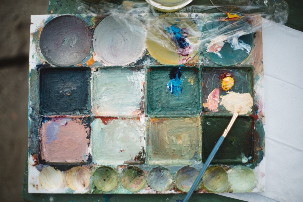
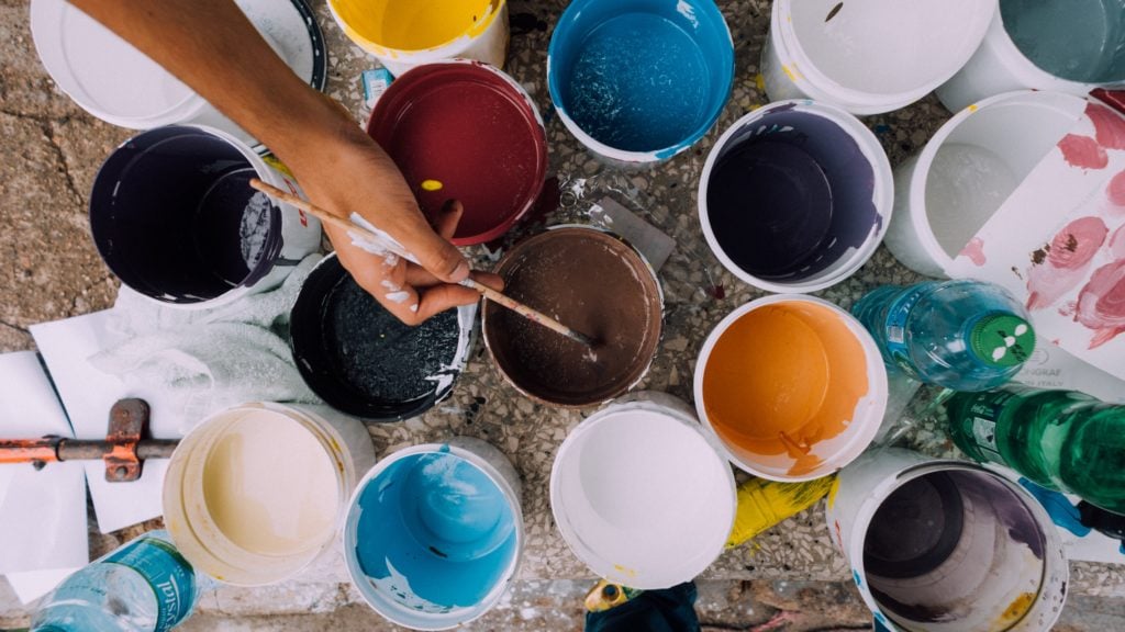
To get started with watercolor mixing, you need art supplies like paint, palette, brushes, and a cup of water. Then, using the concept of basic color theory, you can start mixing colors. Add a small amount of paint on the palette and blend with another shade using a brush. Avoid clumps while mixing.
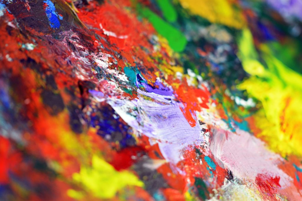
It is impossible to find every color, tint, shade and tone that you want to paint your artwork. This is when you get to explore how the different colors blend together. You can mix watercolors to create unique shades and hues and give an extra magic touch to your painting.
In this article, we will be going through everything that you need to know about watercolor mixing. It includes a step-by-step guide to the technique and all the necessary tips that you need to follow. Let’s get started!
What Are The Materials Needed For Watercolor Mixing?
Watercolor mixing requires you to blend different color pigments to create a variety of shades and colors. However, you should keep a few materials prepared before you understand how to mix watercolors. Here are a few necessary art supplies that you need to get started with watercolor mixing:
1. Paint
It is no surprise that paint is the first and the most important material needed for watercolor mixing, or else what will you even mix? There is a huge variety of watercolors that you can pick from, and the choice should be made based on the kind of art that you will be creating and the paint that you are comfortable working with.
You can go for either pressed cakes, tubes or panswhile choosing your ideal kind of watercolor paint. If you are looking for a set of watercolor paints that is ideal for mixing, then the former choice will be better for you.
However, if you want to paint that is convenient to use - go for the tubes. Likewise, you should make a smart decision while picking good quality paints to learn how to mix watercolors.
2. Water
Water is another essential material required to try out the various watercolor mixing recipes. You should have clean water beside you at all times. It serves two main purposes - helping you achieve the desired watercolor consistency and ensuring that your brush is clean.
For instance, if you add more water to your paint brush or paper, you can create a lighter hue of the specific color. On the other hand, if you wish to keep the hues in your painting on the darker side, you can use less water to avoid diluting the paint.
And in either case, water should be used to clean your brush from time to time to avoid muddiness in your artwork.
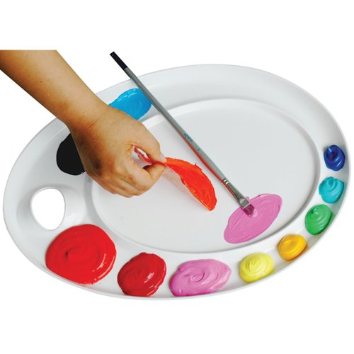
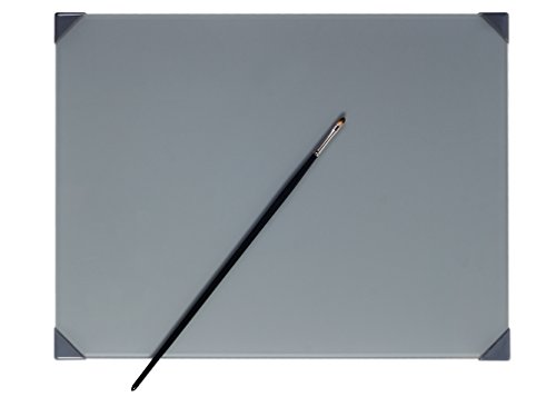
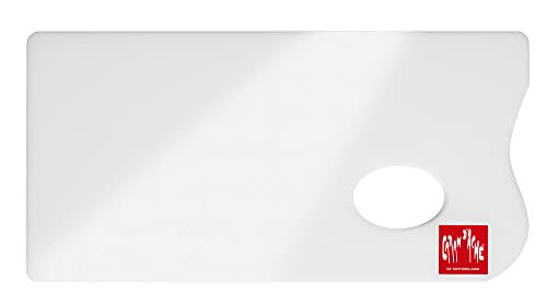
3. Palette
Possessing a watercolor mixing palette makes the overall process of mixing watercolors a lot easier. It is an art tool that is shaped in the form of a shallow container and is made specifically to act as a base for all your paint-mixing requirements.
There are several kinds of palettes that you can go for. For instance, you can choose either a plastic, metal, or ceramic palette to mix watercolors.
You should buy a palette with different compartments to store a variety of pigments if you want to avoid mixing them. But for mixing purposes, going for a watercolor mixing palette that is made to mix colors is better.
4. Brushes
The quality of your brushes can either make or break your painting. Since a cheap one with broken bristles can damage your artwork, it is strongly advised that you only invest in good quality brushes from reputed brands.
Flat brushes that lie in the size 8 to 10 range are ideal for large washes and background painting. On the other hand, a round brush is better for detailing and filling in colors. The latter option is considered an ideal type of brush for watercolor mixing too.
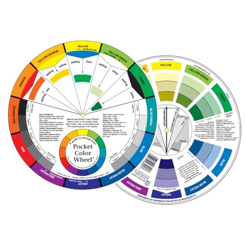
Understanding Basic Color Theory
Grasping the understanding of which color suits what shade may seem difficult to a beginner artist, but is a fairly easy concept. All you need to know is the basics of color theory, and you are good to understand how to mix watercolors!
Color theory helps us understand how different colors interact with each other, and how they are perceived by the human eye. To get a clearer idea of this concept, we need to go through its four vital components:
1. Primary Colors
There are three primary colors - red, blue, and yellow. A common similarity between the three pigments is that none of them can be created by mixing two or more different shades. These are the “mother” pigments of the traditional color wheel since all the other shades on it are created by mixing these three colors.
2. Secondary Colors
When we mix two primary colors, we create a secondary color. There are mainly three kinds of secondary colors - orange (created by mixing primary colors red and yellow), purple or violet color (created by mixing primary colors red and blue), and green (created by mixing primary colors yellow and ultramarine blue).
However, there are more secondary colors that you can create and paint with. For instance, take the example of the shade scarlet. It is formed using the colors red and orange. Even though orange is a secondary color in itself, it is created using red and yellow pigments. As a result, when we mix both orange and red - we get a color that falls under the category of secondary colors (since the red in orange overlaps with the red being mixed).
3. Tertiary Colors
Mixing primary and secondary colors results in the creation of tertiary colors. Both secondary and tertiary colors are made from primary colors, but there is a subtle difference between the two of them.
Since there is one shade contributed by a primary color and two shades contributed by secondary colors, a tertiary color is a combination of three shades. Whereas, secondary colors are a combination of two shades only.
There are six kinds of tertiary colors: red-orange, yellow-orange, blue-green, blue-violet, yellow-green, blue-violet, and red-violet. Artists use such shades to create a harmonious color scheme in their paintings.
4. Complementary Color
The colors on the color wheel and a watercolor mixing chart are not placed arbitrarily. Their position is very calculated, such that the color combinations placed opposite to each other are considered to be complementary colors. Understanding this concept can assist you in experimenting with how to mix watercolors.
As the name suggests, complementary colors go well with each other. They produce a strong contrast when used together, and can be used to give off a suitable vibe from your artwork. A few examples of complementary colors are blue and orange, red and green, etc.
Tip
You can go through a tutorial to understand how the concepts of color theory work on various platforms such as YouTube, SkillShare, and so on.
Mixing Watercolors: Step-By-Step Guide
Watercolor mixing recipes may seem like a frustrating skill to master, but it is quite achievable if you are ready to put in a decent amount of practice. To make your work easier, here is a step-by-step guide on how to mix watercolors to create your desired shades:
Step 1: Start With A Clean Palette
The first step to watercolor mixing is to start with a clean watercolor mixing palette. If your base is dirty, the pigments that you mix on it can get contaminated and muddy. As a result, the colors won’t mix as effectively as you want them to.
Hence, it is always advised to wash away any residue of paint colors from your palette before you start painting any new artwork. In case you are using a fresh palette, you should not use it directly. Wash it thoroughly with water first.
Step 2: Add Water To The First Color
Lift a small amount of pigment that you want to mix from your set of watercolors using a clean brush and place it on your watercolor mixing palette well. Start adding a few drops of water to this compartment, and then add more as per your requirements.
For instance, if you want your first color to have a lighter hue, you can add more water until you reach the desired level of dilution.
Step 3: Add The Second Color To The Same Well
Next, take a brush and dip it in the pigment that you wish to mix the first color with. You can add a few drops of water if you think that the consistency of the paint is too dense for your liking.
Tip
An important thing to note here is that it is easy to mess up the watercolor composition by adding too much of one color while mixing two colors. Hence, be careful not to add an excess amount of either color.
Step 4: Mix The Colors With A Brush
Using the same brush through which you picked up your second pigment, start mixing the two watercolors. This step is extremely crucial because you need to ensure that there are no clumps or streaks in the paint and that the final shade that you create is as smooth as possible.
There are a variety of ways through which you can mix colors. For instance, you can move your brush back and forth on the paint mixture or use your brush in a circular motion for better mixing.
Step 5: Test The Color On A Scrap Paper
Since watercolors give off a lighter hue when they dry, trusting the pigment when wet is not the best decision. Hence, once you are done mixing the watercolors, you should always test the final color on scrap paper.
To do so, simply dip the brush in your newly created shade and stroke it across a clean scrap paper. Examine the color of your paint once it dries out. It will give you a more accurate idea of what the shade of your new watercolor pigment is.
Step 6: Adjust The Color By Adding More Paint Or Water As Needed
The secret to getting the perfect watercolor through the process of mixing paints is following a series of trials and errors. Hence, it is okay if you don’t achieve your desired shade of color on your first try.
Once you take note of the color on the scrap paper, understand what the pigment is lacking and then make suitable amends. For instance, if the hue of the paint looks too dark you may add a little water to it. You can also add more watercolor paints to adjust the tone of your created pigment.
Watercolor Mixing Tips And Tricks
1. Use A Limited Color Palette For Better Results
You might feel the urge to use a lot of colors at once when you learn how to mix watercolors, but you should stick to a limited color palette for better results. This is especially important if you have just begun practicing this technique.
Mixing too many colors can complicate the process of painting cohesive artwork. Hence, you should start by sticking with the OG primary colors - red, blue, and yellow. You can also use some warm neutral colors like burnt Sienna and Raw Umber, or go for cooler tones like Grey. It is fascinating how many colors you can create even with such limited palettes!
2. Mix Colors In Small Amounts To Avoid Wasting Paint
Good quality art supplies are not cheap at all - and watercolors are no exception. Hence, if you use an excess of them while following watercolor mixing recipes, and the whole process goes against your liking - you will just end up wasting a large chunk of expensive watercolor paint.
That’s why you should always mix colors in small amounts. This way, you can prevent the wastage of mixed paint even if you are unsatisfied with the final outcome, since there won't be any surplus paint left over to discard.
3. Experiment With Different Ratios Of Paint And Water To Create Different Effects
The key to creating beautiful artwork is not being afraid of experimenting. Hence, don’t shy away from working with different ratios of watercolor paint and water, as it can help you create a variety of effects and textures.
For instance, you can lower the ratio of water used while mixing the watercolors to create a more concentrated paint effect. If you want to use watercolor painting techniques such as wet on wet or wet on dry, you will need to change the consistency of your newly created pigment by varying the amount of water used to dilute it. This will also help you fix hard edges in your watercolor transitions.
4. Use A Light Palette
Dark palettes can make pigments appear a bit different from their actual shade of color. Hence, it is important to use light color palettes for a better understanding of the pigments being created.
Additionally, most people like to paint on a blank white canvas. Using a light palette to mix colors in this case is a good decision, since you will be able to be more accurate with the color shade creation.
5. Clean Your Brush Regularly
You should always use clean brushes before you paint and mix watercolors. If you don’t wash your brushes routinely, there is a high chance that the previously used watercolor paint will build up on the bristles. As a result, the process can get difficult, since the residue colors will mix with them too.
It is very easy to clean painted brushes. All you need to do is rinse them with clean water and then dry the bristles using clean paper. Repeat this cycle of cleaning every time you need to dip the brush into a new color.
6. Use The Concept Of Complementary Colors
If you want to add a sense of vibrancy and colorfulness to your paintings, it is best to experiment with the concept of complementary paint combinations while trying out the watercolor mixing recipes. Mixing the shades that lie opposite to each other on the color wheel can help you create interesting color combinations and hues.
The concept of complementary color combinations can also be beneficial while watercolor mixing if you need to balance out intense tones like warm colors. For example, if you feel that the color that you have created is an extremely bright yellow shade, you can add a hint of purple to tone it down.
How To Mix Watercolors FAQs
What is the best way to clean my watercolor palette and brushes after mixing?
The best way to clean your watercolor palette is to scrape off the residue paint from its surface first using a paper towel. Next, wash the palette using clean water. You can also use a sponge for the same.
To effectively clean your brushes, you should first remove the excess paint from their bristles using scrap paper. Next, rinse them with clean water. You can also use cleansers such as soap if needed.
How can I make sure the colors I mix are consistent throughout my painting?
If you want to mix your colors in a way that stays consistent throughout your watercolor painting, it is best to keep the ratio of each color used in mind. .
Additionally, you should paint the whole landscape or portrait painting in the same lighting. If you keep changing the light under which you paint, there are chances that the shades of color in your art might end up becoming inconsistent.
Can I mix different brands of watercolor paints together?
Yes, you can try mixing different brands of watercolor paints. However, you should keep in mind that the color shades may vary from one brand to the other. So, make sure you test out the colors before you mix the watercolors of two different companies.
What are some tips for mixing complementary colors?
You should always work with small amounts of paint while mixing watercolors and use complementary colors to neutralize the tones of your pigments.
Furthermore, use light palettes and always clean your brushes regularly to avoid your art supplies from hampering the quality of art that you create. It is also strongly advised that you invest in good quality paper, paints, and brushes.
It is best if you sketch out your drawing using a pencil first, map out the regions where you want the contrasting effects of the complementary colors, and then go ahead with the painting. This will allow you to understand if you need to add more pigments or water to your paint mixture to achieve your desired color and consistency.
How can I mix watercolors to create textures or patterns in my painting?
You can mix watercolors to create many textures or patterns in your painting. For instance, you can use dry brushing to create rough textures like streaks.
To create interesting patterns, you can mix watercolors and then dip your wet brush in them. You can even do a flicking motion using the brush on your canvas to create a splattering effect.
While many people opt for oil painting and invest in acrylic paint sets, the tradition of watercolor painting is not expected to die out anytime soon. More and more artists are exploring the art of using watercolors in their artworks, and so can you! In this article, we went through a step-by-step guide on learning how to mix watercolors easily.
Other relevant things that we discussed above are the materials that you need to go about this technique and the concept of color theory and complementary colors. Now that we are nearing the end of this article, it is important to note that when it comes to mixing watercolors - experimenting your way through is the best way to go about it.
Try out different techniques and colors, and see what works best for you!
Filling pans with watercolor tube paint is easy. Just choose your preferred tube paint brand, squeeze it out into some pans carefully, leave it out to dry for 2-3 days, and then you’re done! Place the pans into a portable palette box, and you have a painting kit ready to go.
Watercolor paints are available in a variety of different forms: watercolor tubes, pan paints, liquid watercolors, etc. The form you buy totally depends on your preferences and needs. However, common consensus does say that watercolor pans are much easier to use than the other alternatives.
On the other hand, many artists prefer tubes over pans because of the quality but desire the convenience of watercolor pans. Well, there’s an easy solution! Turn the watercolor tubes into watercolor pans!
You will hear these terms used throughout this guide. So, let’s first understand what they mean.
‘Pan’ refers to empty plastic containers which you are going to fill with tube paint. Obviously, a pan is not always empty and can be filled with paint. This dried tub of paint is known as the watercolor ‘cake.’ After filling the pans, your dried tube paint is going to become the watercolor cake.
Watercolor pans generally come in two different sizes: full-pan and half-pan. Full pans are larger, and half-pans are, well, half the size of the full pans. Depending upon your painting styles, frequencies, and habits, you can get either the full-pans or the half-pans to fulfill your watercolor needs.
Materials Needed
Like with any scientific procedure, there are a few materials you require before you begin. Make sure you have the following materials handy:
Palette with tin/ plastic pans
Watercolor tubes
Watercolor paint brush
Sharpie marker
Watercolor paper
Toothpick or Bamboo Skewer
Waterproof pen
Paper towel
Types Of Watercolor Tubes Available
The brand of watercolor tube paint you use is going to affect the result of your pan. Obviously, each paint manufacturer uses a different formula and paint pigment to make their watercolor tube paints. Some of the ingredients used even affect the drying characteristics of the watercolor paints.
Let’s get into the proper science. The first thing you should know about is something known as the ‘plasticizer,’ which helps to reduce cracking as the tube paint dries. Primarily glycerin is used as a plasticizer.
The next thing is the ‘humectant,’ which preserves moisture and makes the tube paint easier to dissolve. Most paint manufacturers use honey or sugar syrup as the humectant.
Why is this important to know?
If you want your watercolor pans to be filled with softer paint, you should get watercolor tubes with more honey in the formula. You can even add honey to your tube paints if it ends up drying too hard. This does mean you’ll have to get a watertight palette box since the paint would be wetter than usual.
However, if you prefer dry cakes, you should avoid tube paint brands that contain honey in their formulas. If your pans become too dry and difficult to activate with water, add some glycerine and let the paint become usable!
Steps For Filling Watercolor Pans From Watercolor Tubes
Now let’s talk about how exactly you can turn your watercolor tubes into pan form.
1. Select your colors
When you fill watercolor pans yourself, you have the freedom to choose any colors you want. The number of colors depends on the number of plastic pans on your palette. Your selected colors should depend on which colors you use the most, which colors go together, and what sort of watercolor painting you wish to create.
Tip
Swatch the colors on watercolor paper to get the look of a completed watercolor pan.
2. Remove and label the pans
Remove each empty pan individually and start labeling them. Use the sharpie marker to write the paint name, paint brand, and pigment info on the pan. Get a thin sharpie so you can write easily.
3. Squeeze the paint out of the tube into the pan
Make sure the pans are clean and damp before you start to fill the watercolor pans. Don’t pour too much paint, though. Begin by filling the pan halfway through. Use a toothpick or skewer to stir the paint and spread it into the corners of the pans. Try smoothening the paint surface. Tap the pans on your table a few times to ensure no air bubbles develop.
Tip
Massage or shake the watercolor tube before you squeeze the paint out to ensure all the ingredients inside are mixed together.
4. Filling the pans with the paint
Keep filling the tray pans with more paint to the top. Keep using the skewer in between to make sure the paint fills out the pans evenly.
Tip
Leave a little bit of space at the top so that you can add a layer of water to speed up the paint activation process when you start using the palette.
5. Allowing the tube paint to dry and settle
Leave the pans to dry and settle for at least 24 to 48 hours before checking the results. The drying time will be affected by the humidity and temperature. Let the paints dry naturally; don’t try to speed up the heating process using an oven or a hairdryer. You might actually melt the plastic pans or blow the paint around!
In case your watercolor paints don’t dry even after a few days, there is something in the ingredients of your watercolors that is affecting the drying process. You might want to choose a different watercolor brand in that situation. If the paint cakes start to develop cracks and shrink, you can solve that by adding a few drops of glycerin to the cake.
Ensure your paints have completely dried before putting them in a palette box. Your DIY watercolor pans are now ready to use!
Tips For Using Watercolor Pans
1. Mixing colors in the pan
Watercolor paints are known for their easy blending. First, pick up your first color using a wet paintbrush and transfer it to your palette. Repeat the same for the second wet paint. Mix the two colors on your palette until you are satisfied with the blend.
You can use palette paper to prevent the color from bleeding. A palette paper allows you to mix watercolors precisely.
2. Reactivating dried paint
This is the best advantage of watercolor paints: they can be reused even after they dry. The dried paint can be turned into moist paint using water. The amount of water you add depends on the intensity of color you want. Add more water for a diluted shade and vice versa.
Keep lightly misting all the pans to keep the paint moist.
3. Avoid muddying the colors
Keep two bowls of water to do your watercolor painting: one to assist in the painting and the other to clean your brush. Your watercolor pans will remain clean this way. Also, replace the water as soon as it gets muddy.
4. Organizing pans in your palette
When you fill watercolor pans yourself, you get the freedom to arrange the colors in any way you want. Whether it follows the colors of the rainbow or follows the color theory, organizing your pans will help give a personal touch to your DIY watercolor pan.
The palette box you choose to keep your watercolor pans in greatly depends on your paints and how you will use them. If you have wet pans, you obviously need to use a watertight palette box to prevent any wet paint from getting out. For dry pans, you can choose any palette box you like.
All that’s left to think about is the size.
Ideally, the size of your palette box depends on your painting habits and style. Do you like to travel with your watercolor paints? Or do you like painting indoors? Different watercolor artists have different preferences.
1. Simple Palette Box With A Lid
Some palette boxes come with an included mixing surface. But if you are working indoors or in an art studio, you have access to your watercolor palette and obviously don’t need a separate mixing surface. This is the perfect palette box for your watercolor pans if you like a small handy kit you can carry around. Additionally, you can carry it from one place to another because of its easy portability.
2. Folding travel palette
A folding travel palette is perfect for watercolor artists who like to paint on the go. Need a handy palette to paint while you’re sightseeing in a new city? This is the best solution! Get a travel palette with a mixing surface included, so you don’t have to carry a mixing palette around as well.
3. Large palette box
A large palette box can incorporate large watercolor pans, meaning you will have access to a large number of colors. This is perfect for artists who like to paint indoors in their own comfort zone. Place the palette in a suitable corner of your room or art studio and have access to an array of beautiful watercolor paint.
Benefits Of Making Your Own Watercolor Pans
Even though watercolor paint is available in many different forms, artists prefer to use watercolor pans due to their ease of use and portability. More specifically, artists have now started to make their own pans for several reasons, some of which are listed below.
1. Ease Of Use
Watercolor pans are easier to use than tube paint or liquid watercolors. You don’t have to squeeze the paint out whenever you use it. Just use some water to reactivate the dried cake, and you have fresh paint!
2. Creating your own palette
You can always buy readymade watercolor pans from the market. But the colors included in those pans might not meet your needs. When making your own pans, you can choose the colors according to your preference. You can make a watercolor palette that is specifically suited to your needs, creating a better watercolor painting experience.
3. Choosing your preferred tube paints
Different paint brands sell different tube watercolors. The watercolors might contain a different binder or different pigments. But those watercolor pans might have a different texture, shades, and intensity than you want.
This is why buying tube watercolors and creating your own watercolor pan is better. Choose some artist-quality paints that best suit your needs and DIY a watercolor pan yourself.
4. Reduced costs
Buying good watercolor paint and creating your own watercolor pans generally costs less than buying a set of watercolor pans outright. You can buy full and half-pans from any paint brand. The bonus is that you get to choose your preferred palette box! And I know how much that means to any watercolor artist.
5. Travel-friendly
Watercolor tubes are not really travel-friendly. You need to squeeze the paint out every time you paint. Instead, watercolor pans are extremely travel-friendly. Whether you get the full-pans or the half-pans, these sets are extremely portable. All you need is a wet brush to reactivate the dried paint, and you’ll have some fresh paint!
Fill Watercolor Pans FAQs
Can I mix different brands of watercolor paint tubes in the same pan?
Yes, you can actually mix watercolor paints of different brands in the same pan. This is the advantage of making your homemade pans. An all-time favorite watercolor tube brand is Daniel Smith, but you can mix in other brands if you wish.
Be aware that not all paints are the same. Some may have different binders, different pigments, and different textures. Even the colors might not match each other. So, fill the empty pans carefully. I do suggest using the same paint for the entire watercolor palette.
How do I clean my palette knife or toothpick after filling watercolor pans with tube paints?
Cleaning a palette knife or toothpick is easy after you’re done with filling and refilling pans. Just clean the knife or toothpick with some water. Clean the knife after each color so that the colors don’t end up being mixed and muddy. You can also swatch the leftover paint onto some watercolor paper to get the color chart of your palette.
What palette should I use?
Palettes are available in many different types of materials. You can buy plastic palettes, metallic palettes, ceramic palettes, etc. Plastic palettes are definitely cheaper and more easily available. But they seem flimsy and low-quality.
On the other hand, a metallic or ceramic palette has removable pans that help with the filling process. Mixing colors on metallic and ceramic palettes is also better than plastic palettes.
Can I fill a palette with gouache?
Filling a palette withgouache can have mixed results. It ultimately depends on how well the gouache rewets. Test it out by placing it on a palette and then wetting it. It tends to dry over time and can also fall out of the pan. So, keep that in mind before you start a painting session with dried gouache. Schmincke paint is a good brand of gouache paint you can try for this.
How do I stop the watercolor cake from falling out of the pan?
This tends to happen with overly-dried watercolor cakes, especially if you hold the pan upside-down. One way to secure the pan in its place is to get a Blu-tack, or a White tack, tear off a tiny piece, and stick it to the back of your watercolor cake.
You can also do the same thing with a little bit of gum Arabic. Drop a bit of gum Arabic on the pan and then put the dried cake back into the slot. It will turn out perfectly fine!
Can I refill my watercolor fans multiple times?
Yes, you can. Making home-filled pans has this advantage. After all the watercolors are used, you should clean the empty pans thoroughly. Buy your preferred tube colors and repeat the procedure of filling each empty pan. This will definitely help you save money on your art supplies.
Now that we have come to the end of this guide, I am sure you must have picked up valuable tips on how to fill watercolor pans from tubes. As you might have figured out, it’s not that difficult. Plus, it has several benefits! All you need are the preferred watercolor tubes and pans and a careful hand to fill them out.
This method actually enables you to combine the advantages of watercolor pans and tubes. You get the vibrancy and shades of watercolor tubes with the portability and convenience of watercolor pans.
This technique will definitely help you save some dollars on art materials and figure out which paints work best for you. Happy watercolor painting!
Creating soft, natural edges in watercolor painting takes practice and patience. By avoiding common mistakes and following these tips, you can improve your technique and create beautiful works of art that are sure to impress.
As the sun sets, you take a deep breath and dip your brush in the paint. You begin creating layers, but suddenly, a hard edge appears, interrupting the flow.
Frustration sets in as you try to fix it, only to make it worse. But using the right techniques can help turn those harsh lines into seamless blends of color.
In this article, I'll explore the common culprits behind hard edges in watercolor and help you find out how to fix them.
Achieving soft edges while painting with watercolors can be challenging. Often, the result of your work is hard and unattractive edges that leave your painting looking flat and lifeless. But what causes these hard edges? Here are some of the most common mistakes that lead to hard edges in watercolor painting:
1. Starting With A Dry Surface
If you start painting on a dry surface, your paint will not spread and blend as smoothly as it would on a wet surface. The dry surface will also cause your paint to dry too quickly, resulting in hard edges.
The painting process is all about creating magic on paper with watercolors. But if you start painting on a dry surface, it's like trying to light a fire with wet wood- it just won't work. Your watercolor paints need wet paper to work their magic, and a dry surface just won't cut it. So, make sure your watercolor paper is wet before you start your painting.
2. Using Too Much Water
Applying too much water to your paper can cause your paint to spread too much and create hard edges when it dries. Watercolors require the perfect balance of water and paint to create beautiful soft edges. But applying too much water can ruin your painting. To avoid this, use less water and create an underlying wash of color or pigment.
3. Using A Dry Brush
When it comes to watercolor edges, the brush is your best friend. Using a dry brush can cause hard edges because the paint will not spread as easily as it would with a damp brush. And you will end up with hard lines that can be difficult to soften. So, make sure to gently brush your watercolor paints with a damp brush to create those beautiful soft edges.
4. Letting Paint Dry Unevenly
Watercolor paints are notorious for their unpredictable nature, and letting them dry unevenly can be a disaster. If you let your paint dry unevenly, it will create hard edges where the paint dries first.
Uneven drying will make your painting look grainy and unappealing. To avoid this, make sure to lay down your watercolor paints in layers, allowing each layer to dry completely before adding another. This will help to create an interesting texture and beautiful soft edges in your painting.
Techniques for Fixing Hard Edges
While hard edges in watercolor can be frustrating, there are several techniques you can use to fix them. Here are some advanced techniques to soften and blend hard edges in your watercolor paintings:
Wet-on-wet Technique
The wet-on-wet technique involves adding water to the area of the hard edge and then applying wet paint. The excess water on the surface of the paper helps to blend the colors, creating a soft edge. This technique requires a bit of control over the amount of water you use, as too much water can cause the paint to spread uncontrollably.
To use this technique, follow these steps:
Wet the area around the hard edge with a clean damp brush or spray bottle.
Apply your watercolor paint to the wet area.
While the paint is still wet, use a clean damp brush to blend the colors and soften the edge.
If needed, you can use a paper towel or scrap paper to lift excess paint and water.
Experiment with the timing of adding the paint to the wet area.
Waiting too long may result in the paint not blending properly, while adding the paint too soon may cause the colors to mix too much.
Lifting Technique
The lifting technique involves removing paint from an area to create a soft edge. This technique is useful when the hard watercolor edge is caused by too much paint or water.
To use this technique, follow these steps:
Use a clean, damp brush to wet the area around the hard edge.
While the area is still damp, use a dry brush or paper towel to lift the excess paint and water.
Use a gentle touch when lifting the paint to avoid damaging the surface of the paper.
You can repeat this process until you achieve the desired softness.
Blending Technique
The blending technique involves using a flat brush to blend the colors and create a soft edge. This technique is best used when the watercolor edge is caused by a difference in color or value.
To use this technique, follow these steps:
Wet the area around the hard edge with a clean damp brush or spray bottle.
Apply the second color or value next to the hard edge.
While the paint is still wet, use a clean, flat brush to blend the colors and create a soft edge.
Use a flat brush that is slightly larger than the area you are blending for better control.
Try blending two different colors together for a more dynamic effect.
Dry Brush Technique
The dry brush technique involves using a brush with very little water and paints to create a rough texture and interesting effects. By gently brushing over the painted area with a dry brush, you can create an interesting texture and soften the edges of the painted area.
To use this technique, follow these steps:
Dip your brush into your watercolor paint and then remove most of the excess paint on a paper towel or scrap paper.
Apply the dry brush to the area around the hard edge, using short strokes and varying pressure to create texture and interest.
Experiment with different brush sizes and textures to achieve different effects.
Use the dry brush technique sparingly, as it can create a rough and uneven surface if overused.
Tips for Preventing Hard Edges
1. Choosing The Right Paper
Experiment with different paper weights and textures to find what works best for you. Heavier paper tends to handle water better and is less likely to buckle, while rougher paper can create an interesting texture in your paintings.
2. Proper Brush Control
Use a light touch when painting. Pressing too hard with your brush can create hard edges and lead to overworking the paint. Instead, try using light, feathery strokes to build up color gradually.
3. Building Up Layers Of Paint Gradually
Allow each layer of paint to dry completely before adding another. This can help you build up the color gradually and avoid overworking the paint, which can create hard edges.
4. Use A Glazing Technique
Glazing involves applying thin layers of paint on top of each other to build up the color gradually. This technique can help you avoid hard edges by allowing you to control the intensity and saturation of each layer.
5. Use Wet Paint And Damp Brush
To avoid hard color edges, it's important to keep both your paint and your brush damp. Wet paint will blend more easily with other wet paint, while a damp brush will help to soften any hard lines that may start to form.
6. Work On A Tilted Surface
By tilting your paper at an angle, you can encourage the paint to flow naturally and create soft, blended transitions between colors. Experiment with different angles to find what works best for you.
FAQs Related To Hard Edges in Watercolor
Why should I try to avoid hard edges in my watercolor paintings?
Hard edges can make your watercolor paintings look stiff and unnatural. Avoiding hard edges and creating soft edges can give your painting a more organic and flowing appearance.
How do I prevent hard edges from forming in my watercolor paintings?
To prevent hard edges from forming, start by painting on wet paper or applying an underlying wash. Use less water and layer your paint gradually, allowing each layer to dry before applying the next.
Experienced watercolor artists also suggest using found edges or lost edges, which means allowing the paint to blend naturally and creating a soft transition between colors.
Can I fix hard edges in my watercolor painting after they have already formed?
You can try to soften the edge by re-wetting the area with clean water and blending the color. Or you can use a dry brush to remove excess paint and create texture.
Are there any tools or materials that can help me prevent or fix hard edges in painting?
Some tools that can help prevent or fix hard edges in watercolor painting include a flat brush, clean water, and burnt umber, which can be used to create an underlying wash. A paper towel can also be used to lift excess paint.
Is it possible to intentionally create hard watercolor edges in watercolor painting for artistic effect?
Yes, it is possible to intentionally create hard watercolor edges for artistic effect. Hard edges can be used to create contrast and emphasize the shape and form of an object. They can also be used to create a more graphic, stylized effect in your painting.
How can I use hard edges in watercolor painting to create contrast and depth?
Using hard edges in watercolor painting can create contrast and depth by emphasizing the shape and form of an object. By juxtaposing hard watercolor edges with soft edges, you can create a more dynamic and interesting painting. You can also use hard edges to create a focal point in your painting and draw the viewer’s eye to a specific area.
How can I practice painting soft edges and avoiding hard edges in watercolor?
Create a series of paintings focusing specifically on creating soft edges. Start by applying a wet underlying wash of color, then use a damp brush to blend the paint gently.
You can also practice creating lost edges, where the edge of one painted area blends seamlessly into another. Experiment with different techniques, such as using a fan brush or spraying the paper with water, to see how they affect the final result.
Can I use masking fluid to prevent hard edges in my watercolor painting?
Yes, masking fluid can be a useful tool for areas of the paper that you want to remain white or unpainted, you can create a barrier that will prevent the paint from bleeding into those areas.
As we've seen, preventing hard edges is a fundamental skill that every artist should master. However, mastering this skill is just the first step.
It's easy to get lost in the technical details of painting, but it's important to remember the joy that comes with creating art. While mastering the basics of wet-on-wet technique, proper brush control, and paper selection can help prevent hard edges, it's also important to embrace your creativity and experiment with new techniques and materials.
Instead of viewing hard edges as a mistake or frustration, try incorporating them into your artwork intentionally. The beauty of watercolor painting lies in its fluidity and spontaneity, and by letting go of rigid expectations and embracing the joy of painting, you can create truly stunning works of art that inspire and captivate.
Remember to enjoy the process of painting and allow yourself to make mistakes and experiment. Every painting is a learning experience, and even the most seasoned artists still have room to grow and learn.
Without adequate sizing, pigments will get absorbed by the cellulose fibers of the paper, resulting in bleeding. But sizing watercolor paper improves its absorbency, allowing artists to play with colors. And gelatin is widely used among artists for surface sizing.
For watercolor artists, sizing paper is as important as having the right art supplies.
Sizing is basically a technique through which the absorbent qualities of the watercolor paper are altered. The origin of this technique can be traced back to the 18th century when James Whatman invented a pre-sized wove paper with gelatin.
Because newbie artists do not know much about watercolor paper sizing, I decided to create a guide on the same.
Watercolor Paper Sizing: What Is It And Types Of Sizing?
Sizing doesn’t mean the actual size of the paper; rather, it refers to the bonding agent used to alter the absorbency properties of watercolor papers.
When the right sizing agent isn’t applied to the paper, a paper cannot be called watercolor paper; instead, it’s a copy paper. It’s called so because the paint is absorbed like a sponge into the fibers of the paper. In other words, it soaks through and ruins the surface of the paper.
Taking that into account, painting on a sheet of paper without sizing is impossible because the brush strokes would tear it apart.
So, watercolor paper sizing is important to prevent the paint from sinking right into the paper. It ensures the paper absorbs moisture at a consistent rate when working with wet media.
Types Of Watercolor Paper Sizing
There are 3 types of watercolor paper sizing:
Animal sizing or gelatin sizing (traditional method)
Synthetic sizing
Non-traditional sizing
Properties Of Paper Influenced By Sizing
3 properties of watercolor paper influenced by sizing are color appearance, absorbency, and strength.
1. Color Appearance
Watercolor papers that are traditionally sized using the by-product of animals or gelatin aren’t bright white but slightly creamy in color. Although gelatin is a water-soluble substance and naturally transparent, it lends a slight yellow color when used on artist-quality paper.
2. Absorbency
As I have already mentioned, paper surface sizing affects the absorbent quality and permeability. Because of sizing, paint doesn’t soak into the fibers of the paper; rather, it stays on the surface, allowing artists to work at their own pace.
3. Strength
The third property that is altered by the sizing agent is the strength of the watercolor paper. Surface sizing– be it internal or external, lends a rough and crisp costing to the paper. This coating is what adds to the durability of the paper, safeguarding it from abrasion and wear.
How Sizing Affects Watercolor Painting
The majority of artist-quality watercolor papers are either handmade papers or mold-made. Furthermore, they are specifically created for wet media painting, like ink or paint.
Therefore, sizing is an important element of watercolor painting because it offers greater control to artists. A good-quality watercolor paper, along with the right sizing solution, will accentuate the finest aspects of watercolor paints, as against lesser-quality papers.
Because of the sizing solution, the rough surface of the paper remains wet long enough for artists to work. That means the sizing agent prevents pulling colored pigments deep into the cellulose fibers.
Remember, experimenting with colors would become impossible if the paint is entirely soaked up by the paper because it fixes the pigments in one place. In good-quality watercolor papers, artists get enough time to transfer pigments all over the surface in a wet wash. Not just that, but they also get time to remove the color from a flat surface in case it’s needed.
Thanks to sizing, dry paints are able to settle near the paper surface. Thus, the effects of each color are heightened due to sizing, which is why the painting appears vibrant and luminous.
Anytime an artist mistakenly applies hard or strong pigments on the paper, they don’t get absorbed into the surface. That means the pigments will slide on the surface for quite some time, preventing artists from working on the painting.
So, the amount of sizing ingredient you use will have a significant impact on the way the paper reacts to pigments when applied in different watercolor techniques.
How To Choose The Right Watercolor Paper Sizing
A. Factors To Consider When Selecting Watercolor Paper Sizing
Among the 3 types of watercolor paper sizing, knowing which one would be the right pick for surface sizing could be challenging for many artists. But not to worry, for I have gone into the nitty-gritty of watercolor paper sizing and shortlisted a few factors to help you decide which one you should go for.
1. Painting Techniques
Sizing makes it easier to use paint and experiment on the paper surface.
When artists talk about well-sized watercolor paper sheets, what they mean is that paints flow through the large sheets of paper smoothly and spreads over the surface properly. That means a well-sized paper allows artists to work with ease because the absorption properties are perfectly balanced.
For this reason, you should always take into account the painting techniques you intend to employ on the sized paper. Remember, the sizing will have a great impact on the finished painting.
Here’s a quick rundown of watercolor painting techniques that are affected by the sizing of the watercolor paper.
I. Lifting Off Paint
Many artists prefer the lifting technique to complete their watercolor masterpieces.
In this technique, paint, usually from a dried painting, is removed from the paper surface by either soaking up a few colors using a brush or re-wetting the painting. More often than not, this is done to lighten areas where there are too many pigments to correct mistakes. You can even create a sequence of lighter forms via this technique.
Now, incorrect sizing will make it virtually impossible for you to remove paint via the lifting-off technique. That’s because a too absorbent or too soft sizing will pull the pigments deep into the fibers of the paper.
II. Glazing
Another essential technique in the watercolor painting process is glazing.
Adding depth to a watercolor painting by applying diluted paints in layers, and letting them dry amid application is known as glazing. In simple terms, artists apply colors one at a time in transparent or thin layers, allowing each layer to dry prior to layering another color.
Have you ever imagined what would happen if large sheets of watercolor paper weren’t sized properly? With each new brush stroke, the layers already applied to the surface would be activated without sizing.
That means the pigments will adhere to the fibers of the paper, and each layer will merge and blend with the other every time you try to paint a fresh glaze. Hence, on inadequately sized paper, glazing will become troublesome.
III. Wet-On-Wet Techniques
Quite popular among beginners, wet-on-wet techniques result in spontaneous, soft, yet complex effects, when using watercolors.
To achieve such effects, artists dip the paintbrush in water and brush it across the paper to wet it. This is done in a way to create a wash or shape on the paper, before the paint is added over the wet area.
If wet-on-wet techniques are carried out on paper made of wood pulp, such as student-grade paper, pigments won’t be absorbed. In turn, this leads to excessive dispersion, mainly because the papers are extremely stiff.
Taking everything into account, I’d recommend going for artist-grade papers because they are traditionally sized with gelatin.
2. Pigment Behavior
Not many know that the behavior of pigments is, to a great extent, influenced by the surface of the watercolor paper.
As I stated earlier, student-grade watercolor papers are made of wood pulp, which doesn’t produce great results like other papers. On the other hand, professional watercolor, acid-free paper is made of real cotton, such as cotton paper.
When gelatin sizing ingredients are applied to such papers, their flexibility is reduced, which is why wet media or pigments seep into the fibers slowly. So, you get enough time to play with colors.
Be it a hot press paper or lightweight paper, bear in mind that certain papers are intentionally oversized to make up for sizing loss, which would occur during the stretching process. How a pigment would behave on a sheet of paper can be tested by dropping water droplets on the paper.
In case the droplets pool on the surface, it’s an oversized paper; meanwhile, it’s a hard-sized paper if the droplets don’t sink into the paper and stay on it.
3. Painting Style
By influencing the absorbent qualities of watercolor papers, sizing does affect the painting style. In this regard, I’d suggest checking the texture of the watercolor paper, which is mainly of 3 types– hot press, cold press, and rough surface.
As far as a hot press paper is concerned, it has a hard yet smooth surface. While some artists find the texture ideal for detailing, others prefer cold-pressed or rough surface paper. That’s because the overly smooth surface of hot-pressed papers makes it challenging to control the pigments.
Meanwhile, cold press paper is among the most versatile papers mainly because of its velvety look. In comparison to hot-pressed paper, the cold-pressed paper has a semi-rough surface, which makes it ideal for both smooth washes and detailed work. For this reason, it’s quite popular among artists of all levels.
Papers with a pronounced tooth, ideally called rough paper, are wonderful for washes. That’s because the texture adds brilliance to the finished painting.
4. Budget
In Asia, papermaking experts used a variety of binding agents to size watercolor papers during the papermaking process.
For a good number of years, gelatin has been the go-to sizing ingredient for artists because it’s usable both externally and internally. However, it wouldn’t be the right choice if you have to size single sheets in bulk.
Alkyl ketene dimer (AKD) and methylcellulose are inexpensive sizing ingredients you can use on your watercolor paper.
Ultimately, whichever sizing agent you choose depends on the number of sheets you have to size and your budget. So, make sure to consider these two factors before you choose a sizing agent.
B. Sizing Options For Watercolor Paper
Before I dive in to discuss the sizing options for watercolor papers, let’s discuss in brief the 3 different types of papers used in watercolor paintings.
1. Hot-Pressed Watercolor Paper
Watercolor papers manufactured by squeezing the sheets between hot metal rollers to erase textures are referred to as hot-pressed papers. This means hot-pressed watercolor papers have a smooth surface, because of which they are suitable for artwork with finer details.
Note that hot-pressed papers aren’t as absorbent as other papers, which is why pigments sit on the surface for quite some time.
2. Cold-Pressed Paper
Where a hot press paper is pressed between hot metal rollers, a cold-pressed paper is squeezed between cold metal rollers to create texture. On cold-pressed paper, pigments seep into little dimples and bumps, meaning it’s far more absorbent than others.
3. Rough Paper
As the name suggests, rough paper is one which has a rough texture, which is why it is ideal for loose and expressive painting styles.
During the drying process, single sheets of rough paper are pressed between textured sheets to make them bumpy. Because of the rich texture of the paper, artists are able to get granulation in their finished work.
2 Types Of Sizing Options For All Types Of Paper
Be it hot-pressed paper, cold-pressed paper, or rough surface paper, watercolor papers can be sized in 2 ways– internal sizing and external sizing.
1. Internal Sizing
Internal sizing of watercolor paper usually occurs in the initial stages of the production process. In this method, the sizing solution (chemistry) is mixed with wet paper pulp prior to forming the sheets.
A purpose-made synthetic wax alkyl ketene dimer is used when sizing the paper internally. While internal sizing ingredients can be used in all types of paper, they are generally applied to machine-made papers.
2. External Sizing
Also known as surface sizing or tub sizing, external sizing is done in the final stages of the paper production process. Individual sheets of paper are dried before being immersed in gelatin solution to coat the external surface.
As an artist, you can size the highest-grade watercolor papers like those that are acid-free.
Some manufacturers prefer both internal and external sizing. In regard to the latter surface sizing technique, a sizing formula is applied to the paper pulp directly on the inner side. Then, the paper is submerged in an external sizing solution to enhance its durability.
Internal sizing, to a certain extent, changes the structural qualities of watercolor papers while keeping them stable and slightly stiff. The surface texture of the externally sized paper, on the other hand, is stiff or crisp.
In regards to surface sizing, gelatin from animal hides and bones or vegetable starch is most commonly used by artists. Gelatin has been preferred by artists because it improves the flexibility and strength of the paper.
While you can use methylcellulose in place of gelatin, keep in mind that it shrinks after the curing process. That’s mainly because internally scaled pulp (paper) cast pieces may dry to form a brittle texture of the mold. Therefore, methylcellulose works like a hardener and can be used to stick sheets of paper.
Even carboxymethylcellulose (CMC), as per papermakers, may lead to a slight plastic sheen while causing yellowing.
External Sizing
Although a time-consuming process, external sizing has the edge over internal sizing because different sheets of paper can be sized as per the needs of the artist.
Unlike internal sizing, which encases each and every fiber of the paper, external sizing adds a layer to protect the surface of the sheet. Because of this protective layer, the sheet reduces bleeding and absorption.
You can apply surface sizing to a well-dried paper using one of the following methods:
Tub Sizing – Dry sheets are laid down in a tray containing the sizing ingredient, wherein they are soaked for some time. After that, the sheets are light-pressed.
Spraying – Mix the sizing formula with water, pour it into a spray bottle, and spray it onto the paper so that the sprayer doesn’t clog.
Brushing – With a large soft-haired brush, spread the sizing on the paper by applying strokes in a single direction. Apply a second coat of the sizing in the direction perpendicular to the first coat.
Gelatin Size Recipe: Art Materials Needed
Here’s what you’ll need to size your paper sheets:
Gelatin
Sheets of paper
Water
Stirrer
A shallow tray
Support sheet
Blotting paper
Laminate pressing boards
Spatula
Step-By-Step Guide To Apply Gelatin Sizing On The Watercolor Paper
A 2 to 3% of gelatin solution will be ideal to size paper for watercolor painting.
Combine 3/4 or 1-ounce of technical gelatin with 1 liter of water, preferably cold, and keep it aside until the particles of gelatin swell. After several hours, warm the mixture below 140°F and mix it well until the particles dissolve.
Once you’re done, follow the steps mentioned below to size your papers for creating stunning artwork.
Step 1: Pour The Gelatin-Water Solution Into The Tray
Take a shallow tray and transfer the sizing solution, i.e., gelatin-water mixture, into it. When it comes to the tray, keep in mind that it should be slightly larger. That’s because your paper won’t be sized properly if you don’t use the right amount of sizing solution. And a small tray will hold less sizing solution compared to a larger one.
Since you’re using gelatin, make sure it is warm at about 104°F for better results.
Step 2: Take A Support Sheet And Put It Into The Tray
Now grab a support sheet and put it into the tray. Adding a support sheet is crucial because it will help you remove the sized paper from the tray, so make sure you use a high-quality product.
Of all the sheets available, I prefer polyester web material because it is strong and durable; however, you can go for other materials if you want.
Step 3: Open Out Book Gatherings And Submerge Single Sheets Into The Tray
Before you start immersing paper sheets, unfold or open out book gatherings so that you can submerge each and every sheet.
When immersing the paper, place support sheets both at the bottom and on the top. Also, make sure to soak one sheet at a time by making a stack of leaves. Anytime I size paper sheets, I make a stack of 75 leaves, but you can extend it to 100.
Whenever you size leaves in stacks, make sure to add enough size to the tray so that no leaf comes out unsized.
Step 4: Take Out The Sheets Once They Are Drenched In Size
After immersing the sheets in the gelatin bath, wait for some time so that they get drenched in the solution completely. Once they are sopping wet, take the sheets out and blot off the excess size using blotting paper.
However, if you soaked a stack of leaves, pull the entire stack out of the tray along with support sheets. Then, put the stack in the middle of the pressing boards and blotters after draining it before squeezing it for about a minute.
Step 5: Place The Papers On A Drying Rack
After that, it’s time to air-dry the papers, for which you’ll have to put them on a drying rack.
However, when placing single sheets on drying racks to air dry, changing to new support sheets is important. And in regards to the stack of book leaves, take each leaf out carefully and place them on the drying rack. But before that, cover them with polyester support material.
Keep a spatula handy, as it will be useful in lifting the corners of the papers.
Step 6: Allow The Sheets To Air-Dry Until They Start Curling
Let the sheets air-dry on drying racks, but make sure they do not dry completely.
That means the sheets should dry to the touch yet be slightly damp. As for the final drying process, sandwich single sheets between felts or blotters and under slight pressure, which greatly depends on the surface finish and texture.
Meanwhile, you can arrange book leaves into gatherings after taking them off the drying rack by pressing them in a bunch of gatherings. In the meantime, don’t forget to insert blotters after every 2 to 3 gatherings.
You can also dampen the book leaves again after they are dried and rearrange them for the final pressing stage. I’d recommend the latter method if you have to arrange large bunches of book leaves.
As a word of caution: throughout the process, handle the book leaves and sheets with care to ensure the surface characteristics aren’t lost.
FAQs Related To Watercolor Paper Sizing
What are the different types of paper sizing?
Basically, there are three different types of paper sizing– strong sized or hard sized, weak sized or slack sized, and unsized or waterleaf.
Strong-sized or hard-sized papers include all the coated fine art paper used for creative purposes. Weak-sized or slack-sized paper, often referred to as soft-sized paper, includes newsprint papers along with non-waterleaf papers whose degree of absorbency is relatively high.
Finally comes unsized paper or waterleaf paper, which includes filter paper and blotting paper.
What are the benefits of sizing paper?
As the sizing ingredient envelopes the cellulose fibers of the paper, it eliminates or reduces bleeding to a great extent. Furthermore, sizing keeps the paper safe from oxidative breakdown, meaning the paper won’t turn yellow.
Unlike other fillers that weaken the paper, sizing adds strength and adhesive qualities to it.
What is a good weight for watercolor paper?
Weight of the paper is one of the most crucial factors that artists need to consider during watercolor painting. Gram per square meter is the unit in which the weight of watercolor papers is measured and watercolor papers are available in various weights from 90 GSM to 300 GSM.
While 90 GSM papers are well-suited for drawing techniques, they cannot be used for heavy watercolor painting. Meanwhile, 140 GSM papers are better, but keep in mind they may buckle if used unstretched.
On the other hand 300 GSM papers are heavier than others, which is why they are ideal for soaking and heavy wash. Though their price is slightly on the steeper side, they are resistant to buckling.
How can I stretch watercolor paper before painting to prevent buckling?
The benefits of stretching paper are aplenty, from eliminating buckling to allowing the watercolor paper to lay flat on the surface.
Traditionally, a watercolor paper was stretched by immersing it in water for about 20 minutes. After that, it was stretched and fastened to a lightweight ply backing board (braced). As soon as it dries, it compresses to a tight flat surface.
I prefer stretching watercolor paper by spraying water on the rear surface of the sheet, taping it with gum paper tape, and pinning it to a backing board. When pinning the watercolor paper to the board, make sure the dry side faces up.
Can I use unsized paper for watercolor painting?
Using unsized watercolor paper for painting is advised against as such papers get damaged pretty easily because of their soft surface texture. Moreover, the finished artwork won’t be as good as it would have been on a sized watercolor paper.
Even then, however, if you wish to use unsized watercolor paper, you can lay the paper flat and apply gesso (acrylic primer) to prime it.
Can I add sizing to the watercolor paper after it has been made?
Yes, you can add sizing to a watercolor paper after it has been manufactured. Such sizing is known as external or surface sizing, wherein you size the watercolor paper externally to enhance its durability.
What are some common problems that can arise if paper sizing is not applied correctly?
If paper sizing isn’t applied in the correct amount, your watercolor painting will appear patchy when you apply a wash of color. In addition to that, watercolor paper with incorrect sizing will have splotchy or grease-like marks on the surface.
The good news is that you can correct the paper sizing by immersing it in water and cleaning the paper surface. Because of this, surface sizing is dissolved and dispersed across the surface. Plus, greasy marks are washed away due to soaking and brushing the paper.
What are some recommended brands of watercolor paper?
Some of the best brands of watercolor paper in the United States are as follows:
Fabriano
Strathmore
Canson
Arteza
Arches
Tip
Always go for heavier-weight paper when it comes to watercolor painting because they do not require stretching. Furthermore, they absorb water better than lightweight papers and won’t wrinkle or buckle when wet.
On a heavier paper, you can try new brush strokes or techniques for polishing your skills.
To sum it up, watercolor paper sizing is crucial before getting started with watercolor painting, as it improves its absorption capabilities. Watercolor paint tends to bleed on unsized papers, but artists get more time to play with colors on a sized watercolor paper.
Some paper manufacturers size watercolor paper sheets internally during the printmaking process, while others do not. In such cases, you’ll have to size the paper externally using gelatin to enhance its absorbency.
Instead of soaking the paint pigments, sizing ensures pigments sit over the paper surface, refracting color brightly. Also, anytime you choose a watercolor paper for your projects, always check whether the paper texture is completely smooth or slightly rough.
You can paint on both the front and the backside of watercolor papers, as the former is rough, while the latter is smooth. The front side is well-suited for paintings with depth and texture, while the back side adds finer details.
No art medium is as fascinating as watercolor, but often, choosing between the 2 sides of watercolor papers is tricky.
One side is smooth, whereas the other is slightly textured. Many artists opine that there is no right or wrong side when it comes to watercolor papers, but to a great extent, the techniques you employ determine which side you should use.
This guide discusses in detail the 2 sides of watercolor papersand its various types.
Smooth Or Rough: Which Side Of Watercolor Paper To Use?
Many artists, especially newbies, find it confusing to decide whether they should start watercolor painting on the front side or the backside of the paper. That’s mainly because there isn’t much difference between the two, except for the surface texture.
However, one aspect should always be kept in mind when deciding between the soft and slightly textured sides, i.e., handling properties. Sizing determines the handling properties of a paper, as it prevents pigments from sinking too deep into the paper surface.
The painting technique you employ to complete your watercolor painting project will determine which surface to opt for.
Smooth Watercolor Paper Side
Between the 2 sides, the back side of the watercolor paper is the smooth side because it has subtle textures. The difference in texture is due to the fact that it is squeezed against felt.
Also known as the wire side, the back side has a crisp texture, which is why it’s considered ideal for fine details. That means the felt side responds well to pencils, pens, and ink better than different surfaces.
A. Advantages Of Painting On The Back Of The Watercolor Paper
Most artists prefer painting on the front, but painting on the back can be advantageous in some situations. Below I have mentioned when can painting on the felt side be beneficial for artists.
1. Fine Details
Smooth surfaces are ideal for paintings with fine details. Be it layering, glazing, or wet-on-wet techniques, painting on the backside of your paper will add a good amount of texture to your finished work.
2. If You’ve Ruined The Front Side
Watercolor paints are unforgiving, meaning you cannot undo or fix your mistakes. Especially when people work with acrylics, gouache, or oils, they tend to make a lot of mistakes.
So, what do you do with those failed artwork? Instead of throwing them into the bin, flip the paper and use the back side to paint. Besides, you’ll save money on art supplies.
Tip
Not all manufacturers apply a coat of gelatin on the backside of the paper to size it. That means the backside of the paper will bleed if you pour pigment on it, rendering it useless. In case the paper isn’t sized, you can size it externally by submerging it into a tray of gelatin-water sizing solution.
3. Excellent Paint Flow
One of the significant advantages of a smooth surface is that the watercolor paint flows smoothly on the paper. Because the paint sits on the paper for quite some time, you can try your hands at various techniques on the backside of the watercolor paper.
Besides, blending pigments is not challenging on the backside of the watercolor paper, thanks to the smooth surface.
4. Ideal For Precision
Because the surface is fine-grained without any tooth, the smooth surface makes the backside of the paper ideal for adding fine details. Plus, color washes are more even on the backside compared to the front side.
Since the backside of watercolor paper lends itself to precision, making clean lines and sweeping strokes won’t be difficult. On papers with smooth surfaces, the layers, glazes, and washes on the finished painting appear beautiful.
5. Handles Pen And Ink Well
Smooth surface papers are also well-suited for painting styles in which inks and pens are used in conjunction with watercolor paints. On the backside of the watercolor paper, you can draw strong and beautiful lines, which makes it versatile.
Watercolor Paintings Best-Suited For The Smooth Surface
For paintings with a lot of details, most artists prefer the smooth side of watercolor papers, mainly because the texture handles multiple heavy washes really well. Watercolor paintings whose outcome is exceptional on the smooth surface are as follows:
Animals
Flowers
Rocky coastlines
Streams
Rough Side Of Watercolor Papers
The rough side, also known as the wire side, has more texture than the smooth side. Usually, manufacturers add texture to the front side of watercolor papers by squeezing it against the wire mesh of the mold.
Even after the drying process, the rough paper retains the wire texture; hence, it’s called the rough side.
Advantages Of Painting On The Front Side Of The Watercolor Paper
Even though the majority of artists prefer the front side for watercolor painting, here are 2 specific instances when using it can be advantageous.
1. Loose Watercolor Painting Style
If you’re more interested in capturing the essence or impression of a scene, painting on the front side will be the best bet. That’s because rough papers express the painting better than those with smooth surfaces.
2. Uneven Pigments On Finished Paintings
A rough watercolor paper is full of irregularities, dips, and grooves, because of which paints granulate in them. Granulate, in simple words, means groups of flakes or small dots on the watercolor paper that are visible.
When pigments settle in dimples or holes in watercolor paper, an uneven paint layer is created. So, painting on a rough surface or the front side of the paper will help you imitate the granulation effect.
3. Expressive Painting Styles
For artists more interested in capturing impressions than replicating scenes, loose painting is the way to go because it’s far more expressive than other painting techniques. The rough surface of watercolor paper, ensures the textures and brushstrokes are prominent in the finished painting.
4. Allows For More Dramatic Washes
Rough sides of watercolor papers are best suited for variegated painting techniques, thanks to their textured surface. The variegated effect is achieved by blending 2 or more colors via wet-on-dry and wet-on-wet techniques.
Watercolor Paintings Best-Suited For The Rough Side
Watercolor paintings whose outcomes are exceptional on the rough side of watercolor papers are:
Abstract florals
Landscape
Mountain scene
Dripping fruit
Hot-Pressed Paper Vs Cold-Pressed Watercolor Paper
So far, I have discussed the 2 sides of watercolor paper, along with their advantages.
But choosing between hot-press paper and cold-pressed paper is not easy, especially for beginners. That is why I’ll discuss the 2 types of paper in this section to help you decide which one would be the right one for your watercolor painting needs.
1. Hot-Pressed Watercolor Paper
Papers with incredibly smooth, non-textured surfaces are called hot-pressed papers. Because such papers are toothless, they boast a fine-grained surface.
As soon as the paper is manufactured, it is pressed between 2 hot metal rollers to smoothen and straighten it. Hence, it’s named hot-pressed watercolor paper.
Hot-pressed papers are well-suited to paintings with a high level of precision, like portrait paintings. And since the density of fibers is high in a hot-press paper, it’s less absorbent than others. Therefore, you get adequate time to work with watercolor paints.
2. Cold-Pressed Watercolor Paper
Also known as “not paper,” cold-press paper is the go-to paper for the majority of watercolor artists because of its textured surface.
Cold-pressed papers are manufactured in the same manner as hot-pressed papers; however, they are squeezed through cold metal rollers instead of hot ones. Because such papers have tooth, pigments settle into the fibers quickly, giving artists less time to work with them.
Thanks to the bumpy surface, the cold-pressed paper adds to the aesthetic appeal of the finished painting.
Which Texture Is Right For Your Watercolor Painting Project?
What sets hot-pressed paper apart from cold-pressed paper is its texture– the former is smooth, whereas the latter is bumpy.
Because of the smooth surface finish, hot-pressed paper provides an ideal surface for multiple or variegated washes. Furthermore, its least textured surface is well-suited for artists who wish to recreate paintings with subtle details.
Even colors tend to be brighter on hot-pressed paper than on cold-pressed ones. And since it has no tooth, pigments stay on the paper for long, allowing artists to work at their own pace.
What’s more, its smooth yet hard texture makes it suitable for a variety of watercolor painting techniques like lifting off. But because of the smooth surface, you cannot glaze on hot-pressed papers. Also, some artists complain that the paper is slippery, and it gets difficult for them to control the pigments.
Coming to cold-pressed papers, they are quite popular among watercolor artists of all levels because they are easy to work with. The outcome of watercolor paintings on such papers is velvety due to their textured surface.
Compared to hot-pressed papers, paintings on cold-pressed papers aren’t vivid; rather, the colors appear flat.
However, the textured surface makes cold-pressed paper ideal for smooth washes. Not just that, but it’s also suitable for dry brush technique and scraping, so cold-pressed papers are commonly used for landscape painting.
On the flip side, cold-pressed papers aren’t fit for glazing, as the first layer tends to get disturbed after the application of the second layer. All in all, I’d say cold-pressed papers are ideal for both beginners and experts who are interested dry brush techniques. Not to forget, they can tolerate lifting techniques, too.
How To Determine Which Side To Use On Each Type Of Paper?
While there isn’t much difference between the 2 surfaces of hot-pressed watercolor paper, the surface texture of the 2 sides of cold-pressed paper are different.
More often than not, people prefer to use the top side of the paper because it has a watermark but that doesn’t mean you cannot use the other side. When it comes to watercolor papers, you can paint on whichever side you want.
Check the texture of the 2 sides and try to figure out which side will allow you to carry out the painting techniques you want. Smooth sides are meant for detailed paintings, artwork with high precision, and if you don’t want textures to be prominent in your paintings.
On the other hand, rough surfaces would be ideal for loose watercolor painting styles because of their tooth. Even the outcome of paintings with dramatic washes is greater on the rough side than on the smooth one.
Whichever side you choose depends on your painting style, the outcome, and the techniques you wish to employ.
Side Of Watercolor Paper FAQs
Why is there a difference between the 2 surfaces of handmade paper?
Cotton papers, which are handmade papers, are manufactured by mixing cotton fibers with a large quantity of paper pulp.
A rectangular hand-held mold is used in the process, which is immersed into a vat of water-pulp mixture. The mold is squashed to distribute the pulp equally across the mesh.
As the pulp adheres to the mesh, water drains from the surface and the pulp sheet is moved to a felt sheet for drying. The side to which pulp (paper) adheres to is the wire side, whereas the other side placed on felt for drying is called the felt side.
Even though the impression left by the felt is reduced, wire marks often persist. And that’s why there is a noticeable difference in the texture of the 2 sides of handmade paper.
Which side of watercolor paper should I use if I want to achieve fine details?
I suggest the smoother side because it brings out fine details exceptionally well.
When can I paint on both sides of the paper?
Weight is an important factor when it comes to watercolor painting. Only heavyweight paper is ideal for painting on both sides because it’s thick; the heavier the paper, the less it will buckle and bleed.
As a rule of thumb, go for watercolor papers from a reliable brand because the quality of their papers is top-notch.
Are the 2 sides of the Fabriano Cold Press paper different?
Yes, there is a noticeable difference between the 2 sides of Fabriano cold-pressed paper. The top side of the paper is crisp, whereas the back side is relatively smooth because it has slight textures.
Now that you know the ins and outs of watercolor paper, hopefully, you’re ready to start watercolor painting.
Contrary to what most people believe, there is no right side or wrong side in regard to watercolor papers. Both rough and soft sides of watercolor papers are usable– one is ideal for creating depth and dramatic washes, whereas the other is for precision and fine details.
Ultimately, the side you choose boils down to your personal preference.
Never should you buy an entire watercolor block as a beginner, or you’re only going to waste your money. If you’re a newbie in the watercolor painting world, I’d suggest you use a few sheets from different brands and paint on both sides.
After a while, you’ll understand which side is well-suited for your painting style. You can let me know how you enjoyed watercolor painting after reading my guide, by reaching out on my social media handles!
Yes, acrylics can be beautifully used on watercolor paper with suitable materials and preparation. Prime the paper with gesso, thin down the acrylic paint with water, and you’re done! All else you need is a paintbrush and your artistic imagination to run wild.
Watercolor and acrylic paints are the basic art mediums used by every painter. Whether you are a beginner or a professional, everyone loves to use watercolor and acrylic paints to create beautiful paintings.
It is generally recommended that watercolor paints be used on watercolor papers for the best results. But have you ever wondered if you can use acrylic paints on watercolor papers? Well, if you have, the answer is yes!
I’m sure I have piqued your interest with this. Read ahead to find out exactly how to use acrylic paint on watercolor paper. And don’t forget to go through the tips for extra help.
Watercolor paper is a special type of paper made especially for watercolor painting, having high water solubility. This is the painting paper that artists recommend whenever you’re making watercolor paintings. Generally, you will find two types of watercolor paper in the market: artist-grade and student-grade watercolor paper.
Artist-grade watercolor paper, also known as professional-grade watercolor paper, is made up of 100% cotton and is mostly acid-free paper, while student-grade paper is not. This is why the student-quality watercolor paper is cheaper than artist-quality paper.
What does watercolor paper weight mean?
Watercolor paper weight measures the weight of a sheet of watercolor paper. The higher the weight, the thicker the paper. The weight of watercolor paper is an important issue for artists because of a problem known as ‘buckling.’
Well, what’s that?
Buckling is the way paper warps when it is wet, which ruins the quality and look of your watercolor painting. Obviously, lightweight paper tends to buckle a lot more than heavy-weight paper.
Therefore, lightweight paper requires ‘stretching’ before you do watery painting on it, but that is a time-consuming process. So, you can just get a heavier-weight paper. But heavy-weight paper, on the other hand, is more expensive.
Traditionally, watercolor paper weights are expressed in the British Imperial units: pounds per ream. A ream consists of 500 sheets, while the size of each sheet in a ream is referred to as the ‘basis size.’
In watercolor papers, the basis size of a sheet is 22 x 30 inches and is known as the full imperial sheet. Additionally, whenever you see the weight printed on the label of the watercolor paper, it is actually describing the weight of 1 ream of full imperial sheets.
Watercolor Paper GSM
To overcome the problems of different units being used by different manufacturers, GSM is now more popularly used. GSM stands for grams per square meter. This measures the weight of a single sheet of an area of precisely 1 m2. For example, 300 gsm paper has a paper weight of about 140 lbs. Actually, this is the best weight to get for watercolor papers.
Types Of Watercolor Paper
Watercolor paper is available in three forms: watercolor sheet, watercolor roll, and watercolor block. Rolls are generally available in 44-inch x 10-yard size, while watercolor sheets are available in the traditional full imperial size. Watercolor blocks, on the other hand, are pre-cut watercolor sheets that are glued on all sides.
Textures Of Watercolor Paper
Watercolor paper can be available in two different textures: hot-pressed and cold-pressed. Cold-pressed watercolor paper has a smooth surface and works well with all painting consistencies. On the other hand, hot-pressed paper is more on the rough side and best suited for paint lifting and corrections.
Obviously, there is no set standard for the texture of watercolor paper. One brand’s hot-pressed paper might be different from another brand. So, experimenting is the key.
What Is The Difference Between Watercolor And Acrylic Paper?
Acrylic paper is thicker and more durable than watercolor paperand is obviously more suited to acrylic painting. It can either be absolutely flat or be embossed with a canvas-like pattern. Another difference is the colors of the two. Acrylic paper mostly tends to have an off-white color, while watercolor paper is mostly available in white or cream color.
Watercolor paper is, however, more absorbent than any acrylic artist paper. So, it is more suited for paint mediums that use a lot of water. This also affects the drying time of the paint and the possibility of buckling or warping.
Additionally, watercolor paper is made entirely out of cotton fiber. This prevents watercolor paper from yellowing and makes it suitable for various painting techniques. Acrylic paper, on the other hand, is made from cellulose and synthetic fiber. Hence, it is not susceptible to warping or buckling.
Lastly, acrylic paper tends to be cheaper than watercolor paper.
Acrylic Paints: What You Need To Know
Acrylic paint is made out of a combination of water, acrylic resin, binder, and pigment. It is described as having the combined qualities of both watercolors and oil painting. Acrylic paint is also permanent on paper, meaning there is no easy way to remove it once you paint on it. Although, you could try removing it with a solvent or a specific eraser.
Note that acrylic paint is not permanent on other non-porous surfaces like glass or metal.
Pros And Cons Of Using Acrylic Paint
The popularity of acrylic paints resides in the fact that their drying time is so quick. The paint is very elastic and flexible, so it expands and contracts with the temperature changes without developing any cracks.
Acrylic paint is also highly lightfast, meaning its colors remain vibrant for a very long time and don’t fade with time. Unlike watercolors, acrylic paint can be used on many different surfaces, like watercolor paper, acrylic paper, etc. They also have a high opacity level.
However, due to their permanence and quick drying time, you cannot reuse acrylic paints after drying. The colors darken as the paint dries, which might change the overall look of your acrylic painting, known as a color shift.
Types Of Acrylic Paint
Acrylic paint is available in varying consistencies and thicknesses. You can even buy chemicals to alter the texture and consistency of your acrylic paint. Here are a few types of acrylic paint:
Thick-Bodied- Also known as professional-grade acrylic paint, this paint has a thick consistency and is loaded with color pigment. It is the best for texture and shows the most color shift.
Student-Grade- This is more suitable for beginners and is cheaper than professional-grade paint. It has lesser color pigment and color shift.
Soft-Bodied- Has a fluid-like consistency and is best for drip and splatter techniques, providing good coverage.
Acrylic Inks- It has ink-like consistency and is loaded with color pigment. This is a good option for using as watercolor paint.
What Is The Best Surface To Use For Acrylic Paint?
The best surface to use acrylic paint on is any non-porous surface, like glass, plastic, or metal. This can also be a special type of paper designed explicitly for acrylic paint. The paint prefers non-porous surfaces since they have low absorbency. This means the paint won’t dry too fast, giving you time to work with it.
Why Do Some Artists Prefer To Use Watercolor Paper For Acrylic Painting?
Many artists prefer to use acrylic paint because of its convenience, quick drying time, and vibrant colors. You mostly need to apply a thin layer of primer on the painting surface before you begin painting.
If you use watercolor paper, you can easily skip the priming stage. Just add water to the acrylic medium until it reaches your desired consistency. Additionally, you can also use the watercolor paper as practice drawing paper.
When choosing suitable watercolor paper for acrylic paint, you should keep in mind the thickness, size, and painting technique you are going to use. Some people prefer to use watercolor sheets, which can be found in packs in the market. Another good option is a sketchbook.
A less popular option is a watercolor paper block. They are glued on all four sides, unlike a watercolor paper pad. This makes the paper block more durable and resistant to warping than a paper pad.
Well, now that we have talked about both acrylic paint and watercolor paper, it is now time to combine the two.
Using Acrylic Paint On Watercolor Paper
Art Materials Needed
Acrylic paint
Watercolor paper
Painting palette
Gesso
Jar of water
Paintbrush
Rag or paper towels
Watercolor boards
Techniques That Can Help Acrylic Paint Stick To Watercolor Paper
Soak the paper in water- Soaking the paper in water for a few minutes will help soften the cotton fibers and make the paper more pliable.
Paper stretching- Stretch the paper by taping it down to a painting board. This helps in preventing warping or buckling.
Allow the paper to dry- After the paper soaking and stretching are done, allow the paper to dry completely before you start making your beautiful illustration.
Apply a fixative or sealant- Apply a fixative or sealant after the painting is finished to seal the colors in place.
Prepare Your Paper Surface For Acrylic Painting By Applying Gesso
Pour a generous amount of gesso into a clean jar and stir it for a few minutes. After stirring, apply a thin layer of gesso on both sides of the paper. This will help prevent the paper from warping or buckling and ensure a successful painting project.
This step is optional since you don’t have to worry about warping or buckling if you are just practicing acrylic paintings.
Steps For Acrylic Painting On Watercolor Paper
After the gesso dries, place your paper on the painting board. Fix it in place by using a few pieces of masking tape.
Now, you can just start painting! Yes, it is that easy.
After your painting has dried, seal the finished painting with a water-based sealant. Let that dry for half an hour at least.
Tips For Acrylic Painting On Watercolor Paper
1. Watercolor Paper Weight
Watercolor paper is sold in many different weights and GSMs. But for acrylic painting, you should keep in mind that heavier-weight papers are better. The heavier the paper, the sturdier it is. So, 140 lbs. or 300 GSM is the best watercolor paper.
2. Preventing buckling
Buckling can be prevented by using heavy watercolor paper. However, if some buckling still occurs, here is how you can prevent it. Lay the buckled painting paint-side down on a clean and flat surface. Lightly mist the back of the painting with distilled water and cover it with a paper towel or a single sheet of wax paper. Weight the entire thing down with heavy items and leave it overnight.
3. Testing On Cheap Paper
Consider your money costs when using acrylic paint to paint on watercolor paper. Decent watercolor paper can actually cost more than acrylic paper. So, test your painting technique on cheap paper, like pastel or waxed paper, before using it on good quality watercolor paper.
4. Absorbency
Watercolor paper is highly absorbent since it is made to absorb water-soluble watercolor paints. Acrylic paint, on the other hand, might dry out too quickly. So, mix acrylic paint with some water or use a slow-drying medium to delay the drying.
5. Diluting The Paint
The trick to using acrylic paint on watercolor paper is to dilute the acrylic paint. This way, you won’t have to prime your painting surface with gesso. Just thin down the consistency of the acrylic paint to the level you desire, and you’re done!
6. Paper Longevity
Place your finished acrylic paintings in a glass frame to protect them from UV radiation. Also, try to keep the painting away from direct sunlight. All this will help promote the longevity of the paper and the painting.
Watercolor Paper With Acrylics FAQs
Do I need to prime the watercolor paper before using acrylic paint on it?
No, there is no necessity. You can do it to prevent the warping, curling, or buckling of the paper. Just thin the consistency of the acrylic paint before using it. This way, there will be no need to prime the paper with gesso.
What paper types are ideal for acrylic paint?
The advantage of using acrylic paints is that they work on many different painting surfaces, like acrylic paper, cartridge paper, watercolor paper, canvas paper, textiles, mixed media paper, etc. Each paper has its own unique set of properties that will result in a different painting. So, experiment and find out which one works the best for you.
Obviously, acrylic paper is specifically designed for acrylic paints. So, acrylic paper is the ideal option for acrylic painting.
Can you mix acrylic paint with watercolor paint?
Yes, you definitely can. You can either mix the watercolor paint and acrylic paint together on a palette before you start painting on watercolor or acrylic paper.
You can also paint with the two painting mediums on top of each other. Just make sure the acrylic paint is dry before you add watercolor paint on top. In the same way, ensure to prime the paper with gesso before painting.
Can I use acrylic paint on mixed-media paper?
Yes, you can use acrylic paint on mixed-media paper. It will definitely add unique textures and blends to your work. However, keep in mind that mixed media paper is thinner than canvas paper, so use a light hand when painting.
Can I use acrylic paint as watercolor paint?
Although acrylic paint can be used as watercolor paint, there are a few things you need to keep in mind:
Acrylics are not as transparent as watercolors, so that will affect the final look of your painting.
Acrylic painting techniques differ a lot from watercolor painting techniques.
Acrylics are more durable than watercolors, so your painting will last you a long time.
All you require is some water to turn your acrylic paint into watercolor. Start by adding small amounts of water to your acrylic paint to dilute the paint. Keep adding water till you reach the desired consistency.
What is the difference between watercolors and acrylics?
Here are a few differences between the two most commonly used paint mediums:
Firstly, watercolors are a lot more transparent than acrylics, while acrylic paint is more opaque.
Watercolors can be reused after they have dried, while acrylics cannot.
Acrylics have a high lightfastness rating, while watercolors tend to fade after a few years.
What is the best paper to use for painting?
There are many different types of painting papers available for you to choose from. Cotton paper is the most popular and most suitable for watercolor painting. Wood pulp or synthetic paper, on the other hand, is more suitable for oil paints and acrylics.
Hopefully, this helped you gain some insight into how to use acrylic paint to paint on watercolor paper. As you might have realized, it is easier than you might have thought. All you need are some good quality acrylics, good watercolor paper, a paintbrush, and your artistic skills.
Essentially, you should take full advantage of the versatility of acrylic paint. It can be used on so many different surfaces, so why not use it on watercolor paper? With the proper preparation and the right techniques, you can achieve exciting and beautiful results on watercolor paper.
Well, that’s all from my side. If you have any tips or recommendations you would like to give to an interested artist, feel free to share!
And have fun experimenting!
Amsterdam is a city where gorgeous architecture coalesces with modern technology to create an urban wonder.
The Dutch city has something new to show you at every turn, whether it be a modern architectural marvel or a piece of history. Windmills, canals, and blooming flowers pepper the landscape, further enhancing its beauty.
And its beauty reaches a peak during the Tulip Festival, which marks the start of spring in the Netherlands. The festival lasts just under two months, and there is no better time to capture its likeness than in this time period.
Hey everyone. Today, I’ll be showing you how to recreate a scene from the Tulip Festival in Amsterdam using watercolor.
The painting process is very simple and easy to follow. I would highly recommend following along as I go through and explain the process. Let’s get started!
How To Paint Amsterdam With Watercolor
First, let’s gather the supplies needed for creating this painting. I used the following to create this painting:
Paint: Kuretake Gansai Tambi Watercolors 12 color | Paper: Saunders Waterford Watercolor Paper - White, 300gsm | Brush: Raphael Kolinsky Sable Fine Point Round Brush
If you don’t have supplies identical to what I listed here, you needn’t worry. Using different paper, different types of watercolor paints, or a different brush is a completely fine way to go about it, so long as you follow the process. Feel free to add or subtract the number of shades you use in the painting as per your preference, you can also mix watercolor paints in tubes or pans to get a bigger color palette! Staying true to life isn’t necessarily the point of painting, after all, so every color is fair game here. On that note, if the tulips here raised your interest, we have a guide on how to paint flowers with watercolor aimed at beginners, we also have a guide on how to paint New York with watercolor if you've enjoyed this watercolor city painting exercise.
Apart from that, you can experiment with different textures, using a brush or with a different paper altogether. Remember: experimentation is the key to creating something unique and fresh!
First, let’s start off by creating a sketch of our painting and plan out where each element of the city will be. By doing this, you will have a clear picture of what the final painting will look like from the get-go. Having clarity is extremely important while painting so that you don’t get wrapped up in any last-minute composition changes.
Here, I put special emphasis on the tulips as well as the boat, which is where most of the details will be concentrated.
Take note of the architectural uniqueness of Amsterdam, and try to replicate some of it. And remember to keep your sketch light! It’s for the best if the sketch doesn’t show up at all in the final painting.
Next, I’ll paint the sky. Since this is a large space to paint, I’m using the wet-on-wet technique to fill it in. The gist of it is to apply paint to an existing layer of water or paint, which allows the colors to spread much more effectively. This is particularly effective for the sky, where a blotted finish makes it look a lot more realistic.
If you have any additional details or want your color to appear more saturated, consider waiting until the paint dries before adding them. Watercolor loses nearly half of its saturation as it dries, so add more layers only once it has dried completely.
While the sky dries, let’s move on to the river. Painting the river is similar to the sky, so I’ll be using the same wet-on-wet technique.
Start by applying a layer of water to paint the river and add light blue to it. Spread the paint across the specific area until you’ve created the desired texture for the river. And if your sketch gets smudged in the process, don’t worry! You have plenty of room to fix it later in the process, so keep at it and move on to the next step.
Now comes the fun part! Here, you get to truly stretch your artistic imagination and experiment with the colors to the utmost degree.
Choose your colors and begin putting down the first layer on the buildings. You can use thicker paint to prevent the colors from bleeding into other parts of the painting and achieve a cleaner and more precise finish. Remember to let the paint dry before you add more layers to the buildings!
If you’re on the fence about picking the right colors, then I have a nifty little solution for you. Draw an equilateral triangle and place it over a color wheel to find a set of three colors that complement each other. You can find pictures of the color wheel online, on which you can overlay the triangle and rotate it based on which colors are needed.
Or, you can simply look for complementary colors online. There are several color guides that you can use to get a set of colors, no matter where you are on the color spectrum.
Let’s start painting the boat. If you’ve followed my sketch, your boat might be overlapping a couple of the buildings. And if this is the case, let the paint on the buildings dry before coloring the boat.
I’ve used a nice bright red and a navy blue to paint my boat. You can freely vary this based on your personal tastes and if the colors sit well with the rest of the painting.
Next, let’s paint the tulips, my personal favorite! You can use a reference to find the right colors for them or simply let your imagination run wild.
Use a smaller brush with thicker paint to create tulips with ease, and vary the colors as you see fit. I like to stay as true to life as possible, which is why I’m using a stark red color to paint them.
An important thing to remember here is that you will need to create depth to separate the flowers from the rest of the cluster. Without that depth, the flowers may appear flat and lacking density.
As a general rule, you can desaturate colors the farther you move in the scene. This is known as depth of field, where the colors of an object become less bright as the distance between it and the viewer increases.
Since each tulip is not too far apart from the next in a cluster of flowers, you needn’t vary the saturation exceedingly. The variation should be slight but noticeable, and this principle can be best observed if all the flowers are of the same color.
Using the same principles with a detailing brush, I’ll paint the stems of each flower. Tulips have a dark green stem with leaf blades on their sides that vary from one flower to the next.
And finally, remember to size your flowers differently! A uniform size across each of your flowers will make them appear boring, whereas variation helps keep the scene visually interesting.
Start by adding shadows to the building to give them some form.
Every element on your building will cast a shadow, creating a darker spot of color. Even places like the window frame, the roof shingles, and the slant of the roof will have areas where the light won’t reach them.
So, use a more saturated version of the color you used to paint them and a thin brush to add shadows. Feel free to look back at your reference to get an idea of where to place your shadows!
Next, add the windows and doors to your buildings once the shadows have dried. You can switch to a slightly larger brush if required. Here, I’ve continued to use a detailing brush for the same.
Repeat this process for each building on your painting, after which you can move on to detailing the boat and the river.
Next, let’s add details to the boat. This step refines its colors by improving the vibrance of the existing paint and accentuating them with shadows.
Start by adding borders to the windows of the boat, followed by creating a large shadow underneath. And based on your scene and reference, add more detail to the boat.
At this stage of the painting, the river may appear a little too dull, so let’s fix that in this step. Use darker shades of blue and wavy brush strokes to simulate ripples on its surface. Be sure to leave out gaps while laying down the paint to show the bright reflections on the river surface!
To finish up, I'll add another shade of darker blue to the river to create depth. Typically, a water body seems at its deepest the farther away it stretches, so darken your blues accordingly. And add a few spots of dark blue close to the viewer as well.
Just as we did for the buildings, let’s add a little depth and visual flair to the tulips. Use a brighter and more saturated version of the tulip color to add detail to the flowers. You can completely darken the tulips or use a darker shade to create shadows- it’s up to you!
Lastly, do the same for the stems as well. This will help add some visual consistency to the flowers, making them appear as if they are from the same scene.
That marked the last step of this tutorial! Painting a scene in Amsterdam with watercolor using just a few basic art supplies is a fairly simple process. And now, you have a painting that is ready to be framed and put on display.
I would like to emphasize something about art in general before I take my leave, which is that it’s a long journey to partake in. Every journey has its hiccups, and the artistic one is no different. All that matters with it is that you remain persistent.
Mastery is a result of diligence, repetition, and understanding of the subject matter. So long as you remain mindful of these three aspects of painting, you will become a great painter in the future. Remember to experiment with different materials, take as much time as necessary, and express yourself fully.
Till next time!
I’ll be honest with you - I absolutely love flowers! Everything about them exudes elegance, which is why I find them mesmerizing to look at.
Whenever I come across new flowers during my travels, I take a moment to appreciate their beauty. Their vibrant colors and intriguing shapes never fail to amaze me. That’s why I have decided to capture their charm on paper with my brush.
Hey guys, today, I’ll be drawing seven simple yet beautiful flowers with watercolor. I have specifically chosen this coloring medium because of its versatility, which will allow me to reproduce the vivid beauty of these flowers in great detail.
Also, the stepwise guide that I have provided is simple enough to be followed by experts and beginners alike. So, if you love flowers like me and want to create floral artwork for your gallery wall, then read on!
Painting Simple Flowers In Watercolor
The first thing you need to do is gather the equipment and supplies. Below, you will find a list of all the items that I have used for this painting.
As for the colors, it’s quite natural to think that a full set is necessary here. You will be painting flowers, after all, and the best way to capture their vibrance is to use as many colors as possible.
Luckily for you, the flowers I have chosen can be painted easily with only a few colors, namely - red, orange, purple, blue, and pink. Of course, I have used a couple more colors, like brown, green, and yellow, for the leafy parts, but that’s about it.
Anyway, now that the supplies and equipment are taken care of, it is finally time to start painting!
The first flower that I will be painting today is the lovely lavender. To get started, dip your slightly wet brush into some rich purple paint, and begin painting the flower with short, controlled strokes. Make sure to use the tip of your fine brush to paint the intricate petals.
Needless to say, you have to have good control over your strokes here, or else the drawing will be ruined right at the start. You wouldn’t want that to happen now, right?
Once you have completed the first flower, you need to repeat the above process to create more. Of course, the number of flowers you want to paint is entirely up to you. As you can see, I have made two lavenders, but you can stop at one or make more than two.
After you are done painting the lavenders, you will need to paint their bodies. When I say body, I am referring to the slender flower stalk. Therefore, the more flowers you draw, the more bodies you will need to make. Thankfully, it is not a very complicated step, so there’s no need to worry.
For this purpose, I suggest that you use the same fine brush as before. Dip this brush in green paint and draw the stalks with a long and gentle stroke. If you want, you can add a few green leaves here and there, as I have done. But try not to overdo it because the leaves are not the primary focus here.
How can a drawing of flowers be complete without the iconic rose? That is why I have drawn a gorgeous red rose in this step. Naturally, the structure of a rose is a bit complicated to draw, but if you follow what I have done, you won’t have any trouble with it.
Dip the wet brush into the red paint and paint the center of the flower first. Then, you can gradually move outwards by painting the subsequent layer of petals one by one. You need to be very careful here; otherwise, you will end up with a smudgy, indecipherable mess. So, there’s no need to rush - take your sweet time painting the flower!
It is important to keep the brush adequately wet throughout this step, for that will make it easier to define the edges of each petal. Besides, it will help capture the beautiful watercolor finish.
Same as before, you need to paint the stalk of the rose to give it a complete look. You’ll notice that I have used green paint with a slight yellow tinge here. It has given the flower stalk a slightly withered feel.
But that’s just how I like it, which means that you are free to experiment with your own color combinations. Or, if you like to keep it simple, you could use the same green color as the last flower to paint this part.
Draw the stalk in such a way that it does not overlap with the petals. Likewise, add a few leaves to make the flower look more realistic. After you are done, let the color set for a while. You have to admit - the rose looks charming, doesn’t it?
Now, it is time to move on to the next flower of this art piece, which is the Calendula. In order to paint this flower, I have used a similar approach to the rose. I drew the central part first, and then I moved on to paint the outer petals.
So, dip the brush in the orange paint, and start painting the flower. The petals of a Calendula flower project outwards from the center in a radial manner. Thus, you need to keep this in mind while painting the petals.
On that note, I have used the tip of my fine brush and a slightly darker shade of orange to create textures on every individual petal. I would suggest that you do this, too, for it gives depth to the painting and gives the flower a unique three-dimensional look.
After finishing the main flower, you will need to add some extra elements to make the drawing come to life!
First off, I have added the stem with a single leaf below the flower. While I have used a light green shade for the stem, I have painted the leaf with a slightly darker shade of green. Obviously, you can use the same colors as I have or play around with a different combination. You can add a couple more leaves to the stem for good measure.
Following that, I added a small flower bud on the left of the primary flower to make the painting look more appealing. Here, you should try to keep the secondary flower bud small enough so that it can complement the main flower. Also, I suggest using a darker orange shade to paint it.
Now, I will paint berry flowers, which are incredibly simple to create. Nevertheless, they are quite beautiful, which is why I think you will like them!
Up until this point, I have drawn the flowers first, and then I have painted the stems. But in this case, I have used the opposite approach - I painted the stems first and then the flowers. So, dip the brush in green paint and get started.
When painting the stem, you are free to create as many branches as you wish. Just make sure to leave some space in between so that you can add the flowers.
I recommend using a fine brush and dark green paint for this step. The former will be especially helpful if you are planning to make a lot of branches. Try to use sweeping strokes, as that will allow you to paint cleanly without making any mess.
Once you are finished painting the branches, you will need to add the flowers to them. You don’t need to create any intricate details as I have done for the previous options. Simply press the tip of your brush against each stem, and you’ll be done!
Dip the brush in a rich purple shade and paint the flowers on each individual stem gently. Ensure that the brush is properly aligned with the end of each stem. After all, you don’t want the flowers to look dislocated from the stem, right?
Next up, I painted the Sakura flower, which is another simple but captivating flower. You can start by painting the petals of this flower using a fine brush and a pink or red shade. Dip the brush in the chosen color and softly apply it on the paper with the fine tip.
After you have painted five petals, your first flower will be complete. Then, you need to repeat the process a few more times to paint multiple flowers. You don’t need to make all the flowers of the same size, though.
Note that I painted three flowers initially and added a few more later. You can do the same, or you can create more (or fewer) flowers. When you are done, you need to let the paint set for a little while before proceeding further.
Now that they are dry, it’s time to decorate the flowers! For this step, I have added a small, petite branch to connect all of the flowers together. I used a fine, wet brush dipped in brown color to draw the branch. You need to use gentle, controlled strokes so that you don’t smudge the flowers.
Then, using the same technique, I drew four to five anthers on each individual flower. Try not to make them too thick, or they will ruin the painting. You can also add some fine dots at the tip of each anther, like I have done, to make it look unique.
For the sixth flower of this artwork, I have chosen the Agapanthus. The method for painting this one is almost the same as the berry flowers, as I have painted the stems first and then the flowers.
However, the stem structure is a bit different, as you will see in this step. To begin, dip the brush in a yellowish shade, and paint a long and slender stalk in a single stroke. Then, using the same technique, draw several radial branches around the top end of the stalk to create a brush-like volume.
Step 12 - Drawing The Agapanthus Flowers On The Stems
Dip the brush in purple paint and start adding the flowers. For the best results, you should use the tip of the brush and make short strokes. Draw a flower at the end of each stem first, following which, you can add a few extra flowers in the middle of each stem.
As you can see, I have created two different flower structures here for variety. Some of the flowers have a bud-like shape, and others have a shape resembling a brush.
Don’t go anywhere just yet, for there is still one more flower left to paint! For the last flower of this art piece, I have chosen the lovely periwinkle. Start by painting the petals with a light blue shade. Keep the brush sufficiently wet, and paint five petals using short strokes.
After you are done, repeat the above process to paint a second flower just below the first. I have made this one on the right side, but you can paint it on the left side too.
Step 14 - Adding The Stem, Anthers, And Finishing Touches
It is time to draw the stem of the periwinkle. Using green paint, carefully paint a thin stem to connect both flowers. Like me, you can add a leaf to this stem to make it a little more attractive.
Subsequently, you can add a slight purple hue near the center of each flower to achieve distinctive multicolored shading. Allow the paint to set for a while after you’re done.
Then, you need to paint a few anthers on each flower using the tip of your brush. You can use the same purple shade to draw them.
With that, I have almost reached the end of this artwork, which means that it’s time to add the final touches. Once you are done, allow the paint to dry, and then voila - your painting is finally complete and ready to adorn your gallery wall!
Now you know how to create captivating floral artwork using limited supplies. So, feel free to go ahead and experiment on your own.
Sure, you might make a few mistakes at first, but don’t let that stop you. Instead, use those mistakes as learning experiences, and keep on practicing. And before you know it, you will be able to draw flowers like a pro!
In any case, that’s about it for today. Frankly speaking, I had a lot of fun with this project, and I hope that it was the same for you as well.
A forest may be one of the first things you imagine when thinking about natural beauty, followed by mountains and rivers.
Forests are a representation of life itself in nature, being home to lifeforms both small and large. Such is the beauty of the woods, in both literal and metaphorical senses.
Hey everyone. This time, I’ll show you how to paint a forest using watercolor in 6 simple steps.
You will benefit from following this guide as I walk you through what to do and why. So, grab your watercolor set and brushes, and let’s get started!
How To Paint A Forest In Watercolor
Before we start painting, the first thing to do is to gather art supplies. The equipment I used in this tutorial are:
Paint: Winsor & Newton: Cotman Series | Paper: Arches Watercolor Paper, Cold-Pressed 300gsm | Brush: Winsor & Newton Cotman Watercolor Brush Set of 5 | Additional Supplies: Tissue Paper, Masking Tape
Now, the important thing to remember here is that you don’t need the exact supplies I used. If you have an equivalent of each of these supplies, those will work just fine, keep in mind you can even use watercolors on canvas! As long as you stick to the painting process, the end result will be something to be proud of.
Creating a forest will need just a few colors to appear lush and lifelike, such as greens, yellows, and reds. Depending on the elements you choose to include, you can freely expand the palette as necessary.
For the first step of the painting process, I will be using the wet-on-wet technique to prime the paper for painting. This technique involves applying a layer of paint to a previously applied coat of water or watercolor paint before the latter dries. By doing so, we can create some nice blurry texture for our background.
Start by applying a light coat of water to your watercolor paper, after which you can add a light color to it. Here, I’ve used a light green near the top and a slightly darker green underneath as the base tone for the forest, ground, and sky.
If you’re not feeling confident about the composition of your painting, consider using a light pencil to sketch in the details. That way, you will have an easier time keeping up with all the different elements in your painting.
Next, we’ll start painting the background, and this is where you can get really creative. There is no real limit to the number of colors you can use for this, so feel free to experiment!
I’ve used five colors from the Winsor and Newton Cotman series: Hooker’s green light, sap green, yellow ochre, light red, and vandyke brown.
Before the base layer dries, start applying the colors roughly where your main elements will be. For instance, apply dark green where the leaves will be, yellow ochre for the ground, light red and vandyke brown for tree trunks, etc.
Don’t be afraid of letting colors bleed into each other! The key here is to set a mood and tone for the painting. And since nothing in nature is uniform, you don’t need to worry about keeping the colors separate. Just be mindful of your overall composition and what you would want the painting to look like at the end.
Have you strolled through a forest before? If you have, you may have noticed that not all of the sunlight hits the forest floor. A lot of it is blocked off by tree leaves, creating shafts of light that we call sunbeams. Adding these light shafts can bring an element of realism to the painting. And to do so, you can use tissue paper to create these light shafts quickly and easily.
The principle here is similar to blending stumps used by sketch artists. Blending stumps are sheets of paper heavily compressed into the form of a pen and are used to control the value of a sketch. What this means is that it helps the artist control the lightness or darkness of their strokes.
By using tissue paper, you will be reducing the amount of paint on the canvas, effectively lightening it.
Pick a spot from where you want the light to filter through and use single long strokes of the tissue paper to create sunbeams. Make sure you don’t create too many light shafts, and that you do this before the paint dries!
Now, we will move on to the most important part of the painting: the trees. And you will start to see what the painting will look like at the end of this step.
Once the base layers have dried up, switch to a detail brush to start painting the trees. Trees have a visually sharp edge, so you will want to keep the brush light on water. Keep your color-saturated and thicker to create its shape.
Here’s a tip for you that will help you in all forms of painting: the further away an object is, the less saturated it will appear.
Imagine a tree close to you and an identical one several miles away. When observed from the same place, the one further away will appear lighter and duller than the one closer to you.
This is known as depth of field, and you will find its applications everywhere, in urban and natural settings alike. By using it, you will be a step closer to a realistic painting.
So, I’ll paint the trees in the foreground with a darker color and thicker consistency. I’ll then use a lighter color for those in the background.
You should be more careful when painting trees in the foreground, as they will be the focal point of the painting.
Continue to paint trees until the painting has a sufficient amount of them. Make sure you don’t have too few or too many, as either can cause your painting to look less lifelike or cluttered. And no two trees should look the same. Remember: there is no such thing as uniform in nature!
Let’s start painting the ground. Using a shade of brown, such as the Vandyke brown I’m using, start applying paint where the ground is on your painting.
The important thing to take note of is the direction of your sunbeams. Lighten the shade of brown in places where the sunlight strikes the ground to maintain consistent lighting in your painting. And keep other areas dark for a nice contrast.
You can dilute your paint or mix in another color to lighten the brown around the areas where sunlight hits the ground.
Painting the canopy might be the lengthiest step in this tutorial, but by no means is it a complicated one.
Using a darker color of a thicker consistency, you can start creating the leaves. I advise using a mixture of dark green and yellow to give them a believable sense of depth. And for creating varied textures, you can use different brushes and paint consistencies as well. One-stroke and round brushes no. 2 or 4 work well in this case.
Remember to use lighter colors for the leaves in the background. Maintain the depth of field as you did for the tree trunks and branches to ensure that your painting is visually consistent.
Lastly, you can create grass on the ground to fill up the empty spaces between trunks. I’m using a thicker paint and making single short strokes with a detail brush to replicate the sharp edges of grass blades.
And that’s it! Your painting is ready to be displayed!
With that, you’ve reached the end of this tutorial and created a gorgeous rendering of a forest. Feel free to add a few more elements, such as animals, birds, or something else, to populate the painting even further. You can get as creative as you like when it comes to painting forests.
The nice thing about watercolor is that you don’t need a complex setup to get going. Just a basic set of art supplies and one handy piece of tissue paper will get you the results you desire. All you need to do is understand the principles behind the watercolor painting process.
Before I take my leave, I would like to offer one last piece of advice. Remember that art is not a quick process to learn and certainly not one that is easy to master. You may need several attempts to find the desired result.
But that’s the beauty of art! Even if you spend days on a single principle, the knowledge you accumulate will continue to serve you in the future. The expertise you gain isn’t lost, and the more you explore a particular technique, the better you will be at it. So, keep practicing with our watercolor pine forest tutorial and guide on how to paint different flowers in watercolor!
That’s about it from my end. Till next time!
If you want to create a realistic painting, there’s nothing better than using watercolors to achieve the desired effect, even as a beginner.
Not only do these colors blend extremely well, but they also render an element of flow to the overall painting for a seamless look. And one of the best ways to explore these advantages of watercolors is to create a forest scene with different shades of only a few colors.
So, today, I will tell you all about how to paint a pine forest in watercolor with just a few supplies.
Painting A Pine Forest In Watercolor
Before you start with the painting process, it’s important to keep the essentials handy so that you don’t have to spend time looking for them while painting. After all, it wouldn’t hurt to try and eliminate any distractions beforehand!
On that note, here are the supplies I will use today to paint my pine forest. But you can use anything you have in the vicinity as long as they help you work easily, any watercolor paints, paper, and brush would do, you can even paint watercolors on canvas if that's what you have at hand!
Paint: Winsor & Newton: Cotman Series | Paper: Arches Watercolor Paper Cold Pressed 300gsm | Brush: Winsor & Newton Cotman Watercolor Brush Set of 4
To start things off, I will sketch the outline of the landscape I have in mind with a light green pencil on the paper fit for watercolor painting. My pine forest is set on the backdrop of hills, with the trunks of the pine trees being closer to the eyes.
You can also use a normal pencil but don’t apply too much pressure. Otherwise, you may leave harsh, black strokes that can’t be erased and, ultimately, won’t blend with the watercolors. The green strokes, on the other hand, will seamlessly blend with the dominant color (green) of the painting.
Now, it’s time to paint the pine forest, starting with the sky, which covers a significant portion of the landscape. Besides, starting from the top of the page will give the area enough time to dry and keep the paint from getting smudged later.
We will use the water-on-water technique here to paint faster with a realistic effect. For this, grab a flathead brush, dip it in plain water, and run it across the sky. Make sure there are no water droplets or trails, which can become nasty marks later.
However, if you feel that the paper has become too wet, gently dab it with a clean tissue to soak the excess water.
Before the water dries out, thin out a little dark blue (you can also mix different shades of blue) and paint the sky using brisk, dabbing motions. Doing this instead of simply dragging the color will render a nice texture to the sky. And don’t worry if you cannot cover the entire space and leave white portions- these will create the illusion of clouds to make your sky even more vibrant!
While the sky is drying, clean the flat brush (or use a new one) to apply water to the hills the same way as before and thin out some green color on the pallet with water. The goal here is to paint one side of the hill with lighter shades and the other side with darker colors to add depth and texture to the terrain.
So, I am using a little more color on the left, but without letting the water on the paper dry out. Remember, we still need the flow from the water-on-water technique for seamless color application.
Once the base color of the hill is laid and it’s still wet, take a pointed brush to make pine silhouettes on top, covering as much or as little area as you want. These silhouettes are a way of adding perspective to the scene, so you can extend them further back in the sky to give the illusion of an extensive forest stretching far and beyond.
Simply draw a vertical line and add some spiral-like strokes covering it till about midway. Don’t worry about the smudging colors and shapes- that’s what we’ve set out to achieve.
With the background in place, we will now move on to painting the foreground or the land under the hills and pine silhouettes.
Again, I’m covering the area with water and using a lighter shade of green as the base color of this area. Paint with a flat brush using a similar technique to that of the sky, only this time, try not to leave any white spaces. The ground doesn’t have clouds!
I’ll follow up the light color with a darker shade of green by running the brush all over. This will help the two shades blend easily so there are no harsh contours.
Once the foreground has dried, you can use the same brush to lightly draw over the initial pencil outline of the pine trunks. Don’t apply too much pressure, though- we’re just looking to reinforce the reference lines and not create any prominent shapes at this step.
I will now make the hill appear more prominent and closer to the eye compared to the rest of the background to add some more perspective to the scene.
For this, I will need a thicker consistency of a dark green shade, but not too thick, so as to create rough contours. My target here is to enhance the presence of the hill by adding more color and not shapes. I’d also advise keeping the top of the hills darker compared to the base to create a gradient effect.
Similarly, I will take a pointed brush, dip it in the same color, and go over my pine silhouettes to make them more defined. Draw vertical lines and inverted ‘V’s extending on either end of the vertical ones to create the bushy look of pine trees.
You need not cover all the silhouettes with this technique, as we still need the ‘shadowy’ effect to represent pines in the distance. As you can see, I have only repainted the trees on the top of the hill line to bring them closer to the eye.
Step 7 - Painting The Pine Trees In The Foreground
With everything else done, it’s now time to get started with the main focal point of the scene, aka the large pine trees in the foreground. Since the trees are the closest to the eyes, I’d want to create defined and precise shapes for them. But trust me, this step isn’t as complicated as it sounds!
First and foremost, grab the thinnest brush in your set (I have used a number 2), and dip it in some slightly thinned-out dark green color. Then, following the reference lines created earlier, draw vertical lines with the tip.
Using the same brush, draw inverted ‘V’s to paint the pointed leaves and a few strokes to give the branches a fuller look, like I am doing here. Don’t use too much color here, as we want to keep it lighter to create the illusion of a dense mountain forest. The trees will progressively get darker and shorter as we move to the ‘front.’
Now, lightly dip the brush in some dark green color and continue painting the trees darker than the ones already painted. You can even make the branches at the bottom of the tree a tad bit darker than the ones above. It’s all about perspective, you see!
Continue painting the pine trees one close to the other till you reach the other edge of the paper, with darker trees closer to the eye. It’s perfectly fine for the trees to overlap, as we don’t want to leave any barren land in our pine forest.
This can also be a great step to practice your strokes, so there are no fixed number of trees you should or shouldn’t paint. Allow the painting to dry completely and see if you need to add more color to certain areas by keeping in mind this rule of thumb ‘The closer the elements, the darker their colors.’
And with that, you have painted the perfect pine forest using watercolors!
I know the water-on-water technique can be a little tricky to master, especially if you haven’t used watercolors. It will require you some practice to get the hang of how to thin out the paints so that they don’t end up dripping. But you will easily get the proportions right after a few tries!
And here’s another tip I have for you. If you see that the color you applied has blotted the paper, use the dry tissue technique to absorb it. Or, using a dry flat brush, quickly spread it across to spread it on the paper. However, be careful not to mix colors where you don’t need them to.
If you are looking for more tutorials just like this one, my watercolor roses tutorial and the guide on how to paint a forest that is not pine are amazing watercolor exercises that I highly recommend.
Roses have been an inseparable part of several cultures and traditions across the world, used as a representation of love or passion.
For hundreds of years, roses have been used in an allegorical sense to represent a myriad of concepts. After all, there is beauty in the simplicity of this flower. And what better way to replicate the likeness of a rose than by using watercolor?
Hey everyone. Today, I’ll be teaching you how to paint roses using watercolor paint in 8 steps.
The painting process is very simple, so feel free to join me as I direct you through the steps. Let’s get started!
How To Paint Roses In Watercolor
Before we start painting, let’s go over the art supplies you’ll need for this painting. The materials I used for painting roses in watercolor are:
Of course, you don’t need to have the exact supplies that I used for this painting. Whatever piece of equipment works best for you will work fine for this artwork. The colors I’m using are red, violet, magenta, and green, so you don’t have to have a complex color palette either. Feel free to use different colors if you’re in an experimental mood, whatever you see interesting in your watercolor painting set, works, get mixing on the watercolor palette, and have some fun!
Step 1 - Creating The Center Of The Rose
As the first step of the painting process, we’ll begin by creating the center of the rose. I like to use light pink to paint this, which I create by diluting red paint with water. You can use another shade like magenta for painting the core if you so prefer.
Once you have the color ready, create an unfinished circle in a reversed motion. What this does is it gives the stroke a more natural and lifelike quality. Just be sure to keep your hand steady while performing this motion!
Next, we’ll start painting the petals. Remember that each petal should be painted using no more than a single stroke. Visual variety is key to replicating a rose as it is in nature, so combine thick and thin strokes to paint the petals.
You can change the size and shape of the petals by changing up the pressure on the brush. Increase the pressure on your brush to increase its thickness, and use the tip of the brush for thinner lines. That way, you can achieve a tapering effect as you paint with different types of watercolor brushes.
Few things are uniform in nature, so feel free to vary the petal size and shape to your heart’s content!
When painting larger petals, you can use a lighter shade to add depth to the painting. This may not be visible immediately, but as you add layers to the rose, the difference will become apparent very quickly.
For the second layer, you can darken the paint by adding red or magenta and decreasing the amount of water in the mixture. This will create a much richer shade that we’ll use to build a nice contrast for the petals.
Here, I’ve used different shades of darker reds and pinks to add variety to the painting. As with the petal size, variety can add a lot of oomph to the rose. And with colors, you have a lot of room to experiment with.
Note that the second layer is not exceedingly dark but just dark enough to make parts of the rose stand out. The very purpose of this layer is to add depth to the painting and give the rose some form. As such, it’s important that you leave a few white spaces in the painting to help distinguish between the petals and give an illusion of light directly striking the rose.
You can repeat steps 1 through 3 to paint the second rose and change the colors and petal size to make it stand out.
Another thing to keep in mind here is the spacing. Consider keeping some room around both roses as you paint them. That way, you will have more room to add secondary and tertiary details later on, with leaves and branches.
Once both the roses are done, we’ll start painting the leaves. The principle here is the same as the roses: start with a lighter shade and move on to darker hues. I’ve maintained a very light pressure on the brush for better control over the strokes. And I’d suggest using a smaller or thinner brush to paint the leaves.
The leaves of roses are quite distanced in nature, so painting them a fair distance apart would add to the realism of your painting. I like keeping the leaves small for a more spaced-out look, which keeps the painting from feeling crowded.
Leaves are incomplete without veins, and veins should be typically a few shades darker than the base color we chose. So, I suggest adding more paint to your light green mix and decreasing the amount of water in it to darken it.
You can start by adding intricate veins and darkening them where necessary. I like adding a few thorns here and there to bring the painting a little closer to reality. If the idea appeals to you, you can do so as well.
Lastly, if your painting includes stems or branches, you can use a similar process to paint them as well. Just remember that the rose branches should be in the same color range as the darker green used for the veins.
What rose is complete without a few buds? You can add a few buds sprouting from a branch or two using the same principle as the rest of the painting. Start with a lighter color and add a layer to give depth to the painting.
You can use darker colors for the buds and use a small brush to paint them. As you lay the colors down, remember that the lower part of the bud will be a little darker than the rest of it. The same goes for the point where the branch meets the bud.
Even though these are easier to paint than the rest of the flower, I would still suggest following the process one step at a time. That way, even if you make a mistake, you can easily cover it up with white paint.
At the final step already! This is where we touch up the painting and add more color to it to make it pop out of the paper even more.
The key points to target in this stage are the lower edges of each petal. Adding a darker shade of red to them brings them much closer to life. And the same goes for the lower parts of the flower.
Consider doing the same for the lower edges of the leaves and the buds as well. Doing so will give them a 3D-like quality rather than a painting that appears to be 2D.
A few finishing touches here and there and the painting is done! It’s as simple as that. You can now frame the newly finished artwork and hang it up on your gallery wall. Or, if you want a digital copy of the work, scan it using a scanner or your mobile phone.
And that brings us to the end of this tutorial. Now, you can paint a couple of gorgeous roses that look as if you can reach into the painting and touch them with just a basic set of art supplies.
Before I finish up this section, remember that you shouldn’t be disheartened if you don’t paint the flowers perfectly in a single try. It takes a lot of time to get a good handle on the brush, let alone make it work well with colors.
So, if your first attempt didn’t go as planned, just try again! Do what works best for you, and that includes experimenting with colors, brushwork, textures, different papers, and more. The very purpose of art is to express yourself, so feel free to take as long as you need to perfect the craft.
And if you’re feeling stuck at any point, find an actual rose or images from the internet to use as a reference. After all, no artist begins with a fully-fledged visual library. They build it over time, and you can too! I also highly recommend checking our watercolor sea tutorial and our watercolor pine forest tutorial to exercise your water-coloring skills even further!
Till next time!
There’s something about watercolors that bring seascapes to life!
You can achieve seamless flow and transitions between the colors to make your paintings look all the more realistic, that too without much effort, even if you’ve just started using watercolors. But I don’t mean that skilled painters appreciate this quality of watercolors any less!
Hey there! Today, I’m here with a detailed guide to painting a seascape with watercolors. You can also learn the different tips and tricks to create realistic effects for different spaces, such as the water, the sky, and everything in between.
So, let’s start, shall we?
How To Paint A Sea Using Watercolor
The key to a good painting is as much as the supplies involved as the skill and technique. So, I wouldn't suggest compromising on the quality of the equipment you plan to use. On that note, I will quickly walk you through the supplies I have used for this painting today:
Paper: Saunders Waterford Watercolor Paper - White, 300gsm | Brush: Princeton Aqua Elite Professional 4 Piece Set 4851 | Paint: Sennelier Watercolor Paint La Petite Aquarelle Set 12 Half Pans
Please note here that you need not use the exact products mentioned above. As long as you have quality colors, brushes, papers, and a watercolor palette at your disposal, you should be good to go! Besides, I have used a blue pencil for sketching the outline of the seaspace, but you can do that with a regular pencil, too.
I will start by lightly sketching the outline of my seascape, which has the horizon, a double-story boat, and hills in the background. But feel free to curate your own seascape with as many elements as you want- just ensure that the sea occupies at least the bottom half of the page for your painting to have some depth and perspective.
If you’re using watercolors for the first time or are still new on the learning curve, I’d suggest sketching out something simple. Going into too many elements or details may well require the use of multiple colors, working with which can be difficult on the first go.
Now, the reason I prefer a blue pencil for this step is to help the outline blend seamlessly with the dominant color (blue) I’ll be using later. Black pencil marks are often harder to blend, leaving unwanted strokes in the final piece, as you can’t really erase them.
You can also use a normal pencil for making the outline while applying minimum pressure so that there are no harsh pencil lines.
Since the sky is one of the larger areas of my seascape, I will use the wet-on-wet technique to paint it quickly while ensuring a smooth and realistic fluid effect.
All you need to do is grab a flat brush and dip it in water. Here, I’d recommend pressing its tip lightly against the edge of the water bowl or your pallet to get rid of any excess water that can later drip on the paper. Now, run the brush all across the sky.
Then, dip the same brush in some blue color (I have used a deep shade), thin it out with water, and apply the paint to the sky in brisk dabbing strokes. I wanted my sky to be lighter, so I have used just a couple of layers of blue, though you can add multiple layers according to the desired darkness of the sky.
Make sure you give one layer adequate time to dry before applying another; otherwise, the paint may start dripping on the paper.
I have used the same wet-on-wet technique described above to paint the sea, this time using turquoise as the base. If you don’t have turquoise handy, you can mix light blue with light green to get the same effect.
Once the base color has been properly laid, add gentle touches of deep blue towards the bottom to render some nice gradient to the seawater. Don’t apply too much color, though, as it will darken once the final layer is completely dry.
For the hills, I will use two shades of green that will help add more realistic highlights and shadows to the terrain.
First, I will thin out some dark green paint with water and mix in a little yellow. Then, using a compact tip brush, I will start painting the left side of the hills with this color in short, brisk strokes up to about midway. For the right side, I will use just thinned-out dark green.
You can also add dark green sparsely to the base of the hill to create the illusion of tree colonies here and there.
Make sure you aren’t using harsh lines for contouring the top or the bottom of the hill- let the colors define its shape naturally. Likewise, we’d want the transition between the dark and green colors to be smooth, so don’t worry if they end up overlapping.
I will now be adding touches of light blue paint to the base layer of the sea to create ripples. For this step, I am not looking for very defined shapes, so all I do is run my compact tipped brush in horizontal strokes all over, sometimes a little slanted, to make the effect more realistic.
I’d suggest adding multiple layers of colors here to give your sea considerable depth. Focus on creating dark strokes near the surface and the boat and lighter ones towards the bottom.
While the layers on the sea are drying, grab a thin brush and start filling the boat with colors. I have used light and dark shades of brown for the two decks, but you can use any color of your choice.
After this, wash the brush or take another thin-tipped brush and dip it in black paint to outline the overall structure of the boat. And use it to add the finer details, such as doors, windows, a deck, and sails.
Of course, the intricacy of detailing will depend on the type and the size of boat you’ve sketched, so I’d suggest drawing something simple if you’ve just started painting.
At this point, I felt that my sea was lacking finer details, so I thought of adding some more texture to the water. Using a thin-tipped brush, I am adding horizontal (but not even) strokes of dark blue color to the water, just behind and below the boat, to create small waves. This creates the illusion of the boat moving in the forward direction.
I’m also using other dark colors, like green and black, all over the seawater to create waves in the same way. However, you can use other colors, such as white, to make the waves appear to shine under the morning sky.
Or, you can use hints of pink and purple if you’re feeling a little more experimental- there’s really no right or wrong way to paint your sea your way!
With so much done to the sea, it’s only fair to accentuate the sky a little more! And the simplest yet the most effective way to do so is by adding a couple of birds to the space. I prefer having my birds fly on the edge of my seascape, but here again, their placement isn’t guided by any strict guidelines.
You don’t need to be too precise here, as we want to give the birds the illusion of being in the distance. Just dip a fine-tipped brush in black watercolor and draw different-sized “V”s, similar to what you may have drawn while drawing sceneries as a child!
And with that step, you have successfully painted a seascape with watercolors!
As you may have already figured out, there’s no rule of thumb for completing this piece. You can decide on the combination of colors for each space depending on how you want the painting to turn out.
You can combine different colors to be used for the sea and hills beforehand to see the final effect they create. Similarly, draw some rough sketches of the elements you plan to include in the final piece and paint with colors of your choice to get a better idea about how to create the right shadows and highlights.
Most importantly, don’t lose heart if your first few attempts don’t bring out the result you want. Keep practicing till you get the hang of how to best thin out the colors with water and create natural strokes for a realistic effect. Rome wasn’t built in a day, after all! If you want a tutorial to continue after this one our super easy watercolor galaxy painting tutorial is very fun and a breeze to realize, you can also try to paint roses in watercolor if you feel particularly flowery today but I'd start with the galaxy just because it's so much fun.
Planets, comets, stars, and asteroids are all heavenly bodies bound together by gravity in a mass collectively known as a galaxy.
A galaxy is inherently a fascinating point of discussion in both art and science. While galaxies represent unexplored opportunities for scientists, they are breathtaking collections of shapes and colors that showcase the beauty of the universe for artists.
Hey everyone! This time, I’ll be showing you how you can replicate this marvel using watercolor paints in 6simple steps.
Since galaxies are clusters of gas and heavenly bodies, painting them becomes a rather abstract process. So, get your creative juices flowing and join me as I go through the painting process in the watercolor medium, without a doubt the ideal medium for such a painting, you will soon find out why!
How To Paint Galaxy Using Watercolor
First things first, you will need a few art supplies to start painting. I’ve used the following equipment to create this painting:
The important thing to remember here is that if you don’t have these exact supplies, don’t let that deter you from painting. Using colors that are slightly different from mine or brushes that are thicker or thinner than the one I’m using is completely fine.
And while using textured paper is generally ideal for a painting like this, you can work with regular watercolor paper. All that matters is that you trust the process and follow it closely.
Galaxies are quite colorful, so feel free to experiment with them as you see fit!
Let’s start by creating the borders using masking tape and painting the base layer. We will be making liberal use of the wet-on-wet technique in this step.
Choose three or four colors to be your primary colors and start applying them one at a time. Here’s a neat little trick that can help your galaxy look visually interesting and awe-inspiring: pick bright colors that complement each other. For example, blue, purple, and pink are great colors for painting a galaxy, with blue serving as the framing color.
I would advise using a moderately diluted color when applying the first layer, as shown. Here, I used a bright blue and created a graduating effect by diluting it near the upper edges, after which I applied a bright pink. This allowed each color to shine on its own without taking away the beauty of the ones next to it.
Repeat this process for each color that you’ve chosen. And if your colors bleed into one another, don’t worry! Once we finish the first application, we will deliberately cross the colors over to create an abstract pattern.
Variation is critical for making the painting appear interesting, so add or dilute your colors as necessary to create spots of high and low saturation. Use a combination of straight, wavy, and cross-hatching to add even more variety to your base layer. Nothing in the universe is uniform, after all!
Before we begin painting the second layer, we must let the base layer dry first. If you’ve painted with watercolor before, you may know that it loses nearly half of its saturation once it dries. So, the goal of this step is to bring the saturation of the painting back up.
Here, we will be painting over the base layer using the same colors, albeit with less water on our brushes. Once again, don’t be afraid of letting your colors go over one another! In fact, doing so will create even more interesting shapes when the second layer dries.
I’ve added a layer of pink over the framing blue close to the top, with a touch of purple near the bottom. And to create the characteristic cloudy feel of a galaxy, I added a few splotches of purple to the pink areas. I like to repeat this step all over the painting using all three colors to create as much cloud-like volume as possible.
And just like step 1, use a combination of different brush strokes to breathe some life into your painting.
You don’t need to let the paint dry for this step, as we will be enhancing the saturation even further to create volume. To do so, we’ll use the wet-on-wet technique to blend saturated colors into the second layer.
Use a highly saturated version of your framing color and create a stripe close to the middle of the painting. Here, I used navy blue and blended it into the purple and pink mix in the middle.
Similarly, use a highly saturated version of your other colors and paint thin streaks close to the framing color. In this step, I allowed the colors to mix and blend as I applied them across the painting. This helps the piece sell the idea of volume much better than separated colors.
Additionally, vary the shapes of your streaks all across the painting!
If you’re feeling a little lost, consider looking at pictures of a nebula to get a better understanding of how the colors pop. Nebulae have a mixture of several colors, both bright and dark, but with no single prominent color. Our goal is to replicate this!
Lastly, we’ll go over the existing colors once again and darken them even more before they dry. This will help you create volume and texture using brushwork techniques and help the piece retain some of the saturation when it dries.
Note that if you blend the saturated colors into the existing ones, the painting will end up looking much flatter than desired. A more textured look will sell the idea of volume much better.
For this, you will need to let the paint dry. After all, creating small shapes with sharp edges on wet paint is extremely difficult, not to mention impractical.
As one would imagine, this step is straightforward: simply paint small shapes onto the artwork. You can use a white pen or a thin brush with white paint to create the stars. I’m varying the shapes of the stars so that no two stars look alike.
The more variation there is in the stars, the more appealing the artwork will be.
For this step, I will be using the flicking technique to create sparks in the galaxy. This will add the distant star-like particles to the painting that we’ve all seen in pictures of galaxies.
Dip your brush in moderately diluted white paint and hover it above the painting. Flick the brush tip with your other hand and move it across the painting. Doing this will throw small droplets of the paint onto the piece in a somewhat random manner which can be difficult to control.
You may want to make sure that you don’t end up with a large cluster of sparks in one small portion of the painting. Keep the brush appropriately high enough, so you don’t end up with spots that cover up too much of the painting.
If your painting still feels a little empty, feel free to add a few stars with a thin brush or a white pen. Repeat this step a few times to cover the painting in this particle-like effect, and that’s it!
Once the paint dries, peel off the masking tape slowly and carefully. We don’t want our hard work being torn in half because of a strip of tape, do we?
And voila, your painting is ready to be put on display!
And that marks the end of this tutorial! Paint galaxy using watercolor is all about creating texture and volume by using three or four colors and their variations. You don’t even need more than one brush to finish this painting!
When painting a galaxy, remember that you are not bound by warm or cold colors. As far as the color palette goes, so long as the colors match, the world is your oyster. Once you’ve finished painting, you can pair it with an understated frame to let it shine on your wall.
While painting a galaxy is as abstract as art goes, there is a chance that it doesn’t end up the way you wanted it to. And that’s completely fine! Repetition is the key to success, after all, so keep at it, and you’ll get the hang of it in no time. If you would like a more down-to-earth painting to play with, I have this watercolor house tutorial and this watercolor tutorial on how to paint the sea that is soothing, easy to realize, and exceptionally relaxing, cast a glance!
Experiment to your heart’s content, mix in different colors, brushes, and papers, and just express what you must. That is all that matters.
Till next time!
It doesn’t matter how much of an outdoorsy person you are - at the end of the day, there’s no place like home!
In all honesty, I love traveling just like any other person, but words cannot express the love I have for my home. Thankfully, as an art enthusiast, I can express my feelings with my brush. And when it comes to art, very few other mediums are as versatile as the watercolor medium.
Unfortunately, not everyone may be experienced with this medium. But there’s no need to worry, for I can help with that.
Hey everyone, today, I’ll be drawing a beautiful house in watercolor. The guide I have presented here is pretty simple to follow, which makes it perfect for beginners and experts alike.
So, if you feel the same way about home, and want to express it with art, then join me on this journey!
How To Paint a House with Watercolor
Before you start painting, you need to gather everything that’s needed for the process. Trust me - that will make everything much more convenient and allow you to paint in peace.
With that being said, here are the products that I have used today for creating this artwork:
Paint: Kuretake Gansai Tambi Watercolors 12 color | Paper: Saunders Waterford Watercolor Paper - White, 300gsm | Brush: Raphael Kolinsky Sable Fine Point Round Brush 8404
You can use the same equipment and supplies that I have mentioned above. But there is no restriction in this regard, which means that you can use your own supplies too. Just make sure that your favorite watercolor brushes and paper of choice are of good quality and comfortable for you.
Likewise, you need not have a full set of watercolor paint, either. Most of the painting has been made using browns, reds, and greens, along with some blue and yellow.
Of course, that is because the reference image I used for this project has a similar color range. So, you can play around with different colors to give it a personal touch. Or, you can use a different source altogether if you are feeling confident about your abilities.
Now that the fundamentals of the process have been dealt with, it is time to paint!
First off, I sketched the outline of the painting on blank drawing paper. Here, you don’t need to get into a lot of detail since the whole purpose of this step is to provide a rough idea of the composition. You can use a colored pencil to create a light sketch of the different elements present in the drawing.
I prefer creating the sketch using a single colored pencil, but you can use different colors if you wish. But try to avoid regular drawing pencils since the dark lines will remain visible even after applying the colors.
Once the sketch is complete, you need to start adding colors to the artwork. You can start by painting the base layer of the roof. For this step, you can use a wide brush, but I recommend using a fine brush since that gives you more control and precision.
Dip the brush in the brown paint and color the roof using short strokes. Keep the brush slightly wet so that the paint does not bleed into the adjacent areas. Allow the color to set after you are done.
Now, it is time to move on to the walls of the house. Here you will notice that the painting areas are quite small. So, unless you want to make a mess, you should use a fine brush for this step.
As for the color, I have used red paint for the walls, but you can use a different color if you wish. You can even mix two or more colors to obtain a unique shade. Dip the brush in the paint, and start coloring the outer walls with short and gentle strokes.
After the walls, I painted the roof shade using a different color. I have used gray to give it a realistic, shadowy appearance. In this case, I suggest using long, horizontal strokes. However, make sure to stay within the outline, or else the painting will be ruined.
When you complete the house, you need to start painting the base layer of the ground. For this step, I have used the same shade as the roof, but you can try adding a different color to make it a bit more unique.
You can use long strokes here to cover the area quickly. There is no need to color the whole area meticulously, though. You just need to ensure that the layer seems uniform with the rest of the painting.
Next, you need to paint the base layer of the sky with a blue shade. Note that I have run a wet brush on the area before applying color. This helps in dispersing the paint properly on the paper.
It is a good idea to keep it simple, especially if you want the house to be the main focus of the artwork. That is why I have used a lighter color palette and added some basic shades and highlights.
But, if you are feeling creative, you can add some extra features, like clouds, birds, and so on. Or, better yet, you can use darker shades to paint an evening or a night sky. In any case, once you are done painting the base layers, you need to let the colors set before proceeding further.
Now, I have added colors to the remaining parts of the house. More specifically, I have painted the door, the lower and upper walls, and the roof dormer here. I strongly recommend using a fine brush since that will allow more control over the strokes.
For the door, I have used yellow paint, and for the wall areas, I have used a bright red shade. I have chosen these colors since they make the house look more vivid. As for the roof dormer, I have painted it with a blue shade, which goes with the brown color of the roof quite well.
Once the whole house has been painted, it is time to get to the real fun part - the detailing! I prefer to start with the details on the roof, where I paint each roof tile individually for a thicker consistency.
You have to use a very fine brush for this step - finer than the ones you have used before. If you don’t, you will not get the required amount of precision, and that will result in a botched painting.
Use the slightly wet brush to highlight the edges of the roof tile first, and then add shading to it. Make sure to keep the shading a bit lighter (but not too light) to get a realistic, shadowy finish. Repeat the process for each tile present on the roof. After painting the roof tiles, add a black outline near the bottom to distinguish it from the walls.
This is, without a doubt, my favorite part of the entire process! In this step, I added a few details like cracks and textures to the wall, and then I moved on to paint a lot of red roses on the wall. Here, you need to make sure that these roses have a similar size throughout, or it will look a bit weird.
Subsequently, add some detailing to the lower and upper walls as well. At this point, the painting looks quite elegant, doesn’t it?
With the wall detailing completed, it is time to add details to the door and window frames. For this purpose, I have used a bright red color since it complements the rest of the wall.
Try to relax and keep a steady hand during this step. After all, you wouldn’t want your house to have bent or crooked windows, right? Also, I recommend using long, single strokes to paint these components seamlessly.
There are two sections that need detailing - the dormer and the bottom area of the roof. In the case of the former, you need to detail the frame and base. You can use the same process as the window frames in the last step to highlight these parts.
Following that, you need to detail the lower part of the roof. I’m following a simple pattern with vertical lines that run parallel to each other. However, you can follow a different pattern, too, as long as it feels consistent with the rest of the composition.
Of course, how can the painting be complete without some plants added to the mix? So, after dipping the brush in a green shade, you can begin coloring the plants around the sides and near the base of the house.
If you want to make it more interesting, you can add a second layer of detail to the plants. After the first layer has set, use a darker shade of green to paint more grasses and shrubs. This will add a unique, three-dimensional effect to your drawing.
You don’t need to add a lot of detail to the ground area, as it is not the main focus of the painting. Simple highlights and shading will do the trick just fine. I have added a pavement pattern and some extra shading with a brown color. But if you want, you can add some rocks and pebbles or use a different color.
I have made a mirrored spiral pattern on the door, along with a small mail slot near the bottom. You can do the same, or you can opt for any other pattern that comes to your mind. Try to maintain the scale of the patterns so that they feel natural and realistic. If you use large patterns, they may look out of place on the door.
Now that I am almost near the end, it is time for the finishing touches. Here you can add some highlights to the ground and the sky and touch up any other part as necessary. Then you need to let the painting rest for a while so that the colors can dry.
And with that, your art piece is finally complete. You can finally hang it up on your gallery wall!
To be honest, I had a lot of fun working on this art project. And after going through this guide, I hope that you will feel the same.
That said, you will naturally make mistakes at first but do not be disheartened by that. Just keep on practicing and experimenting with different types of houses and colors. Soon enough, you will be able to create such art pieces like a pro!
Don’t want to paint houses? Then no worries, for you can move on to another art project at any time. There are a lot more art posts like this one coming up, which means that you won’t run out of ideas anytime soon, the watercolor lake tutorial and watercolor galaxy tutorial are two of my favorites but there are far more!
Anyways, that’s a wrap for today. See you around, folks!
Every watercolor sheet has different characteristics, and to flatten the paper, you must get it slightly damp with a brush or spray bottle. For papers made of 50% cotton, apply 4 layers of water and less for lighter sheets.
Most artists need help to maintain the quality of a watercolor painting owing to warping. But there is a simple trick to prevent this issue, which is wetting the sheet's reverse side and allowing the paper fibers to relax.
However, you must refrain from applying too much water as it might damage the painting. To know how to use this technique, read my guide for all the details.
Materials Needed To Flatten Watercolor Paper
Here are some materials you will need to flatten a piece of paper and make it suitable for watercolor painting -
Spray bottle
Heavy objects, like bricks or books
Flat surface, such as a weighted board
Clean water
Large flat brush
Kitchen paper towel or tissue
2 pieces of board or card bigger than the sketch paper
2 sheets of absorbent paper (you can use 100% cellulose watercolor paper).
The buckling of the paper fibers could occur for one of two reasons. Sometimes, painters leave a non-painted border on the sides of a damp sketch paper while the center area of the paper expands after getting wet.
As the border is completely dry, there are several portions on the paper where the fibers have contracted and expanded and other areas where no change has occurred. But if you haven't left a border on the painted paper, buckling could have occurred due to uneven wetting, so different portions of the paper are drying at different rates.
In such instances, you can use several techniques to flatten watercolor paintings, but these methods require wetting the reverse side of the paper.
Tip
It's important to dampen the back of the sheet and allow the water to dry uniformly. Moreover, artists who have used water-soluble paint must ensure water doesn't travel through the paper and ruin the painting on the front side.
Method 1: Using Weights Or Heavy Objects
In the first approach, place the sketch on a damp surface and apply a fine mist from a spray bottle to soak the back of the paper. Some artistsalso prefer damp sponges to avoid overwetting the surface.
You can also use a large, flat brush to apply clean water in gentle strokes from top to bottom or left to right. It would be best to take your time and ensure there are no puddles on the surface.
As the brush reaches the edges of the paper, the paper will start curling, and water will slowly drip to the sides. To avoid ruining the painting, keep a tissue in hand and wait for the paper to absorb the water.
Once the paper has lost its sheen, prepare the cardboard surface by placing a copy paper over it. The sketch/copy paper size should be bigger than the painting.
Slowly lift the painting by its edges and place it face down on the sketch paper. Then use another sketch paper to cover the moist side and cover it with cardboard larger than the newsprint paper.
This creates a sandwich, and you can place heavy books or bricks over the entire surface to prevent buckling. Replace the board, weight, and moist sketch paper every 2 hours and place dry sketch paper until it no longer feels damp before leaving the sandwich to rest for 24 hours.
Method 2: Using Moisture And Iron
Another technique that is less time-consuming involves using an iron set with water. However, I should warn you that if you haven't used this technique before, it would be best to do a test. The iron must not be too hot or sit on the paper for too long to avoid ruining it.
Again mist the entire back of the paper by gently rubbing with a paintbrush, spraying, or using a damp cloth. Don't wet the paper excessively, and place a sketch paper bigger than the painting on a flat, clean surface.
Place the painting over the sketch paper gently to avoid smudging the drawing with water. Then cover it with another sketch paper, but I recommend using a clean, dry towel.
Adjust the iron on a medium-low setting and gently run it over the entire surface. The goal is to remove dampness from the back of the paper and adjust the heat to relax the fibers.
After a few minutes, replace the sketch paper with a fresh piece and place cardboard over it. You can add books or bricks over the cardboard surface but remember to replace the damp sketch paper with fresh paper until it absorbs all the water.
Finally, leave the board and weight to rest on the painting overnight, and it should be wrinkle-free in the morning. Because the moisture slowly relaxes the paper fibers and reduces the chances of damage, this is one of the best, albeit slightly tricky, techniques.
Tips For Flattening Watercolor Papers
You must remember a couple of points while removing buckles from a painted paper. I have mentioned spraying water on the surface, but it's a difficult technique since all the areas of the paper get different amounts of water. But avoid using too much moisture or heat, and choose the right weights to prevent damaging the painting.
Other than that, you can get kitchen towels from the online website of a local art store. Use these towels instead of sketch paper in the sandwich to keep the painting image side safe. However, you must use several layers below and over the painting while ensuring the color or design of the towel doesn't ruin the painting.
Ideally, an artist should use watercolor paper for faster drying since you will have to replace the wet kitchen towels with dry ones frequently.
How To Flatten Watercolor Papers FAQs
Why do you need to flatten watercolor paper?
Stretchingor flattening watercolor paper is essential to prevent ruining the painting. If you use unstretched paper, it will probably warp or buckle after applying the paint. That’s why many artists soak the watercolor paper beforehand to ensure the painting doesn’t lose its original shape or form.
What is a weighted board?
A weighted board is a laminated box usually weighing 8-9 pounds. It provides the ideal surface and support to press and gently rub the watercolor sheet before you start painting. In other words, a weighted board is ideal for small pressing jobs since the surface is moisture-resistant and easy to clean.
Can watercolor papers be flattened after painting?
Yes, it’s possible to flatten a watercolor sheet after painting, for which you can follow these steps.
Use a weighted board with a clean and flat surface
Place the painted side on the board with the blank reverse side facing you
Wet the backside evenly. Don’t use more water than needed.
Place another board larger than the painting over it
Add books, bricks, or weights on top of the board
Leave it to dry for 24 hours
How can I prevent my watercolor papers from warping?
To prevent a watercolor sheet from warping in the first place, you can use the following tips.
Use paper weighing more than 300 pounds
Rough-textured papers have greater absorbing potential
Cold press papers deliver a greater balance between absorbance and texture
Fill a medium bucket with cold water
Dip one watercolor sheet into the bucket
Keep the moist paper on a flat surface
Use a paper towel to soak water from the sheet
Apply washi tape or painter tape around the edges
Leave the paper to dry overnight
Start painting while the paper is taped to the surface
What is the humidification and flattening technique?
The humidification and flattening technique is the process of keeping paper in an enclosed area and moistening it by introducing a water source. This technique is useful for flattening drawings that have warped with time, as water vapor helps the paper fibers relax.
As a result, you can open the document safely, press it, and let it dry, so it becomes flat. It’s also possible to create a homemade humidification chamber with a plastic container, towel, water, and light diffuser panel.
For flattening the sheet, you will need several blotters, glass, and weights. But if the sheets have adhesives, use spun-bonded polyester to prevent sticking.
Why does watercolor paper still buckle after following all the steps?
Despite following all the steps, even good paper tends to buckle, especially when using two watercolor paper sheets. This happens when you mist the back of the painting image side, although the paper will still be okay for use.
After you remove the weights and open the sandwich, the painting may curl if moisture is trapped on the reverse side. This happens in 1-2 minutes, so use masking tape on the edges to keep the sheet flat.
Having had my fair share of mishaps with folded watercolor sheets, I have tried and tested these techniques numerous times. Rest assured, if you follow the steps I have mentioned, you won't face issues with warping again.
I recommend arranging all the tools and components before stretching the paper. And always use high-quality paper to prevent ruining the painting. You can even experiment with different techniques to find the most suitable method.
Moreover, when using blotters, ensure each paper is the same size for particular blotters and keep the sheets in the same position. Most importantly, take your time and be gentle when wetting the paper to get the desired outcome.
Are you in a colorful conundrum trying to find the perfect art gift for your painter friend? Find out the best presents that will make their creative heart skip a beat. From classic art supplies to offbeat accessories, let's unleash our inner Picasso and add some color to their life!
What do you get someone who already has 50 shades of blue? Choosing the perfect gift for a painter can be a daunting task. You want to give them something that's both practical and thoughtful, but with so many options out there, it can be hard to know where to start.
Whether you're shopping for a budding Picasso or a seasoned Monet, I've got you covered with a list of the most creative and practical gift ideas for painters. So, brush up on your gift-giving skills, and let's get started!
Picking Presents for the Picassos
Buying gifts for creative people can be tricky, especially when it comes to artists. But fear not!
First and foremost, consider the type of art they create. Are they a painter or sketch artists, or do they work with other mediums? If they're a painter, you can't go wrong with a set of quality art supplies like brushes, paints, or canvases. If they're a sketch artist, consider a set of colored pencils, a sketch pad, or a light box to help them with their drawing skills.
Next, think about their level of experience. If they're new to art, consider gifting them an online course to help them get started or a step-by-step instruction book to guide them along the way. For more experienced artists, unique carving tools or metallic pencils may be a thoughtful gift.
Consider their favorite artist or creative person. Do they have a favorite painter or sculptor? If so, a book about that artist or a set of their favorite brushes could be a lovely gift.
Don't forget about the little things! A lovely pencil sharpener or a set of watercolor paper can be the ideal gift for an artist who already has all the supplies they need. And if you're not sure what to get, a gift card to their favorite art store or website can be a wonderful gift.
In the end, the best gift is one that shows you've put thought into their interests and passions. Whether it's a set of fine art supplies, a quirky accessory, or an inspiring art book, the gift that helps the creative juices flow will always be appreciated.
Tools of the Trade: The Palette of Possibilities
Every painter needs the right tools to bring their artistic vision to life. And with the right palette of possibilities, you can give them the gift of inspiration and creativity.
1. Paint Brushes: Strokes of Genius
A set of high-quality paintbrushes is a must-have for any painter. Look for brushes that are durable, versatile, and suitable for the type of paint your painter uses. If they love bold, dramatic strokes, consider a set of large, fluffy brushes.
For more detailed work, choose a set of precision brushes that will help them create intricate designs. And for painters who like to experiment with different textures and effects, consider a set of specialty brushes, like fan brushes or palette knives.
Every painter needs a canvas to create their masterpiece. Choose from a range of canvas sizes and types to suit their needs. Mini canvases are great for quick sketches and experiments, while larger canvases provide ample space for more ambitious projects. You can also choose from different types of canvas, like a stretched canvas, flattened watercolor paper, canvas boards, or even linen canvases for a more textured surface.
3. Drawing Mannequin: Perfecting Proportions
This little wooden model is not just a toy, it's a serious piece of equipment designed to help artists hone their skills and master the art of proportion. With its poseable limbs and joints, the Drawing Mannequin is like a miniature contortionist, ready to strike any pose your friend may need for their artistic endeavors.
4. Easel: The Backbone of the Artist
A sturdy, adjustable easel is an essential tool for any painter. Look for an easel that is easy to set up and can accommodate the size of canvas your painter typically works with. If they work in a small space, consider a tabletop easel, while a floor easel provides a more stable base for larger canvases.
5. Palette: Mixing It Up
A good palette makes it easy for painters to mix and blend colors. Look for a palette that is easy to clean and suits your painter's style. A large palette is great for blending multiple colors, while a smaller palette is more portable and easy to store. You can also choose from different materials, like plastic or glass, depending on your painter's preferences.
6. Color Wheel: Understanding Color Theory
Not only is it a practical gift, but it's also a beautiful addition to any studio. With its rainbow of colors, it's like a little piece of art in itself. Your friend can even use it as a reference when painting, making sure they get their colors just right.
No more trying to mix colors together and ending up with a sickly brown mess. With the color wheel, they can learn about complementary colors, analogous colors, and all the other wonderful secrets of color theory.
Whether your painter prefers acrylics, oils, or watercolors, a set of high-quality paints is essential for creating vibrant, long-lasting works of art. Look for paints that offer rich colors and good coverage, and consider investing in professional-grade paints for serious painters.
Whether your favorite painter is a beginner or a seasoned pro, the right tools can make all the difference in their artistic journey. So go ahead and give the gift of endless inspiration and creativity with these must-have tools of the trade. Who knows what kind of masterpieces they'll create next?
Inspiration Station
As any artist knows, finding inspiration is crucial to the creative process. Help your artist friend, young artist, or budding artist find their next spark of inspiration with these unique gift ideas.
8. Aromatherapy Diffusers
Sometimes, inspiration can be found in unexpected places. Aromatherapy has long been known to have a positive impact on mental well-being, and certain scents like lavender and peppermint are believed to stimulate creativity. Consider giving the gift of aromatherapy to your artist friend. It could be just the spark of inspiration they need to jumpstart their creative process.
9. Art History Books
Great art comes from a deep understanding of the art world and the techniques that came before. Give your creative person the gift of art history books to expand their knowledge and inspire their painting skills.
10. Beading Kit: Creating Jewelry with Beads
Got a friend who loves beads more than a magpie? Give them the gift of bling with a beading kit! With everything they need to create their own jewelry, they'll be bedazzling everyone and everything in no time. And who knows, they might just make you something sparkly as a thank you!
11. Online Classes
Whether they are a professional artist or just starting out, online courses are a great gift idea for any artist. Choose from a wide range of classes, from watercolor painting to digital art, to improve your skills and creativity.
12. Bamboo Paintbrush Set
A set of bamboo brushes is a great gift for any artist who loves to paint. These brushes are made from sustainable materials and provide a smooth and precise application of paint.
13. Art Museums Memberships
What better way to get inspired than by immersing oneself in the world of art? Give the gift of an art museum membership, providing access to a wide range of exhibitions and events, as well as opportunities to meet other artists and learn new techniques.
14. Artistic Subscription Boxes
Give the gift of monthly inspiration with an artistic subscription box. Each month, your artist friend will receive a box filled with art supplies, project ideas, and techniques to try out, providing endless inspiration and creativity.
Artistic Retreats
15. Artistic Wall Calendar: Inspiration for Every Month
With 12 months of beautiful art and inspiration, this calendar is perfect for anyone looking to keep their creative juices flowing all year long. Not only is this a great gift for a creative person, but it's also a practical one. The calendar is perfect for any art lover or art teacher and would make a great addition to any art school or studio. Plus, it's the perfect present for the holiday season or any special occasion.
16. Artisanal Soap Set: Cleansing the Creative Soul
Looking for a creative gift that is both practical and pampering? Look no further than an artisanal soap set. Not only will it cleanse their body, but it will cleanse the creative soul as well. A soap set is perfect for young artists, new artists, and most artists who want to take a moment to step away from their artwork and indulge in a little self-care.
17. Humorous Gifts
If you're looking for a fun gift, consider something humorous that will make them smile. For instance, a sketchbook that reads "Warning: May cause sudden urges to doodle" can add a playful touch to their painting process.
18. Artistic Phone Case: Carrying Art Everywhere
For the creative person in your life who loves to carry their art with them everywhere, an artistic phone case could be the perfect gift. There are many options available online or in stores, with designs ranging from classic art pieces to colorful abstract patterns. When choosing a phone case, make sure it is compatible with the recipient's phone model, and consider the level of protection it provides for the device.
19. Artistic Tote Bag: Carrying Art Supplies in Style
Artistic tote bags are a great gift for anyone who loves to create art on the go. They provide a stylish and convenient way to carry art supplies, books, and other materials. Many artistic tote bags feature unique designs, such as colorful patterns or inspiring quotes, that can help spark creativity and inspiration.
Voila! You now have a one-of-a-kind gift that will be cherished for years to come.
Best Gifts for Painters FAQs
What should I consider when buying a gift for a painter?
When buying a gift for a painter, consider their skill level, preferred medium, and personal style. Think about their favorite tools and materials, and consider gifting them high-quality versions of these items. You can also consider unique and creative gift ideas that align with their interests or hobbies.
What are some essential tools and materials for a painter?
Essential tools and materials for painters can vary depending on the medium, but some common items include brushes, paints (such as watercolor or acrylic paint), canvases or paper, easels, and palettes. Other useful tools include sketchbooks, pencils, erasers, and blending tools.
What are some unique and creative gift ideas for painters?
Some unique and creative gift ideas for painters include personalized aprons or tote bags, specialty pigments or inks, craft kits for specific projects, a set of high-quality pens or markers, or a custom-made leather sketchbook cover.
What are the best gifts for beginners in painting?
The best gifts for beginners in the painting are starter kits that include all the necessary tools and materials for their chosen medium, instructional books or videos, or gift cards to art supply stores. Paint-by-number sets or beginner-friendly craft kits can also be good options.
What are the best gifts for professional painters?
The best gifts for professional painters include high-quality tools and materials, such as top-of-the-line brushes, paints, and canvases. Personalized items, such as custom-made leather sketchbook covers or engraved pens, can also make great gifts.
What are some budget-friendly gift ideas for painters?
Budget-friendly gift ideas for painters include sketchbooks, drawing pencils, kneaded erasers, paintbrush sets, or a coffee mug featuring a famous painting.
What are some high-end luxury gift ideas for painters?
High-end luxury gift ideas for painters include a professional-grade graphics tablet, a handcrafted wooden desk or easel, or a set of premium-quality pastels or paint brushes. Custom-made jewelry featuring a color wheel design can also be a unique and luxurious gift.
Can I buy a gift card for an art supply store as a gift for a painter?
Yes, a gift card for an art supply store can make a great gift for a painter. This allows them to choose their preferred tools and materials.
What are some eco-friendly gift options for painters?
Eco-friendly gift options for painters include recycled sketchbooks, refillable paint brushes, or eco-friendly paint options that are low in toxicity. Sustainable or recycled textile bags can also make a great gift.
How can I personalize a gift for a painter?
You can personalize a gift for a painter by adding their name or initials to a leather sketchbook cover, customizing a mug with their favorite painting, or creating a personalized woodblock print featuring their favorite art quote or saying. Embroidering their name on an apron or bag can also be a great personal touch.
Conclusion
In conclusion, finding the perfect gift for a painter doesn't have to be a stroke of luck. From brushes to paints, canvases to easels, you now have the best gift ideas for painters in all their creative glory. With these gift ideas, you'll be able to brush off any gift-giving stress and paint a smile on their faces.
So go ahead, let your creativity run wild, and give the gift of inspiration. And always remember, when it comes to gifts for painters, it's not just about the paint. It's the joy, the passion, and the memories that come with it. Happy gifting!
To ensure success in acrylic art, pay attention to the pigment information, lightfastness rating, and transparency/opacity level when reading a paint tube. Pigment info tells you the color name and composition, lightfastness rates, and the paint's resistance to fading.
Understanding the labeling on paint tubes can greatly benefit artists seeking to create intricate works of art. The symbols and text on paint labels provide valuable information regarding a paint's transparency and lightfastness, aiding in the planning and execution of artistic projects.
While initially overwhelming, it offers valuable insight about the composition and properties of the paint. This guide looks at the reason labeling conventions allow informed decision-making when selecting paints for acrylic or watercolor painting.
Labeling art materials helps artists visualize the final color that will appear once the paint dries on their canvas. The primary element you will find on a paint tube label is the name of the color. Occasionally, the name reflects the pigment utilized to produce the color, while at other times, it may be a marketing name, like "Sky Blue" or "Grass Green."
Using marketing names by a paint brand can substantially affect an artist's color selection process. For example, the disparity between "Prussian Blue" and "Midnight Blue" influences an artist's color preference depending on the outcome they desire to achieve.
Therefore, understanding the names of paints is an essential component of comprehending paint tube labels.
Color Indexation
Understanding the intricacies of color is crucial for creating beautiful paintings and pigments are the fundamental components of color in paints, as they come in various forms. Each pigment possesses unique properties, including lightfastness, opacity, and hue, that impact the final appearance of a painting.
When looking at a paint tube, it is common to see a series of characters such as "PR122" or "PW6." The letter before the number represents the type of pigment used to create the color, with "P" standing for pigment and the character combinations called color indexes.
Knowing a paint's color index can help decipher the color recipe, allowing the ability to blend comparable shades with different pigments. The number at the end of the color index indicates the chemical compound that constitutes the pigment. For example, Quinacridone Magenta is identified by the color index PR122, while PW6 identifies Titanium White.
Roman numerals may also indicate the lightfastness of paint, with I being the most lightfast and V being the least. Finally, the American non-profit association ASTM International developed a grading system to identify the quality of paint, with student grades being the lowest quality and artist grades being the highest.
Characteristics And Properties Of Oil Paints
Oil paint is a popular medium amongst artists due to its vivid colors and ability to manage the canvas well. It is created by mixing pigments with drying oils such as linseed or safflower to form a thick, creamy paint. However, not all oil paints are created equal, and there are several factors to consider when choosing the right paint for a particular project.
One big difference between oil paints is the quality. Student-grade oil paints tend to be cheaper but contain less pigment, resulting in colors that may be less vibrant and can fade quickly over time. On the other hand, professional-grade oil paints contain higher levels of pigment and have a higher permanence rating, meaning they will resist fading for longer.
It is crucial to read the labels and research the brand before purchasing. It is also essential to know the different oil paint manufacturers and brands, as they may have different characteristics and formulations. Some brands may use fugitive colors, which can fade quickly, while others may contain toxic pigments that can lead to chronic health problems.
The Importance Of Understanding Pigments In Art
When discussing colors, artists often use the term 'hue' to refer to pure color without any added black, white or gray. For instance, a color may be blue, but it could also be light blue, dark blue or somewhere in between. Understanding hue is essential for creating harmonious color schemes and ensuring that the colors used in a painting complement each other.
Color index codes are a valuable tool to help artists understand the properties of different pigments and create their desired colors. For example, Golden's Heavy Body Prussian Blue Hue has a color index of PBk 9/PB15:0/PV23, which indicates that it is a mixture of Bone or Ivory Black (PBk9), Phthalo Blue (PB15) and Dioxazine Violet/Purple (PV23). Knowing this information can help artists mix a similar color using different pigments if the specific paint they need is unavailable.
In addition to hue, other factors such as lightfastness, opacity and transparency impact the appearance of a painting. Professional-grade paints, such as cadmium paints, often have better lightfastness and opacity than student-grade paints but they are more expensive.
When reading a paint label, it is essential to note the paint used. Acrylic polymer paints are water-soluble and dry quickly, while oil paints are not water-soluble and take longer to dry. Some paints, such as cadmium red and cadmium hue, can be toxic and should be used cautiously. Titanium white is a standard pigment used to create white paint.
Understanding Color Indexes And Pigment Codes In Paint
You are not alone if you have ever wondered about the letter and number combinations on your paint tube. Understanding paint color codes can be vital, especially when working with acrylic paints. These codes are called Color Indexes and reveal the pigment used to create the paint color.
The number at the end of the code represents the specific chemical compound used in the paint. For example, "PB29" refers to Ultramarine Blue, and "PB28" refers to Cobalt Blue Hue. The "P" stands for "Pigment," while the letter following it indicates the color family (e.g., "B" for blue).
By analyzing these codes, you can comprehend the basic recipe of color and use it to recreate or modify color when needed. For example, Golden's Cobalt Blue Hue is identified with the pigment code PB28/PB15:3. The code indicates that this hue is created by mixing two different pigments: Cobalt Blue (PB28) and a greenish-yellow pigment (PB15:3).
Knowing the pigment codes can help you estimate the tinting strength and opacity of the paint color. Some pigments, like Ultramarine Blue, are transparent, while others, like Cobalt Blue Hue, are more opaque. This information is beneficial when working with student-grade paints, which tend to have lower pigment concentration.
The paint label or manufacturer usually lists the pigment codes on the paint tube or container. Therefore, reading a paint tube label before purchasing or using acrylic paints is crucial to get the desired color or effect.
Understanding The Meaning Of "Hue" On Paint Tubes
When examining the label on a tube of paint, if the term "hue" is present, it indicates that a newer pigment has been used to produce the color. This substitution may be due to various reasons, such as toxicity concerns, cost reduction, or unavailability of the original pigment. However, it does not necessarily imply that the resulting color is of lower quality than the original.
Instead, the term "hue" is used to assure consumers that the color is similar but not an exact match for the original. Therefore, it is essential to understand the meaning of "hue" on paint tubes to make an informed decision when selecting paint colors, regardless of the brand.
Additionally, it is vital to be aware of the potential for poor lightfastness, which can cause colors to fade quickly over time, particularly with pigments like flake white. To ensure you choose high-quality paints, look for certifications from reputable organizations such as the Creative Materials Institute.
Understanding Pigment Durability Ratings
The durability rating of a pigment is an assessment of its ability to withstand various environmental factors, including but not limited to heat, humidity, and cold temperatures in natural settings. In simpler terms, the rating indicates how well a pigment can maintain its color and resist fading or alteration caused by exposure to environmental elements.
This is essential for artists, manufacturers, and consumers who desire art materials, products, or surfaces with long-lasting color quality.
Understanding Lightfastness In Paints: Ratings And Symbols
Lightfastness is essential for artists who want their artwork to stand the test of time. It refers to a pigment's ability to withstand exposure to light without fading over time and so it’s one of the various factors that impact permanency of a painting.
The American Standard Test Measure (ASTM) scale is commonly used to rate a pigment's lightfastness. This scale ranges from I to V, with I being the most lightfast and V being the least. In other words, pigments with a lower number on the scale are considered more resistant to fading caused by exposure to sunlight.
The ASTM rating system can help artists determine the expected lifespan of their artwork. A V rating (Very Poor) indicates a pigment's lifespan is fewer than two years under normal conditions.
A rating of IV (Poor) means the pigment can last between 2 and 15 years, while a III rating (Fair) suggests a lifespan of 15 to 50 years. Pigments with a rating of II (Very Good) can last between 50 and 100 years, while those with an I (Excellent) can last over 100 years.
It is important to note that there is currently no standard label practice for indicating lightfastness, and not all manufacturers use the same symbols. Therefore, it is vital to familiarize oneself with the symbols used by individual manufacturers to make informed decisions about paint choices.
Understanding Paint Labels: Series Number And Opacity Rating
When browsing for paint, you may notice a series number and opacity rating on the label. These are essential indicators of the quality and characteristics of the paint.
The series number refers to the paint cost, with 1 being the least expensive and 5 being the most expensive. This cost is primarily determined by the pigment used, with some pigments being more accessible and easier to process than others. For beginners, starting with a series one 1, such as Titanium White, is recommended, which has good coverage and is affordable.
Symbols indicate opacity rating on the label, including -
A square filled in with color for opaque
A half-colored square for semi-opaque
A square with a colored line for semi-transparent
A square with no color for transparency.
Some paint labels may also include a paint swatch to give an idea of opacity/ transparency. However, paint manufacturers, such as Golden Artist Colors, Inc., use a sliding scale labeled as Tinting Strength instead of the standard opacity symbols. It is essential to check the label carefully to understand the opacity rating of the paint.
Labels and Symbols On Acrylic Paints: Safety, Toxicity, And Manufacturing
The "Conforms to ASTM D 4236" label on acrylic paint means that any potential health hazards from exposure are appropriately labeled. This is especially important for toxic ingredients such as cadmium pigments, which have been scientifically proven toxic in large amounts. Hence, some paint brands offer cadmium-free alternatives.
You will also see that the ACMI stamp on acrylic paint labels indicates that a certified toxicologist has evaluated the paint. The "AP" symbol on the stamp means the product is safe for adults and children, while the "CL" symbol means cautionary labeling is required.
Occupational safety and health regulations in the United States require proper labeling of chemical substances in art and manufacturing. Overall, viscosity, lightfastness, and price are essential factors when choosing paint.
Tip
One tip for reading a paint tube is to pay attention to the color index name and number listed on the label. The color index name and number indicate the specific pigment used in the paint, which can give you a better understanding of the color's properties and potential mixtures. Additionally, knowing the pigment can help you determine the lightfastness and toxicity of the paint, which can be important factors to consider when selecting paints for your artwork.
Read A Paint Tube FAQs
What information can be found on a paint tube, and how do I read it?
A paint tube typically contains information such as the brand name, color name, pigment type, and lightfastness rating. To read this information, look for the labels or codes on the packaging.
Why is it important to know a paint's pigment type and lightfastness rating?
The pigment type can tell you a lot about the characteristics of the paint, such as its transparency, color intensity, and handling properties. Additionally, the lightfastness rating can help you determine how long the color will last without fading or deteriorating.
Can I mix different brands or colors of paint, and how do I know which ones are compatible?
Yes, you can mix different brands and colors of paint, but it’s important to pay attention to the pigment type and chemical composition. Some paints may not mix well or create unwanted effects, such as muddy colors or uneven textures. To ensure compatibility, check the manufacturer’s guidelines or do a small test before mixing large amounts of paint.
What are some common mistakes to avoid when reading paint tubes?
One common mistake is assuming that all paint colors are created equal. Different brands and pigments may have varying levels of opacity, saturation, and color shift, so it’s important to compare them before painting.
As an artist, understanding the labeling of paint tubes can significantly enhance your creative process. So, pay close attention to the pigment information, lightfastness rating, transparency, and opacity level.
The color indexation and pigment codes on paint labels provide valuable information about a paint's composition and properties, while the "hue" label indicates the color's similarity to the original pigment. You can make informed decisions and create beautiful artwork by thoroughly comprehending these labeling conventions.
So the next time you pick a paint tube, read this guide and take a minute to understand its labeling.
Get ready to be a "gouache" boss with these funky and bold gouache painting ideas! Unleash your inner artist and dominate the art game with this tutorial to make your gouache painting stand out. This is your ticket to be the master of all gouache ceremonies.
Get ready to "gouache" out with these wild and wacky gouache painting ideas! From bold hues to funky designs, these gouache techniques will take your art game to the next level.
Warning: These gouache painting ideas may cause excessive creativity, wild color combinations, and bouts of laughter. So grab your paintbrushes, put on your favorite playlist, and let's dive into the world of Gouache art!
Gouache: The Hidden Gem of Painting
Are you tired of that same old watercolor painting? Feeling jaded by acrylics? Look no further, my friend, because I'm here to introduce you to the underdog of the art world - gouache painting!
What's gouache, you ask? Well, it's like opaque watercolor, but better. Originating in France in the 18th century, gouache is an opaque water-based paint that's highly pigmented and produces a matte finish. It's like the rebellious teenager of the paint world - colorful, bold, and unapologetic.
And if you thought drawing with gouache was limited to just boring old landscape paintings or painting portraits, think again! I've got a plethora of creative and fun gouache painting ideas up my sleeve, from illustrative landscapes to potted plants, from cloudy skies to the night sky, and from skin tones to still life. Trust me; there's no limit to what you can create with this highly forgiving medium.
Gouache is like the Swiss Army knife of paints. It can be mixed with watercolor paint or acrylic paint, used on watercolor paper or canvas, and even mixed with other mediums for a mixed-media masterpiece.
Many artists agree that gouache is an excellent medium for fun creating and experimenting with vibrant colors, mixed media, and even see-through techniques. And don't worry about making mistakes - gouache is a very forgiving medium, so you can layer, blend, and fix any tiny details to your heart's content.
So, why not give gouache painting a try? With its endless source of inspiration and different techniques to explore, you'll be creating your own work of art in no time.
Gouache Painting Ideas that will "Paint-spire" You
Let's get gouache-ing with these fun and funky gouache painting ideas.
Gouache Painting with a Twist
Welcome to 'Gouache with a Twist,' where we'll take this classic medium and give it a fresh spin with the coolest gouache painting ideas!
1. Gouache of Thrones
Create an illustration inspired by your favorite fantasy or sci-fi series, using gouache to bring the characters and landscapes to life. Imagine the "Game of Thrones" characters as different types of fruit or "The Office" cast as different types of office supplies.
2. Gouache in Disguise
Use gouache to sketch a portrait of your pet or a bird but with the twist that they are dressed up in a ridiculous costume. Maybe your dog is wearing a top hat, carrying a plastic bag and monocle, or your cat is wearing a tutu, a fish eye, or ballet slippers.
3. Sinisterly Sweet Gouache Delight
Use gouache pigment to create a series of food portraits, but make them all look a little bit sinister. For example, you could paint a doughnut with sharp teeth or a cupcake with devil horns.
4. Bob Ross Goes Rogue
Take a page from famous illustrator Bob Ross and try sketching a "happy little tree" in the middle of an unexpected location, like a busy city street or a crowded concert venue.
5. Pun-tastic Art
Create a series of paintings inspired by your favorite puns. For example, you could paint a portrait of a banana wearing a crown leaf and call it "A-Peel-ing Majesty."
Remember, in art and in life, it's the unexpected twists that make things interesting. Keep on gouache-ing with these gouache painting ideas.
Gouache Memoirs
They say a picture is worth a thousand words, but a gouache design can capture a memory in ways words never could.
Take a stroll down memory lane with 'Gouache Memoirs' and paint your fondest memories with the vibrant colors of gouache.
6. Gouache Travelogue
Create a travel journal of gouache paintings inspired by your travels. Capture the essence of the places you go to by painting outdoors. Or paint the places you've been to and bring your memories to life on the canvas. You can also paint a scene inspired by a place you have always wanted to visit.
7. Gouache of Love
Paint a portrait of a loved one using gouache, adding elements that are personal to them, such as their favorite flowers or a beloved pet. Have fun with it by adding accessories like glasses, hats, or even a bow tie.
8. Gouache Paint Symphony
Create a series of gouache paintings inspired by your favorite songs or albums, or news. Let the music guide your color choices and compositions.
9. Gouache Childhood Nostalgia
Bring back memories of your childhood with a series of gouache paintings inspired by your favorite toys, games, or cartoons. Paint a scene from your favorite childhood movie or a still life featuring your beloved stuffed animals.
Your gouache memoirs are a true reflection of who you are and the memories that matter most. Keep creating and cherishing those precious moments!
Gouache Painting Timeless Treasures
Do you remember the last time you were mesmerized by the beauty of nature or felt a rush of nostalgia from your favorite childhood memory? Well, get ready to bring those feelings to life with Gouache Timeless Treasures.
10. Gouache Floral Fantasia
Create a series of gouache paintings inspired by the beauty of nature. Paint intricate floral patterns, lush green landscapes, or even a shadow of serene sunset over the ocean. Use gouache's versatility to bring your nature-inspired visions to life.
11. Gouache Culinary Chronicles
Use gouache to create a visual diary of your culinary adventures. Paint your favorite dishes, ingredients, kitchen tools, or even a colorful farmer's market scene. Use gouache's bright colors and your skill to bring some food memories to life.
12. Gouache Starry Nights
Paint a night sky with gouache featuring your favorite constellations, stars, space, and celestial bodies. Experiment with different color schemes and brush techniques to create a dazzling and dreamy composition.
With Gouache Timeless Treasures, you'll create not only beautiful works of art but also relive cherished memories and discover new inspirations that will last a lifetime.
"Gouache"-y Creations
Are you tired of painting the same old things? Say no more! Get ready to create some 'gouache'-y masterpieces that will blow your mind.
13. "Gouache"-y Abstract Art
Get experimental and let your imagination run wild with bold strokes, daring colors, and dynamic shapes. Don't be afraid to mix and match different textures and techniques to create a unique visual experience.
14. Gouache Impressionism
Paint a landscape or still life in a loose, impressionistic style using gouache. Use thick brushstrokes and vibrant colors to capture the essence of the scene rather than creating a detailed representation. Or create a whimsical underwater scene with bright, vibrant colors. Add in some sea creatures like octopuses, starfish, and colorful fish on a marine plant.
15. Once Upon a Gouache
Paint a scene from your favorite fairy tale or fable, but give it a modern twist. Maybe Little Red Riding Hood is texting on her phone, or the Three Little Pigs are living in a high-rise apartment building.
Get ready to mix things up and let your imagination run wild with these fun and funky gouache painting ideas!
Gouache-ful Techniques: Tips and Tricks for Perfecting Your Art
If you're new to gouache, don't be intimidated. Think of it like Watercolor's cool cousin who wears leather jackets and drinks coffee at all hours of the day. It's water-soluble, like watercolor, but it's opaque, like acrylics. And with gouache, you can create a range of effects from smooth and velvety to textured and gritty.
One of my favorite gouache painting techniques is to use it as a base layer for mixed media pieces. It's like a trusty sidekick that sets the stage for other art supplies to shine. But be warned, once you start painting by mixing gouache with other mediums, you may never go back to single-medium art.
Another way to create interesting textures with gouache is to experiment with water and salt. This technique involves sprinkling salt onto a wet gouache surface, and as it dries, it creates a beautiful texture that can resemble natural surfaces such as rock or sand. It's a fun and easy way to add depth and interest to your gouache painting.
If you want to get your creative juices flowing and mix things up a bit, try mixing gouache paint on a mixing palette or even on your painting surface to create custom colors. Gouache is like the chameleon of paints, and it's great for color mixing because it's opaque, so you can create a range of colors from just a few tubes of paint. Plus, who doesn't love a little DIY color action?
Now, when it comes to layering gouache, slow and steady wins the race. Don't rush to add more layers until the previous layer has dried completely. Otherwise, you'll end up with colors blending together and getting muddy, and no one wants that. So, exercise a little patience, let those layers dry, and your gouache will shine like a star. Remember, don't get discouraged if your first layer doesn't turn out the way you want it to.
When it comes to paper, you'll want to use thick, absorbent paper like watercolor paper. This will help prevent the paint from bleeding or smudging and keep your artwork looking sharp.
If you're into the fine details and like to add some pizzazz to your artwork, use a small brush and thin down the gouache with water to create a more fluid consistency. This will give you more control and allow you to create those tiny details that really make your artwork pop. And, if you're into realistic subjects like portraits, gouache can be a fantastic underpainting and base layer, while oil paint is great for adding depth and detail. It's like a match made in heaven.
Lastly, if you want some inspiration and want to see how other artists use gouache to create unique styles and effects, check out some YouTube videos of James Gurney. He's a master of the medium and will leave you in awe of what can be accomplished with gouache.
Gouache Painting FAQs
How do I get started with gouache paint?
To begin, choose a few colors of gouache paint and mix them on a palette to create a color palette. Then, wet your brush and add a few drops of water and gum arabic to the paint to thin it out. Start painting thin layers of color onto the paper surface, building up the image gradually.
What are some basic gouache techniques?
Some basic techniques for using gouache paint include wet-on-wet painting, dry brushing, and layering.
How do I achieve a smooth, even wash with gouache paint?
To achieve a smooth, even wash with gouache paint, start by mixing the desired color on a palette. Apply the paint to the watercolor paper in a single, even stroke using a large brush. Work quickly to cover the desired area before the paint dries. If the paint is too thick or the brush is too dry, the wash may appear streaky or uneven.
How do I create texture and depth in my gouache paintings?
To create texture and depth in your gouache paintings, experiment with different brushstrokes and layering techniques. Dry brushing can create a textured effect while layering can build up depth and dimension in the painting. You can also add details and highlights with a fine brush or by lifting paint with a damp brush or paper towel.
How do I layer colors with gouache paint?
To layer colors with gouache paint, start with a base layer of paint and allow it to dry completely. Then, mix a new color on a palette and apply it on top of the base layer, allowing some of the underlying color to show through. Repeat this process with additional layers of paint, building up the colors and allowing each layer to dry completely before adding the next.
How do I fix mistakes in my gouache painting?
To fix mistakes in your gouache painting, wait for the paint to dry completely and then use a damp brush or paper towel to lift the unwanted paint from the surface. You can also use a palette knife to scrape off any excess paint. If necessary, you can repaint the area once it is dry.
What are some tips for creating a successful gouache painting?
Some tips for creating a successful gouache painting include using high-quality art supplies, experimenting with different techniques, and planning out the composition before starting the painting. It is also helpful to work in thin layers and to let each layer dry completely before adding the next.
How do I properly store and care for my gouache paints and brushes?
To properly store and care for your gouache paints and brushes, keep them in a cool, dry place and avoid exposing them to direct sunlight or extreme temperatures. Clean your brushes thoroughly after each use and store them in a brush holder or lying flat.
How do I know when my painting is finished?
Knowing when a painting is finished is a matter of personal preference and artistic vision. However, you can look for signs that your painting is complete, such as a balanced composition, a clear focal point, and a sense of harmony in color and tone. Take breaks and step back from your painting to assess it from a distance. You may also want to ask for feedback from other artists or trusted friends.
How do I continue to improve my gouache skills over time?
Practice is key when it comes to improving your gouache skills. Set aside regular time to paint and experiment with new techniques. Take classes or workshops to learn from other artists and get feedback on your work. Study the works of famous gouache painters and try to replicate their techniques.
Are there any famous artists who have worked with gouache paint, and what can I learn from their work?
Many artists throughout history have worked with gouache paint, including Paul Klee, Marc Chagall, and Henri Matisse. By studying their works, you can learn about the versatility and unique qualities of gouache paint, as well as different techniques for using it. You can also gain insight into their artistic styles and creative processes.
Parting Thoughts
You've just scratched the surface of the infinite possibilities that gouache paints have to offer. Congratulations, you're now a certified gouache expert! Well, maybe not quite, but you've got some seriously cool gouache painting ideas and techniques to play around with.
It's now time to take those gouache paints and start creating some seriously stunning works of art. With all these amazing gouache painting ideas and techniques at your fingertips, you're sure to have a blast painting with gouache.
With a little creativity and some quality art supplies, you can create your own artwork that showcases your unique style and personality.
With gouache, the possibilities are endless, and who knows, maybe one day you'll have your own gallery exhibition showcasing your vibrant and unique artworks. Just remember to sign me up for the opening night champagne!
With this gouache painting tutorial, you can explore a world of textures, layering, and creative techniques that will leave you mesmerized. In this article, you will explore the exciting and colorful world of gouache paint, from the basic materials and gouache techniques to the more advanced tips and tricks.
Have you ever been frustrated with your artwork and thought, "there must be something missing"? Like it needs an extra layer of depth or a pop of color that just can't be achieved with traditional watercolor paints or acrylic paints? Well, I have just the thing for you - gouache paint, the paint that's like watercolor's more opaque cousin.
In this gouache painting tutorial, I will cover everything you need to know about this unique medium. So, let's grab some paints and get started on your artistic journey with gouache!
Are you ready to rock the art world with a medium that's just as unique as you are? Look no further than gouache paint! This offbeat and often misunderstood medium is sure to take your art to new heights.
Gouache paints have been the secret weapon of commercial artists for decades, but now it's time for fine artists to get in on the action. With its rich opacity and endless possibilities for experimentation, gouache is the perfect way to break free from the same old, same old, and create something truly one-of-a-kind.
But before you dive into your painting session, let's talk about the materials you'll need.
To get the best results with gouache, it's important to use high-quality watercolor painting paper. This will allow the paint to adhere properly and prevent warping or buckling.
3. Paint Brushes
Synthetic brushes are best for gouache paint, as they can handle the thick consistency of the paint without getting damaged. Look for a range of brush sizes, from small rounds for detail work to larger flats for blocking in areas of color.
4. Palette
A palette is essential for mixing your gouache colors. You can use a traditional painter's palette or a plastic palette with wells for holding your paints.
5. Water Container
You'll need a container for clean water to rinse your brushes between colors.
6. Paper Towels
Keep some paper towels handy to wipe excess paint off your brushes and clean up any spills or mistakes.
7. Spray Bottle
A spray bottle filled with clean water can be useful for keeping your paint moist and workable, especially if you're working on a larger piece.
Optional
Acrylic paint gouache or white oil pastel for creating highlights, graphite pen for sketching your design onto the watercolor paper, and gum arabic for adding a glossy finish to your finished painting.
With these materials at your disposal, you'll be well-equipped to start your journey to painting with gouache. So let's get creative and see what you can do with this unique and versatile medium!
Gouache Galore: Types of Gouache Paints
Gouache comes in a variety of types, each with its own unique properties and characteristics that make it perfect for different artistic styles and applications.
First up, we have traditional gouache. This classic paint is like a smooth, creamy dream on your canvas, thanks to its binding agent of gum arabic. With a wide range of colors to choose from, you can paint anything from bold and bright to soft and subtle.
Next, we have acrylic paint gouache, the speedy Gonzales of the gouache world. Made with acrylic resin as a binder, this type of gouache dries quickly and is more water-resistant than traditional gouache. Plus, it has a super matte finish that will make your artwork stand out. While acrylic paints are often opaque, acrylic gouache can be thinned to create transparent washes.
Now, for all you designers out there, we have designer's gouache. This ultra-pigmented paint has a smoother consistency than traditional gouache, making it suitable for graphic design and illustration work. With a limited range of colors, you'll be able to create eye-catching designs that really pop.
For those who demand the best of the best, we have Schmincke Horadam Gouache. Made in Germany with top-quality ingredients, this artist-grade gouache is highly pigmented and has a smooth consistency that's perfect for fine art applications. Your artwork will look like a masterpiece with this paint.
Last but not least, we have Acrylic Gouache. This highly pigmented acrylic paint gouache is a favorite among artists and illustrators. With its matte finish and water-resistant properties, your artwork will be protected against the elements while still looking fresh.
Mastering the Building Blocks: How to Paint with Gouache
Gouache painting techniques are similar to those of watercolor paints but with a few key differences. Let's start by preparing the palette and paints. This is where the magic begins, as you carefully choose your colors and arrange them on your palette. It's like selecting the ingredients for a secret recipe that will result in a masterpiece. You mix and match colors until you find the perfect blend that will make your painting pop.
With just a few basic colors, you can create a vast spectrum of hues and shades that will breathe life into your canvas. It's like being a mad scientist, mixing potions and experimenting until you find the perfect blend.
Now, get ready for some seriously captivating techniques.
1. Wet-on-wet Technique
The wet-on-wet technique is a masterful way of blending colors together, creating a dreamy and ethereal effect. It's like watching colors dance and swirl together in a cosmic ballet, creating a stunning masterpiece that will transport you to another dimension.
The wet-on-wet technique involves applying wet paint to a wet surface, creating a beautifully blended effect. This technique is often used for creating soft backgrounds or atmospheric effects. It's a technique that requires a delicate touch, as too much paint can cause the colors to blend together into a muddy mess.
2. Dry Brush Technique
Or, if you're feeling bold, the dry brush technique can give your painting a raw and textured feel, bringing it to life in a whole new way. It's like creating a rough and gritty landscape, adding depth and dimension to your painting in a way that will leave your viewers in awe. Watercolor brushes can be used for gouache painting, but a stiffer brush may be necessary for thicker layers.
The dry brush technique involves using a dry brush to apply paint to a dry surface. This creates a textured effect that can be used for creating realistic textures like grass or hair or for adding depth and dimension to a painting. It's a technique that requires a light touch, as too much pressure can result in a harsh and scratchy effect.
3. Layering
But the fun doesn't stop there! Layering is a technique that can add depth and complexity to your painting, creating a stunning visual experience. It's like creating a multi-dimensional universe, with each layer adding a new dimension that will leave your viewers captivated.
Layering is a technique that involves building up layers of paint to create depth and complexity. It's a technique that can be used for creating realistic textures, like the layers of leaves on a tree, or for adding dimension to a portrait. Watercolor paints are often used as a base for gouache painting, creating a layered effect.
4. Lifting
And if you make a mistake? Fear not, because the lifting technique can save the day by removing unwanted paint and giving you a fresh start. It's like being a magician, waving a wand and making a mistake disappear, leaving you with a clean slate to work on.
Finally, the lifting technique involves removing paint from the canvas, allowing you to correct mistakes or create highlights. It's a technique that requires a light touch and some patience, as it can take several attempts to achieve the desired effect. But it's also a technique that can save a painting from disaster, giving you the opportunity to start fresh.
Let's explore a few more:
A. Glazing
This technique involves layering translucent paint over an already-painted area to create depth and color variations. The glaze technique can be used to create a luminous effect or to deepen shadows.
B. Impasto
Impasto is a technique where thick layers of paint are applied to the canvas, creating a three-dimensional effect. The paint can be left in visible brushstrokes, adding texture and depth to the painting.
C. Alla Prima
Alla prima, also known as "direct painting," is a technique where a painting is completed in one sitting, with wet paint applied on top of wet paint. It's a bold and immediate approach to painting that can create a fresh and spontaneous effect.
D. Pointillism
Pointillism involves painting small dots of color that blend together to create an overall image. This technique creates a luminous and vibrant effect and requires a lot of patience and precision.
E. Sgraffito
Sgraffito is a technique where a layer of paint is scratched away to reveal the layer underneath. It can be used for creating fine details and texture or to add interest to a plain background.
F. Grisaille
Grisaille is a monochromatic painting technique where the entire painting is created in shades of gray or another monochromatic color. This technique is often used as a foundation for oil paintings, with color added on top of the monochrome base. But unlike oil paints, gouache dries quickly and can be reactivated with water.
These basic techniques are just the tip of the iceberg when it comes to the world of painting. Each technique can be explored in greater depth, allowing you to unlock a world of artistic possibilities. So grab your brushes and paints, and let your creativity soar!
Creating a Visual Symphony: The 4 Key Stages of Painting
From the very first stroke to the final touch, each step requires focus, creativity, and imagination. But what goes into creating such a masterpiece? What are the essential steps that every painter must take to bring their vision to life on canvas?
Well, let's break it down into four key stages: sketching and drawing, blocking in colors, adding details, and finishing touches.
Getting Started: Sketching and Drawing
First things first: before you can start painting, you need to have an idea of what you want to create. This can come from your imagination, a reference photo, or a combination of both. Once you have your gouache painting ideas, it's time to start sketching and drawing. This step allows you to plan and refine your composition, proportions, and overall design. Don't worry too much about making a perfect sketch; the goal is to have a rough idea of what you want to paint.
Building the Foundation: Blocking in Colors
Next, it's time to block in your colors. This step involves using large brushstrokes to establish the overall color scheme and values of your painting. Think of it as laying the foundation of your artwork. You can start with a monochromatic underpainting, or you can jump right into adding color. Natural or synthetic pigments can be used to create a wide range of colors with gouache. Remember to keep your strokes loose and energetic; this will help you establish a sense of movement and mood in your painting.
Zooming In: Adding Details
Now that you have your basic colors in place, it's time to start adding details. This step involves using smaller brushes and finer strokes to add texture, highlights, and shadows. Take your time with this step, and remember that less is often more. You don't need to include every little detail; instead, focus on the key elements that will bring your painting to life.
The Final Flourish: Finishing Touches
As you move on to adding details, things start to get really interesting. This is where you'll start to bring out the individual elements of your painting, adding texture, depth, and contrast to create a sense of realism or abstraction. Depending on your preferred medium and techniques, you might use a range of tools for this stage, from brushes and palette knives to paper towels and wax paper.
Finally, it's time for the finishing touches. This is where you'll put the final polish on your painting, tweaking the colors, adding highlights and shadows, and refining the details until you're happy with the finished graphics.
The Secrets to Perfecting Gouache: Tips and Tricks
Creating something unique and beautiful is an exciting journey, but sometimes it can be challenging to know where to start. Fear not because, with these tips and tricks, you'll be on your way to mastering your craft.
1. Experiment with Different Techniques
Art is all about exploring and pushing boundaries, so don't be afraid to try new techniques and mediums. You never know what you might discover, and you might even find a new signature style that sets your artwork apart from the rest.
2. Use a Limited Color Palette
When it comes to choosing your colors, a limited palette can work wonders. By sticking to a few colors, you can create a cohesive and harmonious piece that's pleasing to the eye. Plus, it can challenge you to get creative with color mixing and come up with unique combinations.
3. Use Different Tools
While brushes are the most common tools for gouache painting, don't be afraid to try out different materials, such as pens, chalk, or wax, to add texture and depth to your work. This can create a unique and compelling effect that sets your work apart.
4. Creating Gradient Effects
One technique that can add visual interest to your paintings is creating a gradient effect. You can achieve this by mixing gouache colors on your palette to create a smooth transition from one color to the next. Additionally, you can use newspaper as a stencil to create a textured gradient effect.
5. Exploring Solubility
Gouache paints have varying levels of solubility, which affects how easily the paint dissolves in water. This can affect how you work with the paint and achieve certain effects. For example, wet gouache can create a more fluid and translucent effect, while dry brush techniques can create a more textured and opaque watercolor effect.
6. Waterproofing and Varnishing
To paint with gouache, it's important to consider waterproofing and varnishing your work to protect it from water damage. Satin varnish can be used to protect your work without altering the appearance of the paint.
7. Experimenting with Mixed Media
Many artists choose to incorporate other mediums, such as ink or acrylic paint, into their gouache techniques. This can add visual interest and create unique effects that can't be achieved with gouache alone.
8. Managing Excess Paint
Gouache paints can be quite thick, so it's important to manage excess paint and avoid overloading your brush. Use paper towels to blot excess paint and keep your brush wet but not dripping.
9. Creating Transparency and Translucency
One unique aspect of gouache paint is the ability to create both transparent and translucent effects. To create a transparent effect, dilute the paint with water and layer it over other colors. To create a translucent effect, use wet gouache and apply it in thin layers to allow the underlying colors to show through.
Practice, Practice, Practice!
Of course, like anything else, practice is essential. The more you paint, the more you'll learn about your own techniques and preferences. Don't get discouraged if your first attempts don't turn out as you envisioned; keep at it, and you'll see improvement over time.
Don't Be Afraid to Make Mistakes
One thing that can hold artists back is the fear of making mistakes. But mistakes are a natural part of the creative process, and they can even lead to happy accidents that make your artwork more interesting. Embrace imperfection, and don't be afraid to take risks.
Take Care of Your Brushes and Materials
Clean your brushes thoroughly after each use, store them properly, and replace them when necessary. Use high-quality paints and paper to ensure your artwork stands the test of time.
Additional Tips
- Start with a light hand and build up the colors gradually
- Always test your colors on a scrap piece of paper before applying them to your painting
- Use a white pencil to lightly sketch out your composition
- Experiment with different paper textures to see how they affect your painting
- Let each layer dry completely before adding another
- Don't use too much water, or your colors will become too translucent
- Use masking fluid for fine details
- Gouache paint is not typically toxic, but it's good to use proper ventilation and avoid ingestion
- Join a gouache painting community for inspiration or watch a gouache painting tutorial.
So, there you have it – some tips and tricks to help you along your artistic journey. Remember, the most important thing is to have fun and enjoy the process!
Conclusion
By now, you should have a good understanding of the properties of this versatile medium, as well as the techniques and tools required to create beautiful, vibrant artwork. Gouache painting can be a wonderful and rewarding experience for artists of all levels, from beginners to professionals.
Painting with gouache is not just about creating a piece of art; it's about pouring your soul into the canvas, expressing your emotions, and sharing your unique story with the world. With every stroke, you are creating a piece of your heart, and that's what makes gouache painting so special.
So, let your creativity soar to new heights, experiment with your imagination, and let your passion for art take over.
Gouache Paint: bold colors, subtle blending, and endless possibilities for creativity. This versatile medium offers a unique set of properties that make it stand out from the crowd, providing artists with the perfect way to inject new life into their art.
What if there was a way to inject some excitement and unpredictability into your artwork? That's exactly what Gouache Paints do. With its lively colors, subtle blending techniques, and versatile application, Gouache Paint is like a shot of adrenaline for your art.
So, if you're ready to break out of your creative comfort zone and try something new, let's take a closer look at the fascinating world of Gouache Paint.
"Gouache? What is that?" Well, gouache paint is a unique medium that combines the best of both watercolor and acrylic paint. It's like the lovechild of these two popular mediums, offering the best of both worlds. Intrigued yet? Let's dive in and learn more!
Gouache paint is a special watercolor paint that has been used by artists for centuries. The word "gouache" comes from the Italian word "guazzo," which means "mud" or "watercolor painting."
It has a unique characteristic that sets it apart from other mediums: it's opaque! That's right, folks - no more dealing with transparent washes or layering for hours on end. With gouache, you get that beautiful, solid coverage in just one swipe.
Now, let's talk about how gouache compares to other mediums. First of all, it's often compared to watercolor due to the fact that they both use water as a solvent. However, while watercolor is a transparent medium, gouache is opaque, which makes it perfect for creating chalk-like pastel effects.
This means that you can layer lighter colors over darker colors without the watercolors getting muddied or washed out. Additionally, gouache has a matte finish, which is perfect for achieving a more velvety look in your paintings.
When compared to oil painting, gouache has the advantage of being less toxic and easier to clean up. In order to clean oil paints, solvents such as turpentine are necessary, but they can be harmful to breathe in and require proper disposal. Gouache, on the other hand, can be cleaned up with just water.
The Magic of Gouache
So, what are the properties of gouache paint? Aside from its opaque and matte characteristics, gouache is also known for its ability to dry quickly. This makes it great for artists who want to work on their pieces in shorter sessions. Another advantage of gouache is its versatility. It can be thinned down with water to create washes or thickened up for impasto effects. The possibilities are truly endless!
But wait, there's more! Gouache is a true champion when it comes to mixing colors. With just a bit of water, you can make lighter shades or mix them with other colors to produce new ones. This means you have the power to create endless shades and hues to bring your artistic vision to life. Plus, layering colors with gouache is a breeze, allowing you to add depth and dimension to your paintings.
Gouache paint adheres like glue to a variety of surfaces, including paper, canvas, and board. And don't even get me started on pigment density. Gouache has a high pigment density, which means that a little bit of paint goes a long way.
Finally, we have water resistance. Once gouache paint has dried, it becomes water-resistant, which means you can paint over it with watercolors or other water-based mediums without worrying about the gouache bleeding or smudging. This gives you even more creative freedom to try out different techniques and mediums.
Overall, gouache paint is a unique and versatile medium that any artist should have in their arsenal. Its opaque and matte characteristics set it apart from others, and its quick-drying and versatile properties make it perfect for a wide range of projects.
Let's explore how to use this highly pigmented and opaque watercolor paint and unleash your inner artist with these exciting techniques!
Materials Needed for Gouache Painting
To start with gouache painting, you will need a few essential supplies. First and foremost, you will need gouache paints. You can use natural or synthetic pigments, depending on your preference. Next, you will need watercolor brushes and watercolor paper, and a mixing palette.
You may also need a spray bottle to mist the paper or the paint to achieve specific textures or effects. Additionally, drafting tape or masking tape can come in handy to create clean edges and borders on your paintings. A ruler can be useful for measuring and drawing straight lines.
Other optional materials you may need include a pencil for sketching your design, a kneaded eraser, and a palette knife for mixing paint.
Finally, it's worth investing in a good-quality easel to hold your paper while you paint. This will allow you to work comfortably and avoid any unwanted smudging or smearing of your work.
Overall, while gouache painting does not require a vast array of materials, having the right tools and equipment can significantly improve the quality of your artwork and enhance your overall painting experience.
Techniques for Gouache Painting
From basic application techniques to advanced methods, there are plenty of techniques you can use to make your paintings come alive.
1. Basic Application Techniques
The basic application techniques are the foundation of any great gouache painting. These are the techniques that every artist must master before moving on to more advanced methods. Let's take a closer look at how you can use them to create stunning works of art.
A. Brush Techniques
With a flick of the wrist and a dab of gouache paint, it is possible to create a world of texture and depth on your canvas. Whether you prefer small and detailed brushes or large and loose strokes, the possibilities are endless.
B. Layering Techniques
Ah, the joy of layering! As you add layer upon layer of gouache paint, your painting will come alive with vibrant color and depth. It's like building a sandcastle, only with paint!
C. Wet-on-Wet and Wet-on-Dry Techniques
These techniques are all about controlling the flow of your gouache paint. Whether you want to create soft, blended washes or sharp, crisp edges, you can achieve it all with these versatile techniques.
2. Advanced Techniques
Once you've mastered the basics, it's time to take your gouache painting to the next level with these advanced techniques.
A. Impasto Effects
With thick, buttery strokes of gouache paint, it is possible to create a three-dimensional effect that practically jumps off the canvas. It's like sculpting with paint!
B. Scumbling and Glazing Techniques
These techniques are all about playing with light and shadow, creating a sense of depth and luminosity that will make your paintings glow.
C. Mixed Media Techniques
Who says gouache paint has to be used on its own? By combining it with other materials like acrylic paint, acrylic gouache, or even acrylic inks, a whole new world of texture and color can be created.
And don't forget - there are always more techniques to discover and explore, from dry brushing to adding fine details. The possibilities are truly endless with gouache paint!
Tips for Working with Gouache Paint
Here are some tips and tricks for working with gouache paint that is sure to take your artwork to the next level:
1. Embrace the Opacity
Unlike watercolor, gouache paints are known for their opacity, which makes them perfect for creating flat and solid areas of color. Use this quality to your advantage and try out different techniques to create unique and eye-catching effects.
2. Mix it Up
One of the joys of working with gouache paints is their ability to be mixed with other colors to create new shades. Be sure to have the primary colors on hand to create any hue you desire. Don't be afraid to mix in a little white gouache to tone down the intensity of a color or to add highlights.
3. Choose the Right Surface
Gouache paint works well on a variety of surfaces, but it's best to use it on surfaces that are absorbent and have a matte finish, such as watercolor paper or illustration board. Avoid using it on glossy or slick surfaces as it may not adhere properly.
4. Experiment with Dry Brushing
Dry brushing is a technique that involves taking a small amount of paint and applying it to a dry brush and dragging it across the surface of the paper. This technique can create a textured, almost scratchy effect, which is perfect for adding interest to backgrounds or creating the illusion of fur or feathers.
5. Add Gum Arabic
If you want to create a more fluid consistency with your gouache paint, try adding gum Arabic to the mix. This binding agent helps to make the paint more water-soluble and can also help to create a more matte surface.
6. Consider Acrylic Gouache
If you're familiar with working with acrylic paints, you might want to try out acrylic gouache, which has the same opaque qualities as traditional gouache but is water-resistant when dry. This makes it a great option for creating outdoor murals or paintings that may be exposed to moisture.
7. Protect your Work
Gouache paintings can be fragile and susceptible to damage if not properly protected. Once your painting is complete, be sure to store it in a protective sleeve or frame it behind glass to prevent it from getting smudged, scratched, or exposed to moisture. This will help ensure that your artwork lasts for years to come.
Examples of Gouache Paint in Art
Gouache paint has been used by artists for centuries to create stunning works of art. From the iconic landscapes of France's en plein air movement to modern-day commercial designs, gouache paint has found its place in the art world as a versatile and unique medium.
Famous artists like Henri Matisse have used gouache to create bold and bright works of art. Contemporary artists continue to push the boundaries of what is possible with gouache, exploring new techniques and textures that add depth and dimension to their work.
Applications for gouache paint are endless, with artists using it in fine art painting, graphic design, and illustration. Gouache is perfect for creating flat and solid areas of color, making it an ideal choice for poster and logo design, children's book illustrations, and even comic book art.
Gouache Paint is like that friend who always manages to surprise you with their incredible talents and versatility.
It's not just paint; it's a personality, a mood, a vibe. If you're an artist or someone who loves to dabble in art, Gouache Paint can add a touch of magic to your artwork, making it pop and come to life in ways you never thought possible.
With its lively and vibrant colors, subtle blending techniques, and versatile application, Gouache Paint is the perfect medium to bring your art to life.
So, to all my fellow creatives out there, don't be afraid to try something new and exciting. Let your imagination run wild, and let Gouache Paint be the canvas for your wildest dreams and ideas.
The Winsor & Newton Cotman watercolor set stands out as the best travel watercolor set on this list for its affordability, vivid colors, and compact size. In second place is the Artisto watercolor paint set because of its beginner-friendly kit. Another good option is the Sakura Koi watercolor set.
Watercolor painting and traveling are the favorite activities of many people. Well, what if I told you could combine the two? You get a travel watercolor set!
If you are confused about which is the best travel watercolor set for travel painting or plein air painting, then this article is for you. Read ahead to find the perfect watercolor paint set for your painting needs.
Winsor & Newton Cotman Water Colours are a range of water...
Cotman Water Colours possess good transparency, excellent...
What I like
Affordable paint set
Vibrant colors
Good transparency
Beginner-friendly
What I don't like
Flimsy pans
The Winsor & Newton Cotman watercolor set is a quality travel watercolor kit that is quite affordable for the everyday artist. The portable watercolor set contains 12 vibrant colors packed in a portable plastic box. The pans are half-size, making the watercolor set extremely pocket-friendly. Additionally, you also get a travel paintbrush and a mixing palette built into the lid.
Moreover, the colors are pretty vibrant and flow smoothly on good watercolor paper. In spite of cheap alternatives being used for the pigments, I found the paints to be reasonably satisfactory, having a nice transparency to them.
The colors included in the paint set are lemon yellow, cadmium red, cadmium yellow, alizarin crimson, ultramarine, sap green, intense blue (phthalo blue), yellow ochre, burnt sienna, burnt umber, viridian hue, and Chinese white.
Furthermore, this watercolor set has a rating of 4.7 stars out of 5 on Amazon, with over 14,000 reviews. So, you know you are going to get your money’s worth.
Number Of Colors: 12 | Pan Size: Half Pans | Item Weight: 3.17 ounces
EXPLORE ENDLESS COLOR: This set includes richly pigmented...
COMPLETE PAINTING KIT: Explore the rainbow with vivid...
What I like
Contains fluorescent and metallic colors
Contains additional art materials
Vibrant colors
Beginner-friendly
What I don't like
Grainy after drying
The Artistro watercolor paint set has a large variety of colors to offer at a very inexpensive price. The color palette is excellent for beginners and professionals, with 40 watercolor paints, 4 fluorescent colors, and 4 metallic colors. You can use these watercolor paints on many papers like coloring books, bullet journals, sketchbooks, notebooks, etc.
All 48 paint colors are included in a handy tin box that contains many additional art supplies like 10 pieces of 300 GSM watercolor sheets, a water paintbrush pen, a sponge, a drawing pencil, an eraser, a swatch sheet, and a flexible brush. So, this is an excellent travel set since it already contains all the necessary art materials.
The colors themselves are very vibrant and transparent, although they have a low lightfastness rating. The paints flow smoothly over the paper and are reasonably saturated even after adding water.
However, I did notice the paint texture to be grainy after drying. If that is something you can look past, this is an excellent watercolor travel kit for a beginner since it already contains all the necessary supplies.
Number Of Colors: 48 | Pan Size: Small | Item Weight: 12.7 ounces
🎨 Adopted High Quality Arabic Gum: The arabic gum can...
🎨 High-pigmented: The set has great color selection, high...
What I like
Large variety of colors
Natural gum arabic
Included watercolor paper and paint brush
Included palette
What I don't like
Flimsy tray
The MeiLang watercolor paint set is a sturdy metal case containing 36 highly-pigmented colors. The colors blend really well, and there is no grainy texture to them even after they dry. The gum Arabic included in the watercolors makes the watercolor paints really glossy and nicely transparent.
The package is also quite travel-friendly, having an easy open/close lid. Additionally, you can also use the lid as a mixing palette. There is also a metallic ring included in the metallic box, which acts as a handy holder for your paintbrush.
The watercolor paint set also comes with cotton watercolor paper, which you can use to make a swatch card or try out the vibrant colors before you start painting. Moreover, these paints are both beginner and professional-friendly.
Number Of Colors: 36 | Pan Size: Half Pans | Item Weight: 8.8 ounces
ALL-IN-ONE-KIT: Ultra organized and compact kit contains...
CAPTURE THE MOMENT: Portable kit makes it easy to take on...
What I like
Included watercolor brush
Beginner-friendly
Vibrant colors
Easy to blend
What I don't like
Easy to contaminate the paints together
I am sure you have heard of the Japanese brand Sakura, renowned worldwide for making high-quality stationery. So, it should come as no surprise that a Sakura watercolor set has made this list.
This Sakura Koi watercolor set contains 30 highly-pigmented colors in half pans, also including a small watercolor brush and a sponge. This unique watercolor brush is collapsible, meaning it can store some water, making it very travel-friendly and convenient.
The watercolor paints blend really well, making the paint set very beginner-friendly. I wouldn’t describe the paints as professional-grade, but you can try them out as a high-quality paint set. You don’t get refills with this watercolor set, but you can always fill them out using Sakura Koi watercolor tubes.
All-in-all, it is a pretty good set for beginner artists. The only con of the set is that the watercolor cakes are placed very close together, making it very easy for the paints to muddy up together. But since that is because of the travel-friendly size, you can definitely take those odds.
Number Of Colors: 30 | Pan Size: Half Pans | Item Weight: 10.1 ounces
24 Assorted Water Colors With a Quality Refillable Water...
Designed To Fit In Your Pocket, Ideal For Painting On The...
What I like
Pocket-friendly size
Great variety of colors
Refillable watercolor brush
Included palettes
What I don't like
Paint colors are not labeled
The Jerry Q Art watercolor paint set is a really good option for a travel-friendly watercolor paint set. Containing 24 assorted colors, a refillable watercolor brush, and a sponge. The small size and light weight of the watercolor set make it very pocket-friendly, enabling you to paint on the go.
The watercolor paints have great variety and are very easy to blend as well, making the paints extremely beginner-friendly. Additionally, you also get a porcelain calligraphy dish in case you want to try out some watercolor calligraphy. However, the paints tend to crack after drying, but you can easily fix that by adding a little bit of water.
Moreover, you get two removable plastic palettes with the box, giving you plenty of space to mix the watercolors. The two included water pens are also convenient to use.
Even more, the colors of this removable palette are replaceable, meaning you can buy the colors separately from the brand. But this can be pretty tricky since the colors themselves are not labeled. So, finding an exact match on the manufacturer’s website is a little challenging.
Number Of Colors: 24 | Pan Size: Half Pans | Item Weight: 10.1 ounces
The Sennelier French Artists’ Travel watercolor set is a palette for professional artists. Being a brand from France, you might find it difficult to find it in retail stores here in the United States, but it is readily available on Amazon. And being a French brand, it definitely has the high quality you would expect from artist-grade pan paints.
The set contains just 8 basic colors, but I found nothing basic about the quality of the paints. The watercolors are extremely rich and vibrant. The dried cakes are very easy to activate as well, being ready to paint with just a little amount of water.
A special ingredient included in these paint colors is very sweet: honey! This helps make the paints last longer and look extremely vibrant and brilliant at the same time.
If you’re an artist that likes granulation in your paints, then these are the paints for you. You will get the perfect gritty texture with these paints that many artists look for. Moreover, the paint kit is very sturdy, having a transparent window on the top so you can look at the colors inside.
The only con for this portable watercolor set is its price. For 8 colors, it has a high cost. However, for better quality paints, you can expect the pricing to go even higher. So, if it fits your budget, I would recommend you try this artsy watercolor paint set, as it would be a good investment.
Number Of Colors: 8 | Pan Size: Small | Item Weight: 2.08 ounces
[PORTABLE SET] Includes the essential tools you need to draw...
[USABILITY] Versatile for a wide variety of professional or...
What I like
Traditional Japanese watercolor paint
Includes water brush pen and fine pen
Rich colors
Easy to blend
What I don't like
Underfilled pans
Now we have another Japanese brand on the list. The Kuretake Gansai Tambi watercolor paint set contains every tool you would need for an on-the-go painting session. Each kit contains 14 colors, a travel-friendly drawing pen, and a refillable water brush pen.
Gansai Tambi is traditional Japanese watercolor paint, where paints are developed based on those seen in nature.
These paints are great for a professional artist and suitable for sketching, painting, cartooning, illustrating, card-making, and more. Additionally, the colors are very vibrant and opaque as well, giving a smooth texture rather than being granulated. Moreover, the watercolor paint dries smoothly, leaving behind no cracks. You can replace each individual pan as well.
Talking about the additional included tools, the paint set also has a fine pen for line drawing, developed by incorporating the thoughts and techniques of professional Japanese cartoonists. The pen contains water-based pigment ink, which will not bleed or mix with water once it has completely dried.
The water brush pen included is also very handy for lettering and calligraphy. The small size and ergonomic body shape of the pen make it very easy and comfortable to hold.
Lastly, the small size and lightweight watercolor paint set are extremely travel-friendly.
Number Of Colors: 14 | Pan Size: Large | Item Weight: 1.76 ounces
NON-TOXIC PROFESSIONAL PAINTS: While some other water color...
LIMITED PALETTE FOR INFINITE HARMONY: Create a color-harmony...
What I like
Sturdy metallic case
Travel-friendly
Brilliant colors
Beginner-friendly
What I don't like
Does not include a brush or paper
The Zen Art watercolor paint set is a professional quality watercolor set consisting of 12 high-quality half pans. The paints are highly-pigmented, reasonably transparent, and richly vibrant. The colors dry quickly as well due to the high pigment load.
The compact set is made out of sturdy metal, has a beautiful design, and is very travel-friendly, enabling you to paint anytime. It also contains information about the shades and lightfastness of each color.
These watercolors are also non-toxic, meaning you are helping out the environment while watercolor painting. Hence, this set is perfect for all: beginners, students, and artists alike!
However, this watercolor painting set does not include any painting brushes or paper like the other sets on this list.
Number Of Colors: 14 | Pan Size: Half Pans | Item Weight: 6.7 ounces
The Woocolor watercolor painting set has the most variety of colors than any other set on this list: a huge 50 colors! The paints apply smoothly, dry quickly, and have a high lightfastness rating. They are very rich and vibrant as well.
The watercolor set also contains many additional tools: 2 kinds of paintbrushes, 1 sponge, and a color card. You can use the empty pans for mixing and blending the colors.
The metal tin box might feel a little cheap, but it is pretty sturdy. Additionally, the small brush included did not turn out to be very useful.
Number Of Colors: 50 | Pan Size: Half Pans | Item Weight: 9.1 ounces
Quick Comparisons Of The Top Travel-friendly Watercolor Sets
If you are a beginner watercolor artist, you might have some doubts and questions about which watercolor set is the best for your watercolor painting needs. So, here is a handy buyer’s guide for you so you know which points and features to look for when buying a watercolor set. And even if you’re a professional artist, a few tips never hurt!
1. Number of Paint Colors
Depending on your painting needs, you might be content with just a few basic colors. But many people like to have a lot of colors and not need to blend custom shades. So, the number of paint colors in your watercolor set does matter.
Moreover, more colors mean a bigger-sized watercolor set, so keep the portable angle in mind when choosing the perfect number of colors. It would be best if you looked for a kit that stays compact and has a large variety of colors at the same time.
If your budget is not very big, you should go for watercolor paint sets that contain all the primary colors. I understand that fancy and stylish colors might look more attractive. But in the case of a limited palette, primary colors fare better since you can actually mix those together to create custom shades.
2. Portability
What is the important quality of a travel watercolor set? The ‘traveling’ part, of course! So, you obviously need to make sure that your watercolor set is extremely compact and portable enough to be carried easily and safely over long distances.
If the compact travel watercolor palette comes with additional tools like watercolor paint brushes, watercolor sponges, watercolor brush pens, etc., then you need to look at whether the watercolor set can store them safely. You should be able to carry all those additional tools over long distances without any hassle.
The portability and accessible storage of a watercolor painting will come in really handy in case you want to paint landscapes or try plein-air painting.
Talking about additional accessories...
3. Additional Tools And Accessories
As you might have noticed, many of the watercolor sets included in this list contain a lot more than just the paint colors. Watercolor paint brushes, water sponges, watercolor paper, mixing trays, and watercolor brush pens, to name a few. This is excellent for beginners since they can get an all-in-one kit. This makes it very easy to start learning and enjoy painting.
As a beginner, you might not know which paper or paintbrush goes best with the watercolors you have bought. So, the additional tools and accessories will greatly help you get past that initial hurdle.
For a professional who must already have their favorites and set preferences, these tools can serve as additional practice accessories.
4. Paint Quality/ Paint Grade
Depending on your painting skills, you might prefer artist-grade or student-grade paints. As must be obvious, artist-grade watercolor paints are a lot more expensive than student-grade paints. They are made for experienced artists, having high-quality pigments and impeccable vibrance.
Student-grade watercolor paints, on the other hand, are cheaper and beginner-friendly. This means they might not have the same high-quality pigments, but they are a good option for amateur painters just starting out.
Look out for the pigment quality and the blending ability of the paints in the watercolor set. Even if you are buying a small number of colors, the blending ability will allow you to create all the custom shades you need for your watercolor paintings.
So, depending on your painting needs and skills, you should get a suitable paint grade.
If you intend to travel in planes with your watercolor paints, this is an important factor. Many airlines have specific regulations about what kind of items you are allowed to bring in a carry-on on your flight.
This means if you don’t have a TSA-approved watercolor set, you might not be able to travel with it on a flight. So, this might be one of the features to check out when you are buying your watercolor pans.
However, since you are probably buying one of these dried watercolor sets, you don’t have to worry. Airlines have specific rules about liquid watercolors, not allowing any tube of watercolor paint to weigh over 3.4 ounces.
FAQs Related To Travel Watercolor Sets
Can I use my travel watercolor set for other types of painting besides travel painting?
Yes, you absolutely can. A travel watercolor set is, by virtue, very compact and pocket-friendly. This means you can try painting landscapes around you, you can try plein-air painting (which means painting out in the open air), and even regular watercolor painting.
Just because the watercolor paint sets are tagged as travel-friendly doesn’t mean you can’t use them for any other sort of painting you want to do.
What are some advantages and disadvantages of purchasing a travel watercolor set?
Anything has both pros and cons. So, here are the pros of buying a travel watercolor set:
Water-soluble colors are easy to clean
Water-soluble colors are easy to blend
Beginner-friendly
Dried paint can be reactivated
Long-lasting watercolor paints
Travel-friendly
Now, here are some cons of buying a travel watercolor set:
Watercolors might muddy up together
The quality of paints can be low
Paint can get contaminated with dirt and dust
Limited colors
How do I properly maintain and care for my travel watercolor set?
It is very important for you to keep your travel watercolor set clean if you want to get brilliant and vibrant colors every time you paint. Here are some tips you can follow:
Tip 1:
Use a palette for mixing and blending colors and not the watercolor set itself. This way, you can keep the watercolor set clean and prevent the watercolor paints from mixing with each other.
Tip 2:
Rinse all the used paintbrushes by rinsing the bristles with water. Gently run over the bristles with your fingers to make sure there is no leftover paint on the bristles. After they are thoroughly cleaned, dry your brushes flat by laying them on a clean paper or cloth.
Tip 3:
Store each watercolor cake in an airtight box to avoid direct contact with air or sunlight. This will ensure their longevity and prevent any cracks. Also, keep the lid closed at all times to prevent any dust or dirt from settling.
Tip 4:
If you used the watercolor set as a mixing palette, clean the palette with running water before the paints have dried. If the paint marks seem too stubborn, a little dishwashing soap or detergent won’t hurt. Use a rag or paper towel to dry the palette after use.
What are some tips for using a travel watercolor set while traveling or on the go?
Painting while traveling can be quite confusing for beginners initially since you have a really compact space for your art supplies. So, here are some tips to help you out-
Use Handy Watercolor Paper
You cannot travel with a whole canvas or a canvas stand everywhere. So, choosing handy formats of watercolor paper is key. A watercolor paper pad and a watercolor sketchbook are the best options.
Easy-to-use Watercolor Brushes
You will want to carry the least amount of tools possible. So, choosing a versatile watercolor brush is important. I recommend picking a round brush in both thick and thin variations. This way, you have a brush for both fine details and thick washes.
A great tip is to tape your paint brushes together to prevent the bristles from getting damaged.
Choosing The Right Location
Travel painting or painting en plein air is only worth it if you have found the right location and landscape. That will give you the perfect inspiration to create your watercolor masterpiece. Choose a location with good scenery and less crowd to paint in peace.
Keep A Handy Bag
Keep a small separate bag or backpack for your art materials, including watercolor paper, watercolor paints, watercolor paint brushes, a water bottle, and any other necessities.
Verdict
Coming to the end of this list, it is time to mention the top picks. The Winsor & Newton Cotman watercolor set stands out on the top of this list because of its affordable price, vibrant colors, and travel-friendly size.
The Artisto watercolor paint set comes in second place due to its inclusion of fancy colors, additional accessories, and beginner-friendly size. Another good option is from the Japanese brand Sakura due to its vibrant colors and student-friendly vibe.
Hopefully, this helped you figure out your travel painting needs. I am sure you will highly enjoy the experience. Have fun painting!
Watercolor tubes are pigmented, last long, and blend well, but are expensive and not travel-friendly. Pans, on the other hand, are quite affordable, portable, and ideal if you want to create precise details in your art, but are less pigmented and dry out easily.
Watercolor painting is a beautiful way of creating enticing artwork.
It allows you to get as innovative as possible and lets you truly enjoy the process of creating something new. However, what kind of watercolor paint should you use for this form of painting?
Well, the battle of watercolor tubes vs. pans has existed for quite some time now, and it is high time that we put an end to it! So, in this article, I will be going through a deep analysis of these two types of watercolor paints.
Watercolor tubes are squeezable paints, and their consistency resembles that of toothpaste. Generally, such tube paints have high solubility in water. Since they have a metal cap tightly screwed over their opening, they preserve moisture inside the pigments.
Such watercolor tubes have highly pigmented shades and are ideal for artists who like to have access to large amounts of watercolor paint easily. If you are looking for a watercolor paint that can add a touch of vibrancy to your watercolor painting - watercolor tubes are the ones to go for!
Advantages Of Using Tubes
1. More Intense Colors
Intense colors can help elevate your artwork. Since watercolor tubes are well known for their strong pigmentation, you can create vibrant and more intense paintings without using a large amount of tube paint.
The paint in a watercolor tube is quite thick in texture. This feature can facilitate you to create brighter hues and bold effects. It is not easily achievable with watercolor tube alternatives like pan colors. So, you should definitely go for the former to create your desired effect of a bold punch in your painting.
2. Easier To Mix And Blend Colors
If you do not like compromising on your blending abilities simply because the quality of your paint fails to put up with your skills, the watercolor tubes won’t disappoint you. Since you can control the amount of paint that you apply by squeezing the tube, you can achieve your desired blends more accurately.
Further, it can help you achieve your desired tonal variations. Since watercolor tubes allow you to use concentrated pigments in just the right amount, you can easily create smoother transitions as well.
3. Longer Lasting
There are two main reasons why paints wear out over time - they either dry out or get contaminated. Fortunately, you do not have to deal with either of these issues while using watercolor tubes.
Since they have a tight screw cap, you don’t have to deal with the issue of dried paint. This strong seal also prevents any kind of contaminants like dust from mixing with the tube paint. As a result, watercolor tubes maintain their quality and consistency and last way longer than their alternatives, watercolor pans.
4. Greater Variety Of Colors
The best part about working with liquid watercolors is the wide spectrum of shades that you get to create in your watercolor painting. However, if you like to go bold with different colors - you might be a little disappointed with watercolor pans for their limited shade range.
In such cases, watercolor tubes are a great option to go for. They offer a wide variety of colors, such as metallic and fluorescent colors, along with primary and secondary shades. This greater availability of colors can help you experiment with different color combinations.
5. Better Control Over The Amount Of Tube Paint Being Used
To prevent wasting paint while creating art, it is important to control the amount of liquid tube watercolors in the process. Watercolor paint in tubes gives you complete control over how much pigment you squeeze out. This is why artists that use tubes do not end up with too much paint on their mixing trays.
Additionally, when working with watercolor tubes, you can control the color palette more efficiently. You have the option of mixing colors before painting on a paper, which can be a tricky task while using watercolor pans (since you need to keep dipping your brush in pan paints!).
6. Ability To Re-Wet
Last but not least, the ability of a watercolor tube to re-wet itself is one of the best advantages that it has to offer you. This means that even after the watercolor tube paint dries - either on your palette or on your watercolor paper - you can easily reactivate it by adding water to it.
This is especially useful for people who get second thoughts on the kind of effects that they wish to create in their artworks. You can be as flexible as you want while using watercolor tubes and experiment with different effects as and when you get new ideas.
Disadvantages Of Using Tubes
1. More Expensive
Anything good comes at a price - and watercolor tubes are no exception to this. Since the watercolor tubes are superior in terms of quality and functionality as compared to pans, they are costlier than the latter too.
This can be a make-or-break aspect for artists who are on a tight budget. Some brands offer beginner-friendly watercolor tubes at a somewhat affordable cost. But they generally have a shorter lifespan and lack the level of vibrancy that you might desire.
2. Less Portable
If you are looking for a decent travel-friendly watercolor set, liquid watercolor tubes might not be ideal for you. These small tubes can get heavy and bulky. As a result, you may have to carry a heavy case of wet paint if you wish to create art as soon as you see inspiration.
For most people, this is not practical at all. Hence, watercolor tubes are not the best kinds of paint if you’re always on the go.
3. Requires Careful Handling
A watercolor tube can be a very useful art supply, but it requires careful handling and management on the artist’s end to prevent potential messiness. For instance, since you need to squeeze tubes to release paint, you might end up losing control over the flow of paint and stain your clothes.
Additionally, if you forget to screw the cap tightly on your watercolor tubes, there is a high chance that they will start leaking. Hence, watercolor paint tubes are not for clumsy artists!
Watercolor pans are a traditional form of paint widely used by many artists even today. They are cold-compressed paints filled in shallow trays in small sections. Such pans can become dried paint when not in use and need to be activated through extrusion before you begin painting.
The process of activating a pan paint is very simple. All you have to do is wet your brush and rub it gently across the pan paint. Then, the liquid form that will stick to the bristles of your brush can be used to paint your art.
Advantages Of Using Pans
1. More Affordable
If you are on a tight budget, purchasing affordable art supplies like pan paints can be a great decision for you. They cost significantly lower than other forms of paints, such as watercolor paint tubes. Hence, you can experiment as much as you want with concepts such as color theory without blowing a hole in your pocket.
Another great thing about pan paints is that they can be purchased in sets as well as individually. This means that while you can buy a bigger set if you have enough money, you can also stick to buying only the colors that you need the most at a time.
Hence, watercolor tubes can help you make smart financial decisions when it comes to spending money on art supplies.
2. More Portable
If you travel a lot but do not like to wait until you reach your accommodation to start painting, you must own pans. Since they are lightweight and compact, such paints are ideal for traveling and painting on the go.
You can easily fit such full pans in your backpack. They are small and slim, and you can easily place them in any suitable compartment of your bag. This way, you can create art in your leisure time, irrespective of where you are!
3. Easy To Use And Control
If you are a beginner artist, you might want to start with watercolor pans. They are easy to use and can assist you in creating precise details in your artwork. You can also use this form of paint to create smooth transitions easily.
Additionally, if you like creating complex designs using several layers, watercolor pans can help you do so effectively. Since you get the ability to build the intensity of hues over time, you can decide when exactly you wish to stop. This gives you greater control over the concentration of colors in your art, which is absent in the case of watercolor tubes with highly concentrated pigments.
4. Easy To Clean
If you do not like dedicating time to maintain the cleanliness of your art supplies, then paints like watercolor tubes might not be the best for you. Apart from the necessary routine of cleaning brushes and mixing tray, they also require you to clean their nozzles and caps properly.
On the other hand, alternatives like watercolor pans are very easy to clean. All you need to do is wipe off any paint or water left behind on the watercolor pan set to avoid contamination of colors. This makes watercolor pans a low-maintenance alternative to a variety of paint options out there on the market.
5. Less Waste
When artists use watercolor pans to paint their artworks, all they have to do is use the brush to lift off the pigment from the container and use it on their canvas. There is no hassle of measuring how much paint needs to be drawn out or how tightly the caps need to be screwed back.
Since you only use the amount of paint that you need in the case of watercolor pan sets, there are fewer chances of wasting it. Hence, if you want your paint to last longer - it is better that you invest in good-quality watercolor pan sets.
Disadvantages Of Using Pans
1. Less Intense Colors
Watercolor pans may not be the best kind of paint if you want to create bright and bold hues in your paintings. Their pigments are quite diluted, which is why they give off a particularly lighter shade as compared to their alternatives, like watercolor tubes.
For beginners, it can be challenging to identify certain shades like cool reds and transparent browns when unwrapping their pan paints. Different colors have varying pigment intensity and transparency, making them appear black.
2. Limited Color Selection
Watercolor pans are generally available in sets of 12 to 24 on the market. While this range is enough for some artists, it may seem quite less for people who want a wide spectrum of paints in their watercolor palette.
There are a few brands that offer a wide variety of color selections in their watercolor pan sets. However, they are quite costly, which affects one of the biggest USPs of watercolor pan sets - affordability.
3. Can Dry Out Quickly
The solid cakes of watercolor pan sets are made up of dry pigments and a binding agent (gum arabic binder, for instance). Since such paints are already in a solid form, they are much more prone to drying out. This means that you will have to re-wet the cakes constantly if you have to paint for long hours at a time.
Further, constantly using water to wet the watercolor pan sets can decrease the concentration of pigments in the solid cakes. As a result, you may end up using more than the required amount of paint, leading to wastage.
Which To Choose: Tubes Or Pans?
1. Personal Preference
One of the most important judgment criteria when it comes to watercolor tubes vs. pan form is the aspect of personal preferences. One shoe can never fit all, which is why you must sort your priorities and understand what kind of paint you want to go for.
For instance, if you want to create bold effects in your paintings using bright colors, you might prefer tubes over pans. However, if you want your paints to be portable and easier to set up, watercolor pan sets have the edge over their contender.
2. Painting Style
The style of painting that you opt for while creating any particular artwork should strongly influence your decision when choosing between these two types of paints. For instance, if your priorities lie in the creation of layers and blending colors, watercolor tubes should be the better option for you.
They have a rich texture and are very easy to blend, all the while retaining their strong pigmentation. Watercolor artists who like experimenting with different color pops in their art should consider working with the strongly concentrated pigments of watercolor tubes.
However, if your painting style lies closer to working with precision and providing ample attention to even the smallest details, watercolor pan form sets might be better for you. Since these paints allow you to gradually build your layering up, you can closely look at what works for you and what does not, and make the necessary changes.
3. Budget
On comparing the prices of watercolor tubes vs. pans, it is very evident that we have a clear winner. Watercolor pan sets are significantly cheaper than tubes, which is why artists with a limited budget prefer this paint supply.
However, it is important to note that you might need to buy more than one set of watercolor pans even if you are working on a single project at a time. This is because the color palette of this form of paint is very limited, and you might need to purchase several sets to achieve a wide range of liquid watercolors.
4. Level Of Control
Another important aspect to consider while comparing watercolor tubes with pans is the level of control that each option provides to you. Both these paints can help you control the process of application in different ways.
When it comes to controlling the flow of watercolor paint, the amount of pressure applied to the brush can also make a significant difference in the final result. With watercolor tubes, you can apply different pressure levels on the tube to adjust the amount of paint that comes out. This way, you can control the color's intensity and the paint's flow.
Additionally, if you are looking for watercolor paint that can provide you with a good amount of control while blending - watercolor tubes are the best option to go for. You can mix colors from a watercolor tube to your desired level of consistency without much hassle.
On the other hand, if you require more control in terms of the amount of water being used with your paint - watercolor pan sets will work better for you. All you need to do is dip your wet brush into the solid cake of a shade to apply its pigment over your artwork. Hence, you can control the amount of water being used in the process.
Tip
Experiment with both watercolor tubes and pans to find the level of control that suits your style the best.
Watercolor Tubes Vs Pans FAQs
Which is more cost-effective, watercolor tubes or pans?
While watercolor tubes are considered worth their high prices, they may not be cost-effective for every artist. Hence, watercolor pans are generally considered more cost-efficient than watercolor tubes.
However, it is important to note that not every watercolor pan is cost-effective. You should only go for the watercolor pan sets that offer you a wide variety of color options to paint with at a reasonable price.
Which type of watercolor is better for beginners?
If you are a beginner, you might want to master using watercolor pans first. They are easier to control since all you have to do is dip a wet brush in it to begin painting. There are lower chances of you messing up the paint set while using pan sets.
While watercolor tubes are easy to blend and paint with too, it might require a decent level of skill to know how to not make a mess with the liquid paint. Additionally, pan sets are not very expensive. Hence, you can use them without being scared of losing out on a huge chunk of money simply because you are scared of spoiling the paint.
Can you mix colors more easily with watercolor tubes or pans?
While both watercolor tubes and pans can be used to mix colors, you might find it easier to blend while using the former paint. The paint in watercolor tubes is thick and rich in texture, which allows you to blend it with other colors quite smoothly.
On the other hand, pan sets are solid dry cakes. Hence, you need to wet them first before you begin mixing different colors. This process might lead to a decrease in the concentration of pigments in the cakes, causing the mixed colors to give off a diluted look.
What is the shelf life of watercolor tubes and pans?
Both watercolor tubes and pans can last for years at a time if you store them properly. However, it is worth noting that pan sets generally dry out faster than watercolor tubes. This is because the pans are in contact with air directly for a longer duration, which makes them more prone to drying and wearing out over time.
On the other hand, watercolor tubes come with a tight metallic screw cap. This ensures that air and contaminants do not enter the tube in any case. As a result, this paint retains its moisture and lasts longer than pan sets.
Are watercolor tubes or pans better for plein air painting?
En Plein air painting is when you step out of your studio to paint outdoors. Hence, it is natural that you will need a set of paints that you can travel with more easily. pan sets are a better option to go for in such cases as compared to watercolor tubes as the former is way more portable than the latter.
Carrying large tubes can be a difficult task because they are quite heavy. As a result, they are more suitable for indoor painting. In the case of plein air painting, the lightweight and compact size of pan sets makes it a much more feasible option to go for.
How do you store watercolor tubes and pans to make them last longer?
There are several steps that you can take to make your paints last longer. In the case of watercolor tubes, it is strongly advised that you keep them in an upright position to avoid any form of leaks. You should also ensure that the tubes are stored in a cool box and dry environment at all times.
A good thing about watercolor pans is that they do not require extensive effort from your end for them to last longer. All you need to do is clean the set from time to time and store the pans in an airtight container.
Are there any differences in the quality of watercolor paint between tubes and pans?
One of the biggest differences in the quality of watercolor paint between pans vs tubes is due to the varying ratio of pigment and binder in these two kinds of paints. Watercolor tubes are manufactured with fewer binding agents and more pigments. In contrast, watercolor pans have fewer pigments and a slightly higher amount of binding agents.
Another way through which there can be differences in the quality of these two watercolor paints can be the brand and costs. Brands like Winsor & Newton, that have a good reputation in the art tool manufacturing field, are likely to produce expensive but better quality products, as compared to new brands that sell cheap supplies.
Can you use watercolor tubes and pans together in the same painting?
If you want to create a wide range of effects in your painting, it might be a good idea to use watercolor tubes and pans together. There are several ways through which you can do so. For instance, you can use watercolor tubes to create a bold and enticing background for your painting. Then, you can add precise details to your art using watercolor pans.
You can also flip the role and use the watercolor pans to create a clean wash in your painting. Next, you can add bold depths to your artwork by using watercolor tubes.
What is the best way to transport watercolor tubes and pans?
It is important to transport watercolor tubes with care because they have a high chance of leakage. The best way to carry such paints from one place to another is by using a tube carrier. It can help prevent your tubes from rolling over and squeezing the tube paint out from their nozzles.
In the case of watercolor pans, you should use a case that is designed especially for containing watercolor pans. You may also use a palette with a lid for the same. It is also advised that you wrap your paints – be they watercolor pans or tubes – in a soft bubble wrap or plastic sheet before packing them for transportation.
Are there any environmental concerns with using watercolor tubes or pans?
There are generally no environmental concerns with using watercolor tubes or pans. However, it is worth noting that artists should not pollute their surroundings by disposing of their pan or tube paint without taking proper measures first.
For instance, throwing away worn-out watercolor tubes directly on the road can degrade your environment. Since the tubes are not recyclable in any way, you should throw them properly in a bin. You should also not pour the water used for washing brushes while watercolor tubes or pan painting directly into drains.
It may seem impossible to choose a clear winner in the fight of pans vs tubes, since both options offer their share of benefits. However, narrowing down your personal preferences and needs can help you reach a more sound decision.
The main advantages of watercolor tubes include intense pigmentation, easy blending, long-lasting, greater variety of colors, and the ability to re-wet. On the other hand, watercolor pans are better for precise detailing, creating lighter hues, affordability, and portability.
Summing up, both watercolor tubes and pans can be useful in their ways. However, it is best to stick with watercolor pans first if you are a beginner. Once you start mastering various watercolor techniques, you can try experimenting with both types of watercolor paints together too!
Watercolor tubes are made using binders and pigment with a thick, cream-like consistency, while watercolor pans are available in the form of small cakes. Liquid watercolors contain highly concentrated pigment and watercolor pencils can be used for drawing and painting.
In the art world, few other types of paints can match the vibrancy and luminosity that watercolor paints offer.
That is the primary reason why such paints are the preferred choice for many artists. However, if you are just entering the world of watercolor painting, it can be quite confusing to distinguish between the different types of watercolors available.
That's why I've decided to share this guide on the subject.
To understand the differences between the various types of watercolor paints, it is vital to know how they are manufactured. While almost all types of watercolor paint essentially contain the same components and are manufactured similarly, the finished product can be quite different.
Generally, two primary ingredients are used to manufacture watercolor paints. These include gum arabic, which is the binding agent and color pigment that has been finely ground. In addition, there may be a moisturizer that prevents the binding agent from turning brittle and a wetting agent that allows the paint to flow on the painting surface.
Gum Arabic is a useful ingredient as a binder since it helps the paint to adhere to the canvas and allows you to use strokes with varying levels of transparency. Now that you know how watercolor paints are created, let's look at the different types of paints available.
Types Of Watercolor Paints
Watercolor paints can be categorized into six major types, and all other types of watercolor paints are generally derived from these.
1. Watercolor Tubes
Watercolor paint available in tubes has a cream-like consistency and is made using pigments and binders. Such paints may be available in a single tube or in sets of multiple tubes containing between three and five milliliters of paint.
The biggest advantage of these types of watercolor paints is that even a tiny tube contains a considerable amount of paint and can be used for large paintings. And you can mix different watercolor tube paints in a palette to create various colors.
Watercolor tube paint may be opaque, semi-transparent, or completely transparent but can retain its luminosity and vibrancy for a long period. The downside of using this type of watercolor paint is that it can dry out quickly if the cap of the tube is not sealed properly. Thankfully, most watercolor tube paints can be reused even after they have dried by adding a little water.
Daniel Smith is one of the most famous brands of watercolor tubes.
Pros
Contain a considerable amount of paint
Easier to find in single-color options
Convenient to blend and use
Can be dried as pans and reused later
Cons
Slightly messy
2. Watercolor Pans
Manufactured in a manner similar to watercolor tubes, watercolor pans, also called watercolor cakes, are generally available in small containers. You can get them in full-pan or half-pan sizes, and both have a compact form, which makes them easily portable.
Like tube paints, watercolor pans are available in a single option and in sets of multiple colors. Watercolor pan sets may contain 12, 24, 36, or 48 colors and are available in extremely cheap and very pricey options.
Their special feature is that their pigment can last for an extended period, making them well-suited for all types of watercolor painting. You just need to apply some water to the paints to start using them. However, I would like to point out that the pigment present in watercolor pans is generally not as vibrant as that in tubes.
Pros
Ideal for beginners
Very compact and highly portable
More affordable than liquid watercolors or tubes
Easy to create new shades
Cons
Can easily get dirty
3. Liquid Watercolors
Liquid watercolor paint is among the most vibrant options and can be diluted to reduce the vibrancy when needed by adding water. This type of paint can be manufactured using dyes or pigments and is usually available in bottles. For a single color, you can get a single bottle or get a set of liquid watercolor bottles for multiple colors.
What I like most about these paints in liquid form is that they can be used with a traditional brush as well as airbrush techniques. Liquid paint also flows quite well, which is why it is the most suitable option for kids, but you can even find artist-grade paint in this segment.
On the downside, these paints are not the best when it comes to lightfastness, which is why the paint cannot resist fading when exposed to light. Thus, artworks created using this type of watercolor paint can fade with time.
Pros
Highly concentrated pigments lead to vibrant colors
Tend to last a long time
Well-suited for detailed work and lettering
Do not require adding water
Cons
Can fade quickly in the sun
4. Watercolor Pencils
Watercolor pencils are a great choice for students, hobbyists, professionals, and artists since they offer the advantages of drawing and painting with a single tool. This type of watercolor paint is available in the form of pencils, but instead of a graphite core, the pencils have a core made of color pigments.
When dry, these pencils can be used for drawing like regular ones. But you can activate the pigment by dabbing the tip in water to give your artwork a watercolor feel. These pencils do not require as much water as other types of paint and are easy to carry around.
Watercolor pencils used by students are generally available at affordable prices, but professional-grade ones can be costly. While these types of watercolor paint offer greater control, they do not retain their vibrancy after drying, much like watercolor pans.
Pros
Can be used with other watercolor paints
Suitable for drawing, sketching, and painting
Available in student and artist grades
Easy to use
Cons
Poor lightfastness rating
5. Watercolor Markers
Watercolor markers are similar to regular markers but contain water-soluble ink. You can use them as standard markers or for watercolor painting by adding water that helps dilute the ink pigment. These markers are available in a wide selection of colors and usually have a brush tip on one end and a bullet tip on the other.
The tips are the most useful feature and are made of nylon, which makes them quite flexible and incredibly versatile. You can use the bullet-type tip for painting one section and the brush tip for another.
Bullet tips are similar to the tips on standard markers, while brush tips move more smoothly over the painting surface, just like a paintbrush. But the watercolor markers do not have a very good lightfastness rating, and their vibrancy depends on the solubility of the pigment. Also, compared to other types of watercolor paints, watercolor markers do not last very long.
Pros
Two different tip types
Convenient to use
Versatile
Ideal for beginners
Cons
Not the best for very large paintings
6. Gouache Paints
Unlike most other types of watercolor paints, gouache paint is a non-transparent option, resulting in punchier and more vibrant colors. It can be activated by the application of water and is easier to use than oil-based paint. Artworks done using this type of watercolor paint have a chalky, matte-type finish.
The major advantage of gouache is that it is easier to work with than many other types of watercolor paints. You can use other types of watercolor, such as colored pencils, over these paints once they are dry. And there is no need to follow any specific order when painting due to the non-transparent nature of gouache paint.
Additionally, gouache paint can be easily lifted off a surface for alterations or adjustments. But this type of watercolor paint works best on paper that is already wet and may not be ideal when you require a transparent medium.
Sennelier, owned by Blick, is a leading manufacturer of gouache and other watercolor paints.
60 COLORS FOR A COMPLETE PALETTE: Build a fuller watercolor...
HIGHLY PIGMENTED TUBE PAINTS: A small amount of paint...
The Arteza brand is known for its range of high-quality art supplies, and this watercolor paint is an excellent option when it comes to watercolor tubes. Made from the best quality pigment, these tube paints are available in a single tube option or packs that can contain 24 or 60 tubes.
Each tube has lightfastness and transparency indicators to provide all the information regarding the paint. You get 12 ml of paint in the tubes that are easy to squeeze and have a convenient screw cap to prevent the paint from drying. The colors are also quite vivid and support multiple painting techniques, like glazing, wash painting and dry brush painting.
You can use these tube colors with other supplies, like colored watercolor pencils, and they come in a box for easy storage. Since these watercolor tube paints are non-toxic, they are an ideal choice for kids, hobbyists, and professionals.
Winsor & Newton Cotman Water Colours are a range of water...
Cotman Water Colours possess good transparency, excellent...
These watercolor pans from Winsor and Newton are available in a set of 13 colors and have a high level of transparency for different types of artwork. They come in a plastic storage box with a mixing palette in the lid that can be quite handy when painting. There is also a brush tray that can be used for techniques like graded washes.
The pigments used in these watercolor pans come from various sources, including natural and synthetic ones. And I liked that the consistency of these pigments does not change between different colors, making them especially useful for beginners.
Despite being high-quality watercolor pans, they are one of the most affordable options. The color selection is also nice, and the compact size of the box makes the Winsor & Newton watercolor pans great as far as portability is concerned.
BEAUTIFUL, VIBRANT COLORS: A set of six 1-oz. bottles with...
MORE VERSATILE THAN SOLID WATERCOLORS: Can be used as color...
If you're looking for liquid watercolor paint, this option from S & S Worldwide which contains six vibrant colors, might be worth considering. These incredibly versatile colors can be mixed together to create new shades for use on various surfaces. You can apply them on watercolor paper, wood, glass, fabrics, and more.
Since these are liquid watercolors, you can use different tools for application, such as an eye dropper, watercolor brush, or spray bottle. The colors are water-based and completely non-toxic, making them suitable for adults and kids. Color saturation is also impressive, and the bottles come in a small box for easy storage.
Moreover, the S & S Worldwide liquid watercolors are a budget-friendly option, so you won't need to break the bank to get excellent painting results. They are easy to use without requiring a lot of skill, thus making them a good option for those just starting out.
72 WATERCOLOR PENCILS AND BRUSH - Our set of 72 watercolor...
FINE, PRECISE, AND WATER-SOLUBLE LEAD - Our watercolor...
Zenacolor is a brand that specializes in manufacturing premium art supplies, specifically colored pencils, and these watercolor pencils are among the finest offerings from the brand. It is a set of 72 watercolor pencils that come with pre-sharpened tips and a back brush. Each pencil has a 3.3 mm lead that is sturdy but soft enough for easy painting.
These are a versatile option that can be used for drawing, sketches, shading, art therapy, etc. With these pencils, you can use a moist paintbrush to mix, blend, and combine different colors easily. There is also a metal storage case that makes it easy to store the pencils and carry them where required.
What I like most about these watercolor pencils is that they come with a 30-day money-back satisfaction guarantee. If you are not happy with their performance, the seller promises to provide a complete refund.
EXPLORE BRUSH PEN AND WATERCOLOR EFFECTS: Create colorful...
CONTROL EVERY STROKE: Flexible nylon tips respond to...
As far as watercolor markers go, these markers from ARTEZA are among the finest and come with fantastic features like self-cleaning bristles. These bristles are made from nylon, which makes them very durable, and allows you to use them for blending without needing to clean them afterward.
You can use these pens for illustrations, drawings, sketches, and even calligraphy. The colors are water-based and do not bleed, making the painting experience smoother and more enjoyable. Additionally, the ink of the markers dries quickly and permanently, which further adds to the experience.
Being non-toxic, these watercolor markers are suitable for people of all age groups and are also mess-free, meaning you do not have to spend much time cleaning up after painting. The markers come in sturdy cardboard packaging that can be used for storage, while they have ergonomically designed barrels for comfortable use.
The Artme Gouache paints are available in 24 colors, each containing 30 ml of pigment. The paints have a thick consistency that can help retain spatula or brush marks and provide texture to your paintings. You also get a set of high-quality paint brushes with these paints, which are highly durable.
There is one round-tip brush and two flat-tip brushes specially designed for gouache painting. The colors can be used for large sections as well as detailing with exceptional results. I also liked the box these paints come in, which has been designed to keep the paints moist and ready for use.
Other than that, the paints do not crack or crumble even after drying and can be diluted by adding a little water. The most important feature of the Artme Gouache Paint Set is that it meets the U.S. ASTM D-4236 & EU EN71 safety standards and is completely non-toxic.
Buying Guide - How To Choose The Right Watercolor Paints?
Selecting between the different types of watercolor paints isn't easy, especially if you are a beginner and have no experience. But various types of paints available can affect the painting process and the finished artwork in different ways. That is why it is crucial to select paints that you find easy to use and suitable for the specific artwork.
In this section, I've mentioned some of the things worth considering that can make it easier for you to select the right type of watercolor paint.
1. Quality
Like acrylic paints, watercolor paints can be divided into two categories - student and artist grades. Student-grade paint contains a larger quantity of binders and less pigment, which is why it tends to be cheaper. Artist-grade watercolor paint contains a larger amount of high-quality pigment.
The paint quality you should select will depend on your painting requirements and budget. For those with professional requirements, artist-grade watercolors are a better choice, while hobbyists and beginners can go with student-grade options. The biggest difference between the two is that artist-grade paints will last much longer, so they are better for studio artists.
2. Color Selection
Various manufacturers and brands offer different color selections, and the colors available are another consideration when selecting watercolor paints. This is because getting every color available is not practically feasible, but having a set of versatile colors that can meet most requirements is essential.
Some common colors that are often needed include sky color, umber, honey, ultramarine, etc. You can also create other colors by mixing all primary color paints. When starting out, go with a few select colors that can be later expanded as required.
Getting a set of colors or individual colors are both good options, but keep in mind that not all types of watercolor paints may be available in individual colors.
3. Lightfastness
The lightfastness of a color refers to its ability to withstand exposure to factors like light and humidity without any alteration in its vibrancy. Watercolor paints generally have a lightfastness rating that ranges from one to four. Paints having a lightfastness rating of one are considered to be the best since they are not affected by light and can last a long time.
On the other hand, paints with a rating of four can easily fade or darken on exposure to light. Paintings done using these colors need to be kept away from sunlight. The rating is mentioned on the packaging or the manufacturer's website and may sometimes be mentioned as excellent or very good.
4. Transparency And Translucency
What makes watercolor paints different from other types is their transparency. Watercolors allow light to pass through them and bounce back from the surface of the paper, making the artwork extremely vibrant. However, the transparency of watercolor paints often depends on the type of paint.
For instance, liquid watercolors, tubes, and pans are the most transparent, while watercolor pencils and markers may be semi-transparent or translucent. Finally, gouache colors are opaque, and their higher opacity makes them more suitable if you want to create a painting with a matte-like texture.
While some artists avoid using opaque watercolor paints, it should not be a problem for hobbyists and beginners. The only thing to remember is that transparency will affect the layering process, and more transparent colors will allow all the different colors to show through.
5. Staining And Non-Staining
Certain types of watercolor paints tend to pass through the fibers of the paper or other painting surfaces, leading to staining, while others remain on the surface even after drying. The latter can be easily removed for adjustments. Usually, the distinction between staining and non-staining is not a major cause of concern for home use.
However, if you are going to be trying out lifting or layering techniques, it is important to select colors that allow doing so. Such techniques often require removing paint from certain parts of the painting, which is only possible if the colors are non-staining and easily removable.
6. Brands
Various characteristics, such as quality, lightfastness, transparency, etc., can vary significantly between watercolor paints from different brands. While paints from a particular brand may be better in one aspect, they may be worse in another than paints from another brand.
You can experiment and select various colors from different brands. However, remember that colors from reputable brands may be better than those from relatively unknown ones, though there can be exceptions. Ultimately, in this case, personal preference is a major factor when choosing the right type of watercolor paint.
7. Budget
Since watercolor paints are available at different price points, ranging from extremely expensive to very affordable ones, you need to consider your budget when deciding. For those just wanting to experiment with watercolors or starting out, I wouldn't suggest spending a large amount of money when getting watercolors.
Once you gain experience and get used to watercolor painting, you can upgrade to costlier options. However, when it comes to professional requirements, spending more and getting better quality paints is better than going with inferior quality ones that may not cost much.
That being said, it isn't necessary that cheaper paints will always be of better quality and vice versa. You can try checking the prices at online stores like Amazon when deciding.
Types Of Watercolor Paints Related FAQs
What type of watercolor paints are best for beginners?
While there are several options to choose from, for beginners, I would recommend going with half-pan watercolors. They are much easier to use than most other types of watercolor paints and quite inexpensive. These paints allow you to try out various techniques and experiment freely.
Once you’ve mastered the basics of watercolor painting, you can upgrade to other options.
Do watercolor paints go bad?
Watercolor paints do not expire, but their quality can deteriorate with time, especially if not stored properly. The pigment in the paints can separate from the binding agents, making it impossible to moisten the paint again. Surprisingly, watercolor paints that have been taken out in a palette can last a bit longer if stored properly.
How long do watercolor paints last?
The period for which watercolors can last vary among the different types of paints. For instance, watercolor markers can last around two years, while watercolor tube paints can last up to five years. Similarly, pan watercolor paints can last as long as ten years, and watercolor pencils can last indefinitely.
What are some tips to help your watercolor paints last longer?
For tube watercolors, always make sure to tighten the caps of the tubes properly. You can also keep tube colors in airtight jars to protect them from moisture. For pan watercolors, ensure the colors are dry before closing the container lid to prevent them from getting muddy. Similarly, liquid watercolors can be kept in small containers, such as condiment or food jars.
What are fugitive watercolor paints?
Fugitive watercolor paints are those whose colors can alter depending on changes in certain environmental factors, such as temperature, light, and humidity. Thus, these colors do not have a permanent nature and can become lighter or darker, or their hue may change or completely fade away when exposed to certain conditions.
Tip
When selecting watercolor paints, avoid options containing elements like antimony, cadmium, barium, chrome, lead, zinc, etc. Prolonged exposure to elements like cadmium pigments can cause poisoning. To avoid paint toxicity, look for safer alternatives that meet ASTM International standards.
Whether you are a beginner, an intermediate user, hobbyist, or a professional artist, selecting the right type of watercolor paint is crucial. It can determine not only the quality of the artwork but also the painting process and your painting experience.
With the information provided here in this guide, you may now have some idea regarding the different types of paints available and which one to choose. Just keep your personal requirements in mind, as nothing is more important, and consider the factors mentioned in the buying guide before making a decision.
Doing so will make it easy to find the most suitable watercolor paints from among the various options.
Discover the battle between two artistic heavyweights: oil painting and watercolor. From techniques to misconceptions to famous artists, this article dives deep into the world of these two mediums. Read on to uncover the secrets and unique qualities of each medium.
Picture this: You're standing in an art store, surrounded by rows and rows of paints, brushes, and canvases. You're staring at two of the most popular mediums used in painting: oil and watercolor. The colors are vibrant, and the textures are rich. But you're stuck, wondering which medium to choose for your next masterpiece. Should you go for the thick, buttery oils or the delicate, translucent watercolors?
Well, fear not, my fellow artist! Get ready for a showdown between two of the most popular painting mediums in the world: oil paints and watercolors!
Oil Painting Unveiled
Imagine a world without oil paintings - no Mona Lisa, no Starry Night, no The Persistence of Memory. Art would be a much duller place without the vivid colors, thick textures, and mesmerizing details of oil paintings.
Oil painting is a complex and versatile medium that has been used for centuries by some of the most famous artists in the world, from Rembrandt and Van Gogh to Picasso and Warhol. At its core, oil painting involves using pigments suspended in an oil-based medium, typically linseed oil, to create a wide range of colors and effects.
One of the most notable characteristics of oil painting is its vibrancy. The pigments used in oil paints are rich and intense, resulting in bold colors that can create striking contrasts and depth. Additionally, oil paints are translucent, which allows artists to create layers and subtle transitions and variations.
Oil painting is not just about creating bold colors - it's also a versatile painting medium. Unlike watercolor paintings, which require a light touch and a quick hand due to the paint's fast-drying time, oil paints dry slowly. This gives oil painters more time to manipulate the paint and create the desired effect.
Additionally, oil paint makes it possible to work on a variety of surfaces, from paper to canvas. Oil painters can even combine oil paints with other mediums, such as charcoal or pastels, to create unique painting styles. Another advantage of oil paint is that the pigment is suspended in a paint layer that takes longer to dry, allowing for more time to make changes and blend colors.
Many artists prefer to use linseed oil as a medium in their oil paintings because it makes oil paints more fluid and easier to work with. While acrylic paints offer their own benefits, oil painting remains popular and enduring in the art world.
Despite its many advantages, an oil painting also poses some unique challenges. The lengthy drying time can be frustrating for artists who want to work quickly, and the need for special tools and solvents can be intimidating for beginners.
However, these challenges are outweighed by the benefits that oil painting provides. The slow drying time allows artists to work at their own pace, giving them the freedom to experiment and create their desired result. And while the need for special tools and solvents may seem daunting at first, they provide artists with more control over their work, allowing them to create intricate details and textures.
So the next time you gaze at a masterpiece created with oil paints, take a moment to appreciate the complexity and versatility of this timeless medium.
Are you looking for a painting medium that is as expressive and versatile as your imagination? Look no further than watercolors! Watercolor painting is a unique and exciting art form that offers both challenges and rewards for artists of all levels.
So, what exactly is watercolor painting? Simply put, it is a technique of painting with pigments suspended in a water-based solution. Unlike oil paints, which require a solvent such as turpentine or mineral spirits to thin the paint, watercolor paints are water-soluble, making them easier to clean up and less toxic to work with.
But watercolors are much more than just a convenient paint medium. They possess a variety of unique characteristics that make them ideal for creating beautiful, expressive works of art. For one, most watercolors are known for their transparency and translucency, allowing light to pass through the layers of paint and creating a sense of depth and luminosity.
Another great advantage of watercolors is their portability. Unlike oil paints, which can be messy and require a lot of supplies and space to work with, watercolors are lightweight, easy to transport, and require very little equipment to get started. All you really need is some watercolor paper, a set of watercolor paints, a few watercolor brushes, and you're ready to start painting wherever you are.
Of course, like any medium, watercolor painting also has its challenges. One of the biggest is the unpredictability of the paint. Because watercolors are highly reactive to water and other additives, they can be difficult to control, and mistakes can be hard to correct. However, many artists find this unpredictability to be part of the beauty of the medium and embrace the happy accidents that can occur when working with watercolor paints.
But with a little practice and experimentation, you can learn to harness the unique characteristics of watercolors to create stunning works of art that capture your unique vision and style. Whether you're just starting out with watercolors or you're a seasoned pro looking to push your skills to the next level, there's never been a better time to start exploring this exciting medium.
So, what are you waiting for? Grab your watercolor paints, some paper, and your favorite brushes, and start exploring the wonderful world of watercolor painting today!
Oil paints are known for their rich, vibrant colors that have a glossy finish. They are made by mixing pigments with an oil-based medium. The paint dries slowly, which allows artists to blend colors and create smooth transitions between shades. This makes it a popular choice for creating depth and texture in paintings. However, the drying time can be a disadvantage for those who prefer to work quickly.
Watercolor paints, on the other hand, are known for their slightly translucent appearance and matte finish. They are made by suspending pigment in a water-based medium and are applied to the paper using a watercolor brush. Watercolors dry quickly, which makes them a good choice for artists who prefer to work fast. However, watercolor paints can be less forgiving, as mistakes can be more difficult to fix.
But how do these two paint mediums compare to each other? Let's break it down.
Appearance: Glossy vs Matte
Oil paintings have a lustrous, glossy finish that can create deeper shadows and richer tones, while watercolors have a slightly translucent, matte finish with brighter highlights and a lighter appearance.
Technique: Layering vs Blending
Oil paints are great for layering and building texture, while watercolors are best used for creating washes and subtle blends.
Mood and Style: Classic vs Whimsical
Oil paintings are associated with traditional, classic styles and serious themes, while watercolors are associated with a more whimsical and playful style.
Blending: On-Canvas vs Pre-Mix
Oil paints are great for blending and mixing colors on the canvas, while watercolors require pre-mixing on the palette knife to achieve desired color blends.
Detail work: Precise vs Delicate
Oil paints allow for more precise detail work due to their ability to be used in layers and manipulated on the canvas. Watercolors, while capable of detailed work, require a more delicate touch and are more prone to bleeding outside of intended lines.
Drying time: Slow vs Fast
Oil paints take a long time to dry, which allows for more flexibility and blending while painting. Watercolors, on the other hand, dry much faster, making them more challenging to blend and adjust once applied.
Layers: Depth & Texture vs Blending & Bleeding
Oil paints can be layered on top of each other, creating a sense of depth and texture in a painting. Watercolors, however, cannot be used for layers in the same way as the colors tend to blend and bleed together.
Portability: Bulky Supplies vs Lightweight Materials
Watercolors are easier to transport than oil paints, as they require only paper, brushes, and a set of watercolors. Oil paint supplies can be bulky and require more planning for transport.
Longevity: Timeless vs Ephemeral
Oil paintings are known to last for centuries, while watercolors are more prone to fading and discoloration over time.
Cost: Expensive Supplies vs. High-Quality Paper
While watercolor paints are generally more affordable than oil paints, the cost of high-quality watercolor paper can add up quickly. Oil painting supplies such as solvents and drying mediums can also add to the overall cost.
Cleanup: Solvents and Special Cleaning Agents vs Water
Oil paint requires the use of solvents and special cleaning agents to remove paint from brushes and surfaces. Watercolor paints can be easily cleaned up with water.
Now, let's take a look at some famous paintings in each medium to illustrate the differences. "Mona Lisa" by Leonardo da Vinci is a classic example of oil paint, with its deep shadows and subtle hues creating a mysterious atmosphere. In contrast, "Nocturne in Black and Gold: The Falling Rocket" by James McNeill Whistler features a striking combination of gold and black, capturing the beauty and energy of fireworks in the night sky.
Both watercolor and oil paint have their unique pros and cons, and the choice ultimately comes down to personal preference and the desired outcome of the artwork. Whether you prefer the bold, textured strokes of oil paints or the organic, playful patterns of watercolors, there is no right or wrong way to express yourself through art. So, grab your brushes, experiment with different mediums, and start painting today!
FAQs Related To Oil Painting Vs Watercolor
Which medium is more forgiving to work with, oil or watercolor paint?
Both oil and watercolor paint can be forgiving to work with, depending on the artist’s skill and technique. Oil paints can be easily corrected and blended, while watercolors can be reactivated with water for some time after application, allowing for adjustments.
Which medium is better suited for different painting techniques, such as layering or blending?
Oil paints are better suited for layering and building texture, while watercolors are best used for creating washes and subtle blends. Both mediums can be used for blending, but oil paints are more forgiving in this regard as they can be blended on the canvas, while watercolors require pre-mixing on the palette.
How do the drying times of oil and watercolor paint differ, and what implications does this have for the artist?
Oil paints take some days or even weeks to dry, which allows for more flexibility and blending while painting. Whereas watercolors dry faster, making them more challenging to blend and adjust once applied.
What are some common misconceptions about oil paints and watercolors?
One common misconception about oil paint is that it is toxic or harmful to work with, but modern oil paints are generally safe when used as directed.
With watercolors, a common misconception is that they are only suitable for light, delicate paintings when in fact, they can be used to create a wide range of styles and effects.
Which medium is more expensive to use, oil or watercolor?
The cost of using either medium depends on the quality of the supplies and the specific techniques used. Generally, high-quality oil paints and supplies can be more expensive than watercolors, but the cost of high-quality watercolor paper can also add up. Acrylic paint can be a more affordable alternative to both oil and watercolor.
How do oil and watercolor paintings differ in terms of their color intensity and vibrancy?
Oil paints tend to have more intense and vibrant colors, as the pigment is suspended in an oil-based paint medium. Watercolors can also be vibrant, but the translucent nature of the medium can give them a softer, more delicate appearance.
Who are some notable artists who work primarily in oil paint or watercolor, and how do their styles reflect the unique qualities of each medium?
Notable artists who worked primarily in oil paint include Vincent van Gogh, Rembrandt, and John Singer Sargent, while notable watercolor artists include Winslow Homer, J.M.W. Turner, and Georgia O’Keeffe.
The styles of these artists reflect the unique qualities of their chosen medium, such as the textured brushstrokes and bold colors of van Gogh’s oil paintings or the delicate washes and subtle blending of Homer’s watercolors.
Which medium is better suited for different types of subject matter, such as landscapes, portraits, or still lifes?
Both oil and watercolor paint can be used to paint a variety of subjects, but some artists prefer one medium over the other for certain subjects.
Oil paints are often used for portraits and still lifes, as they allow for precise detail work and the building of texture. Watercolors are well-suited for landscapes and nature scenes, as they can capture the fluidity and organic quality of these subjects.
However, these are not strict rules, and many artists use both mediums for a variety of subjects.
At the end of the day, art is subjective and personal, and what may work for one artist may not work for another. It's all about finding your own voice and style and using the tools and techniques that resonate with you.
As for the age-old question of whether oil painting or watercolor is better, the answer is simple: there is no winner. Both mediums offer their unique advantages and challenges, and it ultimately comes down to the artist's individual preferences.
It's easy to get caught up in the debate over which medium is better, but in reality, art is about much more than that. It's about capturing the essence of the world around us and bringing it to life through our own unique perspective.
What's most important is that artists continue to experiment and push the boundaries of their craft, using whatever materials and techniques best suit their creative vision. Whether it's an oil painting, watercolor, or something entirely different, the true beauty of art lies in its ability to connect with us on a deep emotional level and inspire us to see the world in a new light.
Watercolors and acrylics are both excellent options for an amateur painter. While acrylic paints are more forgiving as they allow you to correct mistakes easily, and are very versatile and lightfast, watercolors provide unique effects and textures.
Watercolor and acrylic paints are the first paints any beginner artist encounters. They seem similar due to their water-solubility and affordability. But, as you'll find out after reading my guide, they are pretty different.
Both watercolor and acrylic painting have their appeal. But which one is the best for you? How are they really different from each other? What are their respective strengths and weaknesses? Read ahead to find out.
Watercolor Vs Acrylic Paints
Watercolor Painting
Let's talk about watercolor paint first.
Watercolor paints are transparent and water-soluble colors that are made using organic materials. However, you might find some watercolor paints made out of synthetic material, such as synthetic glycol. But, mostly, they are a mixture of a binder, pigments, and organic materials. In the past, sugars, natural gum arabic, and hide glue were used as binders.
These water-based paints are very vibrant paints that are perfect for abstract creations and free-flowing designs. They basically come in two forms: tube and pan. Watercolor pans are very good for beginners compared to other mediums since you can start painting right away. With tubes, the color is more intense, creates opaque layers, and is great for painting large spaces.
Properties Of Watercolor Paints
Transparency
Watercolor paints have a great range of transparency. They can go from transparent to translucent to opaque with just the right amount of water. Even though the transparent pigments might seem less saturated than other types of paints, they retain vibrancy. To use them as an opaque watercolor, use less water. In the same way, for translucent or transparent layers, use more water to dilute the color.
Suitable Surfaces
Watercolors require specific surfaces to showcase their beauty. They are commonly used on special watercolor paper, boards, or pads. The paper surface should be able to absorb the water properly for the watercolors to show up. You can also use watercolors on surfaces that have been primed with a thin layer of watercolor gesso.
You can get watercolor paper in varying thicknesses. Thicker the paper, the more watercolor paint it can handle. If not used on a suitable surface, the paper will just absorb the water, and the paint will bleed through.
Drying Time
Watercolor paints have a quick drying time of about 5 to 15 minutes. It generally depends on the amount of water you use and the humidity conditions in your area. However, you don't have to worry if you have any dried-up watercolor paint on your palette. You can easily use the paint again by re-wetting it with water.
Affordability
Watercolors are quite affordable for the average artist. Firstly, you don't have to worry about wasting any paint since you can re-wet the dry paint and use it again. Secondly, you don't need any additional tools to start painting with watercolor paint. All you need are the paints, a paintbrush and watercolor paper. Lastly, watercolor paints come in tubes and pans, which are very easy to carry around. Hence, watercolor paints are a very budget-friendly option.
Lightfastness
Lightfastness is defined as the ability of a paint to retain its color in the face of sunlight over time. The lightfastness of watercolors is not great. That means though your watercolor painting might look excellent at present, it is not going to retain its vibrancy for a long time. The paper, too, starts to become brittle over time. You can delay this by protecting the painting from sunlight.
Correcting Any Mistakes
While watercolor painting, you will find it challenging to create new layers without reactivating any layers beneath. So, you need to wait an appropriate amount of time for the paint to dry before applying a new layer to your watercolor art. To correct any mistake, you can wet the wrong area and lift it off with a rag or a paper towel.
Techniques Used In Watercolor Painting
Watercolor techniques can be quite tricky for a beginner. The various techniques used in watercolor mediums are negative space painting, blending, masking, wet-on-wet, wet-on-dry, variegated wash, etc. Most of these techniques are unique to watercolor paints and cannot be used with any other kind of paint.
Make sure you are performing these techniques with the best watercolor tools, that is, the best watercolor brushes and watercolor paper.
Advantages And Disadvantages Of Watercolors
Advantages
Usually made up of organic materials
Water-soluble
Reduces wastage as they can be re-wetted
Easy to clean
Easy to blend
Affordable
Vibrant
Mistakes can be corrected by lifting
Disadvantages
Not very lightfast
Require specific surfaces to show up properly
Layering can be tricky
Acrylic Painting
Coming to acrylic paints, they are a great choice for beginners. Acrylic paints are water-soluble when wet but become water-resistant when dry. So, they leave behind an acrylic polymer that is hard and water-resistant.
Acrylic mediums are made from an acrylic polymer emulsion. It consists of acrylic resin, pigment, and a binder. The resin here is artificial, unlike the natural binder used for watercolors.
Acrylic paint comes in tubes, jars, and bottles. There are also different types of acrylic paint: medium-viscosity acrylic paint and fluid acrylics, which is the best option for a beginner. All these different types have different drying times and textures.
Properties Of Acrylic Paints
Transparency
Acrylic paints are quite saturated and very opaque. Once you begin painting, you can thin the acrylic paint if you wish to have a characteristic watercolor effect, but note that it will still have a milky appearance.
Acrylic paints are also available in varying viscosities and mediums, each having a different level of transparency. So, you get a lot of customization when using acrylic paint.
Suitable Surfaces
Acrylic paints can be used on many different surfaces. You can apply it on any porous area, like wood, canvas, fabric, glass, cardboard, etc., and easily create detailed paintings. However, you should prime your surface with gesso before applying acrylic paint to it.
Drying Time
Acrylic paints are quick to dry and become hard in about 10 to 20 minutes. So, it would help if you were very careful while painting with acrylics when it comes to blending and covering large areas. You will not be able to re-wet the paint after it dries, so you need to be quick with your acrylic art.
One way you can prevent this premature drying is to keep a spray bottle filled with water around. Just mist your paints every few minutes to keep them flowy and wet. Please don't leave any paint on your paintbrushes either, since they will get ruined after the acrylic paint dries.
Affordability
Acrylic paints can be costlier than watercolor paints, but they are cheaper than oil paints. But you need to remember that acrylic paints dry fast and cannot be used after they have dried. This means there might be a lot of wastage, which can prove to be an expense.
On the other hand, acrylic paints are quite versatile. You can add some water to them to create watercolor-like textures, and you can also use them as a paste for an oil paint-like texture. Hence, they can prove to be cheaper in the long run if used efficiently.
Lightfastness
Acrylic paints have quite a good rating of lightfastness. They are more durable and resistant when it comes to sunlight and UV radiation.
Consistency
As said above, acrylics are available in different consistencies and viscosities, from fluid-bodied to heavy-bodied. You can purchase different chemicals that will help you change the consistency of the acrylic paints. This is what makes acrylic paints so versatile and customizable, which you don't get with other types of paints.
Texture and Finish
Acrylic paints have a shiny finish and dry darker compared to when they were wet. This color shift might take some time to get used to for a beginner. But it will become second nature once you get the hang of it. This does have a sort of magical effect on your acrylic art.
The texture of your acrylic paints depends on their viscosity and consistency. You can also thin your acrylic paint by adding some water to it to imitate the effects of watercolor paints.
Techniques Used In Acrylic Painting
Since acrylic paints have their own unique painting style, you can use many different techniques with these paints, like a palette knife, stippling, splattering, washing, dry brush, dabbing, detailing, pouring, etc.
You can add a little bit of water to the acrylic paint and create thin layers to imitate watercolors. And you can also use it as a paste for an oil painting look.
Advantages And Disadvantages Of Acrylic Paints
Advantages
Durable
Works on various surfaces
Affordable
Versatile
Available in various consistencies
Highly saturated
High lightfastness
Disadvantages
Can become a health hazard if ingested
Colors dry to become darker
Has a speedy drying time
Difficult to blend
Comparison Between Watercolor And Acrylic Painting
1. Difference in Drying Time
Both acrylic and watercolor paints have quick drying times, completely drying in about 10-15 minutes. But watercolor paints can be re-wetted with some water and used again. On the other hand, acrylic paints cannot be reused after they dry. So, you need to work quickly and carefully while using acrylic paints.
2. Difference in Mixing Colors
Both watercolor paint and acrylic paint are fairly easy to mix together to create custom colors and shades. You can use the color wheel to know which colors to blend to create the desired color. For example, you can mix red and blue together to create purple. As for the tools, a palette knife or a paintbrush is the best tool for mixing and blending.
3. Difference in Transparency
Watercolors have quite a range of transparency- they can go from opaque to translucent to transparent. It all depends on the amount of water you mix with the paint. You can play with this range by creating different layers and having fun with the vibrancy.
Acrylic paint is less transparent compared to watercolors. It is a lot more saturated and produces intense shades. You can thin down acrylics to a transparent or translucent consistency, but it will still have a milky appearance.
4. Difference in Opacity
Watercolors are not very opaque since they are less saturated. However, they retain their vividness regardless of the opacity. Acrylics, on the other hand, can be compared to oil paints when it comes to opacity. They can be completely opaque, depending on how you apply them.
5. Difference in Texture
Watercolors have great coverage, as a small amount of watercolor paint can cover quite a big area. They are also easy to layer since they don't create thick layers.
Acrylic paints have an extensive range of consistencies and textures, varying from fluid to thick. You can purchase different mediums to change the consistency of your acrylic paints. This means you can easily alter the drying time, the finish, the texture, the consistency, the opacity, and the transparency of your acrylics.
6. Difference in Difficulty Level
Both acrylic and watercolor paints are easy to use, being highly water-soluble and pigmented. But acrylics are easier to use since correcting mistakes is easier: you can just paint over the mistake without activating any of the layers underneath. While using watercolors, correcting mistakes can be almost impossible since there is always a chance you will activate the layers underneath and ruin the entire painting.
7. Difference in Color Change After Drying
Watercolors dry lighter than when painted. This means you should use more of the paint while painting to make sure your color shows through. After all, it is better for your watercolor to show up darker than not to show up at all.
The opposite happens with acrylics. Acrylics dry darker than when painted. So, keep that in mind while using acrylics to make some room for the darkening.
8. Difference in Lightfastness
Watercolors have low ratings of lightfastness. They get highly affected by sunlight and UV radiation and tend to fade after a few years. You can delay the fading by keeping the painting away from direct sunlight and protecting it by using a glass frame.
Acrylics generally are better than watercolors when it comes to lightfastness. But you should always check the ratings beforehand to get the exact measurements.
Watercolor Vs Acrylic FAQs
Can you mix watercolor and acrylic paint together?
Yes, you absolutely can. You can experiment with mixing watercolor and acrylic paint as much as you want. You can mix both and apply the mixture directly onto watercolor paper. Or you can also paint acrylic paint over dried watercolor paint. Additionally, you can also apply a layer of watercolor over acrylic.
Just keep in mind that applying watercolor over acrylics will cause the water to start pooling in any existing ridges. Also, don’t forget to use suitable watercolor paper!
Which medium is better for beginners- watercolor vs acrylic?
Acrylic paints are amazing mediums for beginners. This is because it is pretty forgiving- you can quickly correct any mistake by painting over the erred part after it has dried. Conversely, watercolors can be tricky to get the hang of and tend to run off in different directions. Layering with acrylics is also easier than with watercolors.
Thus, if you are a beginner, I suggest you start your art adventure with acrylics and then move on to watercolors.
Can I create a watercolor effect using acrylics?
Yes, you can. All thanks to the varying consistencies of acrylics. First, you need to get soft-bodied acrylic, fluid acrylic, or acrylic ink. Then, make sure you don’t dilute the paint with more than 25% of water since that might lead to the breakage of the pigment binder. You can also just use a thinning medium to add to your acrylic paint.
Just note that you might not get the perfect watercolor effect, and it might leave you with a milky texture.
What are some common misconceptions about watercolors?
Even these paint mediums are not barred from having misconceptions. Certain misconceptions about watercolors are-
You can use an acrylic brush with watercolors
Make sure to use only watercolor brushes for watercolors since they are specifically designed to absorb water.
You should never use white paint with watercolors
Many watercolor artists will advise you to conserve the white in your watercolor paper. But it will not be the end of the world if you use some white paint in your paintings.
You should throw away leftover dried paint
This is absolutely wrong and will lead to a lot of waste. Watercolors can be easily reused if they dry up by adding a little amount of water.
What type of surfaces can you use for watercolors and acrylics?
Acrylics are pretty forgiving when it comes to suitable surfaces. You can use acrylics on paper, canvas, wood, fabric, glass, cardboard, etc. You might have to apply a layer of varnish on some surfaces before using acrylics on them.
Watercolors, on the other hand, are not so forgiving. They require a surface that can withstand the amount of water used without warping or turning into pulp. So, for the best results, you should use only good quality watercolor paper, watercolor canvas, and watercolor board for watercolor painting.
Can acrylics be a health hazard?
Although acrylics themselves are non-toxic, they should neither be ingested nor applied directly on the skin. Be sure to check the label before you make any reckless decisions. Additionally, acrylics have a characteristic odor that can cause headaches and dizziness for some people. So, be careful while using acrylics.
Are oil paintings more valuable than acrylic paintings or watercolor paintings?
This is a misconception. The value of the painting comes down to the painter’s talent and the painting itself and does not depend on the medium. So, whether it’soil paintings or watercolor paintings, the value will ultimately depend on the painter’s talent, not on the paint itself.
Many of the most famous abstract paintings were made using acrylics or watercolors. So, don’t think you have to have mastery over oil painting to get value for your painting.
Conclusion
So, there you have it! I hope I’ve effectively compared the two most common painting mediums: watercolor vs. acrylic. You should try out both paints and check your own needs before you make a decision about which one to use.
Both paints have many similarities, and it's not a competition. Both are special in their own way and are perfect for you to start your painting journey. So, I hope this article helped you to make a decision about which paint is perfect for your needs.
Watercolor painting is an enduring and captivating art form that has been used by renowned artists throughout history to create stunning works of art. From traditional landscapes to abstract compositions, watercolor painting has evolved over time, inspiring contemporary artists to experiment and push the boundaries of the medium.
Today, famous watercolor artists like Tracy Emin, Sukran Moral, Dima Rebus, Nadine Faraj, and Ekaterina Smirnova continue to use watercolors to showcase the enduring popularity of this beloved medium. This article highlights some of the most famous watercolor artists throughout history and their contributions to the art world.
Famous Watercolor Artists: Celebrating Their Captivating Works.
I look at the unique and varied ways in which watercolors can be used to create watercolor paintings.
Famous Watercolor Artists
1. Albrecht Dürer (1471-1528)
Albrecht Dürer (1471-1528) is renowned as a preeminent European artist, whose artistic mastery extended beyond a single medium. While his body of work encompasses a broad range of subjects, it is his watercolor paintings that have garnered significant acclaim. Dürer's watercolors are famed for their intricate detail and striking color contrast, with landscapes, nudes, animals, and plants among his most common subjects.
Young Hare is perhaps his most celebrated piece, showcasing his remarkable proficiency with watercolor paints. Its exquisite depiction exemplifies Dürer's exceptional skills as an artist, making him a towering figure in the history of European art.
2. William Blake (1757-1827)
William Blake (1757-1827) was a renowned English poet, and a famous watercolor artist and printmaker. His unique works of art deviated from the conventional style of his contemporaries.
Blake's mastery of engraving led him to perfect his style of "Fresco." In this technique, he painted a design onto a copper plate, printed it onto paper and finished it with watercolor and ink, resulting in a fine art painting.
His most celebrated collection of artworks is the illustrations he created for Dante's Divine Comedy in 1826, which remained incomplete due to his death a year later. But Blake's legacy continues to inspire artists and writers today.
3. J.M.W. Turner (1775-1851)
Joseph Mallord William Turner, born in 1775, was a prolific British artist known for his stunning watercolor paintings. He displayed exceptional artistic talent from an early age and at 20 years old, his first watercolor was exhibited at the Royal Academy.
Initially, Turner employed watercolors for commercial purposes and produced numerous paintings to support himself financially. As his career progressed, he utilized watercolors to document his global travels. By the time of his passing in 1851, Turner had created over 2,000 acclaimed watercolor paintings, cementing his legacy as one of the greatest artists of his time.
4. John Constable (1776-1837)
John Constable, born in 1776 and died in 1837, is renowned for his oil paintings. However, in 1829, he shifted his focus to watercolors while still capturing the same subjects as his earlier oil sketches.
Watercolors provided Constable with an opportunity to express and portray changes in the sky in a naturalistic manner. By using thicker brushes and more opaque pigments, he was able to convey darker and more emotional scenes effectively. Constable's watercolor works exemplify his mastery in capturing the ever-changing moods of the sky and landscapes.
5. John James Audubon (1785-1851)
John James Audubon (1785-1851) was a naturalist and one of the contemporary watercolor artists renowned for his book “The Birds of America,” which pioneered the tradition of watercolor paintings of the natural world. Audubon's work is characterized by its intricate detail and masterful use of color, setting the standard for ornithological illustration.
His art captures the beauty and complexity of nature, and his legacy is a testament to his passion for the natural world. Audubon's work remains a source of inspiration for artists and scientists alike, reminding us of the importance of preserving and celebrating the natural world.
6. Elizabeth Murray (1815-1882)
Elizabeth Murray (1815-1882) is a celebrated English watercolor artist renowned for her unique style. She learned the art of watercolor painting from her father and honed her skills to develop a recognizable technique. Together with her father, Murray traveled extensively, exploring Morocco, Rome, Andalusia, and even settling in the Canary Islands for a while.
Elizabeth Murray favored the traditional English watercolor approach of layering delicate hues to create depth. Her works are distinguished by warm colors such as blues, violets, reds, golds, browns, blacks, olives, and tans. In 1855, she founded the first Society of Female Artists, leaving an indelible mark on the art world.
7. Thomas Moran (1837-1926)
Thomas Moran (1837-1926) was a celebrated watercolor artist renowned for his breathtaking landscape paintings. He attended the Rocky Mountain and Hudson River schools, which greatly influenced the aesthetic imagery of American landscape painting in the 19th century. Moran's paintings played a significant role in the establishment of Yellowstone National Park in 1892.
His mastery of the watercolor medium allowed him to capture the beauty and grandeur of the American landscape with remarkable precision and vividness. Moran's contribution to American art is widely recognized, and his legacy continues to inspire and awe art enthusiasts and nature lovers alike.
8. John Singer Sargent (1856-1925)
John Singer Sargent (1856-1925) was a renowned artist primarily known for his portrait paintings. However, he also had a talent for creating stunning landscapes using watercolors to capture the beauty of the places he traveled to, including North Africa, Italy, and the Middle East.
Despite producing over 2,000 watercolor paintings, John Singer Sargent only participated in two watercolor exhibitions throughout his life. Nevertheless, his legacy lives on as one of the most skilled watercolor artists of his time, leaving behind a remarkable collection of work for generations to admire.
9. Paul Klee (1879-1940)
Paul Klee, born in 1879, is widely regarded as one of the most significant painters of the past century. Klee’s watercolor paintings are highly expressive and designed to challenge the viewer's perception with their three-dimensional quality. Klee often incorporated lines into his compositions to highlight distinct surfaces within the artwork.
In 1911, Klee became a member of the artist group Blaue Reiter, where he used his watercolor paintings to explore and express the spiritual realm. His works were influenced by primitivism and non-figurative artistic forms, with color being a critical element in his artistic expression.
10. Charles Demuth (1883-1935)
Charles Demuth (1883-1935) emerged as an artist during the Modern era and incorporated aspects of cubism into his watercolor paintings, which he passionately pursued. Initially, Demuth primarily focused on watercolors and later switched to oils.
His watercolor subjects ranged from fruits and flowers to his personal experiences with homosexuality. By adopting elements of Cubism, Demuth's style integrated structured elements and softer watercolor washes, combining structure and fluidity in his work. Overall, Demuth's art represents a fusion of structure and flow, exemplifying his unique artistic vision.
11. Georgia O’Keeffe (1887-1986)
Georgia O'Keeffe, born in 1887 and died in 1986, is renowned for her oil paintings of flowers. However, during her tenure as head of the West Texas State College art department in her late twenties, she experimented with composition and color in watercolors.
O'Keeffe used watercolors to create abstract portrayals of the Texas landscape and nude figures. Art historians consider this period as crucial to her artistic development, as her later iconic oil paintings were influenced by her abstract watercolors. Thus, O'Keeffe's watercolor works were instrumental in her finding her artistic voice.
12. Reginald Marsh (1898-1954)
Reginald Marsh (1898-1954) was an American watercolor artist renowned for his vivid portrayal of the lively and raw urban environment. His work in the 1930s and 40s focused on capturing everyday life in New York City, particularly at Coney Island and burlesque clubs.
Marsh's talents with watercolors and observational abilities landed him a job with The Daily News, where he documented the city's bustling activities. His dedication to portraying the energy and excitement of city life has made him a celebrated figure in American art.
13. Andrew Wyeth (1917-2009)
Andrew Wyeth (1917-2009) was an accomplished watercolor master who started painting with this medium at a young age, guided by his father, the renowned illustrator N.C Wyeth. At the age of 20, he had his first solo exhibition of watercolor paintings, which sold out.
This success propelled his career forward, and he began to experiment with other mediums such as egg tempera. Despite his success, Wyeth continued to create watercolors inspired by solitary walks in his hometown of Chadds Ford.
14. Antonio Calderara (1903-1978)
Antonio Calderara, a self-taught modernist painter from Italy, was a skilled craftsman and graphic designer in addition to his artistic pursuits. His artistic style was heavily influenced by modernist artists like Mondrian and Albers, which is evident in his use of non-representational imagery and geometric abstraction.
Calderara's paintings are characterized by color fields and graphic elements, such as lines and geometric shapes. He is renowned for his minimalist and refined approach to art, which blends simplicity and sophistication in a unique way.
His work showcases an extraordinary blend of geometric precision, abstract forms, and a range of colors that combine to create a mesmerizing effect. His art is known for its clean, uncluttered design, a signature style that demonstrates his mastery of geometric abstraction.
15. Tracy Emin
Tracy Emin, while not primarily a watercolor artist, has a considerable number of watercolor pieces in her body of work. Her art is heavily influenced by her personal experiences, and her watercolor collections often reflect emotional and poignant themes.
Her Abortion series from 1990, which falls under the category of confessionary art, depicts her personal and collective struggles. In 1999, Emin was nominated for the Turner Prize and to keep up with Emin's latest work, you can follow her as she creates in her new studio.
16. Sukran Moral
Sukran Moral is a renowned Turkish watercolor artist who fearlessly delves into the cultural inequalities prevalent in modern society. Her watercolor depictions address various issues, such as mental health, immigration, transsexuality, and prostitution.
In her work, she also confronts the influence of religion on the suppression of women in Turkey. Sukran Moral's Instagram page offers a glimpse into her insightful and captivating creations, which challenge viewers to contemplate critical topics.
17. Dima Rebus
Dima Rebus, a young artist from Russia, delves into the darker side of watercolor painting, creating surrealistic and eerie compositions that straddle the border between reality and fantasy.
His pieces often feature people caught in haunting scenarios and are accompanied by wry and playful titles that offer a critique of modern life. Rebus has provided illustrations for various publishers and magazines, including National Geographic's Saints & Strangers film. On his website, visitors can appreciate the fine nuances and intricate details of Rebus' work.
18. Nadine Faraj
Nadine Faraj's abstract watercolor paintings offer a unique perspective on the age-old topic of sex as an artistic expression. Through her technique of splattering, spilling, and washing watercolors onto the canvas, Faraj creates a sense of movement that brings her nude figures to life. Faraj's work portrays erotic scenes, as well as a representation of naked bodies existing in their own right.
Her paintings capture the raw humanity of sexuality in a sensual and sensitive manner. Her works can be found globally, recognized for their distinct portrayal of sex and sexuality.
For those interested in exploring more of Nadine Faraj's artwork, her website provides access to her collection.
19. Ekaterina Smirnova
Ekaterina Smirnova is an accomplished American artist with a specialization in the domain of watercolor painting. Her area of operation is in Seattle and she is well-known for her remarkably intricate large-scale watercolor paintings that serve as an inspiration from the realms of space, science, and technology.
These paintings, which are often as tall as 2.5 meters, are created using a combination of spray, wiping, washing, and splashing techniques with a large brush on textured paper.
Tip
Furthermore, she regularly stretches the boundaries of traditional watercolor painting by incorporating electronic elements into her works. To stay up-to-date with the latest developments regarding Smirnova's artistic endeavors, you can visit her website.
Famous Watercolor Artists FAQs
Who are some of the famous watercolor artists?
There are many famous watercolor artists, including John Singer Sargent, Winslow Homer, J.M.W. Turner, Paul Cezanne, Claude Monet, Georgia O’Keeffe, John Marin, Edward Hopper, Andrew Wyeth, David Hockney, and many more.
Which are some of the famous watercolor paintings?
Some famous watercolor paintings include
John Singer Sargent’s “Carnation, Lily, Lily, Rose”
Winslow Homer’s “The Gulf Stream”
Paul Cezanne’s “Mont Sainte-Victoire”
Claude Monet’s “Water Lilies”
Georgia O’Keeffe’s “Red Poppy”
John Marin’s “Movement, New York”
Edward Hopper’s “The Lighthouse at Two Lights”
Andrew Wyeth’s “Christina’s World.”
Who are some of the most famous medieval watercolor artists?
Some of the most famous medieval watercolor artists include Hildegard of Bingen, Jean Fouquet, and Albrecht Dürer.
Conclusion
From the famous watercolor paintings of the middle ages to the works of today's most influential watercolor artists, there is always something new and exciting to discover in the world of watercolor for art lovers.
Be it Albrecht Dürer’s inspiring art to Georgia O'Keeffe’s unique style, these artists have contributed to the evolution of watercolor painting. In fact, they have inspired other famous artists to experiment and push the boundaries of the medium.
Today, artists like Tracy Emin, Sukran Moral, Dima Rebus, Nadine Faraj, and Ekaterina Smirnova continue to use watercolors to create unique and captivating works of art, showcasing the enduring popularity of this beloved medium.
In this article, I’ll delve deep into the fascinating world of watercolor brushes, exploring the different types available and discovering the unique qualities each one can bring to your painting. So, let's get ready to elevate your artwork to the next level!
Picture this: you're a watercolor artist, the paint palette is laid out in front of you, and you're ready to start painting. But wait, what brush are you going to use?
The type of paintbrush you select can make all the difference in the final outcome of your artwork.
So, join me as we explore the fascinating world of watercolor brushes and discover the diverse array of options available to elevate your painting to the next level.
Importance of Choosing the Right Watercolor Brush
Choosing the right brush for painting is crucial for achieving the desired effect and bringing your artwork to life. The type of brush you use can greatly affect the texture, line quality, and overall outcome of your painting.
Using the wrong brush can result in frustration and disappointment. For example, I love using a round brush for delicate washes and a flat brush for bold, expressive strokes that add depth and dimension to my work.
Choosing the right brush is not just about technique, but also about exploring your creativity and pushing the boundaries of what you thought was possible. It can also help you develop your own painting style and methods.
The right brush can help you create different effects, such as soft washes, bold strokes, and intricate details. It can also help you control the flow of paint, creating a wide range of textures and gradations.
So, next time you're selecting a brush, take some time to consider the type of painting you want to create and the effects you want to achieve. Experiment with different shapes to find the ones that work best for you. Remember, the right brush can make all the difference in your watercolor or acrylic painting journey!
If you're anything like me, you know that not all watercolor brushes are created equal! Personally, I've found that the shape of a brush can make all the difference in the final outcome of my paintings. In fact, in this section, I'd love to share with you the different types of wash brushes based on shape and how I use them to create various effects in my artwork.
A. Round Brushes
Round brushes are perhaps the most commonly used type of brush for watercolor painting. I love how they come in various sizes, from tiny #0 to large #24, giving me the flexibility to create fine details or broad strokes and washes.
The size of the round brush you choose depends on the size of the area you want to cover and the amount of detail you want to achieve. Smaller round brushes are ideal for fine details, while larger brushes are great for creating broad strokes and washes.
One of my favorite techniques to use with a round brush is creating a graded wash. It's amazing how a simple brushstroke with a round brush can help me achieve a smooth transition from light to dark tones.
Round brushes can be used for different painting techniques, such as wet-on-wet, dry brush, and glazing. To create a wet-on-wet effect, load your round brush with a lot of paint and water and apply it to wet watercolor paper. The paint will spread and blend with the water, creating a soft and diffused effect. For a dry brush effect, use a round brush with very little water and more paint to create a rough, textured surface.
Round brushes are also great for creating lines, dots, and other details. To create a sharp line, use the pointy tip of a small round brush and apply light pressure. For thicker lines or dots, use the belly of the brush and apply more pressure.
Pros
Versatile
Good for blending
Good for the wet-on-wet technique
Cons
Limited to certain brush shapes
Can be difficult to control
Can leave brush marks
Of course, like any tool, round brushes have their pros and cons. While they are versatile and great for blending, they can be difficult to control and leave brush marks. Despite these drawbacks, I still believe that round brushes are an indispensable part of any watercolor artist's toolkit.
B. Flat Brushes
Flat brushes have a unique shape that sets them apart from round brushes. As the name suggests, they have a flat brush ferrule and bristles that are arranged in a rectangular shape. They come in different sizes, ranging from 0.25 to 2 inches.
I love using flat brushes when painting landscapes, as they make it easy to create sweeping, broad strokes that capture the essence of a scene. They are also great for applying washes to large areas. You can use the edge of the brush to create thin lines or the flat surface to make wide marks.
They are versatile and can be used for a variety of painting techniques. They work well for both wet and dry brush techniques, and you can use them for blending colors together. They are especially useful for painting landscapes and backgrounds.
One downside to flat brushes is that they can be a bit slow when it comes to painting small details. If you're looking to paint details, you may want to consider using other brushes in addition to a flat brush.
Pros
Ideal for creating bold, broad strokes
Great for filling in large areas
Can be used for a variety of techniques
Cons
Not as versatile as round brushes
Can be harder to clean
Can be difficult to control
Flat brushes are like the Hulk of the watercolor world. A flat brush is big, bold, and perfect for creating strong, wider strokes. Plus, with a variety of brush sizes available, you can use them for everything from washes to details.
But, like the Hulk, they're not always the most precise, so you may need to supplement your collection with some smaller brushes for those delicate details. Overall, flat brushes are a must-have for any watercolor artist looking to add some power to their painting.
C. Filbert Brushes
Alright, let's talk about Filbert brushes! These brushes have an oval shape that comes to a fine point at the end. They are available in a range of sizes, from 0.125 inches to 2 inches.
The Filbert brush is great for watercolor painting because it can be used for a variety of techniques. You can use it to create rounded edges, blend colors together, and paint small details.
One of my favorite things about Filbert brushes is how they can create soft edges that add a gentle touch to a painting. If you're using a natural hair brush, sable hair or Kolinsky sable-hair brush will give you the best results. Synthetic filbert brushes are also a good choice, especially if you're on a budget.
One technique that many watercolor artists use with a Filbert brush is to create foliage or trees. The filbert brush's shape allows you to create leaves and branches with ease. Its good point and versatile shape also make it ideal for creating continuous lines and linear strokes.
Pros
Blends colors well
Creates soft edges
Creates organic brushstrokes
Cons
Not suitable for sharp details
Can be difficult to control
Add a splash of creativity to your watercolor paintings with Filbert brushes!
D. Fan Brushes
Fan brushes are named after their distinctive fan-shaped bristles, which are spread out in a fan formation. The bristles of a fan brush are typically made of natural or synthetic fibers, such as hog hair, and they can vary in brush size from very small to quite large.
There are many different sizes of fan brushes available, ranging from 0.25 inches to 4 inches. The size of the watercolor brush you choose will depend on the size of the area you are painting and the effect you want to achieve. Smaller fan brushes are great for detailing and adding texture, while larger fan brushes are ideal for covering larger areas and creating broader strokes.
Fan brushes are extremely versatile and can be used for a variety of painting techniques. One common use for fan brushes is for blending colors together, especially in landscape painting. I love using fan brushes to create organic-looking foliage and soft cloud formations. You can achieve this texture by lightly dabbing the brush onto the surface of the painting, which creates a stippled effect.
Another technique that fan brushes are great for is dry brushing. Dry brushing involves using a brush with very little paint on it to create a rough, scratchy texture on the surface of the painting. Fan brushes are perfect for this because their shape allows you to create both thin and thick lines with ease.
Pros
Easy blending
A diverse range of sizes
Texture creation
Cons
Limited precision
Shedding over time
Not suitable for all painting styles
Why settle for a flat painting when you can add depth, dimension, and life to your artwork with a fan brush? Just be careful of shedding over time, and you'll be a fan of fan brushes in no time!
E. Mop Brushes
If you're looking to create beautiful, large washes of color in your watercolor paintings, then the mop brush is a must-have tool in your art supplies collection. Mop brushes have a round, bulbous shape that ends in a pointy tip, with a soft and absorbent head made of either natural or synthetic hair fibers.
Mop brushes come in a range of sizes, typically from 1 inch to 4 inches, with larger sizes suitable for creating broad washes and smaller sizes ideal for more detailed work. They are also available in different hair types, including synthetic hair fibers and natural hairs like Kolinsky sable and Squirrel.
To use a mop brush, wet the brush head in clean water and then gently blot it on a paper towel to remove excess water. Dip the brush into your paint and apply it to the paper in broad, sweeping strokes. The soft, fluffy head of the mop brush allows it to hold a lot of water and paint, making it perfect for creating large, smooth washes of color.
When I paint with mop brushes, I feel like I'm working with a magical tool that brings my paintings to life. The softness and flow of the brush allow me to create beautiful, flowing washes of color that add depth and dimension to my artwork. I particularly love using them for painting landscapes or creating ethereal effects in my paintings, like mist or fog.
Pros
Can blend colors
Unique texture and flow
Soft washes of color
Holds lots of water
Cons
Less versatile
Soft edges
Difficult detailing
With their unique texture and ability to create beautiful, soft washes of color, mop brushes are a must-have for any watercolor artist looking to create a dreamy and ethereal effect in their paintings.
F. Rigger Brushes
Rigger brushes, also known as liner brushes, are a type of brush with a long, thin shape and a pointed tip. The shape of the brush is similar to a round brush but with longer bristles. The length and shape of the bristles make them ideal for creating thin, precise lines and details.
Rigger brushes are available in different sizes, ranging from 1 inch to 4 inches or even more, with larger sizes available for broader strokes and smaller sizes for finer details. The watercolor brush sizes are measured in millimeters and are usually indicated by a number.
Rigger brushes can be used for a variety of painting techniques, including watercolor, acrylic, and oil painting. I find these brushes especially useful for linear strokes, fine points, and washes. The results are always so impressive, and I find myself reaching for my rigger brushes more often than not.
To use a rigger brush, it is important to hold the brush near the end of the handle to achieve the best control. Dip the brush in water and then in the paint. Start with light pressure to create a fine line, and increase pressure for a thicker line.
Rigger brushes can be made with different types of hair, including synthetic fibers and natural hairs such as sable hair and kolinsky sable. Professional artists usually prefer brushes made from natural hair as they are more flexible, retain their shape better, and hold more water and pigment. However, synthetic brushes are also a great option for those looking for more affordable and durable brushes.
Pros
Precise lines
Different sizes
Quality brushes
Cons
Expensive brushes
Delicate hairs
Maintenance required
Overall, rigger brushes can be a valuable addition to your brush collection, particularly if you enjoy painting fine details and lines. However, they may not be the best choice for all painting styles or budgets.
G. Detail Brushes
Detail brushes are used for creating precise and intricate details in paintings. They come in different brush shapes, including round, pointed, and flat, and various sizes ranging from 00 to 10 or higher.
When choosing a detail brush, consider the type of paint you will be using. Synthetic brushes work well with acrylic paints, while natural hair brushes like goat and weasel hair are better for oil watercolor paints. Some popular brands for detail brushes include Winsor & Newton and Raphael.
To use a detail brush, hold it towards the end of the handle for maximum control and apply gentle pressure. Use fluid strokes to create thin lines and small details, such as fur or texture.
Pros
Precise detailed work
Great for small areas
Versatile brush sizes
Cons
Not suitable for broad strokes
Not ideal for large areas
Get ready to take your painting skills to the next level with the perfect detail brush! These little wonders are a must-have for any artist looking to add fine lines and intricate details to their work. With a variety of sizes and brands available, you're sure to find the perfect one to suit your needs. So go ahead and invest in a quality brush. Trust me, your artwork will thank you for it!
Types of Watercolor Brushes Based On Materials
Let's talk about the different types of brushes based on the materials used in their bristles:
A. Natural Hair Brushes
These brushes are made from animal hair, like Kolinsky Sable, and are known for their high quality and sharp point. They come in different brush shapes, including round, flat, and wash brushes. They can be expensive, but if you're serious about watercolor painting, they're definitely worth the investment.
B. Synthetic Brushes
These brushes are made from synthetic fibers and are generally more affordable than natural hair brushes. They come in different shapes and sizes and are perfect for beginners or those on a budget. They can be used for both detail work and larger washes. Synthetic brushes can be a good choice for beginners or those on a budget.
C. Blend Brushes
These brushes are a combination of natural and synthetic bristles and offer the best of both worlds. They come with the softness and absorbency of natural hair and the durability of synthetic hair. Overall, these brushes can be a great choice for artists who want a high-quality brush without a high price tag.
Investing in good point brushes is always worth it, but you don't necessarily need to break the bank. Check out online art supplies stores for a wide range of good brushes at different price points. And if you're looking to improve your skills, you can learn from a free course, there are plenty of them available online.
So there you have it, the different types of watercolor brushes based on materials.
Best Brush Techniques For Creating Realistic Watercolor Portraits
Creating realistic watercolor portraits can be a challenging task, but with the right brush techniques, you can achieve stunning results.
Layering is one of my favorite techniques to use when painting watercolor portraits. By layering thin washes of paint, you can create depth and dimension in your portrait. Use a round brush to apply the washes, starting with lighter colors and gradually building up to darker ones. A watercolor brush size chart can be a helpful tool for both beginners and experienced artists to choose the right brush for a specific task or effect.
Another important technique is blending. To achieve a smooth transition between colors, use a flat brush to blend the edges of your washes. Be sure to use a clean, damp brush to avoid creating muddy colors.
Another technique that can add depth and dimension to your watercolor portraits is using a combination of different watercolor brush sizes. By using brushes of different sizes, you can create a range of brushstrokes and textures that can bring your portraits to life.
For example, start with a larger brush to create a broad wash of color for the background. Then, switch to a smaller brush to add more detail and texture to the subject's hair types, clothing, and facial features. This can create a sense of depth and make your portraits more visually interesting.
Finally, adding those fine details with small brushes is the finishing touch that can bring the portrait to life. It can be a bit nerve-wracking to add those details, but it's always worth it in the end. I've found that taking my time and being patient is the key to creating fine details that truly make the portrait shine.
Keeping Your Brushes in Top Shape
To keep your watercolor brushes in top condition and extend their lifespan, proper care and cleaning are essential. After each painting session, rinse your brushes thoroughly with clean water to remove any excess paint. Gently reshape the brush heads and let them air dry completely before storing.
For deeper cleaning, use a mild soap or brush cleaner specifically designed for watercolor brushes. Avoid using hot water or harsh solvents, as this can damage the bristles and affect the brush's performance.
When storing your brushes, make sure they are completely dry to prevent the growth of mold or mildew. Avoid storing brushes upright, as this can cause the bristles to bend or become misshapen. Instead, store them flat or with the bristles facing down to help maintain their shape.
It's also a good idea to invest in a protective case or roll to keep your brushes organized and prevent them from getting damaged during storage or transport. By taking proper care of your brushes, you can ensure they stay in top condition for years to come and continue to produce beautiful works of art.
Types Of Brushes For Watercolor FAQs
How do I choose the right style of brush for my painting?
To choose the right brush for your painting, consider the size and shape needed for your desired effect.
What are the differences between synthetic and natural hair brushes for watercolor?
Synthetic brushes are durable and affordable, while natural hair brushes offer greater absorbency and a softer touch.
What are the benefits and drawbacks of using a flat brush vs. a round brush for watercolor?
Flat ones are ideal for washes and wider strokes, while round brushes are great for detail work and finer lines.
How do I care for and clean my wash brushes?
Clean your wash brushes with warm water and soap after each use. Gently reshape the bristles and allow them to dry fully before storing them.
Can I use any wash brush for watercolor, or do I need a specific type?
It’s best to use watercolor brushes, as they are designed for the unique qualities of watercolor paint.
How do I achieve different effects with different types of wash brushes?
Experiment with the size, shape, and bristle type to create different effects. Different wash brushes can be used for various techniques, such as wet-on-wet, dry brush, and glazing.
Can I mix different types of brushes in the same painting?
Yes, using different brush types can create interesting textures and effects in your painting.
What are some common mistakes beginners make when looking for brushes?
Some beginners choose brushes based on money rather than quality, or they choose the wrong size or shape for their desired technique.
Final Thoughts
As any watercolor artist knows, the right brush can make or break a painting. The feeling of selecting the perfect brush and watching it effortlessly glide across the page is one of the most satisfying aspects of watercolor painting.
But with so many options available, it can be overwhelming to select the best watercolor brushes for your specific needs. From the shape and size to the material, each brush offers a unique experience and result. Therefore, it's important to explore the various types of brushes and their characteristics to make an informed decision.
So, grab your favorite brush and let your creativity flow with the perfect tool in hand! Remember, it's not just about the brush but the artist behind it that brings a painting to life.
Round brushes are great for creating detail and making thin lines, while flat brushes are helpful for broad strokes and sharp edges. Fan brushes are perfect for blending or creating texture, and Filbert brushes have a rounded edge that creates soft, blended strokes.
Choosing the right watercolor brush is crucial for creating a masterpiece. Brush sizes range from 000 to 24, but the numbering system may vary among brands. Beyond size, the shape of the brush impacts the type of stroke it creates, and there are different shapes such as round, flat, filbert, mop, fan, and dagger.
In this guide, I explain the different brush types most artists need and how to use a watercolor brush size chart.
Watercolor painting is an art form that demands a range of brush shapes to achieve diverse techniques and effects. Whilst round and flat brushes are the two most popular brushes employed by artists, as proficiency increases, it is advantageous to have access to a variety of good brushes.
It is a sophisticated art form requiring a comprehensive understanding of many factors to create a remarkable masterpiece. And among the several crucial elements is the selection of watercolor brush types, which come in a wide range of shapes, sizes, and hair types.
Before using brushes, you must acquaint yourself with the various dimensions and meanings. The numbering system employed for brush sizes may be confusing, but understanding it is essential. Brush sizes range from 000, the smallest size, to 24, the largest. However, note the numbering system may vary among different brands, so it is crucial to refer to the brand's size chart to ensure you are selecting the appropriate brush.
In addition to the brush sizes mentioned above, there are various other brushes that you may require for watercolor painting. It is advisable to have at least three round brushes of different sizes, as they are the most commonly used in watercolor painting.
1. Round Brushes
The round brush is the most versatile brush and is perfect for washes, broad strokes, and finer details. It comes in diverse shapes and sizes, making it suitable for various applications.
2. Flat Brushes
Flat brushes create broad linear strokes and lay-down washes, ideal for creating crisp or straight edges. The wash brush is also comparable to a flat brush but is much broader and ideal for effortlessly laying down large areas of washes.
3. Large Brushes
Large brushes such as the mop brush are advantageous for watercolor painting. The mop brush is a thick-bellied brush that can hold significant water and pigment, making it beneficial for washes. While it only sometimes has a fine point, the more expensive ones do.
4. Rigger brush
The rigger brush, a round brush with long hair and a fine point, is perfect for long lines, scrollwork, and other fine details. Despite its small size, it can hold a good amount of water. Lastly, the angled brush, resembling a flat brush with an angled shape, helps paint sharp corners, edges, and curved strokes. It is also beneficial for flat washes.
5. Filbert brush
The filbert brush is another flat brush with an oval shape that can be useful for blending. Its rounded head makes it helpful in painting soft round edges such as the petals of flowers. The cat's tongue brush is a two-in-one, flat brush with a fine and pointy tip, just like a cat's tongue! The fan brush is also flat but has widely spread hair fanning in a semi-circle shape, making it great for creating textural effects.
6. Spotter brush
The spotter brush is a detail paintbrush with fine and short hair, making it useful for small and minute detail work. It is also used as a "retouching" brush for minor corrections. The hake brush is originally from Japan and is similar to a wash brush, wide and great for painting big swatches of washes.
Things To Note
Watercolor brushes have smaller and shorter handles than those used for oil and acrylic painting. Most watercolor artists like to work on smaller-sized paintings, which requires them to work closely on the paper or surface.
Holding the brush at the ferrule provides optimum control and balance, so a long and heavy handle is not recommended. When deciding on a watercolor brush, it is essential to consider factors beyond just its size. The shape of the brush significantly impacts the type of stroke it creates, which in turn affects the overall texture and appearance of the painting.
Along with the brushes, other art supplies, such as the paint palette, should also be considered to achieve the best results.
A watercolor brush can be found in various sizes and shapes, each designed for different purposes. As a beginner, it can be overwhelming to decide which brush to use for a particular painting. This is where a watercolor brush size chart comes in handy.
A brush size chart is a useful tool for selecting suitable watercolor brushes for your artwork. The chart provides a visual representation of different brush sizes and shapes, allowing you to choose the appropriate brush for specific areas of your painting.
To use the chart, first identify the type of brush you need, such as a round, flat, or filbert. Then, use the chart to compare the sizes of brushes within that category. Generally, larger brushes are best for painting broad strokes and washes, while smaller brushes are ideal for fine details and delicate lines.
By using a brush size chart to select your watercolor brushes, you can ensure that you have the right tools for your artistic vision. Watercolor painting is a delicate and intricate art form that requires skill, patience, and the right tools.
Tip
When selecting a brush size, consider the size of your painting and the level of detail you want to achieve. A smaller brush may be more appropriate for intricate work, while a larger brush can cover more area quickly.
Tips for Using Watercolor Brushes
Watercolor brushes are essential tools for any artist working with watercolor paints. However, to get the best results from your brushes, it is essential to use them correctly and take good care of them.
Here are some tips for using watercolor brushes:
1. Choose The Right Brush
Watercolor brushes come in various sizes and shapes, each designed for a specific purpose. There are some common shapes such as round, flat, etc. For instance, a round brush is ideal for creating fine details, while a flat brush is great for laying down large washes. Choose a brush that fits the task at hand.
2. Wet Your Brush
Before dipping your brush into the paint, it is essential to wet it first to help the paint flow more smoothly and evenly.
3. Mix Your Paint
Dip your brush into the paint, then mix it on the palette to create the desired color and consistency.
4. Use The Right Amount Of Water
Watercolor paints require a delicate balance of water and pigment. More water will make the paint too thin and runny, while more water will make it too thick and difficult to work with. Experiment with different ratios of water and paint until you find the right balance.
5. Clean Your Brushes
After each use, rinse your brushes thoroughly with water to remove any excess paint. Use a mild soap or brush cleaner to remove stubborn stains.
6. Store Your Brushes Properly
When not using them, store them upright in a jar or brush holder. Avoid leaving them in a water cup or letting them rest on their bristles, as this can damage the brushes.
7. Keep Your Brushes In Good Condition
To keep your brushes in good condition, avoid using them to stir paint and refrain from applying excessive pressure when painting. If the bristles become frayed or damaged, trim them with scissors or replace the brushes altogether.
8. Use A Variety Of Brush Strokes
Experiment with different brush strokes to create different effects. Try dry brushing, splattering, or stippling to add texture and depth to your paintings.
Watercolor Brush Size Chart FAQs
How do I use a watercolor brush size chart?
A watercolor brush size chart is a handy reference tool for artists to quickly identify and choose the appropriate brush size for their painting. Match the brush sizes on the chart to the actual size of the brush you plan to use.
What are the benefits of using a watercolor brush size chart?
Using a watercolor brush size chart helps artists to save time, choose the right brush for the job, and avoid mistakes such as using a brush that is too large or small for the desired effect.
How can I make my watercolor brush size chart?
To make your watercolor brush size chart, gather your brushes and arrange them in size order. Then, use a ruler to measure each brush and write down the size next to it. You can design a chart on white paper or use a spreadsheet on your computer.
Are there any tips for choosing the right brush size for my painting?
Consider the size of the area you want to paint, the level of detail you want to achieve, and the techniques you plan to use. Generally, smaller brushes are better for detailed work, while bigger brushes are better for covering large areas.
What is the difference between a round and flat brush?
Round brushes with a pointed tip are ideal for creating fine lines, details, and curves. Flat brushes have a rectangular tip and are better for covering large areas, creating washes, and straight edges.
Can I use the same brush size for different techniques in watercolor painting?
You can use the same brush size for different techniques, but the results may vary depending on the available painting area and the level of detail you want to achieve.
Selecting the appropriate watercolor brush is crucial for creating exceptional artwork. Consideration should be given to factors such as brush size, shape, hair type, and personal style.
A watercolor brush size chart can be helpful for beginners and experienced artists to make the right choice. Moreover, by caring for and using brushes correctly, experimenting with different strokes or techniques, and selecting the right brush for the job, you can achieve beautiful results.
You can use a kneaded eraser by molding it into a shape that suits your needs and then lightly dabbing it over the required area. A kneaded eraser can be used to lighten certain sections of your artwork. It is also used for blending, creating textures, and enhancing highlights. Make sure to clean it first for the best results.
Erasers are an artist’s best friend. They help rectify the mistakes that might degrade the quality of your artwork. However, what if such tools did more than simply erasing the flaws of your art piece?
A kneading eraser is a versatile tool that can help you create and erase a variety of elements in your artwork. It can also assist you in carrying out several drawing techniques, and it is available in most art supply stores.
But how can an eraser establish all these tasks? And even if it does, how can you use it as a beginner? In this article, I will be taking you through the answers to such questions. Let’s begin!
The primary function of a kneaded eraser is to assist you in erasing small and precise details of your sketches. However, you should keep a few things in mind before you start using this drawing tool, such as:
1. What To Look For In A Kneaded Eraser?
A. Quality
When it comes to purchasing any art supply, quality should be a determining factor. Hence, while buying a new kneaded eraser you should ensure that it is soft and does not leave residue of eraser bits behind after application.
B. Size
Depending on the size of your sketch, you might need different sizes of kneaded erasers. You should also ensure that eraser size is comfortable for you to hold.
2. How To Prepare Your Kneaded Erasers?
A. Clean Them Before Application
To ensure that your putty eraser is working to its full potential, you should always clean it before application. To do so, knead your eraser until it becomes softer. Next, rub it on a clean surface. This will remove any form of dirty buildup on the eraser.
B. Shape Them For Better Results
The next step in the preparation of kneaded erasers is shaping them. Since such erasers are softer and pliable, you will be able to mold them in a pointy shape to erase precise elements of your artwork.
Basic Techniques For Using A Kneaded Eraser
The best way to get started with a kneadable eraser is to practice the basic techniques of its application. Here are four such techniques that you can consider trying out:
Sometimes, we end up shading certain sections darker than they should ideally be. To deal with this, take a kneaded eraser ball and press it gently on the area of graphite or charcoal that you wish to lift. Then, lift the eraser off the paper. You can repeat this process multiple times until the intensity of color is absorbed and you’re happy with the shade on your sketch.
A kneadable eraser makes the process of making transitions in charcoal and graphite sketches easier. All you need to do is use techniques like feathering or smudging to create a blended effect between two shades.
Tip
Make sure to not overblend.
It is strongly advised that you only press the eraser lightly and use small circular motions to achieve any specific effects.
You can also create textures by dabbing the eraser gently on the required section of your sketch. For instance, you can dab on a specific region of your artwork to create a stippled effect. You may also create a layered texture by applying and then erasing a layer of mediums, such as graphite or charcoal in various sections of your art piece.
To create highlights using a kneaded eraser, mold it in such a way that it has a pointy end. Press this pointy end on the section of your sketch where you wish to create highlights gently.
A kneadable eraser can help you create and enhance fine details in your artwork easily. All you need to do is warm up and shape the eraser in a pointy or sharply-edged form. Then, using a dabbing motion, you can gently lighten certain sections to intensify the details.
There is a variety of erasing tools on the market, and you should never shy away from experimenting with them all! To step up the level of your erasing game, you can consider combining a kneadable eraser with other materials, such as electric erasers. This would help you create a spectrum of erasing effects.
2. Layering And Building Up Values
Depth and dimensions can make or break your artwork. Using a kneaded eraser, dab on the specific regions of your sketch that need highlights.
Then, you can add a layer of graphite over them to create a wide range of values in your art piece. You can also learn how to use watercolor pencils to create colorful lights and shadows using this technique.
3. Creating Different Effects And Textures
The versatile nature, flexible surface, ductility of a kneaded eraser together make it a very useful art tool. You can use it to create various types of effects and textures by combining a few basic techniques, such as blending and highlighting.
You can use kneaded erasers to create bold and bright highlights. To do so, you should mold your kneadable eraser into a pointy shape. Using its pointy tip, dab on the region you wish to create highlights until its brightness levels suit your needs. You can then blend out the lines around this section to create a more blended look.
Use A Kneaded Eraser FAQs
What are the advantages of using a kneaded eraser over other types of erasers?
One of the biggest advantages of using a kneaded eraser over other types of erasers is that it can be molded to fit your needs better. For instance, if you need to erase a certain small section of your artwork – you can easily mold the kneaded eraser into a smaller and pointed shape to erase it precisely.
Another benefit of using a kneaded eraser includes its ability to help you create highlights. All you need to do is dab the pointy end of your new eraser over the region you wish to create highlights on. It can also help you create sharp edges. Overall, the versatility of a kneaded eraser makes it a much better tool than its alternatives like plastic erasers.
How do I prepare a kneaded eraser for use?
The best way to prepare a kneaded eraser for use is to start by cleaning it. Once you remove all the dirt and buildup from it, the eraser will work much more efficiently. Next, shape it in such a way that you can easily rub off your mistakes as precisely as possible.
What types of media can I use a kneaded eraser with?
Kneaded erasers can work with any type of media, be it chalk, charcoal, or graphite. You can also use these erasers with drawing materials, such as watercolor pencils and pastel colors from brands like Prismacolor and Faber-Castell.
How do I use a kneaded eraser to erase pencil marks?
To erase pencil marks using a kneaded eraser, take a small portion of your eraser and knead it until you soften it. Then, gently dab the eraser over the marks that you need to erase.
Another good way of going about this process would be to roll it very gently on the pencil marks to erase them. If you rub the kneaded eraser too roughly on your paper, it might damage your sketch by tearing the paper.
How do I clean and maintain my kneaded eraser?
The best way to clean your kneaded eraser is to rub it on a clean surface before using it on your artwork. This will ensure that all forms of dust, dirt, and residue of eraser bits are removed.
You can easily maintain a kneaded eraser by storing it in a dry and clean plastic bag. Also, avoid using it on oily surfaces to prevent damage. And to make them last longer, you should consider not sharing such erasers with others.
Are there any tips or tricks for using a kneaded eraser effectively?
One of the best tricks to use a kneaded eraser effectively is by applying different levels of pressure on it during use. Doing so will help you create a wide variety of textures and effects, and also assist you in understanding what suits your style the best.
Can a kneaded eraser be reused indefinitely, or does it eventually lose its effectiveness?
While a kneaded eraser lasts way longer than natural rubber erasers, it cannot be reused indefinitely and will eventually lose its effectiveness over time. Kneaded erasers might not necessarily wear out like pencil erasers, but over time they keep absorbing the medium (charcoal, graphite, etc.) that they are rubbed on.
Once they reach their saturation point, they will start leaving marks on your paper instead of removing them. This is when they completely lose their efficacy.
Are there any precautions I should take when using a kneaded eraser with certain types of media or surfaces?
Whenever you use an eraser on mediums such as charcoal, chalk, graphite or pastel, you should dab it as gently as possible on the surface of your artwork because they get smudged easily.
You should also be careful while using a kneaded eraser on a smooth surface, since it may leave behind some residue. Kneaded erasers may also whiten your paper a bit, which might be a problem if you’re using a dark paper. Hence, it is best if you test the application of a kneaded eraser on a small part of the dark sheet beforehand.
A kneaded eraser is a great tool to go for if you are looking to upscale your artwork. It can be molded into different shapes and sizes to suit your erasing needs in the best ways possible. You can also use it for blending, creating transitions, and enhancing highlights in your sketches.
Kneaded erasers can be used to create different kinds of textures and sharpen edges too. You can combine such erasers with other erasing materials as well to create a plethora of designs and modes of application.
By experimenting with different pressures and techniques, you can create your way of using kneaded erasers.
So, feel free to use this tool as creatively as you want to. Now that your doubt about how to use a kneaded eraser is answered, let your artistic abilities get to work!
Watercolor pencils are a unique medium of art that combines traditional watercolor painting and drawing, helping you achieve the best of both worlds. With the right tools and paper, you can experiment with various techniques using watercolor pencils, such as wet-on-wet, dry-on-wet, dry-on-dry, etc.
Although similar to regular colored pencils, watercolor pencils use a water-soluble binder (material) to hold the compounds in watercolor paint instead of non-water soluble oil or wax. The watercolor paints are encased in a pencil form that can be sharpened to create beautiful pencil strokes.
Moreover, the water-soluble binder makes it easy to glide the pencils over wet paper, but they’re quite difficult to use without water. So, it requires a certain understanding regarding how watercolor pencils work to achieve a seamless blend to enhance the fine details in your work of art.
Therefore, we’ve curated a step-by-step guide to introduce you to different watercolor pencil techniques and how to use them to create beautiful art. Read on!
Watercolor Pencil vs Watercolor Paint
So, you might be wondering - are watercolor pencils simply watercolor paint in pencil form? Well, not exactly. They are closely related media but use different techniques and require different supplies to achieve intense color. That’s why mastering the art of watercolor pencil doesn’t guarantee mastery over painting and vice versa.
However, these two media complement each other very well. You can enhance watercolor paintings by using a watercolor pencil tip to add detail. Similarly, you can improve pencil drawings by creating a background using traditional watercolor paints and a wet brush while drawing the subject with colored pencils.
Watercolor painting is one of the most difficult methods of painting, but watercolor pencil drawing can help you ease into this method. Unlike traditional colored pencils, these will help you understand how to work with pigment and water and how it moves across the watercolor paper.
The best watercolor pencils offer superior control compared to a wet brush - this benefit helps you add crisp lines or fine details, which might be difficult to achieve with a brush. Watercolor pencils also do better when it comes to adding a rough sketch (drawing) to a wet surface, unlike waterproof pens. Moreover, you can add texture to your work using simple pencil strokes since the watercolor pencil pigments provide a fine point while maintaining the watercolor effect.
Ordinary colored pencils are more difficult to work with due to their color being quite permanent, making it challenging to change the color intensity on wet watercolor paper. But as long as the surface is wet, the color applied with watercolor pencils can easily lighten or darken or mix with other colors using water and a brush. Using simple pencil lines, you can use watercolor pencils without water to take advantage of the sharp point and add better visual information.
And finally, watercolor pencils make little mess compared to other art media - all you need is a wet pencil, paper towel, water, and brush to get started.
Materials You Need
Watercolor pencil applications turn out best when you pair them with suitable supplies compatible with most watercolor pencil techniques. Here are the things you would require to help you get started.
1. Watercolor Pencils
If you’re a beginner, purchase a basic and affordable set with 12 watercolor pencils. While a set of 12 colored pencils might not give you a vast color range, you can blend them in layers or manipulate the color intensity to achieve various shades and textures. The beginner set watercolor pencils from Derwin can be a good fit.
If you’re an intermediary and have already worked with the basic 12 colors, you can purchase the Caran D’Ache Supracolor Watercolor pens (set of 30) for a better tonal range. These watercolor pencils provide softer watercolor pigment, making them more durable and blendable in the long run.
For professional and advanced artists with plenty of experience with watercolor paints, we recommend the Faber-Castell Albrecht Durer set, which includes 120 colored pencils. Such variety, coupled with the brand’s reputation for high-quality art supplies, will help you achieve optimal layering and blending results.
2. Watercolor Paper
Watercolor papers are often made from cotton and nylon to ensure even thickness and a glossy finish. When purchasing watercolor paper, always go for sturdy, thicker paper compared to traditional thinner papers in sketching pads.
This is because thin papers wrinkle very easily and absorb a lot of water - so it’s a big no for a water-soluble medium like watercolor pencils. Briefly speaking, you need to consider these two factors: texture and weight.
a. Texture
You can typically find watercolor paper in three textures: cold press, hot press, and rough texture. Some prefer cold pressed paper due to its ‘tooth’-y texture - most watercolor artists use this since it helps easily create texture in their art.
Meanwhile, the hot-press watercolor paper has a smoother finish and enough thickness to hold water without wrinkling. Moreover, hot-pressed paper absorbs water much slower than cold-press paper, so you can experiment with more pigment on wet paper.
Rough paper, as the name suggests, is similar to cold press paper but has more texture.
b. Weight
Manufacturers mention the weight of the paper, especially the high-grade and good-quality ones. The most commonly seen weights are 90 lb, 140 lb, and 300 lb. This ‘weight’ is calculated by measuring how much 500 pages weigh in total. And since the thickness of the paper contributes to the total weight, the higher the weight mentioned on the paper, the thicker it is.
3. Water Brush or Simple Paint Brush
When it comes to choosing a brush, we recommend starting with a normal paintbrush to get the feel of it while blending the pencil colors on the paper. However, if you don’t want to dip the brush in water too often to activate watercolor pencil applications, a water brush may be the right choice for you.
A medium-sized paintbrush (round 8 or 10) is multi-purpose since it can cover a large surface area, aiding in beautifully spreading color while its tip can enhance the pencil strokes. Moreover, flat and medium-sized brushes like these are suitable for creating a background and abstract color effects.
But if you are big on details and fine lines, we recommend keeping size two and four brushes in your inventory.
4. Paper Towels, And Masking or Washi Tape
Obviously, you’ll require plain water to activate a dry pencil and use different watercolor painting techniques on wet paper. But paper towels are also necessary for removing excess water and color from your water brush and paper.
We also recommend putting a border on watercolor paper using masking or washi tape before you begin drawing. This ensures you get a clean border and zero color leakage beyond it, giving your drawing a neat and professional look.
5. Pencil Sharpener
You’d need a good sharpener to spruce up your watercolor pencils when they become blunt to get fine pencil marks for easier drawing. However, you must be quite careful while choosing a sharpener since most watercolor pencils have quite soft tips that can break easily.
Some reliable watercolor pencil sharpeners we recommend are the Uni Color pencil sharpener (regular pencils) and the Kum No. 410 Magnesium (for larger Faber Castell pencils).
6. Optional Supplies
These materials aren’t compulsory for getting started with watercolor pencils, but they can make the process much easier and give you better results.
We recommend purchasing a good-quality graphite pencil (2B or 4B) for preliminary sketching. If you like ink rather than graphite, consider using waterproof pens for tracing outlines and creating bold, abstract art pieces.
Masking fluid is another optional supply that’s very convenient for blocking areas of the paper you don’t want to fill with color or want a relatively lighter color in. Applying a masking fluid is quite simple - you just have to paint it on the specific areas, let it dry, and color the rest. Then rub it off using an eraser when the artwork is complete.
Speaking of erasers, you wouldn’t want to miss out on kneaded erasers, which can be easily assembled and recycled - they are also great at erasing watercolor pencil marks.
Watercolor pencils are quite versatile regarding the different techniques and approaches you can take to get started. Here are the most common techniques you can experiment with:
1. Dry Pencil On Dry Paper
Most artists who heavily use watercolor pencils draw first on dry paper and then add water after or between each coloring stage to create an ombre effect.
To begin, start lightly drawing your subject with a graphite pencil or a watercolor pencil in the dominant color of your subject. For example, if you’re drawing an apple, the dominant color is red. Very subtly outline the areas you don’t want to color or want to fill with lighter colors. Then, start coloring your subject - from the lightest to the darkest color or shading.
Finally, dip your brush into water, and remove the excess water using a paper towel. Then, start gliding the wet brush over the area with the lightest color - you’ll see that the lighter shades will transform into vibrant colors when you add water. Remember to clean the brush and dip it in fresh water before starting with a new color to avoid unwanted blending or too many layers.
2. Dry Pencil On Wet Paper
Also known as the dry-on-wet technique, it requires you to brush a light coat of water on the watercolor paper to moisten it. Focus on the area you want to draw first instead of wetting the entire paper to avoid wrinkling and water spots.
Next, use a dry watercolor pencil and draw on the wet paper - you’ll see the same vibrant color as when you dip the pencil in water. The results last long in the dry-on-wet technique, and you won’t have to dip your pencil in the water continuously. But you must complete the drawing before the paper dries.
3. Wet Pencil On Dry Paper
This wet-on-dry technique is quite literally the opposite of the previous technique. Here, you need to dip the pencil tip directly into the water instead of using a brush to apply water to the paper. This will result in a bold, dark color, but this wet effect won’t last as long - in the end, you’ll get an effect similar to that of normal colored pencils.
Remember to dry your pencil tips with a paper towel to keep them in good condition.
4. Wet Pencil On Wet Paper
This wet-on-wet technique utilizes even more water. First, you’ll need to moisten the paper with a wet flat brush and then proceed with your drawing using wet pencil tips. You’ll need blurry lines, giving you the same effect as traditional watercolors. If you want varied texture and more vibrant pigment, this is the right technique.
5. Layering
Many art subjects call for layering techniques to achieve a gradient or ombre. There are two ways you can layer colors using the watercolor technique.
In the first method, you can apply one color, use water to activate it, wait until it’s dry, and then apply another color over it. This works like watercolor paints, where the underlying color pops through the second color to create a hue. However, it can also lead to harsh lines and visible color separation.
The second method includes using multiple dry watercolor pencils to achieve a gradient and then activating all the colors simultaneously. This is a more time-saving technique and helps you blend the colors seamlessly without risking hard lines or inconsistent paint.
6. Blending
Blending indicates the process of making smooth transitions between two or more colors. You can use a wet brush to spread the lighter hue into the darker one until there’s a seamless gradient.
Ensure you don’t start spreading the dark color first as that will cover up the lighter one, leaving you with no gradient.
7. Lifting
There will be many instances where you’ll find that you’ve applied too much of a particular color, making it appear too dark or vibrant. In this case, you’ll have to be quick and blot the extra color with a paper towel or dry brush before the paper dries. This process helps you ‘lift’ a color - many artists also use a sponge to create light color for evanescent objects such as clouds.
Unlike paints, watercolor pencils may look different after you activate them with water. So, we recommend creating a palette (painting) or illustration board with tiny boxes for each color and activating them to get an idea of what you’re working with.
b. Prepare The Paper
It is very important to prep the base of your artwork, even if you’re using professional watercolor paper that can hold sufficient amounts of water. This preparation will prevent unwanted warping or wrinkles on the paper while you work.
First, wet both sides of the paper and blot away the excess water using paper towels until it’s sufficiently damp but not dripping wet. Then, using a washi or masking tape, secure the watercolor paper on the table or any flat, hard surface, ensuring that the edges are all covered. Begin drawing when the paper is completely dry.
c. Decide The Subject And Outline
Instead of directly starting off with watercolor pencils, it is advisable to make a rough sketch of the subject or the entire drawing. This will help you mark areas where you want more color and areas that require minimal color - an outline will also help you achieve a neat look. You can use graphite pencils, waterproof pens, and markers for your preliminary sketch.
d. Begin Coloring
Once you mentally consolidate the idea of your artwork, simply fill in the color as you would with regular colored pencils - but you need not fill in every little space. Avoid coloring the areas you want less color in since the water will activate the surrounding colors, allowing you to create a lighter hue in this area.
However, you must be careful of the directions of your pencil strokes - these marks can later show up in the finished artwork. Keep in mind the texture you want for the subject, and use strokes that best complement it. You can also follow the direction of your preliminary outline or draw in one direction to maintain uniformity.
e. Activate The Watercolor Pencil Colors
Now comes the most important part - activating the colors. Use a medium-sized wet brush and glide it onto your pencil strokes with particular attention to the shape and direction. If you want to remove the semblance of any visible stroke, work your brush more thoroughly into the color. But be careful - aggressively blending the color with water can pill or fray the paper.
f. Layer More Colors And Add Depth
When your first application is completely dry, add more layers of the same hue on the existing layer of color to add more depth and create contrasting effects, shading, or finer details. As usual, dip your brush in clean water before using another color to prevent unnecessary blending. Do this until your artwork reaches your ideal depth, transparency, and translucency level.
g. Let It Dry
When you’re satisfied with the final product, let it dry completely. Keep it in a well-ventilated area to expedite the process. When dry, remove the washi tape and erase any color leakage into the border - and you’re good to go!
Tips And Tricks
Using watercolor pencils might seem difficult at first glance, but following simple tricks and tips may help you get better results. These are:
a. Use Fewer Layers of Color
When working with watercolor pencils, use fewer layers of color since too many layers can lead to a sludgy appearance that doesn’t dry quickly. A heavy layer of color can also result in uneven texture, blurring borders between the subject and background, improper blending, etc.
However, every pencil supports a different level of color buildup, so experiment with your watercolor pencils and see how many layers they can support.
b. Don’t Disregard Pencil Marks
It is often quite challenging to get rid of the pencil marks from your drawing, even if you blend it well with water. So, instead of trying to remove them, let the pencil marks give your drawing a texture that distinguishes it from traditional watercolor paintings.
c. Be Quick
Since watercolor pencils dry out more quickly compared to watercolor paint, it’s important to work fast when dealing with this medium. You should work especially fast after adding water to the paper to facilitate seamless blending.
Watercolor Pencils Uses FAQs
What paper should I use with watercolor pencils?
You should only use watercolor paper with enough thickness to hold water and enhance the solubility of the pencils. Watercolor papers come in three variants (cold press, hot press, and rough texture), so you must choose the variant whose texture and finish best suits your subject.
Can I use a brush with watercolor pencils, or can I just use water?
Although you can dip the tips of the watercolor pencils in water and use them on paper, you’ll still need a brush to further blend in the pigment. It is an important part of the process and the only way to activate the watercolor pencil marks.
However, you can choose between different brush sizes. For example, a big-sized flat brush is good for spreading the pigment, whereas smaller brushes (size 2 or 4) are better for details.
How do I sharpen watercolor pencils?
You can sharpen watercolor pencils the same way you sharpen normal pencils, but instead of using a regular sharpener, use a watercolor pencil sharpener that won’t break the soft tips. The watercolor pigment encased in the pencil can be easily broken, so you have to be gentle while sharpening.
Can I use watercolor pencils with other watercolor supplies, such as paints or markers?
Of course! Most artists that use watercolor pencils as a medium follow it up with paints or waterproof markers to make their drawings appear more detailed. You can also create different patterns and textures by combining watercolor pencils with other media.
How do I store my watercolor pencils to keep them in good condition?
It’s quite easy to store watercolor pencils. You just have to ensure they’re completely dry and store them in a cool, dry area away from direct sunlight and excess humidity.
Watercolor pencils are an inexpensive and less messy medium than traditional watercolor paint, but many people might be unaware of how to use them due to their relative novelty. That’s exactly why we've created such a detailed article on this medium!
Once you understand how watercolor pencils really work, you can create precise lines, varied textures, and seamless color blends using only one medium. And you’ll find affordable watercolor pencils in every local art store, so nothing stops you from trying this innovative and convenient medium.
Did you like our in-depth guide on how to use watercolor pencils? If you did, stick around for more informational articles about art and art products.
Until next time, goodbye!
Watercolor canvas, parchment paper, fabric, rice paper, Aquabord, synthetic paper, and vellum are some of the best alternatives to watercolor paper. While they can provide a better painting experience than regular paper, you may have to make adjustments based on the painting techniques.
While being one of the oldest art forms in the world, watercolor painting has evolved a lot with time.
But one thing has remained constant, and that is the use of thick surfaces that can absorb watercolors effectively. Modern artists use specially designed watercolor paper, but it may not always be possible for everyone to have access to such paper.
That's why I've mentioned some excellent alternatives in this guide that you can use.
How Is Watercolor Paper Different From Regular Paper?
Watercolor paper differs from a regular paper in several ways, such as its construction, weight, texture, etc. While it is available in various sizes, weights, and textures, all types of such paper are designed to be able to hold water.
1. Weight
The most obvious difference between watercolor paper and other types of paper is its thickness, also called weight. When it comes to art, a paper that is thicker is of better quality, and the weight of any paper is measured by weighing 500 standard-size sheets, called a ream.
But some types of watercolor paper are available in multiple weights, such as 90 pounds, 140 pounds, and 300 pounds. Watercolor paper that weighs 90 pounds is unsuitable for painting since it starts buckling and dissolving when excess water is applied. It is more suitable for ink drawings.
Then there is a paper that weighs 140 pounds, whichis ideal for painting purposes and is generally quite affordable. However, you need to stretch it at intervals to prevent it from buckling. Finally, you get watercolor paper weighing 300 pounds, which is the most expensive type of watercolor paper and of the highest quality.
It generally does not buckle or warp unless you apply too much water.
Compared to these types of watercolor paper, regular paper weighs just five pounds per ream and will always buckle when water is applied. You can not stretch it since it tears easily, so artists use lightweight paper for rough sketches before moving on to heavier watercolor paper for the final painting.
2. Construction
Another thing to keep in mind besides the paper weight is the texture of different types of watercolor paper. This can vary depending on the pulp used for their construction, as some papers have an even surface, while others may have uneven textures.
Uneven surfaces are generally used to create different types of effects. Watercolor paper is mostly manufactured using cotton, which makes it extremely strong and absorbent. This is essential since artists need to use different techniques when working and a surface that does not tear or warp easily.
Moreover, cotton paper is essentially acid-free paper, so it does not turn yellow with time. But regular paper made from wood pulp can easily dissolve, warp, and turn yellow after some time.
3. Sizing
The watercolor paper contains sizing, a substance made using gelatin that allows you to use watercolor paints before they dry by preventing the paper from absorbing them quickly. You can find two types of sizing on watercolor paint - internal and external.
When the gelatin substance is added to the pulp of the paper, it is known as internal sizing. And when it is applied as a coating on top of the paper, it is called external sizing.
4. Texture
Another difference between watercolor paper and regular paper is that the former has more bumps, also known as its tooth. This prevents the watercolor paint from sliding around as it does in the case of regular paper. There are three types of textures generally found on watercolor paper, hot-pressed textures, cold-pressed textures, and rough textures.
Watercolor paper with a hot-pressed texture is extremely smooth and has very few bumps. It is suitable for most artists who need to work on fine details. The cold-pressed paper has medium roughness with more bumps than hot-pressed paper and is most suitable for beginners.
The reason for this is that you can easily try out different techniques on this type of paper without worrying about the paint moving around. Rough paper has the maximum number of bumps and is used for artwork that does not require a lot of details.
Because of these reasons, watercolor paper is the most suitable choice for making watercolor art. However, in many cases, getting such paper may not be possible, and you may need to look for alternatives. Fortunately, there are a few alternatives that can be used in such instances, such as parchment, rice paper, etc.
There is no denying the fact that high-quality watercolor paper is the best option for watercolor painting. However, such paper can cost a lot, making it unsuitable for many artists, especially those just starting out. And if you just want to practice, spending a considerable amount of money might not be a good idea.
Alternatively, you may only want to experiment with different painting surfaces and compare the results with artwork on watercolor paper. For such situations, having information about the various alternatives available can be handy.
Here are some of the top alternatives to watercolor papers.
1. Watercolor Canvas
Watercolor canvas is a popular base material that is most commonly used for acrylic and oil paintings. However, regular canvas on which watercolor gesso has been applied in multiple layers can be used for watercolor painting if the watercolor paper is not available.
That being said, watercolor canvas does not absorb watercolor paint as well as watercolor paper or other similar textured bases. This can make it a bit difficult to add layered washes on the surface. But this also offers an advantage, as you can wash off the colors more easily in case changes need to be made.
Watercolor canvas allows you to add a combination of watercolors, oil, acrylic paint, and gouache to the artwork. You can even use multiple layers of varnish on top of any artwork done on this base to preserve it.
Finally, with watercolor canvas, it is possible to create artwork in sizes other than the standard watercolor paper ones. Some famous artists known for using watercolor canvas include William Blake, James Whistler, and Edward Hopper.
2. Parchment Paper
Parchment paper may be created using animal skin or plant-based materials, because of which it has a very textured surface. I would like to point out that when you paint watercolor on parchment, the colors tend to be a bit muted because the tone of the base is warm.
One workaround is using gouache when working on such surfaces, which can help create bright and vivid paintings. Also, parchment paper is not a great choice when using oil paint since it can easily get damp.
3. Fabric
Light and thin textile fabrics like silk and cotton gauze can be used as substitutes for watercolor paper. But controlling the bleeding of colors can be quite difficult when using fabrics for painting.
How much color bleeding occurs will depend on the fibers of the fabric. So, I recommend mixing the watercolors with a fabric medium when painting fabrics to reduce color bleeding.
You can even apply the fabric medium after first painting with the colors, but the brightness of the colors can get muted. Another challenging aspect of using a light fabric for painting, especially when mixed with a fabric medium, is that the paint will dry quickly.
It would be best to use art supplies, like a drying time extender, but the good thing about fabrics is that they can be used with several types of paints, such as acrylics. Artists who prefer using fabric for watercolor artwork include Sheila Hicks, Chiharu Shiota, and others.
4. Rice Paper
Rice paper is a specialty paper that provides a highly absorbent surface that is transparent and extremely thin and can be used for the watercolor painting process. It is most commonly used in Japanese and Chinese ink paintings and is usually pasted using adhesive or mounted on a mat board before painting.
You can find rice paper in designed (pre-printed) and plain variants, with the former having embedded or embossed patterns. Since this thin paper is transparent, you may find the lighter colors being affected by the mat board behind the paper.
Good quality paper with designs can help make watercolor paintings more interesting. This is possible since it can add some texture to the artwork through fine wrinkles, or you can crumple it up and get the same results.
Rice paper is a great choice for pieces that have some calligraphy, but you need to be careful when using it on a normal canvas as it is very delicate. Rice paper is used by artists like Carol Leigh and Ryan Fox.
5. Aquabord
Artists who are unwilling or unable to buy watercolor paper can use Aquabord for their paintings. This base material has its lower surface coated with mineral-enriched clay that lets pigments and water flow freely for smoother, softer finishes. Also, the surface texture is highly absorbent and can be used for techniques like glazing.
This means you can apply several layers of paint while retaining the vibrancy of the colors. Also, this watercolor paper alternative is highly versatile and can be used with materials like gouache paint. It even allows lifting the paint, making it easier to deal with problems like stains or blooms.
6. Synthetic Paper
Yupo synthetic paper or baking paper is another non-traditional option you can try out in place of watercolor paper. But since this is waterproof, any paint applied to this paper will remain wet until the water evaporates. Because of this, it is impossible to stack several layers of paint on this material.
Using synthetic paper also requires some preparation beforehand, such as cleaning the paper with rubbing alcohol to remove dirt and dust. This should be followed by creating an outline using a colored pencil or watercolor pencils. Additionally, avoid touching the surface, as that can easily smudge the paint.
The biggest advantage of using this material is that it is reusable and allows washing away the entire artwork if needed. Taylor Ikin is the most famous artist who prefers using synthetic paper.
7. Vellum
Vellum, generally used for botanical art, is a material created from animal hide and is another non-traditional substitute for watercolor paper. It has an off-white, smooth surface that can help add depth and glow to paintings while being used to create realistic artwork.
As original vellum can be quite expensive, you can use plant-based paper vellum when working with watercolor pencils and paint. Vellum was most famously used by Albrecht Dürer for his plant paintings.
8. Terraskin
Terraskin paper is similar to Yupo since both are manufactured using stone and are non-traditional options. However, it does not attract dust and is a bit costlier. It is also an eco-friendly option since wood pulp is not used in its manufacture and can be used with pastels, markers, and colored pencils, besides watercolors.
9. Mixed Media Paper
Mixed media paper is paper that has a lot of weight and tooth with a drawing surface that may be made of vellum. However, this paper has less tooth than traditional watercolor paper, which makes it more suitable for details.
The name mixed media is derived from the fact that this paper can be used with different mediums, such as ink, markers, acrylic colors, and more. Strathmore is the most famous manufacturer of mixed media paper, while Artios is also an excellent brand for this type of paper.
Since mixed media paper can be used with different mediums, it can provide paintings with different textures and is very effective in helping create different effects. On the flip side, mixed media paper does not allow multiple, heavy layers to be created.
10. DIY Alternatives
Some people recommend using DIY alternatives like regular printer paper, coffee filters, or tissue paper for watercolor painting. However, keep in mind that such papers are extremely thin and cannot hold much water, so you are unlikely to get great results. They are best suited for practice purposes.
Watercolor Paper Alternatives FAQs
How do alternative materials affect the overall look and feel of a watercolor painting?
Alternative materials can both enhance and reduce the appeal of the finished artwork, depending on how they are constructed and used. For instance, fabric can be used with several types of watercolors but allows them to bleed and dry quickly. If supplies like a time extender are not used, it can make the painting look incomplete or cause smudging.
Using a material like rice paper can enable you to add more textures to the painting. Thus, it can be used to create a pleasing effect, thanks to the tiny wrinkles and lines.
What are some tips for beginners who want to try watercolor painting on alternative materials?
Beginners who want to try watercolor painting on alternative materials should look for materials with a bit of thickness and texture. This will prevent the paint from flowing freely, making it easier to manage. Also, I recommend cleaning the material with rubbing alcohol and letting it dry before starting to paint since dirt particles can make it hard to paint properly.
Are alternative materials more cost-effective than traditional watercolor paper?
High-quality watercolor paper can be quite costly, and most alternatives are cheaper in comparison. However, there are a few exceptions, such as natural vellum, which is an expensive material, and high-quality fabric that isn’t very cost-effective.
Can you use alternative materials for advanced watercolor painting techniques, such as wet-on-wet or glazing?
Some alternative materials, such as Aquabord, allow techniques like glazing and can be used with mediums like gouache paint. However, this does not hold true for all materials, as fabrics and synthetic paper do not work very well with such techniques. Techniques like wet-on-wet are especially difficult to achieve on such materials as the paint flows easily, and you cannot apply multiple layers.
What are some factors to consider when selecting watercolor paper alternatives?
Factors you should consider when selecting watercolor paper alternativesinclude the quality of the material, its texture, weight, and compatibility with different types of colors. The material should not allow the paint to flow easily and must be absorbent enough to allow the stacking of layers.
Tip
Going with a material that has a rough texture can enhance the effect of the painting and make it look more exciting. However, it can be tricky to work with such materials, especially if you are trying it out for the first time. So, try to create an outline of the painting before filling it in with colors to avoid smudging.
Watercolor canvas, rice paper, parchment, and the other options I've mentioned in this guide are some of the best watercolor paper alternatives you can use. However, selecting the right one will require considering factors such as your personal requirements, skill level, and type of artwork to be done.
I recommend trying out different options, as that will help you get an idea of how various materials interact with watercolors. Once you've tried out the different options, it will be simpler to select one that is easy to work with and can provide good results.
BLICK Art Materials has a huge collection of art supplies at competitive prices with dedicated sections for educators and instructors. Utrecht Art is another art supplies online store with a large product range, easy to use website, and useful tips and tricks.
When it comes to art, the quality of artwork depends as much on the tools as on the artists' skills. That is why it is crucial to put in a lot of effort when searching for the right supplies. But with such a large number of online stores, determining which one to shop from can be tricky.
Today I've reviewed some of the best options in this guide to help you out.
BLICK Art Materials is one of the leading online stores specializing in art supplies. According to Newsweek, it is the best online shop for art supplies with excellent customer service. The store has a huge collection of art supplies, including watercolor paint, acrylic paint, oil paint, canvas and other painting surfaces, brushes, and more.
These are available at competitive prices, and you can also find some great deals. Besides the wide range of products, BLICK Art Materials has a dedicated section containing art resources like lesson plans for educators working in the field. And there is another section from where institutions like schools can buy supplies.
Navigating the website is quite easy as the different product categories are mentioned in a bar at the top. Additionally, there is a menu at the top left from where you can access the various sections, such as the learning resources and school discounts.
If you require assistance, customer service links are provided at the bottom. You can go through various FAQs, find out the pricing and return policy, and even request a product catalog.
Another excellent option for those looking to buy art supplies online is Utrecht Art, an art supplies manufacturer working in the industry since 1949. This manufacturer focuses on providing high-quality products for both professional artists and hobbyists.
Like the previous option I mentioned, the Utrecht Art online store lists the various categories of products at the top. These include paint products, canvas and painting bases, brushes, paper boards, etc. The product selection is extensive, and the products are some of the safest you can find.
In addition, a search box at the top right makes it easy to search for specific products. You can find links to gift cards, deals, and clearance sales on the right side.
The online art supplies store also supports artists through its featured artists section. Furthermore, you can consult with art experts directly through the website to learn new tips and tricks or clear doubts.
What I like most about this art materials store, however, is the deals section, which highlights some of the best offers and deals available at the store.
Cheap Joe's Art Stuff is an online art supplies store that does things differently. It showcases new deals every week, allowing visitors to enjoy huge savings. The various product categories, such as paints, brushes, papers, canvas, and others, are present at the top.
Other than that, the checkout process is one of the easiest I've come across. You can click the cart button at the top to proceed to the checkout page, which lists all selected items. This makes purchases streamlined and quick.
Some of the most popular art supplies purchased by customers from the store are highlighted below. And new arrivals are mentioned under that section, while most products have reviews that you can check out, which can help make it easy to select suitable options.
Cheap Joe's Art Stuff has a dedicated blog section containing tricks and tips, and you can even check out some free art lessons using the YouTube links provided on the store. The contact information, including the email address, office address, and phone number, are all provided at the bottom.
Proceeding onward with this list of online art supply stores, I bring you Jerry's Artarama, which has some of the best art supplies for professional and casual use. Important links like contact information and order status are present at the top and there is a live chat option, which can be handy if you require assistance.
The best products available on the site, such as sketch markers and sets, brushes, canvas, etc., are showcased in the center. Products are separated into categories, and their links are provided at the top for easy access. You can select from painting surfaces, paints, brushes, easels, and even artist studio furniture.
One reason why this is such a popular art supplies store is that the prices are very competitive. And the online art supplies store regularly holds sales on various items, which can reduce the prices even further.
You can also check out some great art ideas using the link to the blog provided below. This section even contains free art video lessons, offering over 12,000 hours of content.
Plaza Art is a platform frequented by artists and hobbyists looking for affordable art supplies. With an overall blue color scheme that is easy on the eyes, this art supplies online store lists the product categories at the top, below a large search bar. This makes it easy to search for specific products from the large selection that includes brushes, canvas, frames, pads, and more.
In addition to the wide range of items, I recommend buying art supplies online from this store because it offers free shipping on orders over $69, though there may be some exceptions. Plaza Art also has a brick-and-mortar store from where you can pick up the items ordered online.
You can find art supplies from some of the most famous names in the industry at the store, including Winsor and Newton, Gamblin, Sakura, etc. at reasonable prices. One of the sections I found most useful was the custom picture framing option, where you can find all types of frames, including mat, glass, and others.
Whether you need painting supplies, drawing, illustration tools, or even resources like books on art, Mister Art has it all. The different product categories are mentioned in a list on the left side of the page, making it easy to visit any department quickly. At the top, there are links to favorites and gift certificates, while there is a search box allowing you to find products quickly.
If you regularly shop online for art supplies, Mister Art provides a subscription service that allows you to save money on purchases. This also makes it easy to buy art supplies online that are required frequently, ensuring greater convenience. Then, there is the bargain bin, where products are available at huge discounts.
Speaking of discounts, what helps Mister Art stand out from the competition is that it guarantees the best prices among online art supply stores. This, combined with the huge selection of products available, makes it a great choice for all your artistic endeavors. You can find brushes, easels, framing supplies, crafts, ceramics supplies, and more.
While it is not strictly an art supply store, Amazon is an online platform with an excellent range of art products. Acrylic paints, sketchbooks, colored pencils, canvases, brush sets, and watercolor paints are just some of the items you can find there. These products are available from several different brands and at affordable prices.
When looking for art supplies at Amazon, you have the advantage of referring to the ratings. Most items purchased by other customers have a rating that indicates how good they are. This helps save a lot of time as you can eliminate products with poor ratings. Customers even write reviews of art items, providing detailed information after using them.
It becomes easy to find the best quality products quickly. Along with the ratings, you can look for items within a specific price range, which can be very handy. Similarly, the online store allows you to choose from different brands and departments, such as craft sets or drawing pens, from the menu on the left side of the page.
Etsy is very similar to Amazon because it is not an exclusive art supplies store and deals in products from several categories, like clothing, jewelry, etc. However, it has a fantastic selection of supplies that you can use for making art, such as palettes, brush sets, watercolor paint sets, and much more.
Apart from these traditional art supplies, I discovered that Etsy even offers utilities for digital artists. This means you can find items like digital brush sets for drawing software like Photoshop and Procreate.
Like Amazon, Etsy has a star-based rating system that makes finding the best-quality art supplies easy. When searching for art supplies on Etsy, you can sort the available options by price, customer reviews, or relevancy. Additionally, you can use filters that categorize the available products into various segments based on their type, shipping location, price, and similar factors.
Apart from affordable art supplies, there are some great gift ideas and personalized tips while shopping from Etsy. And when compared to other online stores like eBay, it has more unique options.
With its impressive range of high-quality art supplies, low prices, and amazing deals, Michaels is a great place to visit for all artists. This online store has a clean, sophisticated appearance with a menu on the top left with links to different sections. You can search for specific products using the large search box at the top.
Next to it, there is a drop-down button that allows signing in to your account and accessing your cart. Coming to the products, Michaels has a great selection of art supplies that includes brushes, erasers, crayons, easels, trays, etc. There are some great prices and special offers on these products.
Michaels online art supply store offers same-day delivery, which can be very useful if you run out of supplies in the middle of a project. Or you can sign up to get special rewards when shopping from the store. To check out the shipping and return policy, learn about the price guarantee, or visit the social media pages, use the links provided at the bottom.
Online Art Supply Stores FAQs
What are the advantages of shopping for art supplies from online stores?
Purchasing art supplies from online stores offers several advantages compared to offline stores. Firstly, you get a much larger selection of items from many brands, while the prices are generally lower since there are many deals and discounts you can take advantage of. Additionally, many art supply stores offer extra resources, such as art tips, that can be pretty useful.
How do you know the art supplies available at online stores are safe?
In most cases, reputed online art supply stores only offer safe products that do not contain any harmful substances. Information about the products is provided for customers to check out before they make a decision. In case a product contains materials that may be hazardous, it is usually mentioned on the page.
What are some tips to keep in mind when buying art supplies from online stores?
The first thing to do is conduct proper research regarding the necessary supplies. Then, look for the most reputable online stores and compare the prices of the items among various online stores. Always make sure to read the reviews before making a final decision and go through the shipping and return policies.
Do online art supply stores allow returns?
Most stores allow returns on the majority of products offered but may not offer them on all products. So, make sure to read about a product on the page and find out whether it is eligible for returns or not. If it is not, consider purchasing it from elsewhere.
Is it necessary to sign up on an online art supply store when shopping from it?
Creating an account on the online art supply store makes it easy to keep track of the order and can be really useful in case of recurring purchases. That is why most stores require you to sign up when shopping from them.
Tip
Consider key factors when choosing an online art supply store: price, product range and quality, promotions, discounts, and return policies.
Check the store's FAQ section to gain more insight on these aspects.
Final Thoughts
The online stores I've mentioned in this guide are among the best if you're looking for art supplies in the United States. They have a wide range of products, low prices, and great deals. While some, like Amazon and Etsy, do not cater to artists specifically, they do have some impressive products.
Aside from the products, most of these stores have a resources section, which I found to be quite useful for great art tips, tricks, and tutorials.
Any artist should have several types of erasers with them to help them make the best use of erasers. Art gum erasers are the best for delicate papers, whereas a kneaded eraser is best for erasing large spaces and adding highlights. An eraser pencil is best for erasing fine details, while a vinyl eraser is best for removing stubborn ink marks.
Most people tend to pay no attention to erasers as a part of creating art. But making mistakes is a part of art, and so is erasing them effectively. While buying art supplies online, you might have noticed that there are quite a few types of erasers to choose from.
These different erasers are made from different materials and serve different functions, and you need to find an eraser that works the best for the kind of art you make. Read ahead to determine which would work the best for your art needs.
Every artist has their own needs and preferences. Depending on those requirements and preferences, you can choose from many different types of erasers.
1. Gum Erasers
A gum eraser, also called an art gum eraser, is a soft eraser and is popular for erasing pencil marks from traditional drawing surfaces. Generally brown in color, they don’t damage the paper while erasing since they are non-abrasive. So, if your concern is maintaining the integrity of your paper, gum erasers are a good option.
A gum eraser can be used to erase pencil marks on a variety of different papers but lacks precision while erasing. So, you can’t use it to erase fine details or points, but you can use it on many different papers.
However, gum erasers do crumble easily and leave behind a lot of residue while erasing. This is also why they don’t last very long.
You can find two types of art gum erasers in the market: oil-based and water-soluble. You might think that the oil-based one is the better option because of its longevity and flexibility. But they also tend to leave behind yellow stains. So, most artists go for water-soluble ones instead.
2. Rubber erasers
A rubber eraser is the most common type of eraser you can find. Everyone has used this since it is mainly found in classrooms and is a classic eraser. Those small pink erasers you remember from your childhood? Those were soft rubber erasers too! They come in many different shapes and sizes and can either be made of natural rubber or synthetic rubber.
You will find the texture of a rubber eraser to be firmer than a gum eraser. A rubber eraser is the best to remove graphite sketch marks and erase pencil marks from paper since it tends to smudge other mediums. They also provide more precision while erasing than gum erasers.
Rubber erasers are the kind you usually find on top of regular graphite and lead pencils. So, you can get one to ease your work.
It also leaves behind crumbs on the paper since it works by shedding itself as it removes the graphite from the paper. Also, be careful while erasing since over-aggressive rubbing can actually damage the paper.
3. Kneaded Eraser
Kneaded erasers are extremely versatile erasers that are made from rubber after vulcanization.
The unique feature of kneaded erasers is in the name itself: they can be kneaded into different shapes. This can make using kneaded erasersa bit tricky compared to other erasers. They are very pliable, meaning they can be kneaded into really fine points as well. This helps in erasing fine details, which is not possible with other wide erasers.
Not only is it perfect for erasing fine details, but it also does not damage the paper. Additionally, it does leave behind crumbs or residue like other erasers. Even more, these erasers are reusable! After they become too dirty, you can just knead them back into their original shape and use them again. They can also work on many different surfaces like pastel paper, wood, etc.
This eraser is best for charcoal and graphite since it is too soft to be used to erase ink. But that is an advantage when it comes to erasing pencil marks from watercolor paintings.
However, this eraser type tends to become sticky after a while of use. So, most artists don’t like using it to erase long spaces. A kneaded eraser is made from un-vulcanized rubber, which helps give it a soft and putty texture. This is why kneaded erasers are also called putty erasers.
Tip
Knead the kneaded eraser into a point and subtly lift highlights off your drawings to give them more depth and realism. It is an actual drawing tool in itself!
4. Pencil Erasers
No, I am not talking about the little pink eraser on top of your pencils. Pencil erasers look just like ordinary pencils, but instead of a graphite tip, they have a vinyl eraser tip. Also known as ‘erasil’ or ‘eraser pencil,’ these pencil erasers can be sharpened to a point and offer precision while erasing.
However, with the fine tip comes a lot of pressure, which can tear the paper. So, I recommend using an eraser pencil only for fine details. Additionally, pencil erasers are also hard to clean since the tip tends to stick to the surface you’re erasing.
Tip
Get a pencil eraser with a brush at the end so you can brush away the crumbs simultaneously.
5. Vinyl Erasers
Vinyl erasers, also called plastic erasers, are pretty hard and rigid and hence are perfect for erasing marks that are too stubborn. They are plastic erasers made of polyvinyl chloride, which is a widely used chemical substance commonly known as PVC.
Being such a firm eraser, vinyl erasers can also remove ink and pen marks. Also known as ‘plastic erasers,’ these erasers are perfect for removing any marks from paper, whether graphite, ink, or charcoal.
However, keep in mind that a vinyl eraser’s firmness can be hazardous for the paper. So, if you are working with paper that is too thin, you’re better off with a kneaded eraser.
6. Glass Erasers
Glass erasers mainly come in the form of a plastic barrel with a glass fiber tip. The tip uses stiff bristles that help remove tough spots that standard erasers cannot remove. It can be used to remove graphite and India ink.
Since the eraser is so firm, it can be too harsh for normal papers. So, I suggest using this for small areas that require small details to be erased.
Tip
You can also use this glass eraser to remove rust spots from everyday household items.
7. Sand Erasers
Sand erasers are a combination of rubber and fine sand particles. As you might know, sand particles can be pretty abrasive. So, you can use this eraser to remove ink, graphite, pastel, colored pencil marks, etc.
Additionally, these erasers don’t leave behind any crumbs or residue. They don’t smudge or smear the paper. Everything about them sounds great, so what’s the catch?
Well, being so abrasive, they can damage delicate and thin papers. So, you can only use them on thick and rough surfaces.
Top Types Of Erasers In The Market
Here are some best erasers for you to get the creativity started.
Dual-purposed, acting as both a non-abrasive eraser and dry...
The Prismacolor art gum eraser is perfect for soft papers and delicate surfaces. Whether it’s graphite or charcoal, you can easily remove it using this gum eraser. Additionally, it leaves behind only a little residue. The pack contains 12 erasers, so rest assured they will last you a long time for your art and craft projects.
Absorbent Material Erases and/or Lightens Charcoal, Pastel,...
There is no artist toolbox without a rubber eraser. This pack of June Gold rubber erasers is a pack of 6 erasers. It erases charcoal, pastel, chalk, graphite, and colored pencils. Since these are kneaded rubber erasers, you can knead them into any suitable shape. You can also easily clean this eraser by kneading it between your fingers.
VERSATILE ART ERASER: Perfect kneaded eraser for artists...
CLEAN ART ERASING: Kneaded erasers for artists leave no...
The Faber-Castell kneaded erasers are the best-kneaded erasers you will find in the market. They are ideal for removing graphite pencil marks, charcoal, and pastel. Its ergonomic shape makes it perfect for soft and smudge-free corrections.
This eraser comes in an easy-to-carry plastic case, which enables easy storage after use. It helps prevent any dust from accumulating on the eraser and also makes it a perfect part of your travel art supplies.
These pencils are perfect for erasing unwanted marks fine...
Having another Faber-Castell eraser on this list comes as no surprise. These eraser pencils are literally erasers in pencil form. So, they are perfect for removing pencil marks and fine details. You can actually use a regular pencil sharpener to sharpen the pencil and create a fine tip. This fine tip can be used to erase the tiny details and make corrections in your drawings.
Not all erasers can be held like a pencil and be used like a pencil. So, eraser pencils are definitely a unique option.
SUPERIOR ERASING PERFORMANCE – High-quality white vinyl...
MINIMAL MESS - Say goodbye to endless eraser crumbs! These...
The Staedtler plastic erasers are the best vinyl erasers an artist can use. Coming in a pack of 4 erasers, the sharp edges are perfect for cleaning up small areas with a bit of water. You can use it to erase graphite, charcoal, colored pencils, and pastel from many different surfaces.
Additionally, the vinyl eraser has minimal eraser dust and does not tear the paper.
The Faber Castell glass eraser is an eraser pen that can be used to erase fine details and tiny mistakes in your drawings. The plastic barrel makes for an easy grip and hold. The soft eraser also does not cause damage to your paper during the erasing.
The Tombow Mono Sand eraser is a pretty abrasive eraser that can be used to remove many kinds of marks from all kinds of surfaces. Made up of rubber and fine sand particles, this eraser is also environmentally friendly.
It comes in a pack of two erasers, so the pack will definitely last you a long time. Additionally, this eraser is also great for blending different colors in your work.
Buyer’s Guide Of Erasers For Artists
Whether it’s watercolor supplies or sketching supplies, you should always know what to look for. The same goes for drawing erasers. As you have read, there are actually many different types of erasers you can choose from. It totally depends on your needs and preferences. But what are the factors you should look out for when choosing one? Read ahead to find out.
1. Eraser Abrasiveness
Abrasiveness means the roughness of a substance. You should keep your drawing surface in mind when figuring out the right abrasiveness of your eraser. If you intend to draw on soft paper, get a gum eraser or a rubber eraser for the best results. Or, you can get vinyl or sand erasers for the removal of stubborn marks.
2. Eraser Shape
Erasers come in many different shapes, like rectangular, round, etc. Some even come in the form of a pencil or pen. The eraser shape and diameter you choose will depend on the type of work you are doing and your required precision. For small areas and precision erasing, an eraser pencil is a good option. For large areas, you can buy rectangular or gum erasers.
3. Dustiness
Some erasers leave behind more residue on your drawing paper when compared to other erasers, like gum or rubber erasers. If you want an eraser that does not leave behind much residue, you should get a kneaded eraser. Art gum erasers are the dustiest.
4. Art Medium
The type of eraser you choose also depends on the drawing medium you are using. Different erasers are suitable for different marks. For removing graphite, vinyl, kneaded, and gum erasers are the best options.
To remove charcoal and avoid smudge marks, a kneaded eraser is the best eraser. Kneaded erasers are also suitable for drawing mistakes done by pastels since they don’t leave behind much residue. For the removal of pen and ink marks, vinyl erasers are the best options.
5. Graphite Vs. Colored Pencils
Standard regular pencils are mostly graphite pencils. Usually used for writing and sketching, they are sourced from carbon, leave a characteristic gray mark, and have their own unique properties.
Colored pencils, on the other hand, are a combination of a color pigment, some wax/oil, and other resins (usually gum Arabic). They are used for drawing, coloring, and watercolor painting and are available in a variety of different colors.
Both these pencils require different erasers for their removal. Sand erasers are the best for colored pencils, whereas vinyl, kneaded, rubber, and foam erasers are the best erasers for erasing graphite and removing pencil marks.
Types Of Erasers FAQs
How should I clean a plastic eraser?
You can use some dishwashing liquid and cold water to clean plastic or vinyl erasers. If that doesn’t work, use some white toothpaste to sand the surface of the plastic eraser and then rinse the eraser really well. Let the eraser air dry for at least an hour before you use it again. Don’t use hot water, as that would soften the plastic in the plastic eraser.
Do kneaded erasers dry out, and how can I prevent that?
Well, yes. Kneaded erasers tend to dry out over time and lose their pliability and flexibility. You can protect your kneaded erasers from drying out and storing them in a plastic bag whenever you are not using them. Revive the eraser’s softness by heating it up with a hairdryer.
What are black erasers used for?
Black erasers are used for erasing graphite, charcoal, and other drawing media from black-colored papers. Unlike white erasers, these erasers don’t leave behind marks on the drawing paper. They also don’t leave behind their color on the paper.
When should I stop using my kneaded eraser?
It would be best if you threw out your kneaded eraser after it starts to leave behind too much residue and smudges on your drawing paper.
What are pink erasers?
Pink erasers are just colored rubber erasers that can be used to erase pencil marks, charcoal, and graphite from regular paper. It works exactly like a rubber eraser by shedding itself as it lifts off the graphite from the paper.
What are the two broad types of erasers?
Erasers can be broadly categorized into two types: putty rubber and erasers that make crumbs. A putty rubber absorbs the marks and does not work by shedding itself. Examples of putty rubbers include kneaded erasers. On the other hand, erasers that leave behind residue include rubber erasers, vinyl erasers, and gum erasers.
What is an electric eraser?
Electric erasers are battery-powered drawing tools that spin the eraser on your paper, helping you with precision and gentle erasing. Hence, you can use this as an eraser pen and erase fine details. Electric erasers mostly contain plastic erasers.
Tips For Using An Eraser
If your eraser tears the paper too much, hold it in your hands for a few minutes to warm it.
Avoid brushing the eraser crumbs off with your hands since that can smudge the graphite pencil or ink stain. Instead, gently shake the paper to get rid of the residue.
Use a craft knife to cut your eraser into the shape and size you require.
You can carve a stamp onto a firm eraser and use it as a rubber stamp.
Knead the putty erasers before first use to expose the inner porous surface.
Conclusion
No matter your drawing skills, every artist deserves the very best. I have described to you the different types of erasers that an artist can use. With the help of this guide, I am sure you will be able to decide which types of erasers would work best for you.
Whether you like the softness of the gum eraser or the hardness of the vinyl eraser or you prefer the kneading ability of the kneaded eraser, you can buy however many erasers to help you make the best art possible.
There is a range of travel art supplies from pens and paints to sketchbooks and mechanical pencils. The best products stand out for versatility, durability, and ease of use, like Multiliner pens that are waterproof and Gouache paints that have a thick consistency.
Imagine this: you're on a plane, suddenly struck with artistic inspiration. But as you reach for your art supplies, you realize they're all back home.
As an artist who loves to travel, I've had my fair share of creative emergencies on the go. That's why I've put together this guide to the best travel art supplies, so you can be ready for anything - even when you're 30,000 feet in the air!
When it comes to creating art on the go, having reliable and durable pens is essential. You don't want to be stuck in the middle of your masterpiece only to have your pen run out of ink or break apart in your hand. That's where the Sakura Pigma Micron Multiliner pens come in - they are the holy grail of travel art pens.
These pens are tough, waterproof, and fade-resistant, and they write smoother than a buttered-up slip-n-slide. With their fine tips, you can create intricate details and sharp lines, making them perfect for sketching and outlining.
In addition to their practical benefits, these pens are versatile. You can use them on a variety of surfaces, from paper to canvas to wood as they are quick drying and deliver greater color consistency by using single pigments. So whether you're creating art on a train, a plane, or in the great outdoors, these pens have got you covered.
2. Gouache Paints
When it comes to travel art, you need a medium that is portable, quick-drying, and easy to use. Enter gouache - the underdog of water-based paints.
Gouache may not be the first paint that comes to mind when thinking about travel art, but it certainly deserves a spot in your art supply arsenal. It is perfect for travel because it dries quickly and can be reactivated with water, making it easy to correct mistakes on the go. Plus, it can be used on a variety of surfaces, from watercolor paper to canvas.
For a hassle-free gouache painting experience, I recommend the Miya Gouache Paint Set with Carrying Case. This brand offers a unique and exceptional set of high quality pigments with a sealing lid, providing a fantastic thick consistency and adding brilliant texture to your artwork.
3. Mechanical Clutch Pencils
You don't want to be caught in the middle of a picturesque landscape with a broken pencil, or worse, no pencil at all. That's where the Koh-i-Noor Mechanical Clutch Pencils come in. These pencils are like the Hulk Hogan of mechanical pencils because the precise metal barrel and components ensure durability and reliability. Moreover, the built-in sharpener in the cap allows for convenient and easy sharpening on-the-go.
With a built-in metal cap and easily replaceable nib, the Koh-i-Noor Mechanical Clutch Pencils are perfect for any traveling artist who wants to travel light. You can fill your small baggage or pochade box with these fantastic pencils for your next trip.
4. Art Sketchbooks
Traveling artists need to be ready to capture their ideas on the go and that's where a quality sketchbook comes in. The Sketch Book Marker Paper Pad is the perfect option as this 8.3x8.3 inch sketchbook is designed to fit in almost any bag, making it easy to draw wherever inspiration strikes.
This sketchbook is like a supermodel; it's beautiful on the outside and a workhorse on the inside. The easy-tear pages allow you to start over or share your work with ease, while the paper is durable yet delicate, preventing bleeding, smudging, or feathering for clean artwork.
Its acid-free paper is perfect for all mediums, including watercolor, acrylics, oil paints, and grey graphite pencils. Hence, the Sketch Book Marker Paper Pad is an excellent option for any traveling artist looking to draw, paint, or sketch their way around the world.
5. Mechanical Pencils
Mechanical pencils are a game-changer when it comes to travel art. Imagine being able to whip out a pencil and start sketching without having to worry about finding a sharpener or a trash can for all the shavings. With mechanical pencils, you can kiss those pesky problems goodbye.
Say hello to your new best friend, the Paper Mate Mechanical Pencils Write Bros. Classic 2 Pencil set! With 50% more lead, a comfortable grip, a sleek design, and a compact size, these mechanical pencils are the perfect addition to any travel art kit.
They also feature a smudge-resistant eraser for clean erasing, while these 0.7mm lead pencils are suitable for home, office, and school use and come in a pack of 24.
6. Watercolor Paint Brush Pen Set
One of the benefits of using watercolor brush pens for travel art is their portability and ease of use. These pens allow artists to start painting without the need for additional art supplies, such as brushes, paints, and palettes. They are also versatile and can be used to create a wide range of effects, from broad strokes to fine details.
The Watercolor Paint Brush Pen Set includes 25 vibrant brush pens, a refillable pen, a 12-sheet drawing pad, and a protective case. These colors are filled with premium watercolor ink that is perfect for blending, coloring, and all watercolor techniques.
Each pen has a flexible nylon paintbrush tip that allows for both broad and fine strokes, making it easy to create beautiful works of art with ease. They are also non-toxic and washable, carefully crafted for ease of use, and suitable for all skill levels.
7. Travel Palette
One essential item that every traveling artist needs in their travel art kit is a compact and efficient paint palette. It not only saves space but also keeps your paints organized and easily accessible.
But why settle for just any travel palette when you can have one that's like a travel-sized Jacuzzi for your watercolors? Introducing the Mr. Pen Watercolor Paint Palette, an ideal travel palette for artists of all skill levels.
This airtight watercolor painting palette, made of easy-to-clean sturdy white plastic, features 18 wells and two mixing areas, providing ample space to mix and experiment with different color combinations. The lid keeps your paints secure during transit, preventing any unwanted spills or messes, which makes this set efficient, convenient, and always ready for a good soak.
8. Portable Easel
If you're someone who loves to draw, you know how important it is to have a stable and adjustable easel that can keep up with your creative energy. And let me tell you, the JIUYE Folding Instant Display Telescoping Easel is the ultimate travel easel that can do just that.
This easel is like a ninja; it can take on any position you need for the perfect painting angle with the help of its adjustable easel height and leg distance.
And the best part? It's foldable and portable enough to fit in your luggage or backpack without taking up too much space. Say goodbye to lugging around a clunky studio easel or worrying about your easel not fitting in your hand luggage at the airport.
9. Watercolor Pencils
Using watercolor pencils while traveling can be a fun and rewarding experience. There's something magical about being able to create beautiful watercolor effects on the go, and many artists find that the portability of watercolor pencils makes them the perfect choice for taking their art with them wherever they go.
One great choice for watercolor pencils is the Faber-Castell Albrecht Durer Watercolor Pencils. These premium, fade-resistant pencils are made in Germany and feature water solubility to produce a smooth color stroke. The colors become permanent when dry, and offer terrific consistency.
10. Watercolor Travel Brush
These nifty little 4 brush set is the perfect companions for your nomadic creative journey. With their compact size, you can easily slip them into your backpack or carry-on without taking up precious space. Plus, the quality bristles made with synthetic sable hair ensure that you'll have a smooth painting experience wherever you go.
But let me tell you, these wooden handle brushes aren't just for drawing picturesque landscapes and cityscapes. I once used my Watercolor Travel Brush to paint my friend's face when we were stuck waiting in a long line for a rollercoaster ride. Talk about multitasking!
So, whether you're off to explore new horizons or simply need a versatile brush for everyday use, the ZenART Watercolor Travel Brushhas got you covered. Trust me, this is a game-changer for any artist on the go.
11. Canvas Box
Are you tired of lugging around cumbersome portfolios and bags when you're out and about, trying to capture the beauty of the world around you? Fear not, because the Jjring Dacron Light Weight Art Portfolio Bag is here to save the day!
This versatile and durable shoulder bag with zipper is a must-have for any traveling artist. Not only does it provide a safe and sturdy surface for your posters, sketches, and drawings, but it also keeps them organized and easily accessible while you're on the go. Plus, the double-stitched folding zipper pocket is perfect for catching those pesky little items that always seem to get lost in the shuffle.
12. Dry Watercolor Pans
Dry watercolor pans are a fantastic option for artists who are always on the go. They are easy to transport, lightweight, and have the benefit of being less messy than liquid watercolors.
They can be easily stored in a colored pencil case or pocket, making them a great choice for artists who like plein air painting or working outdoors. You can use them with a variety of surfaces, including Moleskine notebooks or other sketchbooks.
13. Promarker
When it comes to travel art, Promarkers are a great choice for artists who want to add bold, vibrant color to their work. They are easy to transport and use on the go, making them a popular choice among artists who love to create art while traveling.
The recommended Promarker for travel artists is the Winsor & Newton ProMarker in Black. Its standout features include two inbuilt nibs, fine and broad. The fine bullet nib is narrower, making it ideal for more precise detailing and line work, while the broad nib is great for quick visuals and filling in larger areas..
FAQs Related To Travel Art Supplies
What are some art materials that are easy to carry on a trip?
Some paint materials that are easy to carry on a trip include travel-sized paint sets, watercolor pencils, sketchbooks, pens, pencils, and an eraser. You can also consider using smaller versions of brushes and a portable easel.
Can an oil painter bring their supplies on a plane? Are there any special considerations to be aware of?
Yes, you can bring oil painting gear on a plane, but there are some special considerations you should be aware of. Make sure to pack them securely in a sturdy box or bag, and check with your airline for any specific regulations regarding the transportation of art materials.
Can I use acrylic paint while traveling?
Yes, acrylic paints are a great option for travel painting. They are easy to carry, dry quickly, and are more versatile than oil paints. You can use them on a variety of surfaces, including paper, canvas, and wood.
What is the best way to pack art supplies for a trip?
The best way to pack art supplies for a trip is to use a sturdy bag or box. Consider organizing your supplies into different compartments or using a specific organizer to make it easier to access the materials you need. Pack any fragile materials securely with padding or bubble wrap to avoid damage during transportation.
What medium is best for travel art?
The best medium for travel painting depends on your personal preferences and the type of artwork you want to create. Watercolors and colored pencils are popular options for their portability and versatility. Acrylics are also a good choice because they dry quickly and can be used on a variety of surfaces.
How can I be creative with limited travel supplies?
To be creative with limited travel art supplies, try experimenting with new techniques or using the materials you have in different ways. You can also try using everyday objects or natural materials as inspiration or incorporating elements of the local culture or environment into your artwork.
Tip
To make art on the go, you can start with a small selection of art materials that are easy to carry. Consider using portable art supplies, such as pencils, pens, markers, or watercolor sets, and bring a small sketchbook or paper. You can also draw inspiration from the world around you and take photos or sketches to reference later.
Traveling with art supplies doesn't just mean you get to create beautiful works of art while on the road - it can also be a therapeutic and calming experience. Taking a moment to sit and sketch in a new location can be a great way to slow down, appreciate your surroundings, and connect with the world around you.
So pack up your art supplies, hit the road, and let your creativity flow! Whether you're sketching on a beach in Bali or painting a landscape in the mountains, travel art supplies are the perfect companion for any adventure.
Just remember to keep it light and bring only what you need because who wants to lug around a heavy bag of supplies? So go forth, fellow artists, and create masterpieces while traveling.
The shores of a lake are often the location of contemplation, and in the silence of the lake is where ideas are born.
Surrounding a lake is a biome that represents nature in harmony. Life flocks towards the oasis-like nature of such a water body, flourishing in its presence and enriching the landscape. More often than not, all seems well in the world when you’re near a lake.
Hey everyone. Today, I’ll be showing you how you can paint a lake using watercolor in 13 easy steps.
Painting a lake is very straightforward, and you can learn a lot about watercolor as a medium if you follow along. So, feel free to join me as I go through the process!
How To Paint A Lake In Watercolor
The first thing to do before we begin painting is to gather the supplies needed. If you don’t have the exact supplies I used, you needn’t worry. A slightly thicker or thinner brush or a different shade of paint won’t make that much of a difference. That is, so long as you follow the process correctly.
I used the following supplies to paint the lake in watercolor:
Paint: Sennelier Watercolor Paint La Petite Aquarelle Set 12 Half Pans | Paper: Saunders Waterford Watercolor Paper - White, 300gsm | Brush: Princeton Aqua Elite Professional 4 Pieces Set 4852
The landscape around a lake has plenty of color variations, so you have plenty of room to experiment with. I used shades of dark brown, blue, and green to bring this painting to life. You can add or subtract the number of colors used in the painting as you like, any watercolor paint set will do, you do you!
If you’ve ever observed a lakeside scene, you may have noticed that there are plenty of elements surrounding the waterbody. This may include grass, small plants and shrubbery, trees, distant mountains, the sky, and more, try to envision only parts of them on your watercolor paper, we are going to go with an easy, loose, calming, and relaxing ambiance.
Painting all of these complex elements without planning can be quite challenging, which is why it’s better to make a rough outline first. That way, when you put the paint down, you will have a better grasp of both the scene and the colors needed.
Using a light pencil, create a sketch of your lakeside landscape. Add all the elements from the get-go, and finalize the composition.
Here’s a useful tip that I often use: once you’ve finished sketching, take a step back and observe the composition carefully. What this does is it helps you gauge if something about the sketch looks off, allowing you to fix those mistakes. You should do this before you begin painting, as once you start, there’s no going back.
The sky is likely part of your painting that will not see many additions once you’ve painted it once. It’s better to get it out of the way first and move on to the more complex parts of the painting.
I’m using a large flat brush to paint the sky. For this, I used a heavily diluted blue color to give it that natural light blue tinge. Depending on the time of your scene, you can switch this to a darker blue for the night or an orange for dusk or dawn.
There are plenty of ways to give your painting some visually-appealing variation.
Next comes the lake itself, which I’m painting using the same flat brush. Now, when painting the lake, it’s better to start with a lighter color and darken it progressively as you continue. By doing so, your color will gradually reach the hue you desire, which is better than the risk of going a few shades too dark.
This is only the first layer of the lake, which may make it seem a little flat and shallow. Later on, once the first layer has dried, we will add another layer of paint over it along with a few details.
Now, let’s start painting the hills with a round brush. You can use either brown or a lighter shade of green to paint them. I’ve opted for the latter, as it helps create the illusion of a forest.
The process of painting the hills is similar to that of the lake: start light and then add darker shades to it. Where it does differ is the manner in which we add the darker highlights to build depth in the painting.
The foreground is where most of the details of the painting shine, which is why you should also be careful while painting it. Mistakes here will be noticeable immediately, so I would advise taking it slow.
Much like the other elements, start with a lighter green and work your way toward the darker hues. Note that since the land here is much closer to the viewer, it will be more saturated than the foreground. Mix some color into your brush and begin painting.
And while you make the color darker, you may want to leave some spots a little lighter as well. Color variation can help you depict the idea of differently-sized foliage much more, after all.
Lastly, if the paint on the lake has dried, you can use a few quick and precise strokes to create long grass, as shown here. Leaf blades have visually sharp edges, so you will want to remove some water from the brush before painting them.
Try to paint them in a single stroke, as the more you paint over them, the more you risk making them look splotchy.
For the tree, use shades of brown to give it that recognizable bark-like look. I’m only wetting the brush a little for this, as the edges of the tree and branches are quite sharp.
Let’s move on to other steps while the paint dries. Creating a tree bark is much easier when you use darker paint on a dry surface.
Let’s add another layer of paint to our lake, which looks very desaturated and dull at the moment. I used a round brush for this, but you can use a smaller brush if you feel uncomfortable painting small details with it.
With the brush of your choice, begin painting the lake a dark blue. The sky reflects off its surface, so the part of the lake closest to the viewer will be the lightest. Of course, as you move along its surface, the water will appear darker. To put it simply, the topmost part of the lake will be dark blue, while the bottom part will be light blue.
Be sure to leave a few bright short stripes in the lake to replicate a ripple effect as you paint. I’ve also created a few slightly dark spots near the bottom of the lake for a similar effect. Since nature is scarcely uniform, make sure they aren’t placed similarly or have similar shapes. This will keep the painting from looking sterile.
Just like the lake, I’ll now be adding darker shades of green to the hills. This will add a lot more depth to the hills, giving it a lifelike quality.
What you must remember is that the hills are distant, which means they will be a shade or two lighter than the foreground. It’s a general rule of thumb to remember that as the distance grows, the saturation of these elements also decreases. You can see this easily in any landscape with distant mountains.
Hills are not uniform at all, and there will be several dark spots present where light cannot hit them. So, to replicate them, it’s better to have a photographic reference next to you while painting them. This will give you a better idea of how to maintain the structure of the hills using these darker spots.
The bark of a tree often has grooves that run along its length. Light often can’t hit these grooves, which creates darker lines that give trees their characteristic look. Note that these grooves become smaller as you move from their trunk towards the branches and leaves.
So, for painting these details, I’m using a slightly wet thin brush and a darker shade of brown. Note that the edges have to be sharp to maintain the texture of the tree. You can run the brush over the bark a couple of times with varying shades to create this texture.
I’ve used the same shade of brown to create the smaller branches.
The grass we painted in the foreground will serve as a nice set dressing for the detailed grass blades we will paint in this step.
I am using a thin brush to create the grass blades with a darker color while making sure that they originate from the same point. As you increase the number of grass blades in a particular spot, the point of origin will also be larger.
Create a few spots of grass using the same technique, and remember to vary their sizes and shapes! You can also paint a few spots of short grass using the same paint and brush.
What landscape would be complete without clouds? It’s finally time to give our empty sky some much-needed love.
You can use a round brush and a light blue color to paint clouds like me. The most important thing to remember about clouds is the fact that you need to keep their volumes in mind.
While darker spots help create volume, you will need to replicate their structure as it is in real life. And there is no better way to do so than to use a picture of clouds for reference.
Giving the tree a third layer of color will round out the painting process. This is the final step of creating the texture of the tree, and the overall process remains the same.
I’ve used a small, thin brush to add the grooves present on tree bark.
The light from the sky will illuminate some of the edges, so be sure to keep it in mind as well. I’m leaving a few spots relatively lighter to create this illusion.
Just like the tree, all you need to do now is darken the base color of your lake even further. The reason behind this is simple: watercolor tends to lose saturation as it dries, requiring multiple coats of paint to maintain the required darkness.
Follow the same process as the one detailed before, and you’re done!
With that, we’ve reached the end of this tutorial! Using just a few shades of color and a couple of paintbrushes, you have now created a gorgeous recreation of a lakeside landscape. The painting is ready to be framed and put on display.
What I would like you to remember about art, in general, is that it is a long journey. There will be times when you don’t reach the desired result in the first go- and that’s perfectly fine, if you think it might help we also have an article on basic watercolor techniques for beginners as well as a guide on how to paint a lotus with watercolor, a flower to place on the lake.
If you keep at it and continue learning from your mistakes, you will be a great painter before long. Just try again, and keep experimenting and working with different materials. Art is meant to be an expression of the self, after all, so take as much time as you need to get better at it.
That is about all there is from my end. Till next time!
Watercolor is one of the most popular painting mediums among artists today and with good reason.
With watercolor paint, you can develop striking art pieces of flowers with relative ease. It offers a lot of room for exploration so that you can create what your mind desires. Besides, experimenting with watercolor paint can be a really fun experience for most artists.
However, beginners may find it a bit challenging to use watercolor, especially when painting complex flowers like the lotus. Well, there’s no need to worry, for I am here to help you out with a very beginner-friendly approach to lotus flower painting but if you need more, my article on watercolor techniques for beginners ought to help.
Today, I will be showing you how to paint a lotus with watercolor. In this guide, I have provided a simple, stepwise process that you can follow to create a beautiful work of art.
So, grab your art supplies, and put on your creative hat, for it’s time to get started!
How to Paint Lotus Flower in Watercolor
Let’s address the first things first - you will need to gather the necessary supplies and equipment before you start painting away. You can use the products I am using, or you can choose your own set of brushes and watercolor paper.
As for the colors, you don’t have to worry about getting a full set. I have only used a few shades of blue, pink, and green, along with a few extra options like orange and yellow for detailing. Of course, you can use a couple more shades in addition to the above if you are feeling a bit imaginative.
Still, for those of you who are curious, here is the list of supplies that I have used for this particular artwork.
Paint: Holbein | Paper: Saunders Waterford Watercolor Paper - White, 300gsm | Brush: Princeton Aqua Elite Professional 4 Piece Set 4851
First, you need to create an outline of the painting with a colored pencil. I prefer using a single color for the whole sketch, but you can use different colored pencils for different elements if you wish. On that note, you should avoid using a regular drawing pencil, as the outlines will become too dark.
Once the outline is ready, you can start adding color to the painting. You can begin by painting the water since it acts like a background of sorts. Before applying the color, I suggest running a slightly wet brush through the water areas. This will help to disperse the paint, giving it an authentic, water-like feel.
After that is done, dip the same brush into the blue paint and begin coloring the water. Use small and gentle strokes throughout, and make sure to keep the brush only slightly wet. A dripping wet brush increases the risk of the paint bleeding out, which can ruin your painting.
Anyway, keep painting until you cover the whole water area. You don’t need to maintain uniform color everywhere, though. Make sure to keep some light and dark areas to give it a realistic finish.
Next, you need to start painting the lotus, which is the main focus of the artwork. For this step, you have to use a finer brush, or else it will be difficult to control the strokes. Dip the slightly wet brush into the pink paint and carefully apply the color to the lotus petals.
Do not be alarmed if the first few strokes seem a little deeper than the rest - I’ll be addressing that soon. For now, just keep coloring the flower using short and gentle strokes. Also, you should leave the central area blank, as that will be painted later.
If you make any errors while applying the strokes, there’s no need to worry. You can use a soft and clean cloth to wipe off the color bleed quickly. However, you need to be a bit careful here since the color can become easily smudged if you apply too much pressure.
In any case, after you have finished applying the first layer, you should let the paint set for a little bit. Then you can begin applying the second layer using a slightly darker shade of pink. This will take care of the uniformity issues and give the flowers an even finish.
Moreover, it adds volume and depth to the shading, which is why I strongly recommend adding this secondary layer.
Now that the flowers and the water have been painted, it is time to turn your attention toward the leaves. Here, I have used a hybrid shade made up of light green and yellow colors. However, you can experiment with a slightly different shade if you want.
Once you have decided, dip the brush into the chosen colors (light green and yellow, in my case), and apply the paint onto the leaves. You need to use both short and long strokes to cover the leaf.
In order to prevent color bleed, you can use short strokes near the periphery. Conversely, for the central portions, you can use long strokes, which will help you cover the area quickly.
Same as before, you need to allow the base layer to set before proceeding further. Be advised - you do not want the paint to dry off completely here. If it does, you will not be able to achieve a natural shading effect on the leaves.
For the next layer, you can use the yellow color to get a more realistic texture. Or you use another color if you are feeling a bit creative. For instance, you can use a darker green to imitate a new leaf. Alternatively, you can use a light brown shade to depict an old or withering leaf.
Furthermore, you don’t need to cover the whole leaf in this case. Just paint the central portion and watch as the leaves come to life!
If you have included a few lotus stalks in your artwork, as I have, then you will need to paint them in this step. Given that the stalks have a narrow shape, you have to use a fine brush here, too.
Likewise, the color needs to be a bit darker than the shade used for the leaves. Ideally, I would suggest using a combination of dark green and yellow, but you can use only dark green or a mixture of dark green and brown for this purpose.
You need to paint the elongated portion of the stalk with a long, sweeping stroke. On the other hand, the wider leafy portions near the top need to be painted with short, gentle strokes.
Once the primary areas of the artwork have been painted, you need to get into the finer details, starting with the flower. Needless to say, you have to use a very fine brush from now on. This is necessary if you want the details to be clearly visible.
After you get the brush, dip it into a dark shade of pink, and start detailing around the edges of the flower. You can also use a combination of pink and red if you wish.
Here, you need to add details to the lotus leaves with the same fine brush. Of course, there is no restriction about this aspect, so if you have a spare brush lying around, you can use that too.
I have detailed only the larger leaves in this step. For the best results, I suggest that you use a dark shade of green to make the veins and other leaf details more prominent. Keep your hand relaxed, and draw the veins in the center using single strokes. Then, using the same technique, add the required details along the leaf edges.
Now it is time to make the flower look livelier, which is done by adding more color details to it. Remember when I told you to keep the central part of the lotus blank? Well, that is what I have filled up in this step.
I have used a combination of yellow and orange here for a more vibrant feel. Using a wet brush and short strokes, I’m painting the center of the flower very carefully. As usual, I have used a fine brush for this purpose. Also, you don’t need to fill out the whole area perfectly - you just need to make sure that the color seems consistent with the rest of the painting.
In this step, I have added details to the leaf stalks and the smaller leaves. You will notice that I have used a similar dark green shade as the previous leaf detailing. And after adding a few highlights, I painted an extra layer of color to achieve a realistic shading. Now the painting is really starting to look gorgeous, isn’t it?
Of course, how can I forget to add details to the water? For this step, you can use a slightly thicker brush if you want, but I prefer using a fine brush as before. With the help of a darker shade of blue, you can add some fine detailing to the water’s surface.
Subsequently, you can use a combination of blue and gray to add shadows below the flowers and leaves. I recommend this shade because it will add more depth to the painting and will make the shadows look real.
Now I am almost nearing the end, so it is time to add the finishing touches. Using a wet and fine brush, add some streaks and highlights to the lotus petals. You need to maintain high precision here, or else the painting might become messy. Believe me - you don’t want that to happen at this stage!
Once that is done, you can set the color to dry for a while. And with that, your lotus painting will be complete.
So, now you know how to paint a beautiful picture of a lotus in watercolor using only a few art supplies. As you can see, it isn’t that difficult to accomplish.
That said, you might make some mistakes early on, and that’s quite natural. In order to address those mistakes, you will need to practice a lot initially because practice makes perfect, after all.
Also, I advise you to observe these flowers in their natural environment to capture all the subtle details. And before you know it, you will be able to paint like a professional artist.
Watercolors can be intimidating for beginners, considering how translucent and fluid they are.
If you use less water, there will be no pigment. Use too much, and the colors will start to bleed! However, it’s an affordable art medium, and the result of watercolor painting is always rewarding, regardless of your level of expertise in using them.
Today, I’ll cover the essential techniques and materials you’ll need to create a stunning sunset painting in watercolor. From selecting the right colors and watercolor brushes to employing the right method for a realistic effect, I’ll walk you through the entire process step by step.
Even if you’re a beginner - no need to feel nervous! I will give you the confidence and knowledge to create a sunset painting that you can be proud of, but if you feel like you need an intro to watercolor, this beginner-to-expert guide on watercolors might come in handy!
How To Paint Sunset In Watercolor
Before starting with the process, it is essential to check if you have the right art supplies. Although you don't need to use the exact products I’m using, it definitely helps to find the tools that ease the process.
I’ll be honest - choosing the right brush may take some time. Besides selecting the right brush size, you should feel comfortable holding it. So, try out some options before settling for a particular brand, it takes years and years to find the best watercolor paint for you, and that's perfectly normal, we are discovering ourselves through painting.
That said, here are the items I’m using for today’s artwork:
Paint: Daniel Smith George Politis MA Set 1 6x5 | Paper: Arches Watercolor Paper Cold Pressed 300gsm | Brush: Princeton Aqua Elite Professional 4 Piece Set 4850
I’ve been painting for quite some time now, and I’m quite comfortable creating landscapes. However, I still prefer starting off with a rough sketch to avoid any mistakes while painting. Doing so also helps me create a mind map of the composition.
I’m using a light orange colored pencil to sketch the sea, adorned by a range of hills. I’ll also add a little boat in the foreground. Remember - this is just the first draft, so the sketch need not be very detailed. As long as it helps you paint later on, you’re good to go.
Yes, you read that right! Simply take a wet brush with no paint, and swipe it across the scenery. This is the wet-on-wet technique, and it helps create realistic landscapes, especially if the painting features a water body. Shading and blending also become easier when done on a damp surface.
So, whether you’re creating a sky that’s slowly changing colors or a ripple effect in a pond - the wet-on-wet technique is the ideal approach.
Now, I’ll slowly add colors to the sketch. Remember - less is more, so dip your brush just a little bit in the desired color, or else it might end up creating a huge blob on your painting!
Also, this is just the first layer, so you don’t have to be precise. You can either start with the sea or the sky. As you can see, since the watercolor paper is already damp, the colors blend beautifully into one another.
Of course, you could use white paint over the sky to make clouds. But that won’t look as natural as leaving a few empty spots while painting the sky with blue, orange, and red.
You could experiment with more colors like pink and purple for a mystical vibe. I’ll stick to the basics today but don’t be afraid to experiment. Let your imagination flow - just like these colors on the damp paper!
Now, it’s time to reflect the sky onto the sea. You can simply reverse the order of colors you used in the sky since we want the water to reflect it.
Of course, you don’t have to match the sky with the sea exactly - where’s the fun in that? Simply use the same colors and paint as you wish.
I’m starting with yellow and slowly proceeding with red and orange. Here, I want to emphasize that blending is key. Geez - almost sounded like a beauty guru on YouTube!
Remember the spaces you left for the clouds? It’s time to highlight those as well as create a small circle for the sun with tissue paper. I know today’s painting almost feels like a kindergartener’s art project, but trust the process!
The tissue will help absorb the pigment, creating a faint “light” effect. So, I’ll start by creating a small circle on one side of the sheet - that’ll be the sun.
Next, I’ll wipe off some portions of the sea to depict the sun’s glorious rays dancing on the calm waters. Similarly, I’ll create some clouds in the sky.
As you can see, using tissue paper, as opposed to simply painting the clouds white, allows you to create “softer” clouds and an overall blurry effect. And that’s exactly what I want!
Now I’ll switch to a flat brush and add a layer of blue to the sea. Again, I’m using a very light flush of color and only going darker where I want to. Even if you’ve already planned to use darker colors in certain areas, it’s always safe to start with a light consistency. You can build up the saturation slowly by adding more layers of paint.
Next step onwards, we’ll be focusing on the details, so let this layer dry before proceeding.
Well, patience is a virtue, which I lack, so let’s start painting the hills!
On a serious note, though, if you’re impatient like me, just make sure that the area you’re going to paint on is dry. For instance, I just finished painting the sea, so I’ll avoid adding details to it until it’s dry. On the other hand, the sky was untouched for a couple of minutes, so it’s safe to start painting on it.
Coming back to the hills, I suggest starting with a light consistency to paint the first few hills. You can increase the saturation as you paint more hills, thereby creating a sense of depth in the painting.
This simple technique can make a world of difference in the mood and composition of the painting, giving it a more realistic effect.
Next, I’ll add a bit of yellow around the sun and adjust the saturation as needed. I’ll further add a bit of orange to depict the changing colors of the evening sky.
For the clouds, simply add layers of yellow, orange, and blue around the blank portions. Also, adding a bit of purple here and there will create a dramatic effect, and I’m all for it!
However, you should not feel limited to just these colors and experiment with your favorites instead. Go all out with neon green if that’s what you like. After all, the sky’s the limit!
Once dry, I’ll proceed to add some details to the sea. First, I’ll paint some yellow strokes right below the sun to capture its rays onto the calm sea.
Notice how I’m using horizontal strokes all along? Well, that gives the water body a realistic “ripple” effect. Unless you want to depict movement or some sort of disturbance in the sea, I recommend sticking to horizontal paint strokes only.
Now, I’ll use a thin brush and paint a cute little boat gently bobbing on the sea. Again, I’m painting very lightly to get the initial structure of the boat right. Once I’m happy with how it looks, I’ll add darker strokes and details.
To complete the painting, I’ll add more strokes to the sea. Consider dark blue or purple and warmer tones of yellow. Don’t forget to create shadows below the boat!
And just by adding a bunch of horizontal strokes on the water, the painting is slowly coming to life. You can add as many or as little details as you want. At the end of the day, it’s your painting, and you get to decide how to go about it. So, you do you!
And there you have it - a beautiful sunset you can come home to every single day. You can frame the painting and place it in your bedroom. Or, show off a little by hanging it on the living room wall - your guests will surely notice it!
However, if your first attempt at painting a sunset did not meet your expectations, don’t worry. It takes time and practice to truly capture nature’s beauty on paper. So, experiment with different colors, brushes, and techniques, and let your creativity shine! The tutorial on how to paint trees in watercolor might come in handy as smaller elements might be easier to digest initially, but if a scene is still what you are looking for, I'd suggest trying out the watercolor lotus tutorial.
Watercolors are hands down the best medium to recreate the timeless beauty of nature.
The transparency and luminosity of watercolors offer endless possibilities for exploration, especially when painting trees. That said, painting with watercolors can be a fun and rewarding experience for watercolor artists of all skill levels.
Hi, everyone. I’m Dylla, and today, I’ll show you how to paint four different types of trees - cypress, pine, aspen, and teak. Each tree has a unique structure and texture that requires different techniques.
I will guide you through the process of painting each tree in a way that captures its essence and character. Whether you’re a beginner or an experienced watercolor artist, I’ll help develop your skills and confidence in painting trees.
Before we start with the process, you must ensure you have the right equipment. Of course, you don’t need to use the exact products I’m using as long as you’ve got a brush that works for you. Plus, I’m using just a few shades of greens and browns, along with a hint of black, red, and yellow, so you need not deck up on a lot of colors, too.
But if you’re curious, here’s a list of equipment I’ll be using for today’s artwork:
Paint: Winsor & Newton: Cotman Series | Paper: Arches Watercolor Paper Cold Pressed 300gsm | Brush: Winsor & Newton Cotman Watercolor Brush Set of 4
Start by creating an outline of the trunk and leaves. I’m using a light-colored pencil for a bright finish on 300 gsm watercolor paper, but you can use any paper, here you can find watercolor paper alternatives. However, I do not recommend using a regular pencil as the lines may get too harsh, and considering the sheer nature of watercolors, the pencil outline may be visible.
Next, dip a wet brush into some green and yellow paint and start adding colors to the cypress tree. Remember - you don’t have to be perfect! Just use very light and rough strokes. Also, keep your brush slightly wet to maintain a translucent finish. But make sure your brush is not dripping - that’s definitely not what we want unless you want your painting to bleed!
Once you’re done painting the base layer, wait for it to set. Again, the colors should set but not dry out completely. If they become fully dry before you add more layers of paint, you won’t be able to achieve that natural shaded effect.
Now, add more paint to your palette or add darker shades of green. Doing so will help you create more volume and shadows on the cypress tree, thereby creating a more realistic effect.
In this step, I recommend starting with the trunk too. I’m mixing brown with a bit of red for a more vibrant look. Depending on your preference, you can mix brown with black if you’re creating a nighttime scene or add a hint of yellow for a summery vibe.
For the next layer of paint, I’m adding darker colors for more consistency and detail. You can see that as I add more shades of green, the tree slowly comes to life!
You can continue making more cypress trees for practice or follow me as I make a pine tree next.
Again, I’ll use a light colored pencil to draw a faint outline of the tree trunk and the inner branches. Here, too, you can use any other colored pencil. I just like staying on the safer side with a light orange color like this one!
Because of the unique conical shape of a pine tree, I’ll start by painting the trunk. This will allow me to paint the leaves easily later on. I also suggest using more brown towards the end of the trunk and adding more green at the top.
Note that I’m keeping the brush wet throughout the process since it’s smaller than the one I used previously. So, it tends to dry out quickly, which will obviously not give me the effect I want in this pine tree. Also, with a wet brush, you will be able to paint more intricate details, which is ideal for creating the pointy leaves in coniferous trees.
Just like how we did for the cypress tree, I’ll slowly add more color to my brush and add layers to this pine tree. After a few more details and some highlights on the soil, the pine tree is done.
Doesn’t it look gorgeous? I recommend painting this tree on some handmade cards this Christmas. All you have to do is add some colorful dots for ornaments and a star right at the top. Quick, easy, and absolutely Christmas-y!
Next, we’ll be making an aspen tree, which is quite easy to paint yet looks ethereal. You can even try experimenting with unique color combos like pink, blue, and purple to make the aspen tree look like it's straight out of a fairytale!
But today, I’ll stick to its natural color, and for that, I’m starting with a light outline of the trunk and the branches.
Step 2 - Start Painting The First Layer Of The Aspen Tree
I’ll start with light green mixed with yellow for the first few patches. This will create subtle highlights in the final look. Again, as I mentioned earlier, feel free to play around with your favorite colors to get the desired look.
Now, I’ll dip more color into the palette and add layers one by one. I don’t suggest using a completely drenched brush, but it should be wet enough so that the layers merge naturally.
I also recommend adding a bit of red or brown watercolor while painting the trunk and the branches. To create smaller twigs, I'm using a thinner brush for more precision.
Thereafter, simply add more layers of paint to create a sense of volume and depth within the tree leaves. And that completes your aspen tree!
Lastly, I’ll make a teak tree, probably the most common of them all. So, if you want to learn how to paint just one tree out of the four, I recommend this one as you’ll be drawing this a lot in landscapes.
Just as we did for all the trees, draw an outline of the trunk and the branches with a very light hand. I reiterate this because even if you end up drawing an extra branch, you can always hide it with more paint.
This time, I’ll use a wider brush and keep it dry to create a textured look. As you can see, this helps me replicate the look of a teak tree more accurately. It gives it a somewhat hazy effect, so this technique will come in handy in your future artworks too.
Slowly, I’ll add more layers using the same technique. Keep in mind that the brush is not completely dry - or else it won’t pick up any watercolor. It’s just damp enough to stay pigmented but dry enough to create this texture.
As you can see, the more color I use, the more voluminous the teak tree looks.
Now, for the details, I’m coming back to my round brush so that I can paint with more precision. I’m also adding a hint of red to the trunk for a more vibrant and fresh look. And I’ll use the same red with green watercolor to paint the soil.
With a few more finishing touches, the teak tree is ready. And that completes my artwork for the day!
And there you have it - with just a few colors and art supplies, now you know how to paint four different types of trees in watercolor. Well, I had a lot of fun painting these trees, and I hope it was the same for you.
But before I take my leave, I want to emphasize the fact that practice makes perfect. Your first attempt at painting may not meet your expectations. But don’t be afraid to experiment with different colors, techniques, textures, and subjects.
Take your time to observe trees in nature and study their unique characteristics, like their shape and color. This will help you capture their essence in your paintings.
Watercolor painting is one of the most fun types of painting you can do to express your inner artist. Everyone has used watercolor painting to create beautiful sceneries in their childhood. But as we grow up, we tend to move away from this fun childhood habit.
If you’re thinking about connecting with your inner child by taking up watercolor painting and want to hone your watercolor painting techniques, look no further! My complete guide is filled to the brim with watercolor tips to help you get started!
Do keep in mind that, like with any other skill, watercolor painting has a learning curve. So, patience and practice is the key to perfecting the art of watercolor paint.
To get started with watercolor painting, you will need some basic watercolor supplies and materials. Luckily, all of these are extremely easy to find and inexpensive. Depending on your needs, you can get a lot of fancy materials. Or, you can just get some watercolor paints, some watercolor brushes, some paper towels, a jar of water, and watercolor paper to begin painting!
Watercolor Paints
There are actually a few types of watercolor paints you can find in the market. As a newbie, you might be overwhelmed with choosing the right type of watercolor paint. But it’s pretty simple, actually.
Watercolor paintsare usually available in pan, tube, and liquid watercolor forms. Tubes are generally better in terms of cost-effectiveness, but pans are better for beginners. So, I recommend starting your painting journey with pan watercolors and then moving on to the tube and liquid forms.
Watercolor Paper
Contrary to popular belief, the choice of watercolor paper is actually the most important part of watercolor painting. If you make the wrong choice, no matter how expensive your paints or brushes are, your painting will not look good. So, you need to choose a good quality paper to make pretty watercolor textures.
Your paper needs to be graded at 140 lbs (300 GSM) for the wet paint to look good on it. If you want an even more sturdy option, go for watercolor papers graded at 300 lbs (640 GSM).
The watercolor paper also comes in two different varieties: cold pressed, which has a nice texture, and hot pressed, which is smoother.
Tip
GSM stands for gram per square meter.
Watercolor Brushes
You’ll be using your watercolor brushes to do all of your beautiful painting. So, you need to get one that is sturdy and durable enough to get you started. And, as if there weren’t enough types of watercolor paints, there are also quite a few types of watercolor brushes you can choose from. Here are a few to get you started with your collection.
Round Brushes
Everyone has used round brushes at some point in their life. This is actually the only brush you need to get started. It is one of the most versatile and practical brushes you can buy. You can also get this brush in multiple sizes, which will help your technique. Try to get a small, medium, and large brush to help you get the hang of watercolor skills.
Flat Brushes
Flat brushes are the best when you want to paint a large amount of space with one color. Get one to start improving your painting skills.
Angled Brushes
Just like flat brushes, angled paintbrushes have a hard and flat edge. Except, as apparent from the name, it has a diagonal angle to it. This brush is best for when you’re stuck in a tight corner and don’t want to mix paints.
Filbert Brushes
Since these paint brushes end in an oval shape, they are perfect for filling in round shapes. It’s not necessary to get this brush since it is only really needed in unique situations. But I always encourage experimenting with painting!
Detail Brushes
Detail brushes do precisely what their name says: they help you to add tiny details to your watercolor paintings. These brushes have really small tips and help you add finishing touches to your watercolor masterpieces.
Mop Brushes
Mob brushes can carry a lot of paint, helping you to quickly fill in a lot of space. This is not exactly a beginner brush. So, you can get this one once you start getting the hang of the basics of watercolor painting.
Watercolor Palette
If you purchase some watercolor tubes, you will definitely require a watercolor palette to help you take the paint out or mix paints together. A palette will help you create the perfect blend of colors you need for your desired watercolor painting.
Tip
Use a palette to create combinations of paints for colors you don’t have.
Jars Of Water
This should come as no surprise since it’s right there in the name. For the perfect watercolor painting, you need just the right amount of water. It will help you to blend in the colors and get that characteristic watery texture that makes watercolor painting so charming!
Tip
Use two jars of water during painting: one for cleaning your brushes and the other for painting and mixing colors.
Pens And Pencils
Keep some pens and pencils around to sketch your painting beforehand. This is especially important for a beginner. You can’t remove the paint from the paper, but you can erase pencil lines. So, keep a pencil and eraser handy before you start to paint with watercolor.
Other Watercolor Accessories
Apart from the supplies mentioned above, you can get other accessories to complete your watercolor toolkit. Note that these are not necessary to buy, and you can totally create beautiful paintings without them.
Rags/Paper Towel- You will require a rag, or a paper towel, while you watercolor paint to clean off your paintbrush or clean the paint from somewhere else.
Art Board- Keep your watercolor paper on an art board. This will give you a good and sturdy base for your painting.
Tape- You can use some tape to hold your paper down on the board and prevent it from moving around.
Masking Fluid- Masking fluid is a latex substance you can use to preserve some of the white space on your paper. Read more about how to use it in the negative painting section below.
Heat Tool- A heat tool will help to dry your washes quickly and reduce the drying time of your painting.
Setting Up Your Workspace
You need the right ambiance and workplace to start pouring your creativity onto watercolor paper. It will take some time and practice to figure out what setup works best for you. But here are some general tips to head you in the right direction.
Lighting
You need some good lighting to do some good painting. Your best option would be natural light. Put your table against a window, and start creating art in the sunlight. If a window is unavailable, make sure you are in a well-lit area. This will help you see your colors clearly and add in minuscule details.
Easel Or Flat Surface
An easel stand is what comes to mind for most people when they think of a painter. You can totally get an easel stand to get in the painting mood. Or, to keep things simple, you can get started on a flat surface, like a basic table. A flat surface will enable your painting to turn out just like you want.
Protecting Your Workspace
Watercolor painting is fun, but it is also messy. So, make sure to protect your workplace to ensure it stays neat and clean. Get an artboard to put under your watercolor paper. You can also use some masking tape to keep the paper in place. Keep some rags (or paper towels) around to clean up any mess that might happen.
Organizing Your Supplies
Organizing your watercolor supplies in the right way is vital to keep the flow of the painting going. Keep the materials you will use the most near your dominant hand to have them in close proximity. On the other hand, keep the materials you will use less frequently near your non-dominant hand.
After you have collected all the necessary supplies and set up your painting workspace, you are ready to get started with some watercolor painting. Here are some basic techniques you can use to get the paint rolling.
1. Wet-On-Wet
This wet painting technique is very beginner-friendly and extremely fun to use. First, dip your brush in some clean water and spread it on your page. Now, add one or more colors on top of the wet area to create beautiful textures. You can also use this technique to blend complementary colors easily.
The paint will go where the water goes. So, you can use this simple technique to create highly innovative and creative designs.
2. Wet-On-Dry
In this technique, you don’t wet the paper first. Simply mix a little bit of water with some paint, and start painting directly on dry paper. With this technique, you have a lot of control over where your paint goes. It allows you to create definitive edges and add details.
Also, the dry paper does not necessarily mean a fresh blank piece of paper. You can use this technique on paint that has already dried.
Tip
Go in with the wet-on-dry watercolor technique after the wet-on-wet technique to add extra details and features.
3. Dry Brush/Lifting
You can use a dry brush to lift off some of the paint. You can use this unique technique to lighten some areas. You can even create fun patterns like stripes or polka dots using a dry brush.
4. Glazing
The white of a watercolor paper should be preserved as the paper’s brightness. This helps to avoid muddy watercolor paintings since the white of the paper shines through the lighter areas. This can be achieved by using the glazing technique, where you layer transparent washes one at a time.
5. Masking
You can use masking tape to cover areas where you don’t want the paint to be while you paint around them. Just place a piece of masking tape on the area you want to protect, and then paint around it. After you are done, remove the piece of masking tape.
You can also use masking fluid, which is a liquid latex substance. Apply it carefully on the area you want to protect to get clean edges. After you have completed your watercolor painting, you can rub the masking fluid off yourself or use a block of rubber cement as a removal tool.
6. Gradient And Blending
Watercolors can be used to blend elaborate gradients. First, select the shades of colors you want to blend together to create a gradient. Now, you will have to use a lot of water to create the gradient. Keep the paper wet at all costs. If the paper starts to dry up, you will be left with patchy and streaky areas.
So, keep going over the painted areas to keep them wet. Keep blending it till it is all smooth and a perfect gradient is formed. You can create single-color gradients, two-color gradients, and multi-color gradients.
7. Layering
You can layer different watercolors on top of each other to give your painting more depth. You can create shadows and highlights in your watercolor painting using this technique.
Choose a color and use it to draw a shape. After waiting for it to dry, apply a layer of paint on the shape, just slightly off-center. Keep doing this until you hit just the right amount of depth or shadow. You can also use different colors for this technique. Just remember to keep the lighter colors first.
Tip
Try to experiment using the wet-on-wet and wet-on-dry techniques to achieve interesting results.
8. Watercolor Washes
A watercolor wash is just another term for covering up a large space of watercolor paper with paint. There are many different types of washes you can try to achieve this.
Flat Wash: A flat wash is just one layer of a color painted on the entire area. It is smooth and has the same transparency throughout the painted area.
Graded Wash: A graded wash is where the color of the wash slowly transitions from full color to a lighter color or even full transparency.
Variegated Wash: Just like a graded wash transition from a full color to a lighter color, a variegated wash transitions from one color to another color. This is a good option in the case of painting sunsets and sunrises.
Advanced Watercolor Techniques
If you have completed your dabbling with the basic techniques, you can test the waters with some of these advanced watercolor techniques.
1. Painting Textures
Although you obviously do most of the watercolor painting using different brushes, you can actually use different household items to create new textures. You can use salt, rubbing alcohol, sponges, etc., to change the textures of your existing watercolor painting.
2. Using Negative Space
Negative painting is quite tricky to pull off, but it is worth the effort if done right. Generally, you start painting your subject by building layers of paint and water. In negative space painting, however, you do the complete opposite. You paint around the subject of your painting. This will make your painting much more interesting and unique.
3. Incorporating mixed media
Watercolors can be used to create beautiful and intricate designs. But the skill actually starts to show when you combine it with other media, like ink, gouache, charcoal, acrylic, pastel, etc. So, not only do you paint with watercolor but also with all these other media.
Each medium has its very own unique textures and techniques. So, keep in mind how much paint of each kind you are using. Have fun mixing!
4. Using color theory to paint with watercolor
Color theory is the science that explains how humans perceive color. In color theory, there are three categories of colors: primary colors, secondary colors, and tertiary colors.
The color theory also talks about the color wheel in great detail. The color wheel consists of all three groups of colors. You can separate the cold colors (blues, purples, greens) and the warm colors (reds, yellows, oranges) by drawing a line through the center of the wheel.
Complementary colors are placed opposite to each other on the color wheel, while analogous colors sit right next to each other. All of this is just the basic color theory. You can use your knowledge of the color wheel to create enigmatic paintings with depth and perspective.
5. Using different brush strokes
Using different brush strokes in your painting will create more exciting and captivating designs. A good brush technique will produce a good painting. Various factors can affect your brush strokes, like the amount of wetness, the intensity of your mixture, the amount of pressure you apply, the speed of your stroke, the direction of your stroke, etc.
The different kinds of brush strokes you can use are thick strokes, thin strokes, flick-away strokes, flick-towards yourself strokes, loose strokes, hard-edged strokes, dry brush strokes, etc. Begin with practicing your brush technique on a blank paper. Then, slowly start to incorporate them into your paintings.
Tips and tricks have made everyone’s life easier since time immemorial. So, here are some watercolor tips and tricks for you to get started.
1. Using Reference Images
After you have successfully learned the basics of watercolor painting, you can start painting using reference images. Choose a scenery or photo you would like to paint. Now, use that as a reference image. Try imitating the colors, the textures, and the depth you see in your reference image. Use your inner watercolor artist to channel your creativity.
Reference images make it a little easier to paint since you know exactly where to put your next brush stroke and which color to use.
2. Mixing colors together
Mixing colors to create beautiful blends and gradients is not a piece of cake. You need to have a thorough knowledge of the color theory to make sure that the vibrant watercolors you are mixing are going to produce a beautiful new color.
The three primary colors are red, blue, and yellow. All other colors are a combination of different proportions of these three. When you mix two primary colors, you get a secondary color, like green or purple. When you mix a primary color with a secondary color, you get a tertiary color, like yellow-orange.
Use your watercolor palette to test out the color theory and create unique and wonderful watercolor blends of your own.
3. Preparing your watercolor paper
You will have to keep in mind the wetness of the paper. If you’re painting watercolors using a wet brush on damp paper, the paint might not stay in your control. The brushstrokes might behave erratically and run in different directions. On the other hand, if you are painting on dry paper, you will have more control over what you’re painting. However, you won’t achieve any of the beautiful watercolor textures.
Mastering this will only come from experience. So, roll up your sleeves and get to practicing.
4. Amount of water to use
The amount of water you mix with your watercolor paints will yield varied results. Less water will lead to bold strokes. More water will make the color more pale and diluted. It all depends on the color and look you’re going for.
To practice this form of pigment and water control, you’ll have to mix varying amounts of water with paints and see what new effects you can come up with. Keep experimenting and practicing to learn how to watercolor paint.
5. Knowing when to stop
Weak paints are the result of little paint and too much water. Stop adding water to the painting after the desired effect has already been achieved. Layering also needs to be done carefully to avoid getting a muddy result. So, knowing when to stop is very important while experimenting with watercolor painting techniques.
6. Conserving white space
Since watercolor is transparent, you can’t really paint lighter colors over dark. So, you need to conserve some white space beforehand if you want to do that. This is where all that planning will come in handy.
Tip
You can use some sandpaper, a dry brush, or a sharp knife to scrape some of the dark paint off if you forget to leave some white space.
7. Practice, practice, and practice
There are no shortcuts to success. Practicing with the paints is what is going to improve your skills and teach you how to watercolor paint. If you want to become a true watercolor artist, it is essential for you to take out your paintbrushes and get to painting regularly.
Common Watercolor Painting Mistakes And How To Avoid Them
On the road to becoming a true watercolor artist, you are bound to make some mistakes during your first few paintings. However, you need not worry. Here is a list of some common mistakes and also ways to avoid them.
1. Overworking the painting
Overworking the watercolor painting happens when you over blend the painting with water and paint and try to add too many details. This ruins your watercolor painting and leads to the wastage of good-quality paper. This can be avoided by starting the painting with a plan. You should have a proper vision of what your painting should look like.
So, next time you sit down to paint, do some planning ahead. Visualize using a color wheel. Practice the basic and advanced techniques. And then start dabbling in watercolor paints.
2. Using too much water
Watercolor painting essentially means mixing water with some paint and creating beautiful art out of it. All the watercolor effects and textures depend on how much water you are using. So, using too much water might dilute your paint color. This would not let the actual color of the paints come out and will lead to blurry paintings.
This can only be avoided with experimentation and practice. Pick up a brush and some water-based paints every once in a while. Practice with different amounts of water till you find the right amount.
3. Not letting the paper dry
When you paint with watercolor, you need to have some patience. Painting on a wet wash using a wet paintbrush will lead to muddying of the colors. You will actually risk ruining the under wash; this is known as unwanted back-runs. So, your well-intentioned brush stroke will turn into a muddy sludge.
This can be avoided by just having some patience. Wait a little while for the under wash to dry before you go over it with another layer of paint.
Tip
You can buy a heat tool to dry your paints if you can’t deal with the drying time.
4. Using the wrong paper
I do realize art supplies can be expensive, but the watercolor paper is not something you should compromise on. Essentially, you will be compromising on how your watercolor painting turns out. Cheap paper is made using cellulose, which absorbs water very slowly. This doesn’t let the true beauty and textures of watercolor paintings come out. Other cheap papers just disintegrate into a piece of pulp if you use too much water.
The solution to this is using high-quality cotton paper. Only good paper will lead to good paintings. You can even compromise on the quality of the paint brushes but only get good quality paper for your painting.
Tip
Practice painting on cheap paper before so you don’t waste any of the expensive good quality paper.
5. Not using enough paint
Whenever you paint with watercolor, you need to remember that watercolor paints tend to dry about 25% lighter than when they were wet. So, the colors might start to look too pale and dull after they dry up. This can only be solved through practice and experience.
Open up your painting notebook to a fresh page, and just start painting. Choose the darkest and the lightest colors, and see what creativity you can come up with.
So, remember this when you watercolor paint the next time. After all, it is better for your colors to show up darker than not show up at all.
6. Not changing your water frequently
The water you are using while you watercolor paint starts to become dirty throughout the course of the painting. Dirty water will discolor and contaminate your artwork. So, you need to remember to replace your water regularly.
How to Watercolor Paint Related To FAQs
How do I choose the right paper for watercolor painting?
Professional watercolor artists use 100% cotton paper to paint with watercolor since it provides sturdiness and durability. They offer the best painting texture and surface. If you’re not confident about your painting skills, you can start with wood pulp papers. After you have worked on your skills, you can then progress to better-quality cotton paper.
Watercolor papers also come in two types: hot-pressed and cold-pressed. The hot-pressed paper has a smooth surface and even texture. Hence, it is ideal for fine details for mixed media painting, and the paint dries quickly. Cold-pressed paper, on the other hand, has a bit of tooth to it and is a great option for beginners.
As a beginner, you can also buy a watercolor painting book to keep all your artwork in the same place.
How can I mix colors effectively in watercolor painting?
Mixing watercolors is pretty easy and fun.
First, decide what color you would like to mix
Wet your brush with water, dip it in one of the colors you would like to mix
Dab that paint on a watercolor palette
Now, clean your brush with water
Dip your wet brush in the other color
Dab the second color on the palette beside the first color
Now, clean your brush with water and start mixing the two colors
Mix them until you reach your desired shade
Here are some basic color combinations you can keep in mind:
Red + Blue = Purple
Yellow + Red = Orange
Orange + Blue = Brown
Yellow + Blue = Green
What are the different techniques used in watercolor painting?
There are several techniques used in watercolor painting. You can start with simple techniques like blending, layering, dry brushing, etc. After you have successfully improved those, you can begin practicing some of the advanced techniques, like textures, depth, negative space, etc.
How can I improve my watercolor painting skills and take them to the next level?
Practice is the key to improving any skill. The same goes for watercolor painting. You need to work on your art and keep practicing regularly. Begin with the basic techniques, master those, and then move on to the advanced techniques. Slowly, you will start to notice the improvement in your paintings.
Start with painting small things, like flowers, trees, skies, watercolor lettering, etc. Steadily, you can move on to more complicated and picturesque sceneries. And don’t compare your progress with anyone else’s. Everyone’s journey is different.
You need to find some inspiration and then try to recreate it. If you are having trouble coming up with different ideas to paint while practicing, here are some wonderful watercolor painting ideasto get the ball rolling.
What is watercolor scrubbing?
Watercolor scrubbing is a technique painters use to hide or correct mistakes. Wet a special scrubbing brush or a stiff brush, and start gently scrubbing at the mistake. You will notice that the paint starts to lift off slowly. Just remember to clean the brush in between and be careful not to damage the paper during the scrubbing process.
Hopefully, this article inspired you and assisted you in taking your dip into the world of watercolor painting. One of the best tips I can give you is to start small and have patience. Practice makes perfect, and this absolutely stands true for watercolor painting.
With watercolor painting, you literally need to go with the flow. The flow of water will lead to interesting and charming designs. And slowly, you will learn how to control those designs.
Just remember to have and enjoy the process. After all, what are watercolors for, if not a little fun?
When there is a desire to learn new software, it’s best to follow some high-quality books or tutorials, which will guide you right from the start especially when the learning curve is steep!
Maya is an essential 3D design software that every aspiring entertainment artist should have under their belt. With an excellent grasp of this program, it gets easier to land a job in the music, film, and gaming industry. Every software has its own set of pros and cons, and with Maya, there is no exception.
You’ll find different production pipelines from simple 2D animations to 3D animated films built on Maya. It doesn’t come as a surprise that Maya is known to be an entire ecosystem itself and not just a design software. This program isn’t a new player in the VFX world, but a pretty old one.
There are a ton of books, tutorials, documentation, problem-related posts, scripts, and plugins to improve your work speed and learning curve in Maya.
Let’s take a look at the best books on learning Maya for beginners to professionals!
Best Maya Books for Beginners & Professionals
Here is the list of the 16 best Maya books to help both beginners and professionals master 3D animation and modeling.
If you prefer learning through images, then Maya At A Glance will be suitable for you as it comes with quite a beginner-friendly teaching style. To read this book, you don’t need to have any prior knowledge about any 3D design program or Maya. For every chapter, there are several screenshots along with different tutorials that will help you to get a grasp of the content being taught.
An individual who is looking out for a visual guide will undoubtedly find this book to be of great help. It has an effortless writing style, which will be easy for you to follow. You’ll understand how to create different 3D renderings and how to manipulate objects directly on the screen from the ground up. Don’t get this book hoping that you’ll understand the entire functioning of Maya.
This book will give you an understanding of the fundamentals, along with lessons for using the software. But, a significant chunk of learning needs to be done by you. So, you have to follow the tutorials carefully and keep practicing along.
Format: Paperback | Author: George Maestri | Publisher: Sybex | Edition: N/A | Publishing Date: April 22, 2005 | Number of Pages: 192 | Dimensions: 8.25" x 0.5" x 10.25" | Weight: 1.3lbs | Other Format/s: Digital
Are you a complete novice to the 3D design software Maya? Well! Then you should grab a copy of the book Getting Started in 3D with Maya. The book is by Adam Watkins, who teaches you about the entire interface that is available on Maya and the various tools which can be used.
When you understand the basics of using Maya, the benefits of this software for entertainment artists will be clear. The first chapters in this book talk about modeling and how to set up scenery for a mock video game. It also covers the fundamentals of modeling for rendering, lighting, intricate textures, creatures, and even a little about the basics of animation.
This is a beginner-friendly book, and it covers every information that is required for you to get started on using this software. There are tons of projects in this book, and from each of them, you’ll gain a new skill set. And you’ll also be getting homework which will help you to practice each of the topics. Overall, this helps you to obtain a piece of practical knowledge about Maya.
Format: Kindle | Author: Adam Watkins | Publisher: Routledge | Edition: 1st Edition | Publishing Date: November 12, 2012 | Number of Pages: 421(Print Length) | Dimensions: N/A | Weight: N/A | Other Format/s: Paperback, Hardcover
If you prefer learning from a digital ebook, then Simplifying Maya will be a great resource to help you learn about this 3D design software. This is a brand new book on Maya, which was initially published in 2016. The book consists of 454 pages, and this lengthy edition covers all the fundamentals that will be beneficial in your artwork.
A large portion of this book is focusing on the workflow and how you can develop a design system on Maya. It’s natural for our workflow to change depending on the topic that you’re working on. But, in this book, the author also helps you to understand the different possible workflows that you’ll be coming across.
Jana Germano has covered every information that the title of this book promises to you. The book consists of different step-by-step tutorials which you should be following along. Moreover, as you complete the book and practice the lessons, you’ll be more comfortable working with this program.
Format: Kindle | Author: Jana Germano | Publisher: And/Or Press | Edition: N/A | Publishing Date: February 19, 2016 | Number of Pages: 454 (Print Length) | Dimensions: N/A | Weight: N/A | Other Format/s: N/A
The team at Autodesk usually publishes their own books while the newest one is Introducing Autodesk Maya 2016. The book has been updated with the newer versions of Maya that are available. And the techniques that are mentioned in the book can be applied to all the versions.
This book is an introductory guide, and it focuses mainly on the core fundamentals at first. The book has a total of 624 pages in which you can follow the different exercises which teach you about simple animation, basic 3D creation, and the use of various tools in Maya. But you should be aware that the activities given in this book are a tad challenging when compared to the other beginner books.
However, when you learn the advanced concepts, in the beginning, it will be beneficial for you to evolve your skills faster. The Autodesk team has done a great job to introduce Maya in detail. But, if it gets too overwhelming, then you can start with a guide that comes with a simple intro to Maya. This book is an excellent guide if you’re willing to practice regularly. As it requires a lot of patience and hard work to understand new software.
Format: Paperback | Author: Dariush Derakhshani | Publisher: Sybex | Edition: 1st Edition | Publishing Date: July 27, 2015 | Number of Pages: 624 | Dimensions: 7.4" x 1.2" x 9.2" | Weight: 2.6lbs | Other Format/s: Kindle
You’ll find a lot of animators and modelers spending their time in Maya designing different characters. This often gets similar to character design, where the 2D concept artists can create a design and then import it to Maya for rendering purposes. The author, Jahirul Amin, teaches about anatomy and modeling for digital artists in the Beginner’s Guide to Character Creation in Maya.
There is no requirement for you to have any artistic abilities to understand this book, which might appear a little strange for beginners. Having prior knowledge about traditional painting will not be of great help, because you’ll learn about 3D modeling only with experience in the software. The real difficulty you’ll be facing is with understanding the posture and movement of your characters.
Every character that you're designing has some unique set of traits, which includes distinct locomotion and kinesiology. For an aspiring animator, this is a crucial topic to understand.
For all entertainment artists, this book will be of great help in designing 3D character models. This book also consists of video tutorials that cover around 30 hours in total, so this product is a steal for its price tag.
Format: Paperback | Author: Jahirul Amin | Publisher: 3DTotal Publishing | Edition: N/A | Publishing Date: May 12, 2015 | Number of Pages: 288 | Dimensions: 8.5" x 0.75" x 11.75" | Weight: 2.51lbs | Other Format/s: N/A
Few of the big animation studios all over the world do rely on Maya for getting their animation work done. Learning this software also ensures job security for character artists and professional animators. The book Cartoon Character Animation With Maya gives you an introduction to 3D animation.
To understand every single detail mentioned in the book, you need to know the fundamentals and the basic tools used in Maya. The first few chapters focus on simplifying the concepts of animation and the functions of Maya in a production environment. But eventually, you’ll be moving into the complex exercises which require you to have a decent background in Maya.
If you’re interested in learning about 3D animation or want to leave a mark in this industry, then getting this book will be an advantage. The book also covers many interviews with several pro animators that are spread across the different chapters, and it makes this book an exciting read. You’ll find the lesson to be quite practical, which will help you to understand how Maya works.
Format: Paperback | Author: Keith Osborn | Publisher: Fairchild Books | Edition: N/A | Publishing Date: October 8, 2015 | Number of Pages: 176 | Dimensions: 8.25" x 0.49" x 10.65" | Weight: 1.49lbs | Other Format/s: Kindle
This book is often referred to be an introductory guide to Maya, but it’s not entirely suited for beginners. There are different fundamentals that The Art of Maya focuses on, which will help you to understand the various tools and the standard workflows. You might find the writing to be a little technical, and it doesn’t follow a step-by-step guide format.
The book is more like a manual that introduces Maya, while it covers the various functions of this software. If you want a detailed description of this 3D design software, then you’ll find it all in the 256 pages of the book.
Every chapter focuses on the various workflows and tools that are required for creating different subjects. The main sections focus on rendering, animation, time/space, FX, interactivity, and modeling for game design. The last chapter gives you an introduction to professional Maya, along with six professionals sharing their insights on the same.
We advise you to get this book but, only when you have gained some basic experience with this design software.
Format: Paperback | Author: Autodesk Maya Press | Publisher: Sybex | Edition: 1st Edition | Publishing Date: April 30, 2007 | Number of Pages: 256 | Dimensions: 8" x 0.75" x 9.75" | Weight: 1.6lbs | Other Format/s: N/A
The importance of learning to create different environments is equal to designing characters. There are concept artists who usually prefer to create the environments in 2D, and then for 3D rendering, they transfer them to modelers.
There is another book called Simplifying Maya by an expert in this software named Jana Germano. The writing style of this author is pretty simple, so you’ll have no trouble following it. And the book Creating Environments in Maya is an excellent follow-up to her introductory guide.
As you follow these books, you’ll understand how to form any environment directly in Maya. It focuses on working with realistic situations and the concept of photorealism rather than making cartoony environments. The other topics covered in this book are about matte painting and a few insights for background designers wanting to make a career in this industry.
This book will be a good read even though it focuses more on creating realism than stylized environments.
Format: Kindle | Author: Jana Germano | Publisher: And/Or Press Inc. | Edition: N/A | Publishing Date: May 12, 2017 | Number of Pages: 178 (Print Length) | Dimensions: N/A | Weight: N/A | Other Format/s: N/A
This Maya animation book is a bit lengthier and pricier than the others mentioned in this list. The book consists of 486 pages with tons of exercises. If you follow these exercises, then you’ll understand the functions of this complicated program. Each of these exercises provides you with a step-by-step guide while it teaches you how to use the different menu items in Maya.
3D Animation for the Raw Beginner will help you learn about professional workflows and modeling, which will show you the right direction from the start. Each content that is covered in this book is pretty detailed, and these lessons can also be applied to video games. As a beginner, this book will keep you engaged for months altogether as you try to improve your skills.
Format: Paperback | Author: Roger King | Publisher: Chapman and Hall/CRC | Edition: 1st Edition | Publishing Date: August 17 2014 | Number of Pages: 486 | Dimensions: 7.25" x 1.25" x 10.5" | Weight: 2.25lbs | Other Format/s: Kindle
Every aspiring digital artist and professional should have a copy of How to Cheat in Maya 2014. This is an enormous 300+ page guide that covers the different professional workflows, hacks, and tricks. This will save you time while performing challenging and tedious tasks.
The book mostly covers topics on character animation work, but you can also apply many of these techniques to video games. You can learn several timeline techniques, IK/FK switching, Maya spline, and various other tips regarding realistic animation. If you have some basic knowledge of using Maya, then this book will help you to enhance your skills rapidly.
Format: Paperback | Author: Kenny Roy | Publisher: Routledge | Edition: 1st Edition | Publishing Date: September 3, 2013 | Number of Pages: 326 | Dimensions: 7.4" x 0.8" x 9.6" | Weight: 1.39lbs | Other Format/s: Hardcover, Kindle
Rigging is a vital concept that is used for animation in games and movies. It helps to define the line of action for each model. There are very few Maya-centric books, which cover the topic of rigging. But, Rig it Right! Maya Animation Rigging Concepts is the perfect guide for aspiring modelers and animators wanting to make a career in the animation industry.
This topic doesn’t have many intricate details, but it can get a little confusing initially. However, the book is pretty simple to read, and it covers all the fundamentals, which will be helpful even for semi-experienced Maya users.
Format: Paperback | Author: Tina O'Hailey | Publisher: Routledge | Edition: 2nd Edition | Publishing Date: September 24, 2018 | Number of Pages: 256 | Dimensions: 7" x 0.5" x 10" | Weight: 1.71lbs | Other Format/s: Hardcover, Kindle
This is another book with quality information that covers FX for 3D design. The author of Maya Visual Effects: The Innovator’s Guide is Eric Keller, a former professional VFX artist, with decades of experience in TV, film, and video games. He gives plenty of actionable tips for Maya users in this 400-page guide.
You’ll find most of the chapters focusing on CGI effects and how they can be recreated in Maya. There are a few people who might not find the examples to be on the creative end. But, the book does serve the purpose of a resource manual for your artwork. Before, you grab this advanced book; you should gain experience in creating your environments and characters.
If you’re a Maya user or VFX artist, then we advise you to get this book. It will be highly beneficial in improving your skill set, as it goes way beyond the traditional norms.
Format: Kindle | Author: Eric Keller | Publisher: Sybex | Edition: 2nd Edition | Publishing Date: April 12, 2013 | Number of Pages: 400 (Print Length) | Dimensions: N/A | Weight: N/A | Other Format/s: Paperback
The Maya Professional Tips and Techniques is a detailed guide on advanced Maya work with a reasonable price tag. The 221 pages of this book are full of shortcuts, tips, and workflows, which guarantee to help you use Maya efficiently.
There are tons of shortcuts and time-saving tricks which are given by professional animator Lee Lanier and suggestions by pros from this industry. To understand the different concepts presented in this book, you need experience in Maya and skills for creating your characters. But, we don’t advise a complete beginner to get this book.
Format: Paperback | Author: Lee Lanier | Publisher: Sybex | Edition: N/A | Publishing Date: March 6, 2007 | Number of Pages: 221 | Dimensions: 8" x 0.75" x 10" | Weight: 1.48lbs |Other Format/s: N/A
Digital 3D texturing is a massively complicated topic because of the different textures that you can create. The book Advanced Maya Texturing and Lighting focuses on this topic across 456 pages full of tips/tricks and tutorials for Maya users.
The book expects you to be familiar with Maya because it’s quite technical and covers the topic in-depth. In the first few chapters, you’ll learn about the basic concepts of lighting and ways to design natural and stylized light in your work.
In the following chapters, you’ll find tutorials on how light affects a few materials, and you can render them realistically. If you’re looking to expand your Maya workflow, then you should pay close attention to the lessons on MEL (Maya Embedded Language) scripting in this book.
Format: Paperback | Author: Lee Lanier | Publisher: Sybex | Edition: 3rd Edition | Publishing Date: April 27, 2015 | Number of Pages: 456 | Dimensions: 8" x 1" x 9.75" | Weight: 2.72lbs | Other Format/s: Kindle
The scripting language in Maya is known as MEL or Maya Embedded Language. It is a code alternative to the use of GUI, while with MEL the different things which can be done are not possible with Maya menus/tools. MEL Scripting a Character Rig in Maya makes the scripting language appear quite pragmatic. It teaches you how to script and ways to automate your projects.
You’ll learn how the visual interface can be used to perform specific tasks which are followed by a few comparisons with MEL. There is no requirement of having detailed knowledge about coding to learn about MEL, as the process is not very complicated.
The book does cover many topics on programming like variables, loops, and procedures. When you have a firm grasp of MEL scripting, you can bring up your skills to a power user status in Maya. This is a perfect intro guide with plenty of practical lessons.
Format: Paperback | Author: Chris Maraffi | Publisher: New Riders Pub | Edition: 2nd Edition | Publishing Date: January 1, 2008 | Number of Pages: 368 | Dimensions: 7.25" x 0.75" x 9" | Weight: 1.35lbs | Other Format/s: Kindle
This book is best for beginners, while the tools in Maya 7 have not changed much even in the new versions. The tutorials cover all the vital tools that you can use to animate in Maya- the dope sheet, graph editor, and walk cycles. The authors Phil Young and Patricia Beckman have done a great job of relating the lessons to the needs of an artist.
If you’re a complete beginner to animation, then this book will help you learn about the basic principles of animation. Exploring 3D Animation with Maya 7 focuses on the concepts of animation rather than the other aspects of Maya, like rendering, lighting, and modeling.
The book is quite small, with 260 pages, which is quite easy to follow. You'll receive a CD along with this book so you can watch how the scenes are being created.
Format: Paperback | Author: Patricia Beckman-Wells, Phil Young | Publisher: DCL, Paperback | Edition: N/A | Publishing Date: January 1, 2006 | Number of Pages: 260 | Dimensions: N/A | Weight: N/A | Other Format/s: N/A
Which book is best for absolute beginners who want to learn 3D design using Maya?
‘Getting Started in 3D with Maya’ by Adam Watkins is the best choice for complete beginners. It covers all the essential information and tools needed to start using the software, along with numerous projects and homework to help you practice.
Will 'The Art of Maya' be suitable for beginners?
Although ‘The Art of Maya’ is often referred to as an introductory guide, it is not entirely suited for beginners. The writing can be technical and doesn’t follow a step-by-step guide format. It is recommended to gain some basic experience with Maya before picking up this book.
I am a visual learner, which book can help me learn Maya through images?
‘Maya At A Glance’ by George Maestri is the perfect choice for visual learners. The book has an effortless writing style and includes multiple screenshots and tutorials for each chapter, making it easy to follow along and understand.
I prefer digital ebooks, which one should I choose for learning Maya?
‘Simplifying Maya’ by Jana Germano is a great digital ebook option. This comprehensive guide covers all the fundamentals and focuses on the development of workflow in Maya.
Which Maya book is specifically good for character designers?
‘Beginner’s Guide to Character Creation in Maya’ by Jahirul Amin is excellent for character designers. It covers anatomy and modeling for digital artists and even includes video tutorials, making it a valuable resource for industry professionals.
Which book is good for learning advanced concepts about Maya?
‘Introducing Autodesk Maya 2016: Autodesk Official Press’ by Dariush Derakhshani is ideal for learning advanced concepts. The book includes exercises that teach simple animation, basic 3D creation, and various tools in Maya.
Conclusion
As we discover the world of Maya through books, it is crucial to select the best resources for mastering this 3D software. Different people have different learning styles and preferences, thus requiring diverse options to cater to their unique needs.
From the above 16 best Maya books, here are the top three expert recommendations:
Maya At A Glance is an ideal option for visual learners as it presents a beginner-friendly teaching style and focuses on providing numerous visual aids in the form of screenshots and tutorials. This easily digestible information ensures a good understanding of the fundamentals of Maya.
The book Getting Started in 3D with Maya is a good option for complete beginners as the book covers everything you need to know to start using this software. By offering tons of projects and homework, author Adam Watkins guides you in acquiring practical knowledge about Maya.
Lastly, Simplifying Maya is the right choice for digital ebook learners as it covers Maya's fundamentals and provides various step-by-step tutorials to follow along. As you complete the lessons and practice using this ebook, you'll become more comfortable working with the program.
While choosing the best resources is essential, remember that continued practice and dedication to learning will contribute significantly to your journey in mastering Maya. With these top books in hand, success in becoming a proficient Maya artist is right within reach. Happy learning!
You can store watercolor paintings in a dry, cool, and dark place. Ideally, they should be stored horizontally in a portfolio or acid-free sleeve to protect them from dust, environmental elements like moisture, and physical damage.
Watercolor paintings have been widely popular and cherished for centuries.
However, the delicate nature of watercolors means they require extra care and attention when it comes to storage to maintain their vibrancy and longevity. If not stored correctly, watercolor paintings can fade or become damaged. Exposure to light, heat, humidity, pollutants, and pests are some of the factors that can contribute to the deterioration of paintings.
So, in this article, you will discover how to store watercolor paintings properly that is unframed. From framing to choosing the right storage materials, I’ll share all that you must know to protect your beautiful artwork.
Materials Needed To Store Watercolor Paintings Properly
Acid-free paper is essential for separating the painting from other materials and preventing contact with harmful chemicals. Make sure you choose an acid-free paper specifically designed to store watercolor artworks to avoid color fading or deterioration.
2. Archival Sleeves
Archival sleeves are clear plastic sleeves that protect the painting from dust, dirt, and other pollutants. They are designed to be acid-free, and some also offer protection from ultraviolet rays to prevent fading.
3. Flat Storage
Storing watercolor paintings flat in a file folder helps prevent smudging, formation of wrinkle, and brittleness. It's important to use a flat storage container, large enough to accommodate the painting without bending or folding.
4. Acid-free Mat Board
Acid-free mat board provides extra protection to the painting and creates a professional look for framing. Just ensure that you select an acid-free mat board designed for artwork to prevent any discoloration or deterioration.
5. Archival Storage Box
An archival storage box is designed to store and protect artwork from light, moisture, and pollutants. So, choose a box that is acid-free, sturdy, and properly sized to accommodate the painting.
Each of these materials is important as they offer protection from different environmental elements that can damage the watercolor painting.
Preparing The Painting For Storage
1. Ensure The Watercolor Painting Is Completely Dry
Before storing your painting, it's essential to make sure that it's completely dry. If the painting is not dry, it can stick to other surfaces, and the colors may run, causing damage.
Tip
Leave the painting out in a well-ventilated area until it's completely dry. You could even use a hair dryer to speed up the process, but you’ll have to be careful not to ruin the painting with too much heat and pressure.
2. Remove Any Debris
Use a clean, lint-free cloth or a soft brush to remove any dirt or debris that may have accumulated on the watercolor painting. But avoid using any cleaning products or water, as they can damage the painting.
3. Protect The Surface Of The Painting
Cover the surface with a sheet of acid-free paper or glassine envelope. This will prevent any accidental smudging or transfer of color while the painting is being stored.
4. Place The Painting In An Archival Sleeve
Once the painting is covered, carefully slide it into an archival sleeve. Make sure the sleeve is slightly larger than the painting so that it doesn’t touch its surface.
5. Store The Painting Horizontally
Watercolor paintings should always be stored horizontally and lie flat in a storage container. Again, check that the container is large enough to accommodate the painting without bending or folding it.
6. Store The Container In A Cool And Dry Place
Store the container in a cool, dry place away from direct sunlight, moisture, and extreme temperatures. Avoid storing the container in areas that are prone to humidity or fluctuating temperatures, such as attics or basements.
Choosing the right storage location is crucial if you want to preserve watercolor paintings, as they are vulnerable to environmental factors. The storage location should provide optimal conditions that protect the artwork from potential damage, deterioration, and aging caused by environmental factors, such as temperature, humidity, lighting, and air quality.
That said, prolonged exposure to direct sunlight can cause the colors to fade and deteriorate, while fluctuations in temperature and humidity can cause warping, cracking, and mold growth.
When choosing a storage location for watercolor paintings, consider the following factors:
1. Temperature
The ideal temperature for storing paintings is between 60 and 75°F. Fluctuations in temperature can cause expansion and contraction of the painting, leading to cracking and warping. So, avoid storing the painting in areas that experience extreme temperature fluctuations, such as attics and basements.
2. Humidity
Watercolor paintings are susceptible to high humidity, which can cause bacteria and mold growth, buckling, and warping. The ideal humidity range for storing paintings is between 45 and 55%. As such, damp areas, such as basements, bathrooms, or areas with high moisture content, are not recommended for storage.
3. Lighting
Watercolor paintings are vulnerable to light damage. Direct sunlight and bright artificial light can cause fading, discoloration, and yellowing. To prevent light damage, store the painting in a dark, dry location, away from windows. Also, avoid using an incandescent light bulb or a fluorescent lamp as it can emit UV radiation, causing a chemical reaction on your paintings.
4. Air Quality
The storage location should be free from pollutants, dust, and debris that can settle on the surface of the painting and cause damage. So, do not store the painting in areas with high traffic.
Besides, consider the following tips to find the best location for storing watercolor paintings:
Choose a location that provides stable temperature and humidity conditions, such as a closet or a room with a controlled environment.
Store paintings horizontally or roll them up with acid-free tissue paper to prevent cracking, warping, or folding.
Avoid using plastic wrap or bags as they can trap moisture and cause mold growth.
Proper Storage Techniques
1. Maintain Cleanliness While Painting
It is no secret that cleanliness eliminates dust - in fact, that’s pretty obvious! However, not many know that ensuring cleanliness during your drawing and painting sessions can go a long way when storing your artwork. This is because dirt, dust, smoke, and food residue can cause damage to your work of art.
So, it is important to clean your hands thoroughly before beginning your painting session. Avoid touching the surface of the painting paper, as this can cause water resistance and uneven results. Additionally, it is important to keep all painting supplies, including the canvas, water, acrylic paint, and paper, free of fingerprints and oil.
Tip
Clean your supplies before and after each use to ensure they remain free of dirt or residue.
2. Frame Your Unframed Watercolor Paintings
Albeit an additional step, it can help enhance the durability of your paintings. Given below are some materials you can consider for framing your unframed paintings:
A. Mountboards
It is crucial to use mountboards when for framing, as they provide enough gap/space between the glass and the artwork. Otherwise, the painting's quality can degrade if it comes into contact with the glass, causing damage to the surface and leading to condensation buildup.
B. UV Filtering Glass
I recommend using acrylic or UV-filtering glass rather than ordinary glass for framing. Although these specialized glasses do not provide complete protection from UV rays, they can significantly increase the longevity of your artwork compared to regular glass.
C. Acid-free Materials
All art materialsmust be acid-free, including the masking tape, framing tape, glue, mountboards, and backing boards. The type of adhesive used is particularly important, as acidic variants can turn your painting brown.
While many people use wood backing boards, it is not recommended as most woods contain acidic lignin. If a foam board is needed, it should be the archival option rather than the acidic one.
3. Label Your Artwork
When preparing to store your watercolor paintings, consider packaging and labeling each cardboard box to facilitate easy identification of the paintings without having to open multiple boxes. For better organization, group similar paintings in the same box, preferably acid-free packaging. Using colored boxes or markers for different containers can also aid in this process.
4. Never Touch The Surface
Accidentally touching the surface of your watercolor painting can result in damage to the quality of the artwork. To avoid this, it is recommended to wear cotton gloves when handling the painting, particularly when moving or storing it. This will fingerprints on the surface that may cause contamination.
5. Varnish Your Paintings
To protect your dried watercolor painting, I recommend using an archival varnish. It is important to wait until the painting is completely dry before applying the varnish and to use a gloss varnish for the first coat instead of matte or satin.
Basically, the varnish creates a transparent layer that helps protect the painting from moisture and improves the elasticity of the paper, allowing it to stretch on the canvas.
6. Handle With Care
When handling a watercolor painting, always use clean, dry hands to avoid transferring oils or dirt onto the surface. Use two hands to lift and move the painting, and avoid bending or folding the paper.
FAQs Related To Storing Watercolor Painting
How should I store watercolor paintings in a portfolio?
Storing watercolor paintings in a portfolio is a great way to protect them from dust, smoke, soot, light, and other environmental factors. However, choose a portfolio that is designed for artwork storage and is made of acid-free and archival-quality textiles. Fortunately, there are various types of suitable portfolio cases on the market today.
I recommend PVC-free, acid-free, crystal-clear, or lignin-free top-loading polypropylene pocket sheets with thick gauge acid-free black mounting paper backing sheets.
If the portfolio has straps or ties, secure them tightly to prevent the paintings from shifting. Thereafter, store the portfolio in a cool, dry, and dark place.
How often should I check on my stored watercolor paintings?
I recommend checking on your stored watercolor paintings periodically, ideally at least once every six months. But if you live in an area with fluctuating temperature and humidity levels, you must check them more frequently.
How to store watercolor paper?
Storing watercolor paper has always been a challenge for artists. However, selecting high-quality watercolor paper, such as conservation grade paper or archival paper with acid-free properties, can help to ensure its longevity.
How to protect watercolor paintings from pests?
Pests like cockroach, silverfish, etc., are attracted to damp and dirty places, so ensure your paintings are stored in a clean and dry area, free from moisture, dirt, and soil. You should also store them in airtight storage boxes, preferably made of plastic. Alternatively, you can use insect repellents and seek the services of a professional pest control company.
As such, I do not recommend keeping your paintings in the kitchen, which is more prone to pests, smoke, etc. And if you have a personal art gallery at home, avoid smoking in the area.
Whether you choose to store your paintings flat in archival sleeves, in a portfolio, or framed on a wall, make sure to use high-quality materials. Also, monitor the conditions of the storage room, and check on your paintings periodically.
By taking these steps, you can ensure that your watercolor paintings remain in excellent condition for years to come. So, don't wait any longer - start taking care of your artwork today and enjoy its beauty for many years to come!
The ARTEZA watercolor paint set is a must-have for artists because its 60 shades come in easy-to-squeeze tubes and bonds to the paper surface fast. But for illustrations and posters, the HIMI Gouache Paint Set is a dependable option.
Thinking of transforming commonplace scenes into something extraordinary? Getting your hands on the right watercolor paintingsupplies is all you need to create your watercolor masterpiece.
Too often beginners, though, feel overwhelmed by the sheer number of watercolor supplies on the market. As a result, they end up purchasing the wrong art supplies. This is why I decided to highlight my favorite watercolor art supplies that offer great value for money.
60 COLORS FOR A COMPLETE PALETTE: Build a fuller watercolor...
HIGHLY PIGMENTED TUBE PAINTS: A small amount of paint...
Among the various watercolor paints I have tried, the ARTEZA Watercolor Paint is a great set for both advanced painters and beginners alike, as it comes in easy-to-squeeze tubes. The box contains 60 highly pigmented shades, including burnt umber, titanium gray, scarlet red, and stone blue. Overall, this set contains each and every primary color you’ll need to add life to your creations.
Building layers won’t be challenging with this watercolor paint set, as the binder adheres to the paper quickly. Glazing, layering, blending, gradient, dry brush or wet brush painting– you can use it for a variety of techniques to create your masterpiece.
Equally noteworthy is that these brilliant shades are ACMI-certified, so they are non-toxic and safe for people of all ages. Coming only in a semi-gloss finish, this watercolor paint is available in 3 pack options, ensuring you can pick accordingly.
Not to forget, a sturdy box is included in the package for users to keep the paint colors organized.
Searching for opaque paints for comics, illustrations, posters, and other design works? Well, the HIMI Gouache Paint Set would be a worthy addition to your art supply kit.
The consistency of each of the 24 non-toxic vibrant colors is thick and more viscous than watercolor. Therefore, it retains spatula or brush marks, giving your watercolor paintings a brilliant texture. And if you want to make them thin, dilute the paints with water, and you’ll be good to go!
Other than artist-quality watercolors, 3 paint brushes are supplied with this paint set– 2 flat tip brushes and 1 round tip brush.
Where most gouache paints come in tubes, HIMI supplies them in unique jelly cups of 30 ml. There’s no chance of the paints drying or cracking, as the jelly cups feature lids to keep the shades creamy and wet.
What’s more, the portable carrying case comes with a pen tray where you can store the watercolor brushes for your ease. Best of all is this set is covered by a 100% money-back guarantee?
The jieklove Artist Paint Brushes Set is ideal for students and artists venturing into the world of watercolor paintings because it contains 13 kolinsky sable brushes, including fan, flat and round brushes.
Stiff and ideal for oil painting, the fibers of these natural hair brushes are constructed using hog hairs that are knotted together and adjusted with hands. Because of this, hardly any hair is left on the canvas while painting.
Added to that is an aluminum ferrule that keeps the bristles intact so the hairs don’t stick and destroy your masterpiece. Even the handles are anti-peeling, provided you soak them in water for 48 hours before use.
Unlike synthetic brushes, cleaning these brushes is a breeze– simply use a lint-free cloth to wipe them, and the bristles will be squeaky clean. These brushes are suitable for multi-functional use, from craft art painting to watercolor painting, so they are worth every cent.
Designed For Water-Based Paints - Wide variety of shapes and...
High Absorption, Consistent Flow - Soft synthetic squirrel...
Elegant, durable, and relatively affordable, the ARTEGRIA Watercolor Brush Set contains 10 lightweight and well-balanced brushes. Further their short handles enhance the user-friendliness of these brushes.
What I especially like about these short-handle brushes is that holding them for long periods does not put unnecessary pressure on the hands or cause hand fatigue.
Blending natural squirrel brush characteristics with the springiness of synthetic filaments, these brushes ensure smooth and precise strokes. Also, they are easy to clean and last longer than natural squirrel brushes.
As for the ferrules, they are double-crimped to ensure the bristles do not shed during usage. Flat brush, dagger striper brush, or round brush– this set contains brushes of all sizes and shapes. Be it large washes or fine brush strokes, you can pull off every watercolor painting technique with ease.
Unlike most cheap-quality synthetic brushes, the handle doesn’t flake, thanks to the varnish coating.
Art masking fluid is a pigmented liquid composed of rubber...
For masking areas of work needing protection when color is...
Want to achieve the bokeh effect without tearing watercolor papers? Try the masking fluid from Winsor & Newton that creates a protective mask on watercolor paper.
Composed of pigment and rubber latex, this art masking fluid is usable on dry papers, white papers, and previously colored areas. Upon application, it acts like skin by sitting over the areas of the watercolor pads that you wish to shield from the color wash. When you’re done applying the color wash, gently remove the masking fluid, and you’ll be good to go!
The Art Masking Fluid is yellow in color, so it may not be a suitable choice for soft papers. In that case, you can opt for the colorless fluid offered by the brand.
Besides a 2.5-ounce bottle, it’s available in 2.54 fluid ounces and 8.4-ounce bottles, along with gum arabic binder and gouache tube pattern.
There’s no better way to mask a watercolor than using painter’s tape. And when it comes to masking tape, I prefer the ScotchBlue Original Multi-Surface Painter’s Tape because it is 0.94 inches wide, decent enough for DIY projects like plein air painting.
Secondly, it’s easy to apply– clean the watercolor paper, lay the tape, secure it and let it set. After removing it, what I like the most is that the tape doesn’t leave a sticky residue behind, despite being a strong adhesive tape. So rest assured, your creations won’t be ruined.
Its functionality isn’t limited to watercolor painting, as it can be used on glass, tiles, baseboards, trims, and textured walls. What’s even better is that this solvent-free watercolor paint is resistant to sunlight, UV rays, and moisture.
VALUE PACK: Two unbleached natural sea sponges. Reusable &...
SPONGE SIZE: Approx 5"-5.5" (measured when sponges are wet)
Achieving certain effects using brushes is difficult, and that’s why sea sponges are among the most important watercolor painting supplies that every artist must have.
Of all the sea sponges, I like the Lullingworth Natural Sea Sponges because their naturally irregular surface finish makes them ideal for creating a variety of effects. I have created effects like marbleizing, faux finishes, texturing, and many more on watercolor paper.
Sporting a blend of light brown and yellow color, each sea sponge is unbleached and weighs around 5” to 5.5” when wet.
With these sponges, creating special effects by applying multiple layers on watercolor paper or cold press paper is easy-peasy because of their fibers. Better yet, they leave no hairs on the paper like paintbrushes and are easy to clean.
Not to forget, these carefully sourced sponges last for months if cared for properly; hence, they are an economical option.
455 Sheets/Roll; WypAll PowerClean X80 Heavy Duty Cloths; 1...
Heavy duty cleaning wipes that absorb more water and oil...
From wiping excess paint from the brush to absorbing artist-grade paints from the watercolor pads, the WypAll Power Clean X80 Heavy Duty Cloths is up to tackle all kinds of tasks. That’s because this red jumbo roll is woven with high-tech HydroKnit fast-absorbing material, which scrubs off liquids quickly and efficiently.
On top of that, soft pulp fibers attached to a polypropylene base sheet are used in this paper towel roll for quick absorbency. Not just that, but it also adds to the longevity of the cloth, meaning it will last for years despite being used regularly.
Where other cleaning towels and rental shop towels are unusable after rigorous cleaning, these are reusable towels.
Other than red color, they are sold in blue and white colors and 3 size options. And since they score high on durability, you can use them for a variety of tasks like cleaning grease, and oil, wiping metal shavings from textile machinery, and so on.
For larger watercolor paintings with less details, the Strathmore 300 Series Watercolor Paper Pad will be the right pick. Wondering why? Well, its cold press surface is the reason why it’s a popular option among watercolor artists.
Because of the little bumps, this paper responds well to a variety of techniques, from sgraffito to wet-on-wet paint technique.
Even beginners can get their hands on this watercolor paper pad because its smooth side is ideal for practicing and perfecting techniques. Moreover, it’s acid-free, meaning your artwork will be preserved for years to come.
Sheet pack, tape binding, and wire binding– this watercolor paper pad is available in 3 styles to cater to the needs of all kinds of artists. You’ll also be pleased to know that it comes in 3 sizes, from 9 x 12 to 18 x 24.
Oh, and it’s sold as a package of 24 smooth paper and cold press paper sheets, so you can create plenty of artwork on them.
MADE TO MAKE IT EASY Ultimate watercolor pencil set, named,...
TOTALLY ALL YOU NEED Arranged in vibrant color families, the...
With the Castle Art Supplies 72 Watercolor Pencils Set, creating everything from simple sketches to fully developed masterpieces is easy. Just activate them with a little bit of water and a paintbrush, and the pencil lead will blend and dissolve by melting. Whatever you make using them will appear like a painting.
These highly pigmented vibrant color pencils feature break-resistant leads, which create their mark like colored pencils.
Arranged in a 3-hinged high-grade tin box, these watercolor pencils are named, numbered, and color-coded for ease of use. You can access the 3 pencil trays by lifting each, as they are removable.
Over and above that, these intensely pigmented colors are carefully curated by studio artists to allow artists to experiment with a variety of effects like gradation, blending, and wet-on-dry paper technique. Finally, this watercolor pencils set is backed by a unique money-back guarantee.
Premium Quality Watercolor Pens: Our brush pens come in a...
Multiple Creative Uses Paint Brush Pens: Whether you want to...
Sporting fine and flexible tips, the ARTEZA Real Brush Pens are ideal for creating delicate watercolor effects. But its use isn’t limited to that; you can use it for coloring, dry-brush painting, sketching, calligraphy, and other art-related tasks. Therefore, it’s among the versatile art supplies for beginners.
Consisting of 24 premium colors, including peach and dolphin gray, the pens are neither too long nor too short but just of the right height. Even the weight of the pen is evenly distributed, so using it for long hours won’t cause hand fatigue.
Because of the precise control offered by these lightweight pens, creating gradients or light pastel washes wouldn’t be a problem.
Aside from the 24 real brush pens, the box contains 1 water brush pen to add dimension and fine lines to your artwork without the fuss of cleaning the brush sets. I also like the pigment indicator at the very end of the barrel, because of which I didn’t have to uncap the pens during usage.
EXPLORE BRUSH PEN AND WATERCOLOR EFFECTS: Create colorful...
CONTROL EVERY STROKE: Flexible nylon tips respond to...
Want to improve your watercolor painting skills without learning dozens of wash techniques and details? Then these watercolor markers from ARTEZA would be ideal for beginners as their ease of use allows budding artists to master their watercolor painting skills at their pace.
Sold as a pack of 48 colors, these watercolor markers are highly pigmented, which is why they are also suitable for illustrating and calligraphy. Despite being highly pigmented, these water-based ink markers do not bleed onto the paper. Rest assured, they won’t damage your precious artwork.
The claim of non-toxicity is testified by the ACMR certificate, so it’s completely safe for use for people of all age groups.
Boasting a slim profile, these markers are ergonomically designed to prevent hand fatigue. Other than the 48 well-crafted pens, the package contains 1 water brush pen, which comes in handy for creating gradients and blending harsh lines.
All things aside, you need not wash these markers, as they feature self-cleaning nylon bristles, which are self-moistening too.
Designed for both novices and professionals alike, the Mr. Pen – Sketch Pencils For Drawing comes in a set of 14 in a tin box. That means the package includes pencils of a variety of hardness from HB and 6H to 8B and 10B.
Because of this reason, this sketch pencil set is a must-have for artists of all levels– beginner, intermediate and advanced.
What makes these pencils ideal for sketching, drawing, hatching, writing, and professional graphic and artistic applications is their super-bonded lead. And since the pencil marks are easy to erase, these pencils are usable on a variety of papers, including sketchbook paper, student-quality paper, and hot press paper.
Another aspect that deserves mention is that these graphite pencils can be sharpened with ease. With the ARTEZA sketching pencils, you need not worry about lead breakage because the tin box keeps them safe from all kinds of damage.
Package includes 1 airtight watercolor palette with 18 wells...
Mr. Pen airtight watercolor palette is made of sturdy white...
Compact and portable, Mr. Pen – Airtight Watercolor Palette features 2 large mixing areas surrounded by 18 small sections for colors.
Measuring 10.6” x 5.2”, I find this palette ideal for small to medium watercolor painting projects. So, professional artists, weekend warriors, and students will find this palette feasible for their watercolor painting projects.
Though made of plastic, the palette isn’t flimsy; rather, sturdy material is used in the construction. Unlike other palettes, it comes equipped with an airtight lid to keep the paints wet and fresh. Therefore, you won’t have to empty paints into containers after use.
Cleaning this palette wouldn’t be a time-consuming task, as you can take it off and wash it under running water, which would be done within a few minutes. All in all, this palette (painting) is ideal for mixing watercolor, acrylic paint, and water-based pigments.
Create Anywhere: Turn almost any space into a creative...
Secure Every Sheet: A sturdy metal clip and elastic...
Despite being lightweight, the Artlicious Drawing Board has a strong and supportive surface, offering artists an even surface to draw and sketch.
Made of MDF wood, this classic style drawing board features a low-profile metal clip to anchor sheets and pads, so you can doodle without issues. And if you’re working on your masterpiece outdoors, you can use an elastic band to keep your blank canvas flush against the tote board. On top of that, this drawing board has a thumb handle for easy portability.
At 13 x 17”, this sturdy drawing board is large enough for artists to recapitulate whichever scene they want. Furthermore, it is neither too small nor too large, meaning it would fit in travel bags and tote bags easily.
VERSATILE ART ERASER: Perfect kneaded eraser for artists...
CLEAN ART ERASING: Kneaded erasers for artists leave no...
PVC-free and smudge-free, the Faber-Castell Kneaded Eraser is an ergonomically-shaped eraser that works well for soft corrections like pastel, pencil, and charcoal work. Furthermore, this soft eraser is absorbent and kneadable, which means it’s usable for final drawing touch ups and cleaning slides.
This kneaded erase from Faber-Castell leaves no residue because it’s absorbent. Hence, it’s an excellent choice for graphite and colored pencils.
You’ll be pleased to know that this eraser comes in a plastic case, so dirt won’t settle on it. The plastic box also allows for easy storage after use, so your rubber won’t get lost in your art supply kit.
Best of all, this eraser is relatively affordable in comparison to other options on the market.
Another must-have watercolor tool for beginners is the Holbein Watercolor Spray.
Holbein Art Supplies have been supplying professional-grade art supplies since 1900– its watercolor spray is no exception. Besides re-wetting watercolors on the palette, this spray can be used for a variety of watercolor painting techniques.
Furthermore, its atomizer nozzle makes it an easy-to-use product. All you need to do is fill the bottle with water and a pigment, shake it rigorously to mix, and add more water, and your mixed media is ready to spray.
I also like the fact that this 4 1/2-inch tall bottle is equipped with a non-clogging nozzle. Therefore, you won’t face any issues while using this on your stunning masterpieces.
40Pcs disposable transfer pipettes, capacity: 3ml.
Material: made of high quality plastic, translucent white...
As the name suggests, the pipettes from VCCGY are made from plastic, but even then, they aren’t flimsy. Instead, they are surprisingly sturdy. That means they will last for a good number of years and come in handy for thousands of artworks.
Being 5.8” long and 0.52” wide, these transfer pipettes are translucent, which means you’ll be able to see the quantity of watercolor left in them. And since the pipettes are numbered, it makes it easy for artists to see the amount of watercolor paint or other medium sucked in.
Equally remarkable is the fact that these transfer pipettes do not leak, so your product wouldn’t be wasted. Not just that, but you can use them around your artwork without worries, as they won’t spill on them.
While they are supposed to be use-and-throw, you can reuse them by washing them. Hence, the VCCGY Plastic Transfer Pipettes offer excellent value for money.
Clean Your Brushes - Maintain the beauty of your paint...
Effective Formula - We have created this oil brush cleaner...
Don’t want your paint brushes to lose their beauty? Adding the Tritart 100% Vegan Paint Brush Cleaner Soap to your art supply kit will be the best bet.
Made of 100% vegan ingredients, this paint brush cleaner soap cleans the paint brushes excellently without ruining their bristles. Besides, its unique formula conditions the bristles and returns them to their original form after cleaning, ensuring your brushes are as good as new.
What makes it a necessary art supply is its ease of use. Just moisten the brush by soaking it in warm water and keep rubbing it over the soap till it’s cleaned.
Interestingly, it comes in a travel-friendly size, so you can carry it to your art classes, school, and wherever you go. Oh, I forgot to mention that this soap cleaner has a pleasant lemon smell, which is a bonus!
FAQs Related To Watercolor Supplies
Which GSM paper is good for watercolor painting?
A 200 GSM cotton paper is good for watercolor painting for both professionals and beginners having experience with sketchbook papers. As an artist, you should remember that the lower the GSM, the more easily the paper will warp on exposure to watercolor paints.
Can acid-free paper be used for watercolor painting?
Yes, acid-free paper, more commonly used for oil painting, can be used in place of watercolor paper. You can draw on it anything you want, be it a tree, goat, marketplace, or anything you want!
Are Canson watercolor paper and pads good for watercolor painting?
Yes, Canson watercolor paper and pads are good for watercolor painting, but they won’t be the ideal choice for experienced artists. But if you cannot afford to spend lavishly on watercolor papers and the cost is an important factor, you can go for them.
Tip
Watercolor brushes are as important as watercolor paints, as they influence the finished work. Good-quality brushes offer controlled washes and aren’t too firm, allowing you to paint evenly when compared to low-quality brushes. Thus, it’s important for artists to invest in good-quality brushes on Amazon, especially if you’re on a budget.
Final Words
Phew! That was a lot of information on watercolor supplies needed for beginners to get started with watercolor painting in their art studio.
Having the right watercolor painting supplies will help you master watercolor techniques with ease. Once you understand the basics, mixing colors and achieving the desired textures won’t be much of a challenge.
If you don’t know where to start, I’d suggest getting your hands on basic supplies like watercolor papers, colors, and markers. With time and practice, you’ll understand what you need to create high-quality artwork with your watercolor palettes.
Oil painting is a versatile art medium that has attracted painters since the time of the Renaissance. From Monet to Van Gogh, it's for the masters.
The slow-drying quality of oil paints makes them an instant favorite among artists as they can take their sweet time while mixing the colors. Consisting of pigment particles that remain suspended in oil, preferably linseed oil, you can mix the paints with different media to change their consistency.
Whether you're an amateur or a professional painter, it's only natural to try your hands at oil painting to uncover new horizons of the art world. But, the daunting question is - which oil paint to choose when you have tons of options? We're here to talk about the best oil paint brands and review the seven best oil paints to help you make the right choice.
Before we begin, we want you to know, one of the most astonishing things about oil paint is you can paint it over other types of paints, including acrylic paints. To know in detail we have an excellent article to guide you through to paint oil over acrylic paints.
So, without any further ado, let's get our palettes ready!
Best Oil Paints for Beginners & Professionals Artists
Here is the list of the 7 best oil paints that you can use to create beautiful, vibrant artwork.
BE INSPIRED The greatest works in the greatest galleries are...
EXPECT QUALITY Arranged in two rows of easy-to-pick color...
The first product on our list is the 24-color oil paint set from Castle Art Supplies that'll take you on an enjoyable ride into the world of oil painting. It is one of the best student-grade oil paints that come with a five-stage tutorial to help you get started on your oil paint journey.
Why Did We Like It?
The oil paints from Castle Art Supplies come in resealable and airtight tubes that ensure a long shelf life of these paints. Arranged neatly in two separate rows, these 24 alluring shades of oil paint are there to inspire you to create innovative artwork. The consistent and smooth texture of the paints is expertly formulated using the perfect balance of pigments and oil.
On top of this, the vibrant shades of the paint speak volumes about the product’s professional quality. They are super easy to use and work beautifully on canvas. You can use a brush or palette knife, whatever you want, to apply the oil paint and create a masterpiece.
And why just stick to the canvas when you can apply the paints on different substrates? The paint works on all surfaces: plastic, wood, board, metal, or paper. Don't shy away from experimenting and creating different textural effects using this oil paint.
What Could've Been Better?
Generally, it's natural for oil paints to take a few days or a week to dry up completely due to their slow-drying quality. However, the oil paints from Castle Art Supplies can take up to three weeks or even more to dry up, which can be a bit of a letdown.
Pros
Easy-to-use oil paint tubes
Airtight and resealable tubes
Multiple applications
Tutorial guide available
Cons
Takes a long time to dry
Dimensions: 9.02" x 7.72" x 1.1" | Weight: 1.19lbs | No. of Colors/Tubes: 24 | Tubes Volume Size: 12ml each | Finish Type: Gloss
Next, we bring you the Winsor-Newton Winton oil color paint set that can easily compete with any top artist-grade oil paint due to its rich colors and high pigment load. If you are planning to step into the oil painting world, this paint set might be just what you need.
Why Did We Like It?
Professional-grade oil paints can be quite expensive, but you can get professional quality paints at an affordable price with Winton oil paints. The brand uses moderately priced pure pigment for formulating its oil paints to maintain quality and affordability.
Plus, the extremely high pigment load of this oil paint set offers excellent tinting strength and covering power without compromising the color performance. The Winton range also has a smooth consistency that's far superior to other oil paint brands. It's slightly stiffer and delivers superb color retention when applying a palette knife or brush strokes.
You can mix this oil paint set with different oil paint brands without losing the texture or intensity of the color. If you already own some old oil paints, you can mix them up with this new set to create an eye-catching glossy texture due to their smooth consistency.
What Could've Been Better?
While the brand offers a high-quality paint set for your paintings to shine through, the packaging can be a massive inconvenience. Many customers have complained that some of the paints started to leak out from their tubes due to the busted packaging. Hence, the packaging is not the strongest quality of this oil paint brand.
Pros
Excellent texture and consistency
High pigmentation level
Individually formulated colors
Intermixable with other brands
Cons
Poor packaging
Dimensions: 1.25" x 9.15" x 4.9" | Weight: N/A | No. of Colors/Tubes: 10 | Tubes Volume Size: 21ml each | Finish Type: Satin
24 VIBRANT OIL-BASED COLORS: This oil painting set provides...
BEST VALUE OIL PAINTING SUPPLIES SET: The perfect oil paint...
The Ohuhu oil paint set is one of the best student-grade paints that we came across while curating our list. It's excellent for beginners who are new to the oil painting world and want to explore this art medium. Also, the 24 different paint shades in this set allow beginners to play around and experiment with the colors.
Why Did We Like It?
It is one of the top oil paints that offer premium-quality oil paints forbeginners due to their excellent consistency that allows the paint to roll onto the surface.
The 24 vibrant color options offer endless opportunities for you to try out new painting techniques while taking on an oil painting project. From the refreshing lemon yellow to the bold crimson red, your oil painting journey is bound to be exciting and colorful with this paint set. It's perfect for painting landscapes, sceneries, portraits, or whatever your heart desires.
On top of this, the portable color tubes allow you to capture anything that inspires you on canvas. Planning a day out on the bench? Take the color set with you and paint away. The best part is that the Ohuhu oil paints are completely non-toxic, unlike most oil paints, making them completely safe for children, adults, novices, and master painters.
What Could've Been Better?
If you are a professional artist and looking for artist-grade paints, this paint set might not be the best choice for you. While it's excellent for beginners who are just getting started with oil painting, it doesn't offer the intensity, variety, or depth of colors required by professional oil painters.
Pros
Rich color pigments
Wide range of colors
Portable color tubes
Non-toxic oil paints
Cons
Might not be suitable for professionals
Dimensions: 10.04" x 7.76" x 0.87" | Weight: 1.21lbs | No. of Colors/Tubes: 24 | Tubes Volume Size: 12ml each | Finish Type: Gloss
8 OLD MASTERS' OIL COLORS FOR REALISM - our oil paint...
READY-TO-PAINT ALLA PRIMA (Wet-On-Wet) - ZenART oil paints...
Next up, we bring you eco-friendly oil paints from ZenART supplies that are known for their artist-grade quality. Made from non-toxic pigments and cold-pressed linseed oil, these oil paints can offer you the ultimate professional oil painting experience. The uniform consistency of these paints is ideal for effortless color mixing and creating gorgeous oil paintings.
Why Did We Like It?
The professional quality of these oil paints can make them compete quite easily with top oil paint brands, such as Sennelier oil paints or Michael Harding oil paints. By using these few essential colors and their rich textures, you can create an entire color palette that suits your needs.
This Portrait palette includes earth colors to develop realistic skin tones while coloring portraits or figurative paintings. But the artistic opportunities are not just limited to portraits as these extra-fine oil paints are ideal for wet-on-wet painting and creating rich color texture on canvas. Their buttery consistency also allows you to apply the paints in very thin layers effortlessly.
These handmade paints are carefully formulated by experienced artists so that they can be lightfast and have a high pigment load. The colors are also 100% toxin-free and eco-friendly as they contain no synthetic pigments or harmful chemicals. Hence, they are completely safe to use for both amateurs and professionals.
What Could've Been Better?
These handmade oil colors from ZenART supplies only contain refined linseed oil and no water-mixable oils, so the paints are not soluble in water. They might not be the best choice if you want to create artwork using mixed media painting techniques by combining oil paints with acrylic paints or watercolor paints.
Pros
Professional-grade oil paints
High load of traditional pigments
Excellent for wet-on-wet oil painting
Toxin-free and eco-friendly
Cons
Not water soluble
Dimensions: 10.24" x 5.51" x 1.38" | Weight: 1.65lbs | No. of Colors/Tubes: 8 | Tubes Volume Size: 50ml each | Finish Type: Satin
36 Color Collection: This comprehensive oil paints set...
Quality Oil Base Paint: Experience rich oil color and smooth...
This professional oil paint set from the U.S. Art Supply comes with 36 stunning oil colors that can attract professional artists and aspiring beginners. These high-intensity oil colors contain premium-quality pigments to create perfect blends for your paintings. You can paint whatever you want, from portraits to landscapes, with these excellent oil colors.
Why Did We Like It?
With 36 stunning and vibrant oil-based colors, the U.S. Art Supply professional paint set allows you to create extraordinary artworks whether you are a beginner or a professional. The paints contain premium-quality pigments that offer tremendous depth and glaze to the colors.
These colors have a smooth buttery consistency, allowing artists to paint for as long as they need. Because of their slow-drying quality, you can blend and apply colors without feeling rushed.
While we're talking about blending colors, how can we not like the color mixing wheel that comes with the set? If you're a beginner, this color wheel will act as the Holy Grail to help you master the technique of mixing oil paints. It's an educational color tool that's essential for all budding artists.
Another excellent quality of these oil-based colors is that they are completely acid-free and non-toxic. So, whether you are teaching oil painting to kids or creating your artwork, these paints are 100% safe and don’t cause any allergic reactions.
What Could've Been Better?
If you are just getting started with oil paintings, mixing these oil colors can be tricky compared to other oil paints. It takes some time to get acquainted with the blending techniques. You can use a palette knife, which will make it easier to blend the colors without creating a mess or wasting too much paint.
Pros
High-quality, vivid colors
Smooth consistency
Comes with a color-mixing wheel
Non-toxic and acid-free
Cons
Mixing the paints can be tricky
Dimensions: 11.25" x 3" x 5" | Weight: 3.24lbs | No. of Colors/Tubes: 36 | Tubes Volume Size: 18ml each | Finish Type: N/A
Vibrant Art Set with 48 Oil Paint Colors: This comprehensive...
75% More Paint per Tube – Affordable Oil Painting...
The oil paints from MyArtscape are specially formulated to offer rich depths to create stunning and vivid paintings. You can skillfully develop different color textures with these oil paints because of their uniform consistency. Also, the paints are completely non-toxic and safe to use.
Why Did We Like It?
The strong and rich colors of this oil paint set are vibrant enough to attract anyone to them. They are carefully formulated by using high-quality pigments to make the colors look luxuriously heavy and vivid. On top of this, the colors offer a traditional lustrous glossy finish to create extraordinary portraits.
You can also make the oil paints last for a long time on canvas without fading, thanks to their consistent formulation. While most oil paintings are sensitive to direct sunlight and ultraviolet rays, you can keep the glossy finish of your portrait intact by using these highly pigmented, lightfast colors.
Along with providing a traditional luster, the high pigment load makes it quite easy to blend the colors. This extends your work time so that you don't have to rush through the entire color-mixing process.
If you are not satisfied with the product, the manufacturer offers a 1-year replacement guarantee. Thus, don't hesitate to try out this paint set, and if you don't like it, you can always replace it within a year.
What Could've Been Better?
Even though the paint set offers a wide range of colors with 48 different oil paints, it's missing some essential shades, such as crimson red. So, if you are a professional painter, you might find the color range a bit underwhelming.
Pros
Lightfast colors
Easy to blend
High pigment load
Attractive glossy finish
Cons
Doesn’t have some essential colors
Dimensions: 8.27" x 7.68" x 1.57" | Weight: 2.25lbs | No. of Colors/Tubes: 48 | Tubes Volume Size: 12ml each | Finish Type: Gloss
【Premium & Long-lasting Pigments】Conforms to ASTM...
Want to play with some metallic oil colors? The Magicfly professional paint set of 40 colors includes some stunning metallic colors, such as metallic gold and silver. It also comes with two extra white tubes so that you never run out of my colors and can let your imaginations fly.
Why Did We Like It?
The gorgeous metallic finish of these Magicfly oil colors is an instant attraction and makes them clearly stand out from other oil paints. Your paintings are bound to have a stunning metallic glaze if you choose to use these colors.
While talking about paintings, it's necessary to mention the superb blending quality of these Magicfly oil paints. They thin out quite nicely, and their texture is excellent for trying your hands on some wet-on-wet painting techniques. Also, thanks to their opacity and high pigment load, these colors offer excellent coverage on canvas.
Other than this, the oil colors are quite durable and long-lasting because of their lightfast quality. Hence, your artwork will retain its high-sheen metallic finish and stay fresh for a long time. You can use these Magicfly paints to create wall arts, portraits, and landscapes without worrying about the colors fading away with time.
What Could've Been Better?
It's a known fact that oil paints take longer to dry than any acrylic paint or watercolor paint. However, the drying time of these Magicfly oil colors is even longer than most other top oil paints. So, you might need to apply a gel medium if you want these oil paints to dry up faster.
Pros
Long-lasting colors
Excellent coverage
Gorgeous metallic finish
Non-toxic oil colors
Cons
Take longer time to dry
Dimensions: 10.91" x 8.94" x 2.01" | Weight: 3.01lbs | No. of Colors/Tubes: 40 | Tubes Volume Size: 18ml each | Finish Type: Metallic
Specially formulated to a stiff but smooth consistency
Perfect for Bob Ross' "wet-on-wet" technique!
The Bob Ross oil paints are specially formulated for creating gorgeous landscapes using rich and heavy colors. However, the oil colors are not just limited to painting landscapes. In fact, the buttery consistency and uniform texture of the paints allow you to experiment with them and blend them to develop unique color palettes.
Why Did We Like It?
Alla Prima, or the wet-on-wet technique, is a unique painting technique that allows you to apply a new layer of oil paint over a wet layer without waiting for the previous layer to dry. It's an excellent technique for creating multiple color textures in a single painting. And these Bob Ross oil paints are perfect for the wet-on-wet coloring technique.
The smooth and uniform consistency of the colors allows you to apply them on a substrate in thin layers. You can easily cover each layer with different colors to create stunning color combinations. The colors are stiff enough to hold their texture while you are layering them up on any substrate.
On top of this, the highly pigmented rich colors offer excellent depth and intensity to your artworks and paintings. The glossy finish of the colors also makes your paintings instantly attractive. Furthermore, these oil paints are easily washable, so you can get as messy as you want without worrying about leaving any permanent stains on the workstation.
What Could've Been Better?
Most customers have complained about receiving leaky coloring tubes that created a huge mess. The busted tubes resulted from poor packaging, leading to the unnecessary wastage of perfectly good colors. It also affected the texture and consistency of the oil colors as they became hard and brittle due to leakage and exposure to air.
Pros
Washable oil colors
Excellent for wet-on-wet painting
Attractive gloss finish
Highly pigmented colors
Cons
Leaky tubes and bad packaging
Dimensions: 10" x 4 x 3.5" | Weight: 2.4lbs | No. of Colors/Tubes: 14 | Tubes Volume Size: 37ml each | Finish Type: Gloss
When choosing the best oil paints for your art project, it's best to consider certain criteria. So, we will discuss some key factors that'll help you make a well-informed purchase decision for choosing the right oil color.
Consistency And Texture
Oil painting is all about mixing and blending colors to create unique color combinations for your art piece. The texture and consistency of your oil paints will primarily determine how well they can blend together.
Premium-quality oil paint will have a smooth, buttery, and uniform consistency with a stiff texture. The smoothness of the oil color will allow you to mix it easily without other colors to create your own color palette.
Furthermore, the right consistency and texture of the oil colors will offer maximum coverage in a single brush stroke. You can easily apply the colors using a brush or a palette knife directly from the tubes without any hassle.
Pigment Load of Classic Oil Colors
Oil paints are known for their rich colors that offer great depth and intensity to your artworks. But if you think about it, it all comes down to the pigment particles. Premium-quality oil colors are so vibrant because of their high pigment load. The more the pigment, the more vivid the colors.
In addition to this, high pigment content makes it easier to blend oil colors without any pigment separation. It's safe to say that the consistency of oil paints greatly depends on the pigments. Also, a high pigment load ensures the durability of your oil colors to prevent them from fading early. Hence, it's always a good idea to check the pigment content of oil paint before purchasing it.
Non-Toxic Quality
While selecting the best oil paints, make sure to check their non-toxic quality to avoid any health hazards. Some old varieties of old paints contain lead as their base, which can be highly toxic if you ingest or inhale it. If the oil colors contain lead, it'll be mentioned in the safety instructions on the coloring tubes.
However, it's best to avoid such toxic colors altogether and go for non-toxic and eco-friendly paints. Several top oil paint brands, like Ohuhu and ZenArt Supplies, produce toxic-free oil paints that are 100% safe to use for artists of all ages. So, read the product description carefully to determine the non-toxic quality of the oil colors before buying.
Lightfastness of Professional Oil Paints
As you know, direct sunlight and oil colors are not the best of friends. Your oil colors will fade away soon if you are not careful and expose them to sunlight. But, if you choose oil paints with a high lightfast rating, it can prevent your colors from fading early.
The lightfast quality of oil paints acts as the UV screen to shield the colors from the ultraviolet rays to keep them fresh and vibrant for a long time. So, if you choose to paint with lightfast oil colors, your painting can retain its vivid color textures over the years without needing any art restoration.
You can check the lightfast rating of the oil colors by going through the product information provided on the coloring tubes.
Airtight Tubes
Oil paints must always be stored under airtight conditions to prevent them from getting hard and brittle. If you have loose paints, you need to store them in airtight containers. But, if you purchase painting tubes, check whether they are airtight and resealable.
Most modern oil colors come in metal tubes that are airtight and resealable so that you can use them for years without worrying about their shelf life. These metal tubes allow you to use as much color as you want and seal the remaining color and store them properly in an airtight environment.
Affordability
Generally, oil paints are more expensive than acrylic or watercolor paints. On top of that, artist-grade oil paints are more costly than student-grade oil paints due to their high-quality pigments.
As a beginner, it's best to go for a moderately priced paint set without wasting your entire savings. But, if you are a professional artist having an established career in oil painting, you can go for artist-grade paints. So, it essentially comes down to your needs and available budget.
Best Oil Paint FAQs
How long do the top oil paints last?
Oil paints have a long shelf life and can easily last over a decade if you store them correctly. Ideally, a good oil paint should last up to 30 years under the right storage conditions. If you look closely, oil painting tubes do not have a fixed expiration date, unlike watercolor or acrylic paints.
However, oil paints expire over time as the oils start to separate from the pigment particles. By storing the paints properly, you can extend their lifespan and prevent paint separation. To sum it up, take care of your oil paints, and you can use them for years without worrying about replacing them any time soon.
What oils are used in formulating oil paints?
Linseed oil is the commonly used oil for formulating oil colors. However, other vegetable oils, like poppy oil and safflower oil, work better to extend the drying time of oil paints.
Safflower oil is entirely non-toxic and used as a binder in oil paints to increase the flow and drying time of the colors. If you are working on a big painting project, you might consider using safflower oil as a medium to increase the work time.
On the other hand, the poppy seed oils slow down the yellowing of the oil paints over time, which can be a problem if you’re using linseed oil. They also lengthen the drying time of fast pigments to avoid early shrinkage of the oil colors. Hence, many paint manufacturers prefer using safflower oil or poppy oil to linseed oil.
How to store oil paints properly?
Oil paints are sensitive to air, moisture, high temperatures, and direct sunlight. When they are exposed to air and moisture, they tend to harden up and become brittle. At the same time, if the paints are kept under direct sunlight, the colors will start to fade with time.
However, you can easily protect the oil colors by storing them in a dark, dry, and cold place inside an airtight container. Modern oil paints mostly come in airtight and resealable metal tubes that make storing the colors much easier.
What is the best surface for oil painting?
Surface selection is an important aspect of oil painting because oil-based colors do not work well on alkaline substrates like stones, bricks, or cement. The alkaline conditions make the paints dry up and crack eventually.
When it comes to oil painting, the canvas is probably the best surface choice. You can go for either linen or cotton canvases. However, art restoration can be a bit tricky with a cotton canvas. It’s best to choose canvases made from natural jute or hemp for your oil painting.
What is the lightfast rating of oil colors?
As we mentioned earlier, oil paints are sensitive to direct sunlight. The ultraviolet rays can burn the color and make them dull over time. However, oil colors with a high lightfast rating are more resistant to UV light than regular oil paints.
Lightfast rating essentially highlights the ability of oil colors to screen out and withstand UV rays. Hence, if you choose lightfast oil colors, they’ll last for a long time and won’t fade away any time soon, even when they are exposed to direct sunlight.
Conclusion
Choosing the best oil paint that meets your artistic needs can be a daunting task and requires extensive research. But, after going through our reviews, we hope we've made the task a bit easier for you. We're certain that you can find a suitable oil paint on our list whether you're a professional or an amateur.
If you want our recommendation for professional artist-grade oil paints, we suggest you start with the Castle Art Supplies Oil Paint Set. The rich colors and their uniform consistency won’t disappoint you. You can experiment with 24 vibrant colors and learn the basics of oil painting using the tutorial guide.
However, it's just the tip of the iceberg because you have the entire art world to explore to know more about oil paints. You can always take your time and do some more research by referring to the oil paints buyer’s guide before selecting the best oil colors.
So, don't forget to stay creative. Until next time!
If you're looking for the best side-by-side refrigerators, the GE GSS25GSHSS is the best one to get. It maximizes storage space while ticking all the right boxes.
Each side-by-side refrigerators has different strengths when you compare them to each other, and they come in at various price points.
In this full guide, I'll explain the pros, cons, and features of the 8 top freezer refrigerators that come in a side-by-side layout.
The Top 8 Side-By-Side Refrigerators on the Market Today
Here are the top 8 side-by-side refrigerators that you can buy. I've ranked each depending on their best features compared to the others, so you can see which is a better fit for you.
GE's side-by-side refrigerator is one you'll want to keep in your kitchen. It comes in an on-trend slate, high-gloss black/white, and stainless steel finish.
This side-by-side refrigerator measures 25.3 cubic feet, with 16.07 cubic feet designated to refrigerate fresh food and 9.25 cubic feet for frozen foods.
It has adjustable shelving that utilizes the entire depth and width to maximize the fridge space. You can even adjust the fridge to store wine.
The freezer space has enough room to fit your frozen food comfortably and even comes with a built-in ice maker. This allows you to get ice in ice cubes or crushed ice form.
However, this side-by-side refrigerator, courtesy of GE, isn't meant to be used in a garage, and it doesn't have any innovative features that can really wow users.
Total Capacity: 25.3 cubic feet | Dimension: 69.5 x 35.75 x 35.25 inches | Finishes Available: Black, stainless steel, slate, white | Smart: No | Dispenser: Ice and Water
Filters out ethylene gas from the fresh food storage
What I don't like
Warm recommended settings
No smart features
This side-by-side stainless steel fridge from Frigidaire gives you all the basics you need from a side-by-side refrigerator at a great value price.
It comes in black stainless steel and stainless steel finish options, and the material they use is fingerprint-resistant stainless steel to reduce smudging.
First, it has a system that keeps temperatures consistent in both the fridge and freezer compartments.
The best parts of this side-by-side fridge are the crisper drawers. They keep fresh food from rotting with technology that filters out ethylene gas from the crisper drawers.
It also has a through-the-door ice and water dispenser that can output both cubed and crushed ice. This feature is becoming a staple on any side-by-side fridge.
One downside of this side-by-side model is that it runs a bit warmer when set to the default factory settings. However, you can fix this with a quick calibration.
Total Capacity: 22.3 cubic feet | Dimension: 69.9 x 36.1 x 28.5 inches | Finishes Available: Black and standard stainless steel | Smart: No | Dispenser: Ice and Water
This Frigidaire side-by-side fridge comes in similar finish options as the last fridge model. It comes in a black, white, stainless steel, and black stainless steel finish.
Another similarity this side-by-side refrigerator has to the other model is the inclusion of through-the-door water and ice dispensers.
It has a ton of storage space, having an advertised capacity of 25.6 cubic feet. Whatever you store inside, you can be sure the air inside is kept at consistent temperatures.
While these side-by-side fridges don't have all the smart features or high-end features that other side-by-side refrigerators have, it nails all the basics really well.
It also doesn't draw too much power from the wall, making it a great pick for a budget side-by-side refrigerator. At the price of $1,199 at Best Buy, it's a steal.
Total Capacity: 25.6 cubic feet | Dimension: 69.88 x 36.13 x 35 inches | Finishes Available: Black and standard stainless steel, white, black | Smart: No | Dispenser: Ice and Water
Getting counter-depth side-by-side fridges can be an essential factor in your purchase decision if you want a fridge that doesn't stick out beyond counter depth.
This counter-depth refrigerator is a great option because it maximizes the refrigerator compartment space while remaining compact.
The GE counter-depth side-by-side refrigerator comes in 21.8 cubic feet of space, with 14.23 cubic feet for the fridge door side and 7.56 cubic feet for the freezer door side.
The fridge area on this counter depth has gallon door bins, a deli drawer, and two produce drawers. The freezer capacity is a bit limited, but it has two bins that can store whole chickens.
The ice and water dispenser is well blended into the fridge doors and provides cubed and crushed ice along with filtered water. It also blended in well with the rest of the fridge.
The control panel also sits on the dispenser, where you can control the temperature. Finally, it has hidden hinges to complete the seamless look that fits your kitchen well.
Note
If you want both a shallow and slimmer fridge, try checking out the best narrow fridges.
Total Capacity: 21.8 cubic feet | Dimension: 70.125 x 35.75 x 30.75 inches | Finishes Available: Black, slate, white, stainless steel | Smart: No | Dispenser: Ice and Water
This side-by-side refrigerator from Whirlpool is large enough for your family's needs, with 28.4 cubic feet of storage capacity. This is one of the most enormous side-by-side fridges I've seen.
The fridge compartment has 17.56 cubic feet and a large freezer capacity of 10.93 cubic feet. Frameless glass shelves help maximize space, although adjusting them is a bit limited.
It also has adjustable door bins that have a gallon-sized jug capacity, with the ice maker helping to save space by being integrated directly into the freezer door.
The through-the-door ice and water dispenser works well. While the ice maker itself is a bit noisy, the water dispenser has measured fill, so you don't worry about overfilling.
The Whirlpool side-by-side refrigerator also has an air filter system to keep all your fruits and vegetables fresh for as long as possible.
Finally, it will definitely look good in your kitchen, with various finish options to choose from. They include fingerprint-resistant stainless steel, black stainless steel, white, and black.
Total Capacity: 28.4 cubic feet | Dimension: 68.875 x 36 x 34.875 inches | Finishes Available: Black and standard stainless steel, white, black | Smart: No | Dispenser: Ice and Water
This Kitchenaid side-by-side refrigerator is definitely pricey, but if you're looking for a fridge that will last you years, it will be more than worth it.
The main features of this fridge are the ten-year-long warranty, large 25 cubic feet capacity, dual temperature management, humidity-controlled drawers, and the Freshflow air filter.
This fridge is also Energy Star certified, which means that your electricity bill won't be hit too hard. This is because it doesn't let cold air escape as much as other fridges.
It doesn't have some of the smart features that other side-by-side refrigerators might have, but the reliability, ample space, and energy savings make up for it.
This all combines to make this fridge an excellent long-term option. At around $2800, it's definitely an investment.
Total Capacity: 25 cubic feet | Dimension: 69 x 35.5 x 34.75 inches | Finishes Available: Stainless steel | Smart: No | Dispenser: Ice and Water
This door-in-door refrigerator from LG has a headlining feature that helps keep cold air inside, which helps save on your electricity bill.
Instead of opening the whole fridge door, this door-in-door feature allows the user to open a smaller one that lets less cool air out of the fridge compared to opening the entire door.
However, you can still open the full door to access larger items that you might want to get inside. This makes it save energy while being more convenient.
Even with the energy-saving focus, it has strong LED lighting versus the competition, which can help you see the food in the fridge and freezer better.
It also has a dual ice maker and water dispenser integrated into the left door for convenient use. However, ice production is a bit lacking, which is one downside.
While it is a bit pricey at $1799, you're paying for the extra feature, which could save you money and increase overall convenience.
Total Capacity: 26.1 cubic feet | Dimension: 70.25 x 35.875 x 36.312 inches | Finishes Available: Black and standard stainless steel | Smart: No | Dispenser: Ice and Water
A smart fridge has a lot of benefits, especially if you've already integrated many of your other appliances into a smart home setup.
This LG side-by-side refrigerator can connect to the LG ThinQ app or an intelligent home assistant so that you can control the temperature straight from your smartphone.
You can also use an intelligent home assistant like Google Assistant or Amazon Alexa to make adjustments using voice commands, which is definitely convenient.
You can use LG's InstaView feature, which is an illuminated glass window where you can easily see the contents of your fridge without opening it.
If you want to make a drink with an ice sphere instead of traditional cubes, this fridge has a craft ice dispenser that can do just that. However, you're limited to 3 spheres per day.
Total Capacity: 27.1 cubic feet | Dimension: 70.25 x 35.88 x 33.44 inches | Finishes Available: Black and standard stainless steel | Smart: Yes, pairable with Google Assistant or Amazon Alexa | Dispenser: Craft Ice, Regular Ice, and Water
Side-by-side refrigerators are fridges with one side each for fresh and frozen food. For those who need to access frozen food often, this is a convenient option.
It has two outward-opening doors that you can open either one at a time or at the same time. This means you won't waste cool air if you only need to open the freezer.
The half-and-half out swinging doors that side-by-side refrigerators have also mean that they don't need much clearance to open fully. This means they're suitable for compact kitchens.
It does all of this without sacrificing any cubic feet of space inside.
Differences between a Side-by-Side Refrigerator and other Refrigerators?
There are a few differences between side-by-side refrigerators compared to other refrigerators. Here are the most notable differences.
Freezer Drawer Location
A French door refrigerator will have you bending down to reach the freezer space, while a top freezer refrigerator will have you reaching up top.
Side-by-side refrigerators are much more convenient because everything will be at eye or chest level. This can also be a great feature for those with back pain who can't bend much.
Opening Mechanism
Since side-by-side refrigerators have two out-swinging doors, you can open either the freezer or the fridge side without wasting the cool air in the opposite compartment.
It also means that you need less space in front to fully open the doors of the fridge.
What You Should Know Before Buying a Side-by-Side Refrigerator
There are a few factors you should consider and think about before buying any side-by-side refrigerator. I've listed the most important ones below.
Refrigerator Type
Before you pick up a side-by-side refrigerator, you should first consider whether it's the best option for you compared to other types of refrigerators.
French door fridges are a popular option now, which have the freezer compartment separate at the bottom. They also have two out-swinging doors similar to side-by-side models.
If you want to have more fridge storage space, French door models might be for you. However, they do sacrifice freezer capacity and convenience to access.
Top freezer fridges are another option that is more budget-friendly but also sacrifices freezer capacity, aren't as modern looking, and are not as convenient.
Consider
Whichever type of fridge you choose should be based on your budget and needs, so do a little more research to check what the best refrigerators are for each type.
Exterior Color and Design
Another thing to consider is what color and design you want in your fridge. Some models only offer one finish, while others have a wide variety.
Ideally, you'd want one that matches your kitchen's color and finish perfectly, but that's sometimes hard to tell when images on a screen aren't accurate to real life.
You can also try using complementary colors that aren't precisely the same shade but work well when placed next to each other.
This part is the one most suited to each person's preferences.
Features
With technology getting more integrated into our lives every day, many new features get included in newer side-by-side refrigerators.
Some smart fridges can connect to an app, where controlling the temperature, choosing your snack, or seeing what you're low on could be viewable on your phone.
Others have features like humidity control and air filters that make your fruits and vegetables stay fresh for longer.
Pick a fridge that best fits the features you know that you and your family will use. It's no use buying a fridge full of features that you won't really make use of.
Door Design
There are four main door designs: ice and water dispenser, windowed, door-in-door, and standard.
Standard is just a plain surface. The next most common type is a door with a combo ice and water dispenser. It makes it convenient to get ice and water without opening the fridge.
Windowed designs are standard on smart LG fridges that allow you to see the inside contents without you having to open them.
Finally, door-in-door designs allow you to open smaller door-in-door compartments built into the door so that you don't have to open the whole door. This helps save electricity.
Storage Space and Capacity
Another consideration you should make is how much space you'll need. This is usually indicated on the product page or box in cubic feet (cu. ft.)
For example, get a counter-depth fridge if you need a smaller fridge that can easily fit in your kitchen and won't jut out. They usually come between 20 cu. ft. and 22 cu. ft.
Meanwhile, the largest fridges are nearly 30 cubic feet in capacity. These are more for larger families that need to store more in their fridges.
Also, consider what you'll be putting into the fridge. Some sizes can't fit frozen pizza boxes because their dimensions won't allow it, even if the cubic foot measurements are correct.
Size and Kitchen Footprint
What use is a huge fridge if you can't fit it inside your kitchen? Getting one that's the right size is just as important as getting one with the correct capacity.
The previously mentioned counter depth fridge is perfect if you have limited floor space between your fridge and, for example, an opposing countertop table.
Ideally, you should be looking for side-by-side refrigerators that have the highest cubic foot-to-size ratio.
For example, if you're getting a counter-depth fridge, get one that goes all the way up to 21 cu. ft. or 22 cu. ft. Getting one that's smaller won't maximize the space.
Cost
Probably the most important consideration to make is when it comes to the price you're paying. You don't have to get the highest-end fridge if your budget is limited.
There are many great value and budget options that do the basic fridge functions well. Some even have features that more expensive models don't have!
Try to get a model that maximizes the features and performance for the lowest price. Better yet, get ones that are on sale for the best value.
You can expect to pay between $1,100 for more budget models to upwards of $2,700 for the more premium models.
Organization Options
The best organization options on side-by-side refrigerators are those that are edge-to-edge and adjustable. This maximizes the cubic foot space inside the fridge.
Take note of what you'll need to put in the fridge, too. If you regularly bring home large items like a frozen whole chicken, get one with larger bins that can store them.
Adjustable organization options are the best because you can adjust them based on what groceries you buy. For example, You might need more cubic foot space for milk.
On many of my recommended fridges, you can easily remove some of the glass separators higher to accommodate a tall milk carton.
Ice Maker and Dispenser
Having a dual ice maker and water dispenser is a great convenience feature to have on any side-by-side refrigerator.
Instead of having to open the fridge and get water or ice from inside the refrigerator or freezer, you can just get it directly from a dispenser located on the outside of the freezer side.
Some models even have ice dispensers that can make ice spheres that will melt slower. This is very convenient, especially for making iced coffee and alcoholic drinks.
If you prefer a cleaner look, there are also fridge options that don't have ice makers. The choice is yours!
Side By Side Refrigerators FAQs
Now that you know more about the best side-by-side fridges, you might still have questions related to how they work. I’ve answered the most commonly asked questions below.
Is a Side-by-Side Refrigerator better than French Door Refrigerators?
Both types of fridges have their pros and cons. The main consideration you should make is if you don’t want to bend down a lot to get to the freezer.
If you have regular back pain and can’t bend down a lot, then I’d get the side-by-side refrigerator, as it keeps the freezer at eye or chest level.
French door refrigerators have more space for the refrigerator compartment but have less freezer capacity. Side-by-side fridges are more balanced between the two.
What Features Can I Get With my Side-by-Side Refrigerators?
There are many features you can get with side-by-side fridges – ranging from smart ones to temperature and air-filter-focused ones.
The main features I recommend that you should look for are dual ice maker and water dispensers, easy temperature control, and excellent energy efficiency.
Are Side-by-Side Refrigerators Out of Style?
While french door fridges have increased in popularity, there are still ways to make side-by-side fridges look modern and sleek.
Get fridges in a black stainless steel finish, slate finish, or standard stainless steel finish to keep them looking fresh and stylish.
My Top Picks
Here are my three top picks for the best side-by-side refrigerators you can buy.
This Frigidaire model is the best budget option, being only $1,199 at Best Buy. It has a capacity of 25.6 cubic feet, through-the-door ice, and water dispenser, and is energy efficient.
This makes it a great budget option that will save you money in both the short and the long term.
The GE 25.3 cubic foot side-by-side fridge is the best overall because it ticks all the boxes for basic features and maximizes space with adjustable shelves.
Conclusion
Getting a side-by-side refrigerator is something you should do a bit of research on before choosing to buy.
Whichever one you pick, you should choose one based on your needs. Get the fridge that you know you'll appreciate and use the features it comes with.
SAI has created and curated a community of inspired artists.
These artists not only create beautiful pieces of work using SAI but also create many brushes and texture templates to help other artists.
If you are an avid SAI user or even a budding one, you might be on the lookout for such assets to breathe new life into your work.
But as with any other open community, you might have realized that finding the right thing is an incredibly time-consuming thing. And finding good quality free assets is even more tedious.
So, to help you and many other artists like you, we have traveled throughout the internet to find the best paint tool SAI brushes and textures.
Don’t keep yourself waiting and give it a read!
Best Paint Tool SAI Brushes and Textures
Here is the list of the 20 best Paint Tool SAI brushes and textures that you can use to create stunning, digital artwork.
If you are looking for brushes to give a new flavor to your artwork, this is a really good place to start.
Blotmap Set VIII is a set of unique blot-style brushes that are designed by DA user K-OG.
The brush set is primarily categorized into three types, namely, Dark, Walt, and Grainy.
These brushes provide an incredibly unique look to any kind of artwork you might be doing. And even newcomers to this platform have raved high praises about this brush set.
So, in case, if you haven’t already tried it and are looking for an interesting change of looks, then you must test it out.
If you are new to trying out custom brush sets in SAI, then this is one of the biggest and most comprehensive free brush sets that you can try.
DeviantArt user DarlingMionette has created one of the most complete brush sets that we have ever witnessed with about 15 different kinds of strokes, namely, Rough crayon, Marker, Chalky, Airbrush, Watercolor, etc.
Being about 6 megabytes in size for the entire set, it is one of the largest sets we have ever seen.
But we also absolutely love it and recommend it to any SAI artist because of the sheer variety.
If you are absolutely new to this platform, then you might be looking for something easier to comprehend and make you more familiar with SAI.
There are several easy starter brush kits that you can try out but this particular one we found out is one of the easiest, safest, and complete brush sets out there.
The site even has a tutorial that explains every nook and cranny of the tool to the minutest detail.
So, if you are a little intimated by this vast community of artists and the accompanying plethora of tools, this will be an easy start for you.
By: QTMelon | No. of Brushes: N/A
5. Grass Brush - Best for Detailed Natural Elements
The name might trick you into thinking that is a brush stamp that looks like grass leaves, but that is indeed not the case.
On this platform, you’ll rarely find stamp or pattern brushes, and this isn’t one either. So, you might need to get more familiar with drawing digitally before you plan on to use this brush set without getting frustrated.
The strokes are very smooth and form curves without any hassle. For that reason, the brush set is also incredibly useful for drawing objects other than grasses, bushes, and leaves.
There is a huge number of possibilities with this brush set, that’s why, if you are an intermediate or experienced SAI artist, you must try it out!
This simple and straightforward SAI texture pack from DeviantArt user Piromanova is extremely helpful.
The free texture pack contains 17 unique and interesting textures that are all meant to be used for brushes.
Each individual is also highly flexible and modular in terms of opacity, shape, etc. So, you can kill a lot of time just playing around with these textures.
The set is definitely worthy of high praise and if you are looking for something interesting for your next project, giving this a try is a really good idea.
If you have scrounged through the conventional assets and find yourself bored, then you might want to take a look at this.
This pack brings some free colorful and delightful textures that are of satisfying quality. Each texture is 2000x3000 pixels large and it works perfectly at 300 DPI, which is excellent for print.
There are only 5 textures in the set but you can use Photoshop to alter them and give yourself a variety of options to choose from, and you can even increase your options by using them with various brush options.
It’s a rather large package, sizing at about 38 megabytes but is totally worth the effort.
If you are looking for something easy yet interesting, then this Artist Texture Pack is bound to satisfy your needs.
The free unique-looking textures are really easy to play around with and can serve to be extremely helpful, maybe, some more than others.
But since there’s quite a variety of textures, you’ll find at least something that you’d love about this set. From basic patterns to paper and cardboard textures, you’ve got it all.
If you are an experienced user, there’s good news for you. The textures used in this set are completely open-sourced and are from Creative Commons photos or public domain photos. This means that you can freely alter and redistribute these assets without any backlash or legal consequences.
So, don’t wait anymore! Go ahead and play with it!
Electroslime, a Gumroad user, has created this splendid pack of brushes for artists that can be used for a huge variety of projects.
The pack has cloud-style brushes that are suitable for both pens and brushes, and the best part is that you’ll always find some use of it no matter what your project is about.
For the same reason, it’s an excellent option for beginners and new artists as well, and veterans of the platform might already have it in their arsenal.
In the end, you can download this brush pack for yourself no matter your expertise because of its handiness.
Based on the art style and graphic design of the game Nintendo ARMS, creator PhantomZ2 has blessed us with this interesting brush pack.
The style of the brush pack is a clear mimic of the designs used in the game but the look is so unique and stylish that you can surely make it a part of your own work without a hitch.
You’ll find it even more useful if you happen to work on Manga and cell-shaded artworks, but no matter what your preferences are, we are sure that you can find some use for it.
So, if you love the design principles that are used in the art style of Nintendo ARMS, then this brush pack will surely steal your heart.
If you are a graphic designer who frequently works with illustrations and custom effects, then this brush set will surely pique your interest.
DeviantArt user DigiKat04 has created this wonderful brush set with unique patterns for the pleasure of the entire community.
In the pack, you get about 12 free brushes that have a huge variety including styles like Flat, Lace, Scale, and Flake brushes.
The best part is that even digital painters can spice up their creations by using these varied brushes together in unique combinations.
All and all, this interesting brush pack is great for any SAI user according to use and if you don’t like it, after all, you still have nothing to lose. It’s free!
We don’t think that Nintendo’s blockbuster title Legend of Zelda needs any introduction. And if you are in love with the art style and design choices, you’d be delighted to know about this splendid pack from Gumroad user PhantomZ2.
For obvious reasons, if you create art for video games, you’ll find this pack to be extra lovely. And considering that such a unique and recognizable art style is available to free, you have no reason to skip this one.
So, if you are planning to do your own concept art from scratch or happen to work as a graphic designer for a gaming company, then be sure to try it out because it’s good and it’s absolutely free.
To be honest with you, there’s not a lot of “specialty” with this brush pack, and with that, you might even be wondering why are we even discussing it then.
The reason is that these brushes are perfectly balanced. DeviantArt user Isihock has created a collection of 7 brushes that are born from the very precise needs of an experienced artist.
And it can be used by other SAI artists to ease up their work as well. The pack includes a Painting Brush, 2 Marker tools that are completely different, a Pencil tool, an Acrylic tool, a Fur tool, and a Water tool.
All of these brushes fulfill extremely specific use cases that are very frankly discussed by the artist on the page. But there’s a strong possibility that you can use them in your own unique way.
All and all, the pack is extremely compact and incredibly useful. So, don’t forget to try these out!
These fancy and incredibly interesting brushes by DeviantArt user Ayazuea are extremely useful for a digital painter.
If you are into creating concept arts that are more on the realistic side, you’ll love the feel of these brushes and the way they flow on the screen.
One of the nicest brushes that we used from this set is the one that are meant for smudging. It creates an extremely realistic blend of colors and shades that are pleasing to look at.
For some reason, it’s unlike any other brush we have used before that is meant for a similar purpose.
You might even fall in love with the brushes that are designed for creating shadows because you might have experienced how difficult it is to create thin and real-looking shadows.
Overall, it’s a compact brush set of only 6 brushes but all of them are so highly specific and useful that there’s no way to not love these.
DeviantArt user ToadsDontExist has created this updated and extended brush pack after the success of his first brush pack SAI Brushes.
There is no one way to describe all of the brushes but if you are an avid user of the platform, you can’t live without these brushes.
All of these brushes are unique and extremely useful. If you have these brushes, you’d never have to halt while working just because you don’t have the right brush for the job.
So, no matter what kind of expertise you have with the platform, if you download these, you’ll often find yourself using brushes from this specific brush pack.
And even if you encounter problems with some of the brushes, don’t worry because the creator has SAI Brushes 3 rolling out soon.
This brush pack is a collection of unique brush styles that were originally created by different artists. They are collected and repacked by DeviantArt user itachiXOXOkisame.
But, in any case, the brush collection has some of the most strange, yet extremely useful brushes that we have ever witnessed ourselves.
The brushes are primarily categorized into 6 different groups, square, manga, skin, glitter, zebra, and tweed.
The best part is that all of the brushes are completely unique and interesting, so, no matter what your use case is, you are bound to enjoy these brushes.
And some of the brushes are so unique and helpful that we wonder why no one else has designed something similar yet.
So, go ahead and try these out and we are sure that you’ll love them as much as we do if not more.
Creator Matysia from DeviantArt has made these incredibly good brushes for the benefit of all SAI users.
These 12 brushes include styles of a pen, Copic marker, brush, hair, rough brush, cloud, dirt, watercolor, and blur.
All of these brushes are very well designed and serve their respective purpose in an incredibly neat fashion.
The thing to love about these brushes is how useful they are for a manga or concept artist because of how good they are achieving at their respective effect.
For example, the blur and the watercolor brushes might seem to serve a similar effect but an actual watercolor artist will be able to tell the difference and appreciate the design with a single stroke.
And added to that, you also get rare brush patterns like the dirt brush for absolutely free. So, what’s there not to love about this brush set, right?
If you are incredibly new on this platform and are inspired by the excellent examples that are set by the rest of the community, these brushes are bound to satisfy your ambitions.
The primary reason is that the brushes are incredibly smooth and graceful, and are closest to the experience that you’ll have on paper or other good-quality digital tablets.
For some fortunate reason, shading and lighting with these brushes is an absolute pleasure. And these brushes will help you with a variety of work.
Even if you are a veteran of the platform, you might still want to try these out because you may just find out something you love.
Overall, these brushes are unique, good quality, and absolutely free. So, go ahead and make them yours.
These amazing brushes from Mutealice offer amazing versatility to the artist who is not just into but into creating full-blown concept art.
Out of the 9 brushes, 7 brushes can be used for creating watercolor-like soft blends. Of course, the degree of softness varies depending on the brushes you choose.
Besides that, the other 2 brushes are a little less wide and can be used for sketching. One of the brushes, out of the remaining 2 brush strokes, has soft and feathered edges which provides a unique experience.
Overall, these brushes are extremely good for concept artists because of the kind of blends they can produce.
CatBrushes’ creation brings you a set of 6 brushes that have a unique profile, to say the least. One of the brushes produces medium-thickness strokes with rough edges, and although interesting, there is limited use to it.
2 of the brushes have a dry stroke pattern that looks extremely interesting if you are interested in creating artworks on Sai.
There is one brush for doing soft coloring. It has a texture resembling that of dry chalk and looks extremely pretty.
And the remaining 2 brushes are, technically, for blending. But the blends are extremely unique in our opinion.
One of them resembles the feeling of using watercolor markers with a slanted tip and the other one creates rough blends that look like you have used round-tip watercolor pens with diluted ink.
Anyway, the brushes are extremely unique and since we have not witnessed anything quite like it, we, at least, recommend you give it a try.
By: CatBrushes | No. of Brushes: 6
Best Paint Tool SAI Brushes and Textures Comparison Table
To install new brushes, download the desired brush set and place the files into your “brushes” folder (typically found in your Paint Tool SAI installation directory). Restart the program for them to appear in your tool palette.
Can I use custom brushes from other programs in Paint Tool SAI?
While some brushes might be compatible with multiple programs, custom brushes created specifically for other editing programs might not work with SAI. Look for brushes that are specifically designed for Paint Tool SAI for optimal results.
How can I create my own brushes in Paint Tool SAI?
To create a custom brush, head to the “Tool” panel, select an existing brush and modify its settings like density, blending, and texture. Save the settings as a new brush for future use.
How do I add textures to brushes in Paint Tool SAI?
To add textures, first, add the texture file to SAI’s “papertext” folder. Then, within the program, select the desired brush, click on “Texture” in the settings panel, and choose the texture from the dropdown menu.
How do I change the hardness or density of a brush in Paint Tool SAI?
To adjust the hardness or density, select the brush you want to modify and use the “Density” slider in the settings panel. A lower percentage creates a softer brush, while a higher percentage creates a harder brush.
How can I find more high-quality SAI textures?
Expand your collection by searching online for SAI textures created by others or make your own using a graphics tablet and Paint Tool SAI’s built-in functions and tools.
Conclusion
Navigating the world of Paint Tool SAI brushes and textures can be daunting, especially with the myriad of options available. By understanding each brush set's unique qualities and purposes, you can elevate your digital artwork and streamline your creative process.
From the above 20 best Paint Tool SAI brushes and textures, here are the top three expert recommendations.
For those seeking to create unique artwork, Blotmap Set VIII by K-OG is an ideal option with its distinctive blot-style brushes.
Artists looking for a comprehensive variety in their brush set will find Brush Supplement #2 by DarlingMionette is a good choice, offering 25 diverse brushes ranging from rough crayon to watercolor.
Lastly, for those wanting to explore new avenues in their art, the 40 Brush Settings by DocWedigo is the right choice, providing an extensive selection of brushes and textures that cater to both beginners and experienced SAI users.
Whichever brush set you choose, remember that practice and experimentation are key to mastering your craft and unlocking your full artistic potential. Happy creating!
Window air conditioners are cooling systems that are usually mounted on a window and can be removed after use. These systems are significantly easier to install with the right mounting tools when compared to central units.
Installing a central air conditioner is not only a tedious process but also an expensive one. Due to this, most homeowners prefer installing window air conditioning units.
Though these window AC units are easy to install, they do require some know-how to get the job done properly. So, to help you with window AC unit installation, I have compiled this guide to talk about the factors you need to consider before using a window AC!
Window ACs are installed between the sill and sash window, which enables it to compress the air drawn from outside and remove the heat. Once the heat is removed, the hot air is blown back outside, whereas the cold air is blown into the room.
The assembly process of these air conditioners requires the right mounting tools to ensure they don't fall off the window sill. Though the installation process is not complex, it still requires more effort compared to setting up a portable air conditioning unit.
You must also ensure the heating, ventilation, and air conditioning (HVAC) system is installed closed to the AC power plugs and sockets. This will eliminate the need to use extension cords, guaranteeing safety.
Pros Of Window Air Conditioners
Does not take up much space in the apartment
Projects the compressor noise outside
Better efficiency compared to portable ACs
Cons Of Window Air Conditioners
Installation and removal can be time-consuming
It is louder than a central air conditioner
Considerations For Window AC Unit Installation
Before you use a window air conditioning unit or try installing one, it is crucial to see if it will be the right fit for your home. So, make sure you determine whether the size of the device and the window size of your home are compatible with each other. In case they aren't, it might be better to opt for a portable air conditioning unit.
As mentioned, the window unit that you use should be able to fit on your window without any problems. Most window ACs are made to be compatible with single or double-hung windows. However, making a few changes and adjustments to these window AC units can also allow them to be installed on double-hung windows, sliding windows, or casement windows in the United States.
Window ACs show the maximum and minimum width of the window they can fit into, along with the minimum window opening. The window opening is meant to be wider than the air conditioning unit itself but still narrow to fit the air conditioner’s baffles.
Furthermore, the window should also be able to open to its maximum capacity, which allows the air conditioner to stay between the sill and the sash.
Choosing A Window Air Conditioner For Your Room Size
For efficient energy use, choosing a window air conditioner that is the correct size is key. If the air conditioner is way too small, it won't have the power to cool the entirety of your room. On the other hand, a larger air conditioner can use extra power, leading to expensive energy bills.
Ideally, the cooling capacity of an air conditioner is measured in British Thermal Units or BTU. Smaller air conditioners have a power output range of 5,000 BTU, whereas bigger ones have a range of 20,000 BTU.
To calculate the size of the air conditioner that will be the best fit for your room, you will first need to determine the room's square footage. This can be done by multiplying the length of the room by its width. Once you derive a number, multiply said number by either 20 or 25, which is the number of BTUs needed to cool a single square foot of your living space.
For instance, a 10 by 20-foot room would be around 200 square feet. This means it would require a unit with at least 4,000 or 5,000 BTUs.
Steps To Install A Window Air Conditioner
Once you've successfully selected the right window air conditioner for your home, it's time to begin the installation process.
Step 1: Measuring
As mentioned, before you decide on a window AC unit, ensure that you measure the windows. You can start by measuring the width and height of the window opening with a tape measure. When choosing window ACs, try to find ones that have at least 2 inches of space on both sides of the housing. This allows the baffles of the air conditioning unit to be extended.
Step 2: Assembly
Once you've selected a window air conditioner, you can begin the installation process. First and foremost, attach the flanges, rails, accordion-style panels, etc., to the housing of the unit. Ensure that you refer to the instruction manual provided by the manufacturer and use the screws that come with the device.
Step 3: Preparation
Open the window to its maximum capacity or wide enough to fit the air conditioner. Then, lift the whole unit and place it at the lower end of the window frame. At this point, have a helper hold the device in place while you proceed with other tasks.
Step 4: Positioning
Most window ACs on the market come with two flanges - the first one is situated at the top of the device, whereas the second one is at the bottom. Flanges work best to improve the installation process by making it easier and safer.
Position the lower flange in a way that it sits on the sill. You can then bring down the window sash until the bottom rail meets the top flange of the air conditioning unit to ensure that your air conditioner is held in place.
Based on the size of your window air conditioning unit and the window style of your home, you might be required to install a window air conditioning mount for proper temperature control.
Tip
Remember to consult your building manager about regulations regarding window AC unit installation. And if your air conditioner comprises L brackets, ensure to attach them prior to placing the unit onto the windowsill to make installation easier.
Step 5: Attaching
Most window ACs come with a couple of angle brackets that can be used to attach and secure the lower and upper sash. These brackets are quite important since they prevent the risk of the sashes falling apart or opening the window accidentally. Both these scenarios are quite dangerous as they can lead to your AC unit falling out of the window.
Once the window air conditioner is properly secured, place the angel brackets in the area where the top and bottom sash meet. Use a pencil or chalk to draw guidelines on the bottom sash for the screw holes before drilling the pilot holes to attach the screws.
Coming back to the accordion-style panels that you attached, extend them fully and attach them to your window with the screws that were provided by the manufacturer. Once everything is done, check for any remaining screws and ensure all the screws have been properly tightened with a screwdriver.
Step 6: Paneling
Most window air conditioners are designed with side panels that are accordion-shaped. These panels can retract and extend in order to fit various-sized windows. Furthermore, these panels act as a seal for any gaps and prevent insects or other pests from getting into your home.
Once you've properly mounted the air conditioner to the window, extend the side panels till they fully cover any gaps. However, if you notice that there are still small gaps and cracks near the panel, you can make an airtight foam seal by using foam weather stripping.
After you're done and fully satisfied with the installation, the positioning of the panel, and the air conditioner, find the mounting holes located on the panel. With the help of a drill, make small holes in the window sash that align with the mounting holes. Using a screwdriver and two screws, secure the panel to the sash.
In case your air conditioner does not have an air conditioner screen, using a window AC unit installation kit might be the best option. You can also create a window frame by yourself with some wood or plastic sheeting that covers the gap.
Step 7: Insulation
The final step of the installation process is to seal the gap between both the lower and upper window sash. Since both these window sashes have been lifted to create space for the unit, it is necessary to close the gap once you're done.
Generally, window air conditioners comprise one foam insulating strip in the packaging. Cut the strip to the right length and attach it to the gap, ensuring that it fits snugly.
But in case your window air conditioner unit does not have insulating strips, you can get one online.
Final Words
Installing a window air conditioner is a simple process and does not need any professional experience. Following the steps I mentioned above will help you easily install your window air conditioner.
However, ensure you complete the entire process carefully and do not miss out on anything. Omitting one or more steps can lead to several problems, such as the unit falling out of the window or making your home susceptible to burglary.
Getting the right canvas is one of the most important jobs of an artist.
Doesn’t matter what medium you use or what tools are at your disposal, if the surface of the painting is not right, then you’ll never be able to achieve the desired result.
Moreover, getting the right canvas can also be a tricky job. With all the variety of surfaces that you can get, you’ll have to know what is perfect for your job.
But don’t you worry because we have gathered all the best canvases for oil painting on this list! You’ll find at least one canvas that is perfect for your use, no matter what your need is.
So go ahead and give it a read!
Best Canvases for Oil Painting
Whether you're a beginner or a professional, these canvases are sure to provide you with the best surface for your oil paintings. So without further ado, here's the list of the 10 best canvases for oil painting.
Vintage Artfix L21C Belgian Linen, 5 oz. raw, 13 oz....
Canvas Depth: 7/8", Canvas relief: 5/16" (From Str. Bar)....
Masterpiece Artist Canvas is objectively the best canvas we have on our list. No other canvas on this list can match its quality and performance. From the material that is used to make this canvas to the way it is crafted, everything about this canvas is impeccable.
Experience
The surface is made from 100% thick cotton and it is also double primed and sized to give the best possible experience for oil painters. Our experience of painting on it was breathtaking.
And along with that, the canvas wrap is also incredibly tight and well done. There is surely no chance of any sort of bubbling or tearing happening with this one.
It uses both solid pine and fir stretcher bars, along with cross braces. So there won’t be any chance of slacking or warping with this canvas. It’ll stay as good as new.
Of course, this canvas is meant for professionals who can afford the premium cost of this canvas but can’t afford to compromise on quality. And sure enough, for the money, you are getting the best canvas.
Pros
Canvas is made from 100% thick cotton which has a great tooth for oil paint
Double-primed and sized to give the best experience
Wrapping is also incredibly tight and there’s no sign of slacking
Cons
It is very expensive
Type of Canvas: Stretched | Material: Cotton | Primed: Yes | Size Range: 8x10-18x24 | Pack Size: 12
12-PACK OF 8 X 10 CANVASES: This set gives you 12 blank...
PRE-PRIMED WHITE SURFACE: Each canvas comes pre-primed, so...
Arteza is a famous brand when it comes to art supplies and this is their economic entry, which, we think, is perfect for students and beginner artists. It’s a stretched canvas that comes at an affordable price and is accessible to students. And the quality is so good that even professionals can make good use of it.
Experience
The canvases are of good quality - certainly, better than most student-grade canvases - and they come at a cheap price. The canvas is stretched and it’s an amazing surface to work on.
These are also individually wrapped which is great for storage purposes and feels professional. These are outstanding canvases for casual artists but even for professionals, this is a great practice canvas.
There’s a bit of pillowing on the edges, so, it’s certainly not perfect. But at least there are no ugly staples on the front side, which makes these canvases much more presentable than other student-grade canvases.
Overall, given its quality and price, it’s an excellent choice for beginners and casuals and an excellent practice canvas for professionals.
Pros
Stretched canvases that are amazing for painting
Great price and extremely affordable for students
Great option for professionals for practice
Cons
The pillowing on the edges is not a good sight to see
Professional White Canvas: Design your phenomenal...
Cotton Acid-free Canvas: Made from natural cotton with...
U.S. Art Supply is a well-renowned company for producing top-quality art products of all kinds. These canvas panels are also of incredible quality. Even though these canvases are primarily made for students, professionals can enjoy these as well. The papers also have good enough quality for archival purposes.
Experience
These panels are amazing for working with oil paint. The surface is triple-primes and the way the brushes glide on it makes painting a really enjoyable experience.
The acid-free paper will not corrode even if stored away for long periods of time. You will not need any special medium to make these canvases good for archiving. It’ll not become yellowish or brittle even if stowed away for a long time.
One delightful surprise is the variety of colors, sizes, and bundles of the canvases. The fact that they also give black canvases blew up our minds.
Overall, the quality of these student-grade canvases is splendid. And these redeeming features, like being acid-free and the variety, make this canvas a great buy.
Pros
These canvases have great value for money
It has an acid-free paper that is great for archiving
It has a good variety of colors and sizes, and it also comes in various types of bundles
Cons
It is not intended to be used by professionals
Type of Canvas: Stretched | Material: Linen/Cotton | Primed: Yes | Size Range: 9x12 | Pack Size: 1
Old Holland Claessens Oil Primed Belgian Linen Canvas - 9" x...
9" x 12"
Old Holland is a reputed company in the world of art supplies. Established in 1666, it has been denoted as one of the most respectable brands of art-related products. All their products have a classy design and are crafted to excel at serving artists. These canvases form a perfect middle-of-the-road option between the professional-grade and the student-grade options.
Experience
This Belgian linen canvas has incredible smoothness to it. And along with the tight surface, painting becomes really enjoyable with this canvas.
It is, of course, to be expected because the canvases are made using long staple fiber. The quality of the surface is splendid.
As for color reproduction, two layers of gesso is enough to make your oil colors pop. It also makes the flow of the paint incredibly smooth and the end result will look gorgeous.
With a moderate price, this canvas is an incredible option for both students who want to up their lever and professionals who are looking for something more inexpensive.
Pros
Great middle-of-the-road option
Great quality compared to its price
Surface is incredibly smooth and tight
The color reproduction is excellent as well with oil paint
Cons
It is not as good as some other professional-grade canvases
Type of Canvas: Stretched | Material: Cotton | Primed: Yes | Size Range: 12x12 | Pack Size: 6
Premium Stretched Canvas — Create unique art with Daveliou...
Durable Non Toxic Materials — The individually wrapped...
Daveliou Stretched Canvases are artist-grade canvases that are exceptionally good for oil painting. The quality of the building and the painting experience make it an amazing pick for professional oil painters. It’s also an excellent choice for outdoor painters because of its water-resistant nature.
Experience
The canvas is masterfully crafted as it is built from 3 plies and is stapled to a kiln-dried wooden frame on the backside. Its build is good enough for showcasing.
Daveliou has its own primer for these canvases and it gives the surface ample tooth for any good quality oil paint brush to latch onto it. Painting on this canvas is an incredibly enjoyable experience.
The canvas is also water resistant and it's a heaven-sent for outdoor oil painters. Along with that, the canvas is also backed by a 1-year guarantee.
Overall, it’s a great buy for intermediate artists - students who are looking for ways to level up their artwork.
Pros
It is a well-built canvas that is good enough for showcasing artwork
Value for money is on-point for intermediate artists
It has a 1-year guarantee
The painting experience on this canvas is splendid
Cons
The price point is a little above most students’ budgets
Type of Canvas: Stretched | Material: Cotton | Primed: Yes | Size Range: 8x10 | Pack Size: 10
Art Alternatives Unbleached 4 oz cotton canvas for all media
Primed with acid-free gesso-ready to paint, collage, draw,...
Art Alternatives Stretched Canvas Super Pack is one of the cheapest entries on this list. But even at a low price of $5 per canvas, these canvases are of decent quality and are great for beginners. The canvases have a stretched surface, are individually packed, and have a primed surface.
Experience
The quality of the canvas is astonishing given its price point. The surface is primed, therefore, it is great for oil as well as other mediums like acrylics. The cheap price, the performance of the surface, and the versatility hence make it an attractive offer.
Like the artist-grade canvas from Daveliou, these canvases are also stretched and stapled to a kiln-dried fir wood. Another statement for its quality.
But there are, of course, some downsides. One of which is reported by many artists. And that is the surface soaks up too much oil. It’s not a problem that can’t be fixed by just a little bit of Gesso.
Overall, it’s an amazing buy for beginners given the value for money at such a low price.
Pros
Extremely inexpensive – about $5 per canvas
Canvases are well built – fir wood frame and stretched surface
Versatile canvas, which can be used with other mediums too
It’s a great buy for a beginner or casual artists
Cons
Absorbent to oils, hence, a coating of gesso will be absolutely necessary
Endless Possibilities with 12 Pack of Canvas Panels for...
Premium Touch: Every blank canvas panels for painting is...
Artilicious Canvas Panels are inexpensive but good-quality canvases that are excellent for outdoor painting and practicing. The key reason for being their cheap price, as already mentioned, and the portability due to their small size. These canvases are imported from India.
Experience
The canvases are made from pure cotton and the panels have a rough texture that is primed. Because of that, the surface is ideal for oil painting and the overall experience is enjoyable.
It is extremely portable due to its small profile. That’s why we think these canvases are good for beginners, kids, and casual artists and perfect for artists who like to paint outside.
Although, we should mention that if you are an intermediate artist or a professional one then these canvases are not the right choice for you. Mainly because these are not of good quality.
Still, given the price point, the overall quality and the use case we have in mind, these canvases might be the right one for you.
Pros
Made from 100% cotton imported from India
These canvases are extremely inexpensive
Perfect choice for outdoor painters
Cons
The quality of the canvases is less than satisfactory for intermediate and professional artists
Type of Canvas: Stretched | Material: Cotton | Primed: Yes | Size Range: 6x6-72x72 | Pack Size: Individual
Blick is a well-renowned art company that is responsible for some of the best art products. And these Cotton Canvases are absolutely amazing as well. The canvas is made out of really good quality material and according to us, it is ideal for intermediate and professional artists.
Experience
The canvas surface is made from pure cotton and it is triple-primed. Hence, it provides great tooth and a great painting experience but it still retains the signature woven texture of canvases.
The paper is stretched completely tight and the provided wood doesn’t warp at all. Hence, the build quality is impeccable and it is good enough to be hung off of a wall directly after finishing.
There are 3 different sizes available of varying depths. Overall, it’s an incredible buy for intermediate and professional artists.
The quality is impeccable but the price is a little unjustified for beginners because they usually wouldn’t care about the fine details of it.
Pros
Made from 100% cotton and the surface is triple primed
The frame doesn’t warp at all and the paper is stuck on tight
Great quality product meant for professionals and intermediate artists
Cons
It’s expensive and not recommended for beginners or casual artists
Type of Canvas: Stretched | Material: Linen/Cotton | Primed: Yes | Size Range: 24 x 30 | Pack Size: 3
Winsor & Newton is a reputed establishment that has catered to the needs of various artists of different skill levels with all kinds of products. According to us, this canvas is a great choice for intermediate-level artists. The quality and the price of the product really hits a sweet spot for art students.
Experience
The surface of the canvas is triple-primed which gives the canvas an amazing tooth that grips the strokes really well. The painting experience is significantly more enjoyable than some of our other intermediate-level entries.
The canvas also doesn’t have any noticeable slack because the surface is back-stapled and is handmade. The winding is very tight and the craftsmanship is pretty impressive for the price.
There are 7 different sizes that you could choose from and you can buy these canvases individually or in a pack of 6.
Overall, given the price point and the quality, this canvas is an excellent choice for art students. Any intermediate-level artist, looking to improve the quality of his/her artwork, will also find this canvas very delightful.
Pros
Surface is triple-primed and the tooth is almost perfect for oil painting
Winding is very tight and it is handmade
Comes in 7 different sizes and can be bought individually as well
Cons
More expensive than most other intermediate-level canvases
Type of Canvas: Stretched | Material: Cotton | Primed: Yes | Size Range: 4x4 - 14x18 | Pack Size: Individual
A versatile option for oils, acrylics, water soluble oils,...
10 sheets per pad
Fredrix Canvas Pad is one of the best canvases for purely practice purposes. Especially, for beginners. It’s a great option for learning new techniques and acquiring new skills with practice. You can use these sheets to experiment with new styles and strokes.
Experience
The sheets of this pad are triple-primed and it bears the signature texture of some of the best canvas panels. Hence, the experience of painting on these sheets is pretty amazing in itself but for practice, there’s no better option.
Couple these sheets with cheap oil paint and you can practice to your heart’s content without ever worrying about breaking your wallet.
The price tag hovers somewhere around $7-8 for 10 sheets. We don’t think that there is any other option that is cheaper and gives a more decent experience for practicing with oil paint.
Pros
Triple-primed sheets that impressively mimic the texture of a good canvas panel
It is extremely cheap – $7-8 for 10 sheets of paper
Great for beginner artists who want to hone their craft
Cons
These are not as good as canvas panels for obvious reasons
Type of Canvas: Canvas Pad | Material: Cotton | Primed: Yes | Size Range: 18x24 | Pack Size: 10 sheets
Here are some pieces of information about canvases that should help you make a better decision when it comes to buying canvases.
Type of Canvases
There are many types of canvases to choose from and they can be categorized on the basis of various factors as well. So, here are a few common types of Canvases.
On the basis of fabric
Canvas makers typically use two kinds of fabrics in making the surface of the canvas and those are:
Cotton is the most popular fabric choice for canvases. It’s a shorter fiber with good feedback when the brush is put against the surface.
It’s also more inexpensive to produce compared to our other fabric option - linen. Of course, two canvases made from cotton may not be the same because the cotton that is used in making the canvas also varies in terms of quality.
There are different grades of cotton and depending on the price of the canvas, the performance can vary significantly.
For example, an artist-grade canvas like Masterpiece Artist Canvas uses heavy duck cotton that has amazing feedback and great tooth. But it also comes at a high price.
While on the other hand, Artilicious Canvas Panels can’t be compared to it even though it is also made from cotton.
Linen is a less popular choice for making canvases. These fibers are longer than cotton fibers and they are made from flax.
As a consequence of this, linen canvases are smoother and sturdier than cotton fabrics. They don’t have the same kind of feedback as cotton fabrics.
At the end of the day, it all becomes a thing of preference. While cotton’s springiness has been artists’ favorite for centuries at this point, many prefer the smoothness and rigidity of linen ones.
On the basis of forms
Canvases can be also categorized on the basis of their forms. The following are the three broad kinds of canvases that you can use for oil painting:
Canvas pads are similar to other drawing pads that you can get from a stationery store. But instead of having regular papers, these pads have individual sheets of canvas.
It’s a great option for artists to practice and test out new skills. Because canvases are usually expensive, you don’t get a lot of room for experimenting but canvas pads solve that problem by mimicking the feel of a canvas at an incredibly inexpensive price point.
Canvas panel is sort of a middle ground between canvas pads and stretched canvas - both in terms of price and in terms of ideal use case.
Unlike canvas pads, canvas panels have a hardboard but not a stretcher frame like stretched canvases which are intended for more professional work.
Outdoor painters usually prefer canvas panels over stretched canvas because canvas panels are highly portable.
Canvas panels are great for practicing and studies for professionals, while beginners and intermediate artists can use a canvas panel for a final product as well.
Stretched Canvas is meant for more professional use. It has nice springy feedback which is very important for professional artists.
The stretcher frame gives an incredible amount of durability to the canvas. It inhibits the painted surface from warping and tearing for a long time.
Although stretched canvases can vary a lot depending on the kind of paper and frame used, they are in general more expensive than both canvas pads and canvas panels.
Preparing your canvas
To get the very best performance from the canvas you are using, you’ll have to apply a coat of primer for a good tooth and a smooth finish.
Most professional artists even apply multiple layers of Gesso to get the perfect result that they want.
Doing this is important because a non-primed canvas will absorb a lot more paint than a primed one. And oil paint is expensive, so, investing in a gesso will eventually save you a lot more money.
A more important reason is that a primed surface will have a smoother finish and better tooth. The good tooth will help you be incredibly accurate with your paint.
Oil Painting is a medium of painting that gives you an immense amount of freedom. Using oils you can get life-like shades, tints, and blends that some of the other mediums can never allow you to do.
In this list, we have listed what we think are the best canvases for oil painting but if you are looking for one on your own, then any canvas will do the job.
What you need to worry about is your preference - as in cotton or linen, stretched or panels, etc. Just keep in mind to apply a layer of gesso before you paint apply a layer of gesso before you paint.
Canvas For Oil Painting FAQ's
What is the difference between a stretched canvas and a canvas panel?
A stretched canvas is a canvas that has been stretched over a wooden frame, while a canvas panel is a canvas that has been mounted on a rigid board.
What is the best material for a canvas for oil painting?
The most common materials used for canvases for oil painting are cotton and linen. Linen is considered to be the higher quality material due to its strength and durability, but it is also more expensive.
Should I use a primed or unprimed canvas for oil painting?
It is recommended to use a pre-primed canvas for oil painting, as it helps to protect the canvas from the oil paint and improves the adhesion of the paint.
What is the difference between a cotton canvas and a linen canvas?
A cotton canvas is softer and more flexible, while a linen canvas is stronger and more durable. Linen is also less prone to decay over time compared to cotton.
What is the difference between a pre-stretched canvas and a raw canvas?
A pre-stretched canvas is a canvas that has been stretched over a wooden frame and primed, while a raw canvas is unprimed and unstretched.
How do I prepare a canvas for oil painting?
If using a pre-stretched canvas, make sure it is clean and dry before beginning to paint. If using a raw canvas, it will need to be primed with a gesso primer before painting.
How long does a painted canvas take to dry?
The drying time for an oil painting on canvas can vary depending on the thickness of the paint and the environmental conditions, but it typically takes several days to a few weeks to fully dry.
Can I reuse a canvas for oil painting?
Yes, it is possible to reuse a canvas for oil painting. You can either paint over the existing painting or use a solvent to remove the old paint before painting again.
Conclusion
Thank you for taking the time to read our article on the best canvases for oil painting. We hope our reviews have been helpful and informative for both experienced artists and newcomers alike. It's always exciting to discover new materials that can help bring your artistic visions to life, and the right canvas can make all the difference!
Out of these 10 best canvases for oil painting, here are our top three recommendations:
Best for professional artists: Masterpiece Artist Canvas is an ideal option for those who refuse to compromise on quality. With its 100% thick cotton surface, double priming, and sturdy construction, it truly is the best canvas for serious painters.
Best for beginners and casual artists: Arteza Economy Stretched Canvas is a good option for students and beginner artists. The canvases are of good quality, stretched for ease of use, and boast a reasonable price point. They can even work as practice canvases for professionals.
Best for students and archival purposes: U.S. Art Supply Canvas Panels is the right choice if you need a canvas that lasts longer and comes in exciting varieties. The triple-primed panels are acid-free, making them perfect for archiving your artwork without the risk of damage or discoloration.
The right canvas can help enhance the beauty of your oil paintings and bring joy through every stroke. It's incredible to see how different canvases can cater to different needs, preferences, and budgets. Whether you're an established artist, an aspiring pro, or just starting on your artistic journey, we hope our recommendations help you find the perfect canvas for your oil painting projects. Happy painting!
When working with oil painting or other thicker paints, palettes are much more convenient to use.
A palette is a tool that is specifically invented for creative minds.
Rather than constantly using alternatives, getting a palette will make the work easier and more organized. It also gives the artist a sense of completion and professionalism.
At A Glance: Our Top 5 Picks for Palettes for Oil Painting
Anyway, palettes can be of any material including wood, plastic, ceramic, tempered glass, etc.
And, if you’re looking for a palette to match with your style and preferences, you have just entered the right place.
In this article, we shall review 11 different palettes for oil painting; and what each one has to offer.
So without any more delay, let’s get started!
Best Palettes for Oil Painting
Whether you're a beginner or a seasoned pro, you're sure to find a palette that will meet your needs and help you create beautiful works of art. So without further ado, here's the list of the 9 best palettes for oil painting.
Durable Plastic Paint Palette: Made from durable,...
Peel-Up Acrylic Paint Palette: Designed for acrylics, this...
Our first on the list is a non-stick palette made of dependable plastic. Its surface measures 11 x 15 inches and it weighs 7.2 ounces.
This oval-shaped white palette also has a thumb hole to make handling easy. Besides that, the palette looks pretty simple, yet has a highly professional appeal.
Experience
The Art Advantage Non-Stick Palette is very small and lightweight, which is good for long hours of work. Working with this palette does not leave your hands feeling deadened later.
We also like that this palette is pretty easy to clean up after work. The smooth plastic surface does not hold any stains.
Whether the leftover paints have dried or still remain wet, removing them only requires water and a sponge. And in the case of dried-up paints, you can just scrape it off with a palette knife and then rinse it.
Although this palette provides ample space (for its size) to mix oil paints, somehow we think that separate allotments would have been better and more organized.
You probably have experienced that some white plastic palettes can face discoloration in the long run, due to long work hours. But with this palette, the sleek plastic surface prevents that from happening.
Pros
The smooth surface makes cleaning pretty easy
It is very light and ideal for long hours of work without stressing your hand
Cons
This palette does not contain separate allotments to organize the paints better
Material/Type: Plastic | Shape: Oval | Size (inches): 15.51 x 12.51 | Number of Wells: n/a | Non-Stick Surface: Yes | Peel-Off Capability: No
This is a palette that’s ideal for oil and acrylic paints. It is constructed from highly condensed plastic and that makes it very durable.
On the palette, there are two separate mixing areas: one surrounding the palette, and the other is a big oval-shaped area in the center. It also has a medium-sized thumbhole.
Experience
What’s great about this palette is that it allows you to peel off the leftover dry paint every single time you finish using it.
It is pretty handy at times when you’re busy that you forget to clean up, and you see the paint has dried up. You can just peel it off and this will save you the time you’ll spend scraping, washing, and drying it during busy schedules.
The two separated wells are really helpful when you have to mix different paints.
First, they are both large and they offer a lot of space for mixing oil paints. It’s great when you have to work with multiple colors. This will save a lot of time spent on changing/pouring color after color.
It is also pretty affordable for its quality and service.
However, every time you have to use the palette again (after it’s cleaned), it does not hold paints really well because of its extra slippery surface. And this will create a lot of mess.
Pros
It is a high-quality and really affordable palette
The leftover and dry paints can be peeled off easily to save some time for cleaning and drying
Cons
The slippery surface can create a lot of mess on every first use
Material/Type: Plastic | Shape: Oval | Size (inches): 18 x 15 | Number of Wells: 1 Central Well | Non-Stick Surface: No | Peel-Off Capability: Yes
Next is a square-shaped palette which is 14” x 14” wide. It contains 24 small wells, along with 8 larger corner wells and a large paint mixing area in the middle.
The palette comes with a firm lid so that in case you leave wet paint, it’ll prevent them from spilling out.
Experience
We love that there are a lot of color plots on this palette. And this helps to sort out colors easily and more precisely.
The mixing pad also has a large space that’s perfect for when you need to use multiple colors for your painting, without having to clean it every now and then.
We love that there is a lid that comes along with this palette. The lid has helped to prevent paint spills or any other possible accidents. It’s very thoughtful from the manufacturer’s side.
However, the palette itself is very thin. So you might have to handle it with care when you’re working with it.
Pros
There are plenty of color wells that help with better organizing and sorting out colors
It comes with a secure lid that helps prevent the potential spilling of paints
Cons
The palette’s construction is pretty thin, which requires to be handled with care
Material/Type: Plastic | Shape: Round | Size (inches): 5.98 x 7.87 | Number of Wells: N/A | Non-Stick Surface: No | Peel-Off Capability: No
The POSH Glass Artist Palette is made of tempered glass for...
Uses: The perfect addition to your artist painting supplies....
This palette is made of tempered glass and comes in 3 colors: transparent, grey, and white.
The surface is very wide and allows free mixing of colors. You can rinse off wet paint easily because it is smooth. Otherwise, if it’s dry, it can just be peeled off.
All its four edges are covered with safety guards for protection and safety.
Experience
With this palette, cleaning is pretty easy. We can just scrape off dry paint by using a sharp palette knife or a new blade.
We like that the slippery surface receives all types of paints, especially oil and acrylic paints. And blending them becomes pretty easy.
The palette is a bit heavy but it is very comfortable to hold because it is flat and sleek. And we think this is one of the best things about this palette.
Moreover, these palettes come in different sizes and weights. So you can get one according to your preferred size.
To make sure that the palette stays in good shape for a long time, putting it in the freezer will help serve this purpose.
However, the price of this palette is expensive and it might not be ideal for an artist who is on a tight budget.
Pros
This palette is very easy to clean with water, solutions, sponges, and palette knives
It is comfortable to hold and is great for long hours of work
The edges are protected with a rubber material to assure safety
Cons
It is expensive
Material/Type: Tempered Glass | Shape: Rectangular | Size (inches): 12 x 16 | Number of Wells: N/A | Non-Stick Surface: Yes | Peel-Off Capability: N/A
Airtight palette for acrylic or oil paint keeps colors fresh...
Features 28 divided wells and one large central mixing area
Here is another palette that comes with a secured lid. The lid of this palette is airtight to prevent paints from drying off quickly.
It has got 28 paint wells, and this is great when using multiple paint colors. Besides that, it also has a larger rectangular mixing area in the center.
Experience
Just as the name suggests, the Mijello Multi-Purpose Palette can be used for different kinds of paints.
What we really like about this palette is that it has double shutters on all sides to prevent paint from drying out too soon. This saves a lot of time that you would have spent scraping/cleaning dry paint. It can also prevent the wastage of good paint every now and then.
But in the case of leftover dry paints, you can always just peel them right off the smooth surface, followed by rinsing and drying it.
Unlike certain palettes, you can carry this one around because it has a lid on it to protect the paints. So, this is ideal for artists who like to paint outdoors.
Since the palette is heavy, it can numb the arm after long hours of use. So what we think could have made this palette better is if it has a holder (if not necessarily a thumb hole).
Pros
The palette comes with a tight lid to protect liquid paints from drying
It offers a lot of wells to keep multiple paints
Cons
It is heavy and it does not have a holder
Material/Type: Plastic | Shape: Rectangular | Size (inches): 9 x 13 | Number of Wells: 24 | Non-Stick Surface: Yes | Peel-Off Capability: Yes
Next up is a palette that looks completely different from the regular ones. It’s stylish, sleek, and made from plexiglass.
The Caran d’Ache Aquarelle Palette is pretty light and sleek. It’s ideal for traveling artists and art students.
This palette is smooth on one side while it’s textured on the other.
Experience
This palette is fit for carrying around in a bag. It doesn’t consume much space, or any space at all for that matter, because it is very thin and also very light. Students and artists who are on the go will likely find this to be very convenient for their work.
We love that the palette offers two purposes; which is a feature that we don’t normally find with regular palettes.
On its rough/textured side, we can actually use dry, soluble paints. And so far, it has been really good and has given out terrific results. While on the smooth surface, we mix our normal liquid paints.
On top of that, the palette is also very polished on its smooth side. And this makes it very easy to clean or peel off dry paint.
But apart from being a high-quality palette, it is somewhat small and leans a little bit to the expensive side.
Pros
This palette is pretty flimsy and different in shape
It is portable which is great for students/artists on the go
It has a smooth and rough side for wet and dry paint mixing
Cons
The palette comes at somewhat of an expensive rate
Material/Type: Metal | Shape: Rectangular | Size (inches): 10 x 5 | Number of Wells: N/A | Non-Stick Surface: Yes | Peel-Off Capability: N/A
Handcrafted: Our wooden artist paint palettes are...
Material: Hard white maple wood provides the paint palette...
The New Wave Posh Tabletop Palette is made from maple wood. It is completed with a grey finish which adds to its elegance.
What makes this palette unique is that it is entirely crafted by hand and that sets it apart from other machine-made palettes.
Because it is made from polished wood, that makes it water-resistant and warp-free.
Experience
We admire this palette because it’s made of wood and that adds to its grand and luxurious looks.
One might think that wood palettes are restricted to indoor use. However, this palette resists both water and outdoor elements. So it is great for outdoor paintings just as it is for indoor use.
The mixing surface accepts all kinds of paints and is also very easy to clean, especially with a damp cloth.
One thing that this palette lacks is a thumb hole. Because it is large, we think that a thumb hole would have completed it since handling becomes a little difficult. Otherwise, keeping it in place will also work fine if you’re working in the comfort of your own home.
Pros
The palette’s surface is polished and very smooth, making it water-resistant, dust-resistant, and easy to clean up
It has got a superior, elegant look
Cleaning the palette is pretty easy with a damp/wet cloth
Cons
It lacks a holder/thumb hole which could make it easier to handle
Material/Type: Wood | Shape: Rectangular | Size (inches): 12 x 16 | Number of Wells: N/A | Non-Stick Surface: No | Peel-Off Capability: No
We have another grand wooden palette -- and that is the Jack Richeson Wooden Palette.
This one is an oval-shaped palette. It accepts all kinds of paints as well because the surface is smoothly polished.
It is medium-sized and it comes at a fairly affordable and reasonable price.
Experience
The palette is quite sturdy and robust. It does not easily develop scratches from scraping or scrubbing off dried paint.
On being a wooden palette, we think it’s great that it has a thumb hole. It can help reduce numbness caused by handling it for too long.
The surface receives all types of paints beautifully since it is pretty smooth. It can also be cleaned up easily under running water.
Also, the palette shows no signs of damage even after it has dropped a number of times.
However, it can cause them to dry quickly and you have to coat it with oil so that it will prevent the paints from drying faster. This should be done once a while.
Pros
It is a highly condensed, strong palette that prevents scratches and breakage
The surface is very smooth and accepts all paints well, especially oil paints
It has a thumb hole for comfortable handling even during long hours of painting
Cons
Sometimes, it requires you to oil the surface so that the paints do not dry off fast
Material/Type: Wood | Shape: Oval | Size (inches): 12 x 16 | Number of Wells: N/A | Non-Stick Surface: No | Peel-Off Capability: N/A
So far we have discussed washable and reusable palettes. However, these next ones are disposable palette papers in a pad.
The Pro Art Oil Palette Pad contains 50 sheets of tearable palette paper.
These sheets are made of treated papers to make them impenetrable when mixing oil paints.
Experience
The best thing about these paper palettes is that when you’re done, you can just discard them. There’s no need to set aside time for cleaning them as you do with washable palettes.
Also, you can even use them more than once, depending on how you mix your paints and how you clean them.
These are very light and thin sheets. It makes them convenient and easy to take to the studio or to school, in the case of art students.
Besides being light, all the sheets have thumb holes which, in this case, just adds more to the comfort of handling them.
However, because these are paper palettes, they have the tendency to make your paints dry out much faster than they should. And to solve this, you need to spray spritz water on them to maintain the moisture of the paints.
Pros
Sheets are both disposable and tearable
They receive oil/acrylic paints well since they are impenetrable
The pad is very lightweight and thin which makes transporting them easy
Cons
Since these are paper palettes, they can cause paints to dry off pretty fast
Material/Type: Paper pad with palette shape | Shape: Rectangular | Size (inches): 9 x 12 | Number of Wells: 50 wells | Non-Stick Surface: No | Peel-Off Capability: N/A
If you are still wondering which features you should look for in a palette, take a look at our few suggestions:
Smoothness: A palette that is smooth allows you to mix oil paints really well. Not only that, but they are also very easy to clean up afterward.
Comfortable to hold:When looking for a palette, make sure you find one that’s comfortable to hold. Whether it has a thumb hole or not, a palette should not strain your hand.
Lightweight:Finally, a good palette should be light. It must be easy to carry around with you. It also shouldn’t take up too much space inside your bag.
Palettes For Oil Painting FAQ's
What are the different types of palettes for oil painting?
There are several types of palettes for oil painting, including plastic palettes, glass palettes, metal palettes, and wooden palettes. Each has its advantages and disadvantages, so choosing the right one for your specific needs is important.
How do I choose the right palette for oil painting?
When choosing a palette for oil painting, consider factors such as the size and shape of the palette, the material it’s made from, the number of wells, and whether it has a non-stick surface. It’s also important to consider your own personal preferences and painting style.
Can I use any type of palette for oil painting?
While you can technically use any type of palette for oil painting, certain types may be better suited to your needs. For example, plastic and glass palettes are easy to clean, while wooden palettes may be better for artists who prefer a more traditional feel.
What is the best material for a palette for oil painting?
The best material for a palette for oil painting will depend on your individual needs and preferences. Glass and plastic palettes are non-porous and easy to clean, while metal and wooden palettes may have a more traditional feel.
Do I need a non-stick surface on my palette for oil painting?
A non-stick surface can be helpful when working with oil paints, making mixing and blending colors easier. However, it’s not strictly necessary, and some artists prefer to work without a non-stick surface.
How many wells do I need on my palette for oil painting?
The number of wells you need on your palette for oil painting will depend on your individual needs and painting style. Some artists prefer a large number of wells for mixing and blending, while others prefer fewer wells for a simpler setup.
Conclusion
Thank you for taking the time to read this comprehensive article on the best palettes for oil painting. We hope you found it both valuable and informative. Our goal is to make sure you choose the right palette that best fits your artistic needs, preferences, and budget.
Out of these 9 best palettes for oil painting, here are our top three recommendations:
Best for easy cleaning and lightweight design: The Art Advantage Non-Stick Palette is an ideal option for artists who value quick and effortless cleanup after their painting sessions. Its lightweight design also allows for long hours of work without causing hand fatigue.
Best for paint-mixing versatility: The Mijello Ellipse Peel Off Palette is a good option for those who require a larger space for mixing multiple colors. It also offers peel-off capabilities of dried paint, which can be beneficial in terms of efficiency.
Best for portability and versatility: The Caran d'Ache Palette Aquarelle is the right choice for on-the-go artists, due to its thin and lightweight design. The dual-sided feature, offering a smooth side for wet paints and a textured side for dry paints, makes it versatile for different types of media.
As artists ourselves, we know that each person's preferences vary when it comes to selecting the perfect palette. Consider your own painting habits, the space you have available for work, and your budget when selecting one of these top-rated picks. Ultimately, the key is to choose a palette that enhances your experience, allowing you to fully enjoy and express your creativity in every painting session.
Remember, the right palette can make all the difference in elevating and simplifying your creative process. We hope our recommendations and insights will help you choose the best possible palette to fuel your passion for oil painting. Happy painting!
A paintbrush is like an artist’s body part – vital and indispensable.
Creating an art masterpiece without the right brush is a long shot. If you look at the successful artists and experts worldwide, you will find one thing in common – a set of paintbrushes that is perfect for them, tailored to fit their needs.
At A Glance: Our Top 5 Picks for Oil Paint Brushes
When it comes to oil paints, choosing the right brush is even more critical. There are many reputed brands providing art and craft supplies. We have carefully shortlisted eight of the best oil paintbrushes that you should consider.
Without further ado, let’s get to the detailed reviews of these oil paint brushes.
Best Oil Paint Brushes
Whether you're a beginner or a professional artist, this list will help you find the perfect set of brushes to take your oil painting to the next level. So, without further ado, here's the list of the 7 best oil paint brushes.
Art Advantage offers an affordable and comprehensive paintbrush set, specifically designed for beginners, students, and art hobbyists. The collection includes 24 paint brushes of varying sizes and finishes – six brushes each of Flat Synthetic, Flat Natural, Round Synthetic, and Round Natural. The set comes in a well-organized storage pouch.
Experience
We have included the 8724VP Paintbrush Set from Art Advantage in this list for one reason – it is one of the most inexpensive paintbrush sets available in the market and works well for beginners and hobbyists. You get an adequate variety of brush types in this set that works well with both oil and acrylic paints.
We especially liked this set as it includes twelve sturdy hog bristle brushes and twelve white nylon brushes. Each set of twelve has one flat brush and one round unit in sizes 2, 4, 6, 8, 10, and 12.
If you are new to the field of art and have a lot to learn, you would not want to spend a fortune on art supplies. This set is specifically designed for beginners who most likely operate on a tight budget.
You need to be aware of the fact that this paintbrush set is not meant for professional artists and experts. There is only so much you can get for a substantially low price. As long as you are comfortable with average quality at rock-bottom prices, this set will not disappoint you.
Pros
One of the most reasonably-priced paintbrush sets available in the market
Offers versatile use across different mediums, including oil and acrylic
Ideal set for beginners and art students
Cons
It is not well-suited for professionals and experts, who will prefer a better, long-lasting brush set
Includes Size 3 in series 10, 11, 35 and 5506 to compare and...
The second spot in our recommendations has a paintbrush set for beginners, so let’s talk about the flip side of the coin. At the second spot, we have included the Da Vinci Maestro, which is a series of high-quality, top-of-the-line brushes that can be used with oil and acrylic paints.
Experience
You can choose from seven varieties of paint brushes in the Maestro series by Da Vinci – Round, Rigger Medium, Rigger XL, Filbert, Linear Medium, Cats Tongue, and Bright. You can also choose the perfect size to meet your needs, ranging from 0 to 24.
There is no gimmick here – this is undoubtedly one of the most premium paint brushes available in the market and accordingly commands a steep price. We especially liked the top-notch finish of these brushes, handmade in Germany from male winter Kolinsky Red Sable.
If you are a professional artist or an expert who is looking for a premium paintbrush, the Da Vinci Maestro is the winner hands down. You get superior control and spring with the seamless ferrules and plated brass.
Da Vinci brushes have been a go-to product for professionals and experts for several generations. You will be pleased to know that these brushes are handcrafted from sustainably-sourced wood to prevent any adverse environmental impact. We recommend these brushes due to their long-lasting needle-like point and longer bristles that allow faster tip action and tight point snap.
Pros
Premium paintbrush from a reputed brand, guaranteeing optimal quality
An ideal product for professional artists and experts
Each brush is handcrafted in Germany, goes through a thorough quality inspection, and is carefully packaged
Only gold and nickel-plated brass ferrules are used in this brush, making it rust-resistant
Cons
It is quite expensive, with each brush costing close to $30
BREAKTHROUGH TECHNOLOGY—The Catalyst series features...
ADVANCED POLYTIP BRISTLES—Each fiber has two to three...
The Princeton Catalyst Polytip Bristle Brushes serve as an advancement in the scientific breakthrough of synthetic fiber technology. It is available in eight varieties – Fan, Flat brushes, Egbert, Round, Filbert, Bright, Short Filbert, and Angle Bright. It is also available in all sizes, ranging from 0 to 24.
Experience
We recommend the Princeton Catalyst Polytip Brushes to anybody who wants to get their hands on a nearly artist-grade brush without having to pay an exorbitant price. These brushes are available at an average price of most synthetic bristle brushes but can effectively mimic the high quality of natural fiber brushes.
You might be thinking about how a synthetic fiber brush can compete with top-notch natural fiber painting brushes like the Da Vinci Maestro we just reviewed. The answer is reasonably straightforward – these brushes are made in a unique manufacturing process wherein each synthetic fiber is split at the end, allowing for a far heavier load that improves flow as well as efficiency.
If you are a student or a hobbyist who wants to get a taste of artist-grade art supplies without burning a hole in your wallet, you should consider buying these paintbrushes. If you are a seasoned veteran in the art field, you know this is a close replica of artist-grade paint brushes, but you may still find it useful if you want to save some bucks.
We especially liked painting with brushes because they are incredibly responsive and super stiff. These oil paint brushes are specifically designed for use with acrylic and oil paint.
Pros
The bristles maintain an excellent shape even after heavy use
It is moderately priced to be attractive for students as well as experts
The synthetic tips are split at the end to have an increased volume
Cons
It is not the sturdiest option if you indulge in scumbling techniques and the brushes may lose their shape
The Natural Curve Of The Hog Bristle Produces A Resilient...
A list of art and craft supplies will rarely be complete without at least one product from the reputed house of Winsor & Newton. The Long Handle Brush Set includes five oil paintbrushes – Fan (size 3), Flat (size 6), Bright (size 8), Filbert (size 6), and Round (size 6).
Experience
What we loved about the Long Handle Brush set from Winsor & Newton is the superior build of each brush. These brushes are made from the best Chinese hog bristles and are seamlessly handcrafted into corrosion-resistant ferrules. Although specifically designed for use with oil paints, these brushes work equally well with acrylics too.
You will notice a slight natural curve of the bristle on these brushes, allowing them to retain shape even after heavy use. The brush handles have a green-colored natural wood finish, which is protected by four coats of lacquer. You will not have to worry about these paint brushes for oil looking old and discolored anytime soon.
These animal fiber bristle painting brushes are not as top-notch as Sable but are significantly better than most synthetic bristle brushes. When you buy this set from Winsor & Newton, you get a better-than-average brush set at a very reasonable price.
However, if you are looking for an artist-grade brush set and have considerable funds at your disposal, you should go for an expensive and better alternative.
Pros
A carefully designed starter set for beginners, students, and hobbyists
The Winsor & Newton brand promises optimal quality and long-lasting performance
The set includes a nice variety of medium-sized brushes, perfect for starting with oil paints
Costing around $4 per brush, it is one of the most affordable quality brush sets in the market
Cons
It is not meant for professional artists and experts, who may find its quality to be sub-standard
PREMIUM DESIGN FEATURES — Benefits of Taklon synthetic...
EXCELLENT VARIETY FOR MULTIPLE EFFECTS — 7 professional...
One of the most inexpensive paintbrush sets in this list, the LorDac Arts Detail Paintbrush set includes 12 brushes that can be used with oil, acrylic, or watercolor paint. The set includes five liners (sizes 0000, 000, 00, 0, and 1), five rounds (sizes 0000, 000, 00, 0, and 1), and two flats (sizes 0 and 1).
Experience
LorDac Arts Details Paintbrush is the only product in this list that is made from Taklon synthetic bristles. We love these bristles because relative to natural hair bristles they are less likely to break, more hygienic, easier to clean, and last longer.
The set has a comprehensive variety of brushes, each featuring a short handle design to enable precision work. We recommend this set to students and beginners as it is very reasonable, costing less than $1.5 per brush.
We especially liked the durable construction of each brush in this set. The ferrules are made of aluminum and are double-crimped onto the handle, ensuring long-lasting performance and resistance to damage from paint and solvents.
You will appreciate the ergonomic design of these brushes – perfectly balanced thick, and short handles ensure a stress-free and fatigue-free painting experience. It is reasonably straightforward to maintain precision points with these brushes, helping substantially with detailed painting.
Pros
One of the most inexpensive brush sets on the market
Offers versatile use and works well with oil, acrylic, and watercolor paint
Features sturdy construction and double-crimped ferrules to ensure longevity
Features synthetic Taklon bristles which are better than natural hair bristles
Cons
In spite of all the right things about this brush set, it is not artist-grade and may not appeal to veterans in the art industry
Soft, white nylon bristles ensure even strokes and excellent...
Next on our list of recommendations for oil paint brushes is an all-out winner for students, beginners, and hobbyists. Grumbacher offers student-grade Academy brushes, made of white nylon synthetic fibers. These brushes are excellent for use with oil as well as acrylic paint. Grumbacher offers these brushes in the flat brushes variant in three sizes 6, 8, and 10.
Experience
When it comes to recommending a paintbrush for students, we will undoubtedly pick the Grumbacher Academy Oil & Academy Brush. It has a sleek design and soft nylon synthetic bristles, making it ideal for various painting techniques, including glazing.
We cannot emphasize how easy and comfortable it was to carry out fine detailed work with these brushes. If you indulge in any painting endeavor which requires you to minimize brush strokes, you will realize how comfortable these brushes from Grumbacher are.
You will appreciate the thoughtful design of these brushes. It features a long handle with an oversized center, which allows you an unparalleled comfort level to paint for hours on end. While painting your next masterpiece, this brush will not be causing any hand fatigue or discomfort.
The design of this brush from Grumbacher is not only ergonomic but also attractive. The brush has a durable wood shaft that is covered with a beautiful blue metallic finish. Students will like this brush as it works well with all popular paint mediums like watercolor, acrylic, and oil painting.
Pros
Made from versatile synthetic bristles and can be used with oil and acrylic paint
Features an oversized center and a long handle, allowing for comfortable use even for hours
Handcrafted explicitly for beginners and students
Cons
Available in limited varieties and can be used for some specific painting projects only
ARTIST PAINTBRUSH MADE WITH PURE KOLINSKY HAIR - Optima...
SIZE 1 OIL AND ACRYLIC PAINTBRUSH - Pointed round shape...
Escoda Optimo offers a premium artist-grade Kolinsky Sable brush which is great for controlled, delicate works of art. The fine-haired bristles form a soft brush head, enabling better flow and control. These are available in nine different brush sizes in either round or flat brush variants.
Experience
We are essentially paying homage to the adage “Last but not least” by keeping the Escoda Optimo Paintbrush at the end of our product review list. It is one of the most beautiful artist-grade oil paint brushes you can get your hands on. It is handcrafted from the best Kolinsky Sable bristles.
Escoda uses its exclusive triple crimping process to make these brushes. You will never have to worry about any of the bristles falling out from the ferrule or the unit breaking into two parts, even after the most substantial use.
We especially liked this premium product as a lifetime guarantee backs it, so you know you get your money’s worth when you shell out those extra bucks to buy it. It is also ISO 9001/100 certified, proving that it adheres to the best consistency and quality standards.
It is an artist-grade brush and students or beginners will not be willing to spend so much. A trivial limitation of the brush is that it is specifically designed for oil painting brushes and does not fare well when used with other mediums like watercolor and acrylic paints.
Pros
Comes with a lifetime guarantee, ensuring best-in-class consumer satisfaction
Holds an ISO 9001/100 certification, meeting the best consistency and quality standards
One of the most excellent artist-grade Kolinsky Sable brushes available in the market
The ferrule of this brush is crimpled thrice, to ensure that none of the bristles fall out even during heavy use
Cons
Expensive and cannot be used with other mediums like acrylic and watercolor paints
Buying the perfect paintbrush is more complicated than most people realize. Professional artists and experts know what to look for in a paintbrush, but the same cannot be said for beginners and hobbyists. We have summarized some helpful information that can help you choose the best paint brushes that meets your needs.
Size and Shape of Brush
There are two essential factors to consider when you purchase a paintbrush – the size and the shape.
As a general rule of thumb – go for a size 6 or smaller brush for intricate details, size 6 to size 14 for color blocking or medium-scale work, and size 14 or above for washing, backgrounds, or large-scale paintings.
Paintbrushes are available in many shapes, but if you are going to work with oil paints, you should be concerned with three – Flat for edges, lines, and color blocking, Filbert for blending, Round for patterns, curved lines, and detailed work.
Cleaning and Maintaining Your Brushes
No matter which paintbrush you choose to buy, it will last as long as you do the needful for preserving its useful life. Unlike most of other art supplies, a paintbrush is very delicate and needs utmost care. Even the most expensive brushes will give in to damage unless you clean them regularly.
You should choose a brush that is easy to clean, with regular soap water or inexpensive solvents that are readily available.
Parts of a Brush
You should be aware of the different parts of an oil painting brushes to gain a better understanding of what makes a brush better than the rest. There are three major components of a brush – bristles, handle, and ferrule.
Bristles can be made of sable or hog hair, natural or synthetic, hard or soft. Handles can be long or short and are usually made from plastic or wood. A longer handle is preferred by artists who prefer a lighter touch on the canvas. The ferrule is the metal band that holds the bristles on one end and attaches to the handle on the other. A durable ferrule is vital for a long-lasting paintbrush.
Oil Paint Brushes FAQ's
What are the different shapes of oil paintbrushes?
Oil paint brushes come in a variety of shapes, including round, flat, filbert, fan, and angular. Each shape is suited for different types of brushstrokes and painting techniques.
How do I choose the right brush size for oil painting?
When choosing the right brush size for oil painting, consider the size of your canvas and the level of detail you want to achieve. Smaller brushes are best for fine details, while larger brushes are better suited for broader strokes and larger areas of color.
How do I clean my oil paintbrushes?
To clean oil paint brushes, use a solvent such as turpentine or mineral spirits. Rinse the brush in the solvent until the paint is removed, then rinse it with soap and water. Avoid using hot water or harsh cleaners, as these can damage the brush.
How do I store my oil paintbrushes?
To store oil paint brushes, rinse them with solvent to remove any remaining paint, reshape the bristles, and allow them to air dry. Store them upright in a brush holder or wrapped in paper or cloth to protect the bristles.
How often should I replace my oil paintbrushes?
The lifespan of oil paint brushes depends on how often they are used and how well they are cared for. As a general rule, brushes should be replaced when they start to lose their shape or become too worn to create the desired brushstrokes.
How do I care for natural hair oil paint brushes?
To care for natural hair oil paint brushes, rinse them with solvent after each use, reshape the bristles, and store them upright in a brush holder. Avoid using hot water or harsh cleaners, as these can damage the brush.
What are synthetic oil paint brushes?
Synthetic oil paint brushes are made from man-made materials like nylon or polyester. These brushes are often less expensive than natural hair brushes and are suitable for a variety of painting techniques.
Can I use the same brushes for acrylic and oil painting?
While it’s possible to use the same brushes for acrylic and oil painting, it’s generally not recommended. Acrylic paint can be harder on brushes and can cause them to wear out more quickly. It’s best to use separate sets of brushes for each medium.
Conclusion
We hope you've found this article on the best oil paintbrushes informative and helpful. Thank you for taking the time to read it! Now that you are well-versed with various oil paintbrush options, it's time to reveal our top three recommendations. Ready to take your painting endeavors to the next level?
Out of these 7 best oil paintbrushes, here are our top three recommendations:
Best for beginners: Art Advantage Oil Brush Set is an ideal option for those who are just starting with oil painting, due to its affordability and variety, as well as its compatibility with both oil and acrylic paints. However, remember it's not designed for professional artists and experts.
Best for professionals: Da Vinci Maestro Brush is a good option for professional artists and experts who are looking for premium, high-quality brushes for the finest work. Made from Kolinsky Red Sable and handcrafted in Germany, these brushes offer superior control, spring and rust resistance, albeit with a higher price-tag.
Best value for money: Princeton Catalyst Polytip Oil Brushes is the right choice for painters who want to experience artist-grade brushes without breaking the bank. Made with advanced synthetic fiber technology, these brushes mimic the quality of natural fiber brushes and are suitable for both acrylic and oil paint.
As you take a moment to decide which of these top three best oil paintbrushes to invest in, we encourage you to consider not only the quality but also the value and suitability for your specific painting style and needs. Whether you are a beginner, a professional artist, or a hobbyist looking to hone your skills, rest assured that your creativity will be beautifully expressed with these fantastic oil paintbrush options. And, as you embark on your journey with oil painting, remember that progress is made by practicing your craft, enjoying the process, and never being afraid to make a few happy accidents along the way. Happy Painting!


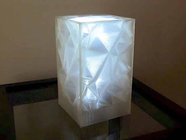
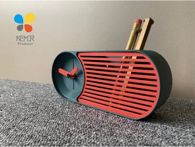

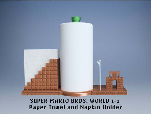
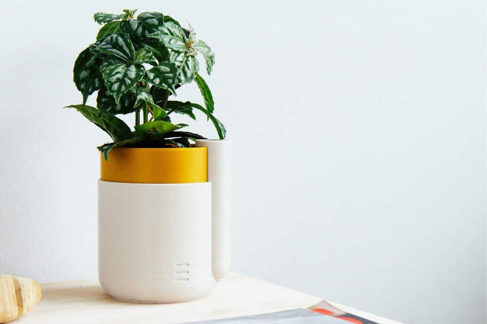
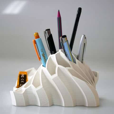
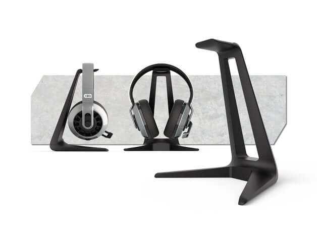
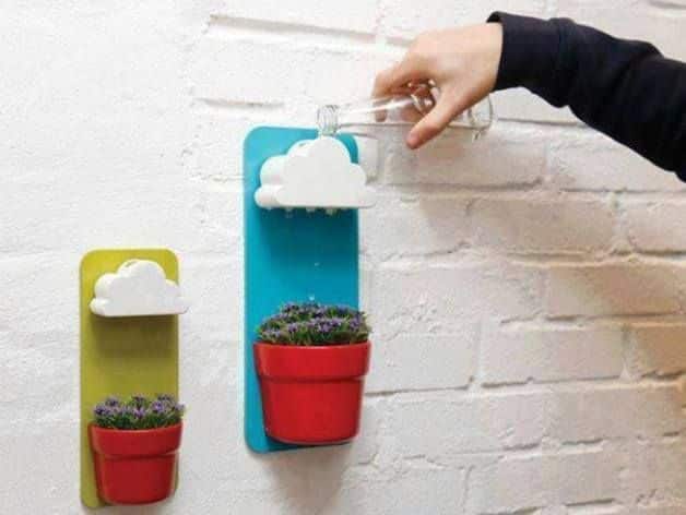
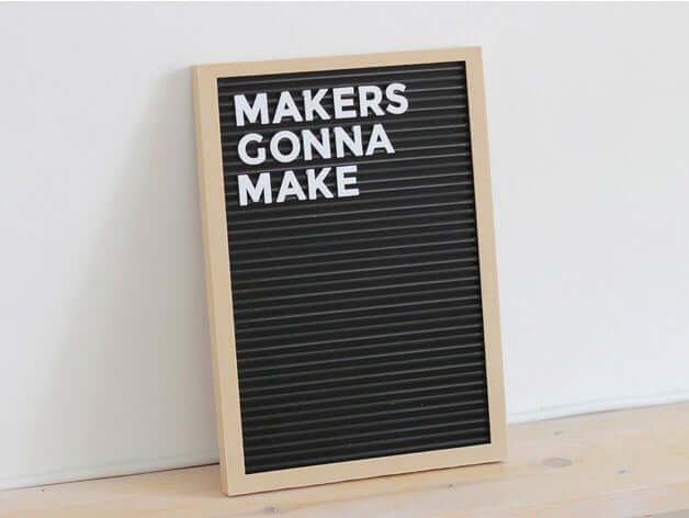
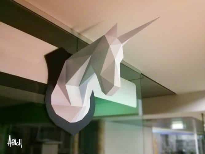
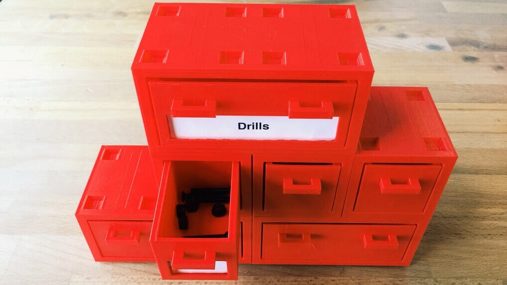
![51[FREE] Digital Painting Tutorials of 2023](https://homesthetics.net/wp-content/uploads/2019/09/Free-Digital-Painting-Tutorials-1.jpg "51[FREE] Digital Painting Tutorials of 2023")

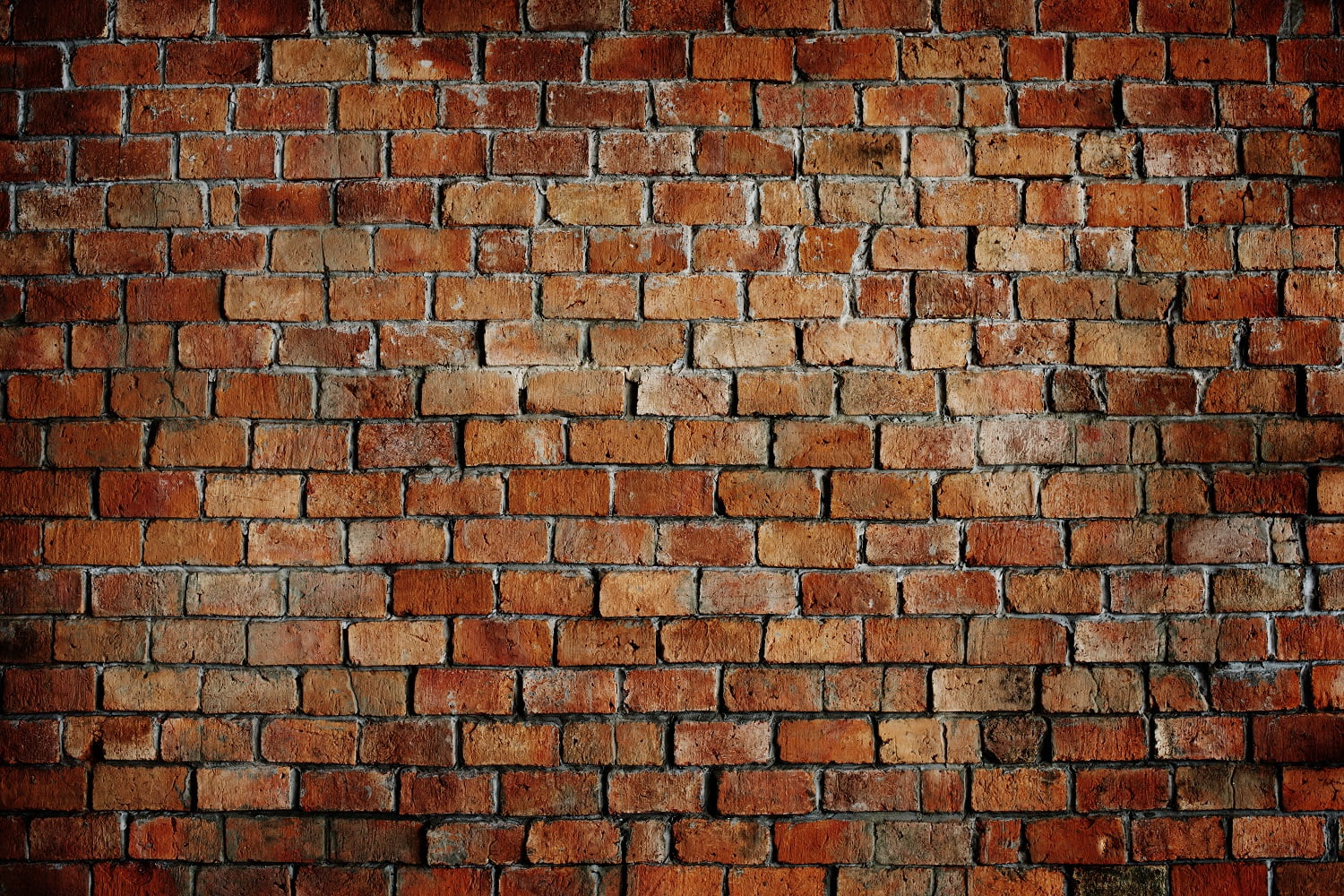
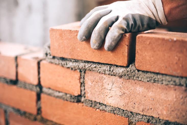
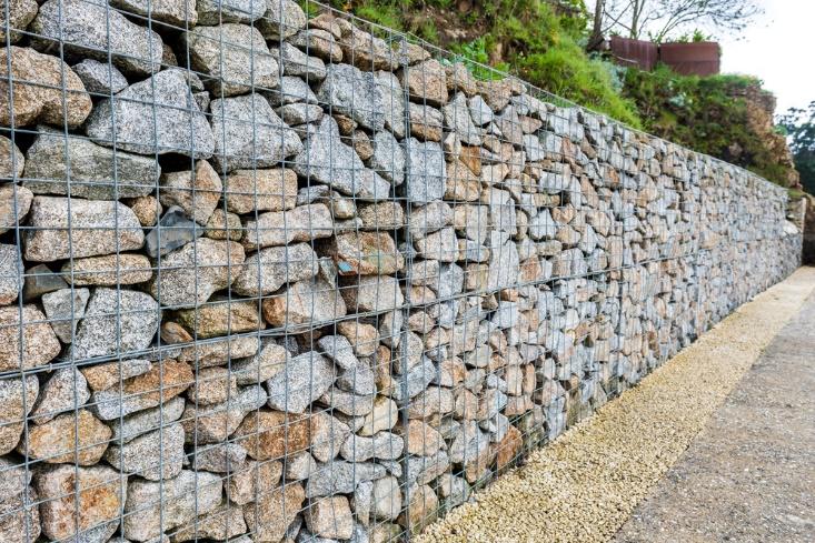
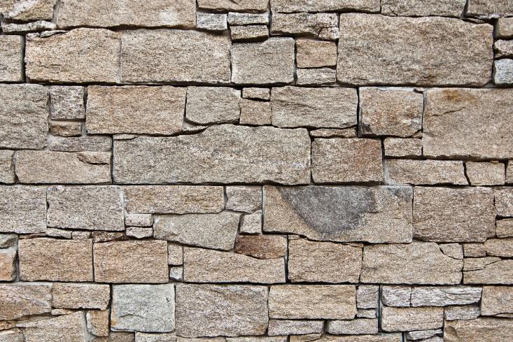
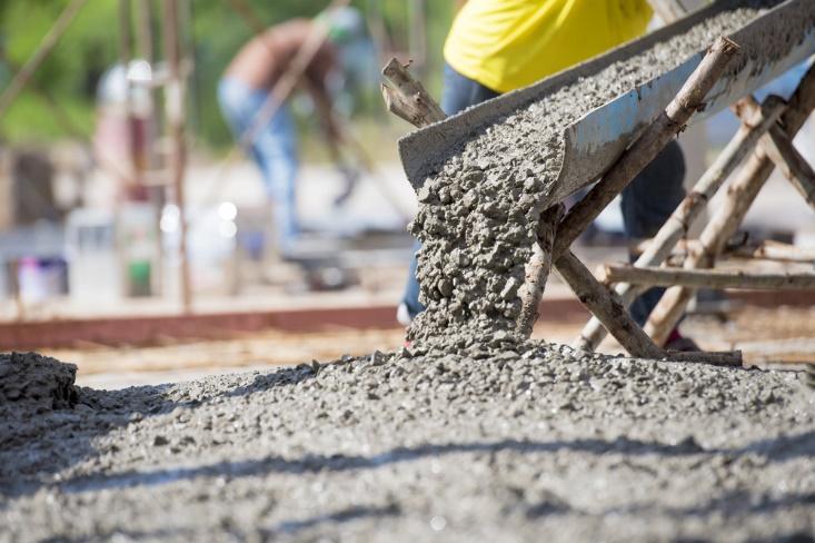
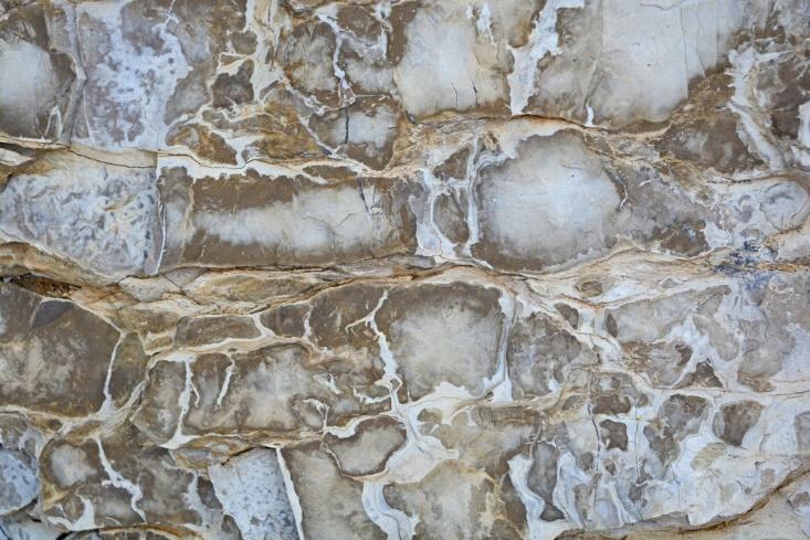
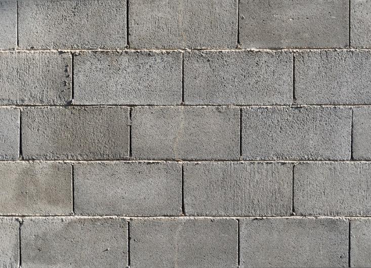
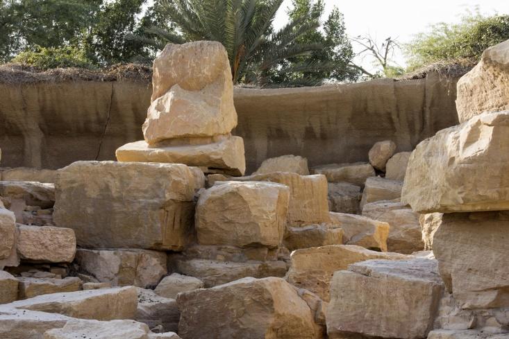
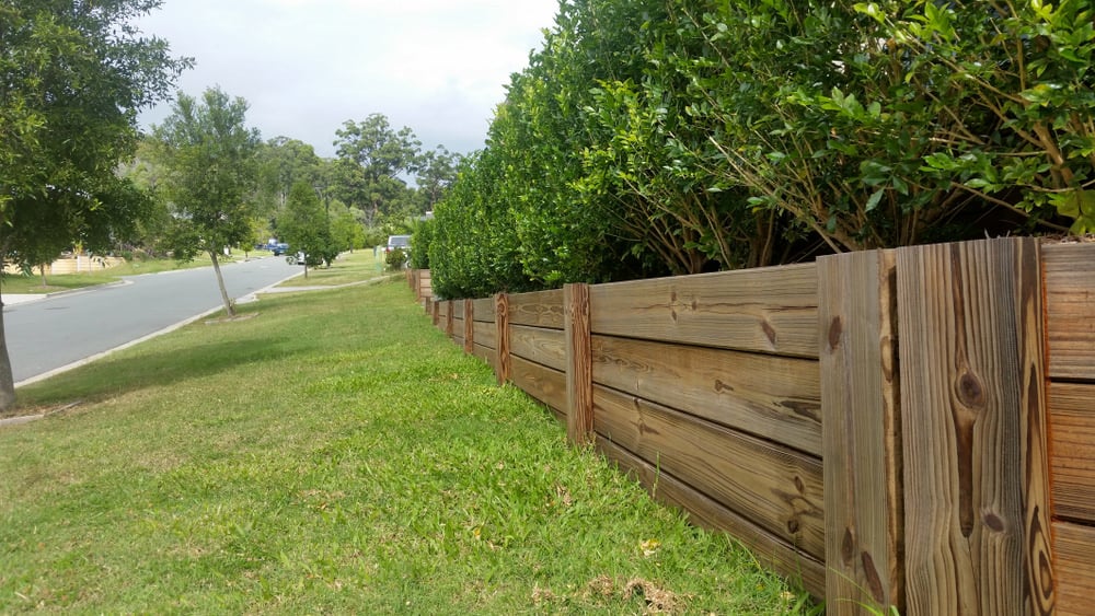
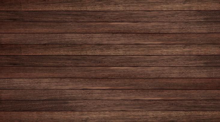
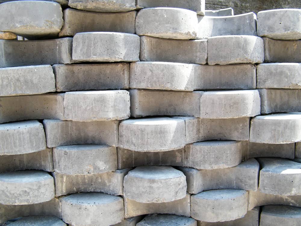
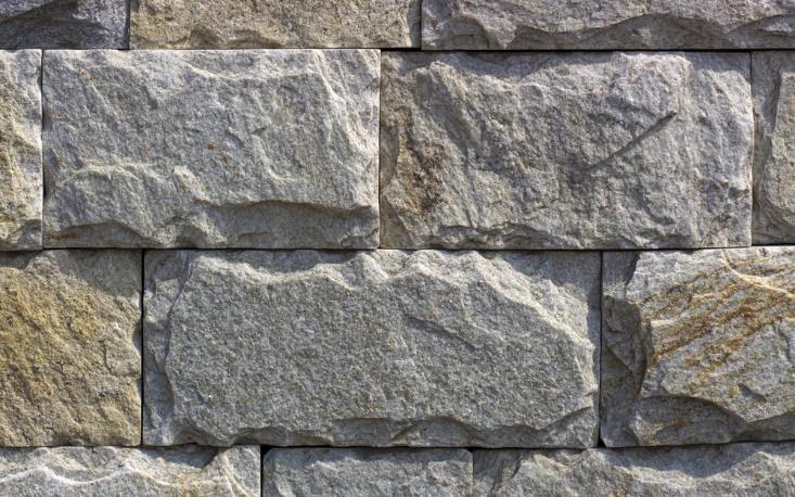

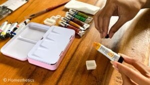
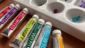


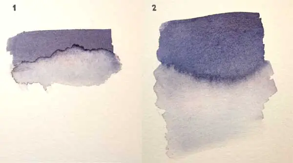
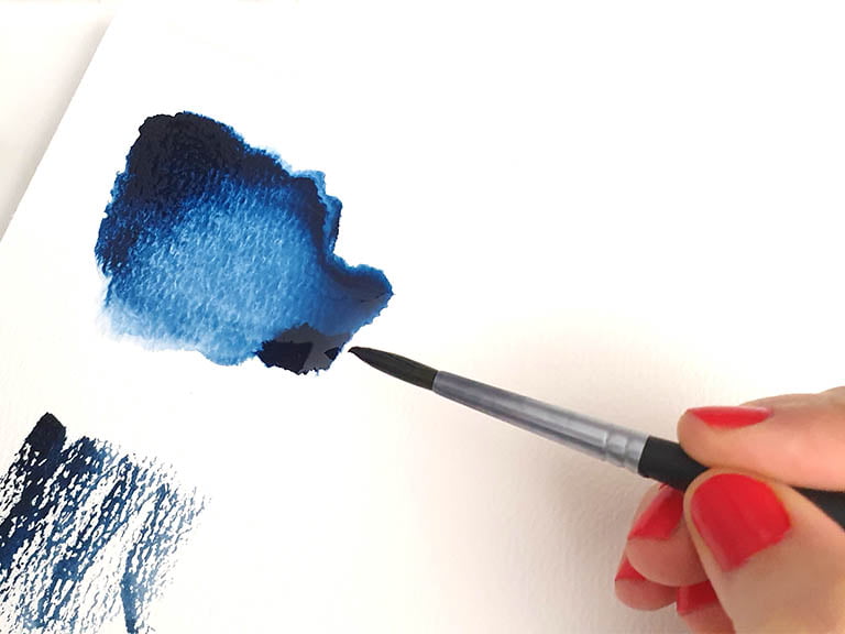
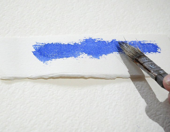
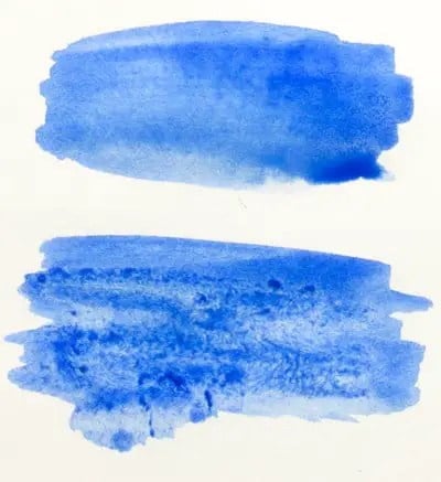


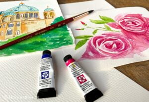
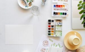

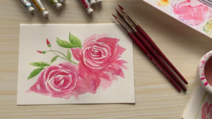


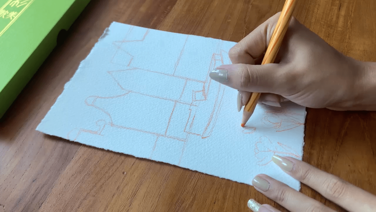
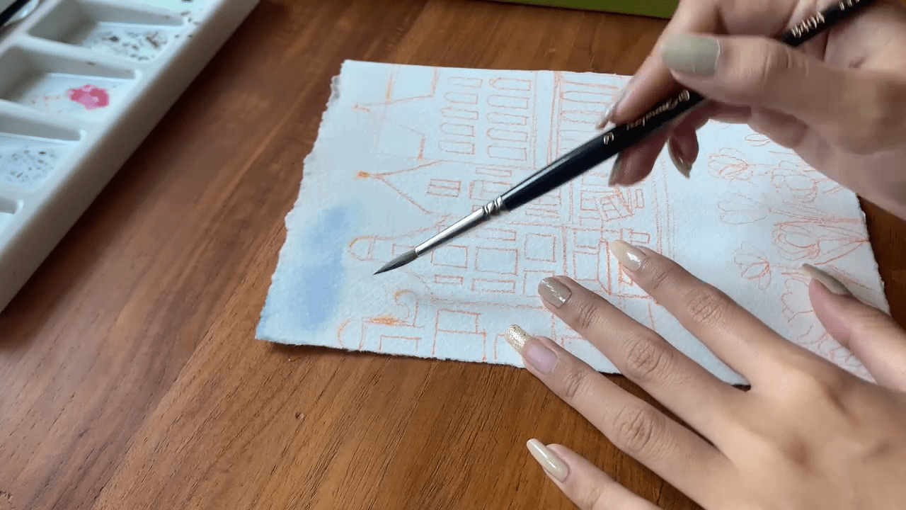
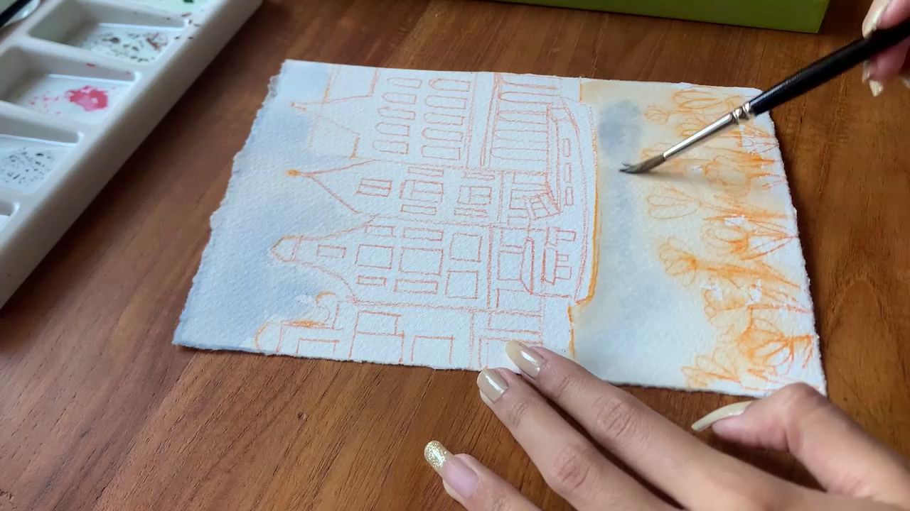
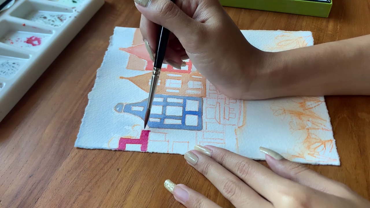
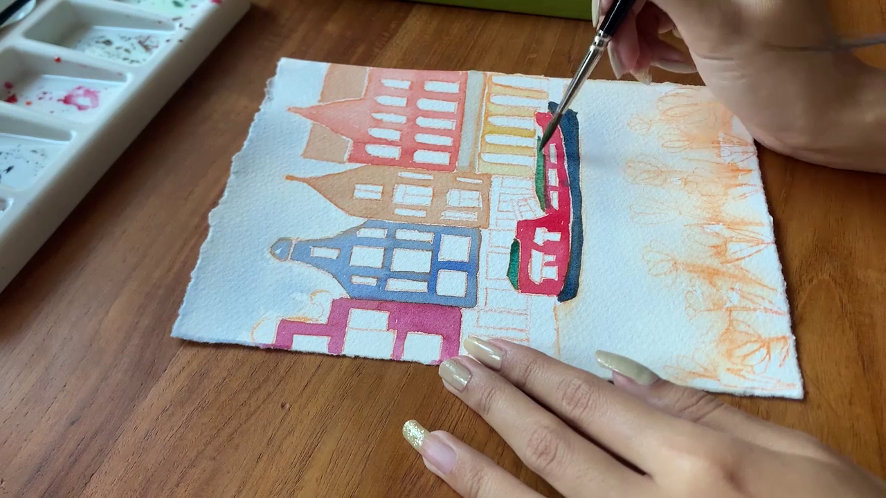
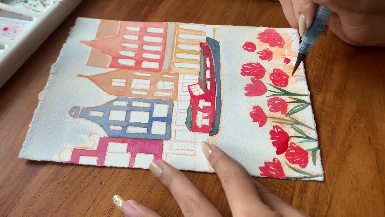
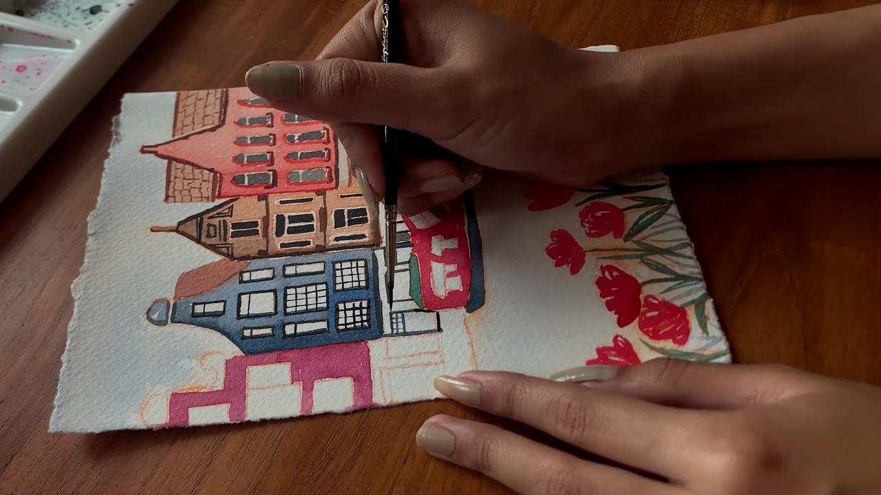
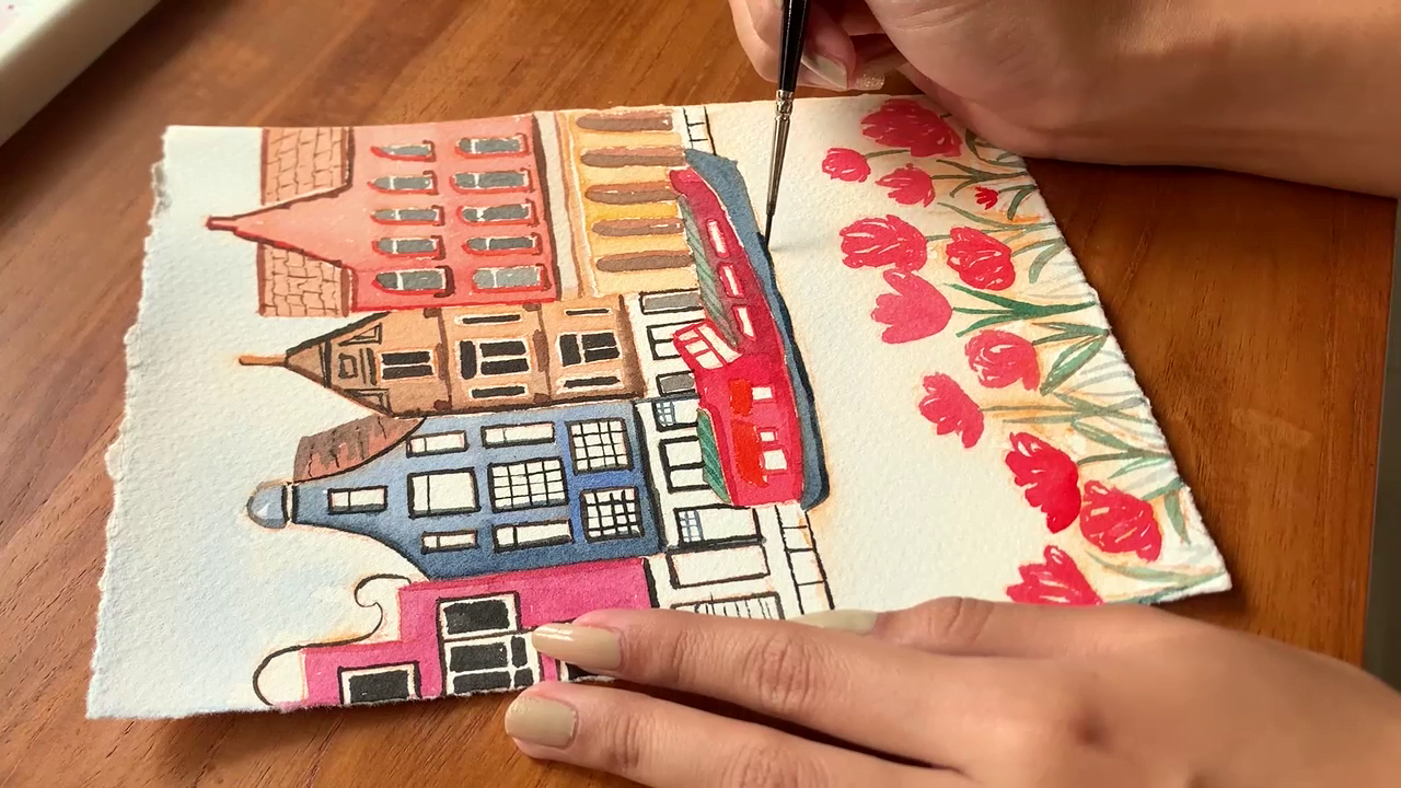
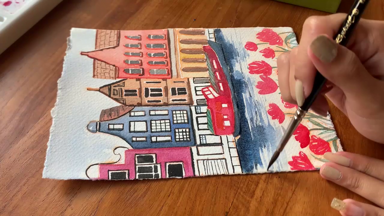
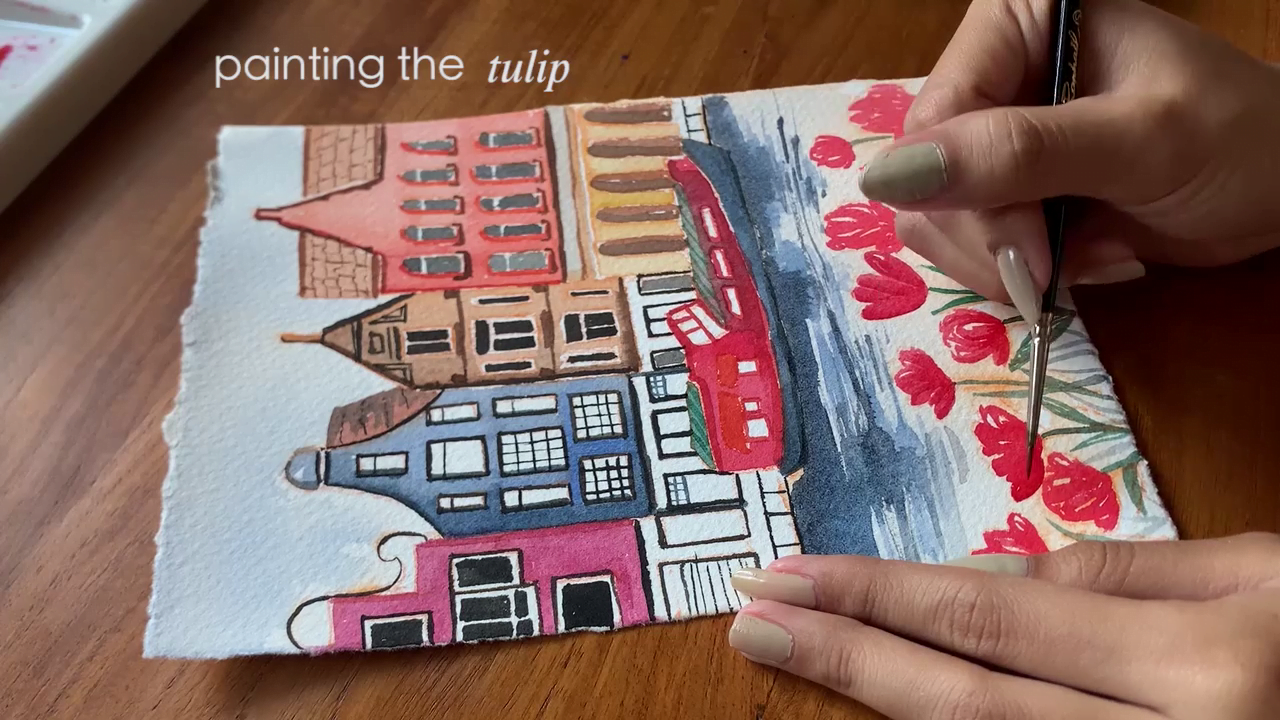
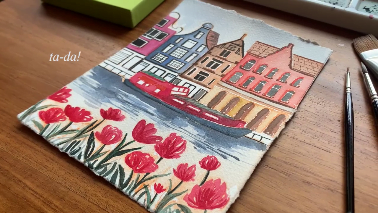

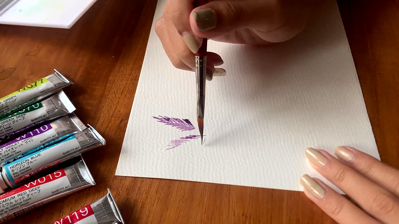
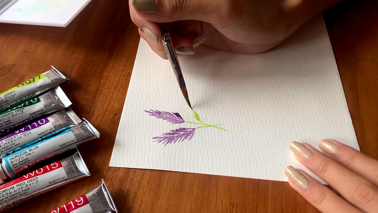
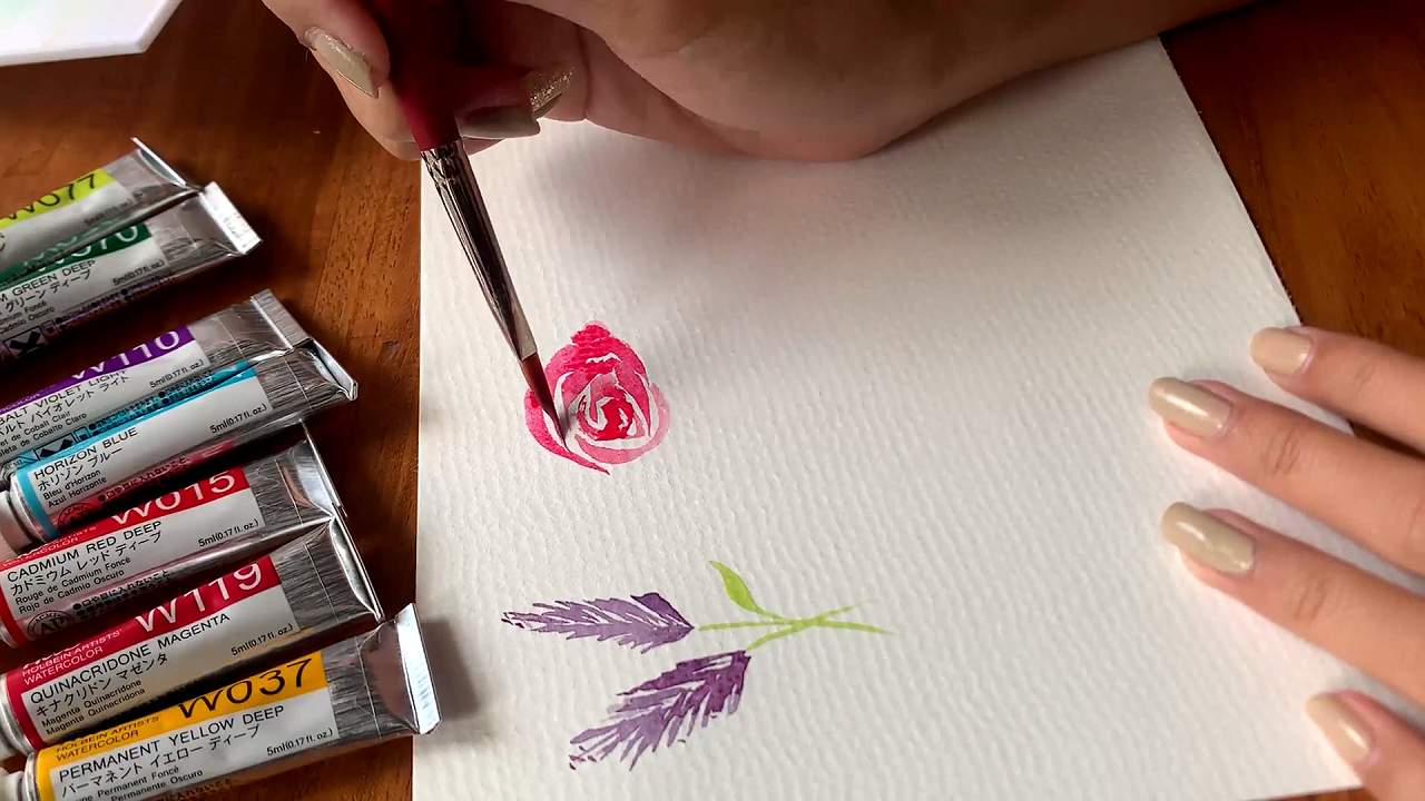
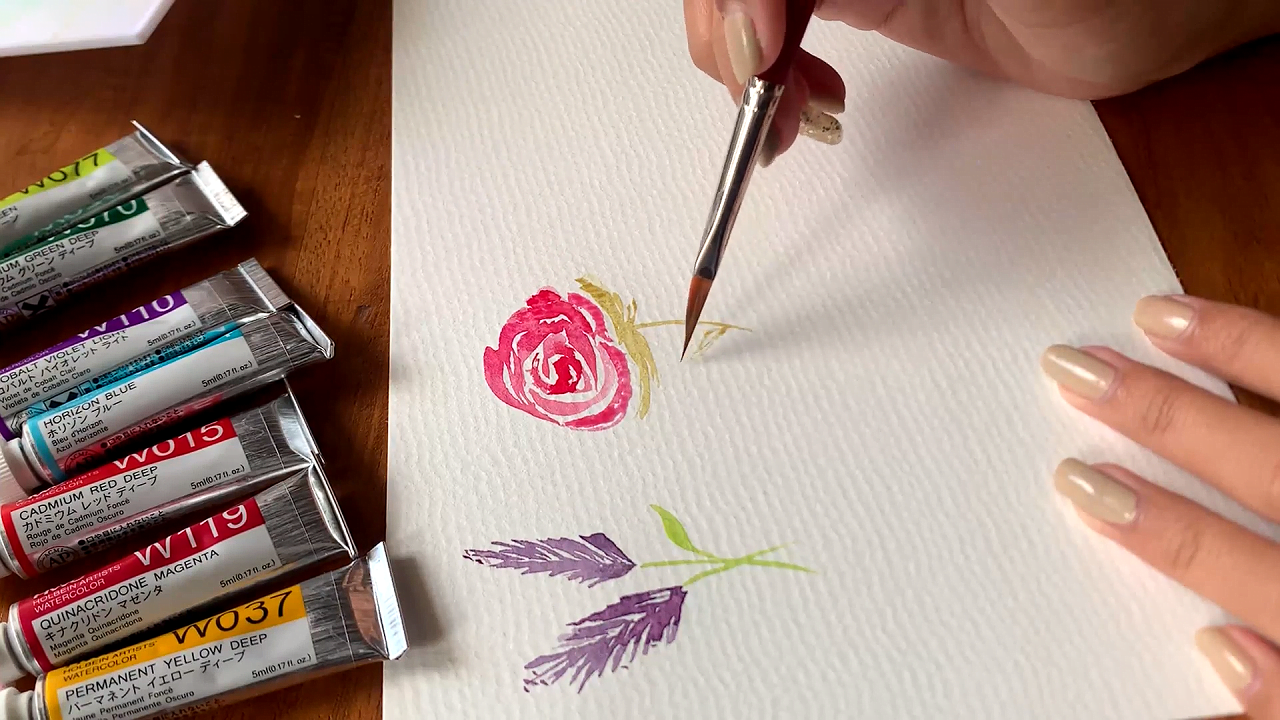
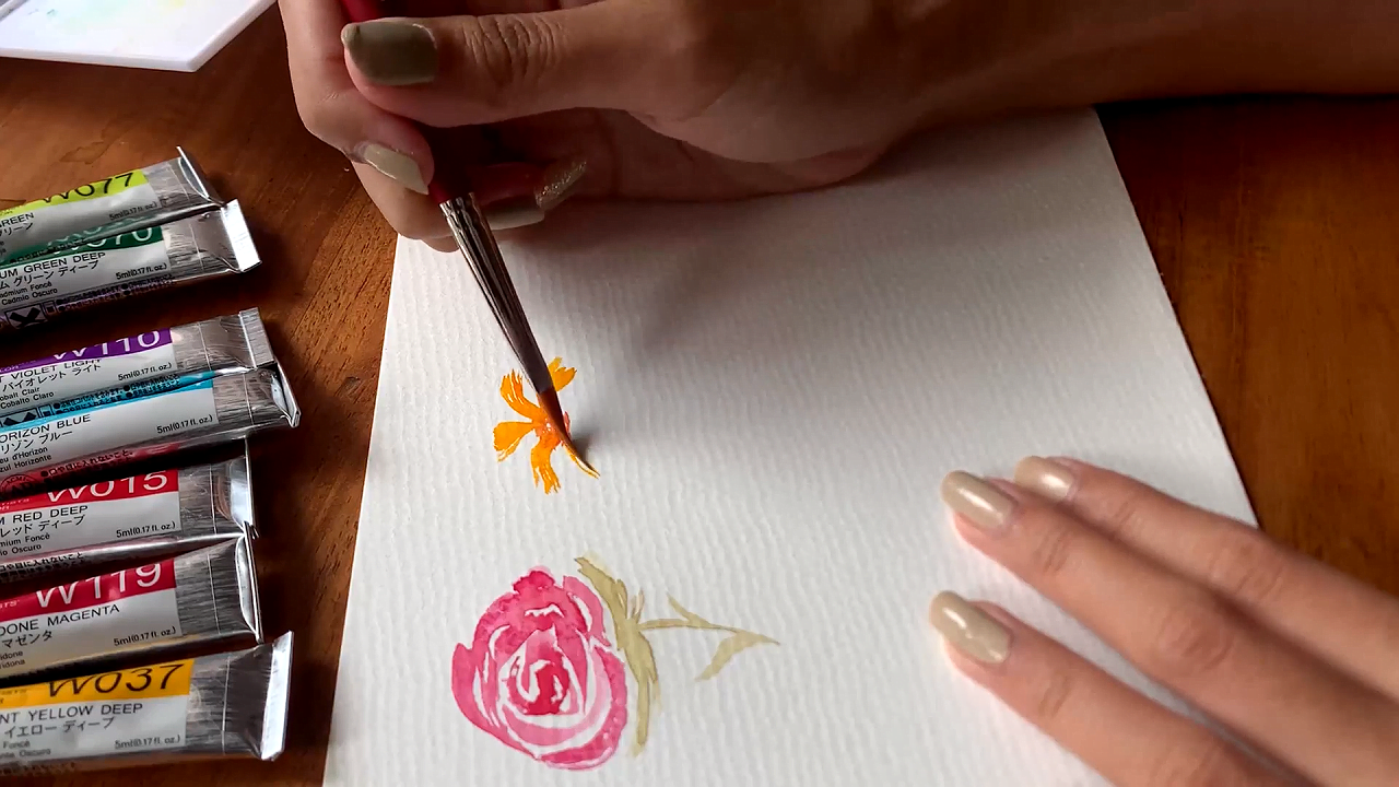
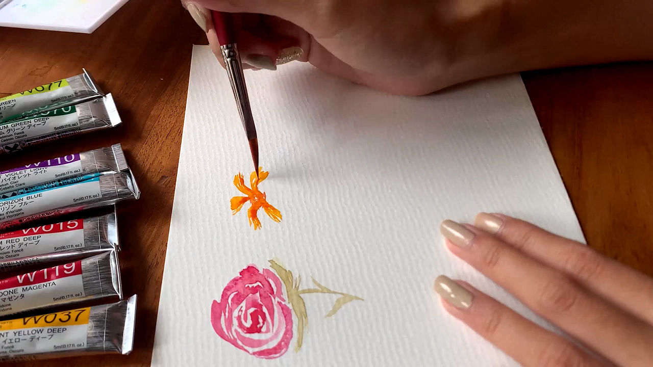
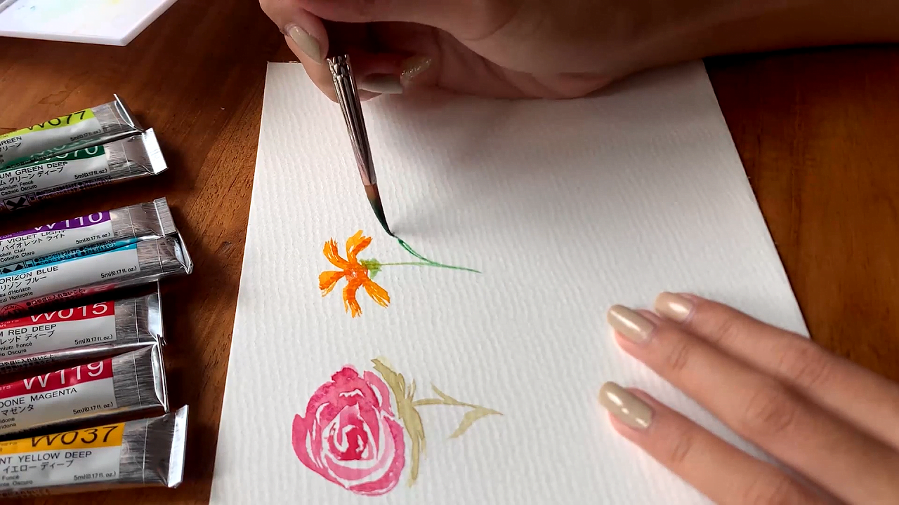
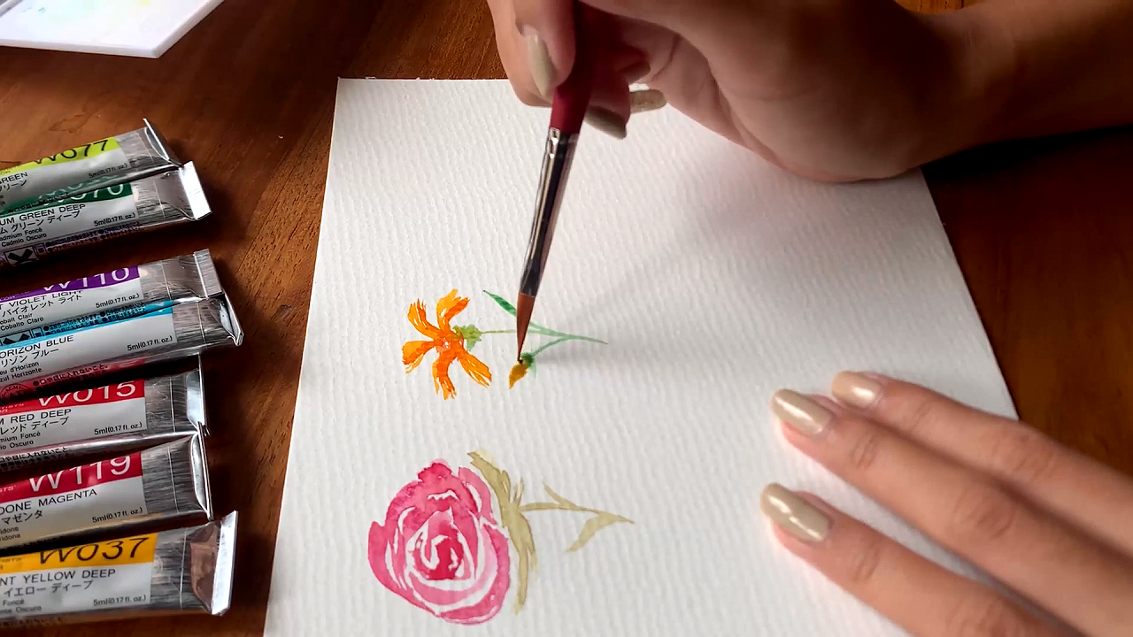
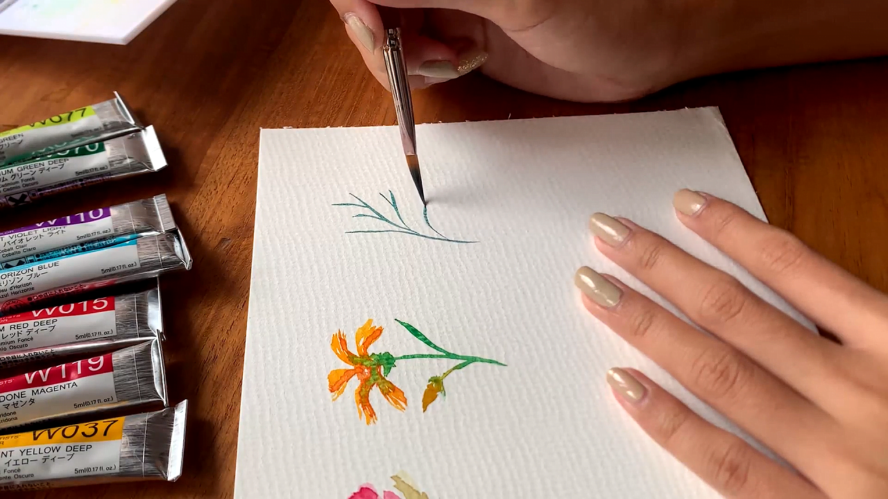
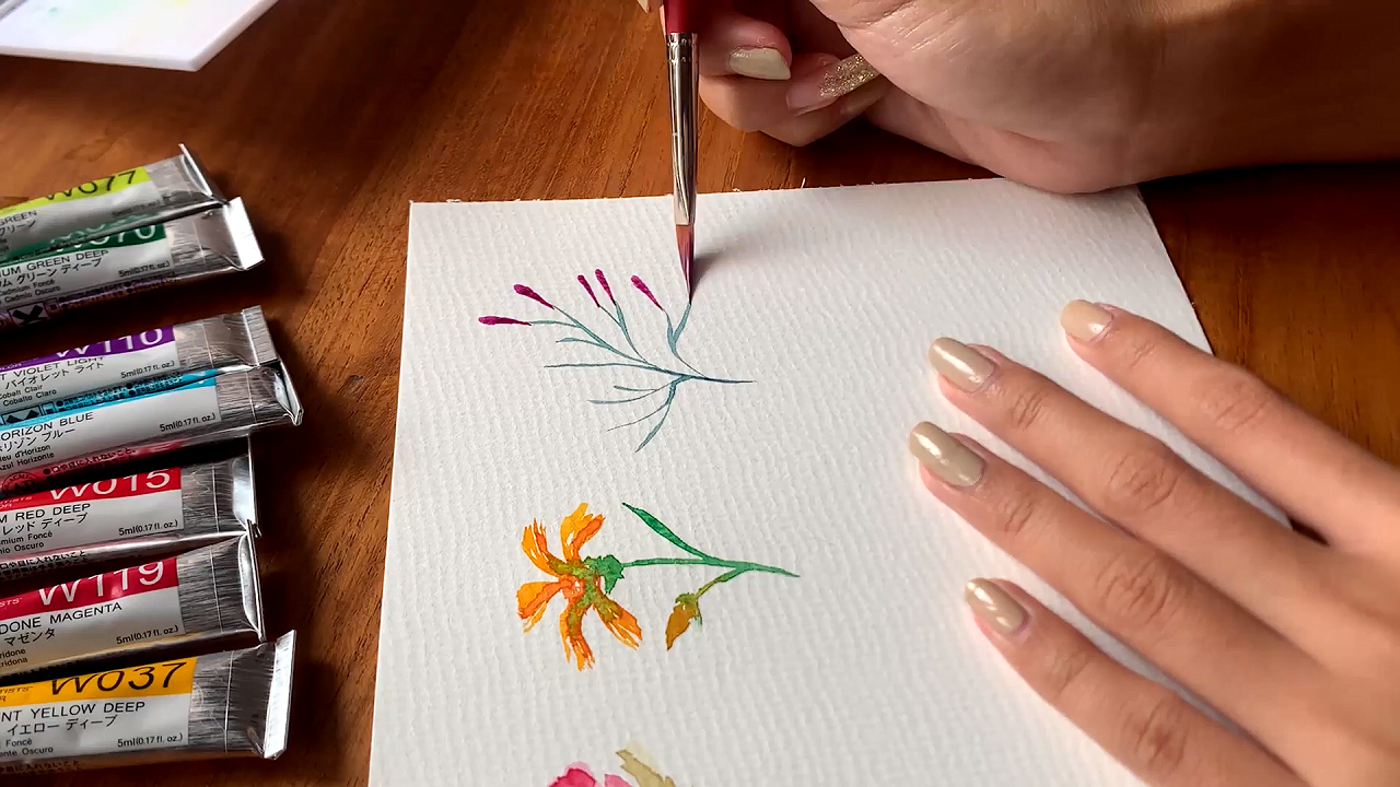
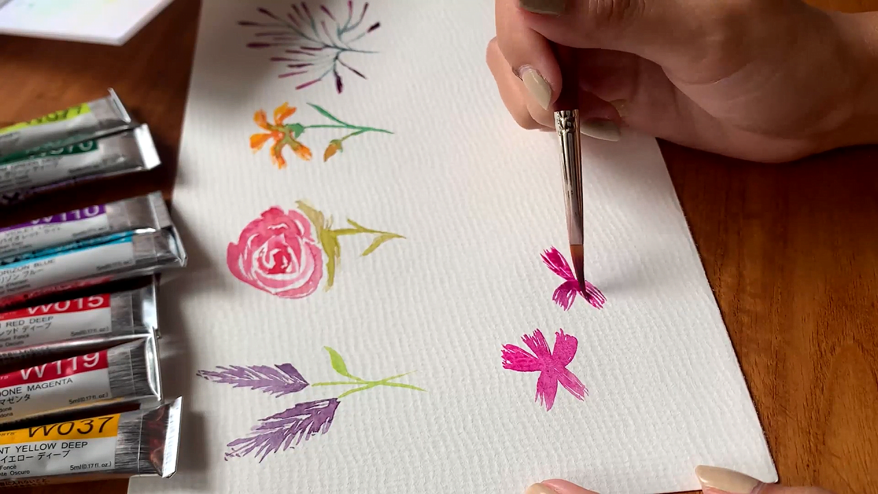
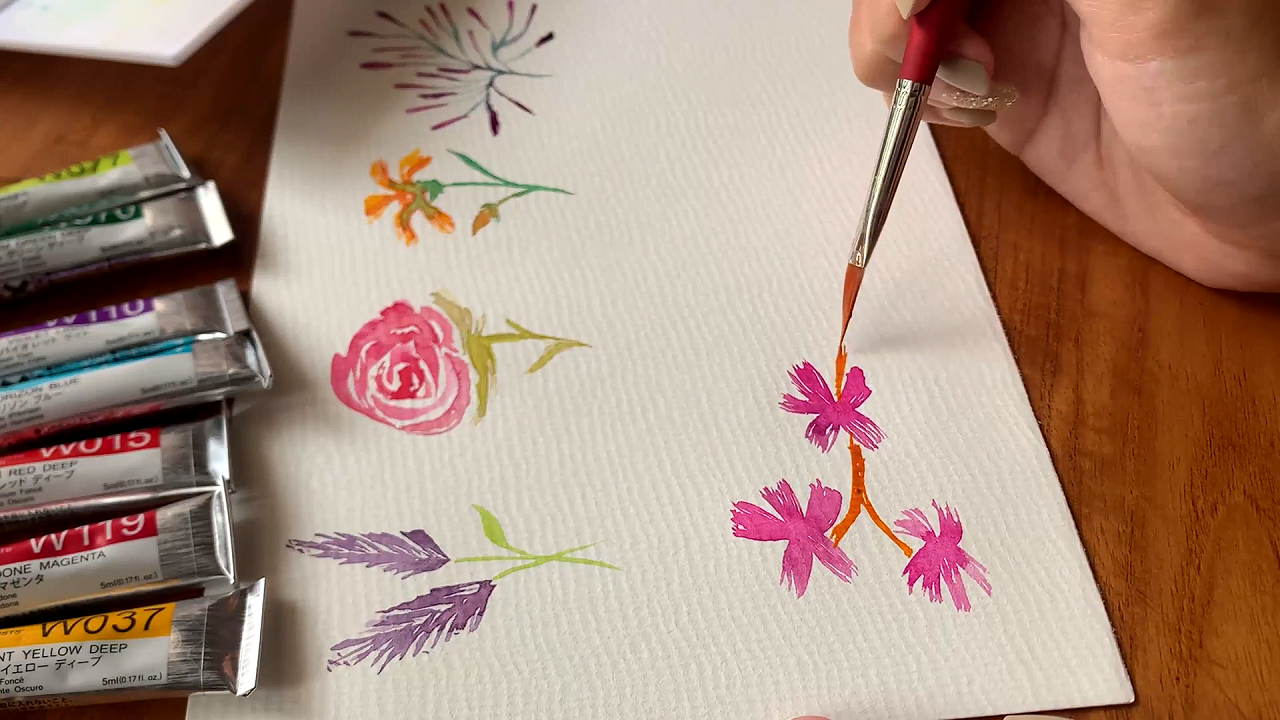
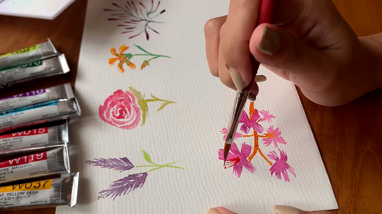
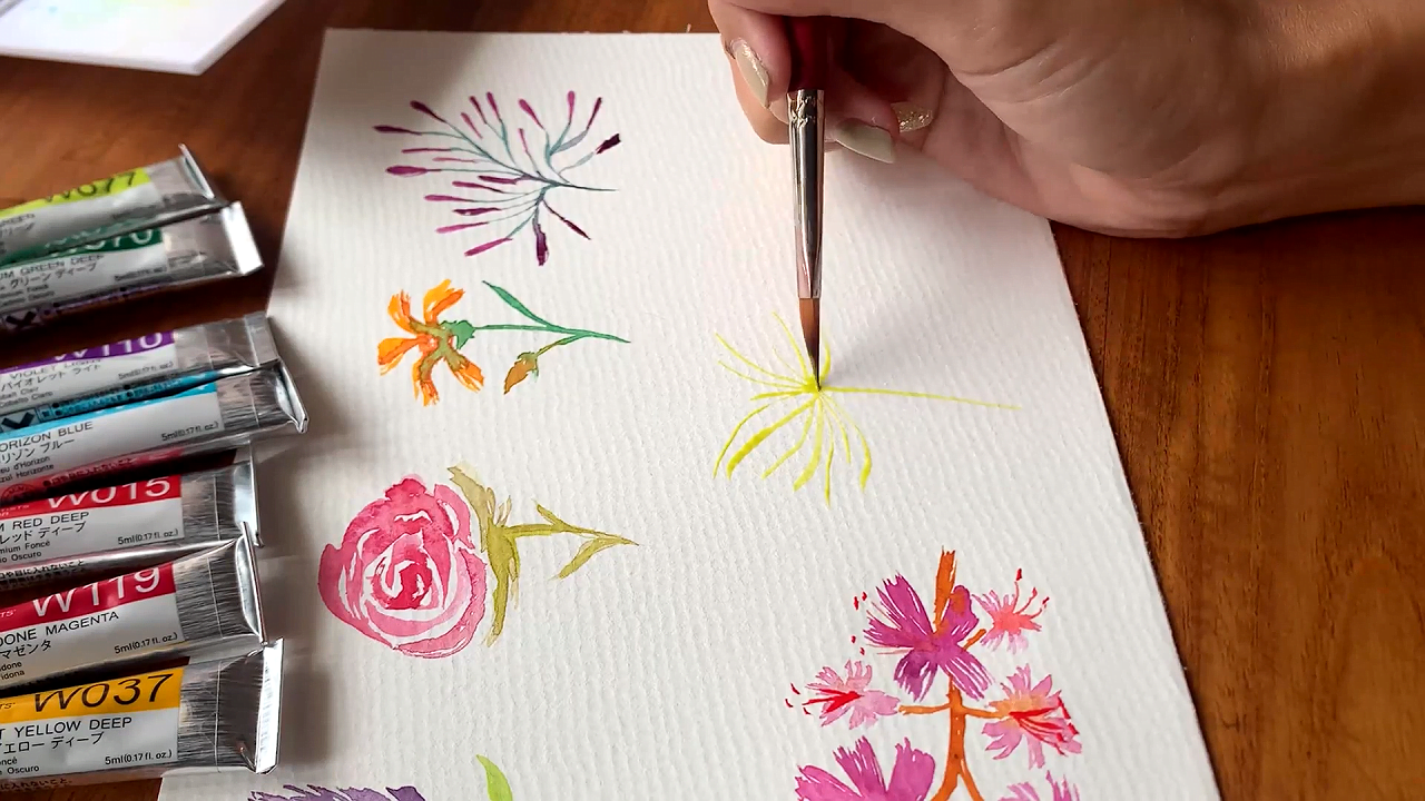
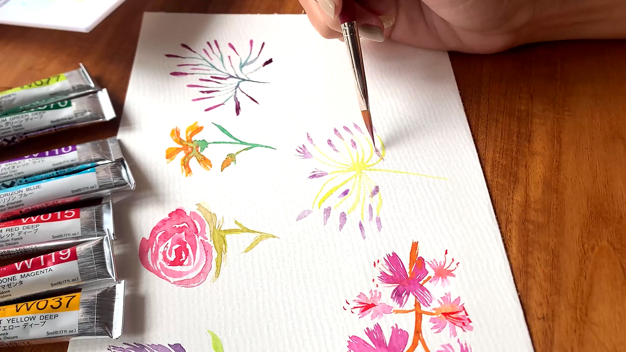
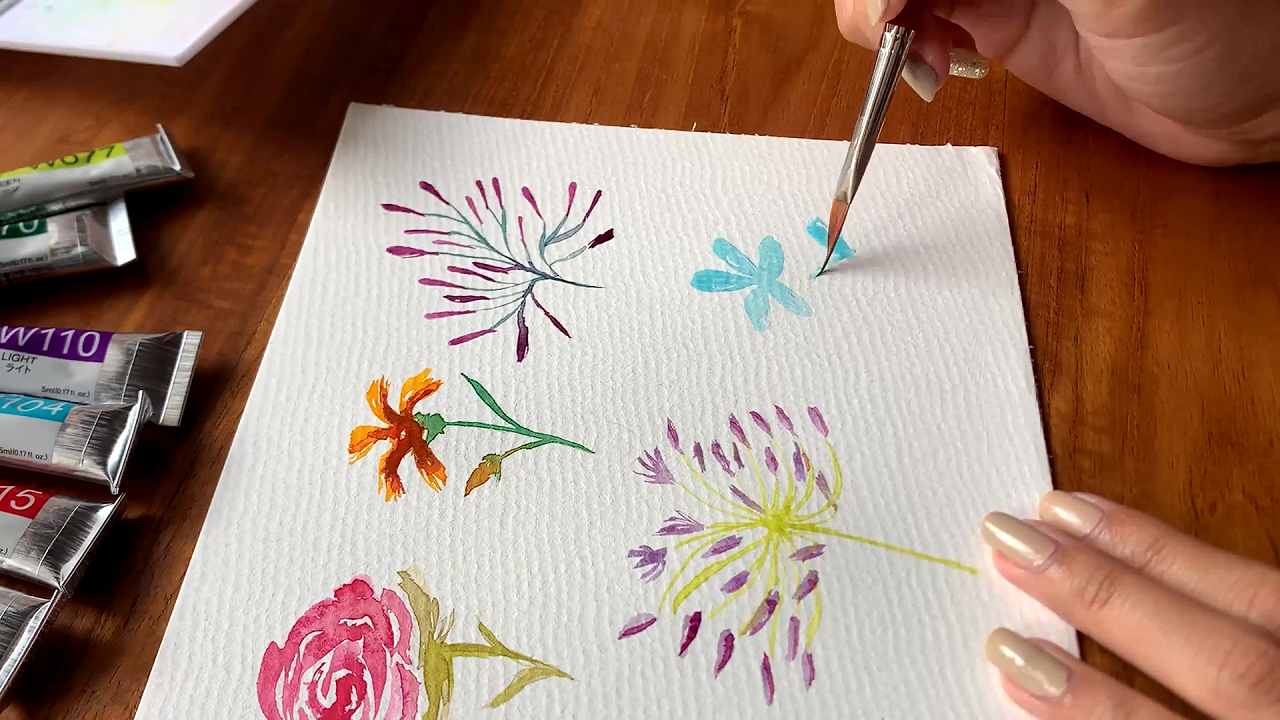
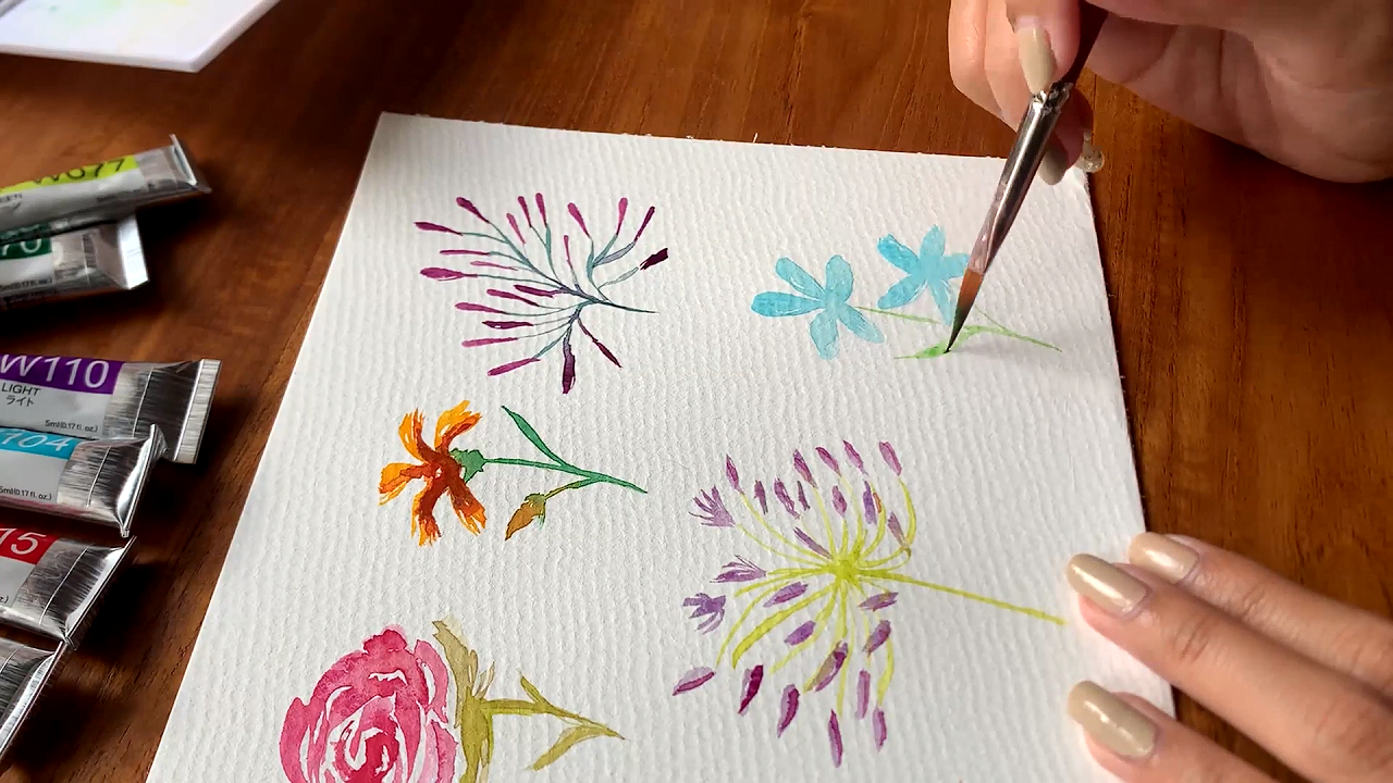
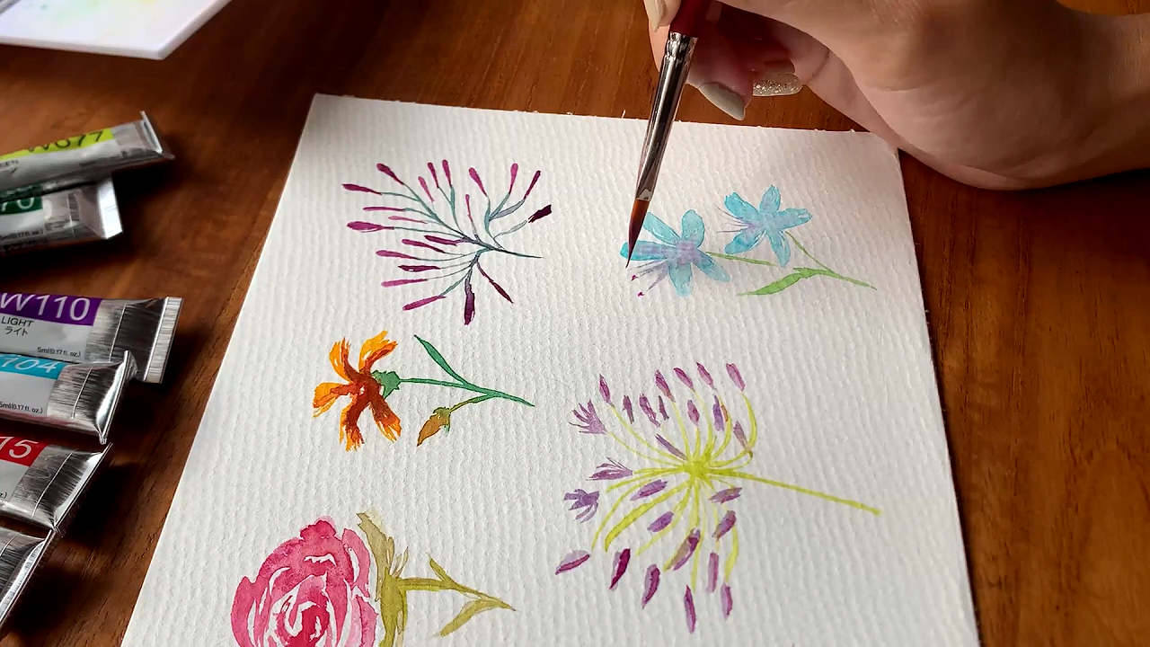
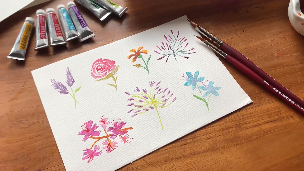

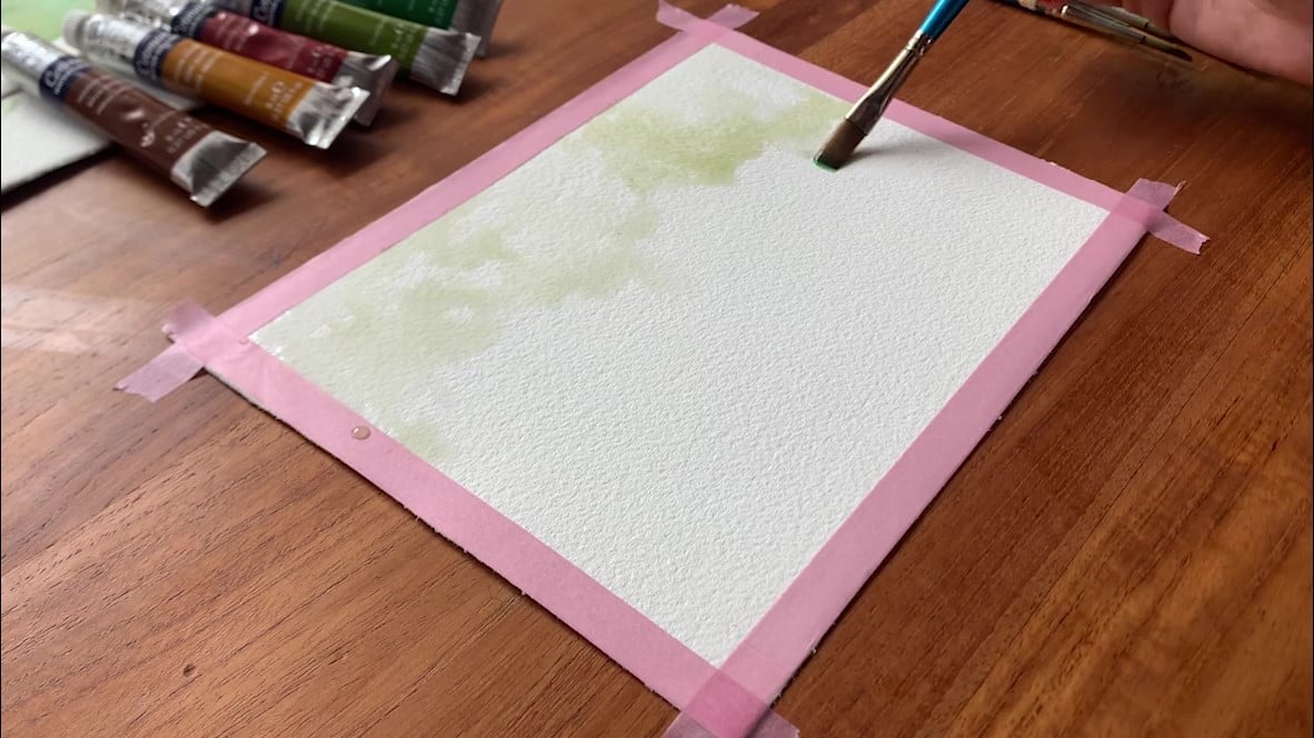
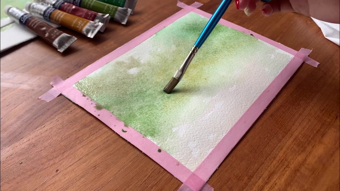
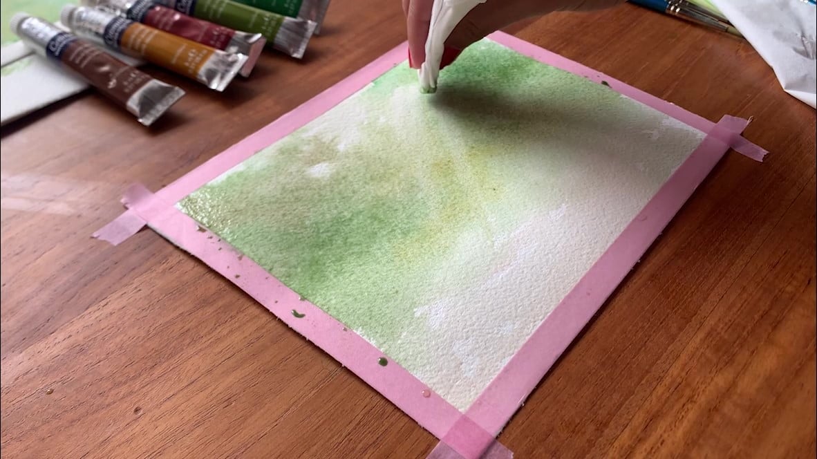
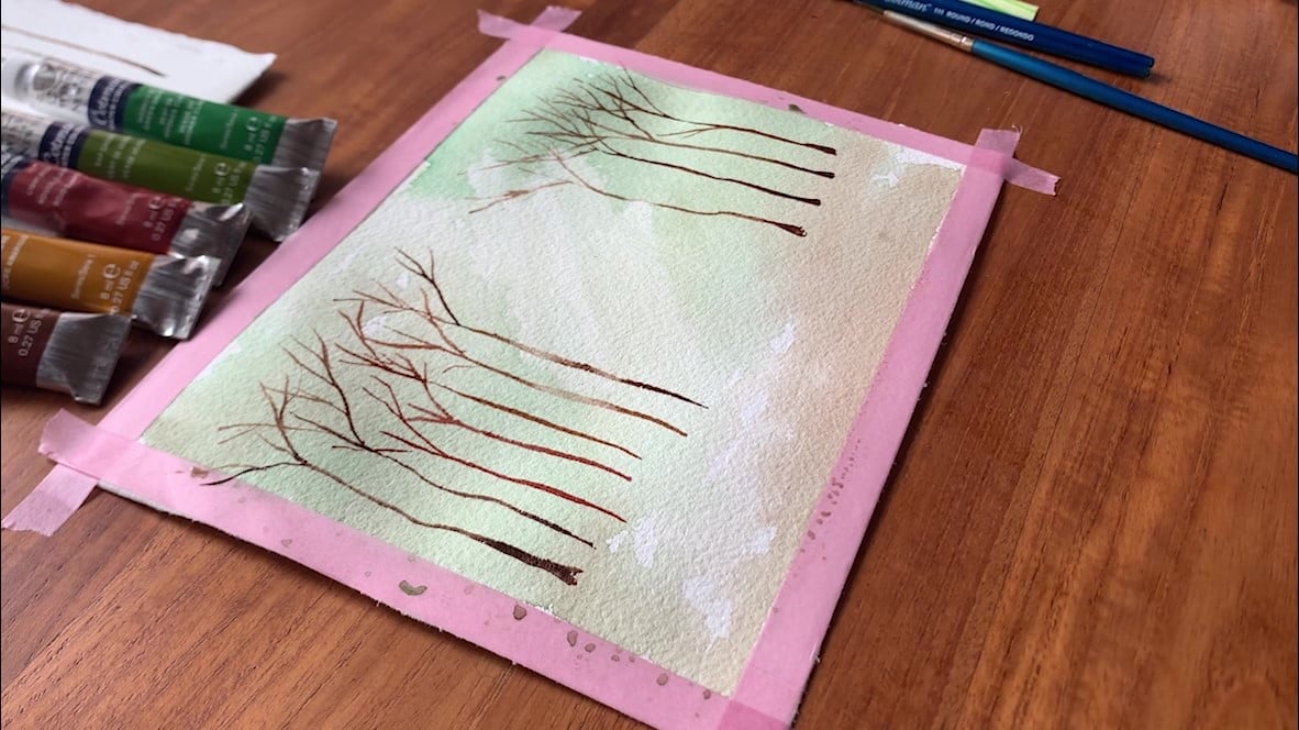
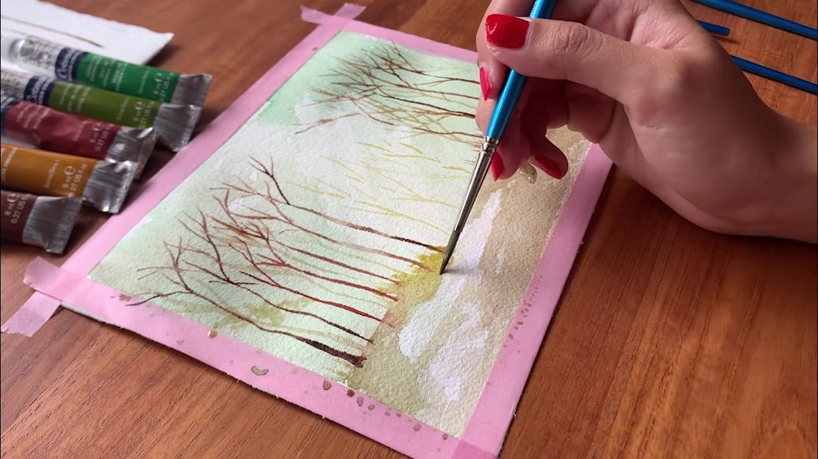
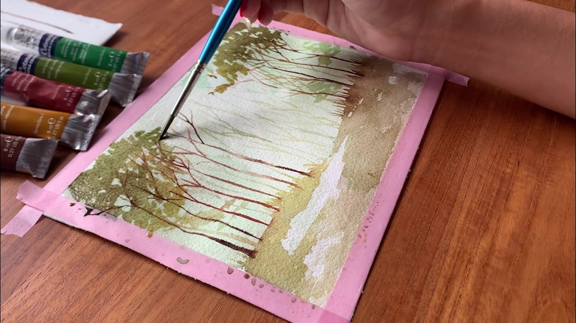
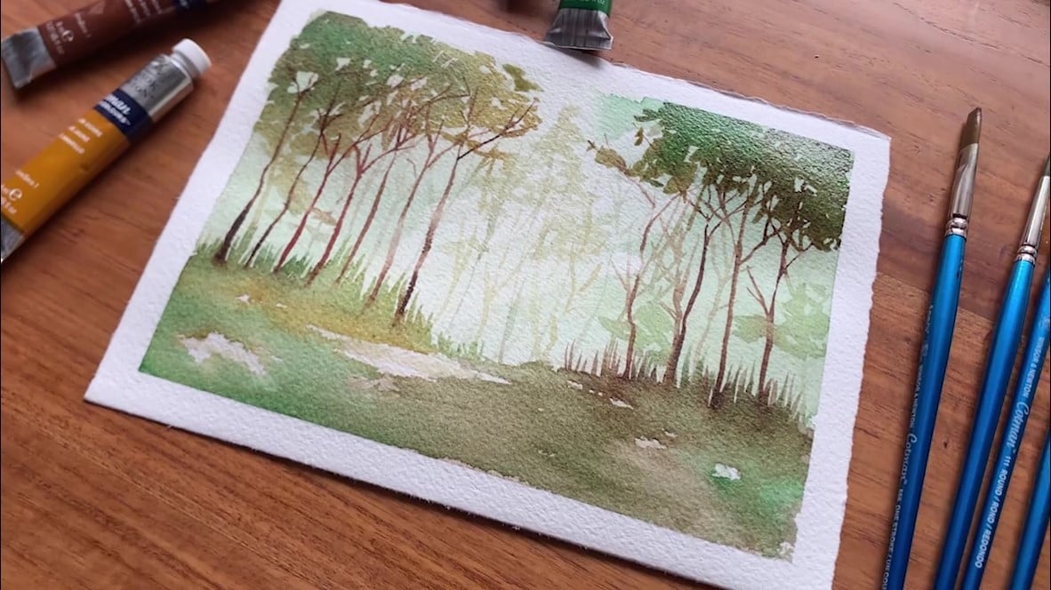

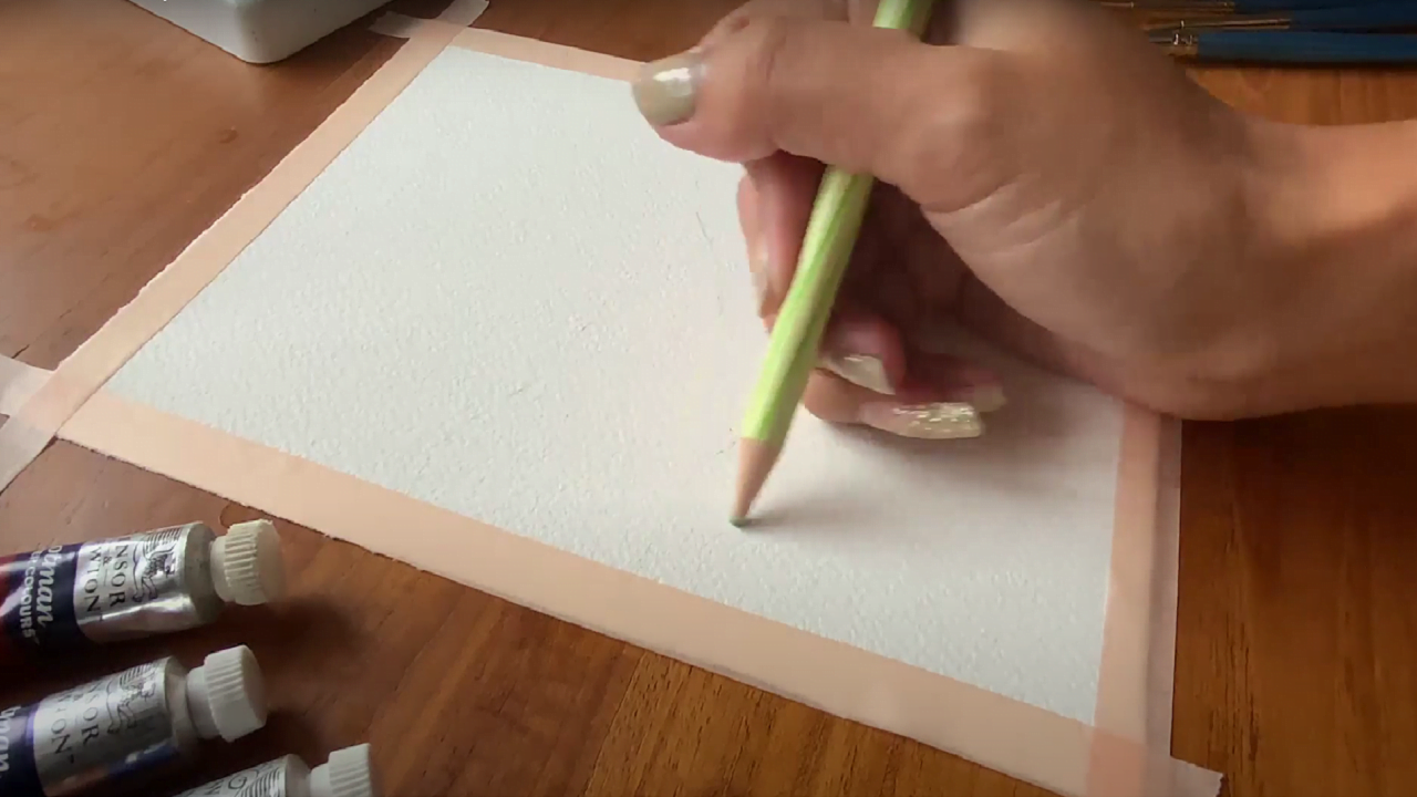
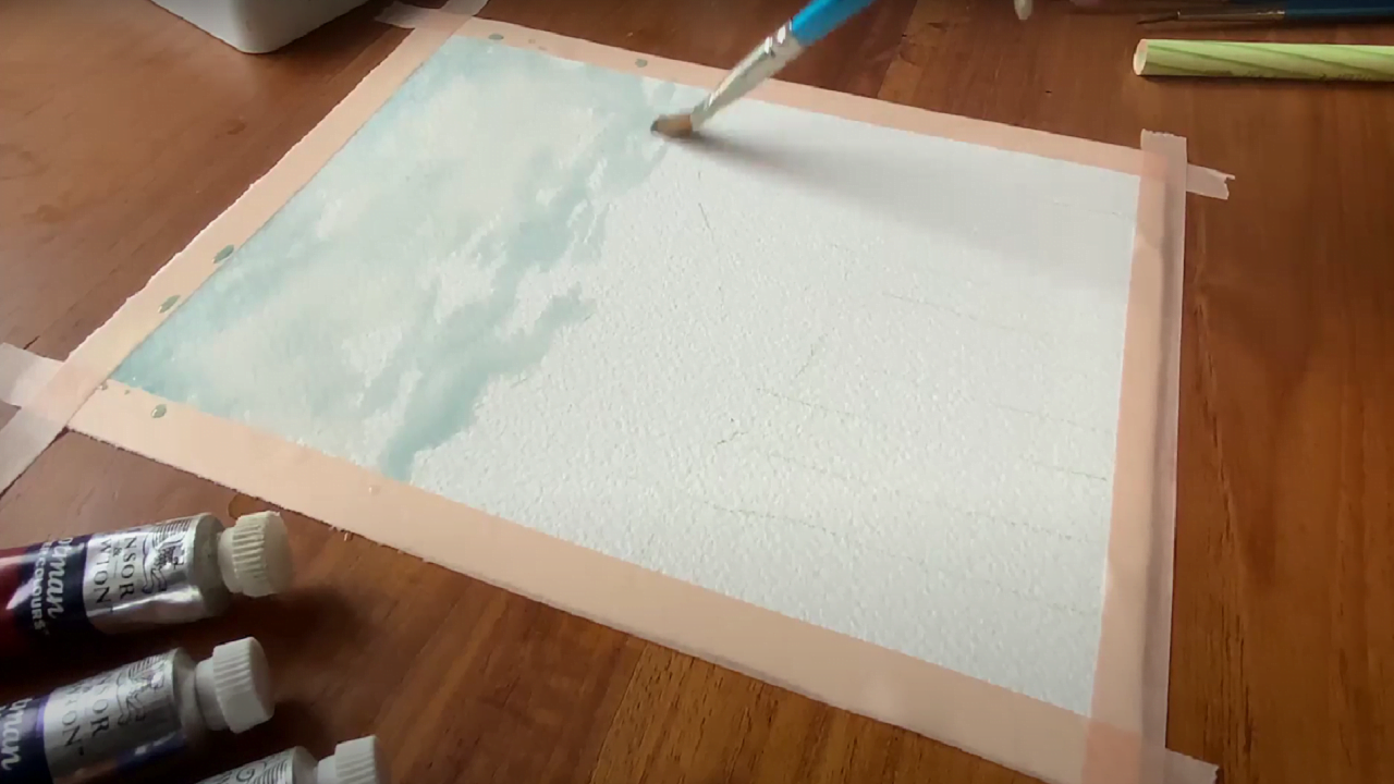
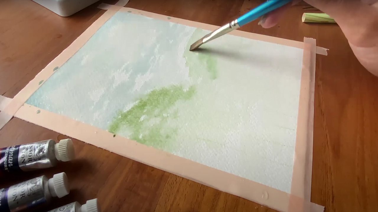
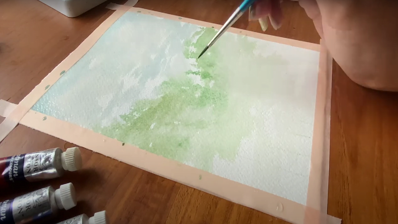
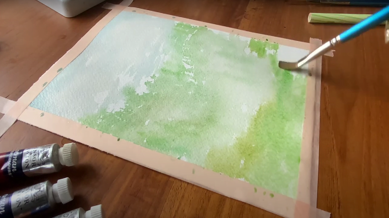
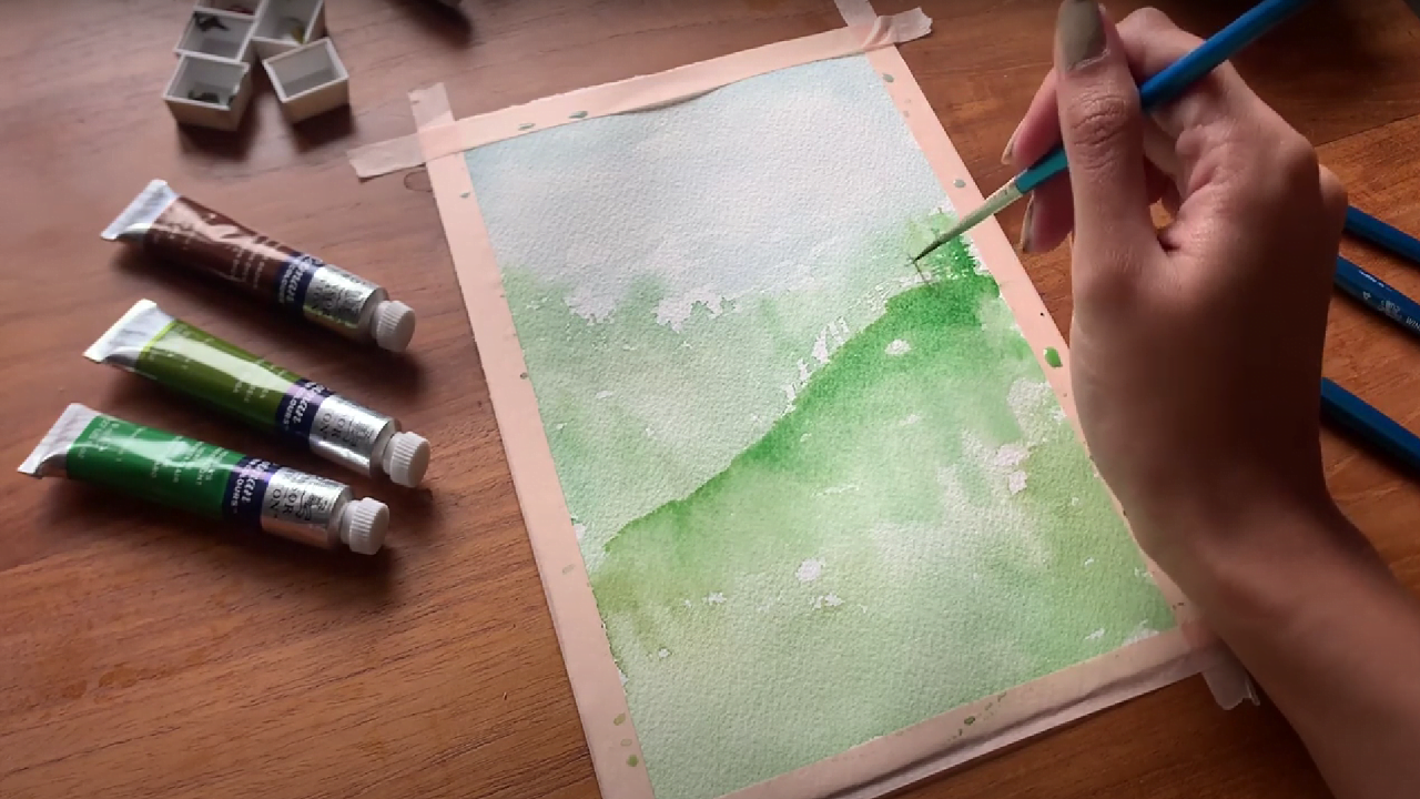
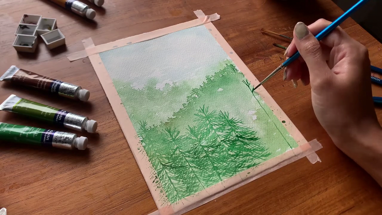
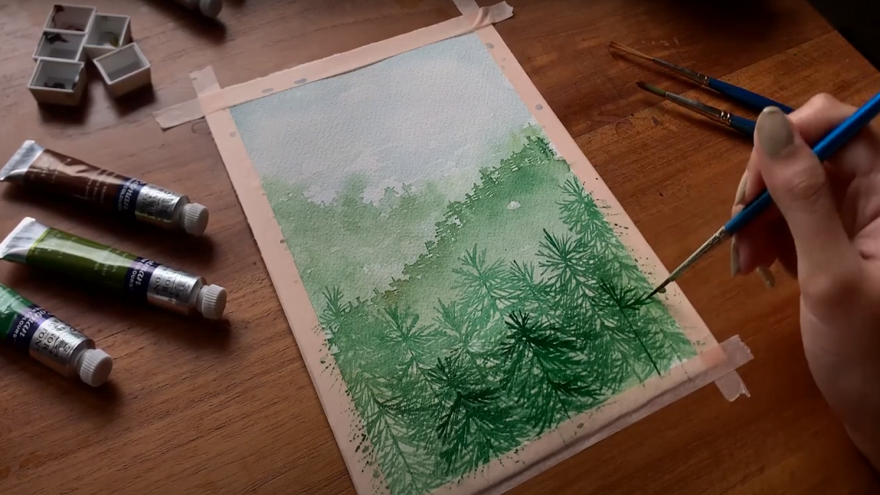
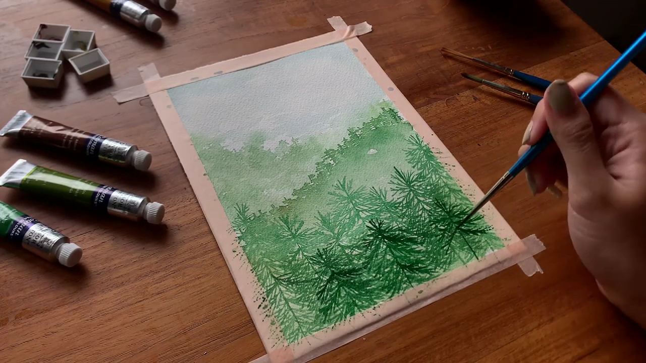

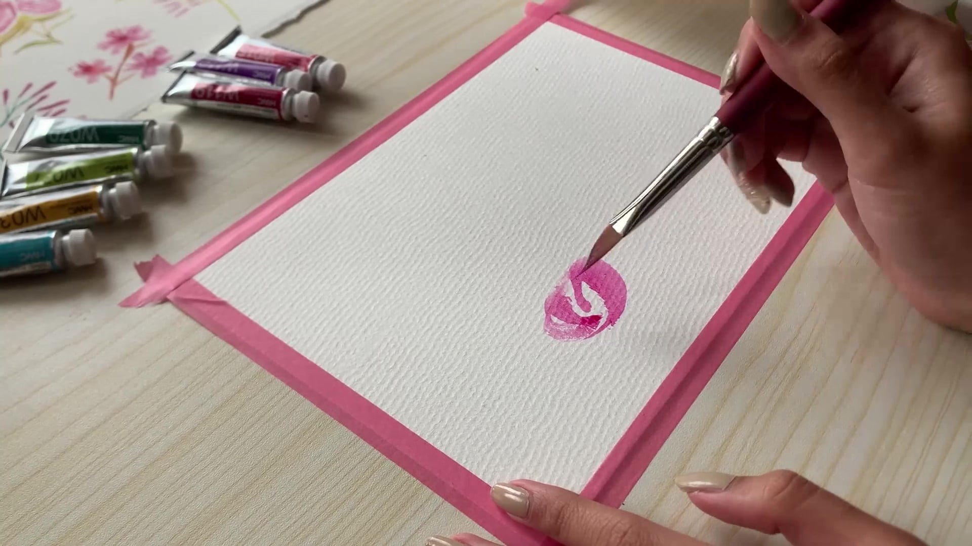
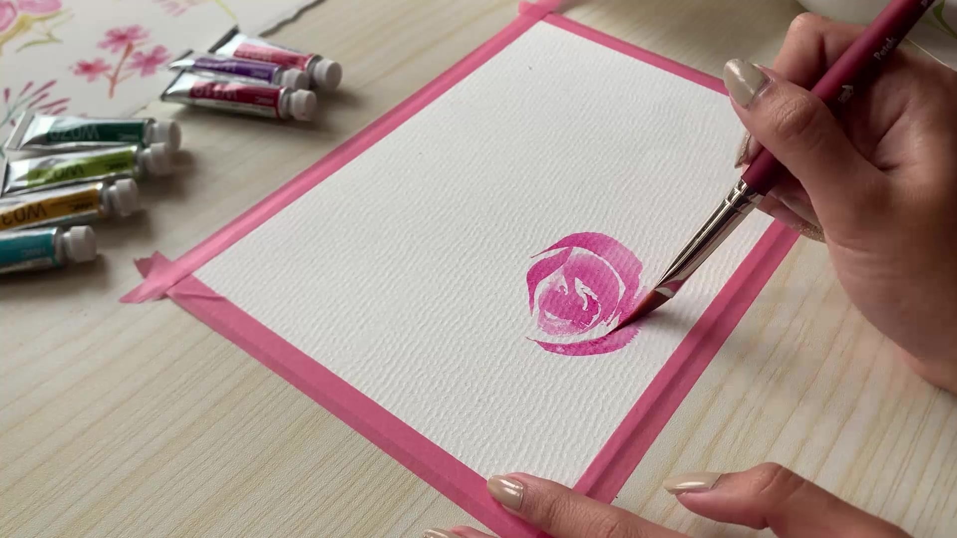
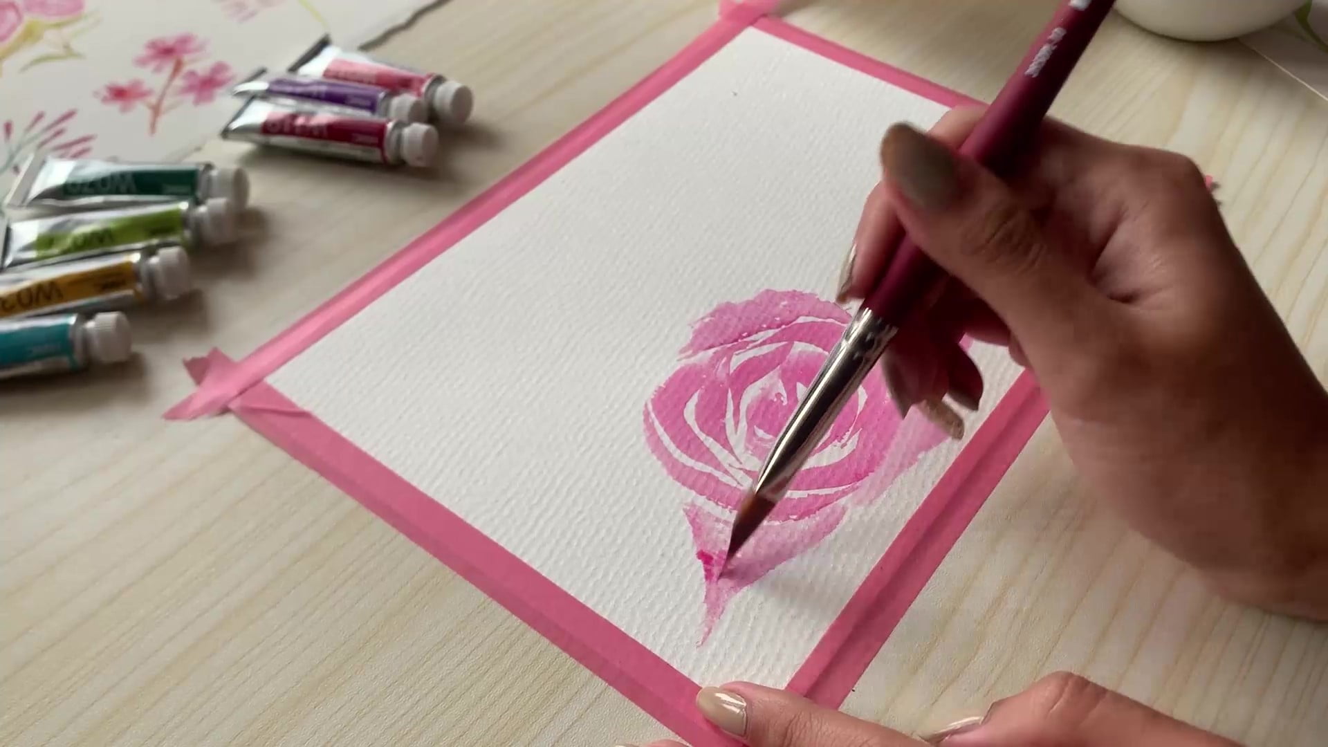
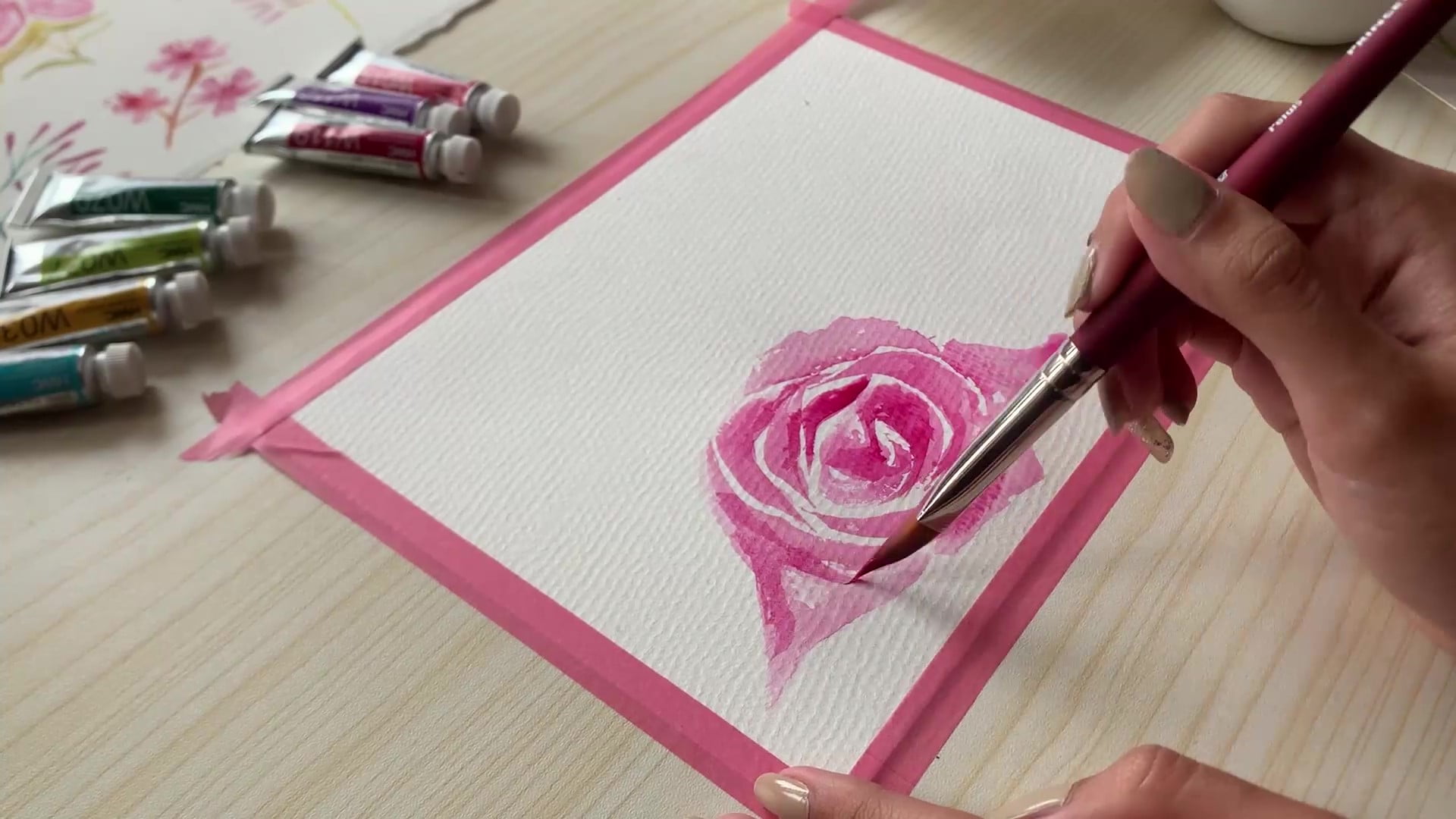
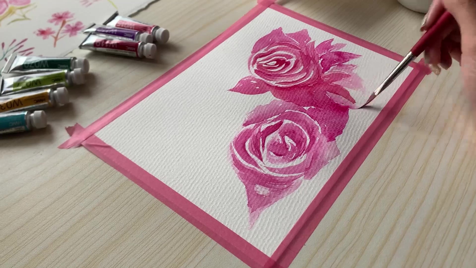
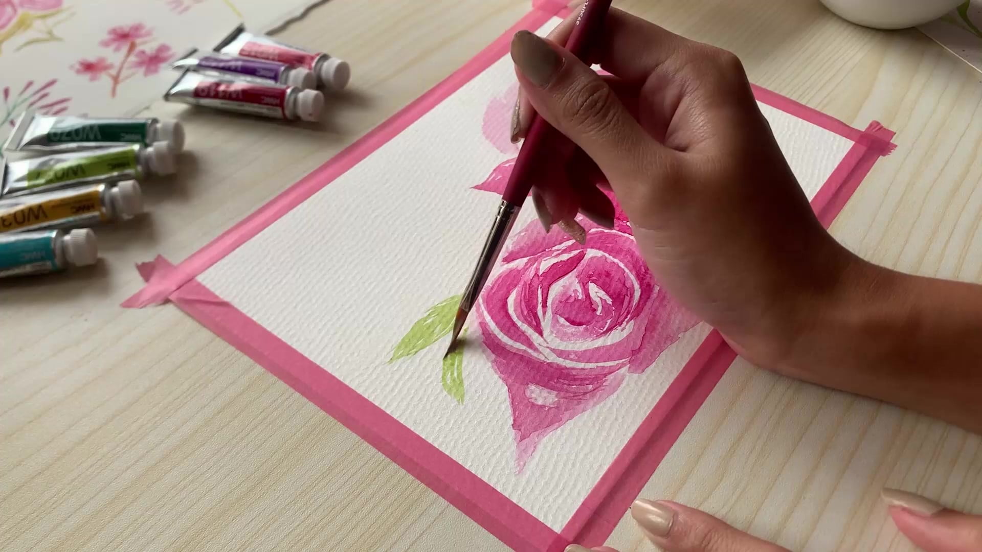
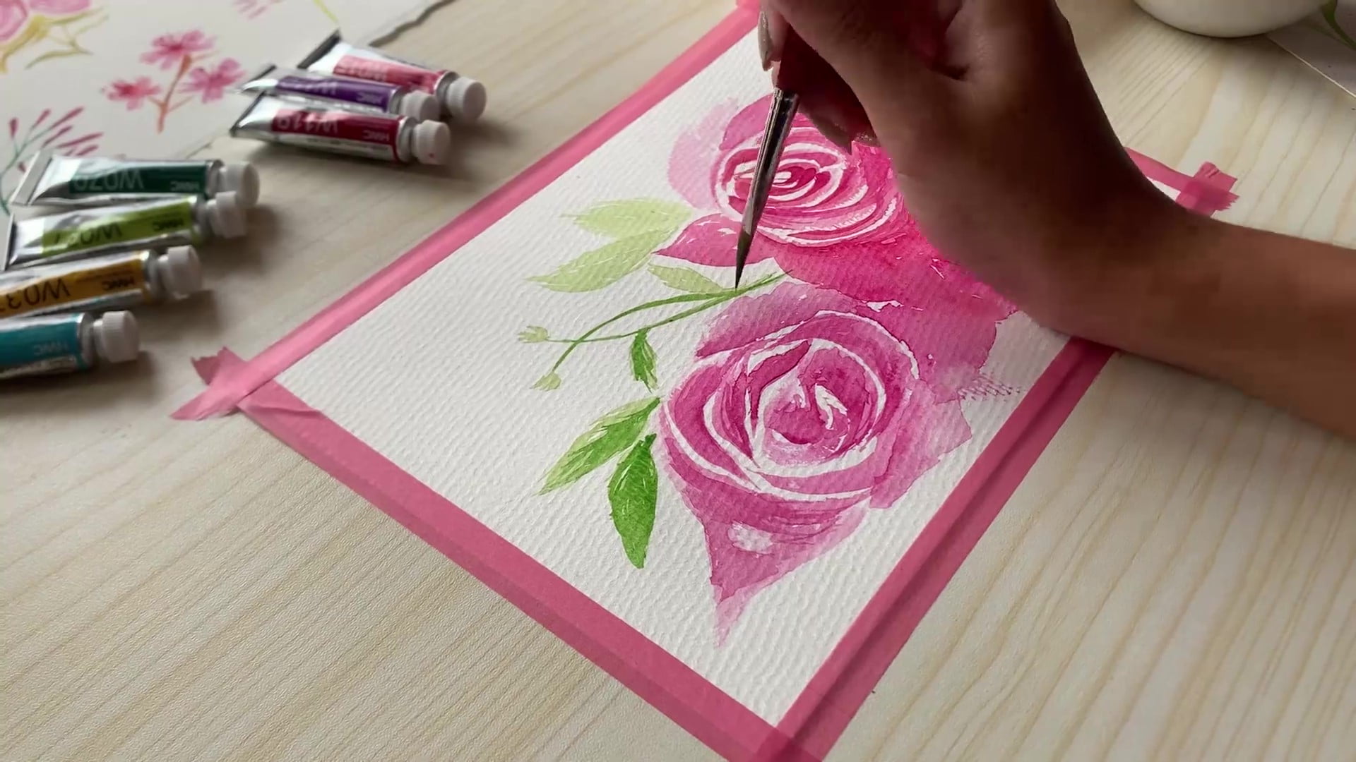
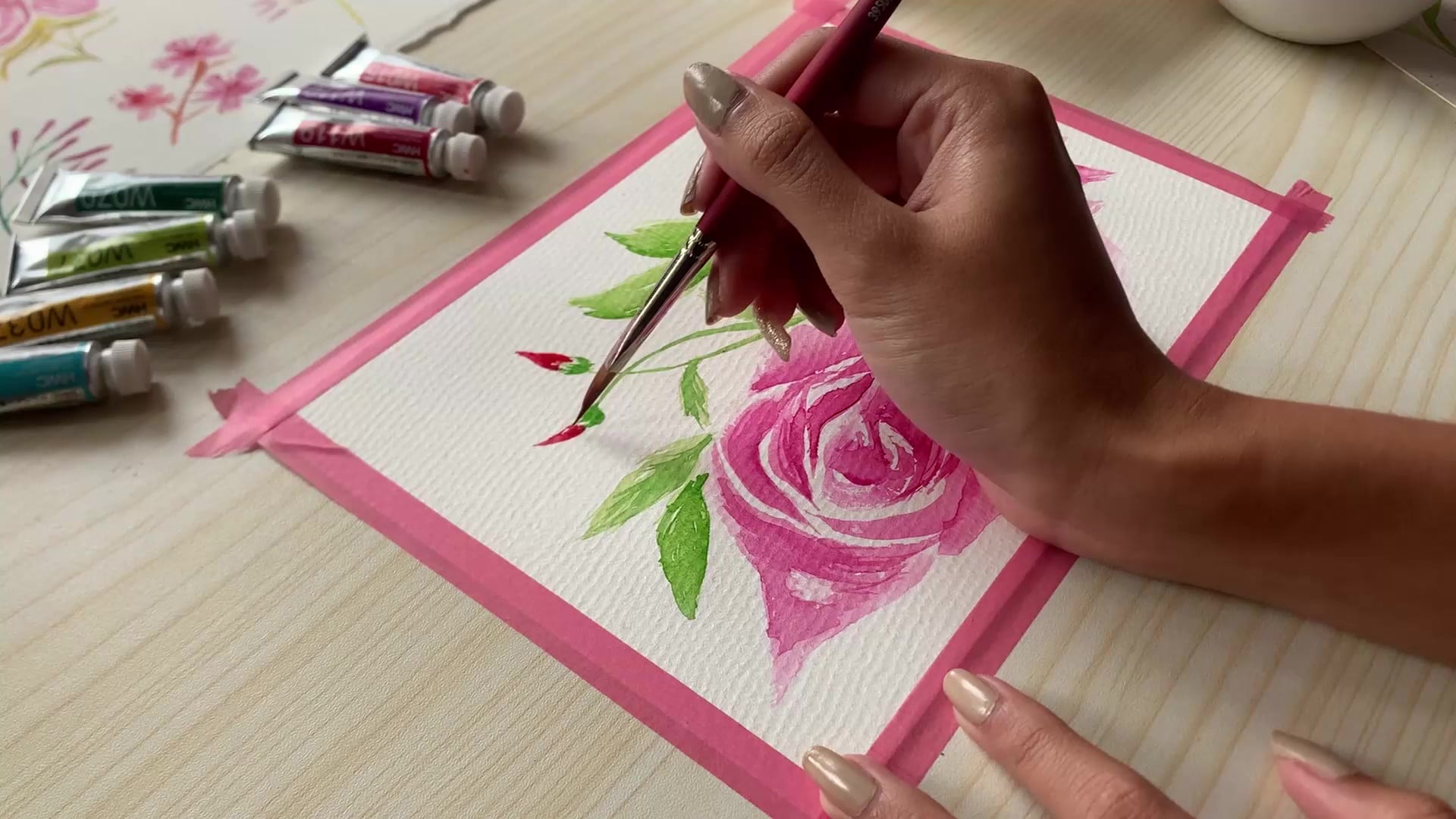
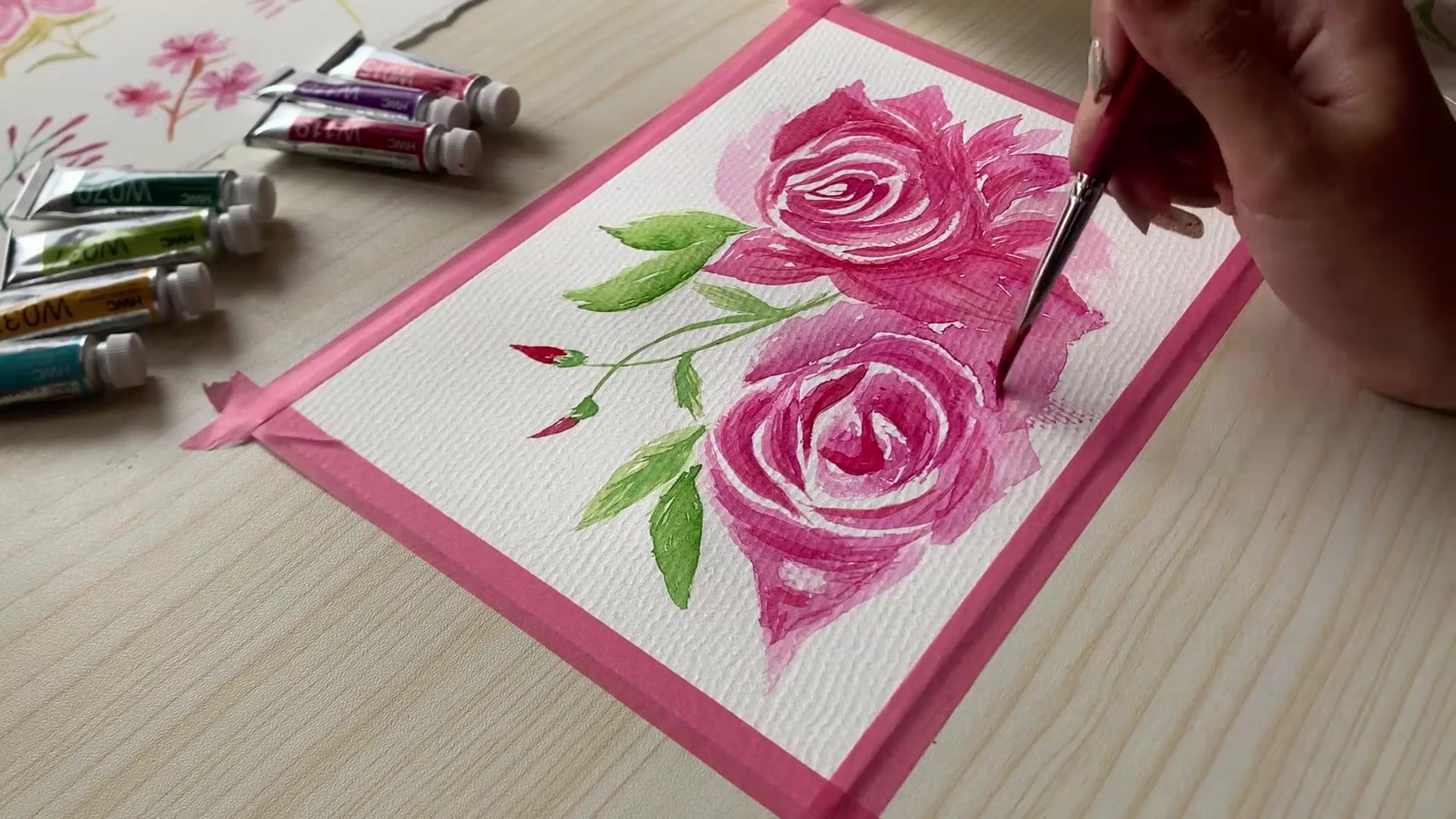
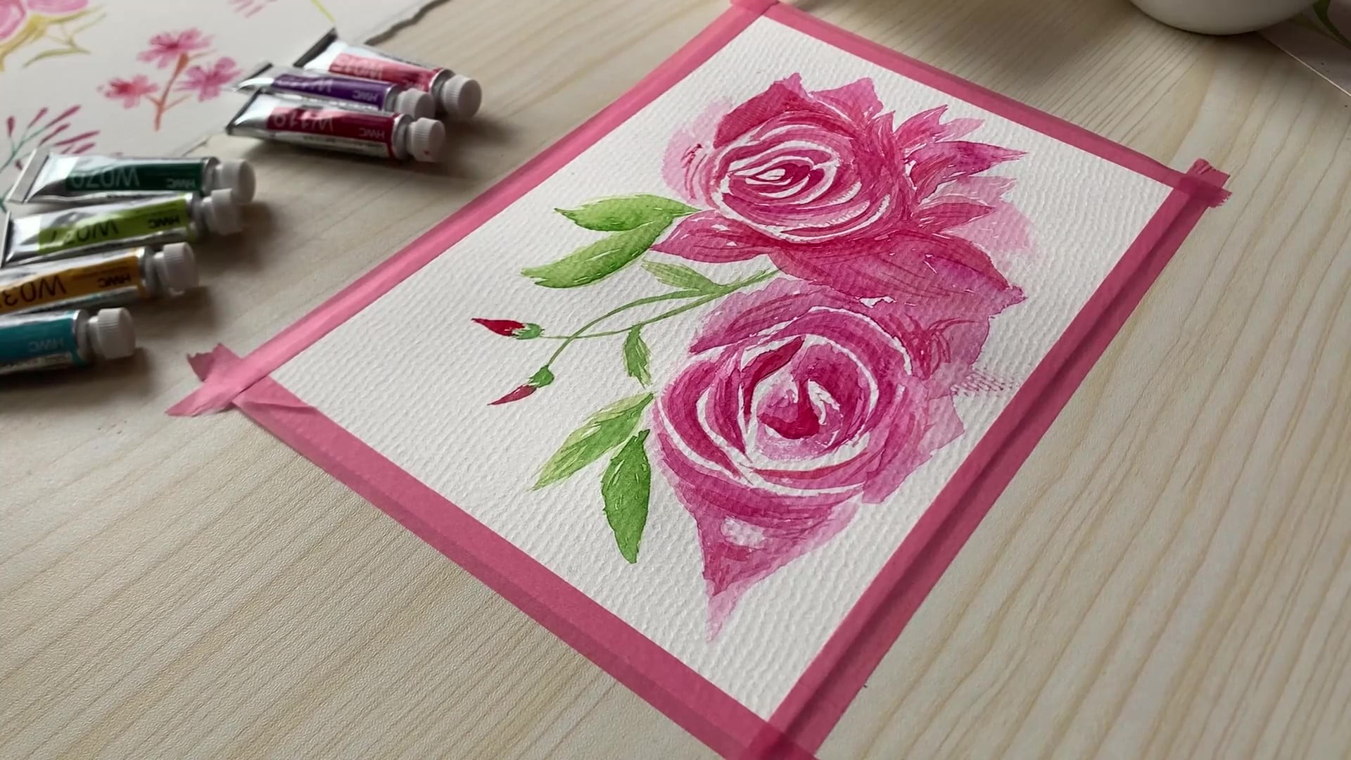

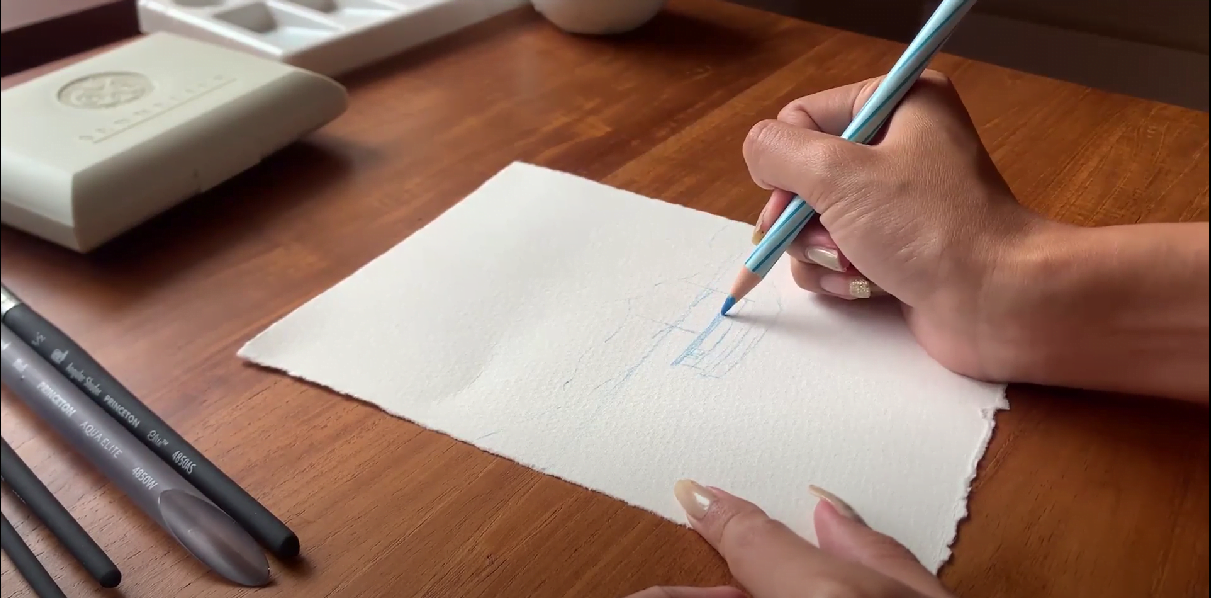
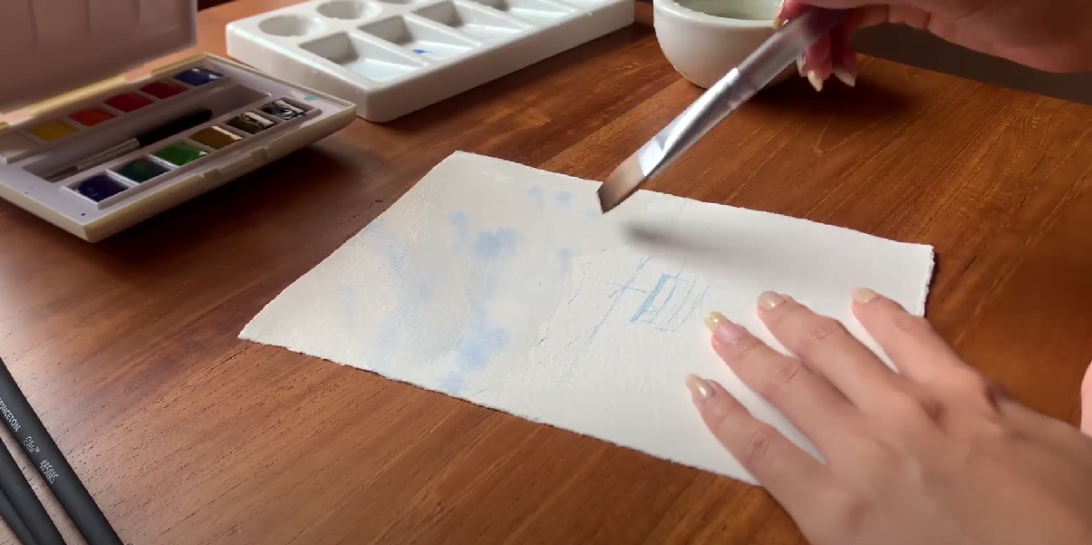
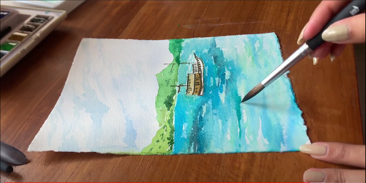
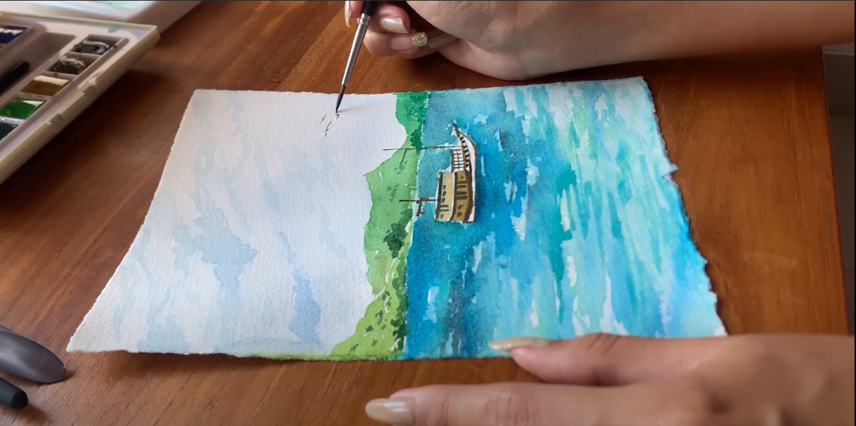


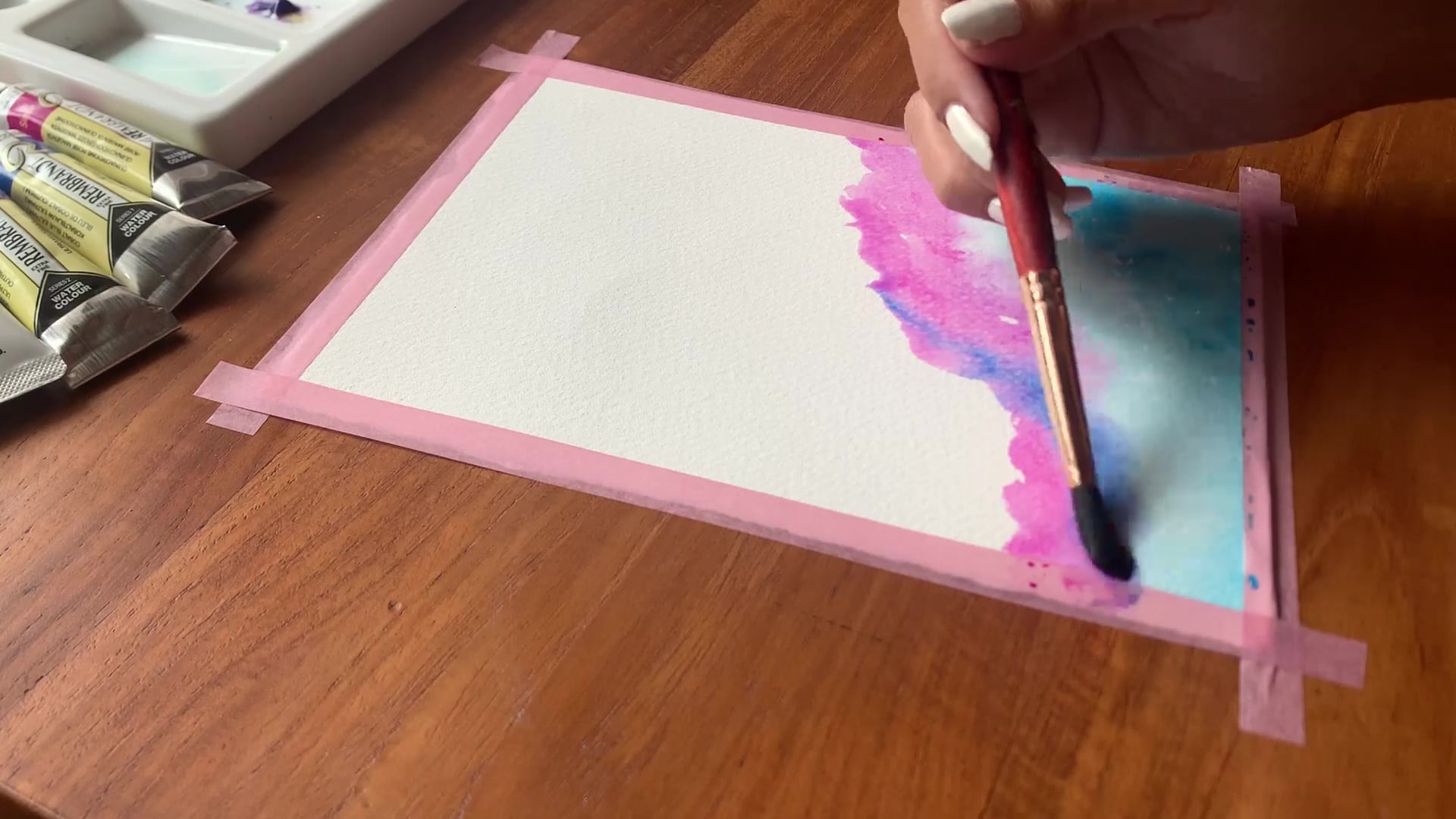
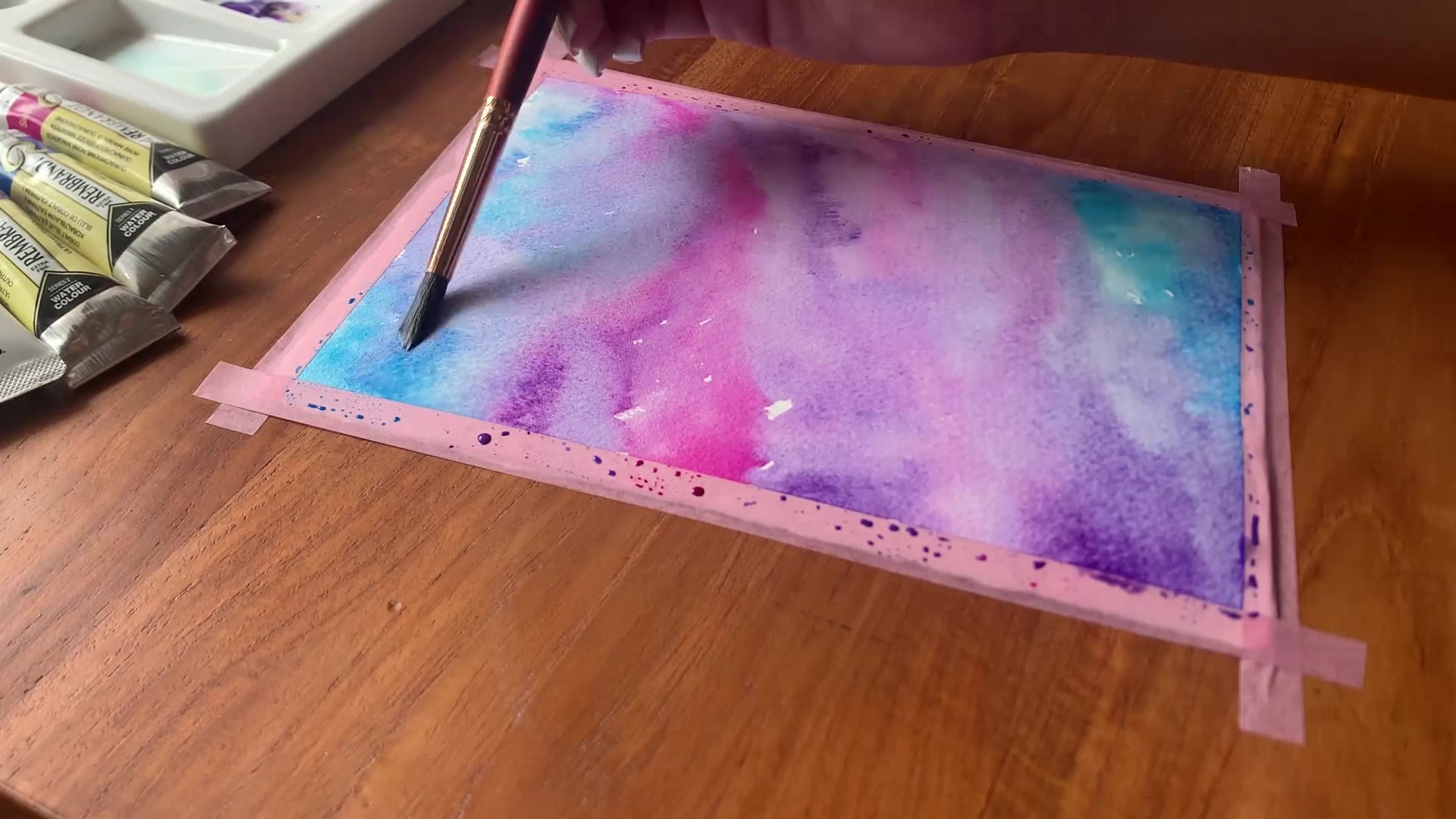
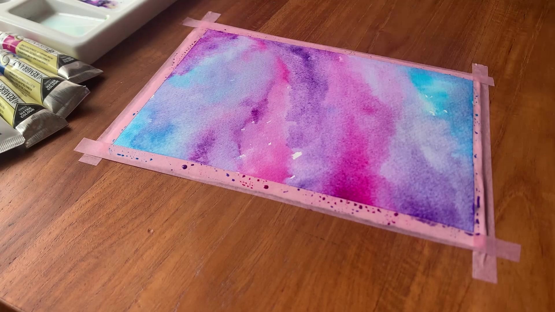
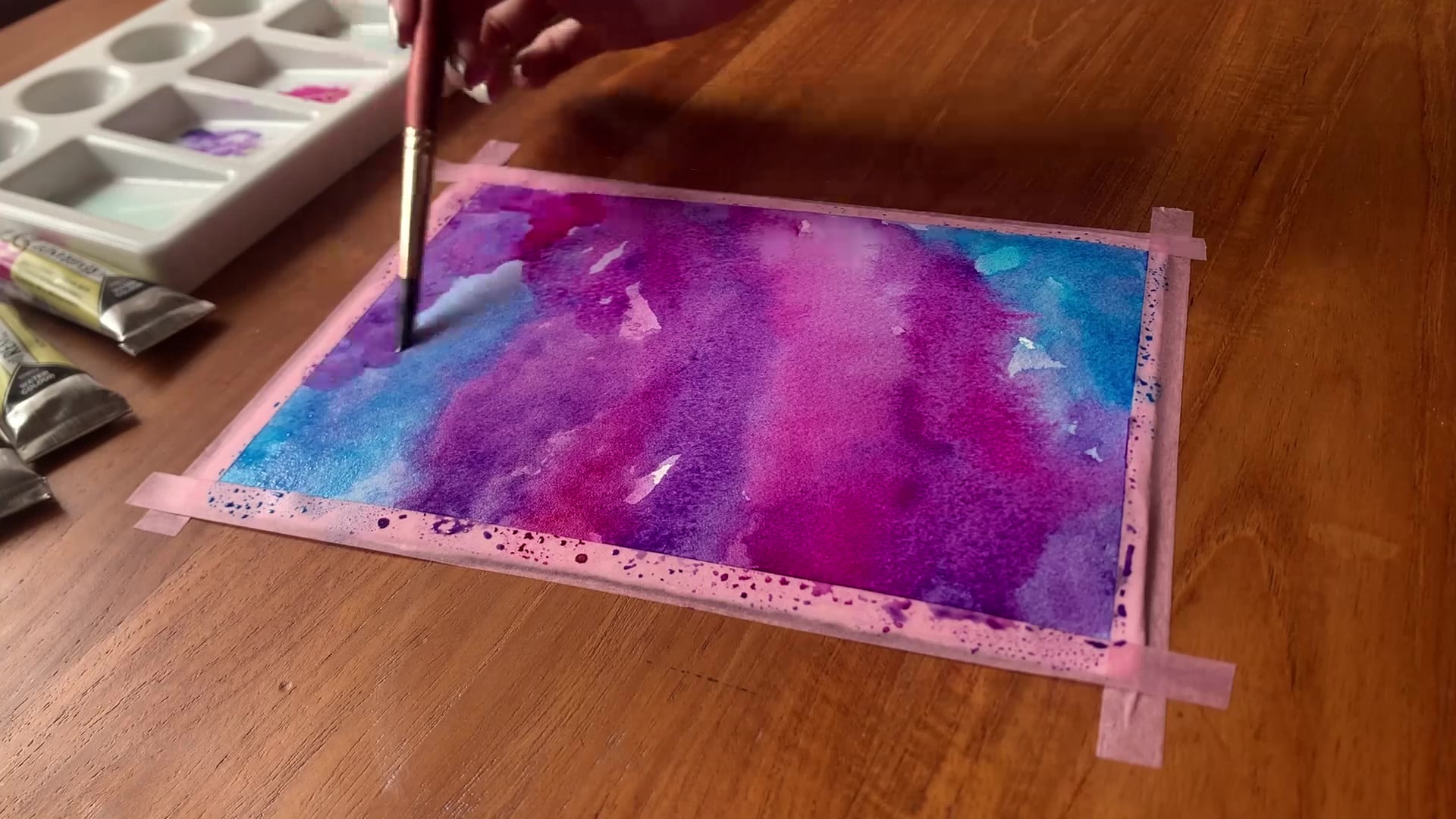
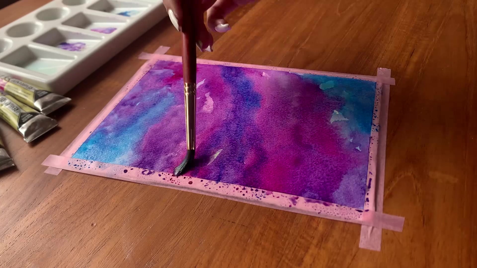
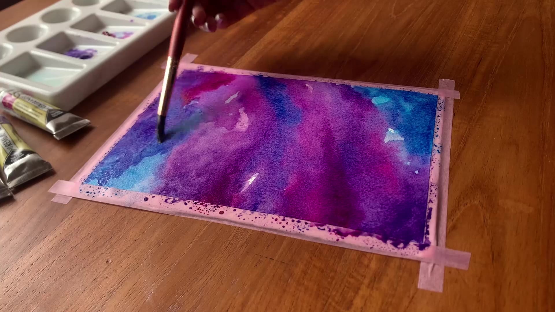
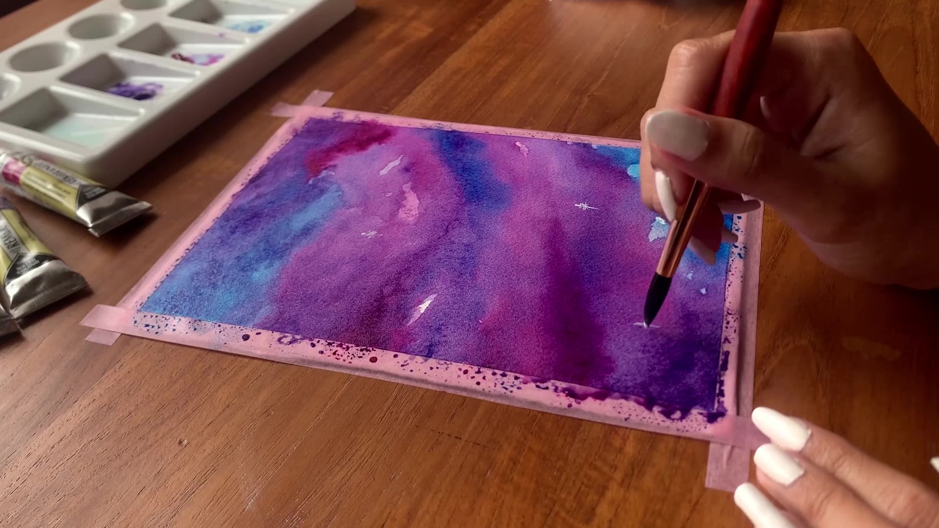
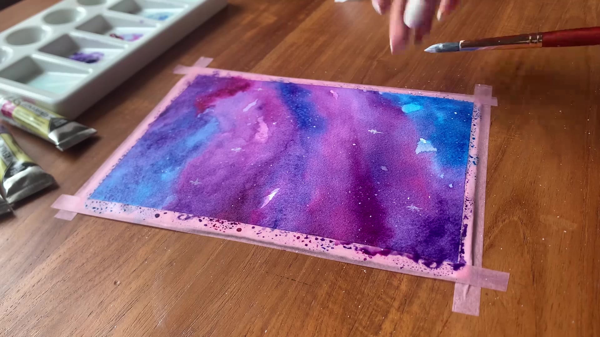
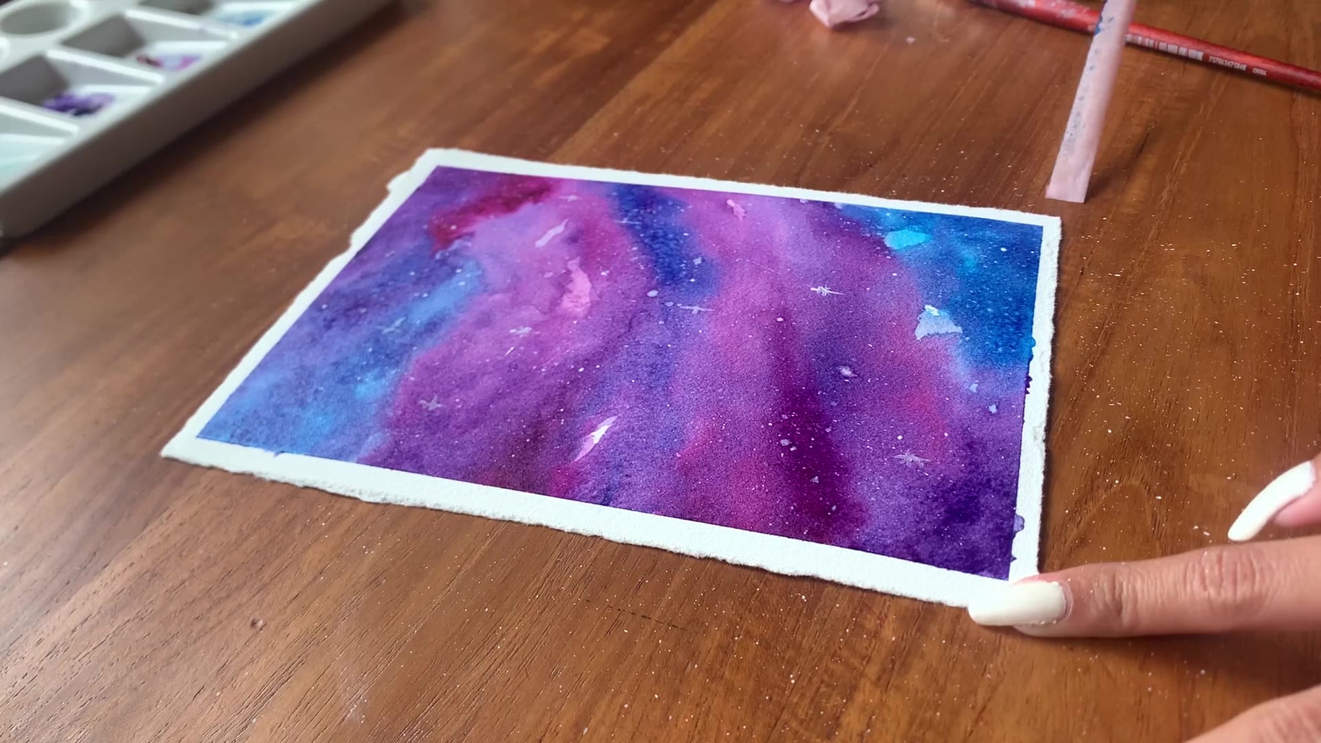
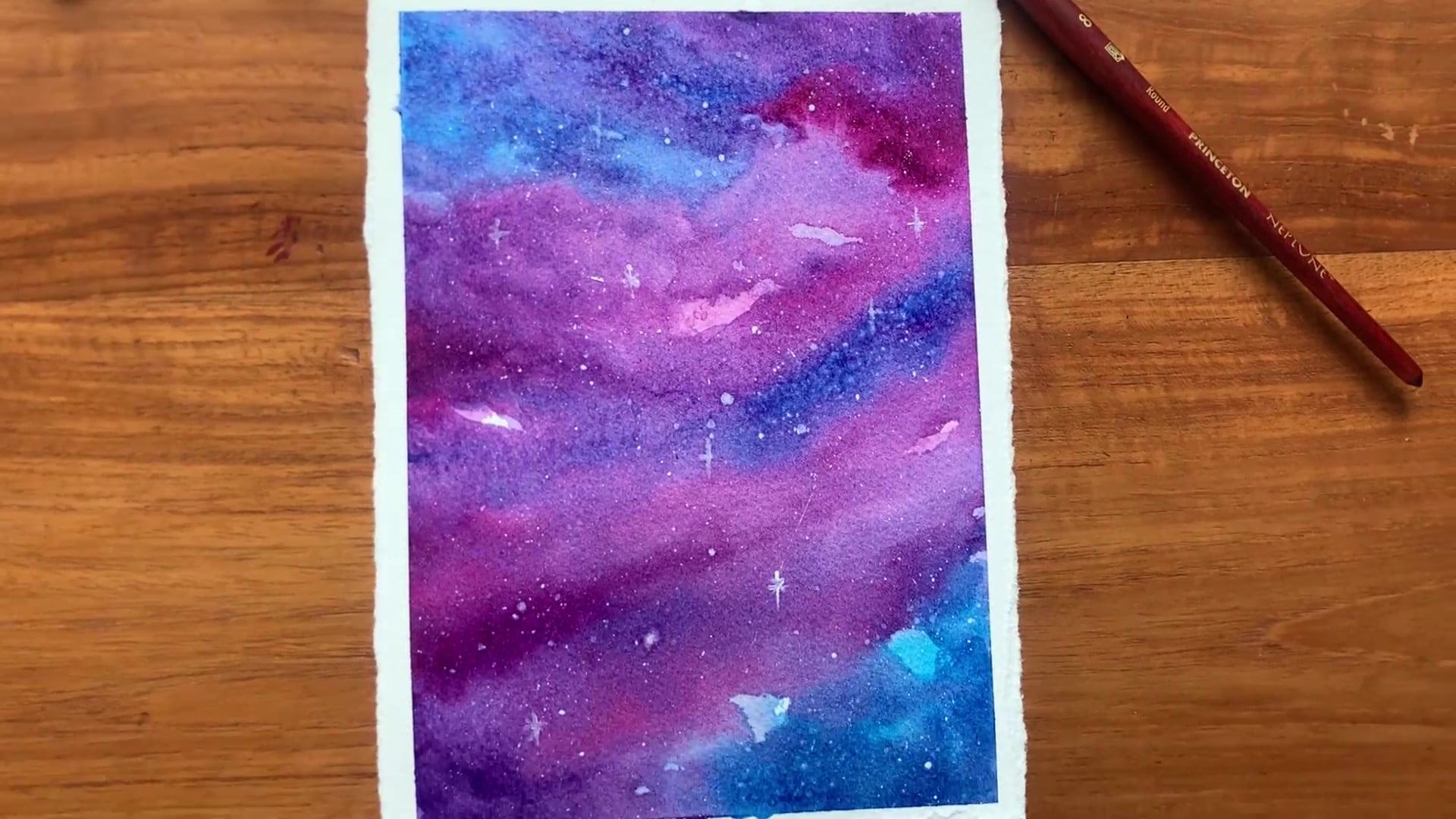

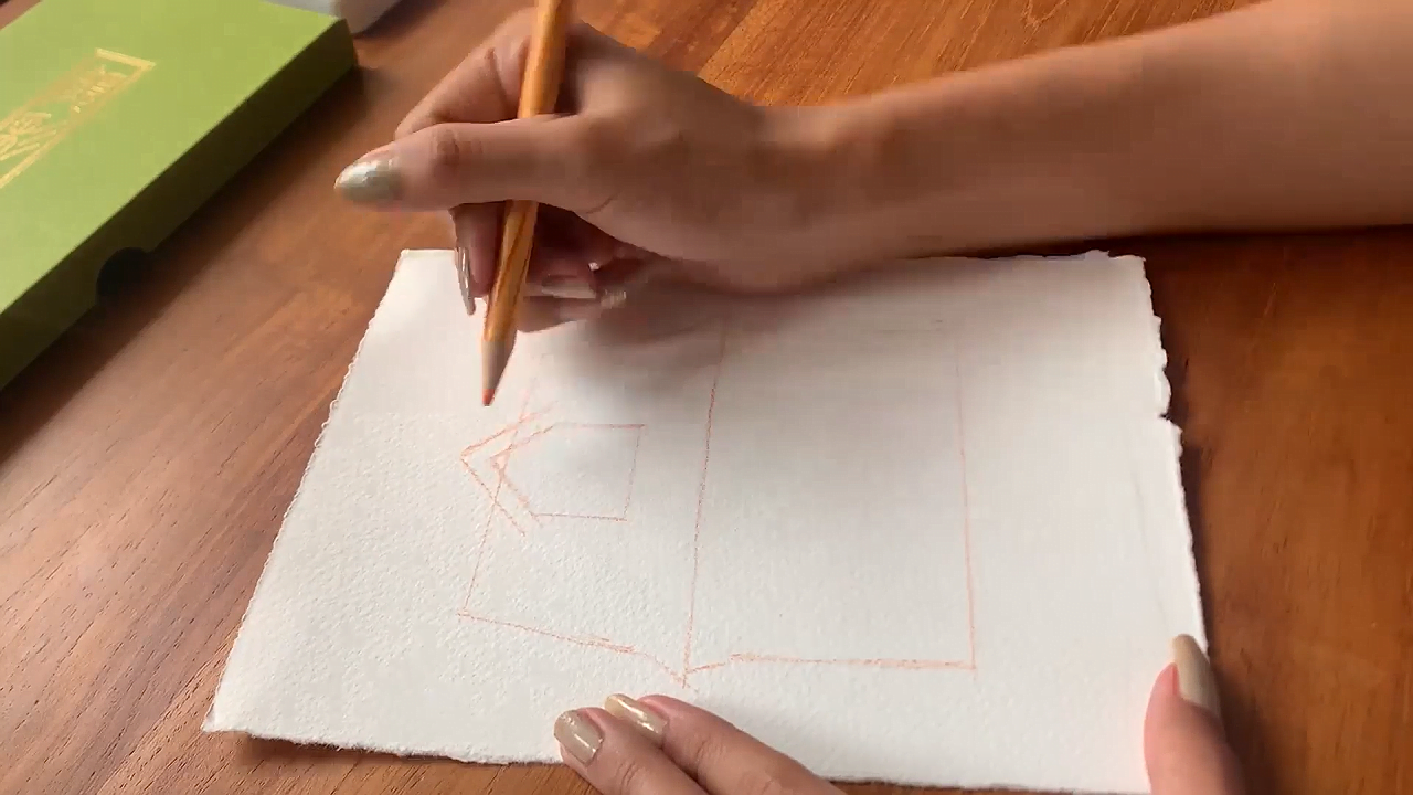
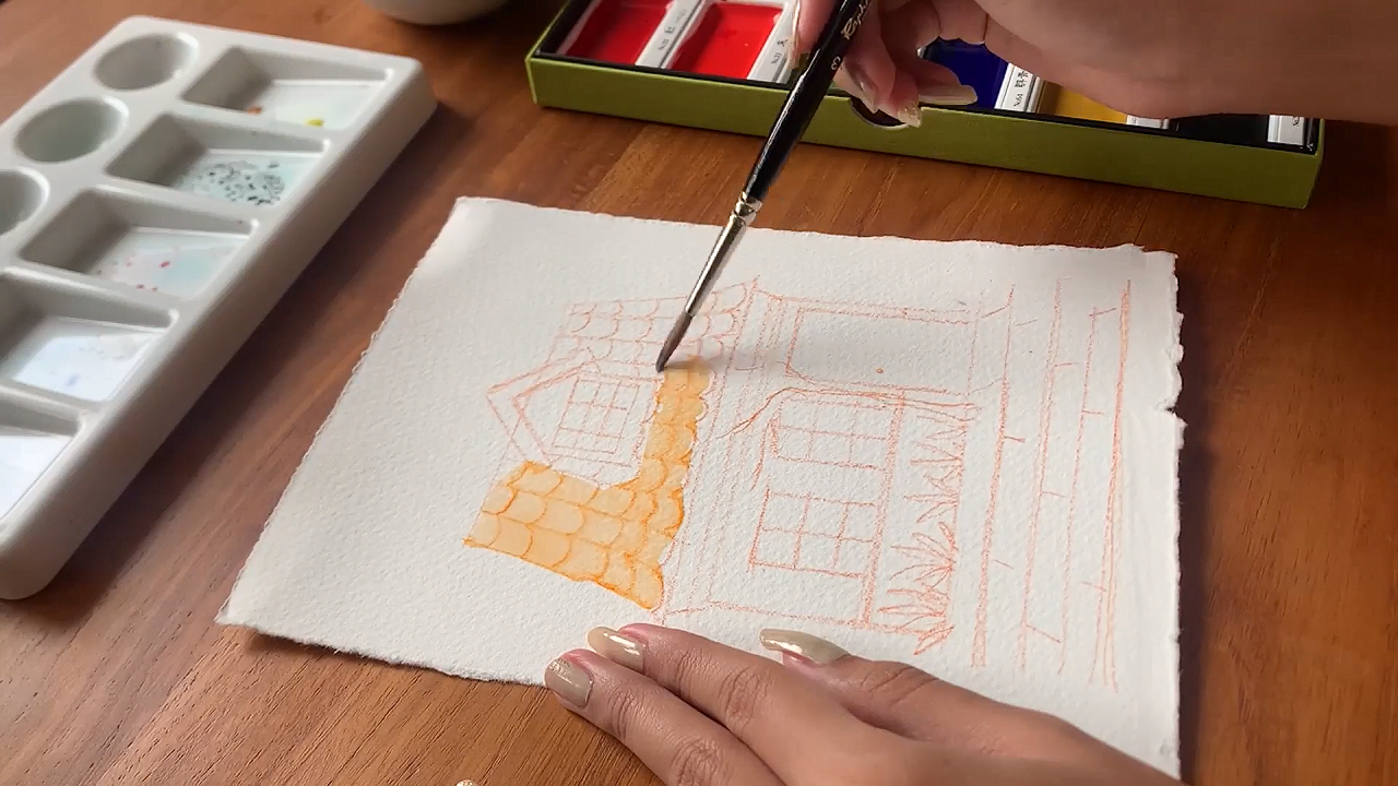
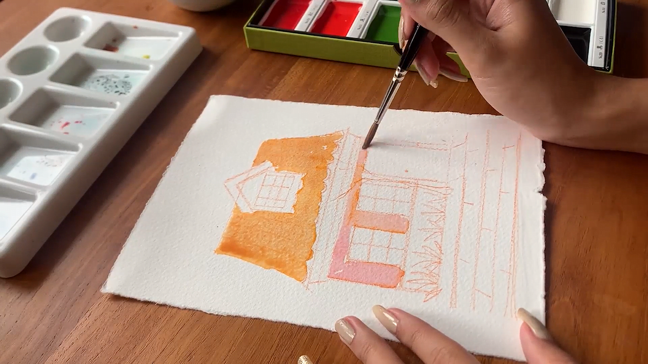
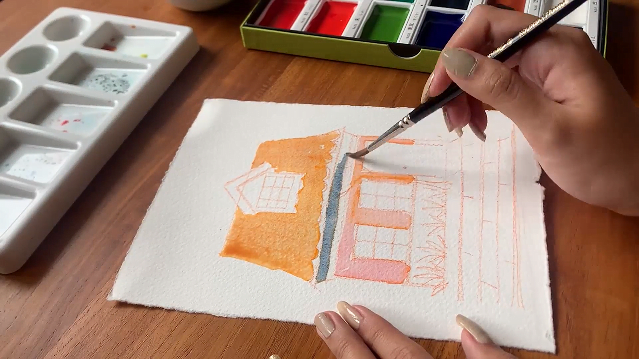
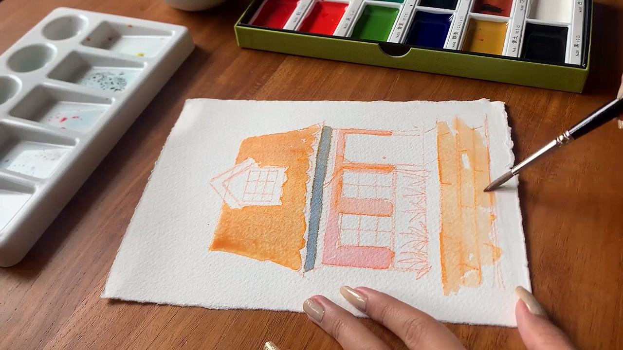
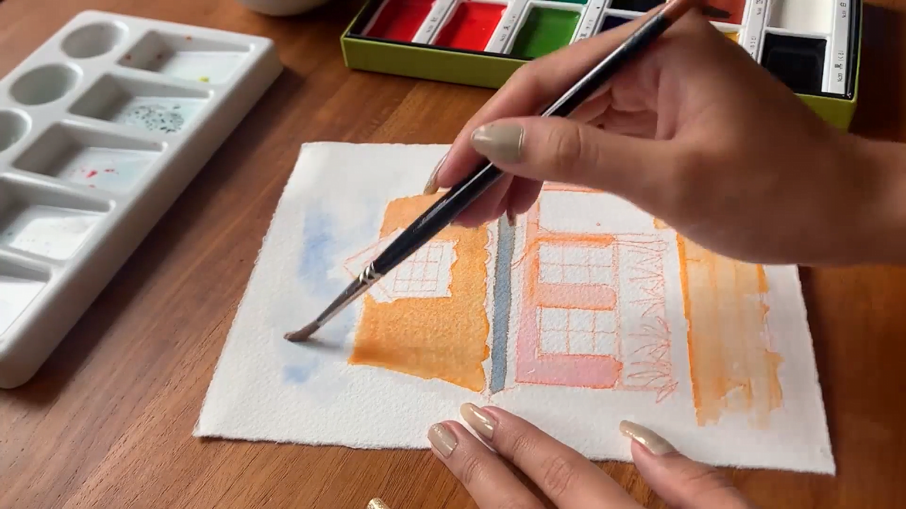
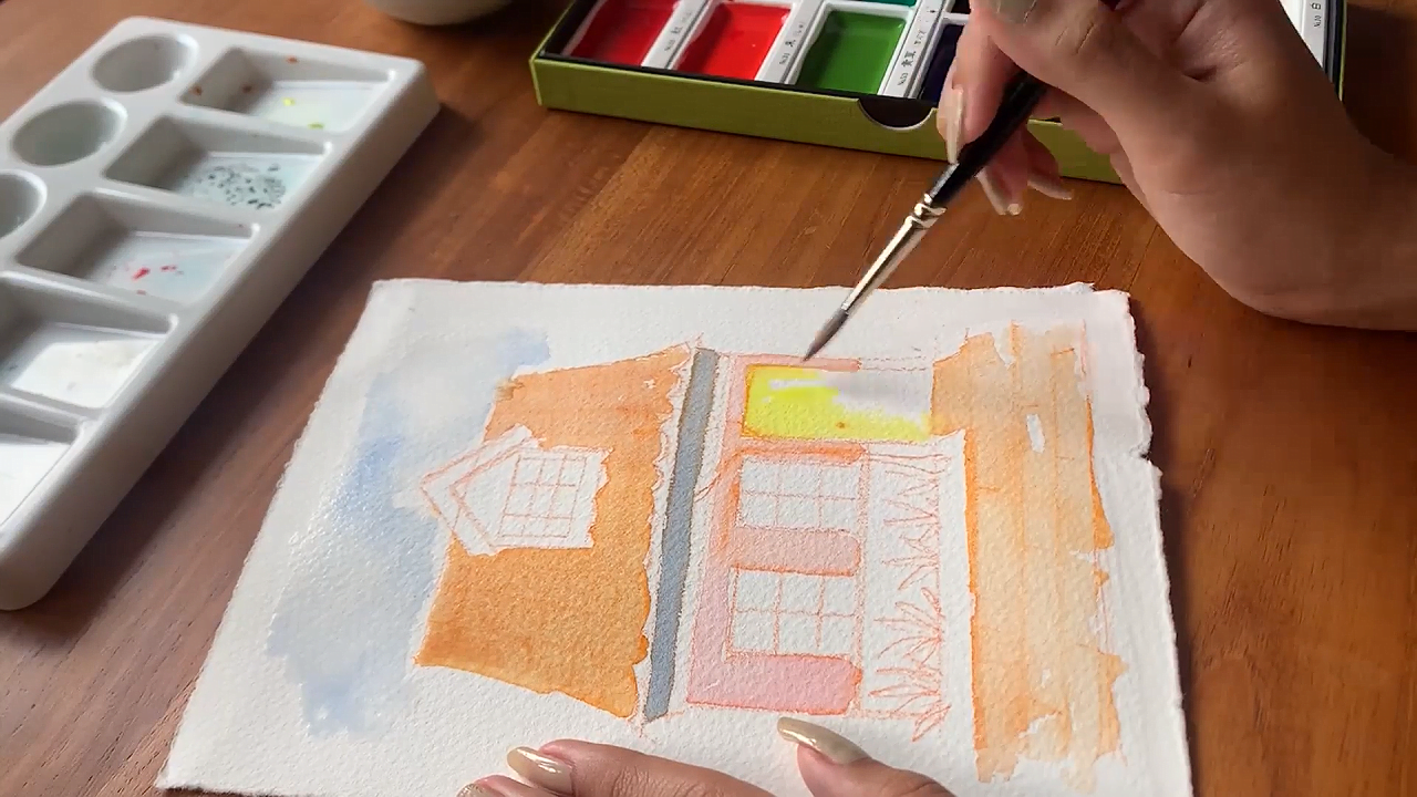
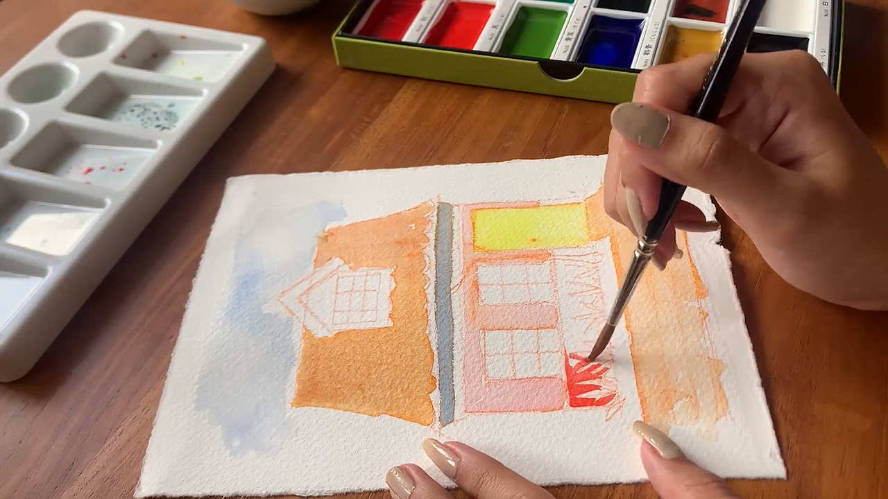
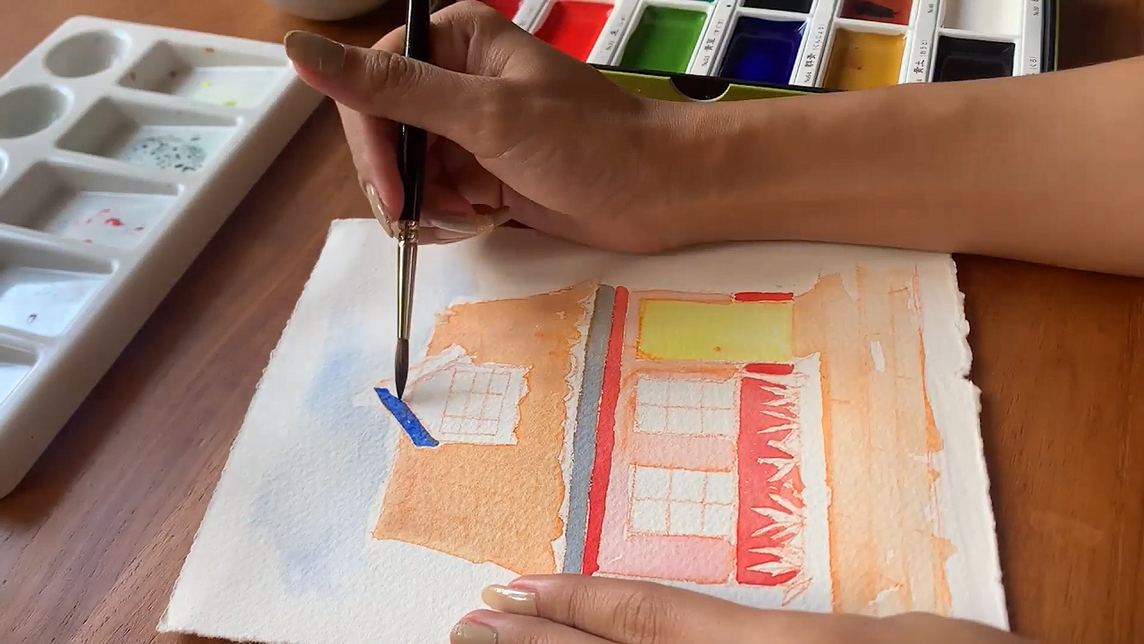
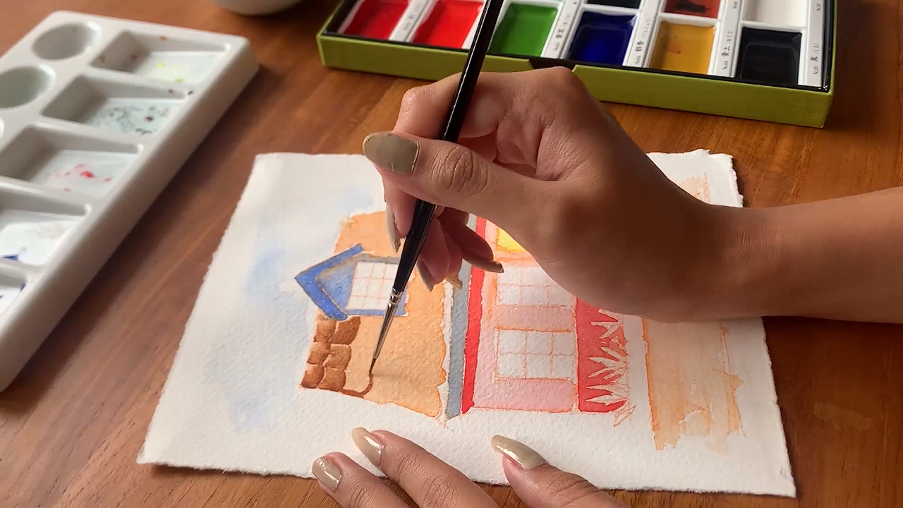
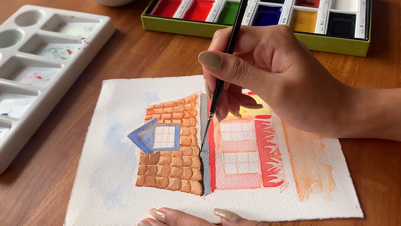
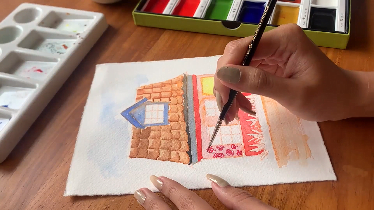
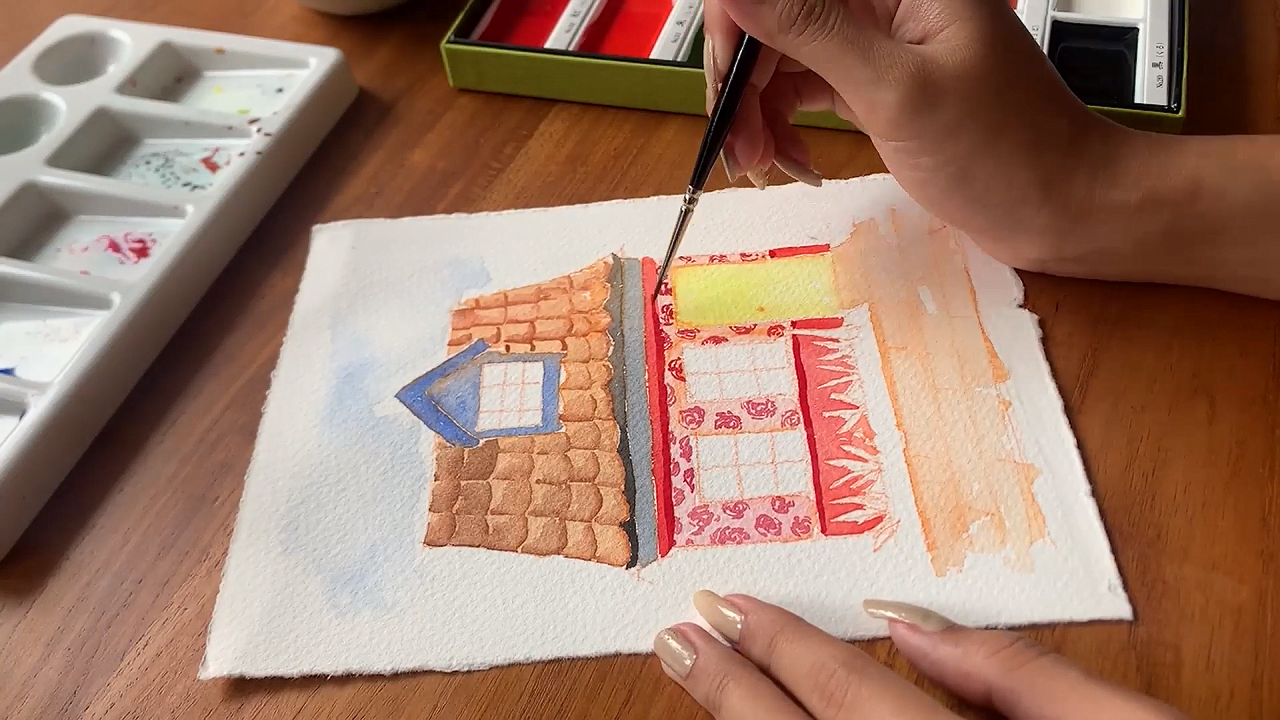
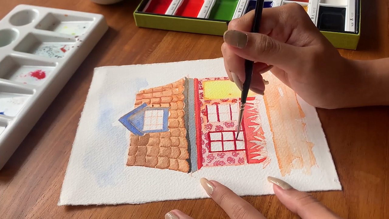
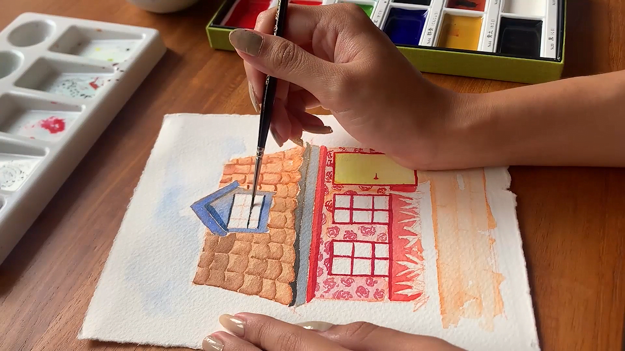
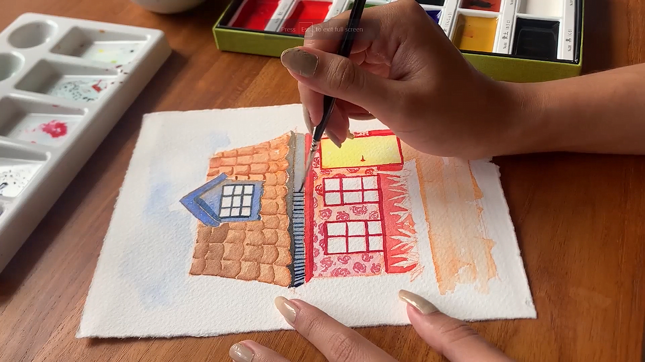
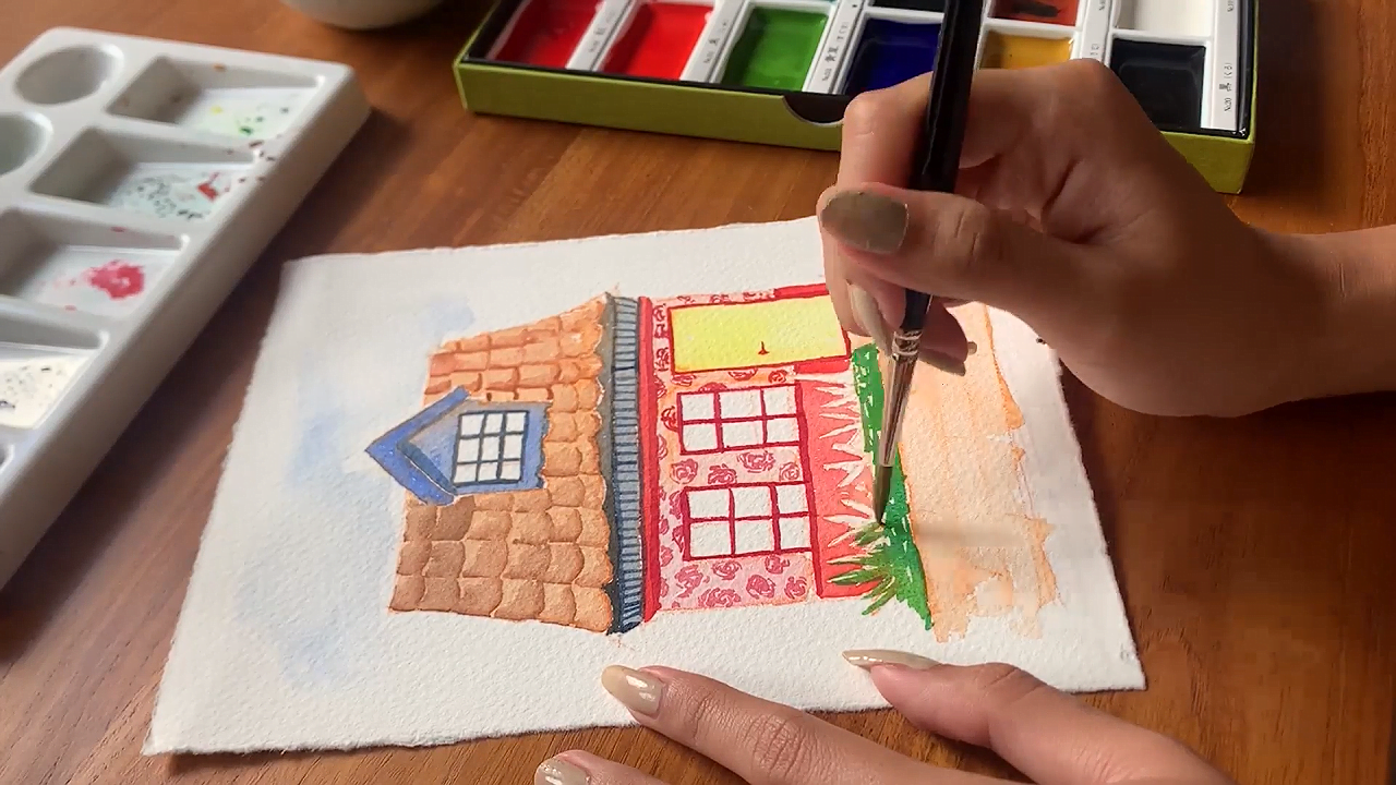
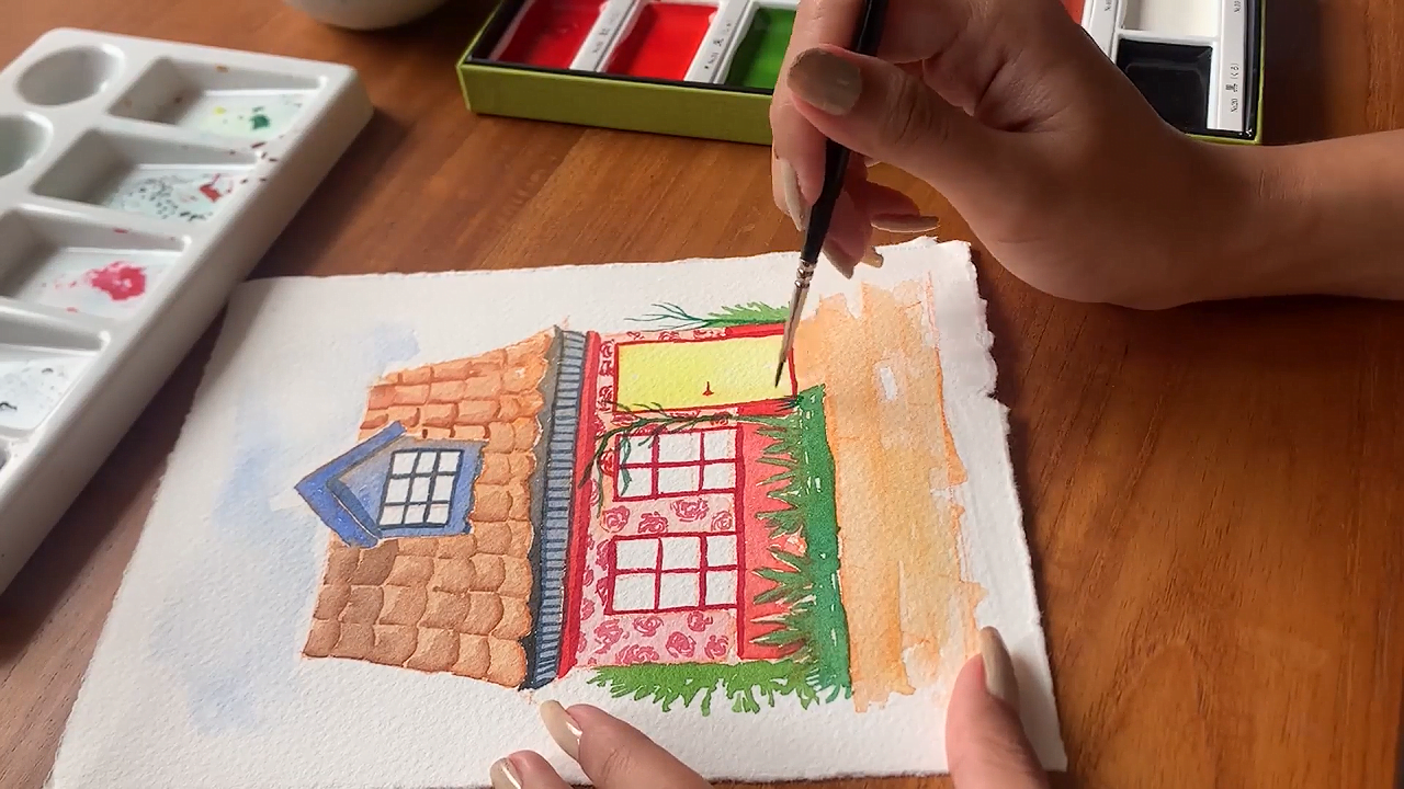
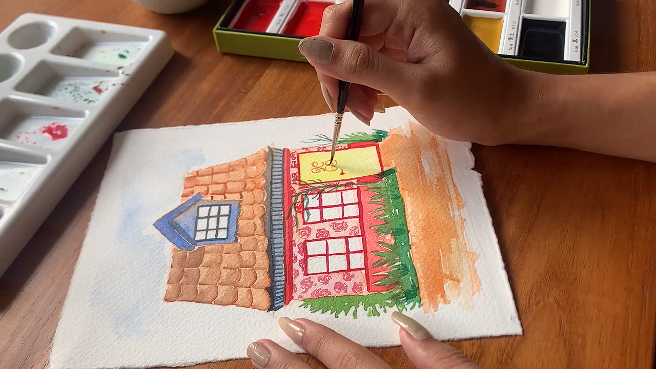
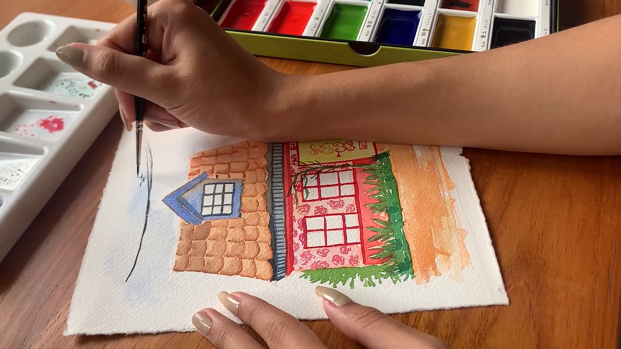


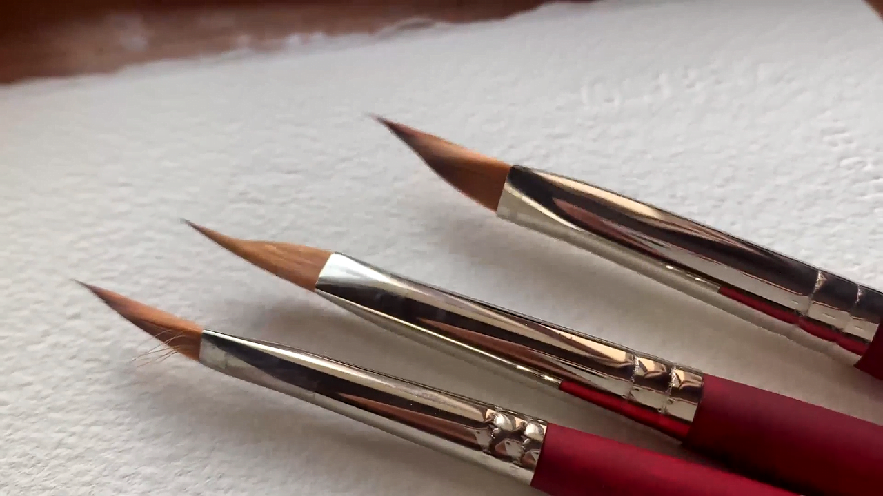
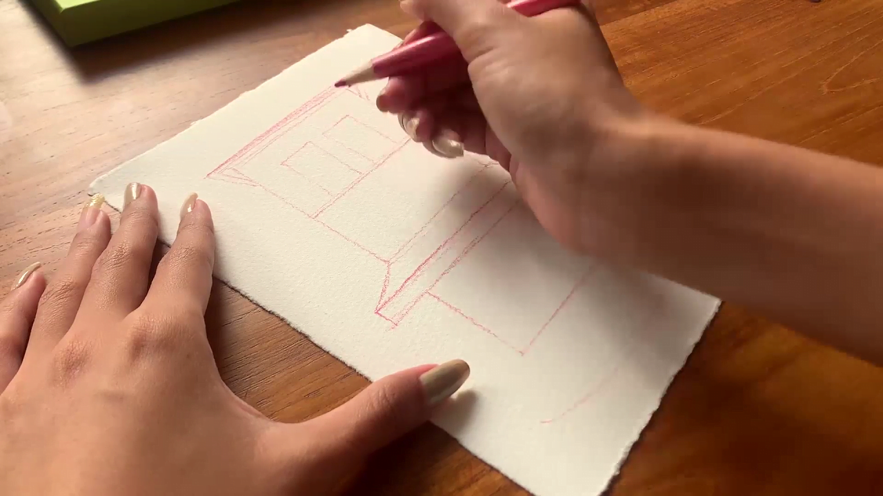
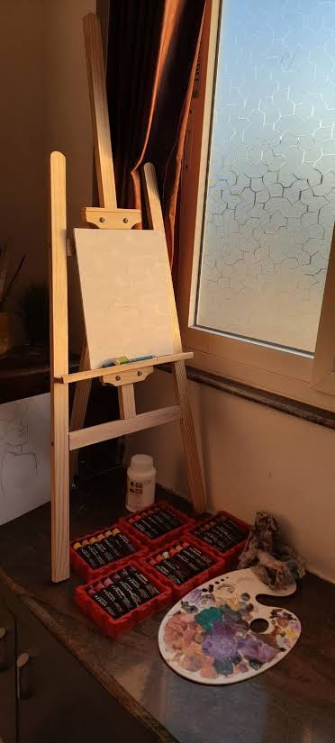
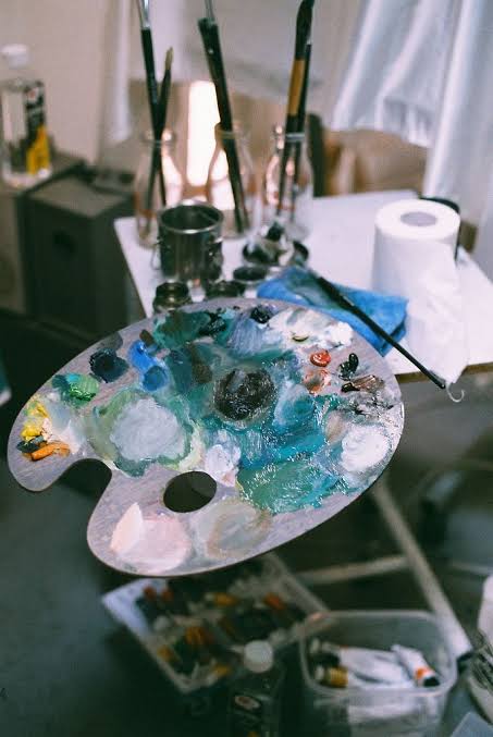
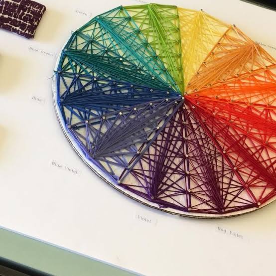
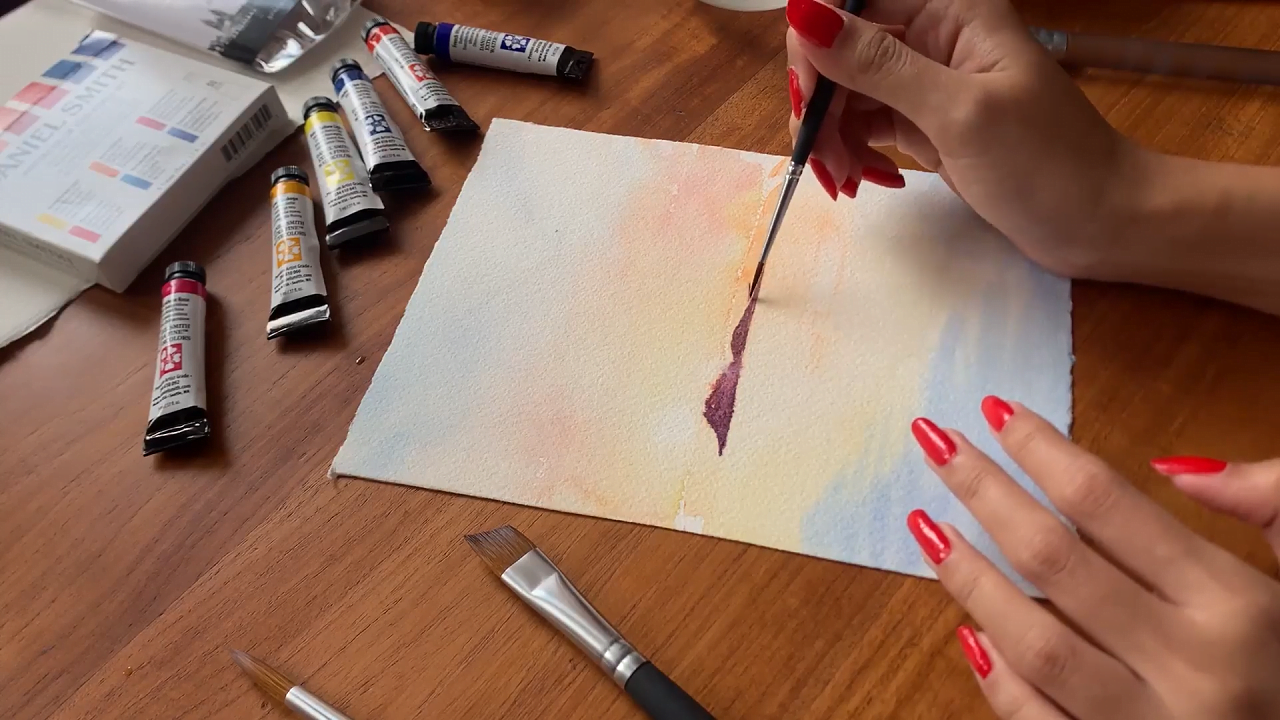
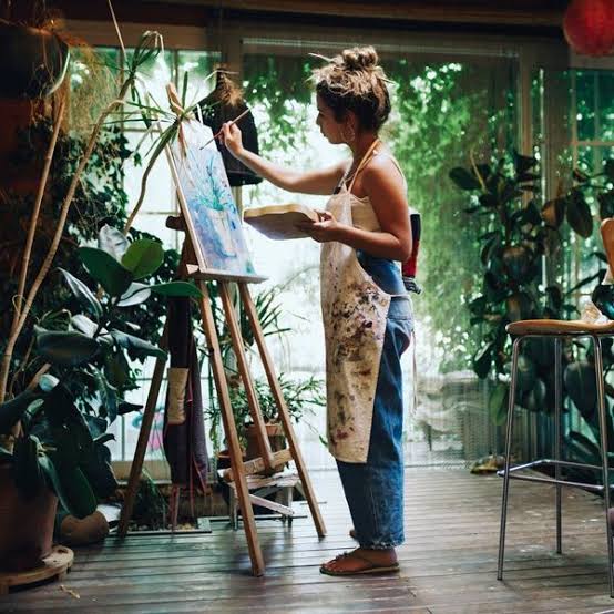


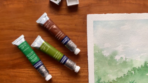

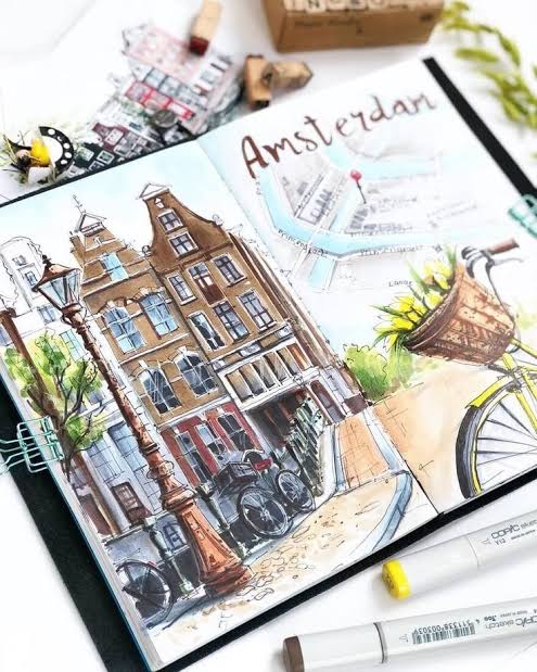
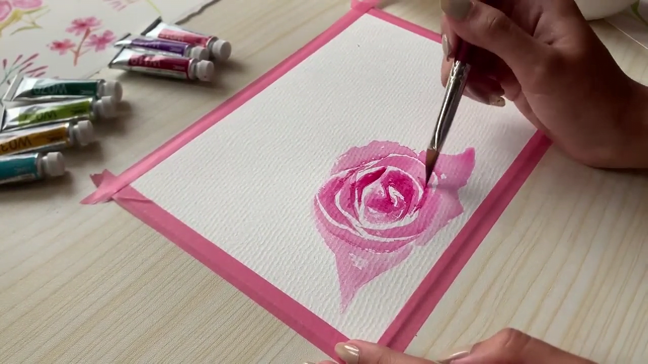

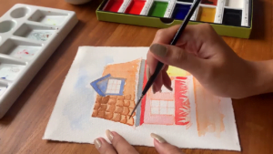
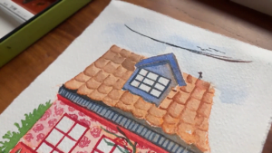
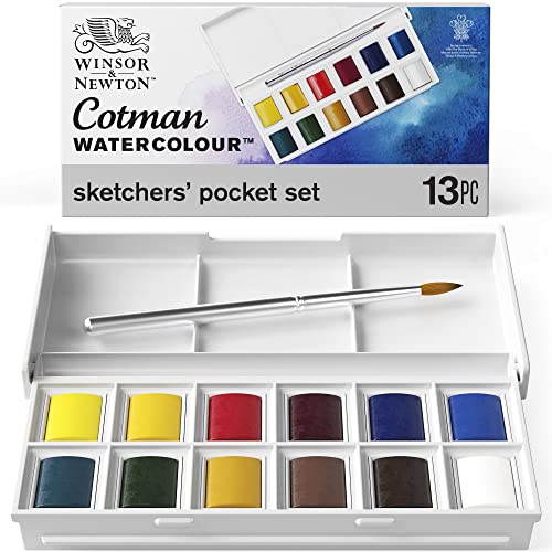
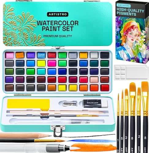


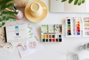

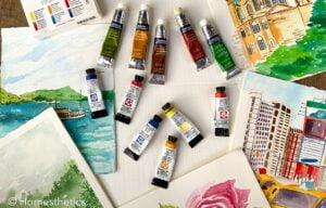


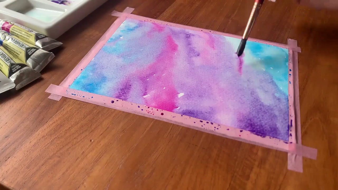
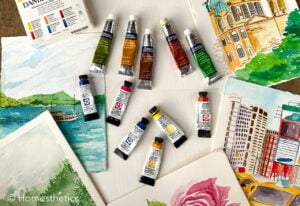


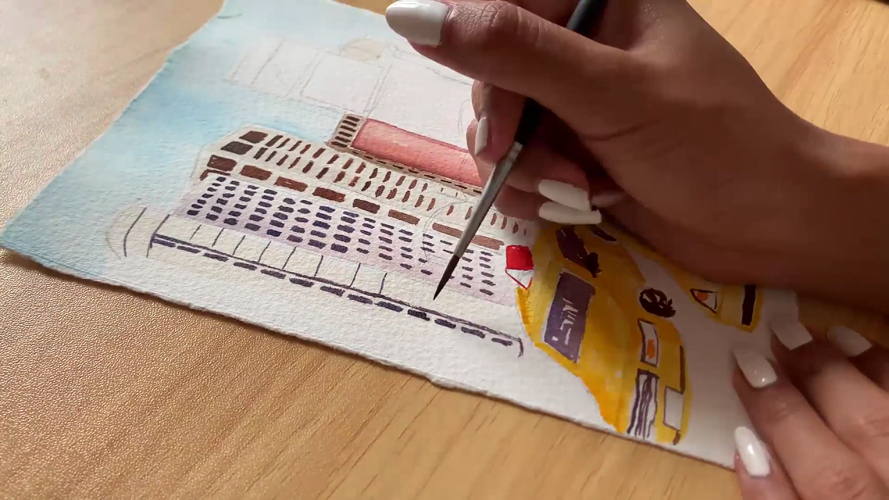

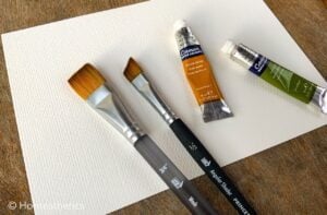
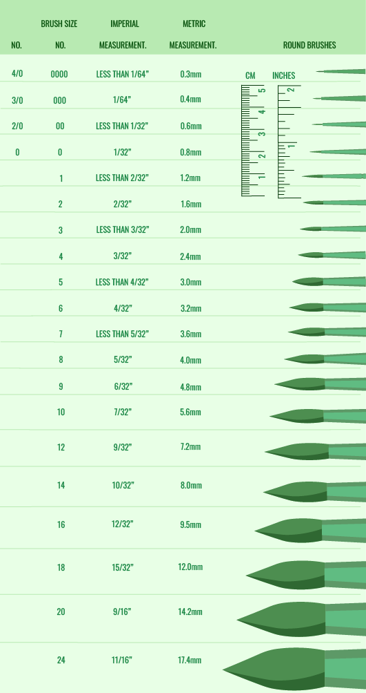
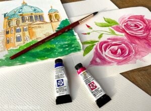

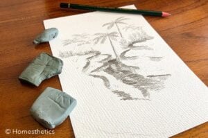
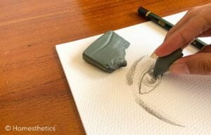
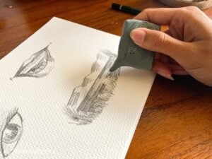
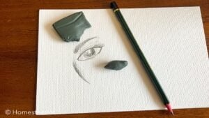


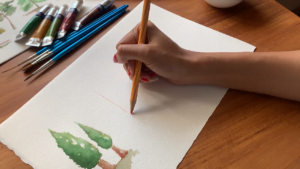
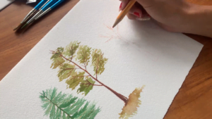


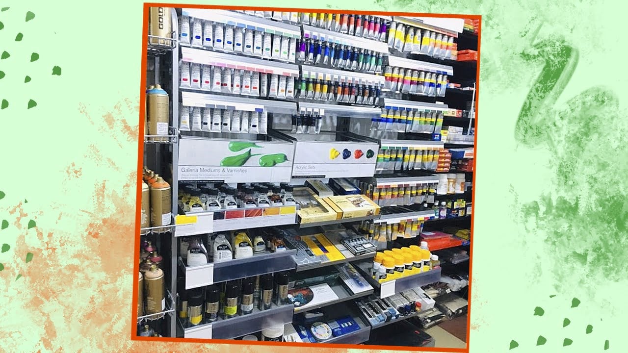


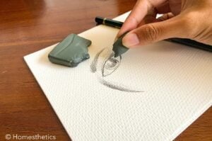


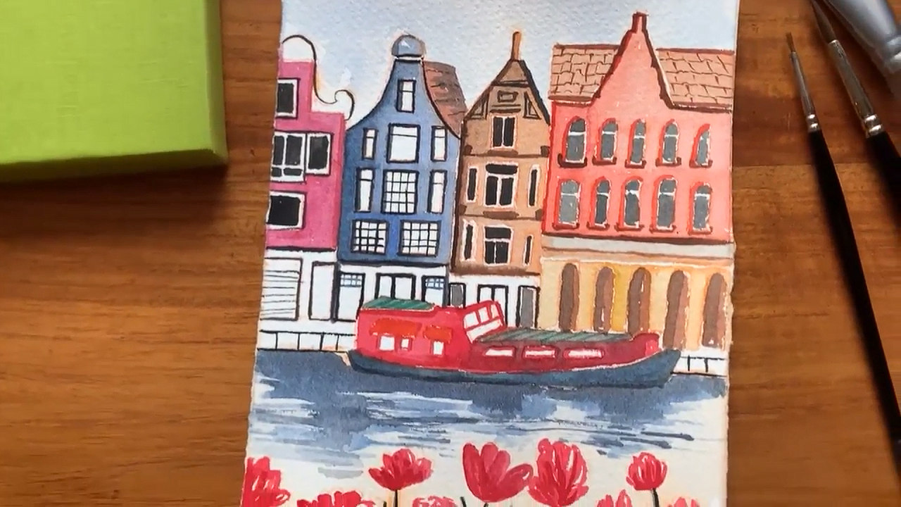
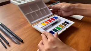

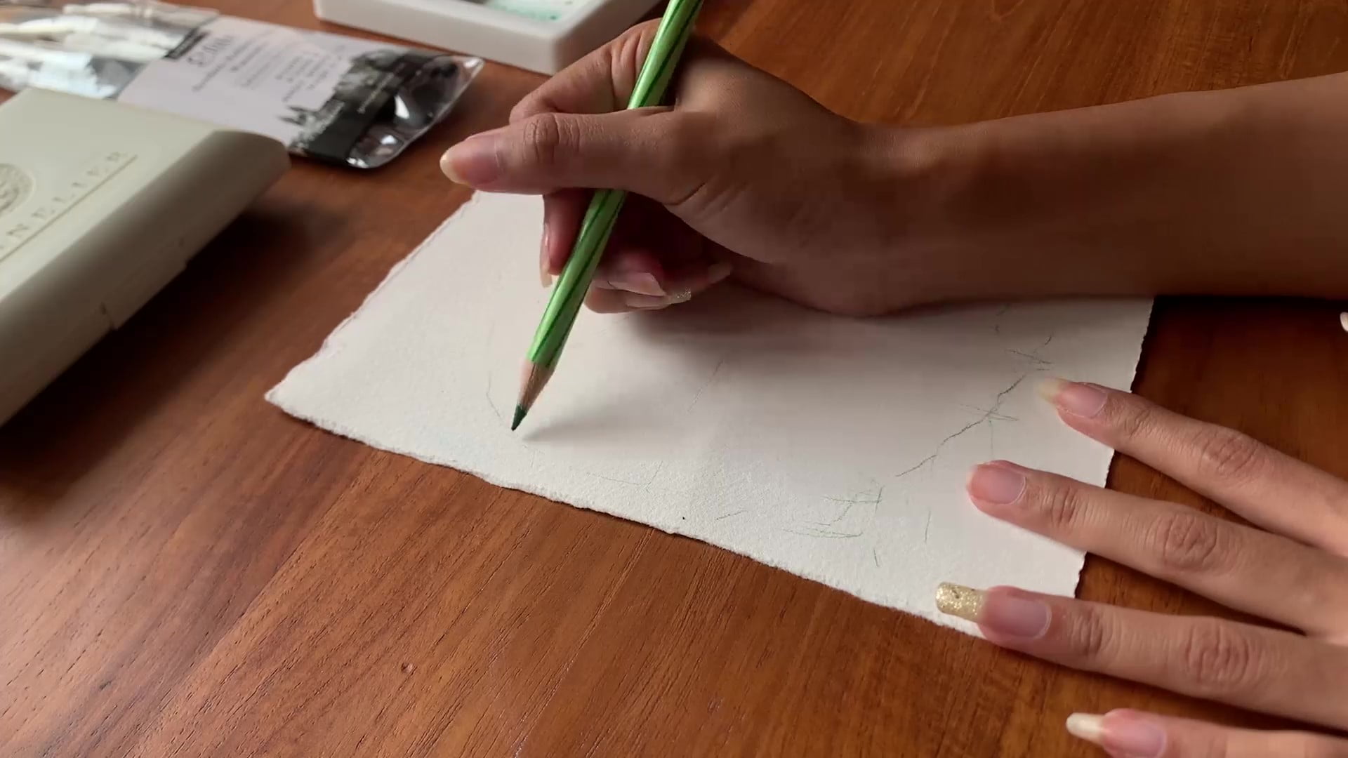
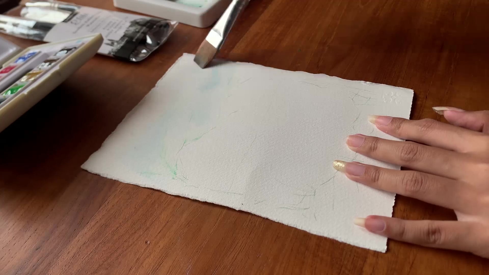
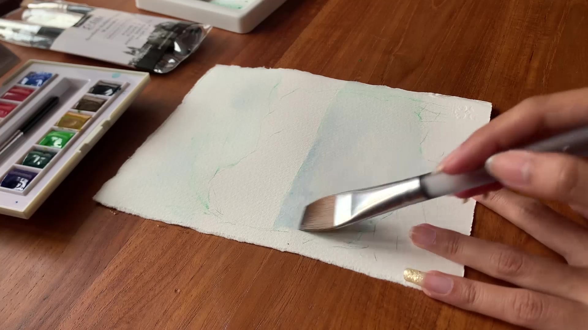
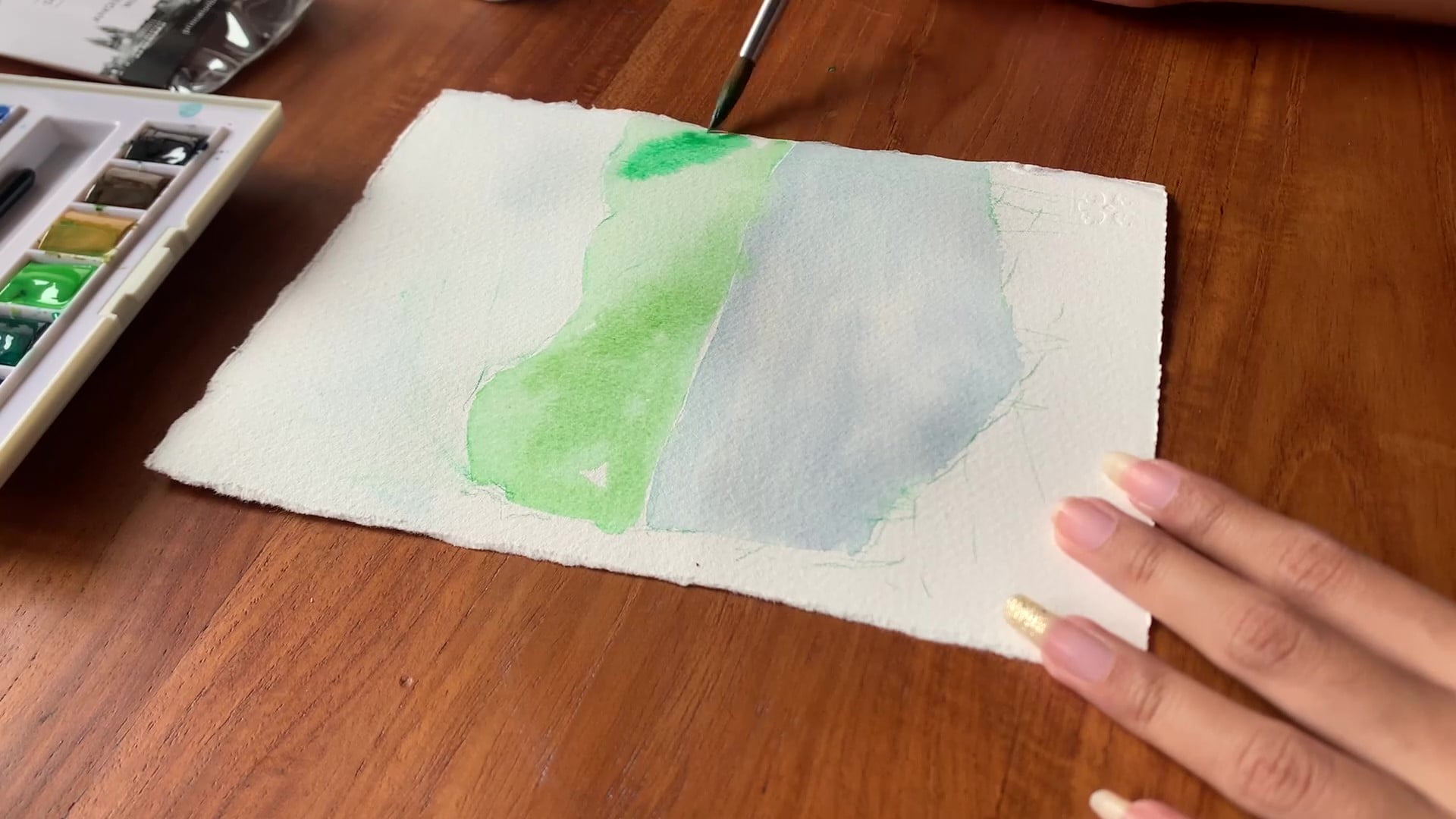
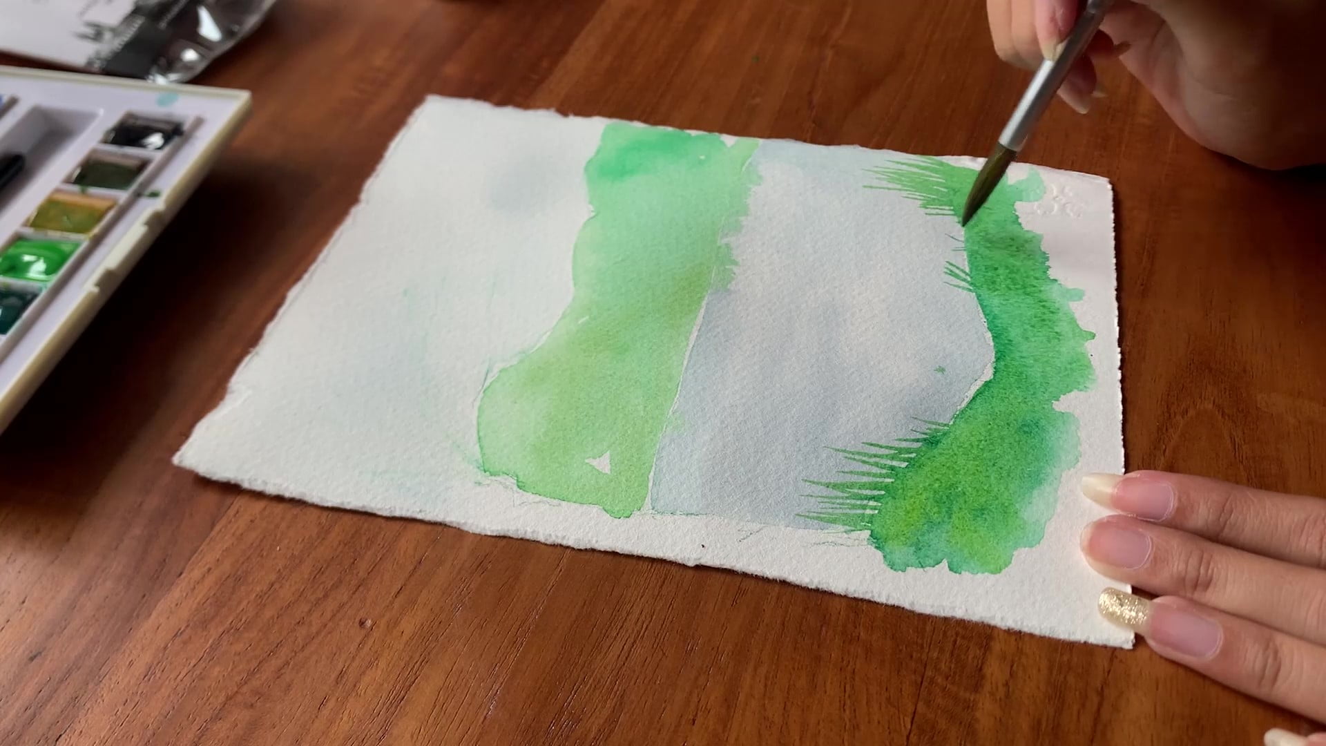
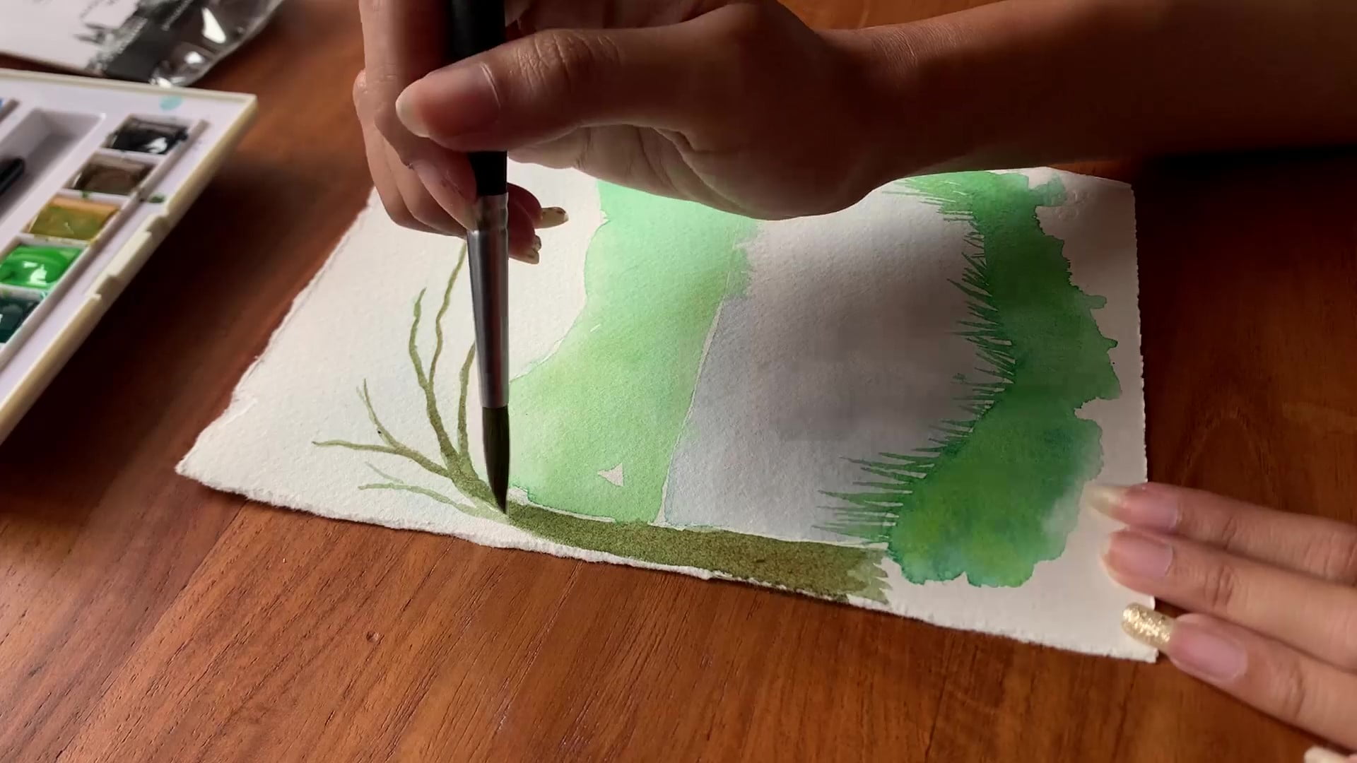
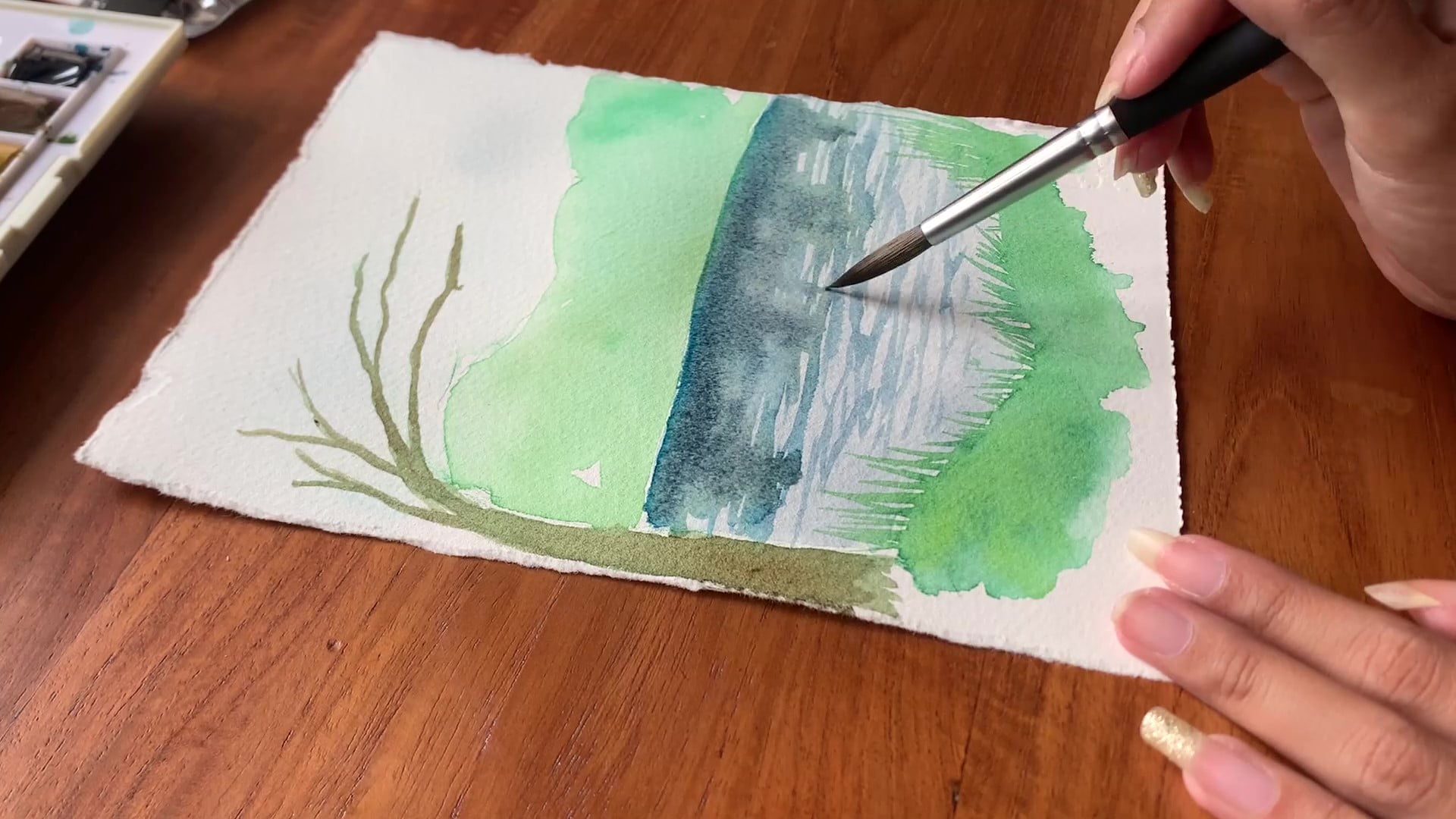
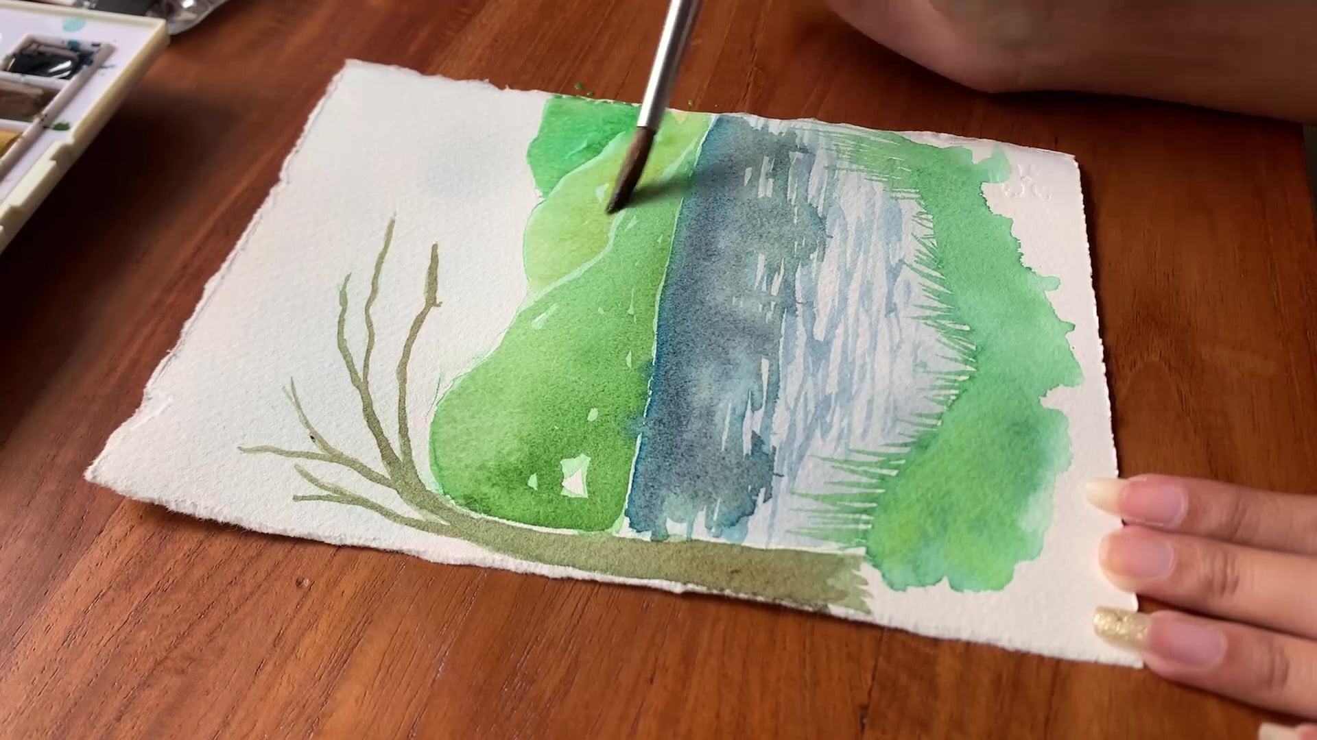
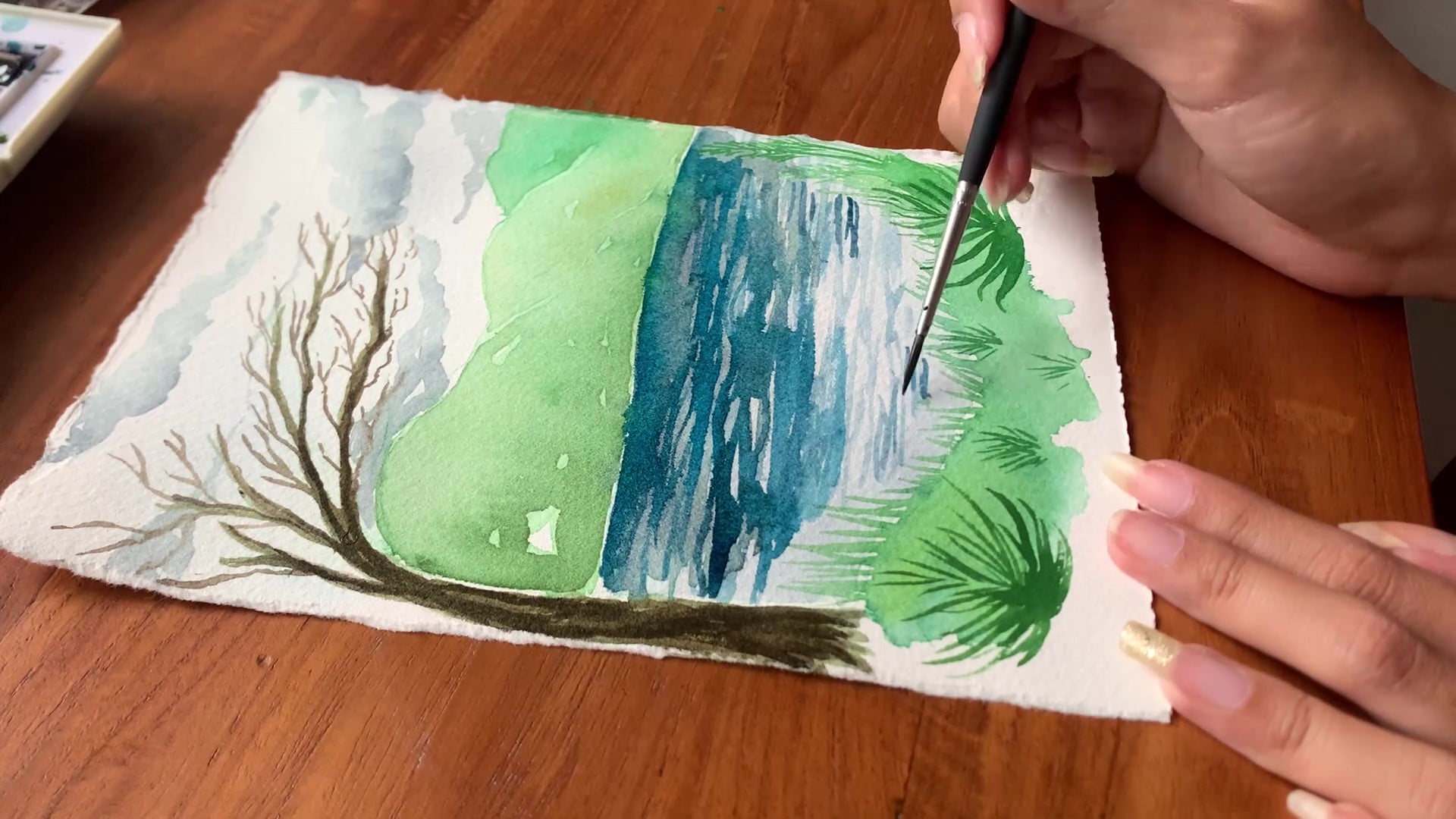
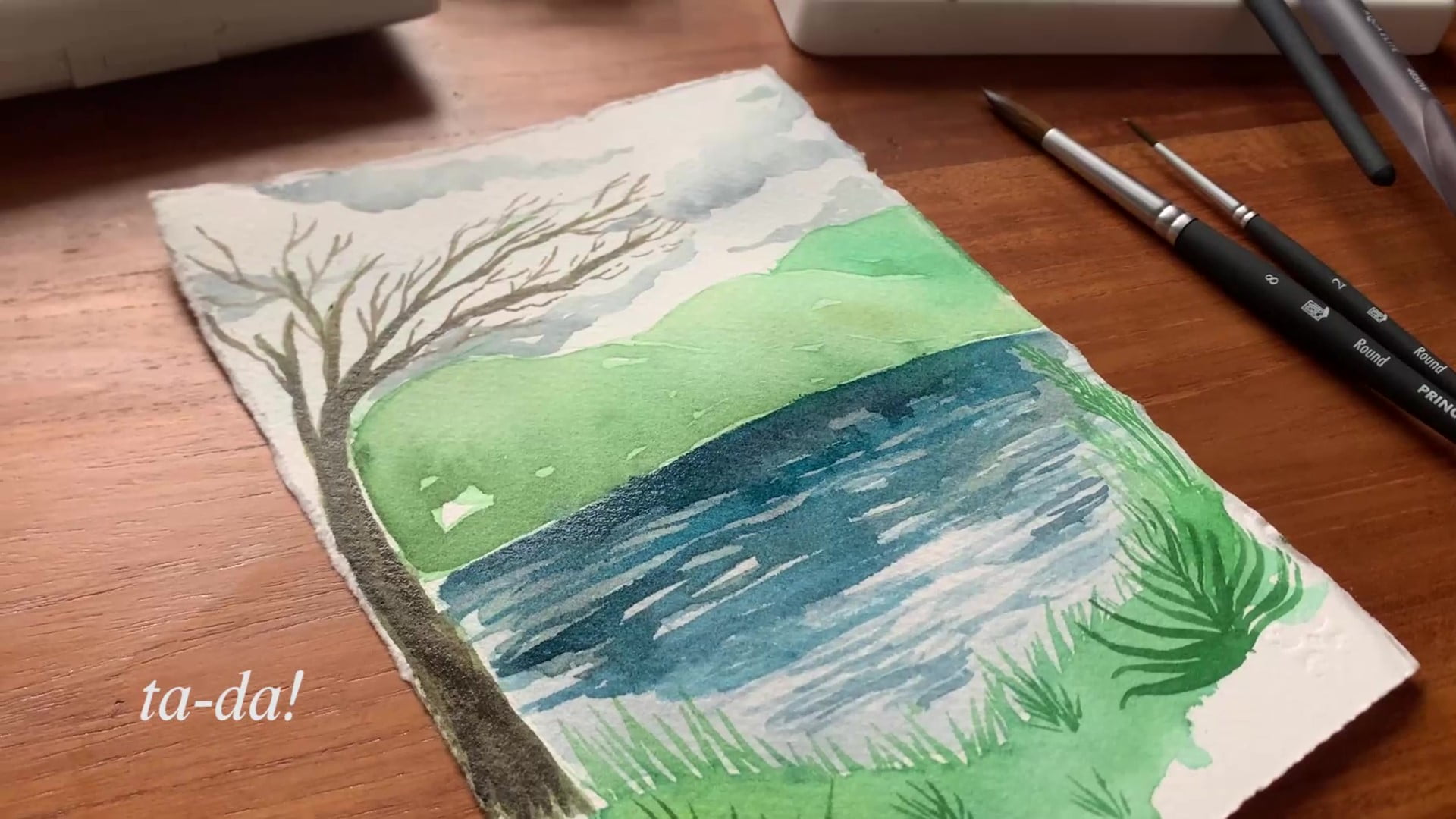

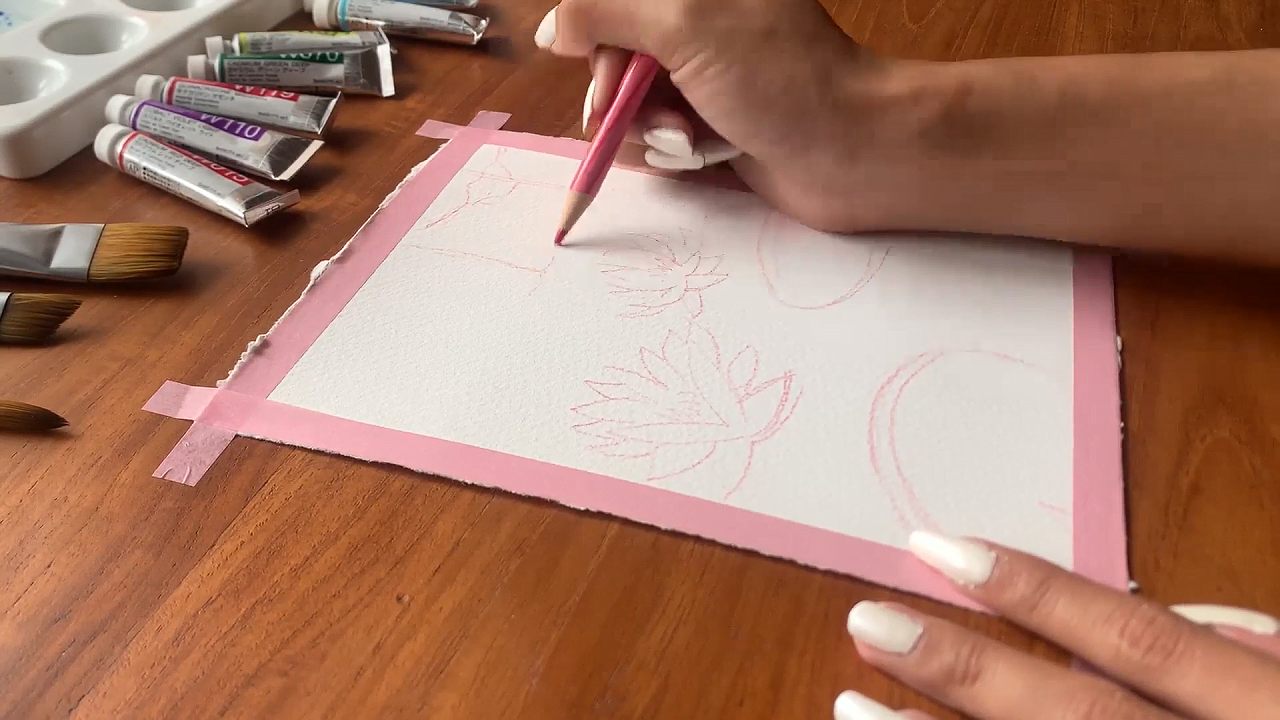
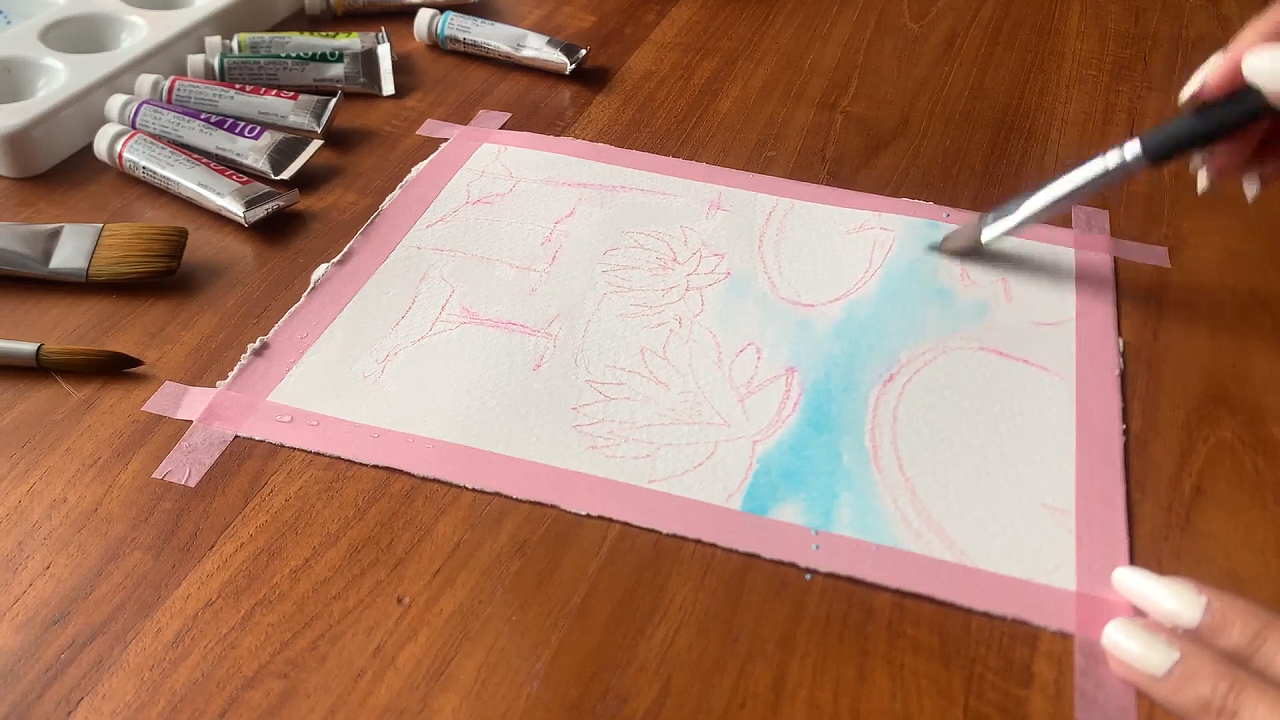
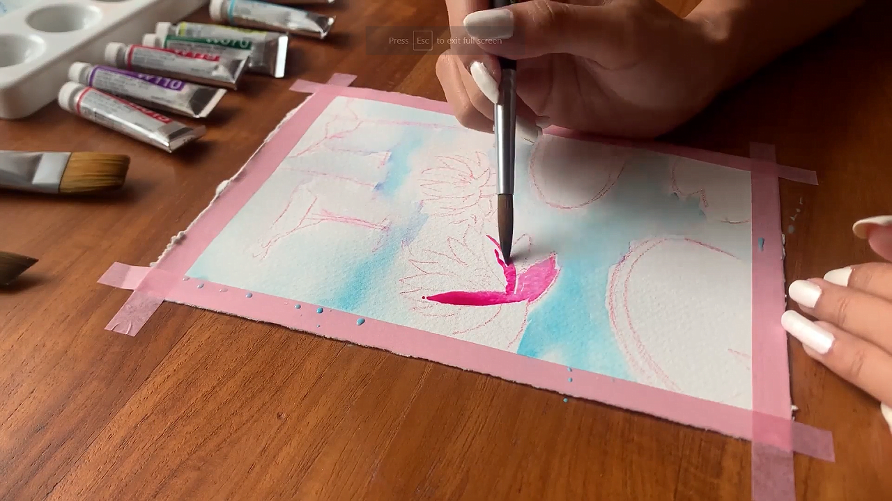
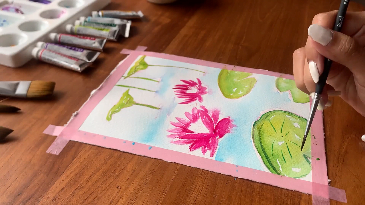
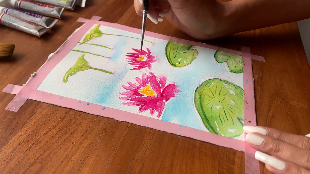
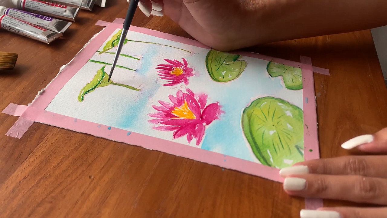
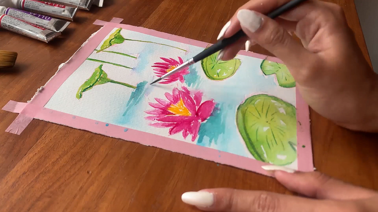
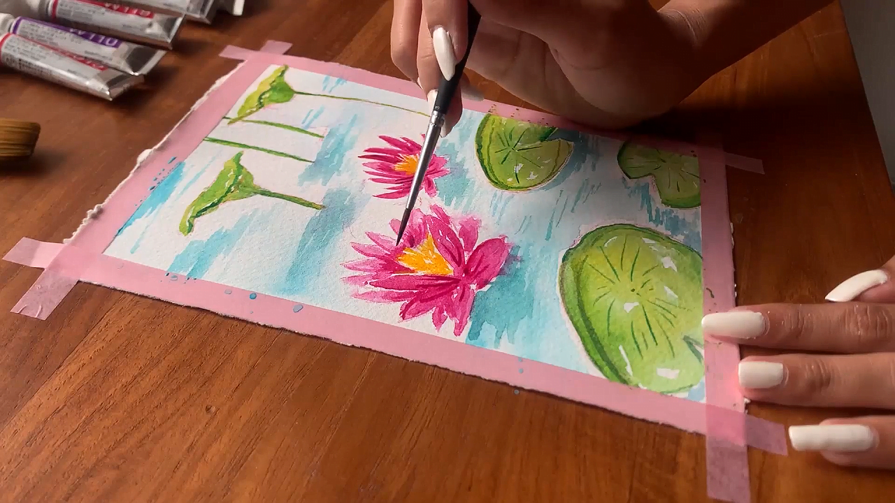
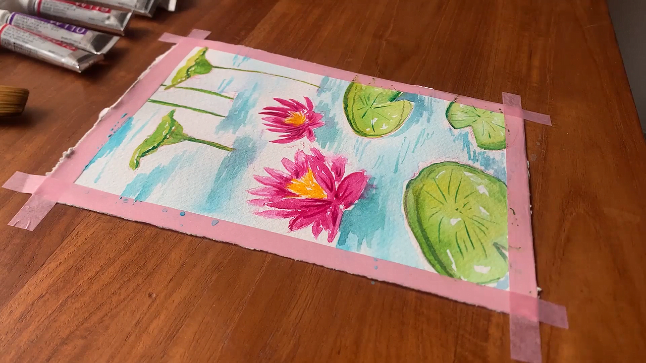

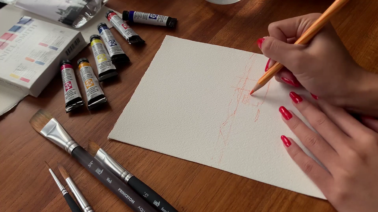
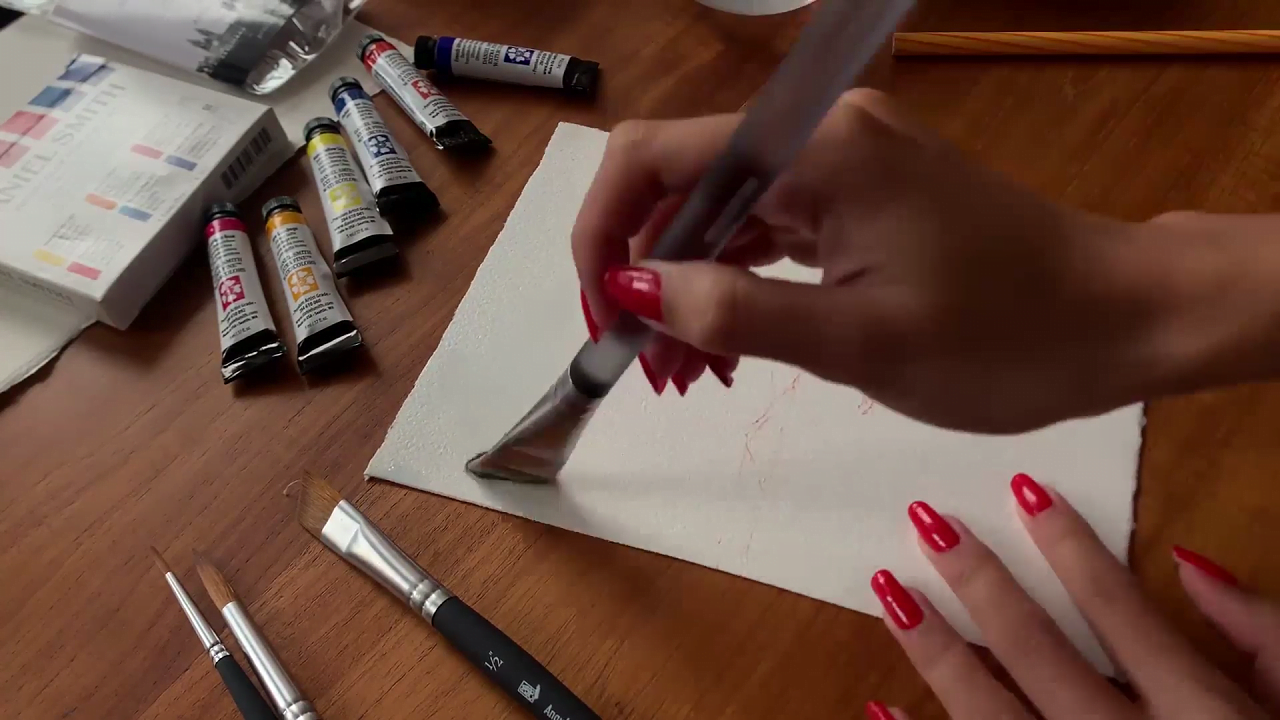
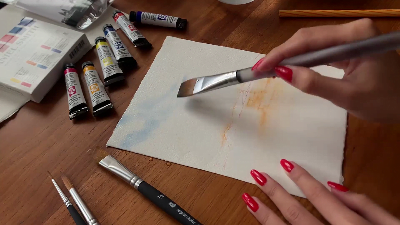
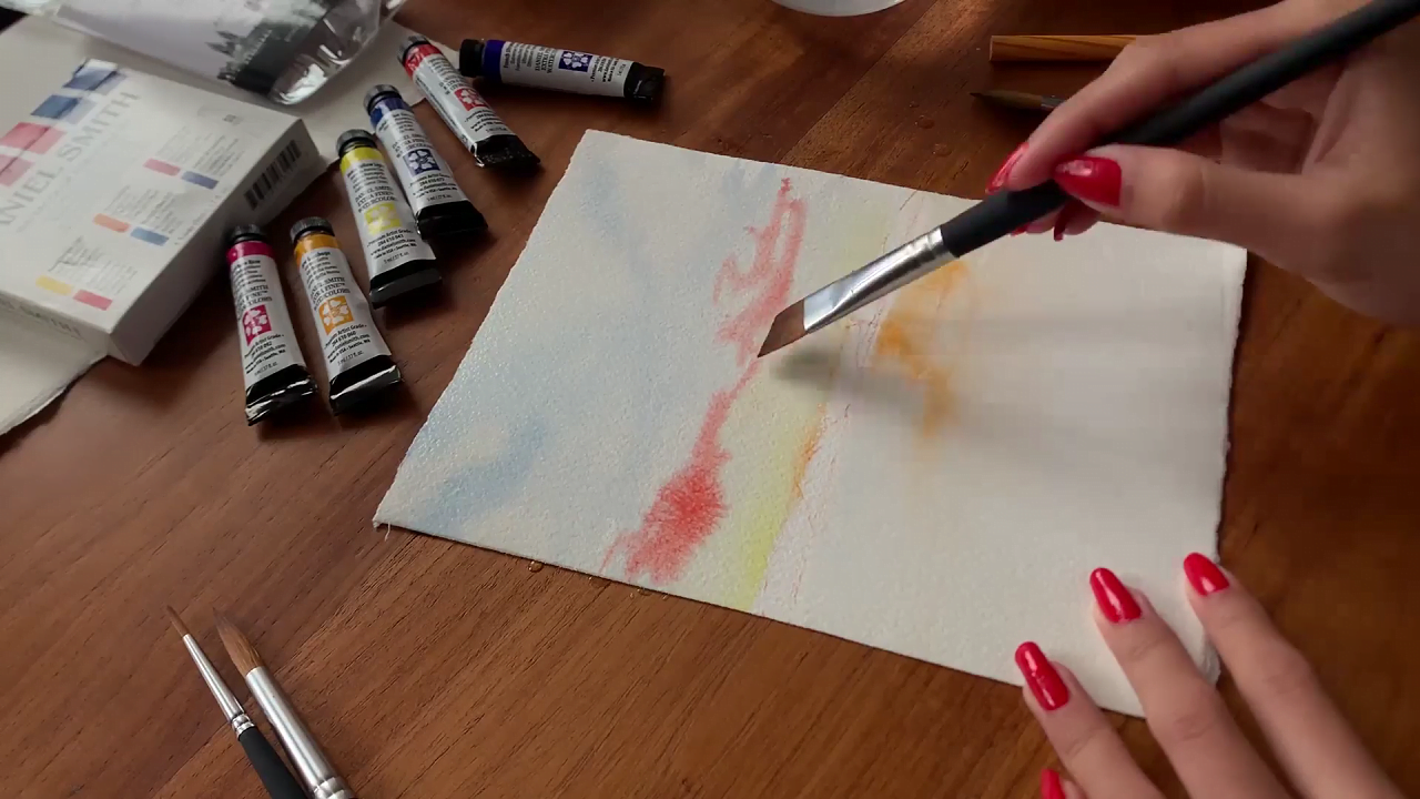
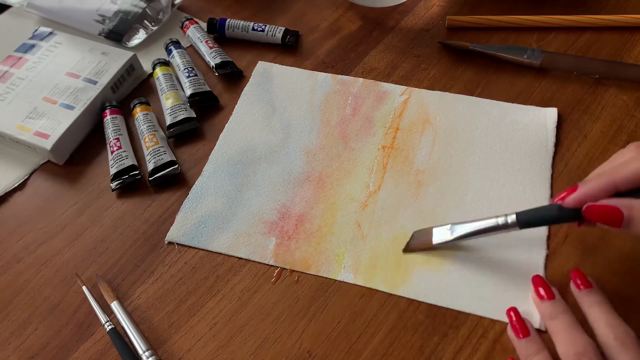
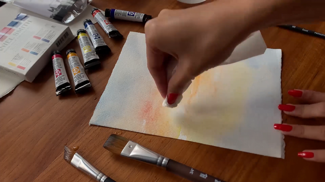
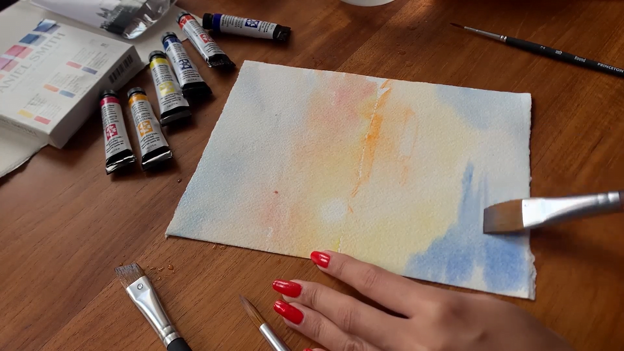
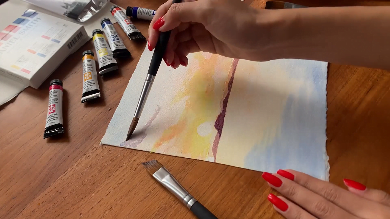
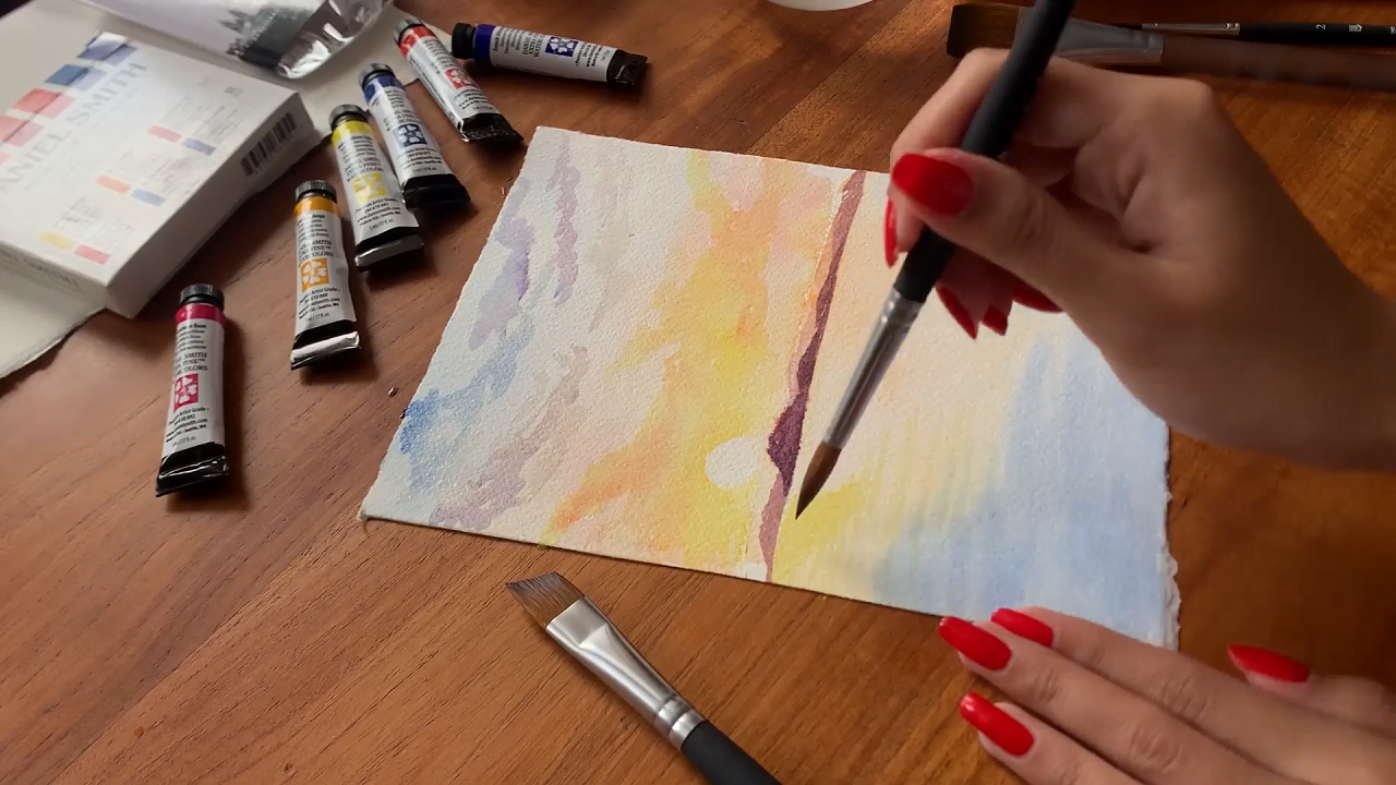
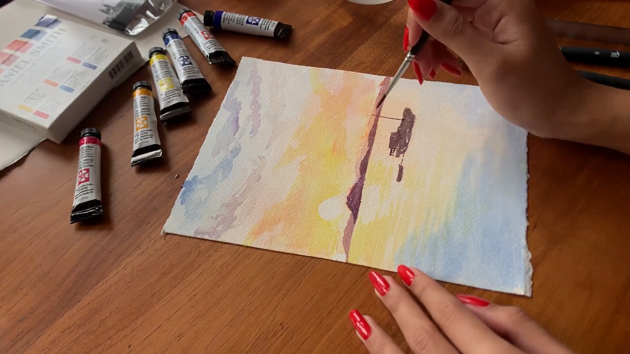
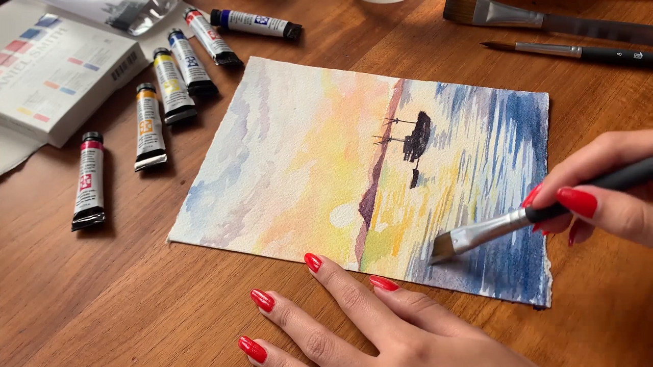
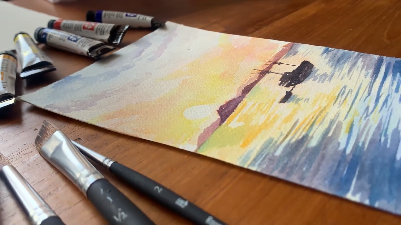

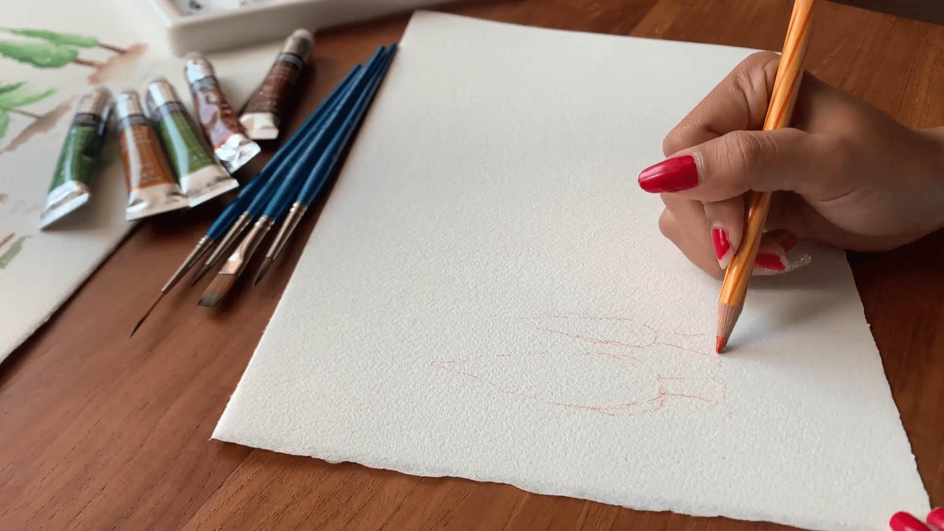
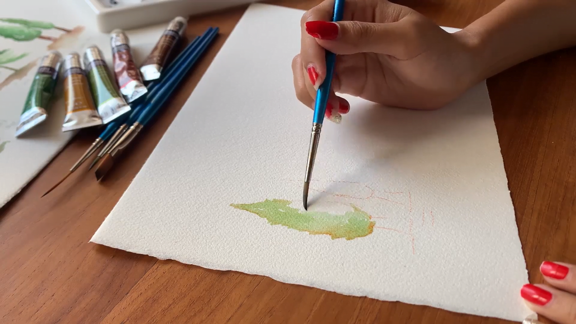
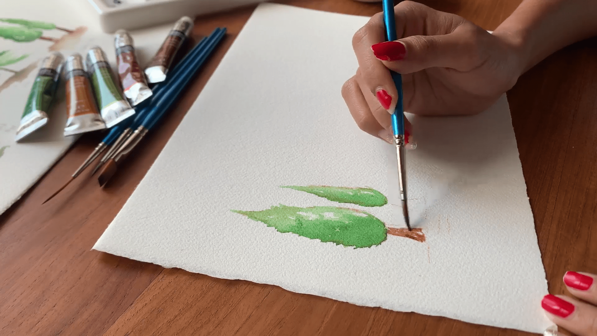
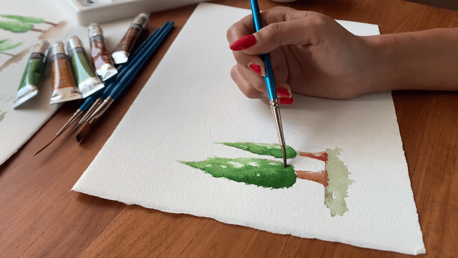
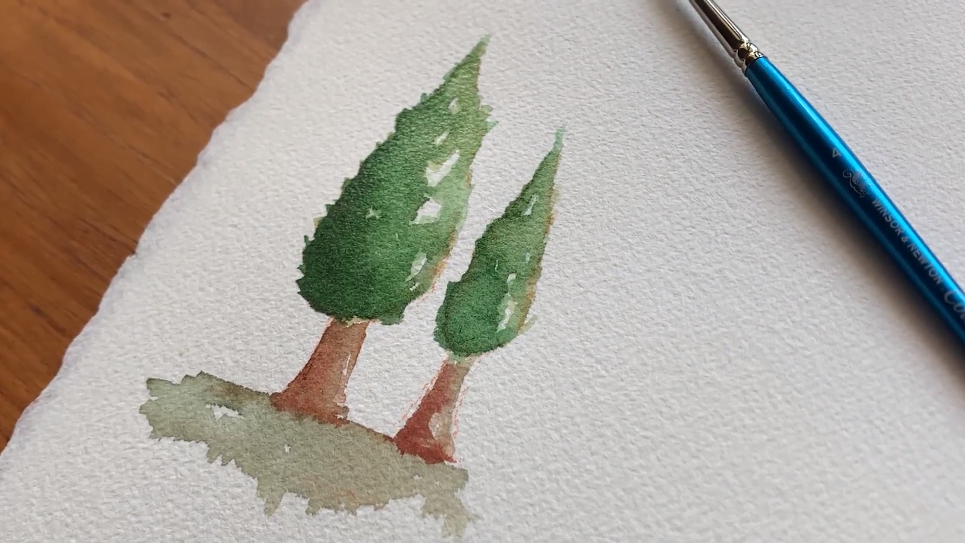
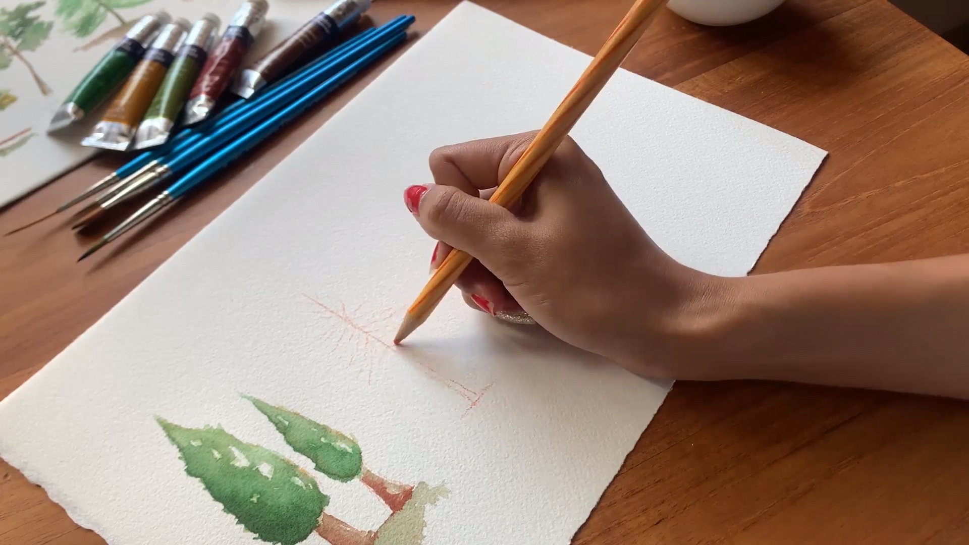

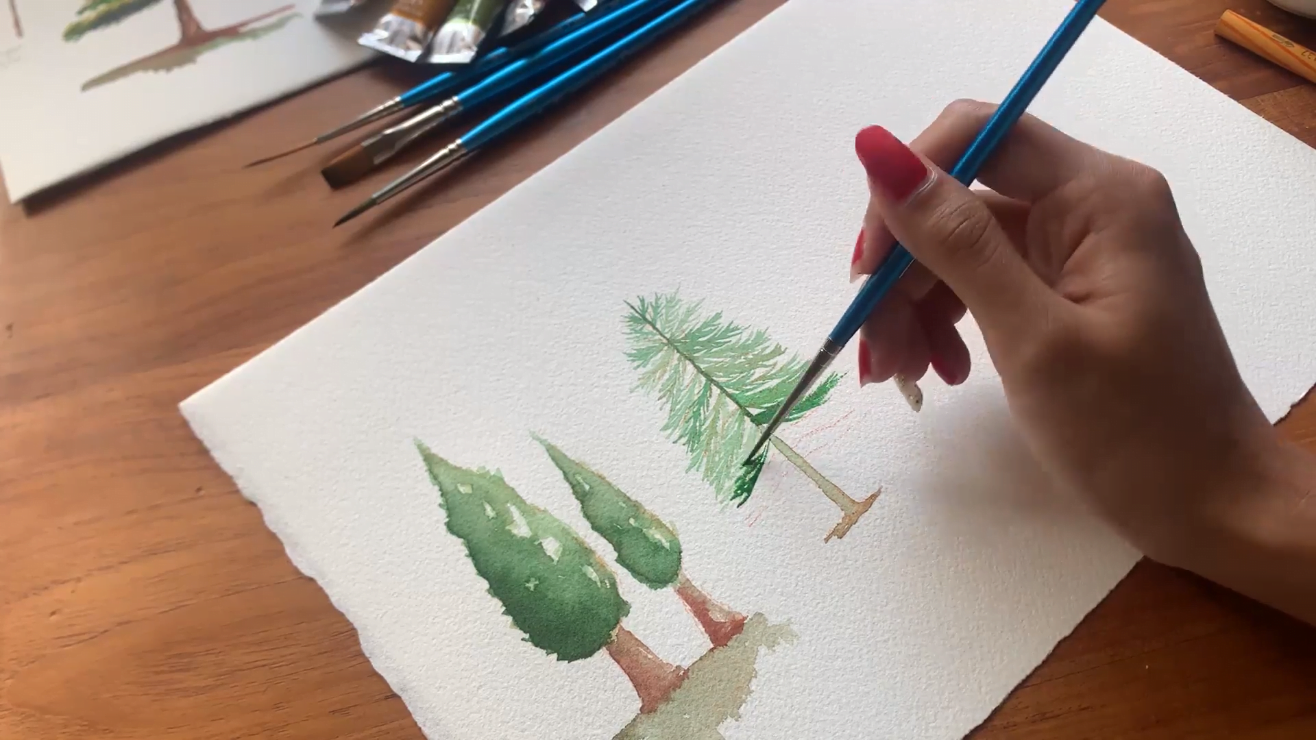
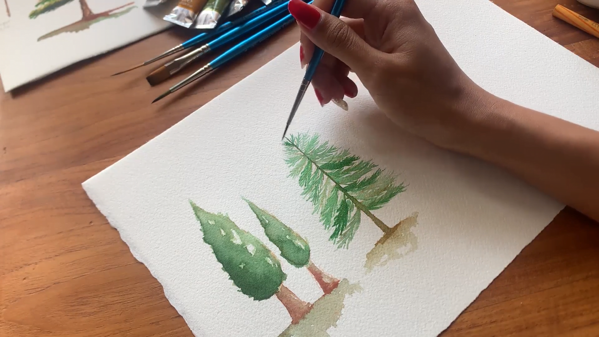
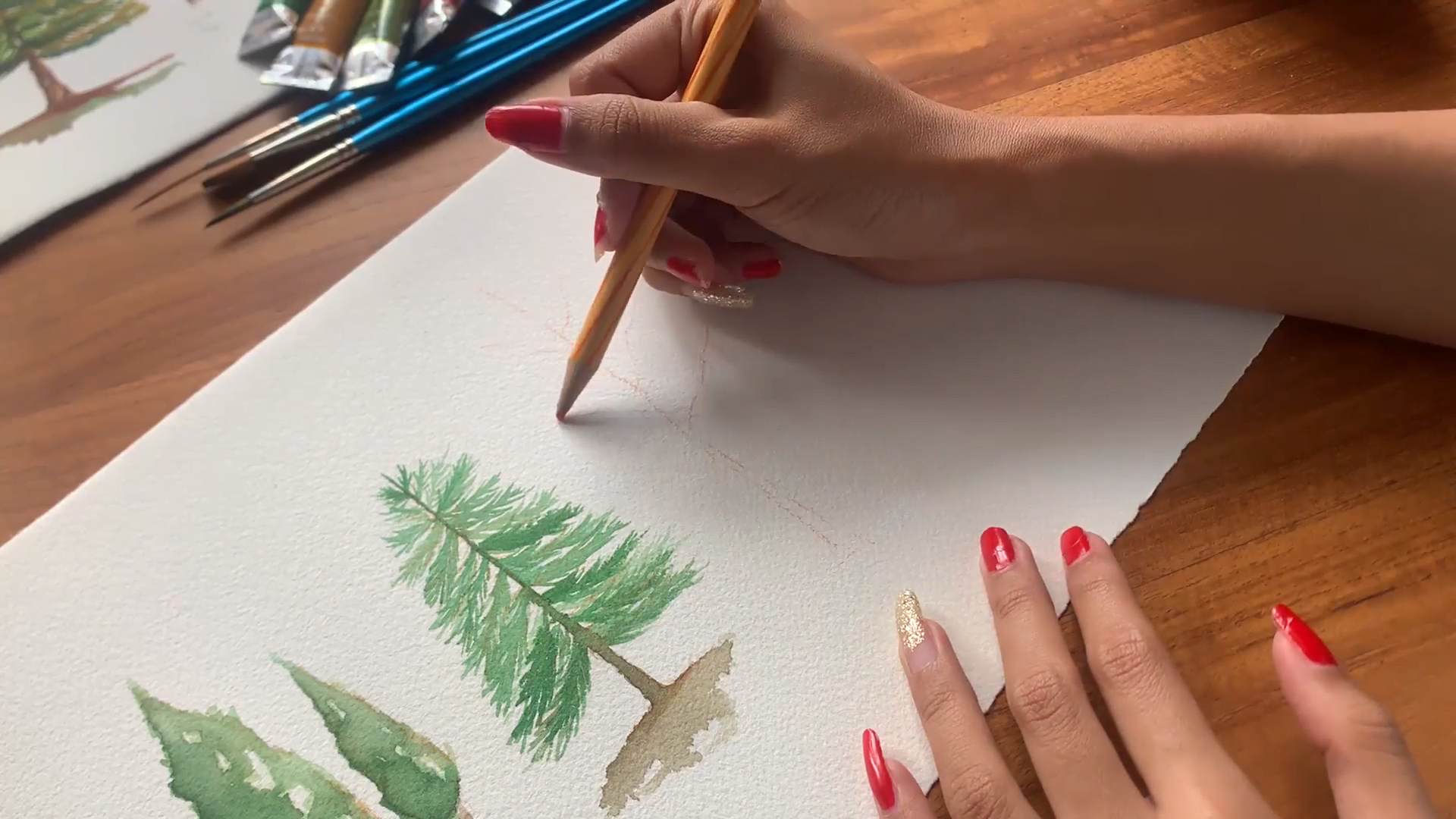
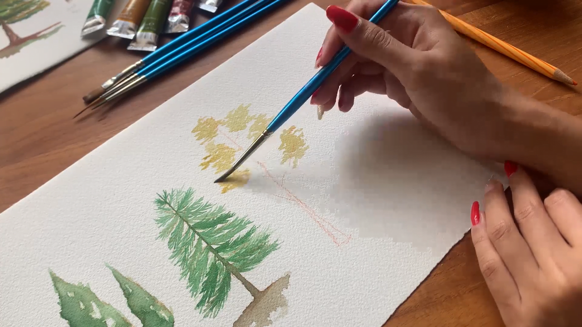
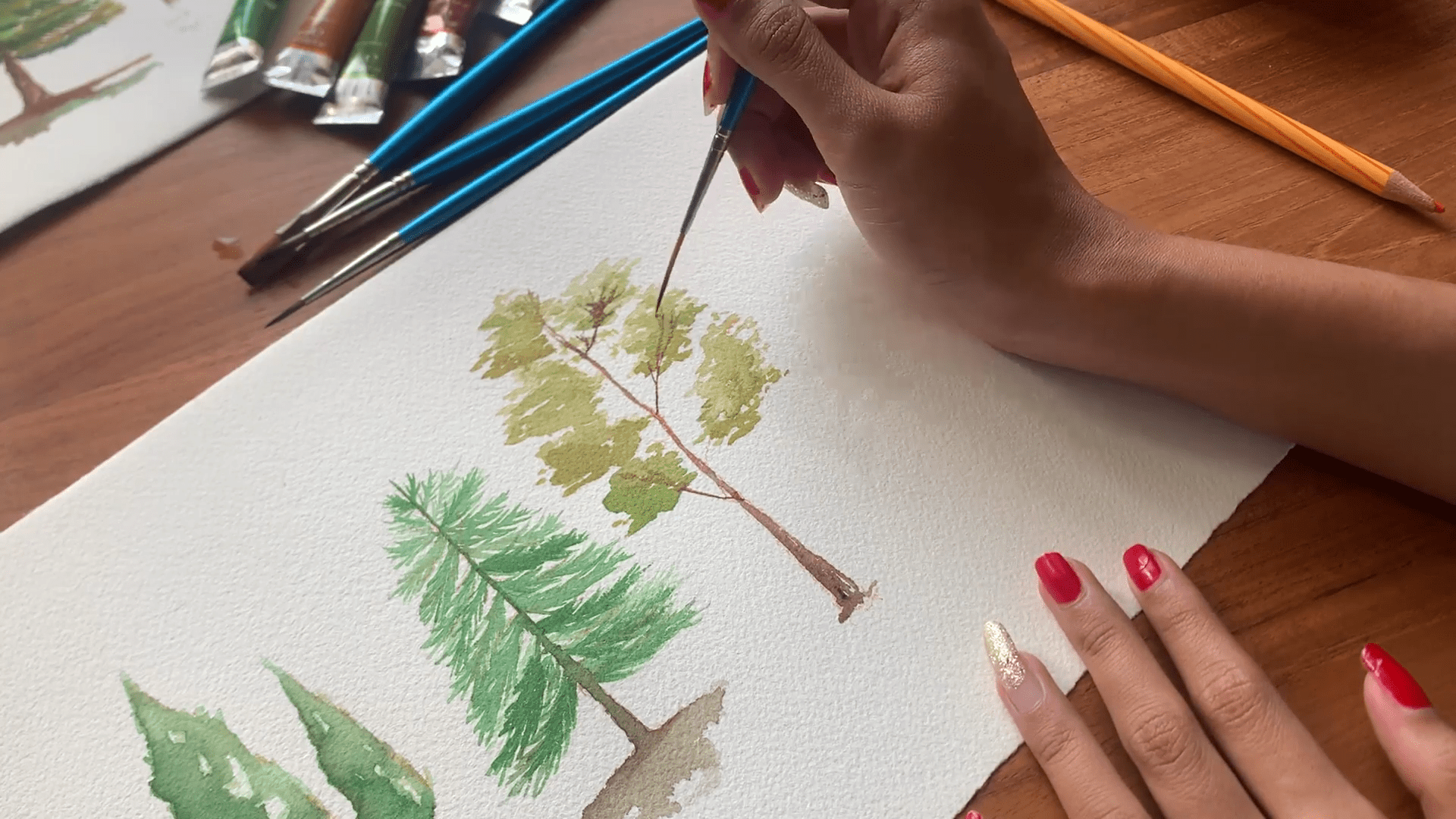
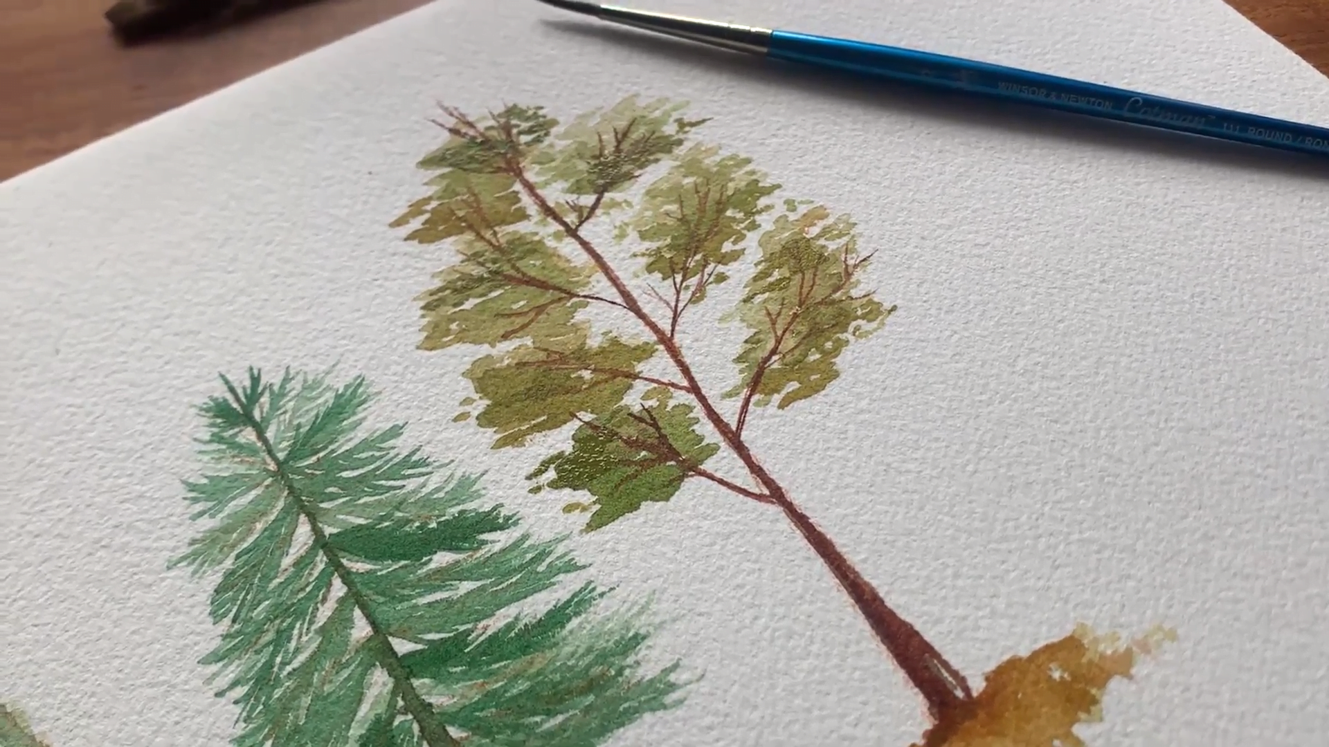
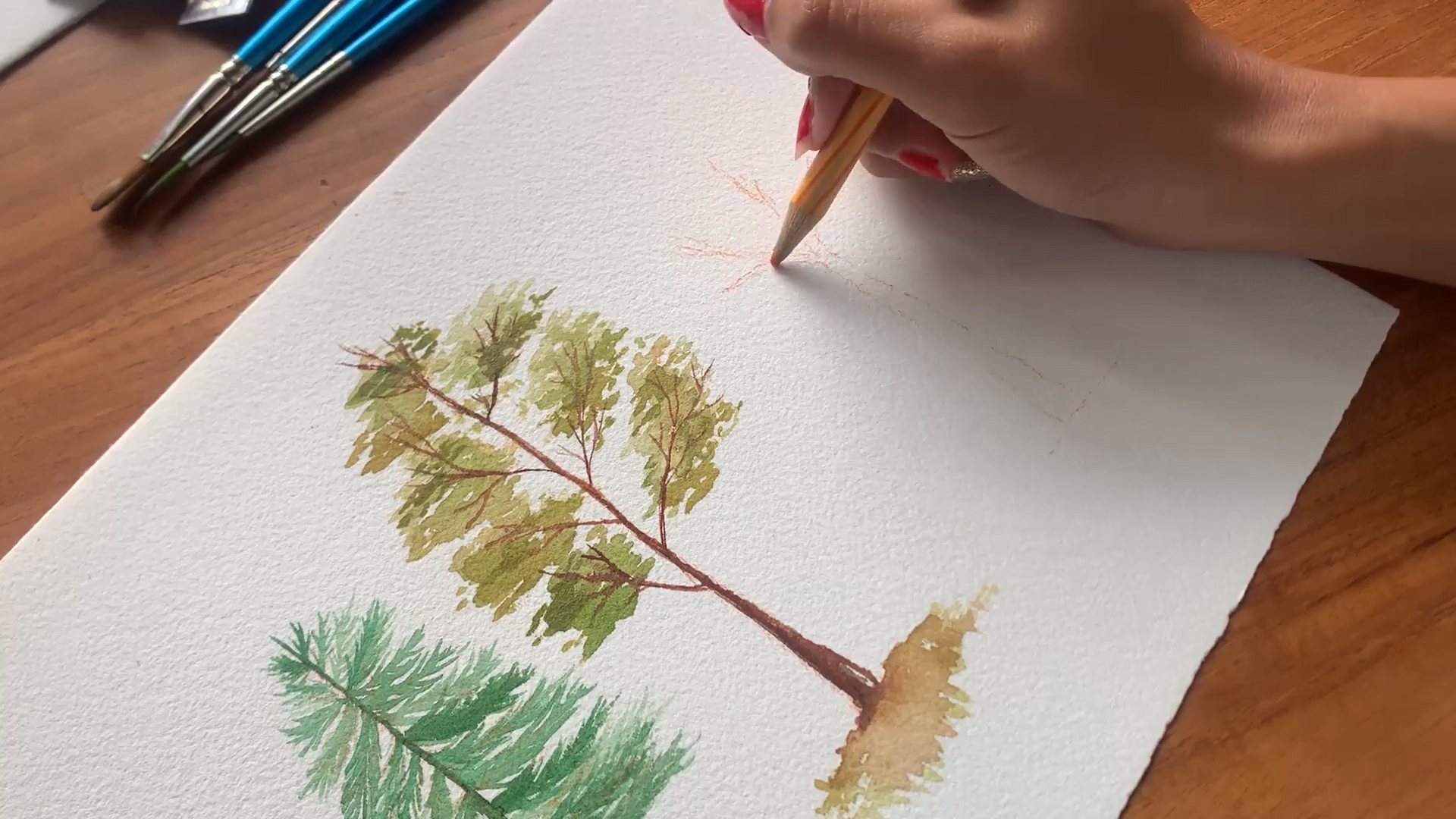
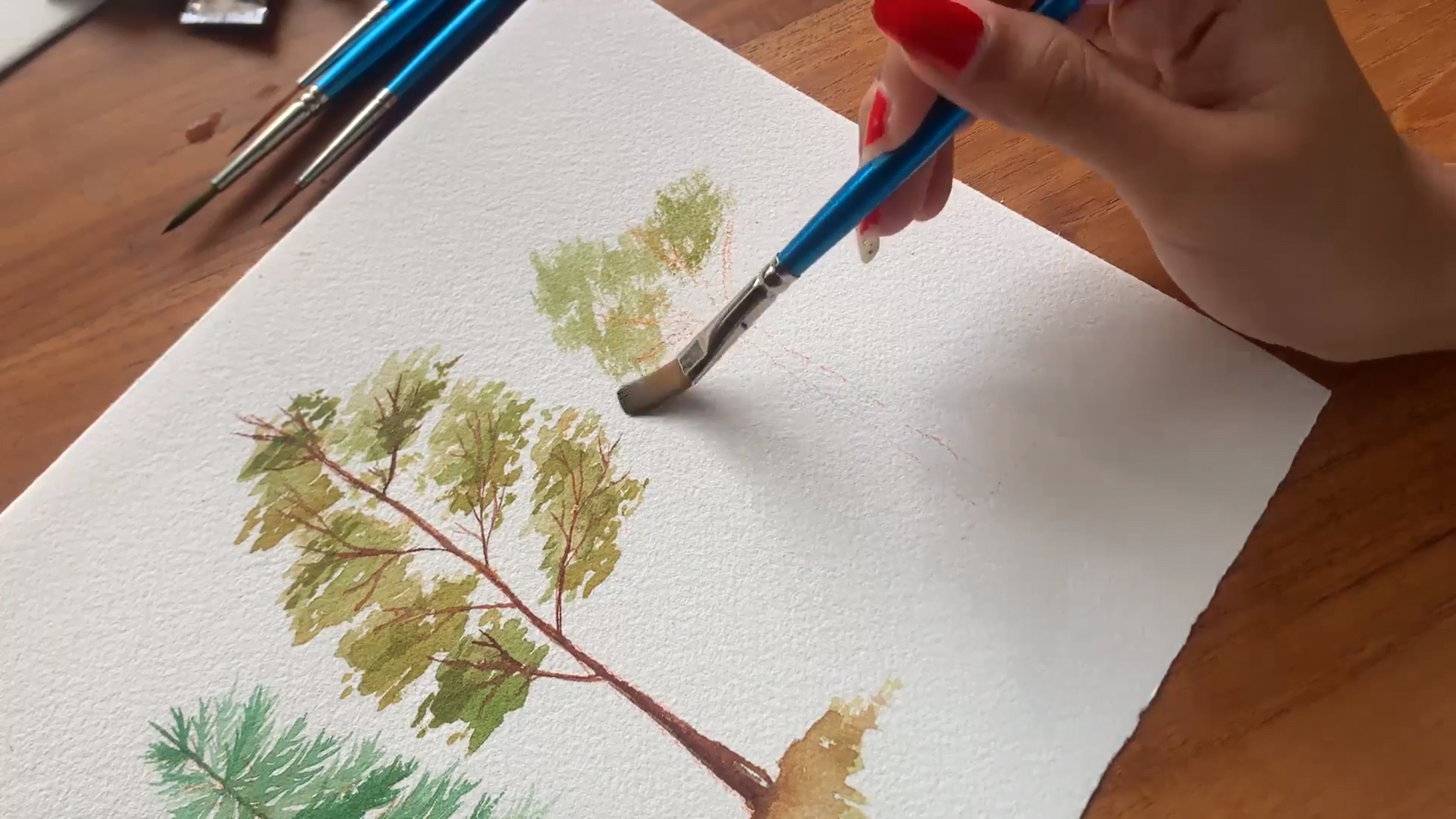
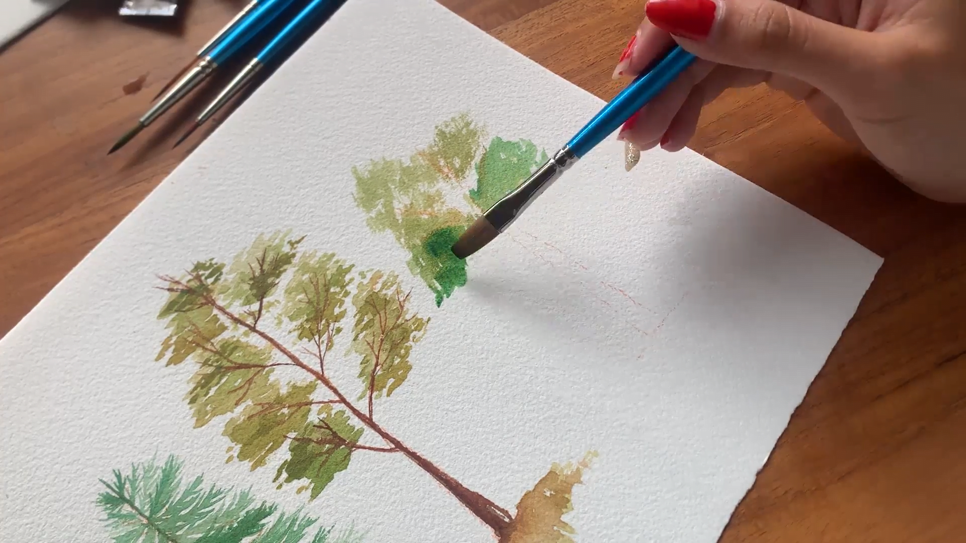
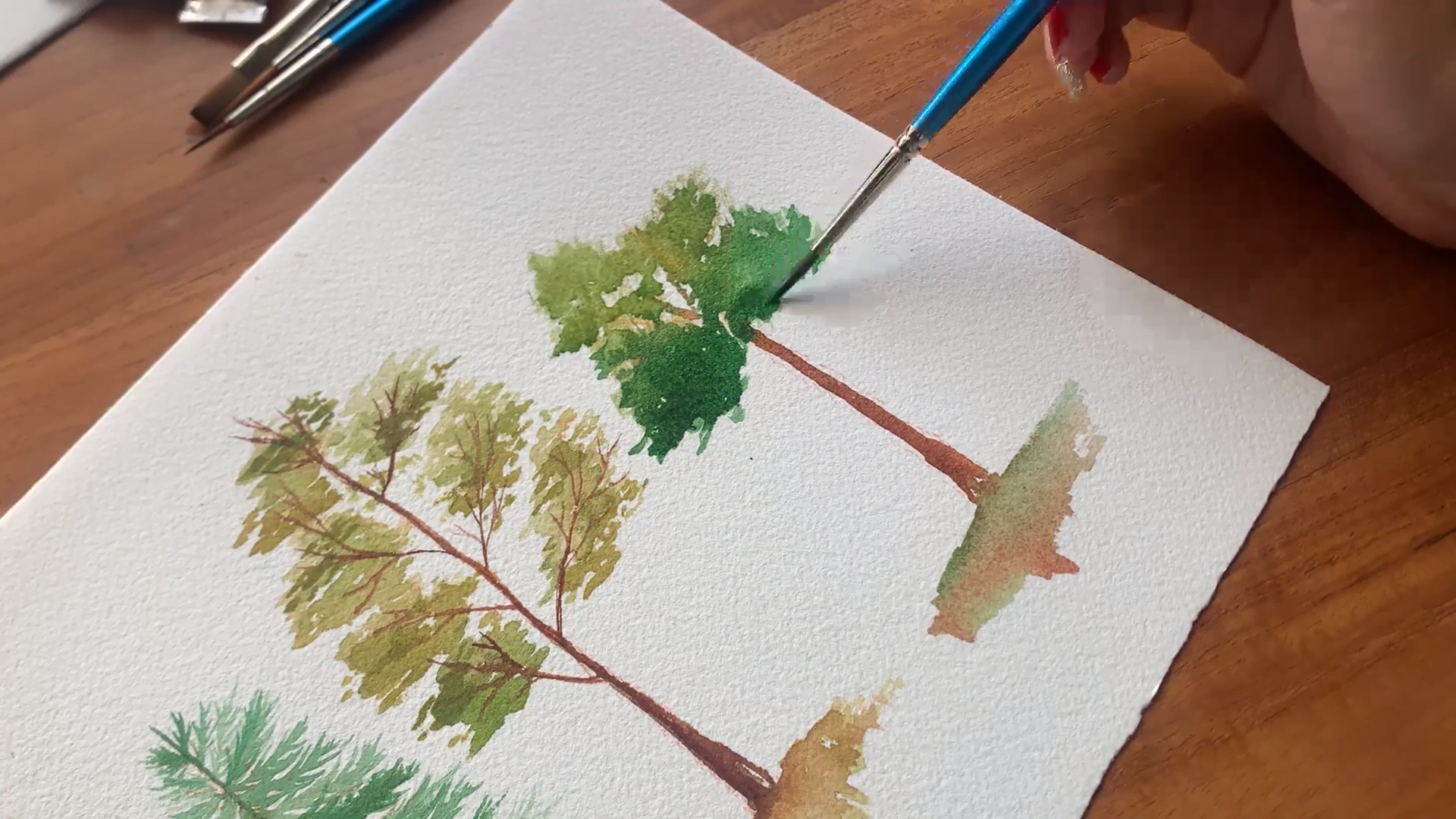
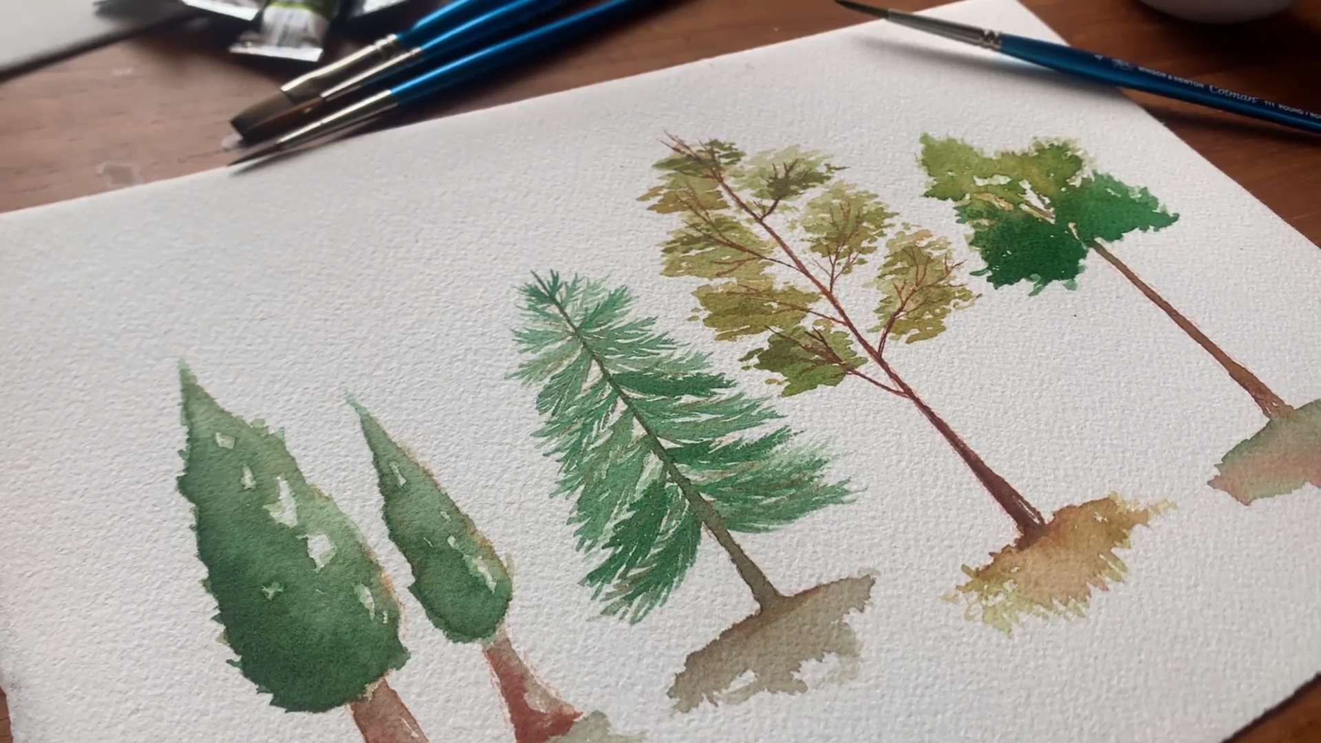

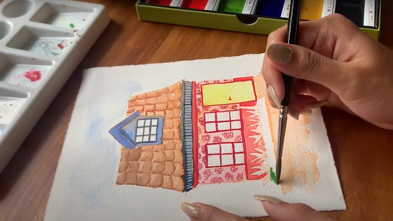
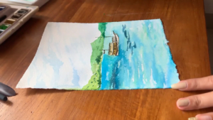
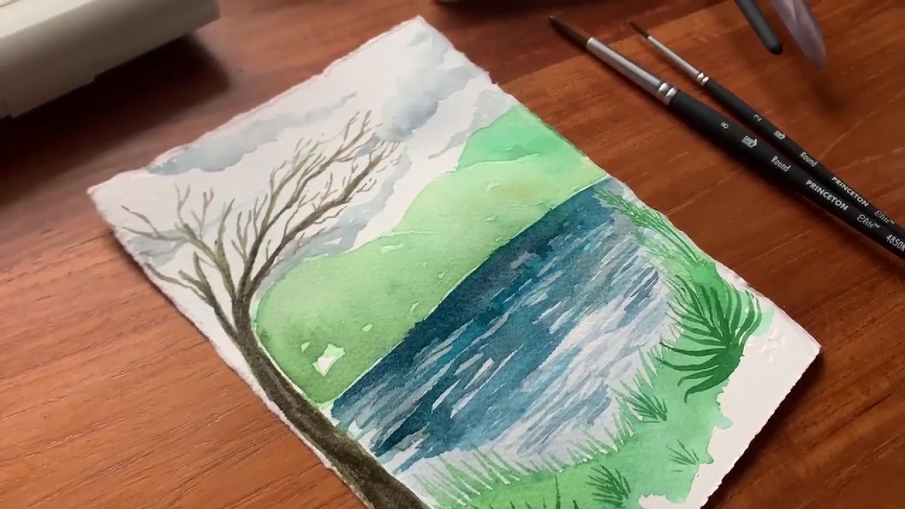
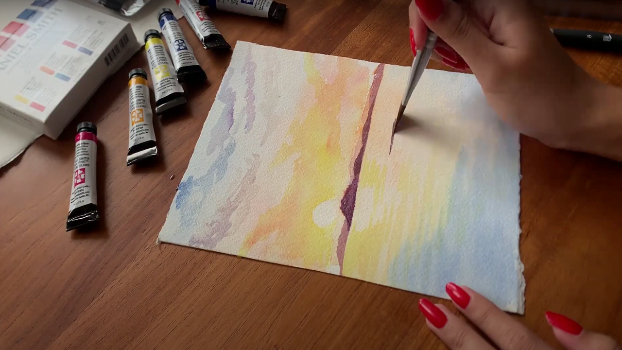


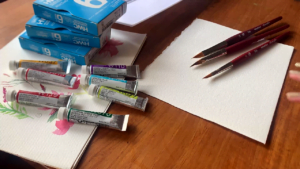
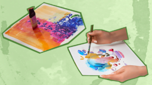

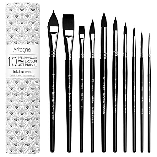


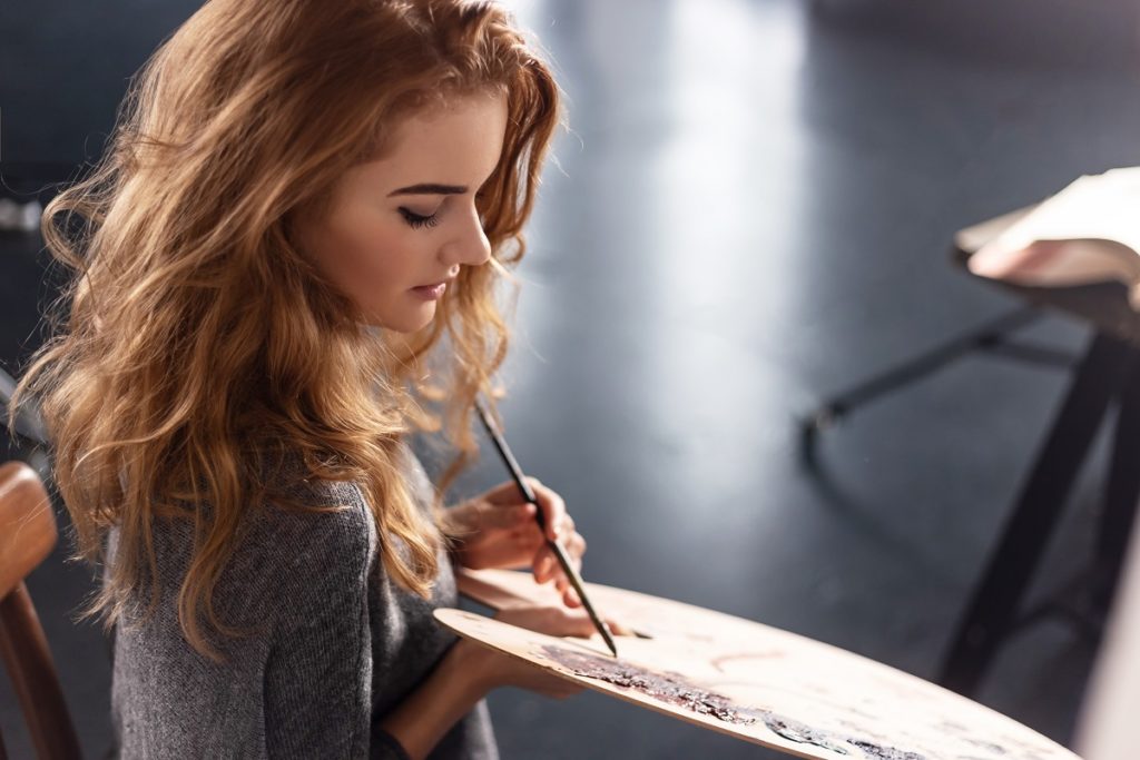


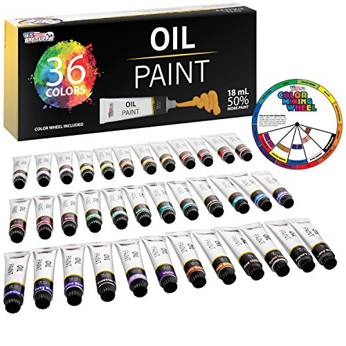
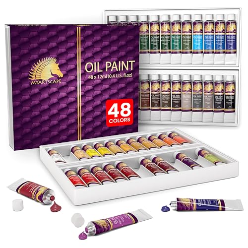
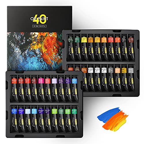

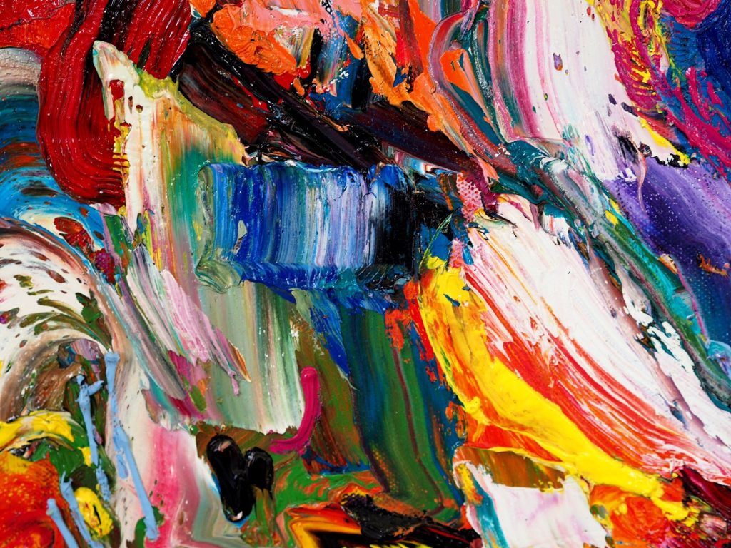

![20 Best Paint Tool SAI Brushes and Textures [Free Download]](https://homesthetics.net/wp-content/uploads/2019/08/Best-Paint-Tool-SAI-Brushes-and-Textures.jpg "20 Best Paint Tool SAI Brushes and Textures [Free Download]")